10 Front Door Color Trends That’ll Drop In Popularity in 2025 And 5 That Are Always Horrible
Your front door makes a bold first impression about your home and personality. With color trends constantly evolving, what seems fashionable today might look dated tomorrow.
Let’s explore which popular front door colors are heading out the door in 2025, plus five shades that decorators consistently warn against.
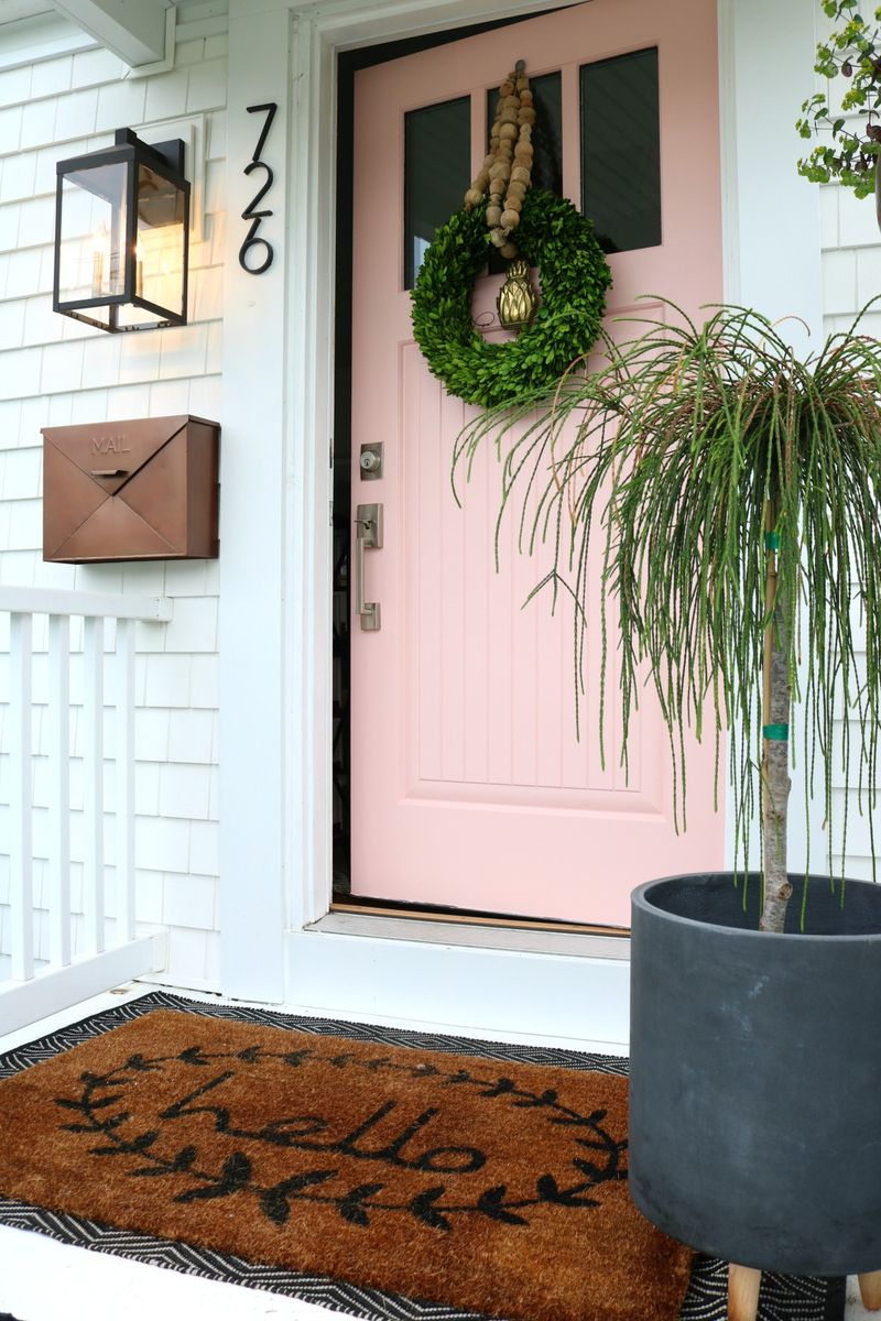
1. Millennial Pink Fatigue
Remember when everything from phone cases to coffee mugs turned that soft, dusty pink? The romance with millennial pink front doors is finally fading.
Homeowners are seeking colors with more staying power and less association with fleeting Instagram aesthetics. If you invested in this trendy hue, consider a refresh before your entryway starts looking like a 2018 time capsule.
2. Navy Blue Oversaturation
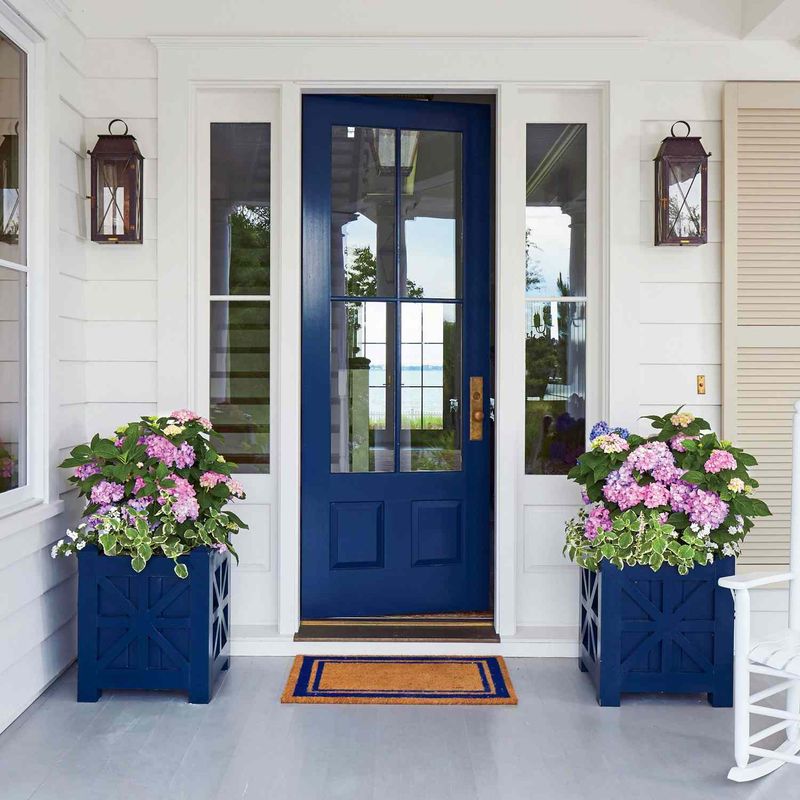
The classic navy blue door that once signaled sophisticated taste has become too commonplace. Walk through any upscale neighborhood and you’ll spot this dark blue hue on every third house.
Design experts predict this oversaturation will push homeowners toward more distinctive choices. Navy had a good run as the “safe but stylish” option, but its ubiquity has finally dampened its appeal.
3. Teal Turning Tired
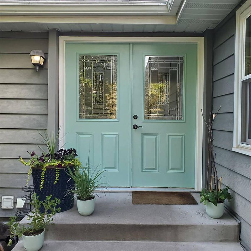
What happens when a bold choice becomes too popular? Teal front doors are finding out the hard way.
Once celebrated for striking the perfect balance between blue and green, teal has saturated Pinterest boards and home design shows to the point of predictability. Designers are already noting a sharp decline in requests for this formerly fresh shade as homeowners seek less obvious color statements.
4. Charcoal Gray Cooldown
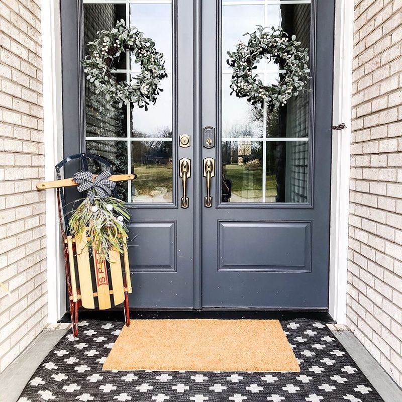
The minimalist’s favorite is losing its edge. Charcoal gray doors, once the hallmark of modern architectural styling, are beginning to feel formulaic rather than forward-thinking.
As warmer, more natural color palettes gain momentum in exterior design, this cool-toned neutral is being left behind. The industrial aesthetic that propelled charcoal’s popularity is giving way to more inviting, less severe entryway statements.
5. Bright Coral Crash
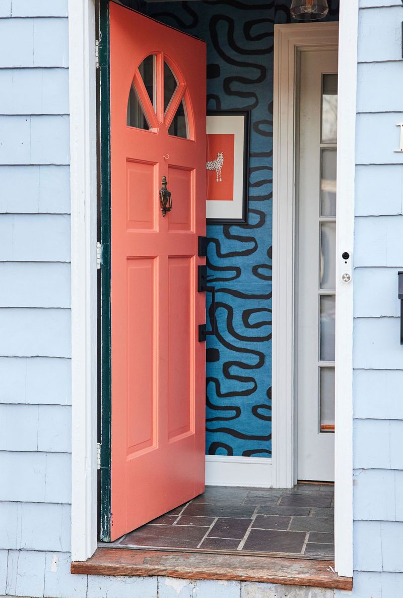
Vibrant coral doors burst onto the scene as a cheerful alternative to traditional reds. Unfortunately, their moment in the sun is setting fast.
This tropical-inspired hue quickly went from fresh to flashy, with many homeowners discovering it doesn’t age well with changing exterior trends. Color forecasters are already seeing coral retreating to accent pieces rather than commanding center stage on front doors.
6. Matte Black Fatigue
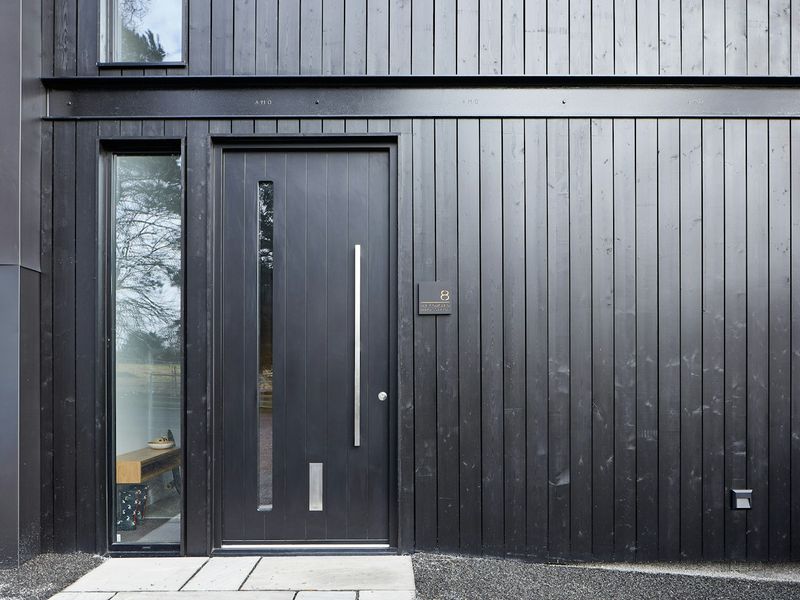
The sleek, sophisticated statement of matte black doors is showing signs of wear. After dominating design magazines and new construction for years, this once-edgy choice now reads as formulaic.
Homeowners are discovering that maintaining matte black’s pristine appearance requires constant upkeep, with fingerprints and dust highly visible. As practicality becomes a priority, this high-maintenance trend is headed for the exit.
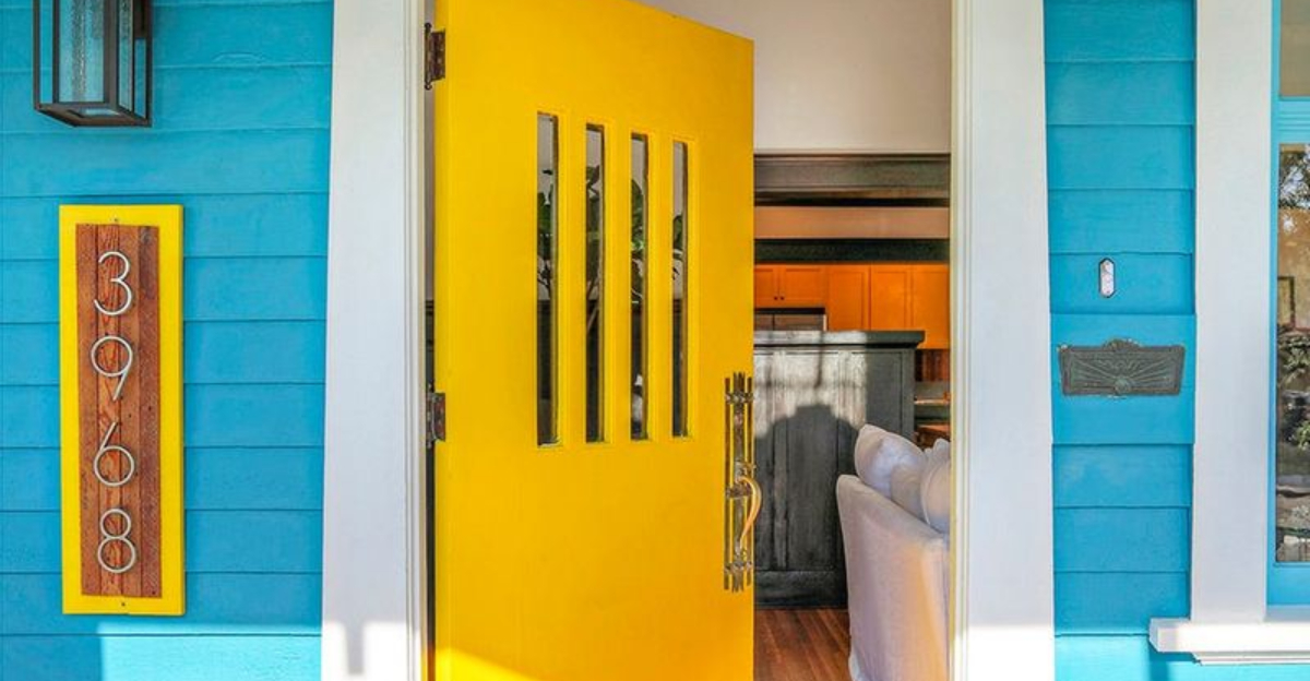
7. Sunshine Yellow Sunset
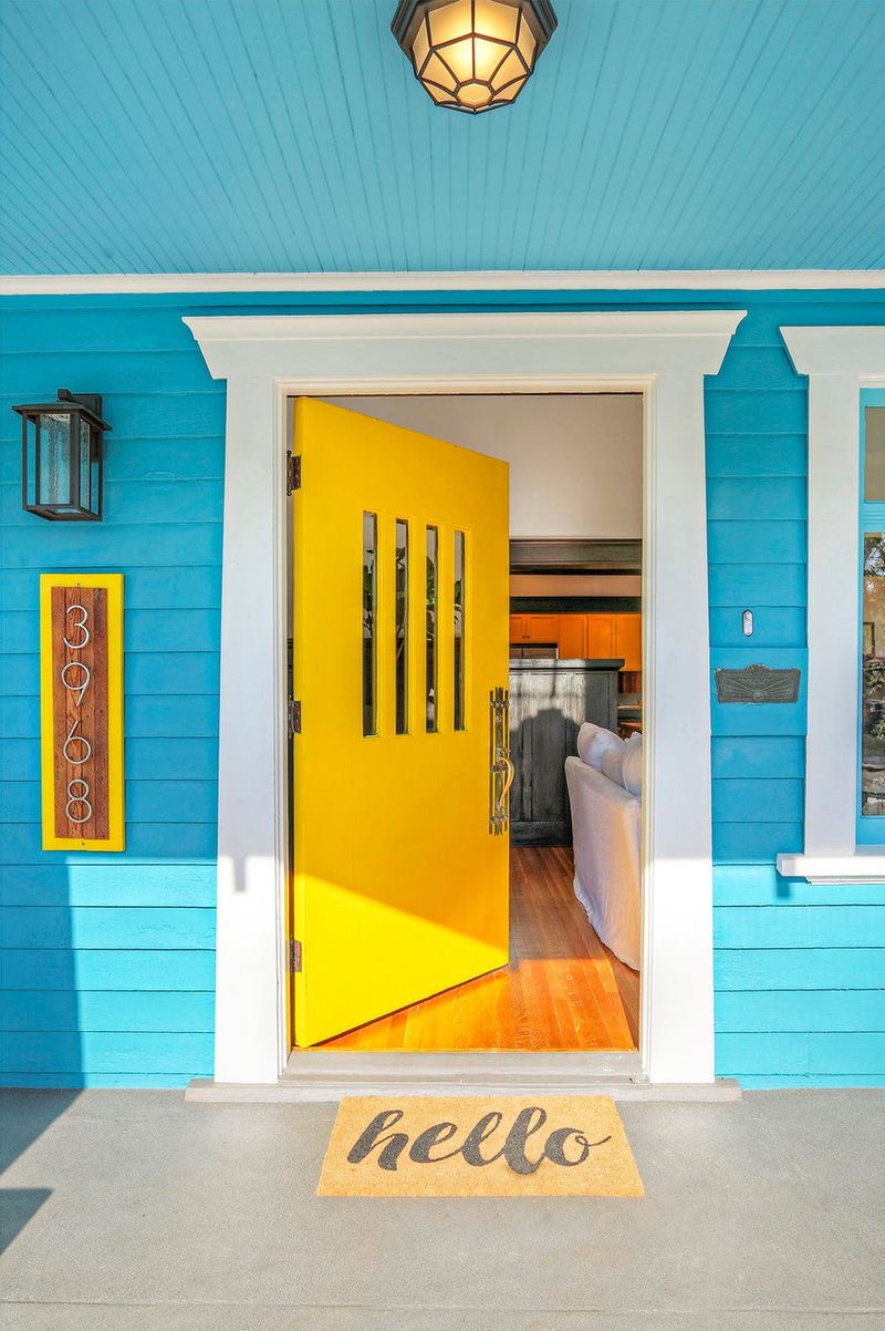
Those cheerful yellow doors that brought a pop of optimism to neighborhoods are losing their shine. What once felt fresh and daring now often appears dated and overwhelming.
Weather takes a particular toll on this bright hue, causing faster fading and a dingy appearance. Design forecasters note that homeowners are shifting toward more subtle, earthy yellows or abandoning the sunny shade altogether for more sophisticated options.
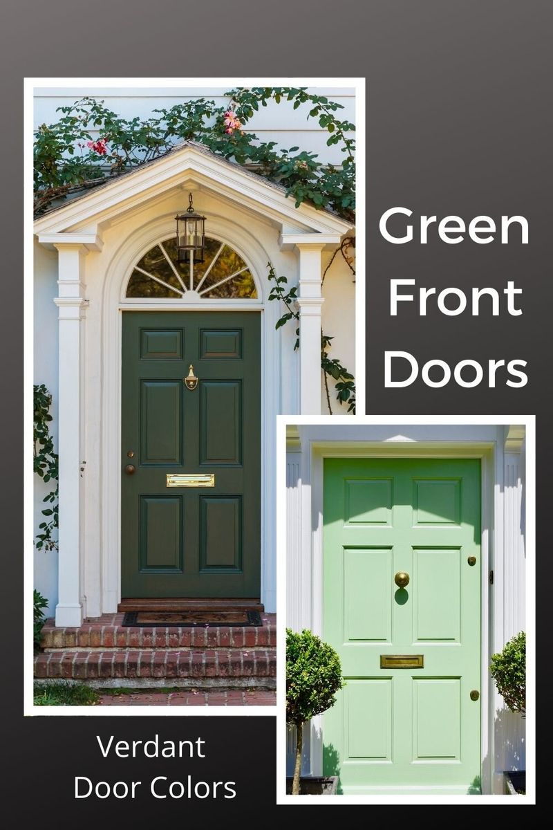
8. Emerald Green Decline
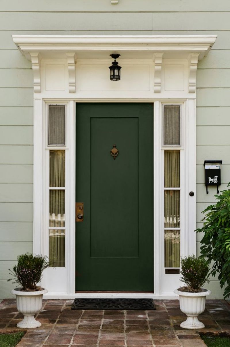
Jewel tones are taking a backseat, with emerald green leading the retreat. This rich, saturated color that once symbolized luxury is increasingly viewed as too intense and limiting.
Changing light throughout the day can make emerald doors appear dramatically different, sometimes attractive and other times harsh. As versatility becomes more valued in home design, this temperamental shade is losing favor with homeowners seeking more consistent curb appeal.
9. Turquoise Retreat
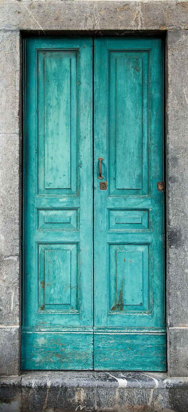
The vacation-inspired splash of turquoise is packing its bags. Once beloved for creating a coastal vibe regardless of location, this vibrant blue-green is now seen as too theme-specific.
Homeowners are discovering that turquoise doors limit seasonal decorating options and can clash with landscaping changes. As more subtle, versatile color choices gain ground, this bold beach-house staple is receding like the tide.
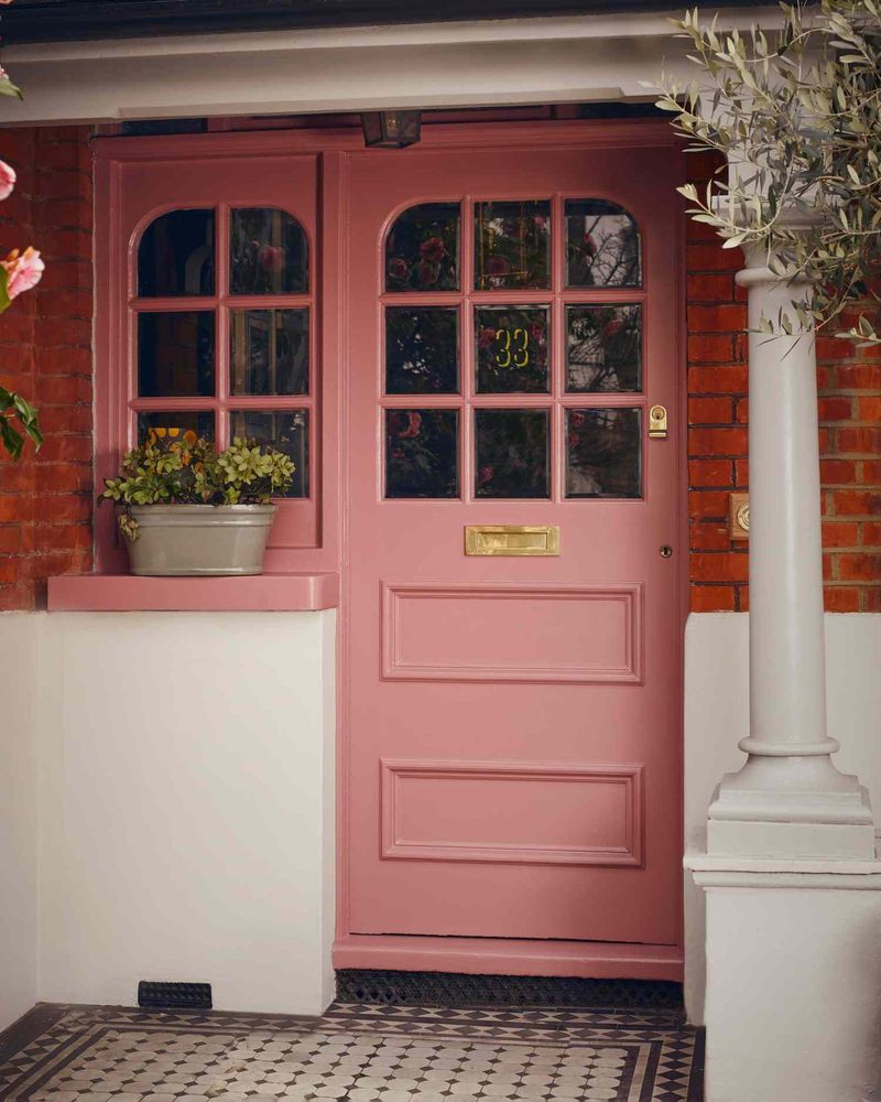
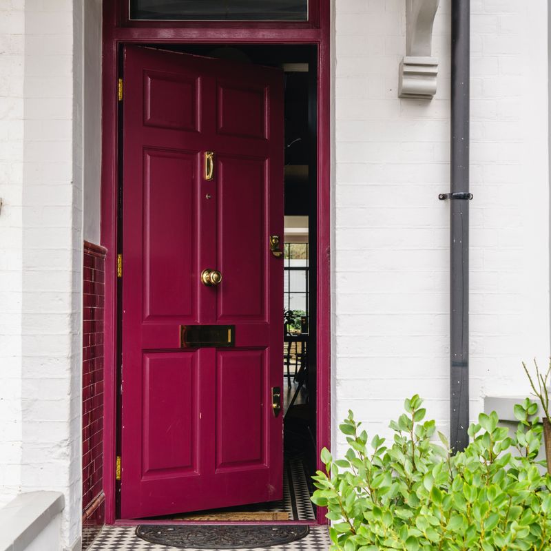
10. Candy Apple Red Cooling
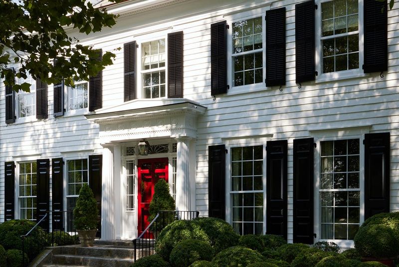
The classic bright red door is losing its commanding presence. Though long considered timeless, the candy apple red that once signaled welcome is increasingly viewed as too loud and traditional.
Color experts note that homeowners are gravitating toward more complex, muted reds with brown or purple undertones. This shift leaves the classic bright red looking dated and simplistic compared to its more sophisticated color cousins.
11. Neon Green Nightmare
Has anyone ever actually liked neon green doors? Apparently some brave souls did, but this eye-searing choice has never found lasting appeal.
Too reminiscent of energy drinks and teenage bedroom phases, neon green creates an unwelcoming first impression that screams “look at me” for all the wrong reasons. Real estate agents consistently report that homes with these shocking green doors take longer to sell.
12. Pepto-Bismol Pink Disaster
Unlike its sophisticated cousin millennial pink, this bright bubblegum shade makes visitors wonder if they’ve arrived at a dollhouse rather than an adult residence.
The glaring, candy-colored pink creates an infantilizing effect that’s impossible to take seriously. Even with the most neutral home exterior, this pepto-pink shade manages to overwhelm everything around it, creating an impression of questionable taste rather than playful personality.
13. Muddy Brown Monotony
When it comes to front door fails, few choices are as universally unflattering as muddy brown. Neither rich enough to appear intentional nor neutral enough to disappear, this ambiguous shade simply looks like neglect.
Often the result of faded black or poorly chosen stain, these murky brown doors create a dreary, unwelcoming entrance. Design professionals consistently rank these dull brown tones among the most depressing color choices for creating positive first impressions.
14. Clashing Purple Problems
While certain purple shades can work beautifully, the wrong purple door creates an instant eyesore. Particularly troublesome are those bright violet or purple-blue hues that fight with most traditional exterior colors.
These jarring purples create visual tension rather than harmony, making homes look disjointed and poorly planned. Unless your entire exterior color scheme was professionally designed around it, a bold purple door often results in a clashing, amateurish appearance.
15. Stark White Surrender
It might seem safe, but plain white doors rank among the most regrettable choices for front entrances. Far from being neutral, they actually highlight every speck of dirt, handprint, and weather stain.
White doors require constant maintenance to avoid looking dingy and neglected. In most climates, they quickly develop an uneven, yellowed appearance that signals poor upkeep rather than crisp cleanliness. Even high-quality paint can’t prevent the inevitable grimy appearance that develops within months.