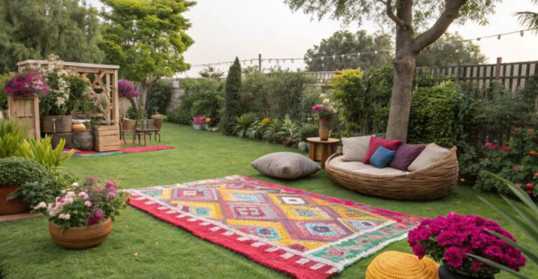
10 Front Door Color Trends That’ll Surge in Popularity in 2025 (And 5 That That Should’ve Been Big Hits Already), According To Designers
Your front door is more than just an entryway – it’s a first impression, a mood-setter, and a subtle way to show off your personal style.
By the end of 2025, designers are predicting a fresh wave of color trends that will move beyond the usual neutrals and safe choices. Expect to see bold, welcoming hues that make a statement without overwhelming the facade.
And while some shades are just now gaining momentum, others have so much potential that it’s unbelievable they haven’t become hits already. Here are 10 front door colors set to shine by the end of 2025 – plus 5 that deserved more love all along.
1. Sage Green
Whispering of gardens and natural serenity, sage green doors are capturing hearts with their subtle yet distinctive presence. This muted green creates a peaceful transition between outdoor and indoor spaces.
Unlike bolder colors, sage offers versatility that works with virtually any home style, from craftsman bungalows to contemporary builds. The organic quality feels both fresh and timeless, avoiding the dated look that can plague trendier choices.
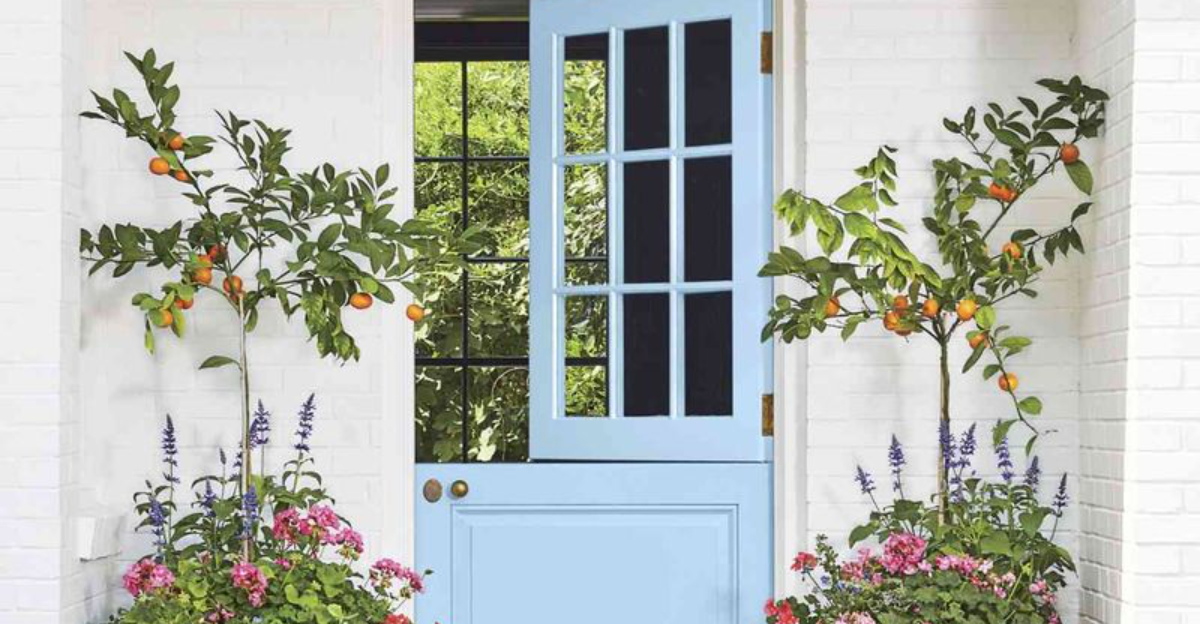
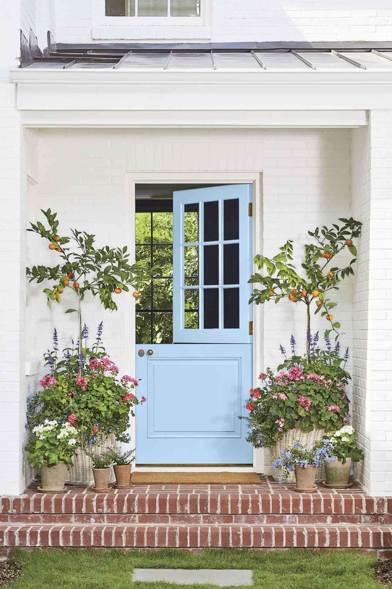
2. Dusty Blue
Gone are the days of bright navy! Soft, weathered blue tones bring sophisticated charm while maintaining a friendly, approachable vibe for your home’s entrance. When the morning light hits a dusty blue door, it creates a serene focal point that stands out without screaming for attention.
This versatile hue plays well with both warm brick exteriors and cool gray or white siding. What makes this shade particularly special is its chameleon-like quality – appearing more gray on cloudy days and revealing hidden blue depths in bright sunshine.
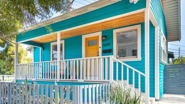
3. Mustard Yellow
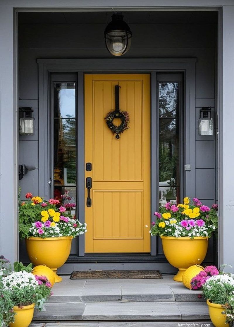
Looking for instant curb appeal? Mustard yellow delivers sunshine vibes year-round while maintaining surprising sophistication that elevates your home’s exterior.
Designers particularly recommend this shade for homes with gray, white, or dark exteriors where the contrast creates maximum impact.
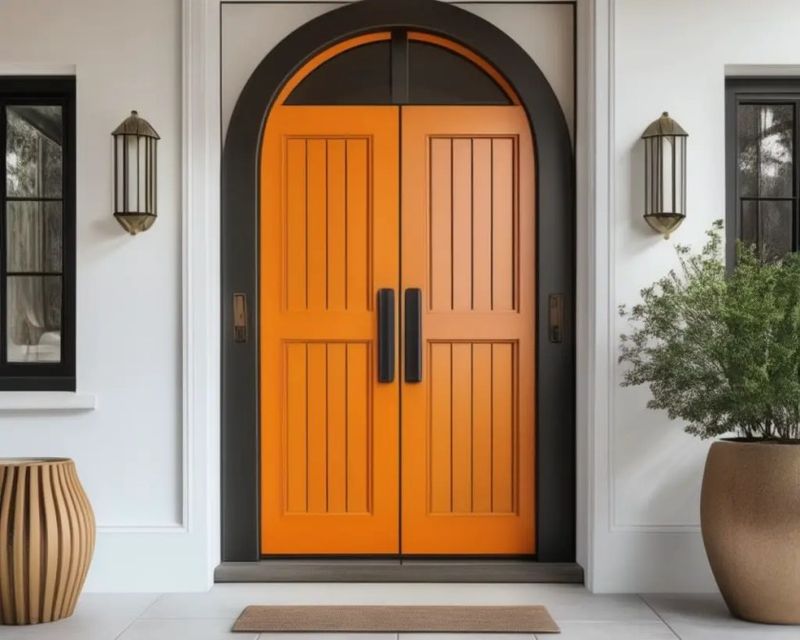
4. Terracotta Orange
Imagine the warm, sun-baked hues of Mediterranean villages gracing your entryway! Terracotta orange brings earthy sophistication while making a confident statement that’s both timeless and trendy. Interior designers are embracing this shade for its ability to complement both modern and traditional homes.
The color works beautifully against neutral exteriors but really pops when paired with lush greenery surrounding your entrance.
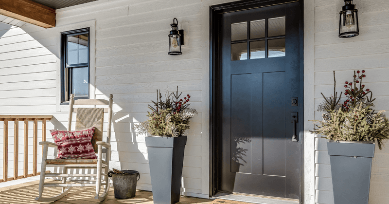
5. Matte Black
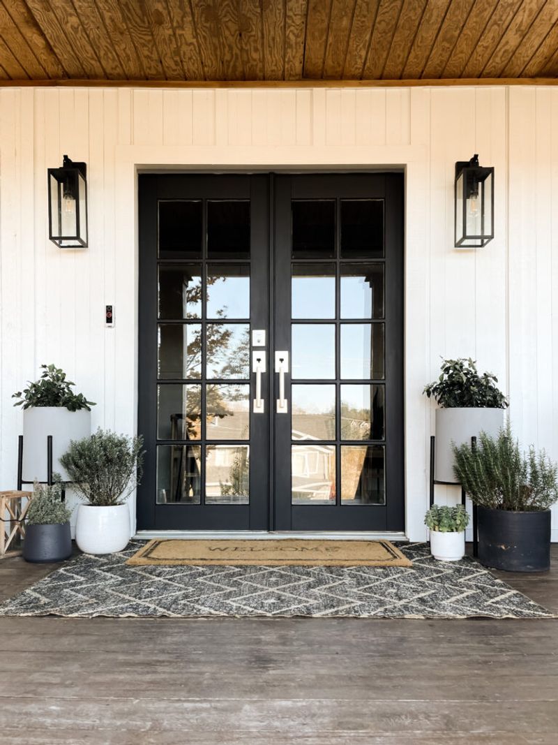
Forever chic and increasingly popular, matte black doors are shedding their glossy counterparts for a more sophisticated, understated elegance. The non-reflective finish adds depth while minimizing imperfections.
Against white or light-colored exteriors, these doors create dramatic contrast that feels both contemporary and timeless.
What’s driving this trend is the door’s chameleon-like ability to complement any architectural style, from ultra-modern to colonial revival, making it a safe yet stylish choice.
6. Coral Pink
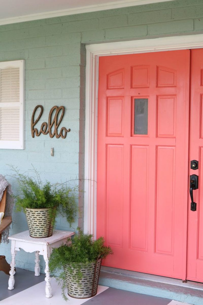
Who says front doors can’t be playful? Coral pink brings unexpected joy while maintaining enough sophistication to avoid looking childish or overly feminine. The beauty of this hue lies in its warmth – neither too orange nor too pink – creating a welcoming glow that instantly lifts moods.
Against neutral exteriors like gray, white, or beige, coral creates a focal point that feels fresh and contemporary. Many homeowners report that this color choice becomes a neighborhood conversation starter, setting their home apart with personality rather than just following safe color conventions.
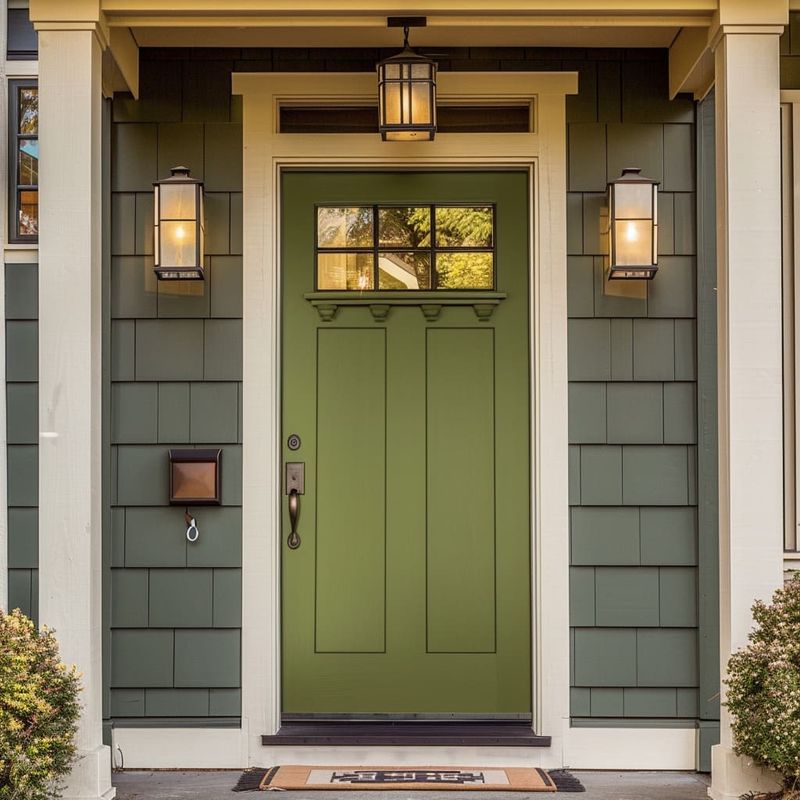
7. Forest Green
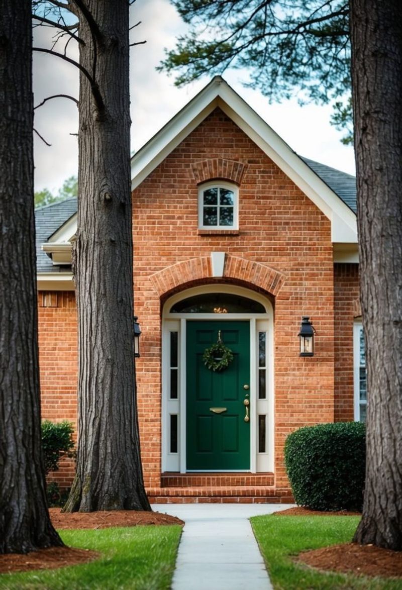
Forget mint or lime – deep, rich forest green is making a magnificent comeback for those seeking timeless elegance with a touch of mystery. This heritage shade feels both classic and unexpectedly fresh in today’s design landscape.
When paired with brass hardware, the combination evokes a sense of established luxury that many newer homes struggle to achieve. The verdant hue works particularly well with brick exteriors, creating a harmonious relationship with the natural elements.
8. Warm Clay
Somewhere between beige and terracotta lies the perfect neutral that’s taking the design world by storm. Warm clay creates subtle distinction without the commitment of a bold color statement.
The genius of this shade is its chameleon-like ability to shift between warm and cool tones depending on the surrounding elements. Against white exteriors, it appears more pronounced, while complementing stone or brick with sophisticated harmony.
9. Charcoal Gray
Not quite black but definitely not light – charcoal gray doors offer sophisticated depth without the harshness sometimes associated with pure black. This nuanced neutral is quickly becoming the go-to for design-conscious homeowners.
Against white or light exteriors, charcoal creates elegant contrast while maintaining a softer appearance than stark black. The subtle complexity reveals beautiful undertones that shift throughout the day as lighting changes.
10. Aubergine Purple
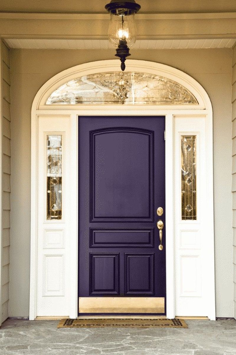
Craving something different without going completely wild? Aubergine delivers sophisticated drama while remaining surprisingly versatile across architectural styles.
The deep purple undertones create rich dimension that changes throughout the day, appearing almost black in shadow and revealing complex color notes in direct sunlight.
Designers particularly love pairing aubergine doors with brass hardware for maximum impact, creating an entrance that feels both regal and contemporary without trying too hard.
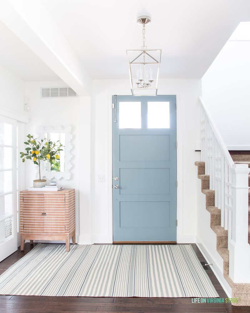
1. Powder Blue
Channeling clear skies and coastal vibes, powder blue doors are bringing gentle optimism to entryways across various architectural styles. Many homeowners are surprised by how this seemingly specific color works with nearly any exterior palette, from crisp whites to warm stones.
The key to its versatility lies in its balanced undertones – neither too warm nor too cool. For those hesitant about bold color choices, powder blue offers a perfect entry point into the world of colorful doors without the commitment of more dramatic hues.
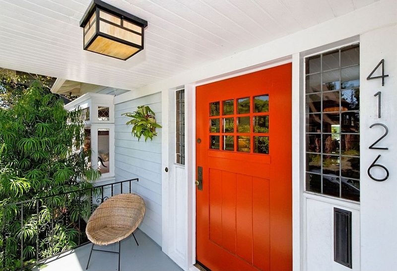
2. Burnt Orange
Autumn vibes all year round! Burnt orange delivers warmth and energy while remaining sophisticated enough for even the most distinguished homes. The earthy undertones connect beautifully with natural elements like stone, wood, and surrounding landscape features.
What makes this color particularly special is how it creates a focal point that feels intentional rather than attention-seeking – the mark of truly elegant design that’s gaining traction among homeowners who appreciate subtle distinction.
3. Olive Green
Neither too yellow nor too dark, olive green strikes the perfect balance between neutral and color, making it increasingly popular for homeowners seeking subtle distinction. This complex shade feels both traditional and fresh simultaneously.
What makes olive particularly appealing is its natural quality – connecting the home to surrounding landscape elements while creating gentle contrast. Against white, cream, or tan exteriors, the door becomes an elegant focal point without shouting for attention.
4. Blush Pink
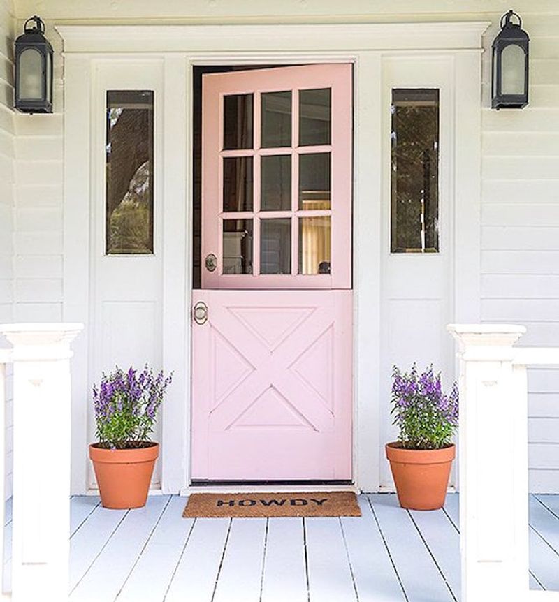
Forget what you thought about pink doors – this sophisticated, muted version is winning over even the most color-conservative neighborhoods with its understated charm.
Against gray, white, or even dark exteriors, this soft hue creates an unexpected moment of delight that feels both contemporary and timeless. The color shifts throughout the day, sometimes appearing almost neutral in certain lights.
5. Burgundy Red
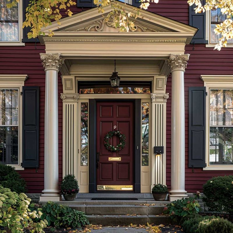
Classic but far from boring, burgundy doors are experiencing a renaissance with updated applications that feel fresh and sophisticated. This rich, complex red brings depth without the brightness of traditional cherry red doors.
What makes burgundy particularly special is its timeless quality – it has historical precedent while feeling perfectly aligned with current design trends favoring complex, layered colors. Against light exteriors, it creates dramatic contrast, while complementing brick with elegant harmony.