Interior Designers’ Favorite 16 Ways To Decorate With Vibrant And Playful Primary Color Pairings
Primary colors – red, blue, and yellow – can transform any dull space into a vibrant wonderland when used creatively.
These bold hues naturally complement each other and create eye-catching combinations that energize your home.
Are you ready to inject some playful color into your living spaces? Let’s explore 16 fantastic ways to incorporate these powerful primary palettes into your interior design.
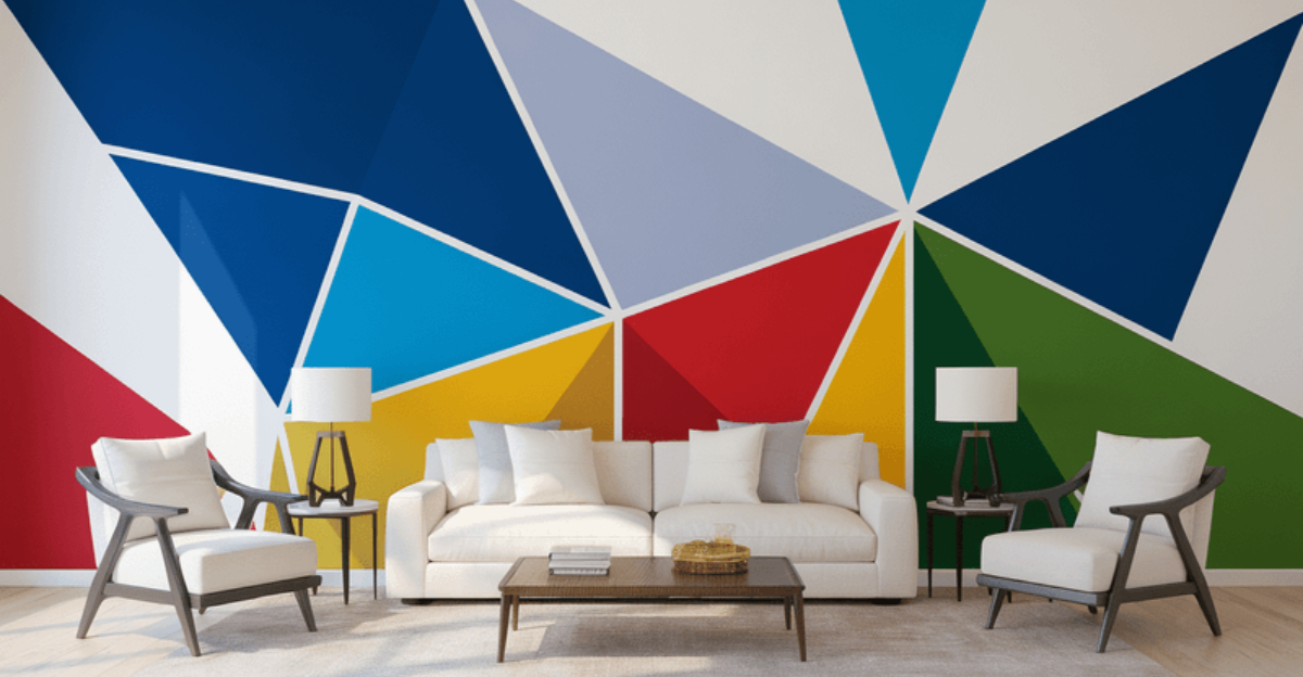
1. Color-Blocked Accent Wall
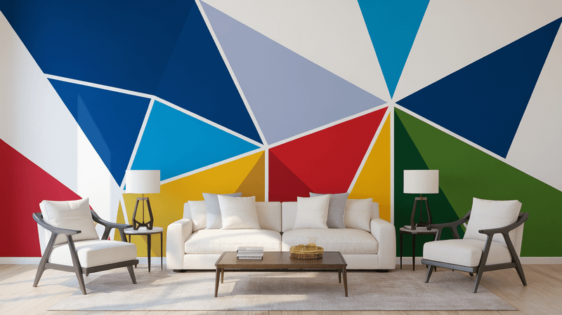
Ever considered turning your boring wall into a masterpiece? A color-blocked accent wall using primary colors creates an instant focal point in any room.
The trick is balancing boldness with restraint. Try painting geometric shapes in red, blue, and yellow against a white background, or create horizontal stripes that transition between primary hues.
This approach delivers major visual impact without requiring artistic skills – just some painter’s tape and a steady hand!
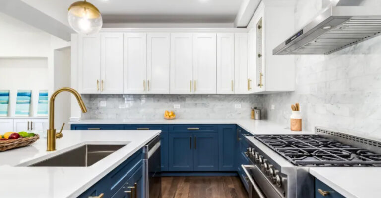
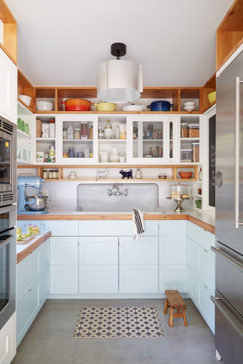
2. Primary-Colored Kitchen Cabinets
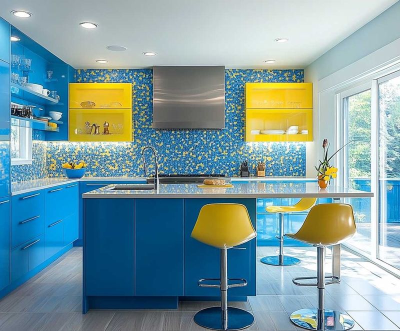
Nothing says confidence like primary-colored kitchen cabinets! Imagine sunny yellow lower cabinets paired with crisp white uppers, or perhaps a bold blue island making a statement in your cooking space.
For the less daring, consider just one cabinet section in a primary hue. The beauty of this approach lies in its versatility – you can go all-in or just add touches of these energetic colors.
Hardware in contrasting metals like brass or matte black provides the perfect finishing touch.
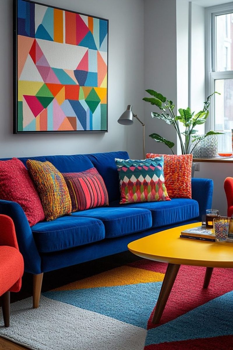
3. Vibrant Throw Pillows Arrangement

Who knew that something so small could make such a big difference? Tossing a few primary-colored throw pillows onto a neutral sofa instantly livens up your living room without commitment.
Mix solids with patterns for visual interest – perhaps a solid red pillow next to a yellow and blue geometric print. The secret to making this look sophisticated rather than childish is maintaining a consistent tone across all three colors.
For extra style points, vary the textures: velvet, linen, and cotton create delightful tactile contrast.
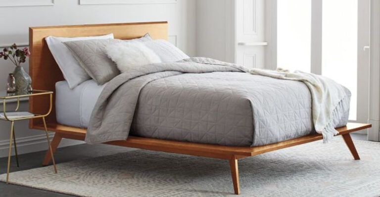
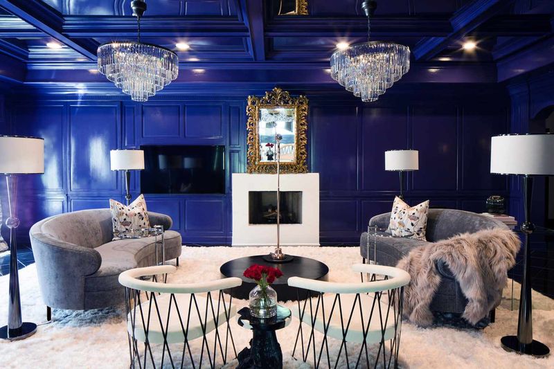
4. Statement Furniture Pieces
Feeling bold? A cobalt blue sofa or cherry-red armchair can become the conversation starter your room needs. When working with statement furniture in primary colors, the surrounding elements should play supporting roles.
Keep walls, floors, and additional furniture pieces neutral to let your colorful selection shine. The impact of a single vibrant piece often outweighs multiple smaller colored elements scattered throughout a space.
This approach works particularly well in minimalist or Scandinavian-inspired interiors where simplicity rules.
5. Playful Ceiling Treatment
Look up! The ceiling offers an unexpected canvas for primary color play. A sunshine-yellow ceiling brings perpetual brightness to a room, while a deep blue creates a dreamy, sky-like effect.
For the truly adventurous, try painting geometric patterns or stripes in combinations of primary colors. This technique works wonders in spaces with architectural interest like coffered ceilings or exposed beams.
Remember that colored ceilings appear to lower room height, making this perfect for spaces with uncomfortably high ceilings.
6. Color-Coordinated Bookshelf Display
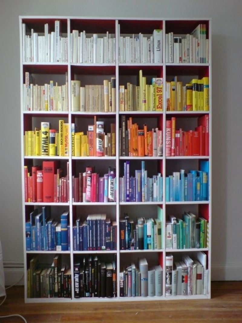
Bibliophiles, rejoice! Arranging books by color creates a stunning visual display that doubles as functional storage. Group red, blue, and yellow books together for maximum impact, or create a rainbow gradient effect.
Don’t have enough colorful books? Cover plain ones with primary-colored paper or add small objects in these hues between book stacks. The result is both organized and artistic.
This approach transforms your literary collection into a decorative element that expresses personality while maintaining order.
7. Primary Color Art Gallery Wall
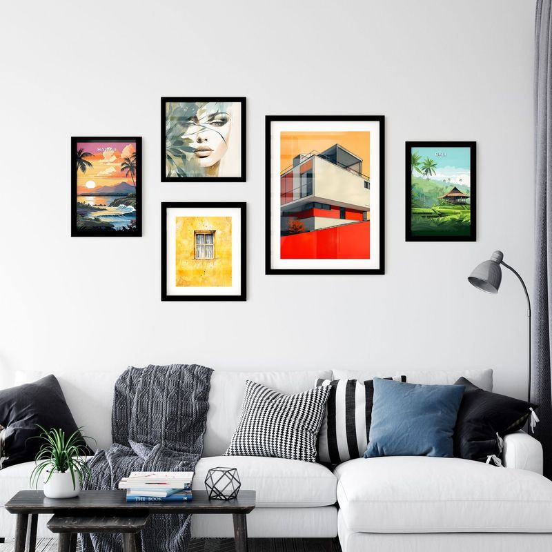
Unleash your inner curator with a gallery wall featuring artwork dominated by primary colors. The secret to a cohesive look lies in variety within constraints – mix photography, paintings, prints, and even three-dimensional objects.
Frame selection matters tremendously here. Try black frames for a sophisticated approach or mix frame colors for a more eclectic vibe. The wall color itself should remain neutral to let the artwork command attention.
This technique allows for personal expression while maintaining a cohesive color story throughout your space.
8. Colorful Kitchen Accessories Display
Kitchens naturally lend themselves to primary color play! A collection of cherry-red mixing bowls, sunshine-yellow measuring cups, and cobalt blue utensil holders creates instant cheer in cooking spaces.
The key to preventing visual chaos is repetition of colors across different items. Perhaps your mixer, canisters, and tea towels all share the same vibrant blue, creating a cohesive thread throughout the space.
Open shelving provides the perfect stage for displaying these colorful culinary tools as functional décor elements.
9. Mondrian-Inspired Room Divider
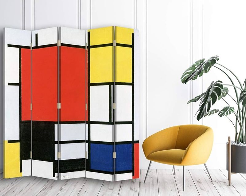
Channel your inner Piet Mondrian with a room divider featuring his iconic primary color blocks separated by bold black lines. This functional art piece creates separation while maintaining an open feel in multi-purpose spaces.
DIY enthusiasts can create this look using a wooden frame with colored acrylic or painted canvas panels. The geometric precision of this style brings a sophisticated artistic reference to your space.
Position it where light can filter through for an ever-changing stained-glass effect throughout the day.
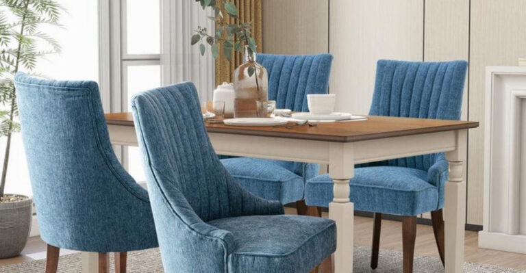
10. Vibrant Dining Chair Collection
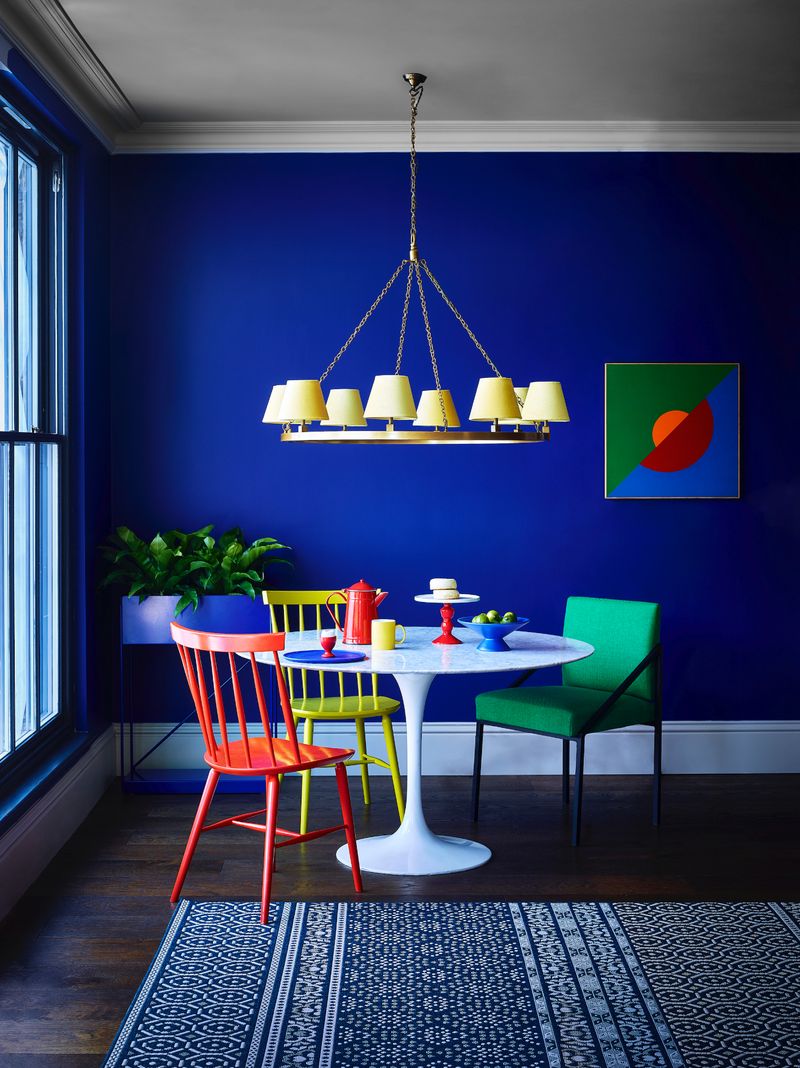
Mismatched dining chairs in primary colors create a playful yet sophisticated eating area. Imagine the visual delight of alternating red, blue, and yellow seats around a simple white table!
The chair style should remain consistent – perhaps all mid-century modern or all Windsor – to ensure the color variation feels intentional rather than chaotic. This approach allows color experimentation without overwhelming the space.
For balance, keep the dining table and surrounding walls neutral to let the chairs take center stage.
11. Colorful Home Office Accessories
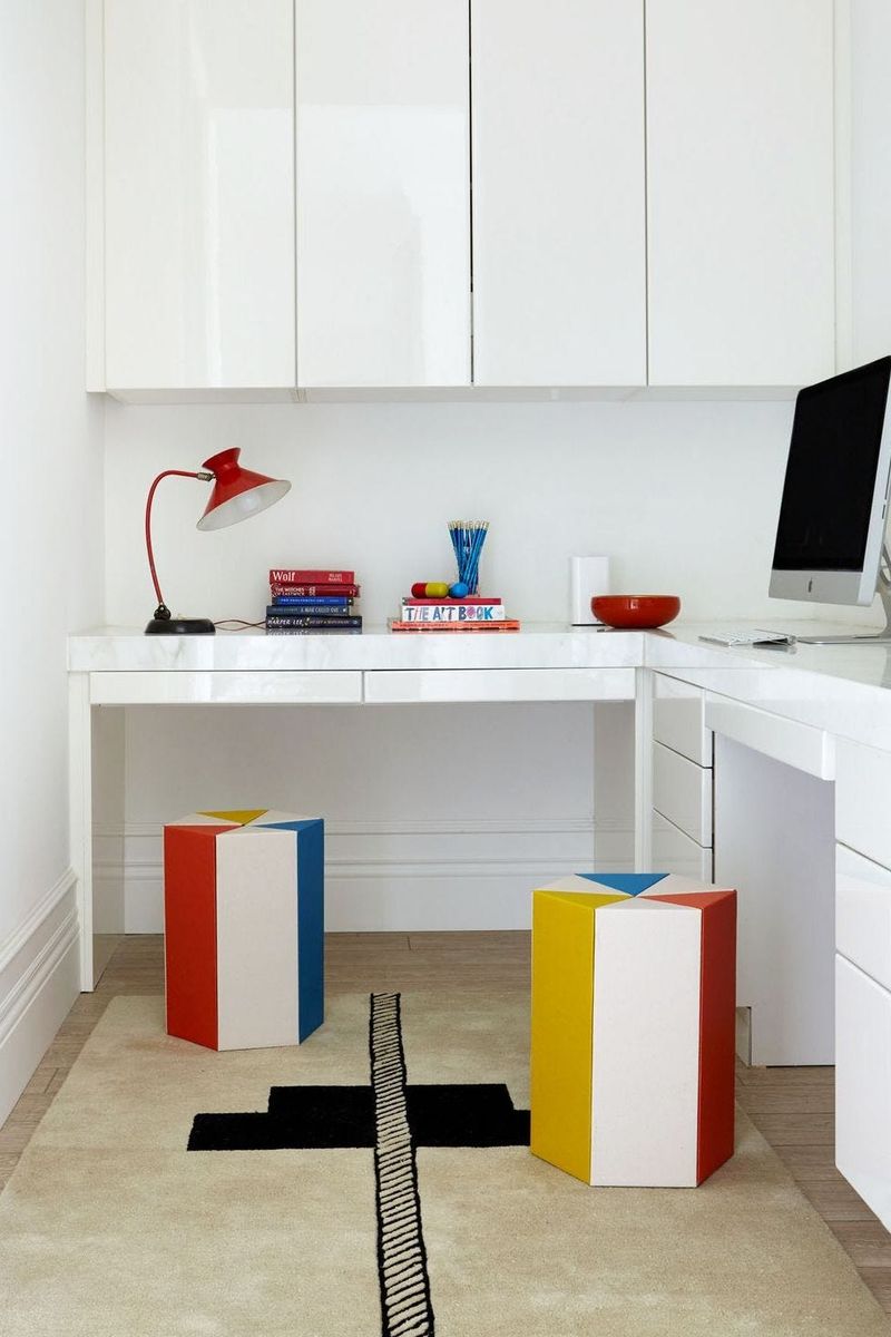
Working from home becomes infinitely more enjoyable with strategic pops of primary colors! A cobalt blue desk lamp, red filing cabinet, and yellow pencil holder create an energizing workspace without overwhelming concentration.
The productivity benefits of this approach are backed by color psychology – blue promotes focus, red energizes, and yellow stimulates creativity. Keep the desk surface and walls neutral to prevent visual distraction during video calls.
This technique allows personality to shine through in professional settings while maintaining appropriate boundaries.
12. Statement Light Fixtures
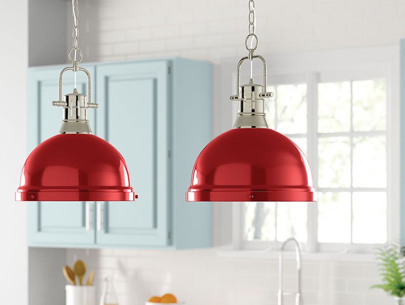
Illumination meets art with primary-colored pendant lights or lampshades! A cluster of red, blue, and yellow hanging pendants creates a sculptural focal point even when lights are off.
Position these bold fixtures over dining tables, kitchen islands, or stairwells where they can be appreciated from multiple angles. The light quality itself transforms when filtered through colored shades, casting warm ambiance throughout your space.
This approach delivers maximum impact with minimal square footage, perfect for those wanting big color statements in small spaces.
13. Primary-Colored Door Makeover
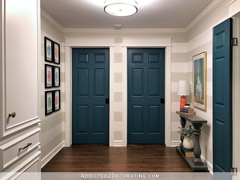
First impressions matter! A front door painted in a bold primary color creates instant curb appeal, while interior doors in varying primary hues add unexpected personality to hallways and transitions.
For maximum impact, keep surrounding walls neutral and let the doors become architectural focal points. This technique works especially well in homes with interesting door styles like paneled, arched, or French varieties.
The beauty of this approach lies in its reversibility – simply repaint if you tire of your color choice.
14. Playful Children’s Space
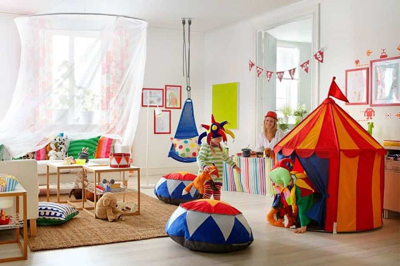
Children naturally gravitate toward primary colors! Create engaging play areas with color-coded storage – red bins for blocks, blue for books, yellow for art supplies – that make cleanup intuitive even for toddlers.
Incorporate these hues through furniture, wall decals, and educational toys. The developmental benefits extend beyond aesthetics, as these distinct colors help children learn categorization and color recognition.
This approach grows with children when incorporated through easily changeable elements rather than permanent fixtures.
15. Staircase Rainbow Treatment
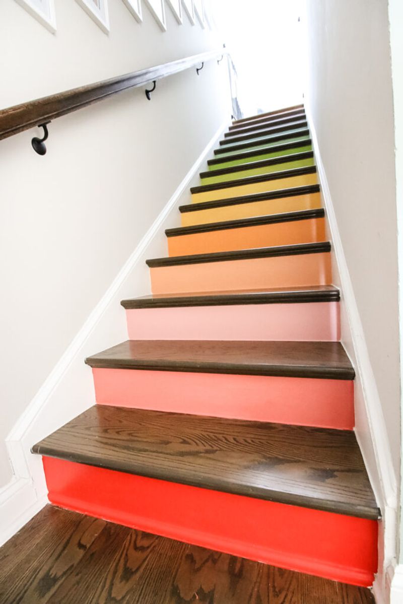
Staircases offer vertical canvases for color expression! Paint each riser in alternating primary colors for a joyful transition between floors. For a more subtle approach, try painting just the banister or handrail in a bold primary hue.
This technique transforms a purely functional element into a statement feature. The linear nature of staircases means the colors appear in sequence rather than competing for attention simultaneously.
This works particularly well in homes with open staircases visible from multiple vantage points.
16. Primary Color Tile Backsplash
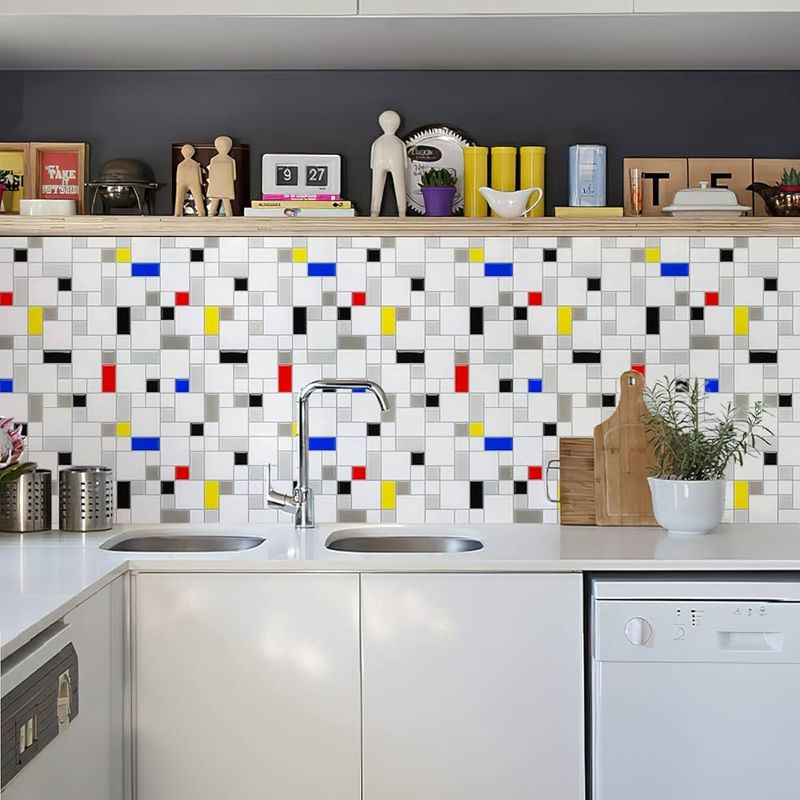
Kitchens and bathrooms shine with primary-colored tile work! A backsplash featuring cobalt blue subway tiles creates dramatic contrast against white cabinets, while a mosaic pattern incorporating all three primary colors adds artistic flair.
The reflective quality of glazed tiles amplifies color impact through light play. For commitment-phobes, removable tile stickers achieve similar effects without permanent installation.
This technique grounds spaces with color at eye level, creating a natural focal point where activity centers.