You Should Avoid These 8 Exterior Design Fails If You Want To Have A Beautiful Home
We don’t normally judge the book by its cover, but… An exterior in some screaming colors, misaligned windows, unfinished parts of the facade? No, thank you.
When it comes to houses, exterior design does matter. No one is talking about posh facades and expensive add-ons just to make the house look like a Hollywood mansion. I’m talking about normal, everyday houses you seen on your way to work every day.
I’m sure you’ve seen a couple of houses that are missing windows where they were supposed to be, or having unusually-shaped rooftops. Those are simple fails I’m gonna teach you to avoid, so if you’re ever building your own home, you know what to steer away from.
1. Facade Colors That Are Too Much
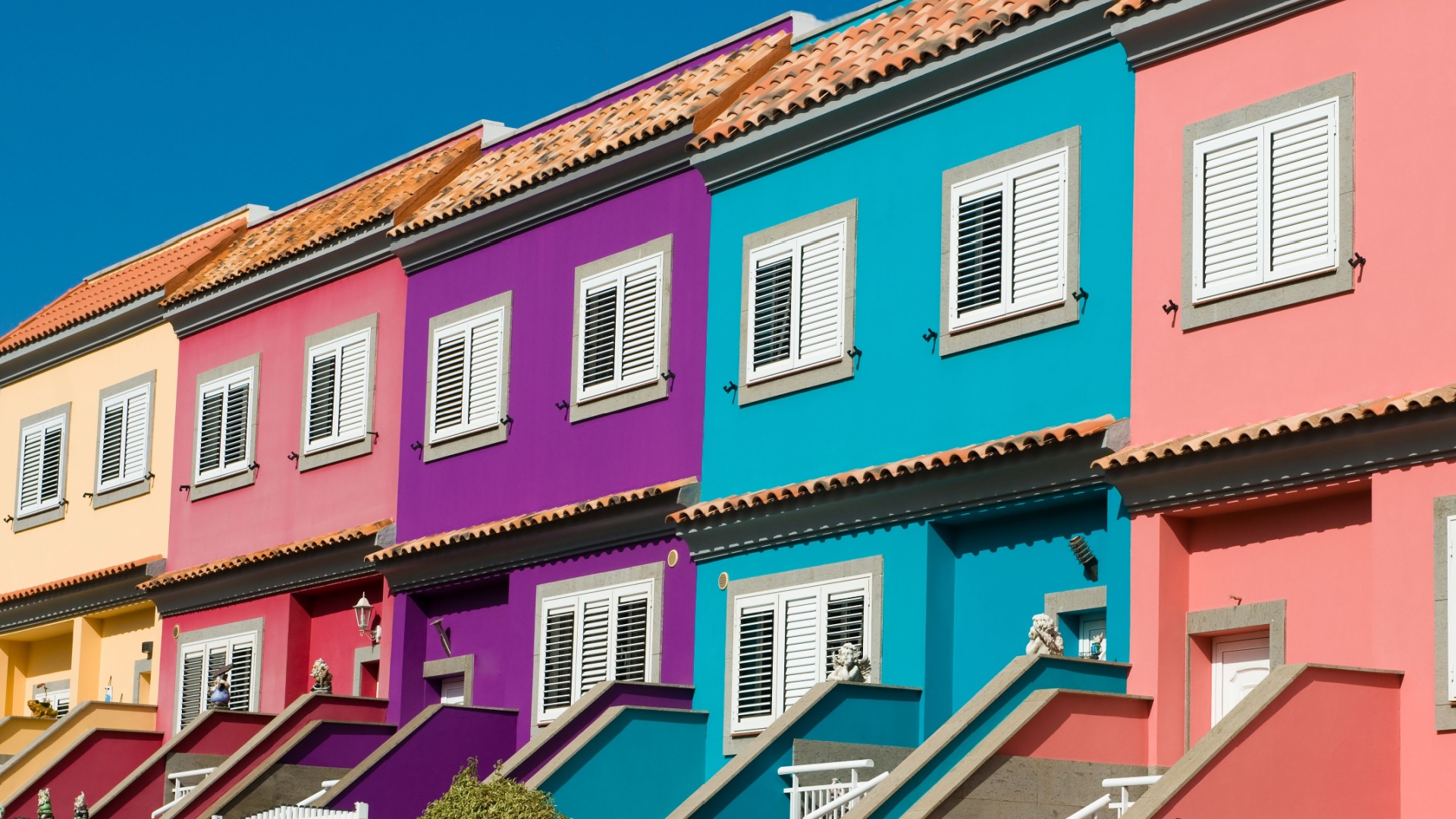
Every little girl dreams of having a pink house. I was that girl once. But, fortunately, I grew up and realized vibrant colors used as facade colors are a huge NO.
That is unless you want your house to be visible from outer space.
Vibrant colors are better to be kept for indoor design if you’re really that much into them. On the outside, a neon yellow, Barbie pink, or Halloween purple is an eyesore.
You want your home to have harmonious vibes. Colorful facade screams increased stress production and no one wants that.
Oh, and let’s not forget to mention your neighborhood would despise you for being the brightest spot in the street, even when it’s not Christmas time.
2. Not Using The Right Kind Of Windows
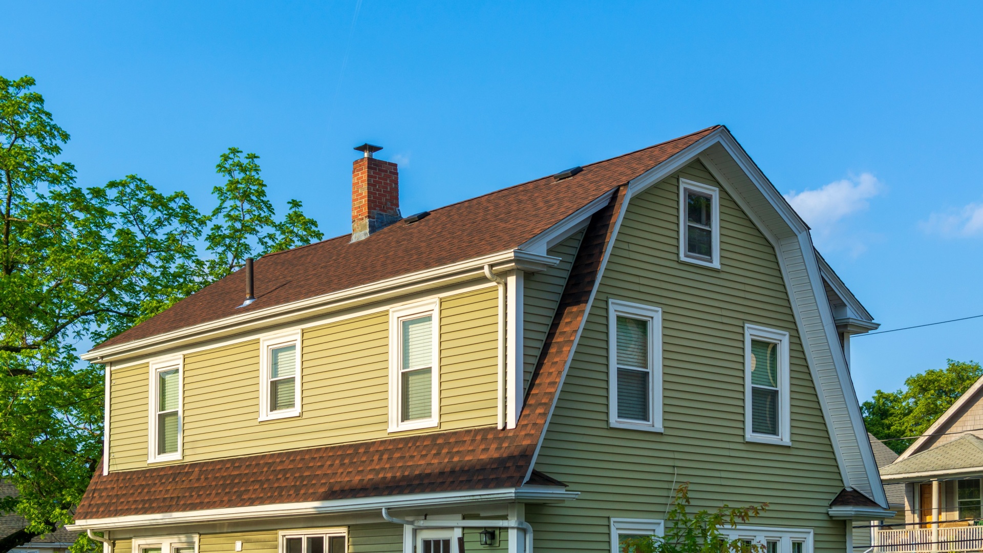
Some might think this is a classic American house style, but I’m here to prove it wrong. Yes, it was once a style, but times have changed. No one really uses this style anymore since way too many windows isn’t considered aesthetically pleasing.
When you combine lots of smaller windows, scattered all over the facade, you get the vibe of an hectic house that’s not tidy at all.
I mean, look at that slightly smaller window in the middle on the front side of the house. Wouldn’t some picture windows be a much happier choice? Or, at least go with traditional double windows to avoid such a failure.
3. Exposed Beams, Pipes, And Other Utilities
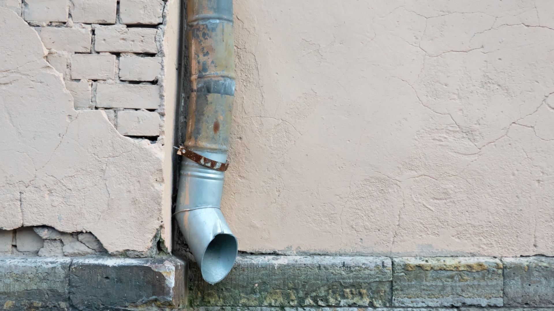
This is not nice at all.
Sure, some houses simply have drainage pipes. Despite how much I think of them as eye sores, they’re still there. And that’s kind of okay if they’re nice, tidy, and in good contusion.
But, when you have something like the photo above, you’ve got a problem.
Don’t leave pipes, beams, wires sticking out, poorly looking drainage pipes, vents, AC units and such just hanging outside. It’s not pretty at all. This only gives out vibes you’re sloppy and don’t want your house to look good at all.
Come on, guy, we live in such incredible modern times. Don’t just give up and leave things hanging out there. Someone actually looks at your house from the outside. Just imagine what they would think of the owner behind all that mess.
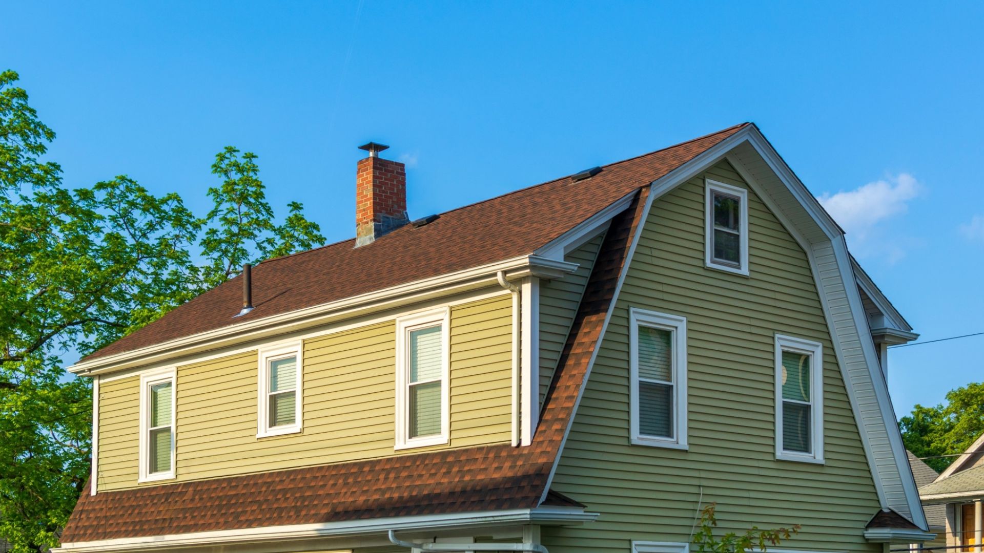
4. Roof Mishaps That Shouldn’t Be Happening
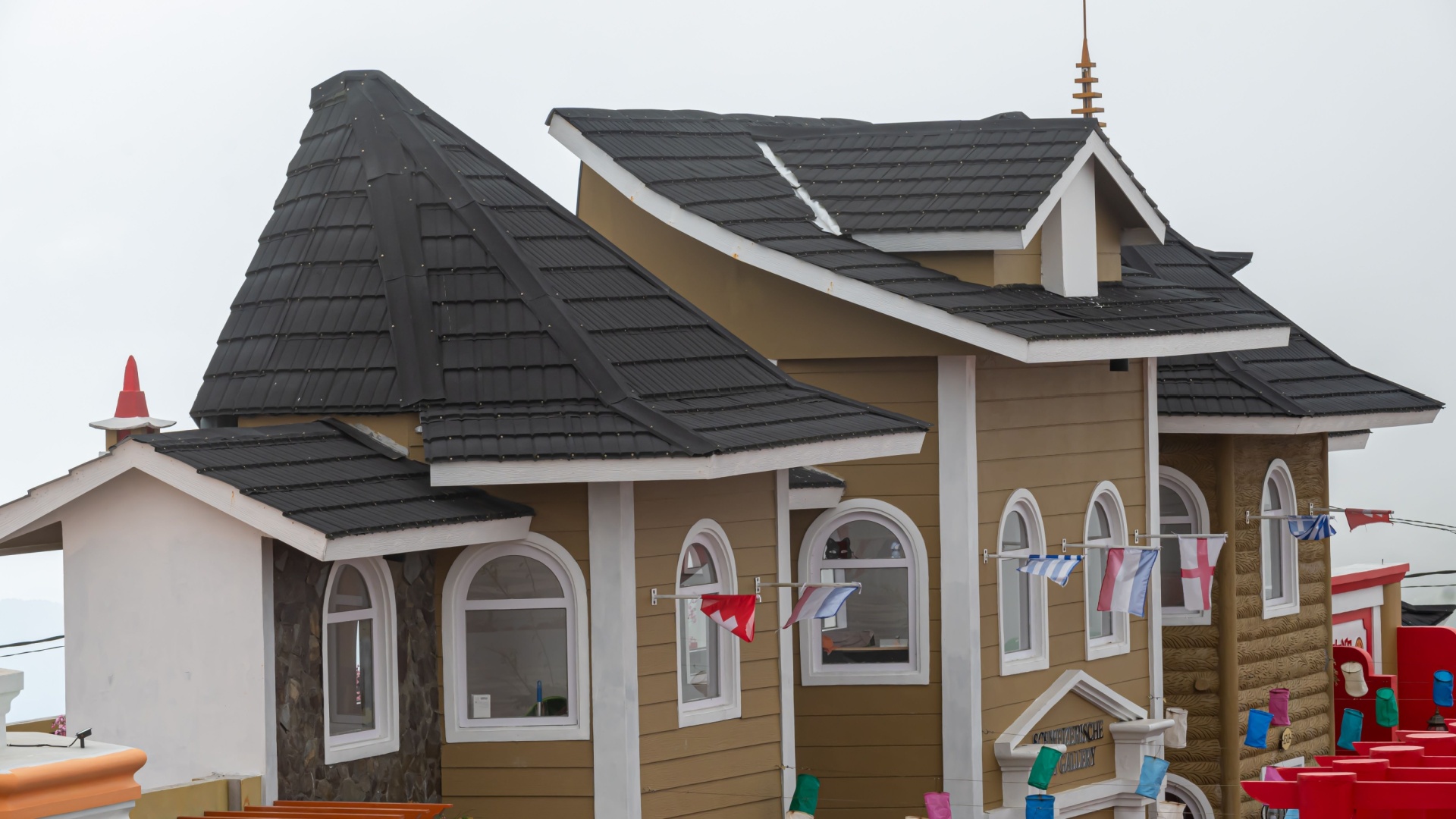
There’s so much going on here, I don’t know where to start!
The roof is… leaving people speechless, but not in a good way. This looks like someone played a bit in The Sims house creator, got bored real quick, and just wanted to play the game. I know that person. I was that person many, many years ago.
Something like this is okay in a video game, but it’s definitely not okay in real life.
I can’t even imagine what would happen if there was heavy rain. I can already see water going down the house in the worst way possible.
Look for symmetry when picking a roof shape. Don’t allow yourself to have a home that looks like a ten-year-old’s Sims design.
5. Landscaping Matters Too!
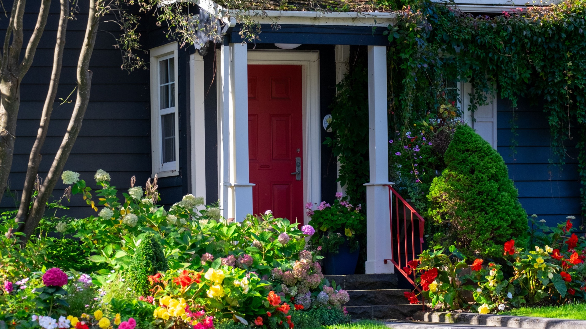
I don’t have anything against you liking flowers and plants but keep them away from the entryway.
There’s a reason people build gardens in the back or smaller flower patches by the fence, far from the front door. Or, at least they stick with smaller, potted plants around the entry just to visually enhance it.
The flowers, bushes, and plants in this photo are lovely, but they’re too much. None of them should be this is close to the front too. Let it overgrow for a couple of weeks and you won’t be able to come inside at all.
Dear garden girlies, or boys, please keep a nice and tidy yard so your home appears nice and tidy too.
Do we have a deal or what?
6. Unproportional House Addons Are Not Cool
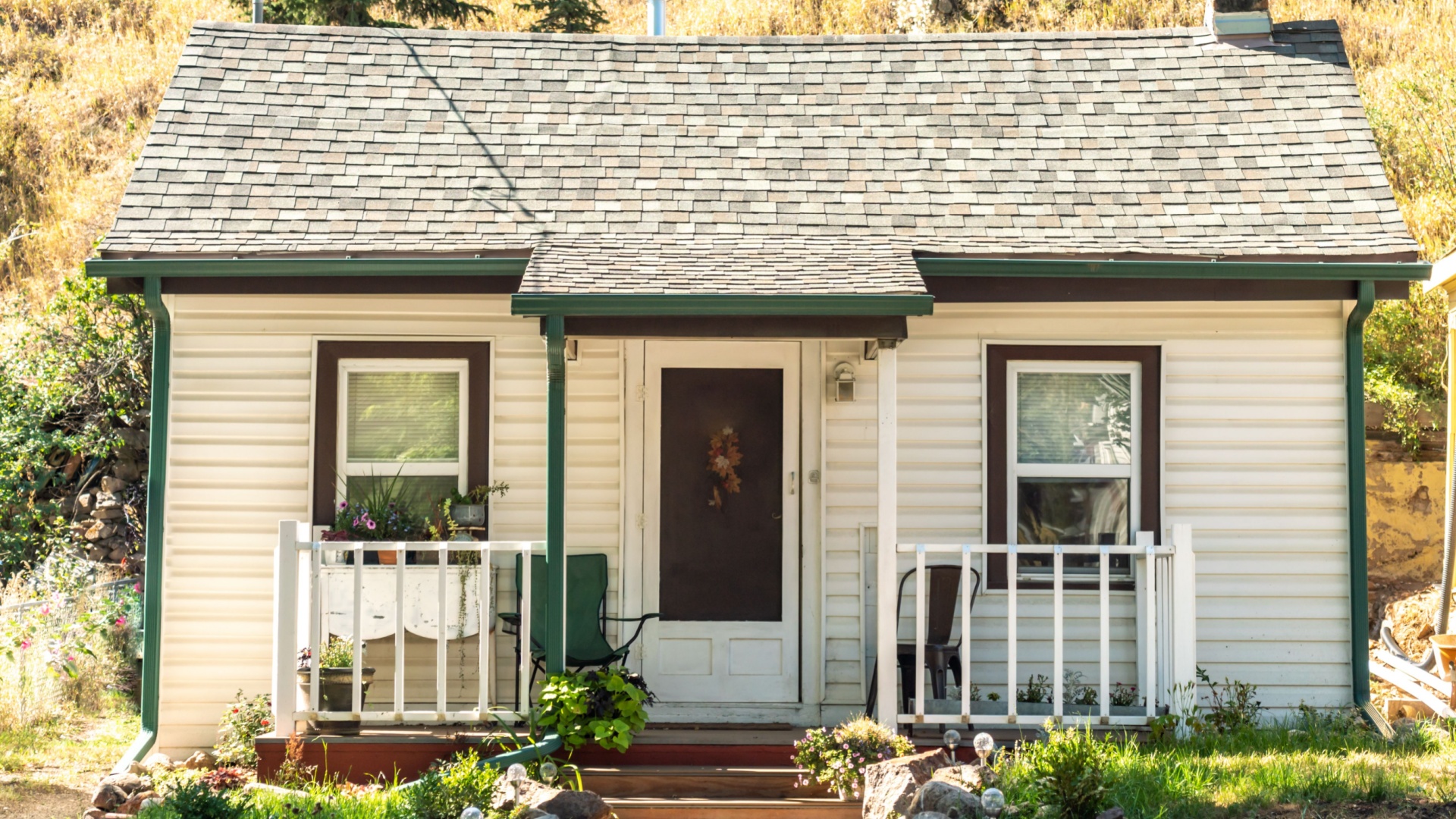
Take a closer look at this photo. Something’s wrong, isn’t it? Something just doesn’t feel right.
If you really can’t tell, I’ll reveal it to you: it’s the super small front porch that almost doesn’t have a purpose. There are two chairs on it, but might as well be none. Why is that so?
A front porch this size does not fit the house, no matter how small the house is. This should be at least twice as big as it is right now. Unproportional house add-ons such as teensy tiny porches and balconies look unfinished and sped up just to finish the process.
Think of it this way: a tall man can’t fit tiny shoes.
7. Doors That Lead To Nowhere
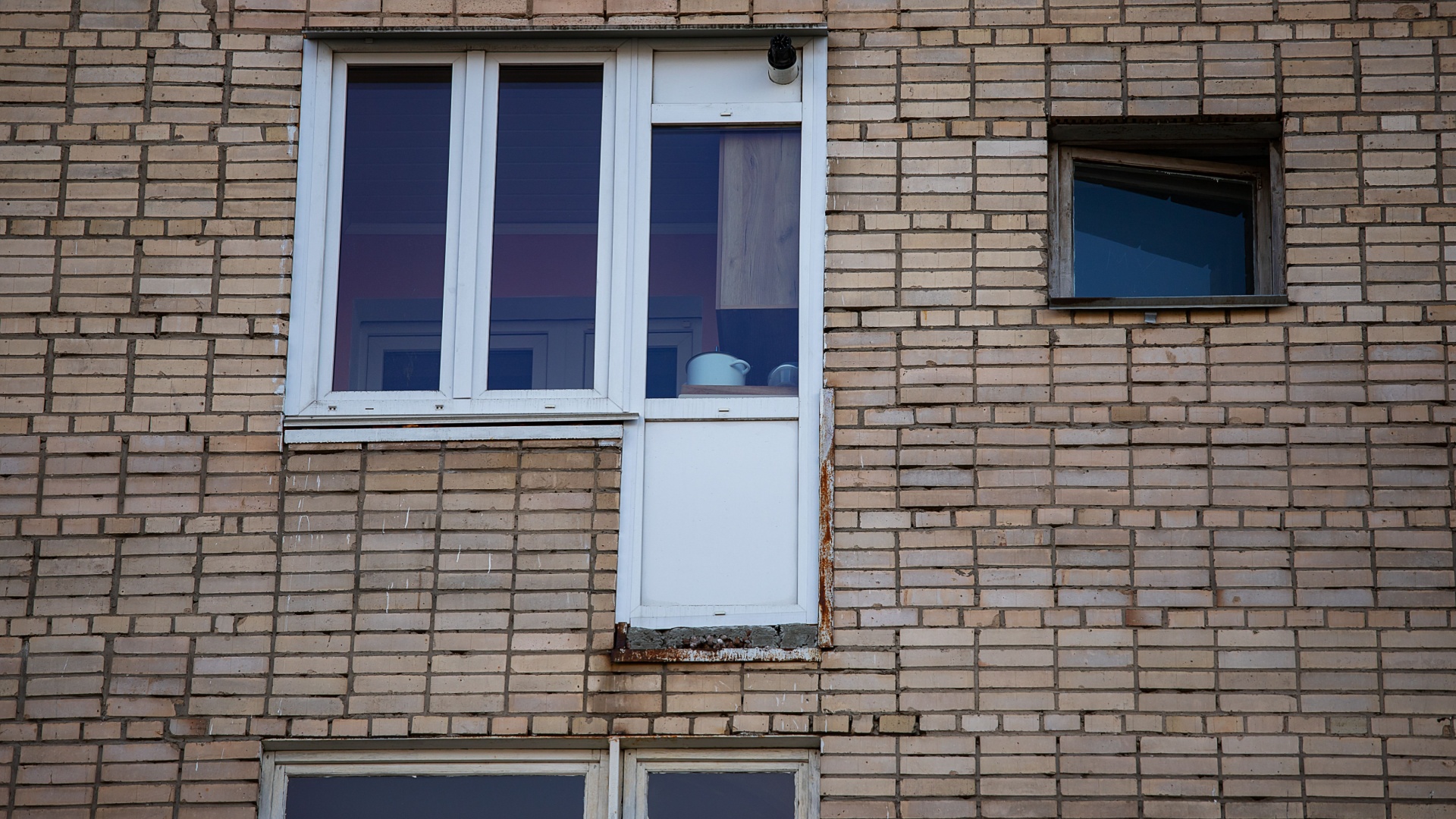
Where exactly are you going? Where are you planning to exit because that door doesn’t lead anywhere?
It’s not the first time I see balcony doors, or even entry doors positioned high up on the second floor without any balcony, terrace, or anything else to be exited on. I like to think they had no more windows when they were building so they just installed an extra door they had lying around.
But, considering the year we’re in, that’s still ridiculous. It might’ve been understandable twenty years ago.
This exterior design fail is simply unacceptable. Just imagine seeing a window instead of the front door. That’s the same, hilarious vibe.
Poor Pathways
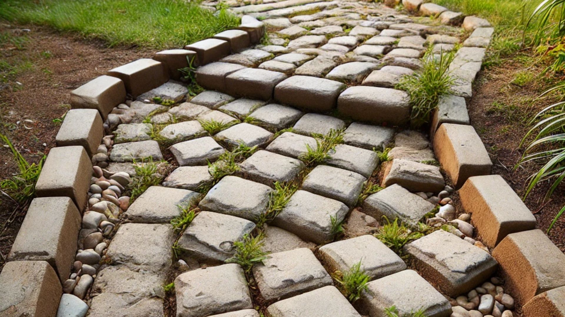
The house pathway is the first thing someone sees when he comes to your home.
If you have a poorly done pathway, what’s your house supposed to look like then?
The pathway sets the tone for the rest of your home, so if it’s uneven, overgrown, or looks like it’s been thrown together last minute, it gives the impression that the rest of the house might follow suit. A poorly-done pathway can make even the nicest home seem neglected, uninviting, and lacking attention to detail.
It’s like serving a gourmet meal on a paper plate—first impressions matter, and your pathway is no exception!

