
Ever fallen for a viral design trend online, only to try it and wonder what went wrong? That dreamy look that dominates your feed often fizzles when faced with pets, kids, or real-life clutter.
Designers know the pain—and they’ve seen the same misguided styles pop up again and again, only to disappoint in actual homes.
Here’s a peek at the overhyped decor choices that pros quietly (or loudly) wish would fade into obscurity.
1. Open Shelving in Kitchens
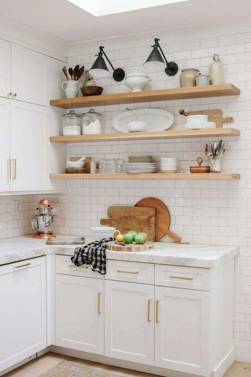
What’s not shown in those gorgeous Instagram photos of open kitchen shelving? The relentless dusting, the meticulous arrangement required, and the inevitable grease film that coats everything near cooking areas.
Unless you’re prepared to maintain museum-quality displays and clean obsessively, those charming open shelves quickly become cluttered catchalls. Most homeowners simply don’t have the perfectly matched dishware or styling skills needed to make this trend work day after day.
2. Barn Doors Everywhere
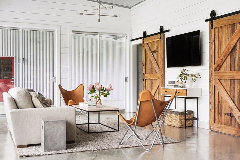
Remember when sliding barn doors suddenly appeared in every modern home? While they photograph beautifully, these chunky door alternatives create numerous practical problems that designers hate. For starters, they provide virtually zero sound privacy and never truly seal a room.
The hardware often becomes noisy over time, and the doors themselves take up significant wall space when open. Many homeowners discover too late that these rustic statement pieces don’t match their actual lifestyle needs.
3. Word Art and Inspirational Quotes
“Live, Laugh, Love” might have seemed charming at first, but designers unanimously agree that word art has overstayed its welcome. These mass-produced phrases lack originality and personal meaning while dating your space instantly.
Walking into rooms plastered with generic motivational quotes feels like being trapped inside a greeting card store. Instead of creating connection, these pieces often come across as trying too hard to manufacture emotion. True personality shines through more authentic art choices.
4. All-White Everything
Imagine living in a pristine snow globe where every surface gleams spotlessly white. Sounds dreamy, right? The reality involves constant cleaning, harsh chemical sprays, and anxiety whenever friends with red wine come over.
Professional designers cringe at all-white spaces because they lack depth and personality while creating a clinical, unwelcoming atmosphere. Plus, white-on-white-on-white shows every speck of dust and smudge within minutes.
5. Gray Everything
Once hailed as the perfect neutral, all-gray interiors have become the beige of our generation. Rooms drenched in fifty shades of gray often feel cold, impersonal, and surprisingly depressing in real life.
Without warming elements, these monochromatic spaces can resemble concrete bunkers rather than inviting homes. Designers particularly dislike how gray-on-gray schemes flatten dimensional qualities and drain energy from spaces.
The trend that promised timeless sophistication has ironically become one of the most dated looks.
6. Shabby Chic Overload
A little distressing adds character, but rooms where everything looks deliberately damaged have crossed into questionable territory. The shabby chic aesthetic often ages poorly, with that carefully curated “vintage” vibe eventually just looking genuinely worn out.
Interior designers point out that the overly feminine, heavily distressed look creates high-maintenance spaces filled with items that are impractical to clean. The abundance of white slipcovers, chippy paint, and ornate details collects dust while creating visual clutter.
7. Mason Jars as Everything
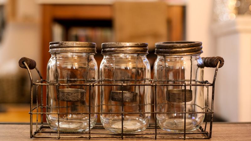
Once upon a time, someone discovered you could put things in mason jars besides jam. Fast forward to today, where these humble glass containers have been repurposed as everything from lighting fixtures to bathroom organizers with questionable results.
Designers point out that while charming in limited doses, the mason jar explosion often reads as unimaginative and dated. The rustic-industrial look they create frequently clashes with other design elements.
8. Accent Walls in Bold Colors
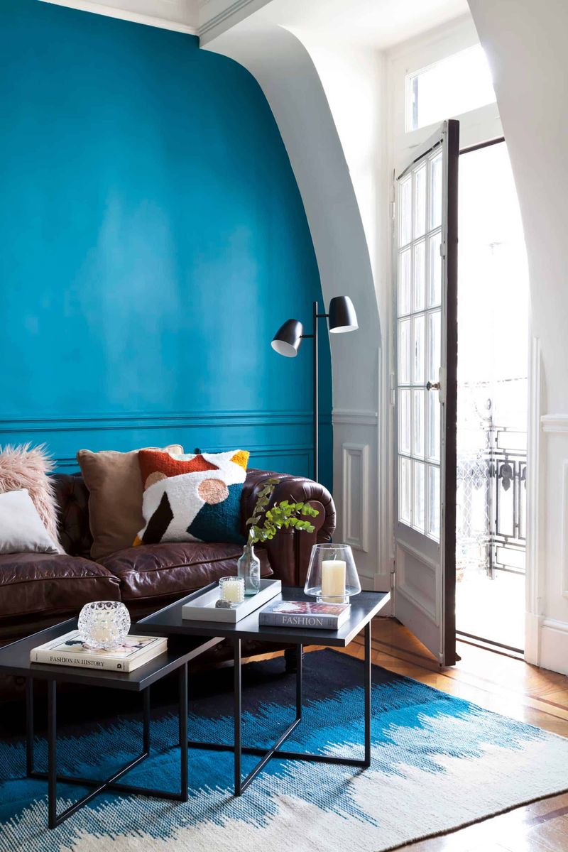
That electric blue wall seemed like such a great idea on Pinterest! Six months later, you’re thoroughly sick of it but dreading the multiple coats needed to cover the intense color.
Interior designers frequently see clients regret bold accent walls because they quickly become visually tiresome and limit furniture arrangement options.
The high-contrast look that photographs so dramatically often feels jarring in daily life. Many homeowners discover that the color appears completely different (and usually much more intense) than expected.
9. Vessel Sinks
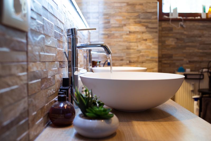
Have you ever tried washing your face in a bowl perched atop a counter? Water splashing everywhere, awkward heights, and cleaning nightmares are just a few reasons designers roll their eyes at vessel sinks. Despite their sculptural appeal in showrooms, these bathroom statement pieces create practical headaches.
The raised height makes them uncomfortable for children and shorter adults. The seam where sink meets counter collects grime that’s nearly impossible to clean. And many models lack overflow protection, increasing flood risks.
10. Matching Furniture Sets
Walking into showrooms, those perfectly coordinated furniture packages seem like an easy solution. Just buy the whole bedroom set and you’re done! However, this one-stop approach creates spaces that feel flat, uninspired, and oddly commercial.
Design professionals compare matching sets to wearing the same outfit head-to-toe—it lacks personality and creativity. Rooms evolve more beautifully when furnishings are thoughtfully collected over time.
The matchy-matchy approach also dates quickly since entire sets are typically tied to specific trend cycles, making future updates more expensive.
11. Shiplap on Every Surface
Joanna Gaines has a lot to answer for! The farmhouse trend explosion brought shiplap into countless homes where it makes absolutely no architectural sense. Those charming horizontal wooden boards quickly overwhelm spaces when overused.
Professional designers note that shiplap collects dust in all those grooves while creating visual busyness that can make rooms feel smaller. When applied in homes without any farmhouse or coastal heritage, it often reads as forced and inauthentic.
12. Oversized Furniture in Small Spaces
Who hasn’t fallen in love with a massive sectional sofa or imposing four-poster bed? Unfortunately, when squeezed into average-sized rooms, these statement pieces transform from luxurious to laughably impractical.
Designers regularly encounter clients who’ve purchased furniture without measuring, creating spaces where you must shuffle sideways to navigate around oversized pieces. Beyond the circulation problems, disproportionate furniture makes rooms feel smaller and more cluttered.
Scale matters tremendously in creating comfortable, functional spaces that photograph well but actually work better in real life.
13. Overdone Theme Rooms
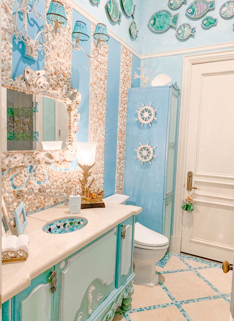
Ever stepped into someone’s beach-themed bathroom complete with seashell soap dishes, lighthouse wallpaper, and rope accessories on every surface? Theme rooms quickly cross from subtle nod to overwhelming commitment that designers consistently discourage.
The problem isn’t the inspiration but the execution that lacks restraint. Heavily themed spaces feel more like temporary installations than comfortable living environments. They also become tiresome quickly and limit your ability to evolve your décor without a complete overhaul.
14. Bathroom Carpet
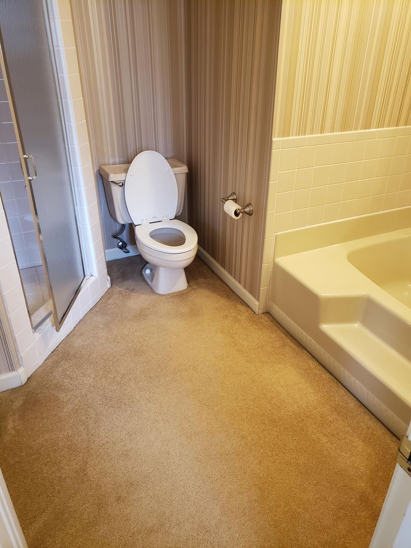
Whoever decided that wall-to-wall carpet belonged in bathrooms clearly never considered what happens in these moisture-rich environments. Yet somehow, this questionable trend continues to appear in homes across America.
Designers universally condemn bathroom carpeting as a breeding ground for mold, mildew, and odors that no amount of cleaning can fully eliminate. The absorbent fibers trap everything you don’t want preserved near your bathing space.
Even worse, the padding underneath deteriorates with moisture exposure, creating a spongy, unhygienic surface underfoot.
15. Faux Luxury Finishes
Not everyone can afford marble countertops or hardwood floors, but designers warn that low-quality imitations often look worse than honest budget alternatives. Those peel-and-stick “marble” countertops and plastic “wood” floors fool absolutely no one in person.
The problem with faux luxury isn’t the budget-consciousness but the unconvincing execution. Printed patterns repeat too frequently, textures don’t match the materials they mimic, and edges reveal the truth.
16. Overly Industrial Interiors
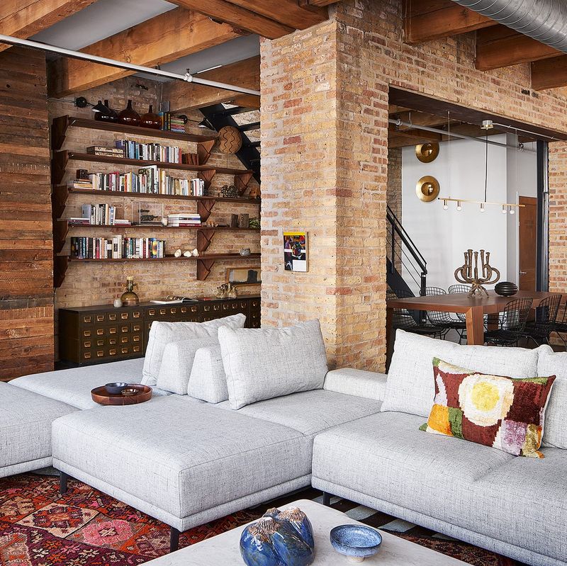
The industrial look, with its raw materials and stark design, may seem trendy, but it often results in spaces that feel impersonal. Open ceilings with visible ductwork and concrete floors create a harsh atmosphere, more akin to a factory than a home.
The charm wears off quickly, leaving spaces echoing and cold. A home should reflect warmth and comfort, something an overly industrial vibe rarely provides. Adding personal touches can soften the edges, but it’s a challenge that many find too daunting.
Ultimately, the appeal fades, leaving homeowners yearning for a cozier environment.
17. Excessive Use of Velvet
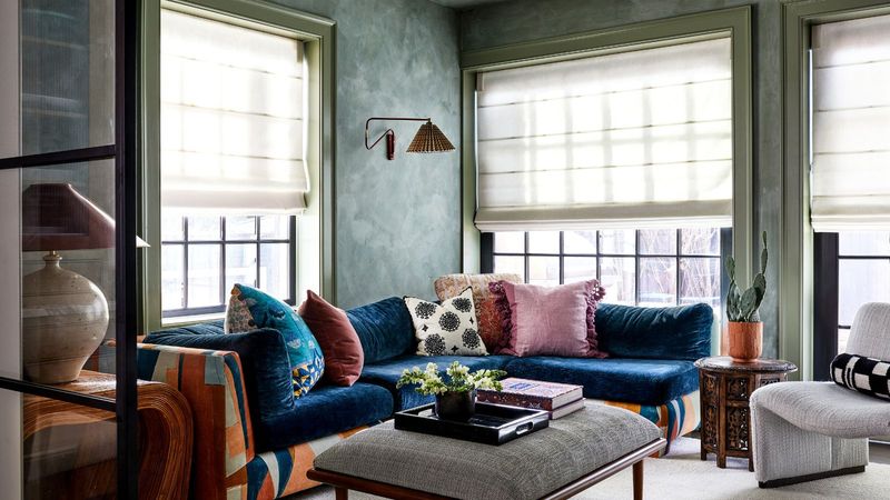
Velvet is luxurious, but when overused, it overwhelms rather than impresses. Imagine stepping into a bedroom where the drapes, bedspread, and pillows are all velvet. The result is a heavy, almost suffocating ambiance.
While velvet adds elegance in moderation, too much can be overpowering and impractical, especially in spaces meant for relaxation. The texture can also attract dust and pets’ fur, complicating maintenance.
Instead, balance is key. A single velvet statement piece can enhance elegance without compromising on comfort or cleanliness, making the space not just beautiful, but livable.