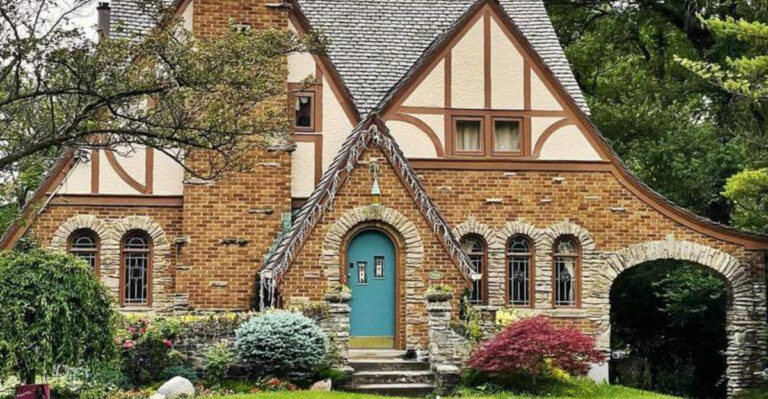
20 Trends Interior Designers Are Already Sick And Tired Of Seeing In 2025
Design insiders have spoken—and the verdict isn’t kind. As 2025 unfolds, once-daring ideas now read like tired clichés in showroom after showroom. What felt edgy a few years ago has blurred into the background, repeated so often it barely registers.
The originality? Long gone. Whether you’re redecorating or just design-curious, steer clear of the trends pros are quietly phasing out.
Here are 20 looks overstaying their welcome—according to the experts.
1. Neon Light Word Art
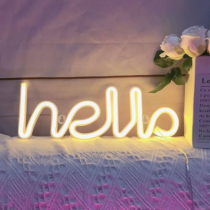
Remember when everyone and their neighbor had a “Live Laugh Love” neon sign? Well, designers are begging you to flip the switch off for good. These buzzing beacons have transformed from quirky statement pieces to the design equivalent of a bad bumper sticker.
What started as a fun accent has morphed into visual noise cluttering walls everywhere. The constant glow and often cheesy phrases make spaces feel more like a teenager’s dream bedroom than a sophisticated home.
If you still crave that ambient lighting effect, consider more subtle options like hidden LED strips or artistic pendant fixtures that provide atmosphere without spelling it out—literally.
2. All-Gray Everything
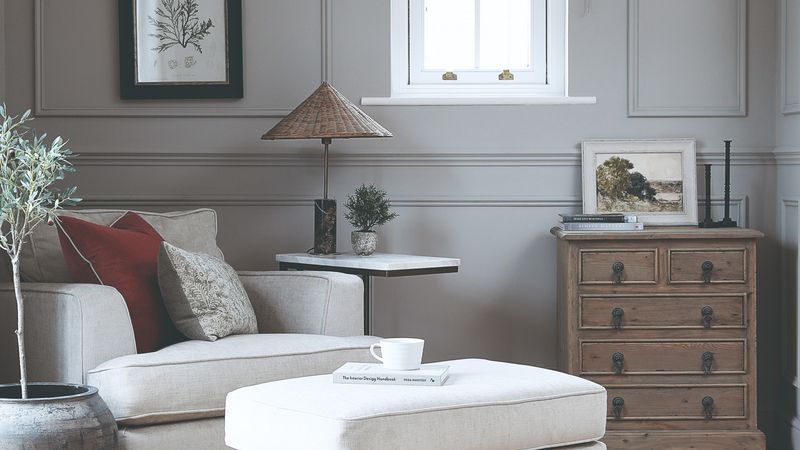
Gray had its moment – a decade-long moment that designers are desperate to see end. Walking into these monochromatic spaces feels like stepping into a black-and-white movie where someone forgot to restore the color.
From gray walls to gray furniture, gray flooring, and even gray decor accessories, this obsession with the world’s most noncommittal color has created homes that feel more like corporate waiting rooms than personal sanctuaries. The lack of contrast or personality makes these spaces feel cold and impersonal.
Instead of going gray, try incorporating actual colors that reflect your personality or natural materials that bring warmth and dimension to your living spaces.
3. Fake Indoor Plants
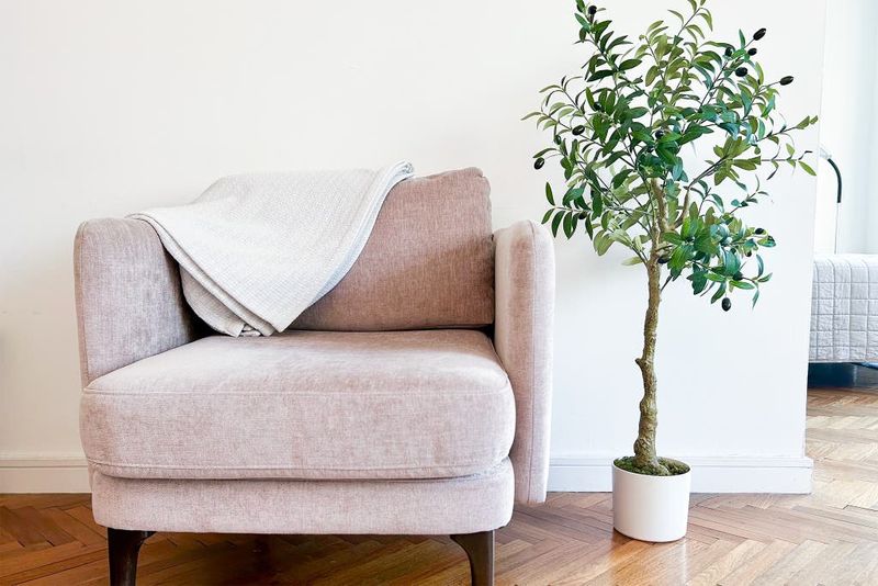
Artificial greenery is collecting more dust than compliments these days. While once considered a low-maintenance alternative, today’s fake plants scream ‘I couldn’t be bothered’ rather than ‘botanical enthusiast.’
The plastic sheen is unmistakable even from across the room, and no amount of strategic positioning can hide the artificial quality. Even worse are the dust-covered specimens that haven’t been cleaned since installation.
For those without green thumbs, consider truly low-maintenance living plants like snake plants or pothos, or simply embrace plant-free decorating rather than filling your home with unconvincing imitations.
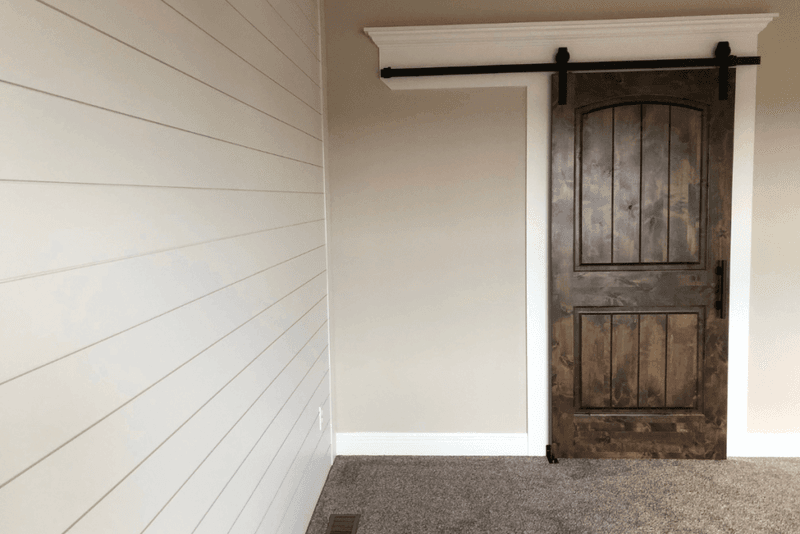
4. Barn Doors Everywhere
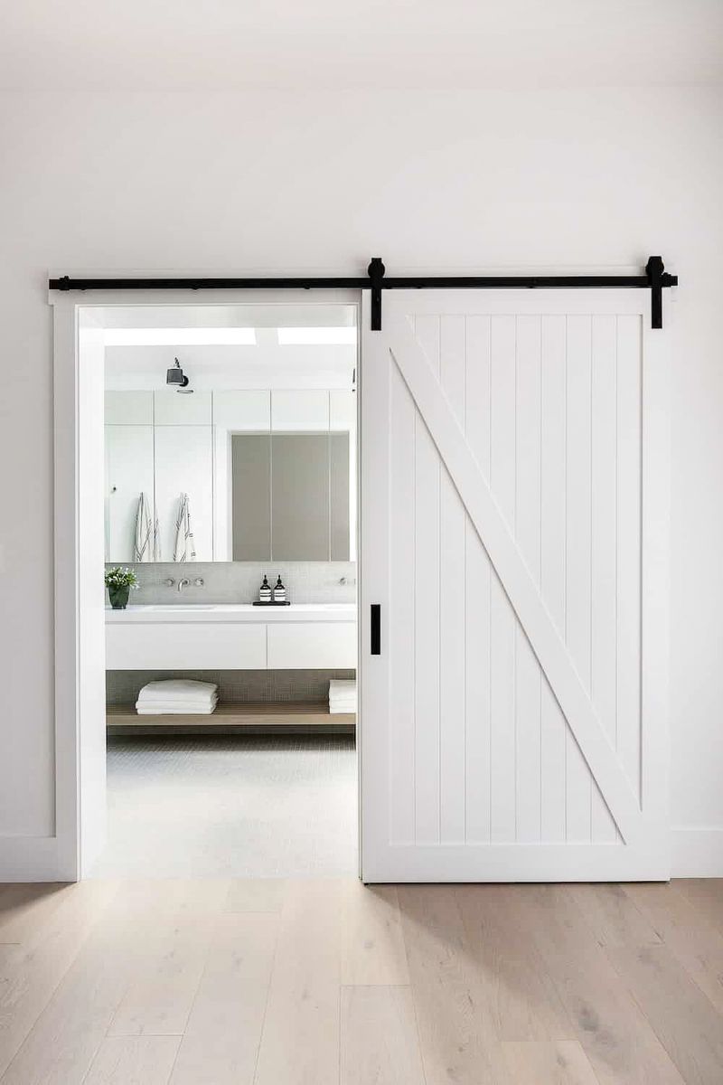
Sliding into our list at number five are those ubiquitous barn doors that somehow migrated from actual barns to covering bathroom entrances in suburban homes. Originally charming when used in contextually appropriate spaces, they’ve been slapped onto every possible doorway regardless of architectural style.
Beyond their questionable aesthetic in non-farmhouse settings, they’re functionally problematic too. The privacy issues alone make them questionable for bathrooms – not to mention the noise factor as they rumble along their tracks, announcing everyone’s comings and goings.
5. Accent Walls That Scream
When did we collectively decide that one wall in every room needed to have a personality crisis? Designers are exhausted by the predictable formula of three neutral walls plus one wall covered in bold wallpaper, garish paint, or stick-on panels.
These high-contrast statements quickly become the room’s only talking point while simultaneously dating the space the moment trends shift. They’re the design equivalent of wearing one neon sock with an otherwise normal outfit—distracting rather than enhancing.
6. Open Shelving Overkill
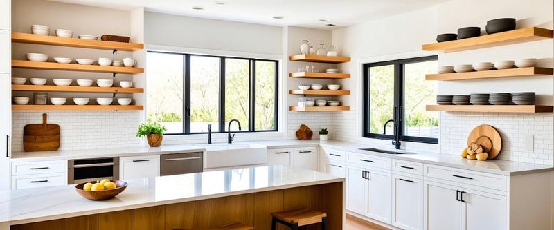
While Instagram showcases perfectly styled open shelves with matching dishware and carefully curated objects, reality tells a different story. Most kitchens with open shelving quickly become displays of mismatched mugs, random packaging, and a fine layer of cooking grease mixed with dust.
Designers are increasingly advising clients against sacrificing practical storage for this high-maintenance display option. The constant pressure to keep everything Instagram-ready has turned what should be functional kitchen space into a stressful display area requiring frequent styling and cleaning.
7. Edison Bulb Exhaustion
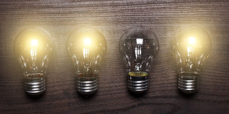
Those exposed vintage-style filament bulbs that once signaled hipster coffee shop cool have now become the design equivalent of a bad dad joke—overused and underwhelming. Hanging naked from cords or clustered in industrial-looking fixtures, these energy-hungry bulbs have lost their novel appeal.
Beyond their ubiquity, they’re functionally problematic too. The harsh glare from exposed bulbs creates uncomfortable direct light, while their yellowish glow often distorts colors in the room. Not to mention their energy inefficiency compared to modern lighting options.
8. Millennial Pink Fatigue
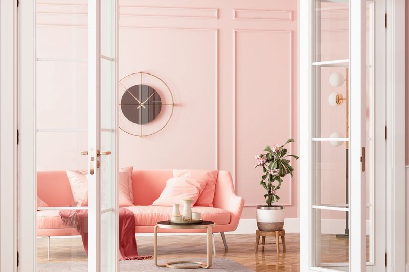
Once the darling of Instagram feeds and startup offices, that muted, dusty pink hue has finally worn out its welcome. What began as a fresh alternative to traditional pastels became so overexposed that designers now see it as the color equivalent of a one-hit wonder playing on repeat.
The shade infiltrated everything from wall paint to furniture, accessories, and even kitchen appliances, creating spaces that feel trapped in the mid-2010s rather than current. Its ubiquity has stripped it of any original charm or personality it once possessed.
9. Terrazzo Overload
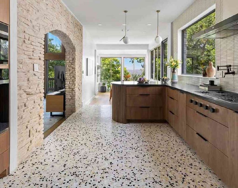
What started as a nostalgic revival of a mid-century material quickly spiraled into terrazzo overkill. From floors to countertops, lamps, wallpaper, and even terrazzo-printed throw pillows, this speckled pattern has been stretched far beyond its reasonable applications.
Designers are particularly tired of seeing cheap terrazzo imitations that lack the depth and quality of the original material. These flat, printed versions miss the dimensional quality that made real terrazzo interesting in the first place, resulting in spaces that feel like confetti explosions rather than sophisticated design.
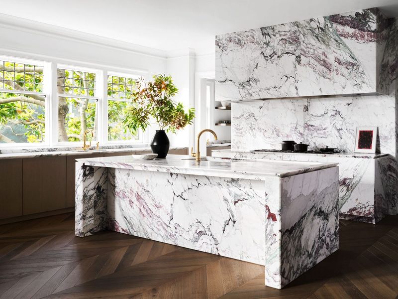
10. Faux Marble Madness
The gap between real marble and its imitators has never been more glaring to design professionals. While technology has improved faux marble’s appearance in photos, in person the repeating patterns and artificial sheen immediately give away these wannabe luxe surfaces.
Particularly egregious are the vinyl wraps and peel-and-stick options that bubble, peel, and damage easily. These temporary solutions often end up looking worse than simply embracing more honest materials that aren’t pretending to be something they’re not.
11. Shiplap Shipwreck
Unless you’re living in an actual coastal cottage or converted barn, designers beg you to reconsider covering your perfectly good walls with horizontal wooden planking. What began as a charming architectural detail appropriate to specific home styles has morphed into a ubiquitous trend slapped onto everything from urban apartments to suburban tract homes.
The farmhouse-coastal aesthetic has become so diluted through overexposure that these once-characterful details now read as generic rather than authentic. The worst offenders are stick-on versions that don’t even commit to the real architectural element.
12. Boho Overload
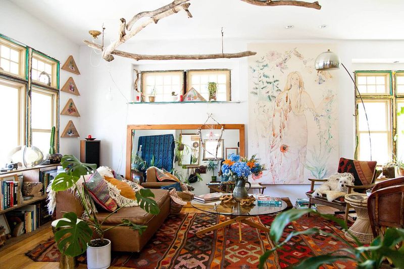
What happens when a design style meant to represent individualism and free-spirited eclecticism becomes mass-produced and formulaic? You get the current state of “boho” decor that has designers cringing at its predictability.
The same macramé wall hangings, rattan everything, Moroccan-inspired rugs, and obligatory fiddle leaf fig trees have created a strange paradox—supposedly unique spaces that all look exactly the same.
True bohemian style should reflect personal travels, experiences, and collected treasures—not a shopping list from a catalog. Designers encourage authentic self-expression rather than purchasing a pre-packaged personality.
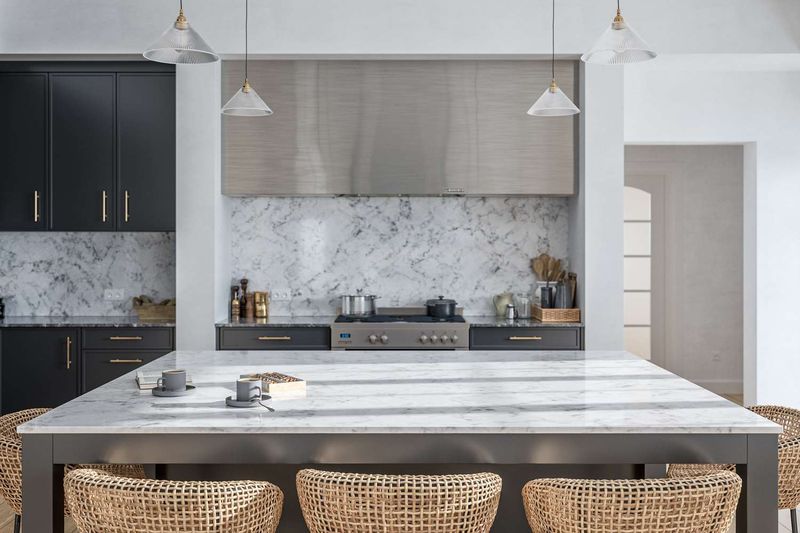
13. Statement Range Hoods
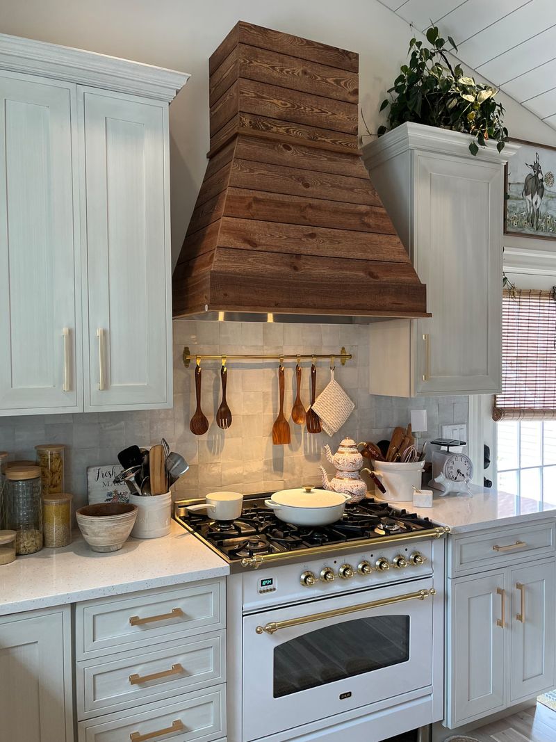
Somewhere along the way, kitchen range hoods transformed from practical ventilation systems into architectural showpieces that dominate the entire cooking space. These oversized metal or plaster structures often appear wildly out of proportion, like putting a sports car hood ornament on a family sedan.
Particularly in smaller kitchens, these massive decorative hoods consume valuable visual space and often feel forced—as though the kitchen is trying too hard to make a grand statement. Their prominent positioning makes them impossible to ignore when they clash with the home’s overall aesthetic.
14. Arch Overload
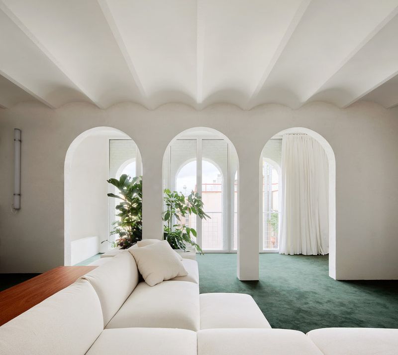
The rounded arch trend has curved its way into every possible application, from doorways to mirrors, furniture, and even painted arches on walls. What started as a pleasing architectural element has been flattened into a surface-level decorative motif that’s lost its impact through sheer repetition.
When every mirror, bookcase, and headboard features the same curved top, the shape loses its special quality and becomes just another predictable design trope. The painted arch murals are particularly problematic, creating fake architectural features that often clash with a home’s actual structural elements.
15. Waterfall Countertop Overflow
Much like actual waterfalls, these countertops that dramatically cascade down the sides of kitchen islands have reached saturation point. Originally an impressive architectural detail in high-end minimalist kitchens, the waterfall edge has become an overused status symbol that often feels forced in traditional or transitional homes.
The continuous material requires significant additional expense for what’s essentially a decorative feature, using expensive stone or solid surface material for vertical areas that serve no practical purpose. In many installations, the proportion feels off—like wearing formal opera gloves with casual everyday attire.
16. Floating Shelves Falling Flat
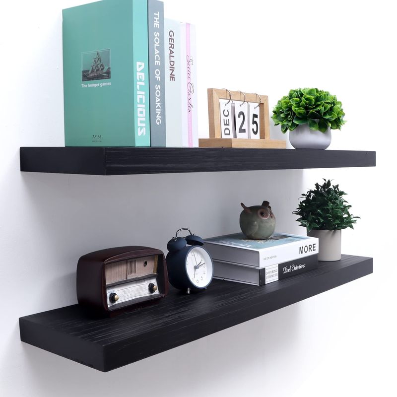
The minimalist floating shelf had its moment, but designers are increasingly seeing these wall-mounted platforms as dust collectors displaying identical styling formulas across homes everywhere. The predictable arrangement—stack of books, small plant, framed photo, random object—has become interior design’s version of paint-by-numbers.
Beyond their visual ubiquity, these shelves present practical problems too. Their limited weight capacity restricts what can be displayed, while their shallow depth often means items appear awkwardly perched rather than properly placed. The lack of visual support can make spaces feel ungrounded.
17. Pampas Grass Proliferation
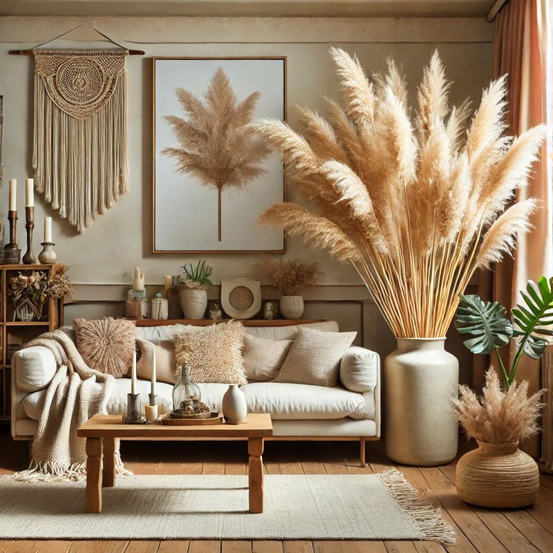
Those fluffy, neutral-toned dried grasses that exploded across social media have officially reached peak saturation. What began as a fresh alternative to traditional floral arrangements has become the ubiquitous calling card of derivative design—instantly dating a space to the early 2020s.
Beyond their overexposure, these dried arrangements have practical drawbacks too. They shed constantly, collect dust efficiently, and are surprisingly flammable—not ideal qualities for household decorations. Their muted color palette, while initially appealing for its subtlety, now reads as a safe, unimaginative choice.
18. TV Frame Fakery
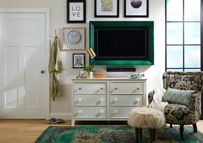
Attempting to disguise televisions as framed art when not in use has created a strange new category of design deception that fools absolutely no one. These “solutions” typically draw more attention to the TV rather than minimizing its presence, with black screens surrounded by obvious frames or mirrors that clearly hide technology.
The worst offenders are the digital art modes that display famous paintings or nature scenes at inappropriate brightness levels with obvious digital quality. Rather than creating the sophisticated gallery effect intended, they often resemble airport digital signage awkwardly placed in living spaces.
19. Monochrome Monotony
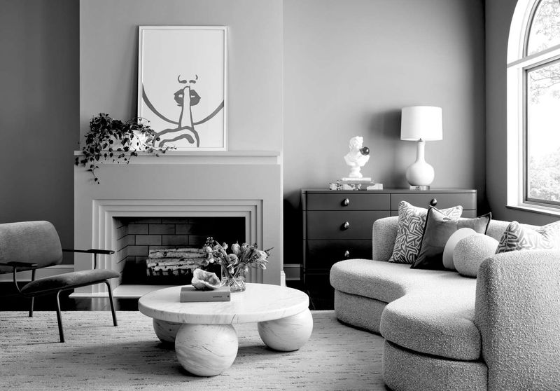
In a world brimming with vibrant possibilities, monochrome rooms often fall flat. Imagine walking into a living space where every element, from the walls to the upholstery, screams one color—beige, white, or black. This singular approach can make spaces feel sterile and devoid of personality.
Designers are moving away from monochrome to embrace more eclectic palettes, mixing and matching colors for a more dynamic feel. By introducing varied hues, spaces can express individuality and warmth.
A splash of contrasting colors can transform a room, offering depth and visual intrigue.
20. Industrial Overkill
Once a refreshing nod to urban sophistication, the industrial style has now become an overwhelming presence. Imagine a space cluttered with exposed piping, harsh metal fixtures, and an overabundance of brick. Instead of feeling edgy, it starts to feel cold and impersonal.
The key lies in moderation, where industrial touches enhance rather than dominate a space, making it feel welcoming and modern.