18 Designers’ Favorite Rules To Make Any Room Better
Ever walk into a room and think, Wow, this just works? That kind of magic isn’t random, it’s all about smart design tricks.
I used to think you needed a big budget or a professional to pull it off, but turns out, there are simple rules the pros follow that make a huge difference.
Whether you’re giving your bedroom a refresh or just shifting your couch around to see what feels better, these tips can seriously level up your space.
I’ve rounded up my favorite designer-approved ideas to help any room look amazing without draining your wallet.
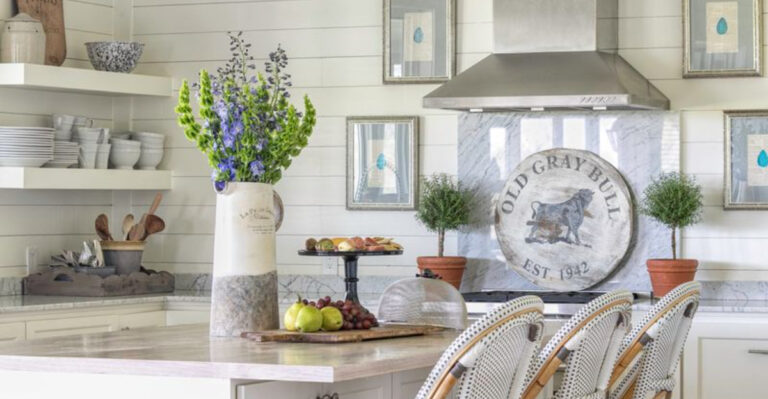
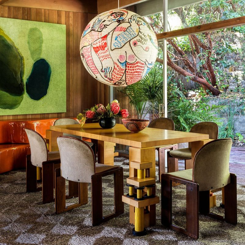
1. The Rule of Three
Grouping objects in threes creates instant eye candy! Professional decorators swear by this magic number for arranging everything from candles to pillows.
Why does it work? Our brains actually find odd-numbered groupings more interesting and memorable than even ones. Three is the sweet spot—not too sparse, not overcrowded.
Try placing three different-sized items with similar colors or themes on your coffee table. Boom! Instant designer vibes without trying too hard.
2. Mix High And Low Price Points
Splurging on one knockout piece while saving on others creates rooms with character! Smart designers know the secret isn’t buying everything expensive—it’s strategic mixing.
Though your budget might scream for all bargain finds, investing in one statement piece (like a quality sofa) while surrounding it with budget-friendly accents creates balance. Nobody will notice which is which!
Where to splurge? Focus on items you touch daily or that anchor the room.
3. Leave Breathing Room
Cramming too much stuff into a space is the number one rookie mistake! Professional designers call that precious empty space “negative space”—and it’s actually a positive thing.
If every inch gets filled, your eyes have nowhere to rest and the room feels chaotic. Think of it like music, the pauses between notes are just as important as the notes themselves.
Sometimes removing one piece of furniture does more for a room than adding three new accessories ever could!
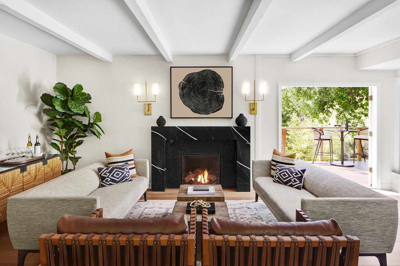
4. Hang Art At Eye Level
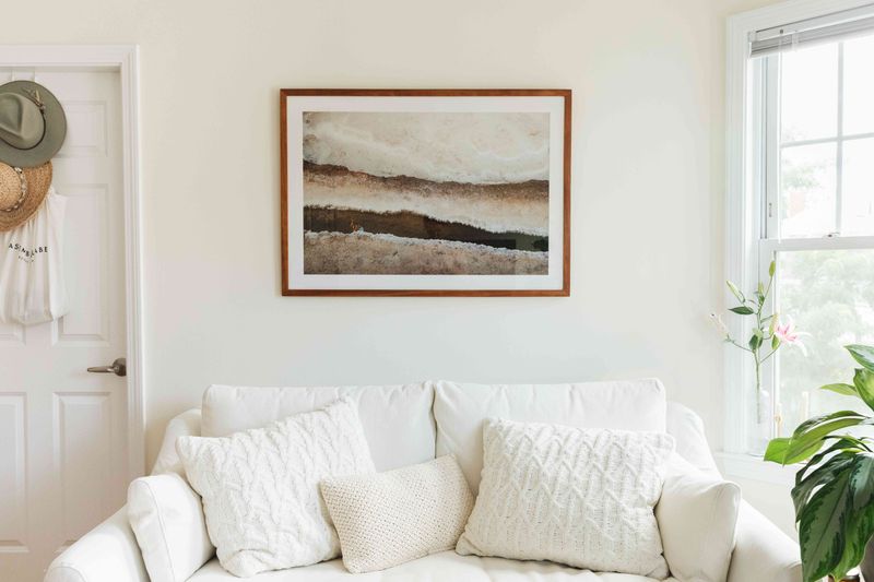
Slapping artwork too high on walls is a dead giveaway that amateurs were here! The sweet spot? Center your art approximately 57-60 inches from the floor, right where most people’s eyes naturally land.
How come this matters so much? When pieces sit at the right height, they connect with viewers instead of floating awkwardly above them. Museums use this trick too!
For gallery walls, treat the entire arrangement as one unit with its center at eye level.
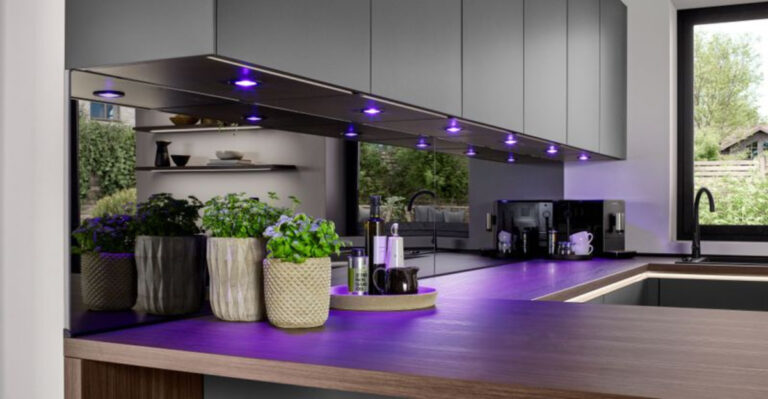
5. Layer Your Lighting
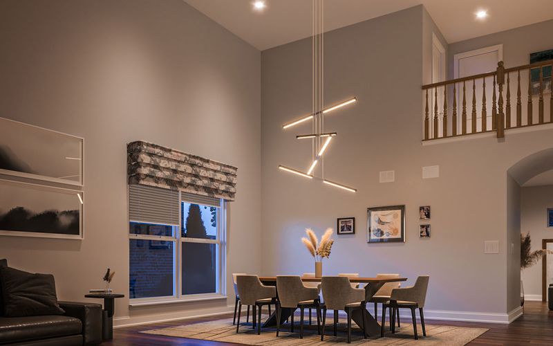
Relying on one ceiling light is like wearing only underwear—technically covered but missing the whole outfit! Professional spaces always combine three lighting types: ambient (general), task (functional), and accent (decorative).
Floor lamps, table lamps, sconces, and candles create depth while banishing those unflattering shadows from overhead lights. Plus, they let you adjust the mood without installing dimmers.
If your room feels flat or uninviting, try adding just one new light source at a different height.
6. Every Room Needs Something Black
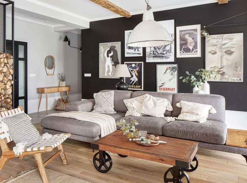
Throwing in something black gives any room instant sophistication! This designer secret works because black grounds a space and provides contrast, like eyeliner for your room.
Don’t panic about going goth; we’re talking small doses. A black picture frame, lamp base, or even just the black letters in a book on your coffee table can do the trick.
Without at least a touch of black, rooms can feel weightless and unfinished, like a face without eyebrows!
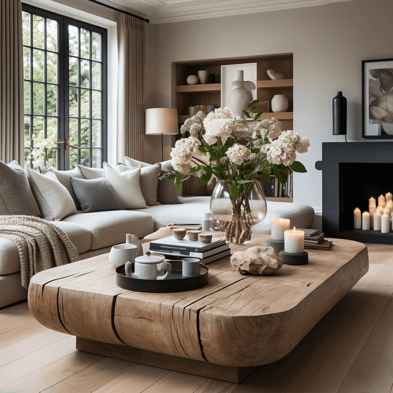
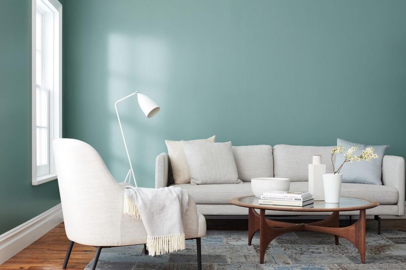
7. Follow The Cocktail Table Rule
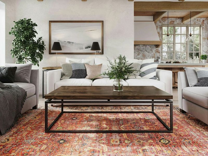
Coffee tables should be like good waiters, close enough to be helpful but not in your way! The magic distance between sofa and coffee table? About 18 inches, just right for reaching snacks without stretching.
Height matters too! Your table should sit 1-2 inches below your sofa cushions. When proportions go wrong, the whole room feels off-kilter.
Bonus tip from top designers: your coffee table should be about two-thirds the length of your sofa for that just-right visual balance.
8. Measure Twice, Buy Once
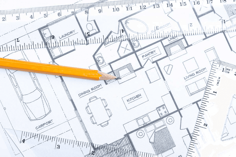
Nothing screams “I didn’t plan this” like furniture that doesn’t fit! Before swiping that credit card, grab a measuring tape and some masking tape to outline where pieces will go.
Smart designers even create paper templates of furniture to slide around the floor plan. Sounds extra? Maybe. But not as extra as returning that sofa that blocks your doorway!
If you’re terrible with spatial relationships (many of us are!), try one of those room-planning apps where you input your exact dimensions.
9. Rugs Should Connect All Furniture
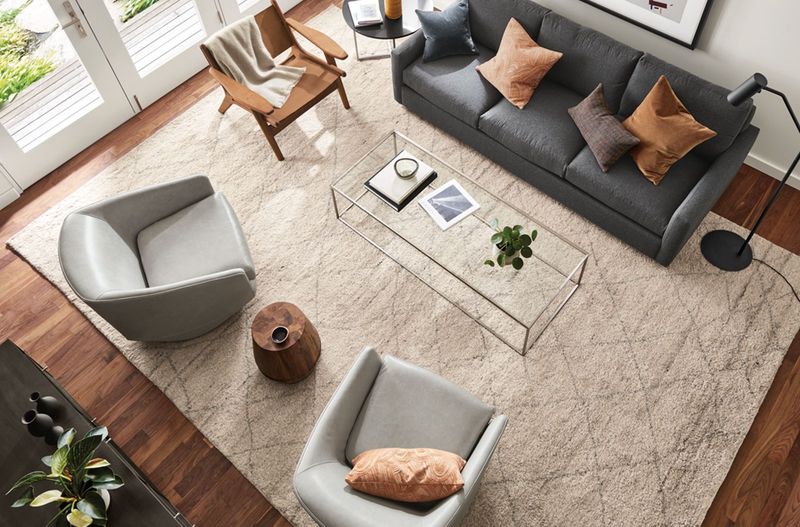
Tiny area rugs floating in rooms look like sad little islands! Instead, choose rugs large enough for all furniture legs to at least touch them, this instantly makes rooms feel bigger and more cohesive.
Under dining tables? Your rug should extend at least 24 inches beyond the table edge so chairs stay on the rug when pulled out. Nobody wants that annoying chair-leg-catching-on-rug-edge situation!
When budget constraints hit, layering a smaller statement rug over a larger, less expensive one creates the right scale without breaking the bank.
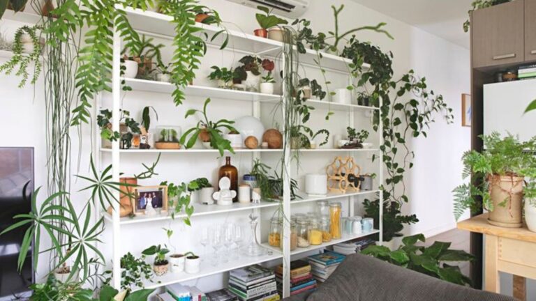
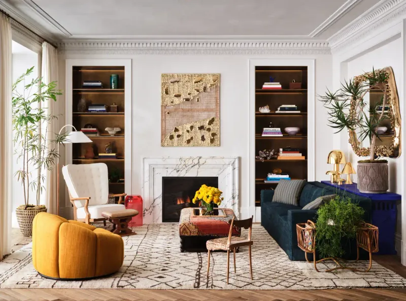
10. Add Something Living
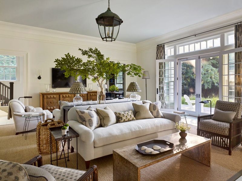
Rooms without plants are like birthday cakes without frosting, technically complete but missing the fun part! Living elements bring energy to spaces that no inanimate object can match.
Lose plants regularly? No problem! Start with nearly indestructible options like snake plants or ZZ plants that thrive on neglect. Or fake it with high-quality silk plants (just dust them occasionally).
Beyond just greenery, consider a fish tank or even a bird feeder outside a window, anything that brings movement and life into your static space.
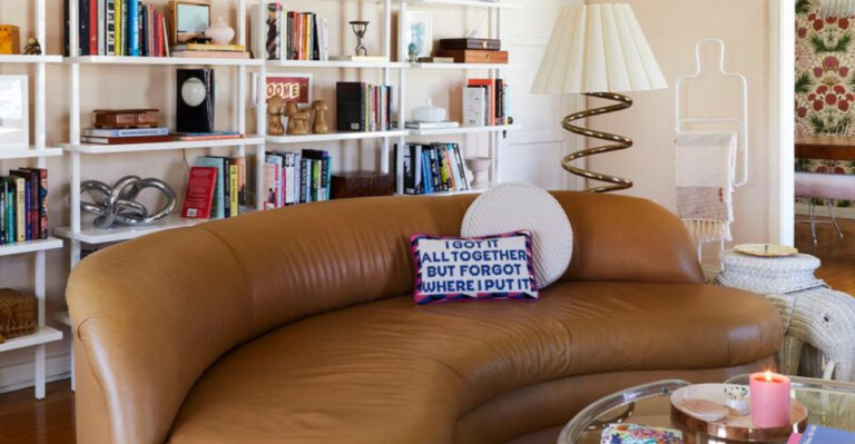
11. Break At Least One Rule
Following every design rule creates rooms that look like furniture showrooms, perfect but boring! The most memorable spaces always include something unexpected that breaks the mold.
Maybe it’s grandma’s quirky chair that clashes with everything but makes you smile. Or perhaps it’s a wildly oversized art piece in a tiny room. These “mistakes” often become the most interesting part of your space!
If everything matches perfectly, your room risks looking like a catalog page instead of a real home where actual humans live.
12. Mind Your Sight Lines
Blocking windows or doorways with furniture is like putting a hand over someone’s eyes, rude and disorienting! Good designers always consider what you’ll see from each entry point into a room.
Try this pro move: stand in each doorway and note what catches your eye first. That’s your focal point and should be something worth looking at, not the back of a tall bookcase or TV.
When placing furniture, imagine drawing a line from each seat to important elements like the TV, fireplace, or window view. Nobody should strain their neck to see!
13. Use The 60-30-10 Color Rule
Picking room colors isn’t about wild guessing, there’s actually a formula! Pro designers use the 60-30-10 rule: 60% dominant color (walls/large furniture), 30% secondary color (accent furniture/curtains), and 10% accent color (accessories/art).
Following this split creates balance while avoiding that matchy-matchy catalog look. Your dominant color provides consistency, the secondary adds interest, and that 10% pop brings excitement.
Stuck choosing colors? Steal them from a favorite painting or fabric pattern, nature already figured out which colors play nicely together!
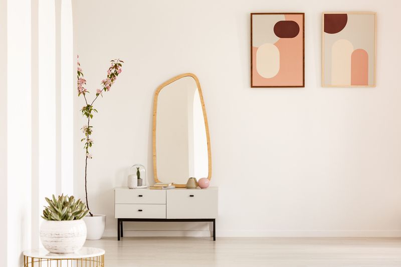
14. Embrace Odd Numbers For Accessories
Lining up accessories in perfect pairs creates museum-like stiffness! Odd-numbered groupings (3, 5, 7) create natural, relaxed arrangements that draw the eye around in a more interesting way.
When styling shelves or tables, vary heights and textures while keeping odd numbers in mind. Three candlesticks of different heights look deliberately stylish; two identical ones just look like you lost the third.
If you already own pairs of things, no need to toss them, just add a third element to create that designer-approved odd-numbered grouping!
15. Test Your Paint Colors First
Skipping paint samples is like buying jeans online without checking the size, a recipe for regret! Colors change dramatically depending on your specific room’s lighting and other elements.
Those tiny paint chips from the store? Practically useless! Instead, paint large sample boards (at least 2×2 feet) and move them around the room at different times of day.
What looked like perfect greige at the store might read purple in your north-facing bedroom or yellow in your south-facing kitchen. Testing saves you from repainting entire rooms!
16. Create Conversation Areas
Pushing all furniture against walls creates a doctor’s waiting room vibe, nobody wants that! Instead, arrange seating so people can actually talk without shouting across the room.
The magic distance for conversation? About 8 feet maximum between facing seats. Beyond that, people strain to hear each other and conversation fizzles.
Even tiny spaces benefit from this thinking, try floating a loveseat perpendicular to the wall with a small chair opposite, creating a cozy chat zone that feels purposeful rather than squashed.
17. Consider The Ceiling
Ignoring your ceiling is like wearing a great outfit with bedhead! This “fifth wall” affects how your entire room feels, yet most people leave it flat white and forget about it.
Simple ceiling upgrades make huge differences, try painting it a lighter version of your wall color for subtle depth. Or go bold with wallpaper or even wood planks if you’re feeling adventurous.
At minimum, replace dated light fixtures that draw attention upward. When a ceiling gets thoughtful treatment, the whole room suddenly feels complete and intentionally designed.
18. Edit, Edit, Edit
Filling every surface with knickknacks makes rooms look cluttered, not curated! Top designers know when to stop, and often remove one item after they think they’re finished.
Less really is more when it comes to accessories. Better to have three perfect objects than fifteen mediocre ones competing for attention.
Try this designer trick: remove half your accessories, live with it for a week, then only put back what you genuinely missed. The room will instantly look more expensive and intentional!