In the ever-evolving world of interior design, color trends can shift as swiftly as the wind changes direction.
As we have entered 2025, many hues that once held the crown in modern homes are now at risk of becoming outdated.
Designers are cautioning against a handful of colors that may no longer hold their allure in the current year. Here’s a sneak peek into the 25 shades you might want to steer clear of to keep your home looking fresh and contemporary.
1. Millennial Pink
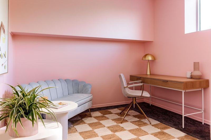
Millennial Pink, once the darling of trendy interiors, is losing its charm. Although it brought a playful and youthful vibe, the hue is now considered too kitschy. Its overuse in commercial spaces hasn’t helped its lasting appeal.
Designers suggest moving towards more sophisticated pastels or rich, earthy tones. Incorporating soft blushes or terracotta can provide a fresh yet timeless look. As color preferences mature, Millennial Pink’s popularity is expected to fade in chic homes.
2. Industrial Gray
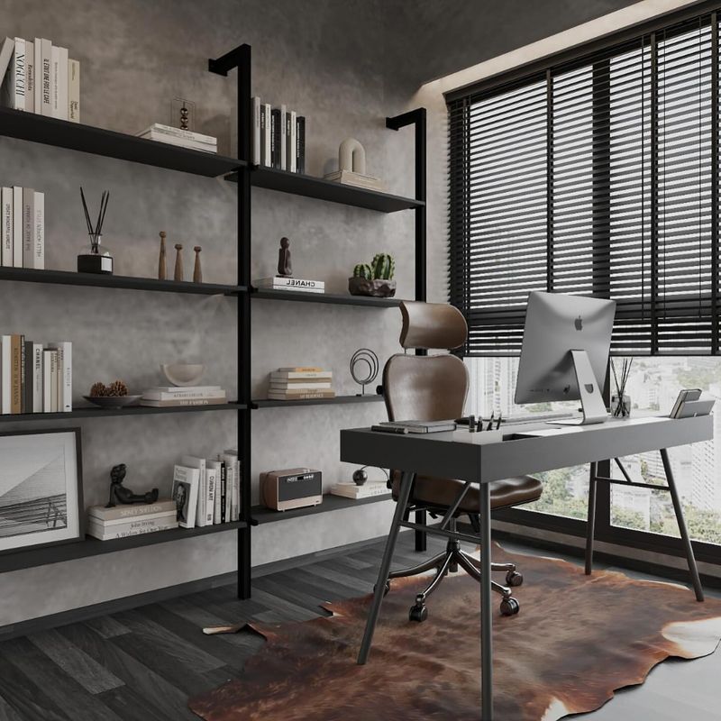
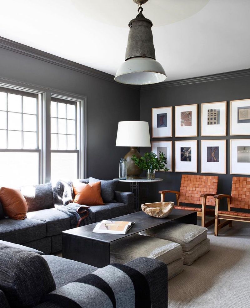
Industrial Gray once symbolized sleek, modern aesthetics, but its reign is waning. The color may feel too cold and impersonal, lacking the warmth many homeowners crave.
To avoid a stark and sterile atmosphere, designers recommend opting for warmer neutrals or grays with green or blue undertones. These alternatives create inviting spaces and offer a more nuanced palette. Industrial Gray is slowly being overshadowed by these more versatile shades.
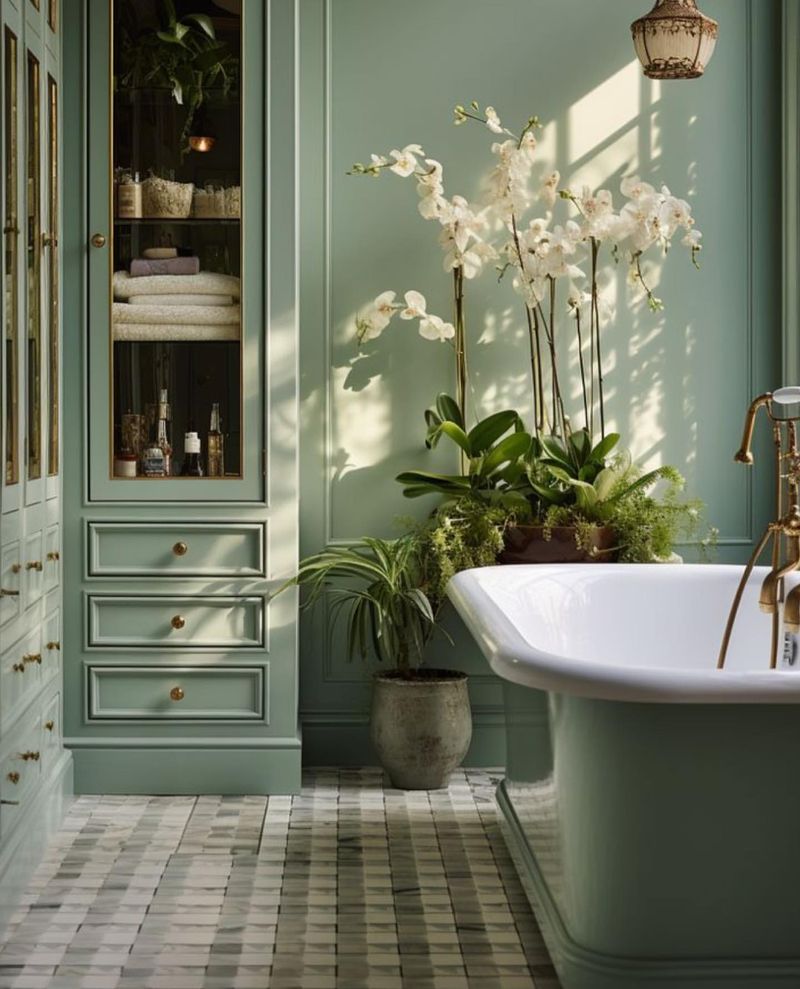
3. Sage Green
Sage Green was once a go-to for a calming, nature-inspired ambiance. However, its ubiquity has dulled its impact, making it feel somewhat predictable.
Designers suggest embracing more unique greens, such as olive or moss, which add depth and interest. These alternatives can invigorate spaces, providing the serenity one might seek without falling into the trap of overfamiliarity.
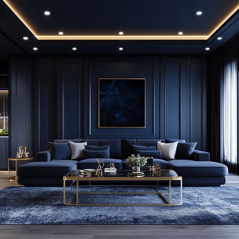
4. Navy Blue
Navy Blue has been a classic choice for its sophistication and depth. Yet, it’s become somewhat overdone and predictable, especially in traditional settings.
Exploring different hues like deep teal or midnight blue can bring a fresh twist on the classic. These alternatives maintain the elegance of dark tones but offer a modern edge, ensuring your space feels both timeless and current.
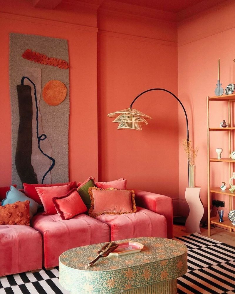
5. Coral
Coral, with its vibrant and energetic vibe, once captured many hearts. Yet, its boldness can quickly overwhelm, making it less appealing over time.
For a softer approach, designers recommend experimenting with muted corals or peach tones. These shades provide warmth and brightness without dominating the space. Coral’s once-popular status is now being replaced by these subtler variations.
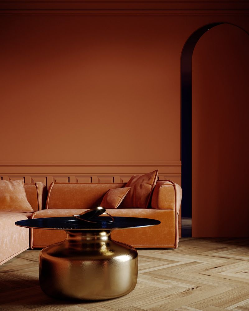
6. Earthy Terracotta
Terracotta tones have been beloved for their warmth and earthiness. However, their trendiness has led to overuse, making them feel less unique.
Designers are turning towards clay or caramel shades to maintain warmth while offering a fresh take. These colors continue to convey comfort and natural beauty without falling into the overly familiar category of terracotta.
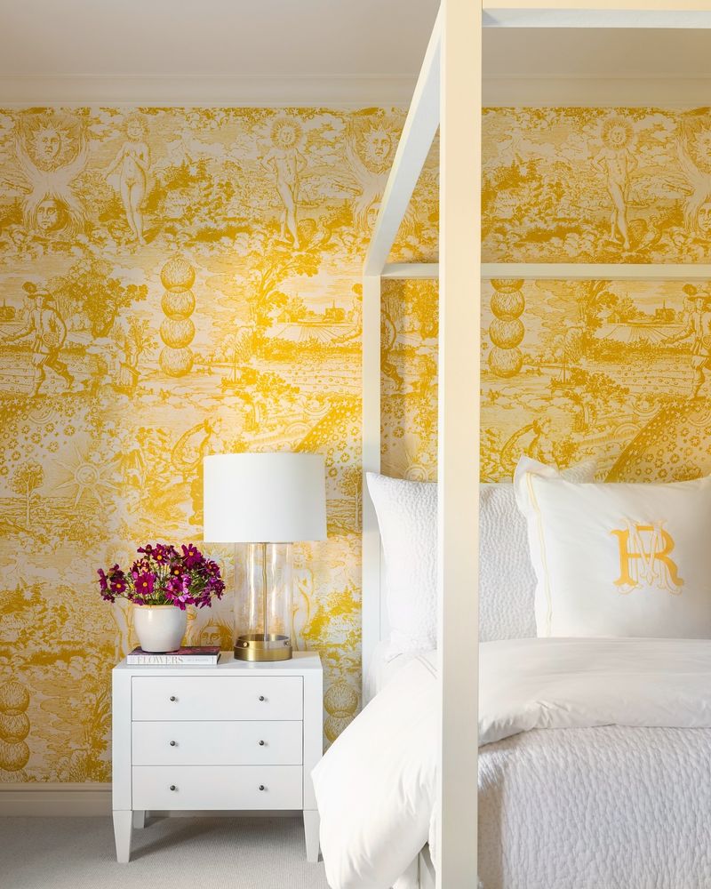
7. Bright Yellow
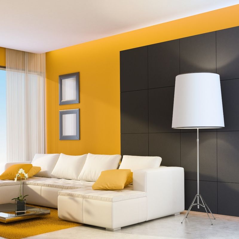
Bright Yellow, while cheerful and sunny, is a color that can easily overpower a room. Its intensity might soon feel more chaotic than uplifting.
A softer mustard or honey yellow can provide the same warmth without the harshness. Designers are steering clients towards these subtler hues, creating a space that’s lively yet not overwhelming.
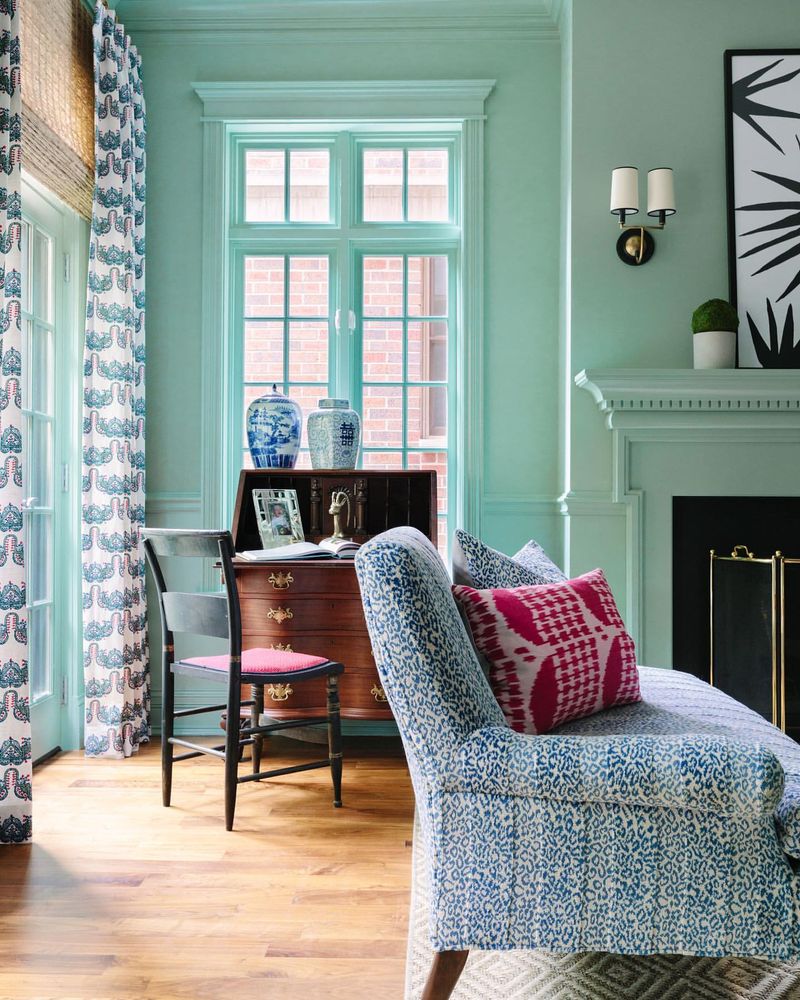
8. Cool Mint
Cool Mint, once a favorite for its refreshing vibe, is slowly losing its appeal. The color can come across as too sterile, lacking warmth.
Designers recommend exploring warmer greens or even aqua tones. These alternatives retain mint’s freshness while introducing a welcoming touch. As tastes evolve, Cool Mint’s crispness may soon feel outdated.
9. Dusty Rose
Dusty Rose, known for its vintage charm, is starting to feel outdated. Once a staple in romantic settings, it now runs the risk of appearing overly nostalgic.
Turning to fresher shades like soft mauves or lavender can preserve elegance while feeling contemporary. These hues offer a modern twist on the classic, ensuring the space remains inviting and stylish.
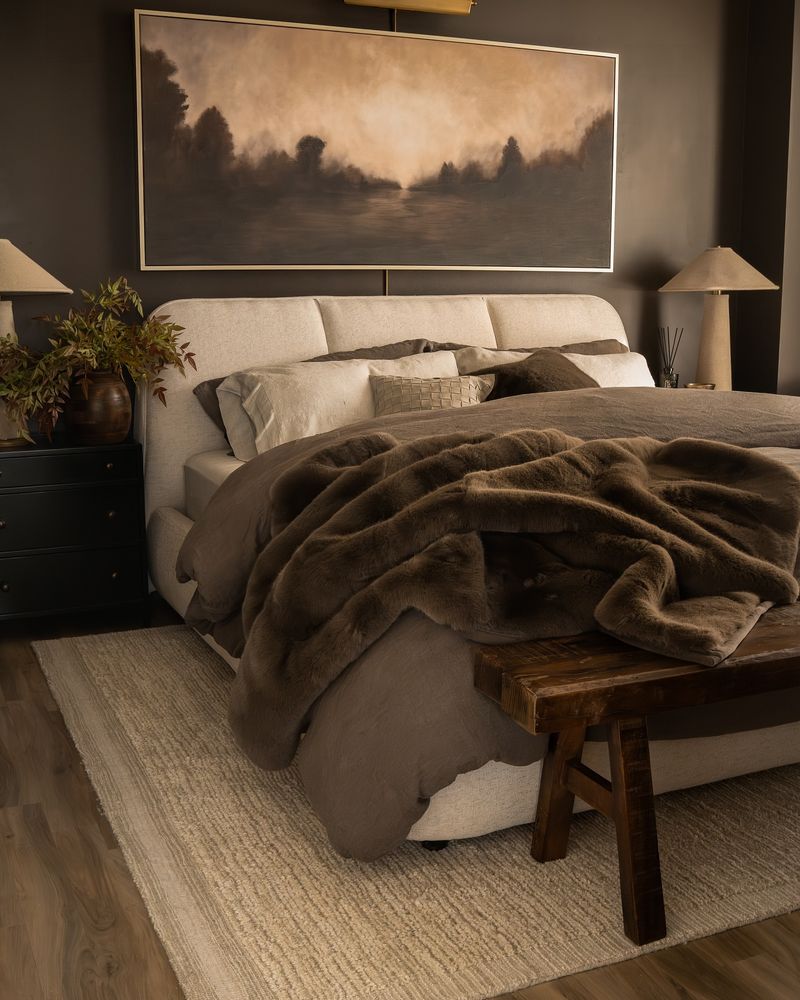
10. Chocolate Brown
Chocolate Brown was once appreciated for its rich, cozy feel. Yet, it’s becoming too heavy and dated for modern tastes.
Lighter browns like mocha or taupe can achieve a similar comfort level without feeling oppressive. These colors introduce warmth while maintaining an airy ambiance, perfect for creating a balanced and inviting space.
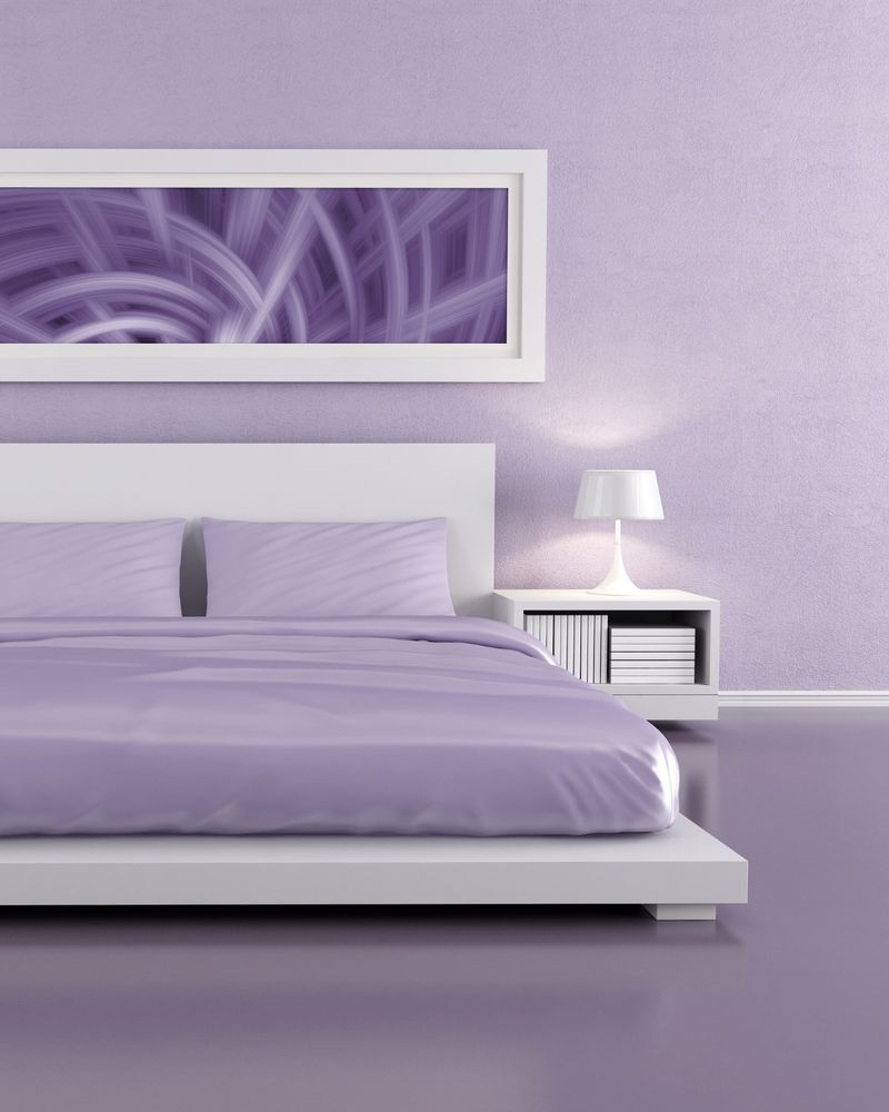
11. Lilac
Lilac, with its soft and romantic undertones, is starting to lose favor. Although it adds a touch of whimsy, it can quickly become passé.
Designers suggest opting for purples with more depth, like amethyst. It’s a shade that provides richness and intrigue, keeping your space both vibrant and stylish.
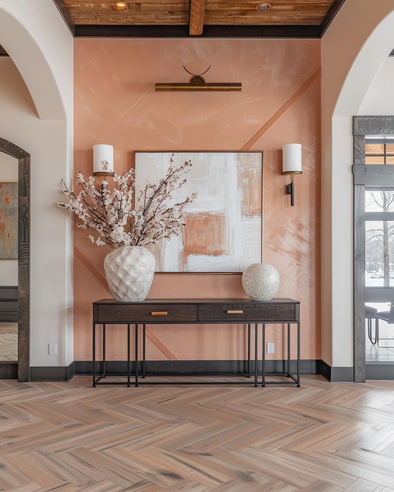
12. Peach
Peach, once beloved for its gentle warmth, is now at risk of feeling too retro. Its overuse in past decades can make it seem out of place today.
More nuanced shades, like apricot or soft terracotta, can offer similar warmth with a modern flair. These alternatives keep the space welcoming without slipping into outdated territory.
13. Burgundy
Burgundy, with its rich and luxurious appeal, is beginning to feel excessively heavy. Its opulence can overwhelm spaces, making them appear dated.
Opting for lighter wine or berry tones can provide a fresher feel. These colors maintain a sense of luxury while ensuring the room remains vibrant and relevant.
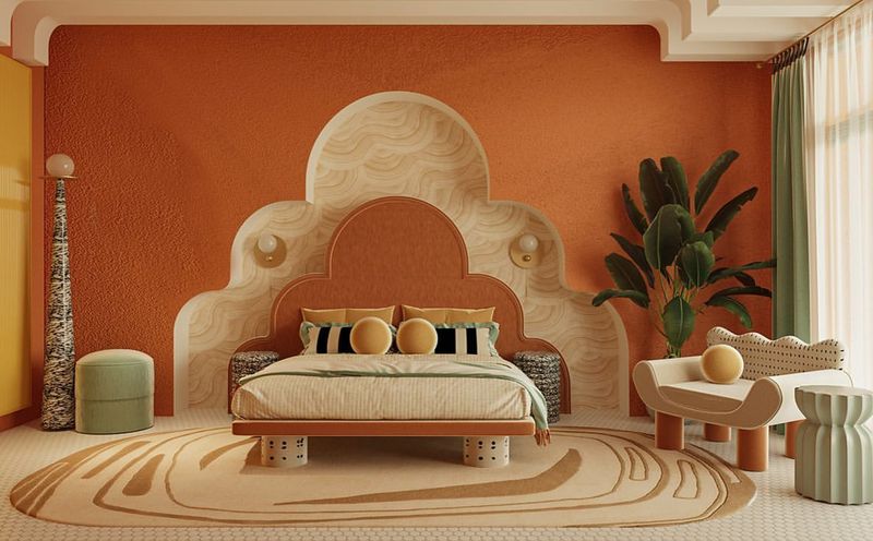
14. Burnt Orange
Burnt Orange once added vibrancy and warmth, but its boldness can easily become overpowering.
Designers are gravitating towards softer amber or rust tones. These shades offer a similar energy without dominating the room. By choosing these alternatives, you can maintain warmth and interest without sacrificing style.
15. Taupe
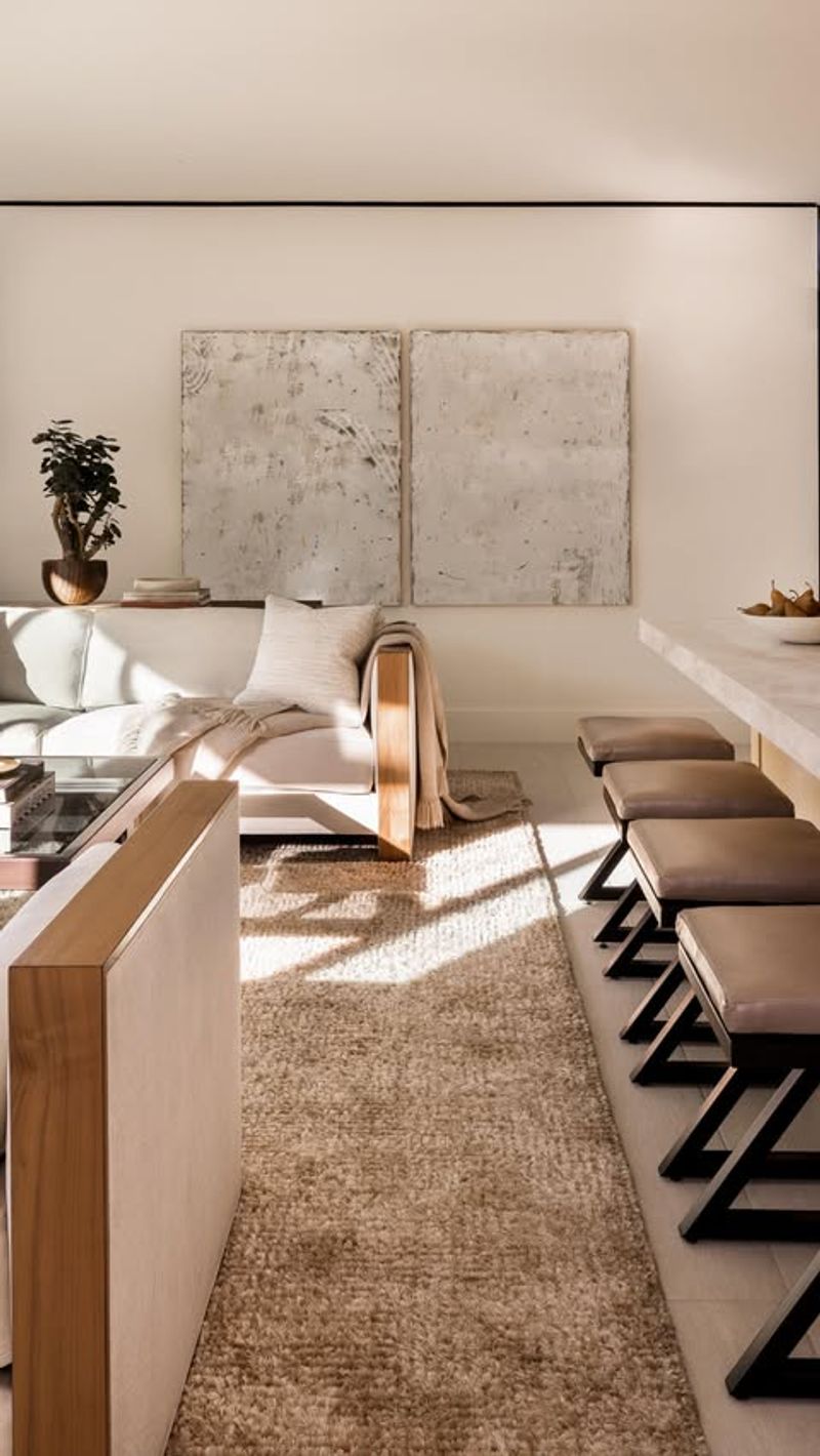
Taupe, while once the epitome of chic neutrality, is now at risk of appearing bland. Its ubiquity has rendered it somewhat uninspiring.
Exploring shades with more character, like greige or warm beige, can breathe new life into your interiors. These alternatives provide the neutrality of taupe while introducing subtle warmth and depth.
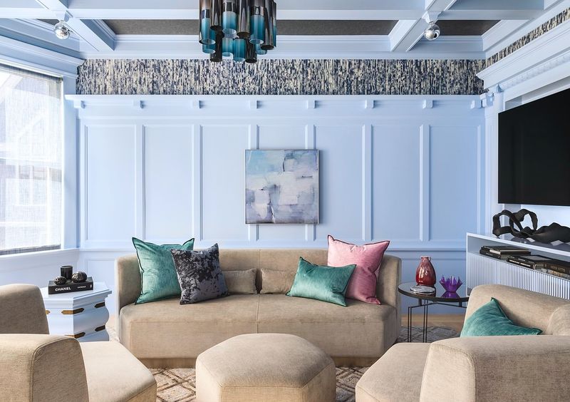
16. Powder Blue
Powder Blue, favored for its soft and calming vibe, is starting to feel predictable. Its association with traditional nursery themes can make it seem cliché.
Designers suggest embracing more sophisticated blues, such as sky or slate. These alternatives maintain the tranquil quality while offering a modern twist, perfect for keeping spaces feeling fresh and serene.
17. Plum
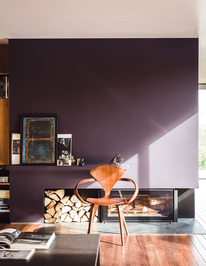
Plum, once admired for its depth and drama, is now seen as overbearing. Its intensity can quickly overshadow other elements in the room.
Opting for softer berry or mauve tones can maintain richness without overwhelming the space. These shades ensure a harmonious balance, keeping your interiors both inviting and stylish.
18. Olive Green
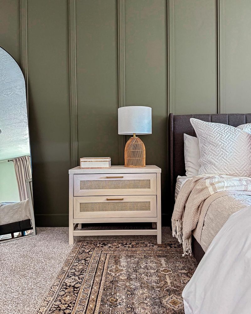
Olive Green, while earthy and grounding, is beginning to feel a bit stale. Its overuse has dulled its uniqueness.
Choosing shades like moss or fern can reinvigorate spaces, adding freshness and vibrancy. These alternatives preserve the natural appeal without succumbing to monotony, ensuring your space remains lively and engaging.
19. Charcoal
Charcoal, known for its modern sophistication, is losing its edge. Its heavy presence can feel oppressive rather than sleek.
Designers are leaning towards softer grays or even deep blues. These colors maintain a sense of elegance while allowing for a brighter, more inviting atmosphere.
20. Mustard Yellow
Mustard Yellow is beginning to feel a bit too retro. Its boldness can dominate a space, making it less appealing over time.
More subdued yellows, like honey or goldenrod, are gaining favor. These shades offer warmth and vibrancy without overwhelming the room, ensuring a more balanced and stylish look.
21. Teal
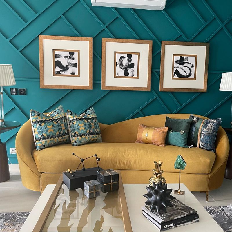
Teal, once a trendy choice for its boldness, is slowly falling out of favor. Its intensity can overshadow other design elements, making spaces feel cluttered.
Opting for muted turquoise or seafoam can maintain a refreshing vibe without overpowering. These alternatives provide a serene atmosphere, keeping your interiors modern and harmonious.
22. Ivory
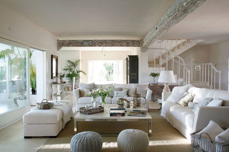
Ivory, once considered timeless, is now seen as lacking distinction. Its neutrality can sometimes feel too safe and uninspired.
Exploring shades like cream or soft almond can add warmth and personality. These colors maintain elegance while offering a fresh update, perfect for creating inviting and sophisticated spaces.
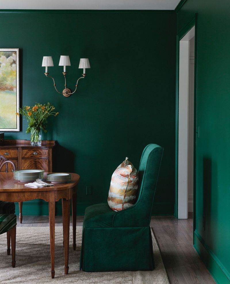
23. Emerald Green
Emerald Green, though rich and luxurious, is becoming somewhat overbearing. Its boldness can overshadow other design elements, making spaces feel less harmonious.
Subtler greens like jade or malachite offer a sophisticated alternative. These shades enhance elegance without overwhelming, ensuring your decor remains balanced and chic.
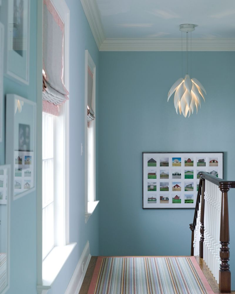
24. Sky Blue
Sky Blue, known for its airy vibe, is now seen as a bit too predictable. Its overuse in casual spaces can make it seem unimaginative.
Exploring deeper blues or blues with gray undertones can provide a modern twist. These shades maintain the calming effect while offering more depth and interest, perfect for keeping your interiors captivating.
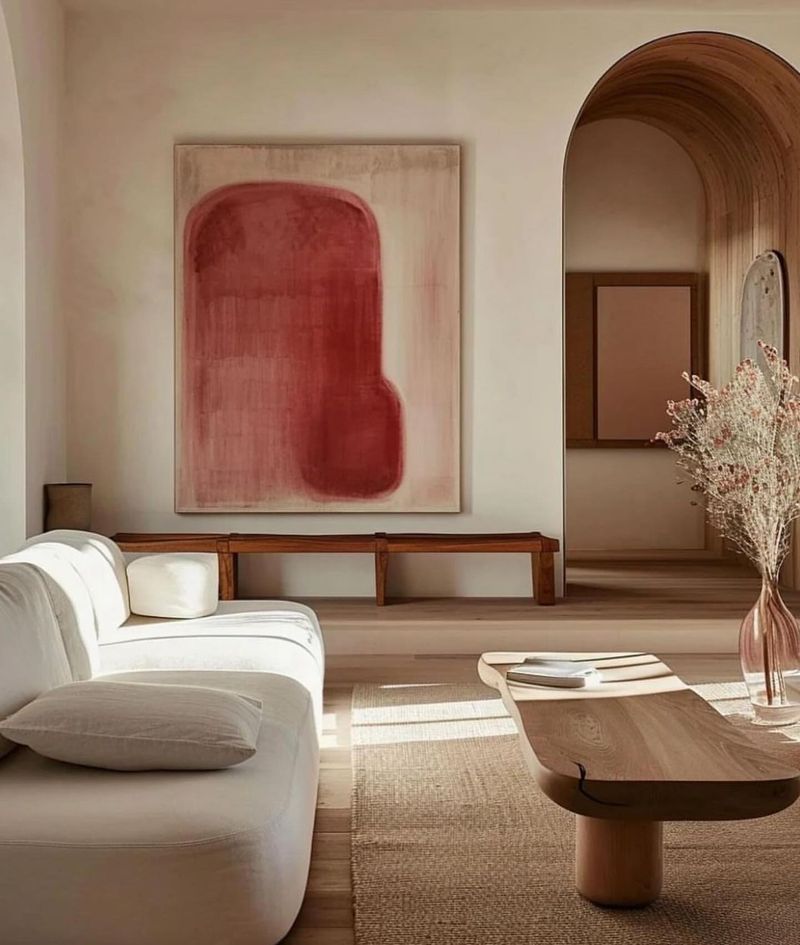
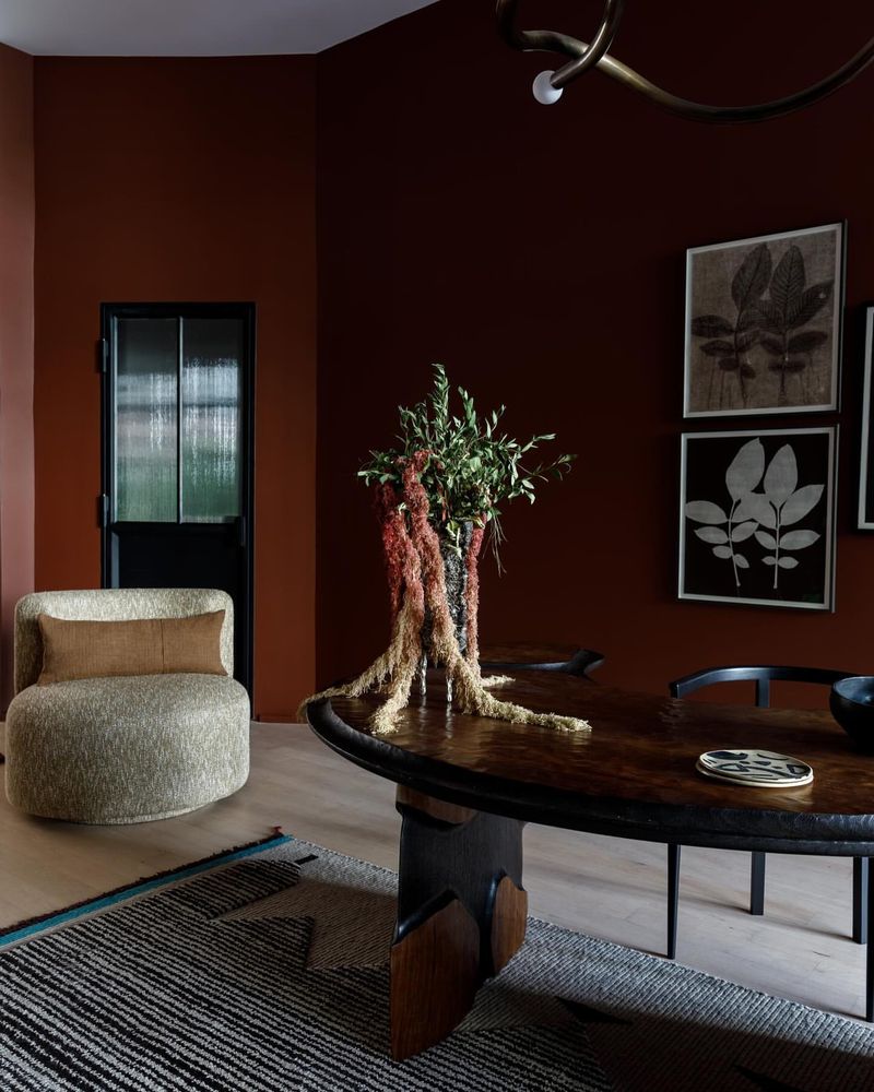
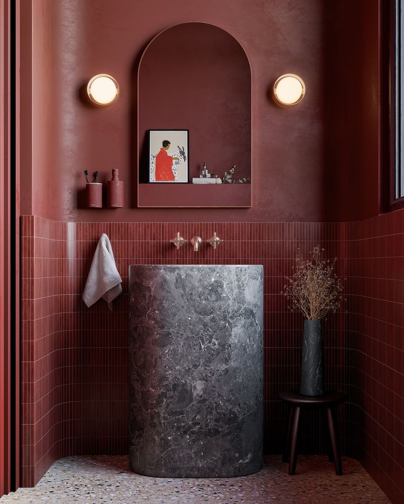
25. Brick Red
Brick Red, once popular for its warmth and rustic charm, is beginning to feel heavy and dated. Its intensity can crowd a space, making it feel cramped.
Opting for softer reds or terracotta can achieve a similar warmth with a modern twist. These alternatives ensure your space remains open and inviting, avoiding the dated feel of Brick Red.
