17 Steps To Choose Curtains With A Print To Ensure They Match Your Room Beautifully
Choosing printed curtains can transform your space from ordinary to extraordinary with just the right pattern and style. The perfect printed curtains tie your room together, reflecting your personality while complementing your existing décor.
Whether you’re redecorating or simply refreshing your space, these seventeen steps will guide you through selecting printed curtains that beautifully enhance your room.
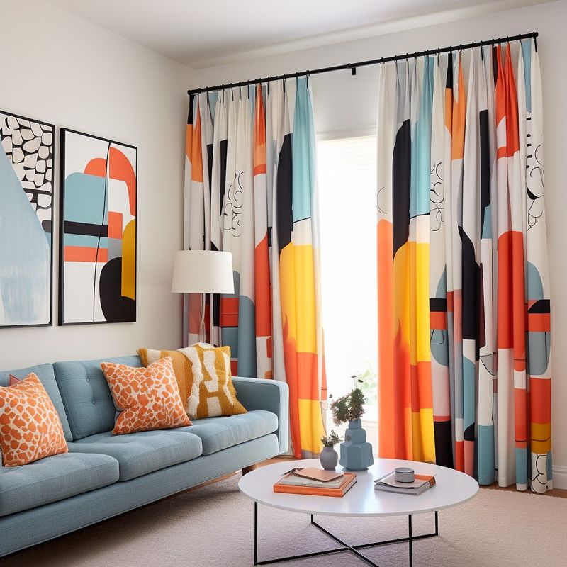
1. Analyze Your Room’s Color Palette
Before diving into pattern hunting, take a good look at your existing color scheme. Which hues dominate your space?
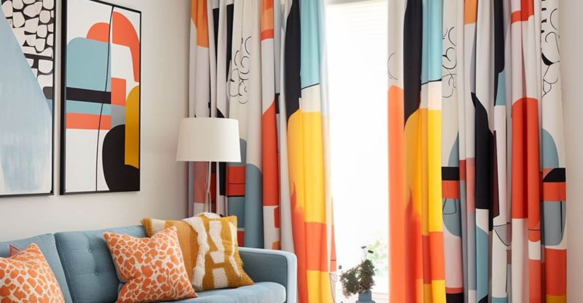
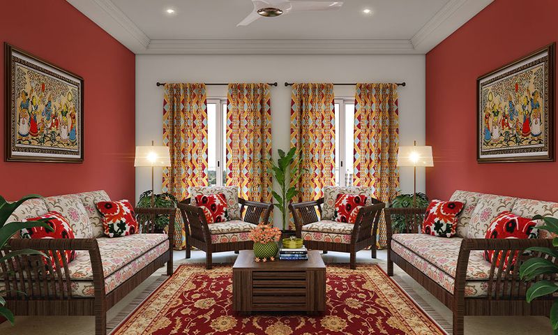
Successful printed curtains should contain at least one or two colors already present in your room. This creates that satisfying visual connection that makes everything feel harmonious rather than jarring.
2. Consider Your Room’s Style
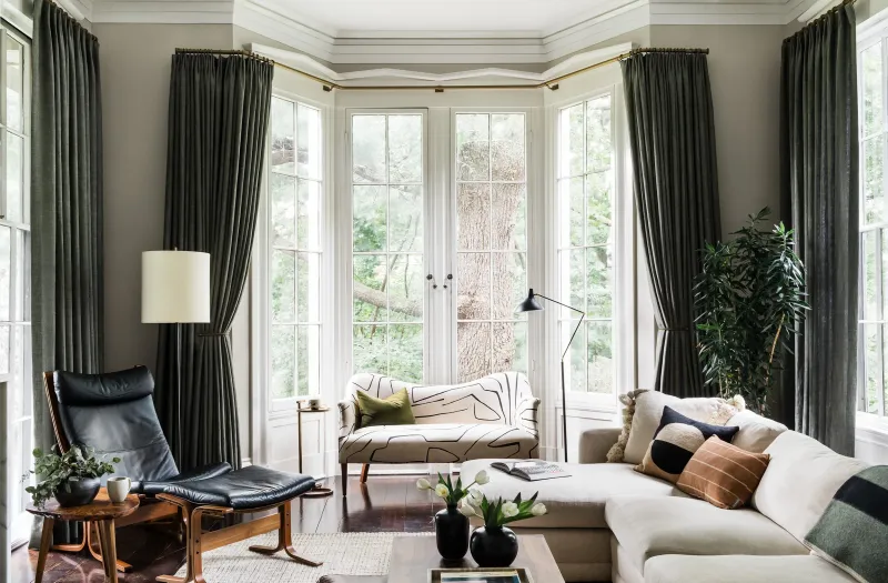
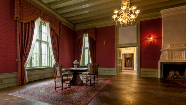
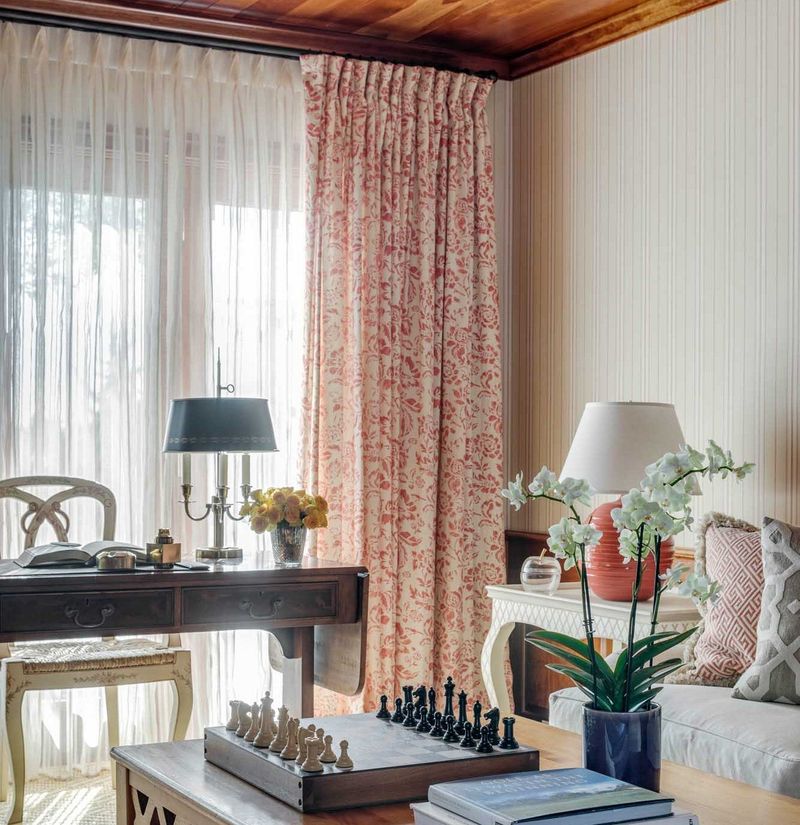
What’s the vibe of your space? Modern minimalist rooms pair beautifully with geometric or abstract prints, while traditional spaces often sing with floral or damask patterns.
Farmhouse styles welcome gingham or toile prints. Your curtains should speak the same design language as your furniture and accessories for a cohesive look that feels intentional.
3. Measure Scale Against Room Size
Tiny patterns can get lost in spacious rooms, while oversized prints might overwhelm smaller spaces. Like Goldilocks, you’re looking for something just right!
Generally speaking, larger rooms can handle bolder, bigger patterns. Petite spaces often benefit from smaller, more delicate prints that don’t dominate the visual landscape of your limited square footage.
4. Test Pattern Visibility From Different Angles
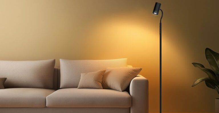
Grab some fabric samples and view them from various positions in your room. How does morning light affect the pattern? What about evening lamplight?
Some prints change dramatically depending on lighting and distance. A pattern that looks perfect up close might appear as a blur from across the room, or a subtle print might wash out completely in bright light.
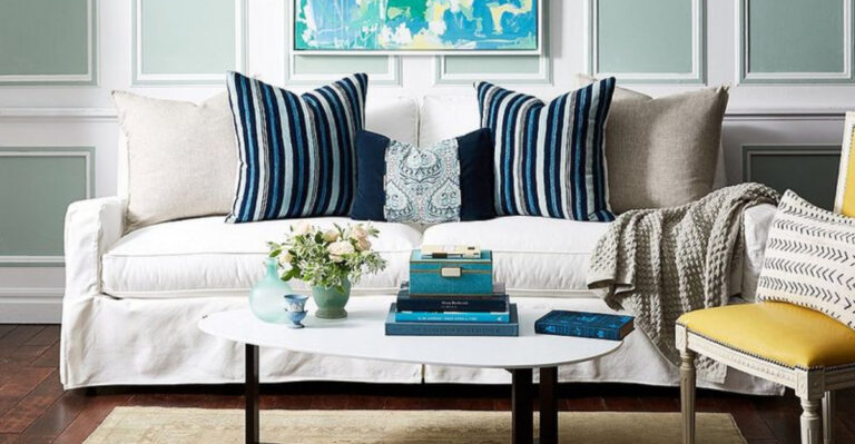
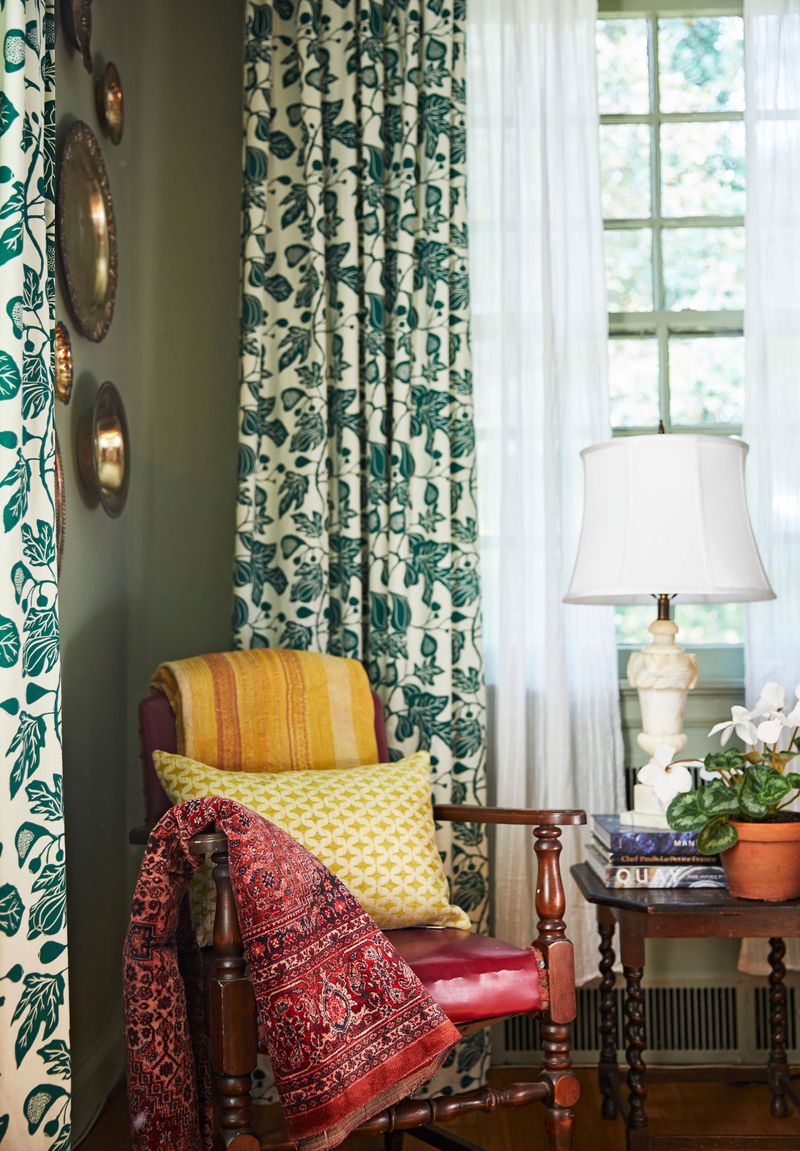
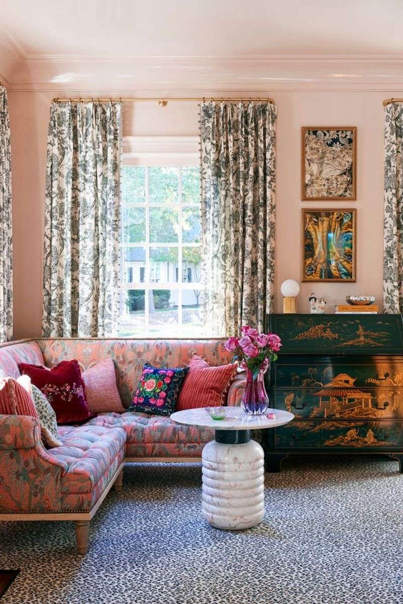
5. Balance With Existing Patterns
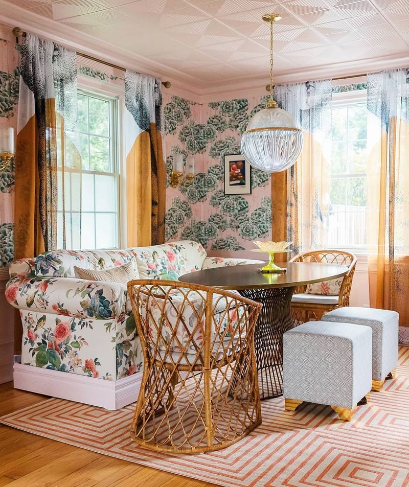
Already have patterned furniture or wallpaper? The secret to mixing patterns successfully lies in varying their scale and type.
If your sofa features large florals, consider curtains with smaller geometric shapes. When combining patterns, try to maintain a common color thread between them. This creates visual harmony even when the patterns themselves differ dramatically.
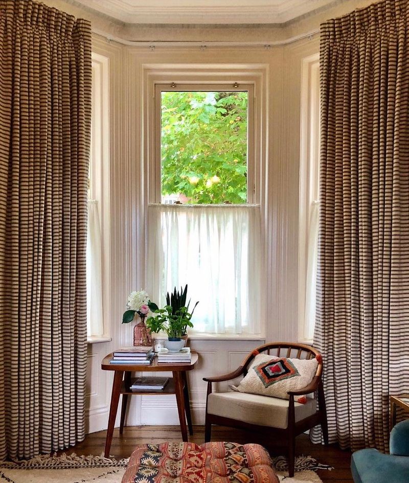
6. Evaluate Pattern Direction
Vertical patterns can make your ceilings appear higher, while horizontal designs can visually widen your space. Clever, right?
Consider what your room needs most. Tight quarters might benefit from the illusion of extra height that vertical stripes provide. Alternatively, a narrow room could feel more balanced with a horizontally-oriented pattern drawing the eye outward.
7. Match Print Formality To Room Function
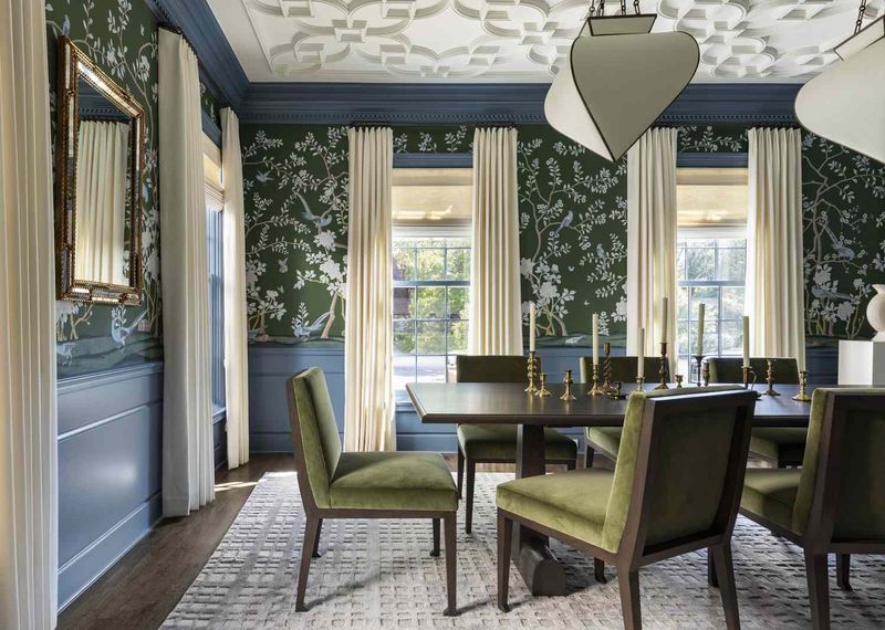
Whimsical cartoon prints might charm in a playroom but would feel out of place in a formal dining area. Think about who uses the space and for what purpose.
Formal rooms often call for sophisticated damasks or subtle geometrics. Casual living spaces can handle more playful, relaxed patterns. Your curtain print should reflect both your personality and the room’s intended atmosphere.
8. Check Print Alignment With Window Shape
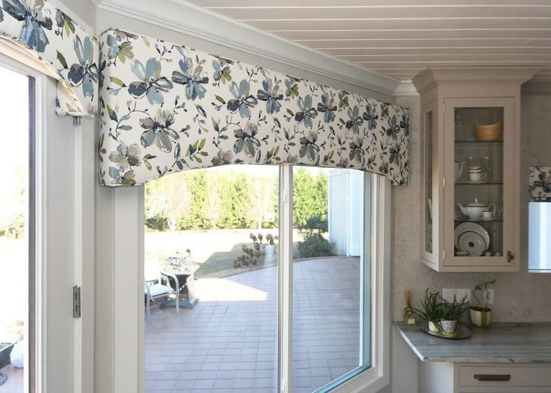
Arched windows look stunning with curved patterns that echo their shape. Similarly, angular window frames can be emphasized with geometric prints that complement their lines.
The relationship between your window’s architecture and your curtain pattern creates a subtle but impactful design connection. When these elements speak to each other, the result feels intentionally designed rather than randomly assembled.
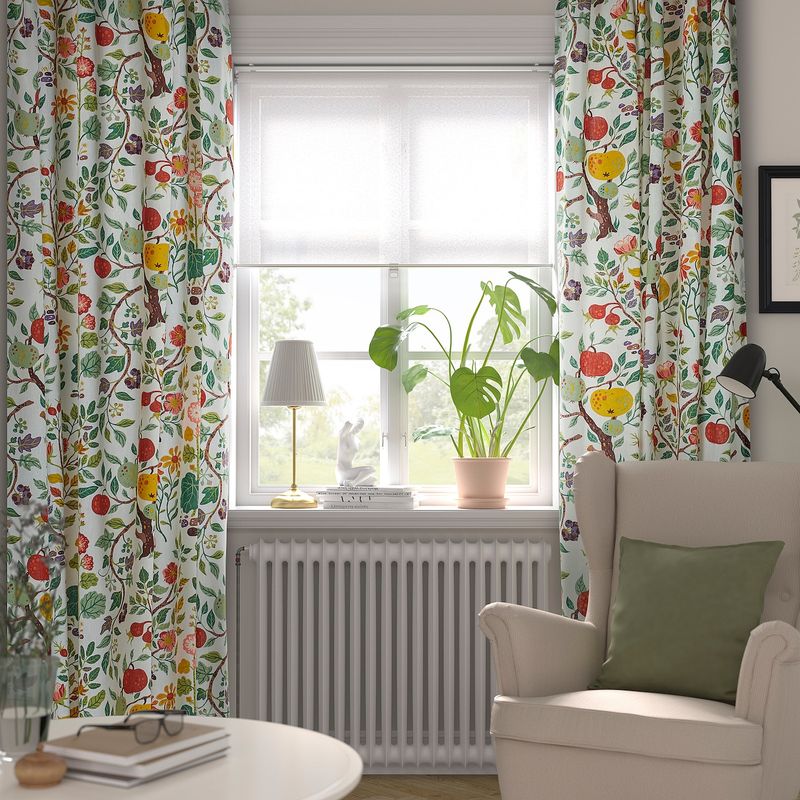
9. Assess Pattern Seasonality
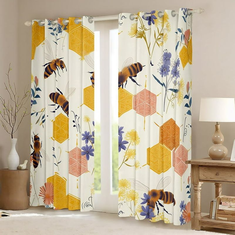
Heavy brocades and dark prints can feel cozy in winter but stifling come summer. Are you willing to switch your curtains seasonally?
If not, aim for prints with year-round appeal. Botanical patterns often work well across seasons, as do abstracts in colors that transition nicely from warm to cool months. Consider how your chosen print will feel during different times of the year.
10. Factor In Pattern Maintenance Requirements
Some prints hide dust and small stains better than others. Got pets or kids? This practical consideration shouldn’t be overlooked!
Darker patterns with varied colors tend to be more forgiving than light, solid backgrounds. Multi-colored prints can mask the occasional spot until laundry day. Balance your love for a particular pattern with the realities of your household’s lifestyle.
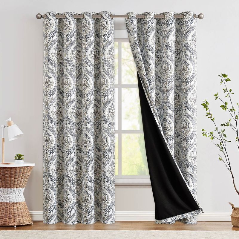
11. Determine If Pattern Matches Both Sides Of Fabric
Imagine the disappointment of installing gorgeous printed curtains only to discover they look plain from outside! Many printed fabrics only feature patterns on one side.
For maximum impact, look for curtains with patterns visible from both interior and exterior views. Alternatively, consider if the solid reverse side matches your home’s exterior color scheme for a cohesive look from all angles.
12. Examine Pattern Repeat Frequency
Ever noticed how some patterns seem to flow seamlessly while others feel choppy? That’s all about the repeat frequency.
Large-scale patterns with widely spaced repeats create dramatic focal points but may be cut off awkwardly depending on your window size. Smaller, more frequent repeats distribute pattern more evenly across your curtains and are often more forgiving during installation.
13. Request Fabric Samples Before Committing

Colors on screen rarely match reality perfectly. Smart decorators always test samples in their actual space before making the final purchase.
Pin fabric swatches near your window and observe them at different times of day. How does the pattern look in morning light versus evening? Does it complement your wall color and furniture as expected? This small step prevents costly disappointments.
14. Consider Pattern Visibility When Curtains Are Open
Curtains spend much of their life pushed to the sides of windows. How will your chosen pattern look when bunched or folded?
Some intricate designs become unrecognizable when gathered, while bold stripes or large motifs remain identifiable. Consider how much of the pattern will be visible in both open and closed positions to ensure you’ll enjoy the look regardless of functionality.
15. Evaluate Pattern Impact On Room Lighting
Dark, densely printed curtains can significantly reduce natural light flow, even when sheer. Is maintaining brightness important in your space?
Light-colored backgrounds with scattered patterns allow more sunshine to filter through. If you’re decorating a naturally dim room, consider how your pattern choice might affect the overall luminosity and ambiance of your space throughout the day.
16. Coordinate With Future Decor Plans
Planning to redecorate other elements soon? Your curtain pattern should harmonize not just with your current decor but with your future vision too.
If you’re gradually transitioning from traditional to modern style, choose a print that bridges both worlds. Curtains represent a significant investment, so select patterns versatile enough to survive your evolving taste and upcoming furniture purchases.
17. Trust Your Personal Connection To The Pattern
Sometimes design rules matter less than how a pattern makes you feel. Does the print bring you joy every time you see it?
Your emotional response to a pattern often indicates whether it truly reflects your personal style. Even if a print breaks conventional design wisdom, if it consistently makes you smile or creates the atmosphere you desire, it deserves serious consideration.