The Entire Street Will Be Jealous Of This Ultra Cool Container House
I’m so happy those old times are over when half of my neighborhood was a middle class with normal homes, and the other half was posh and expensive.
Differences between people still exist, but we’re united by the taste for nice homes. Today, everyone can create a beautiful home.
If you work smart, you too can have that expensive house on the block, the envy of the neighborhood.
How?
Well, a container is always much cheaper than a brick house, isn’t it?
The Envy Of The Neighborhood
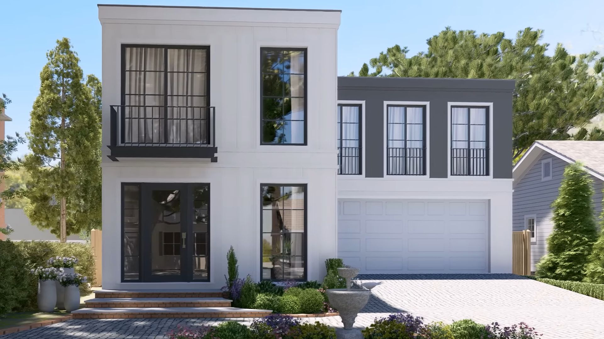
Do you know that house in the neighborhood, the modern one that only rich folks were able to afford? Yeah, we all had that house nearby while growing up.
Fortunately, we now live in a time when people can afford lovely, decent homes since the market is nicely supplied with… everything. Rarely does anyone have that house from the beginning in their neighborhood.
Let’s stop for a moment and imagine we found one. It’s modern, it’s on two stories, and it’s got amenities all the neighborhood kids would bawl their eyes out to see.
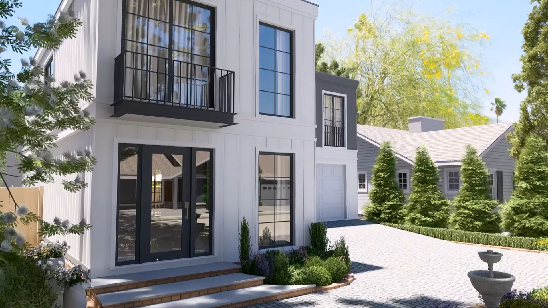
This anthracite grey and white building with a flat roof is the one!
And, it’s hiding a surprise: it was built using shipping containers!
That One Neighbor With The Pool
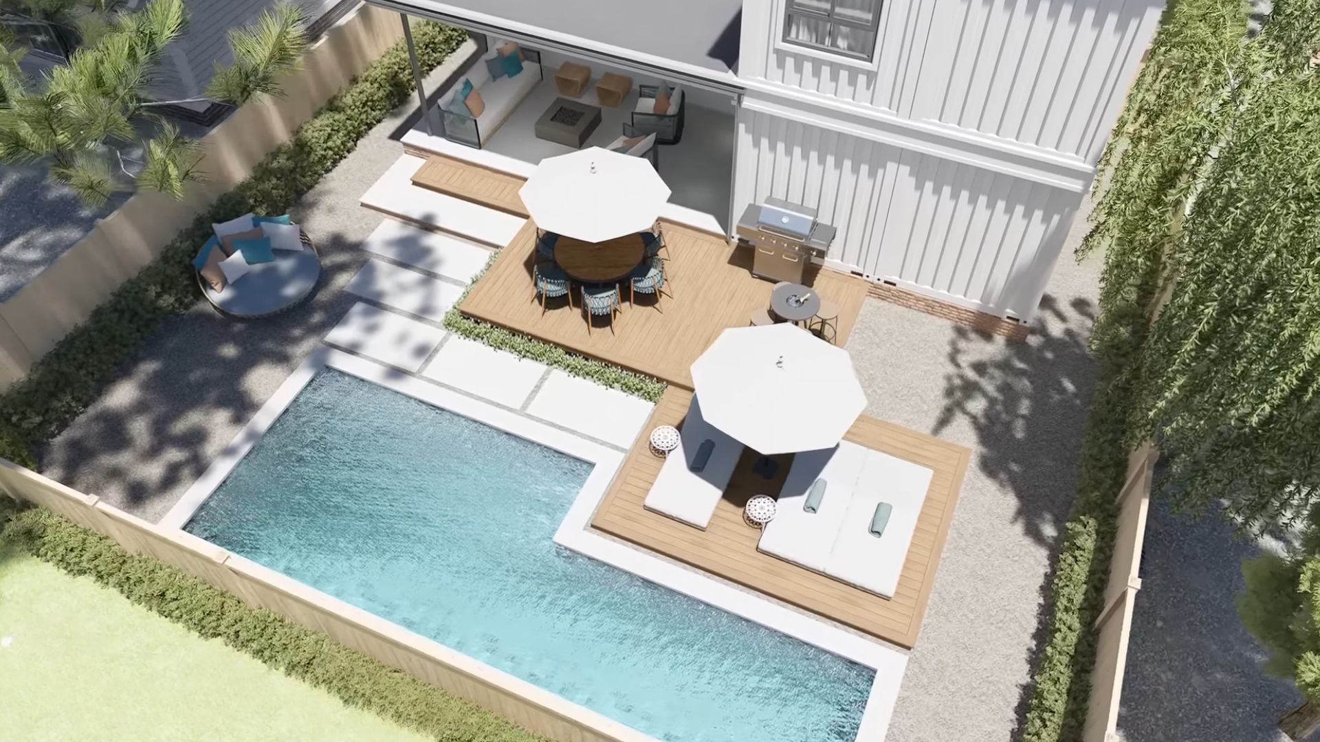
There was always that one kid in the block whose house had a pool. And we all secretly begged the Lord to come over and hang out at the said pool. Some were lucky enough to be best friends with that kid. And some were just occasional visitors.
I remember one summer when it was super hot, and I was so sad my family didn’t own a pool. Kids, right?
Pool Is A Must
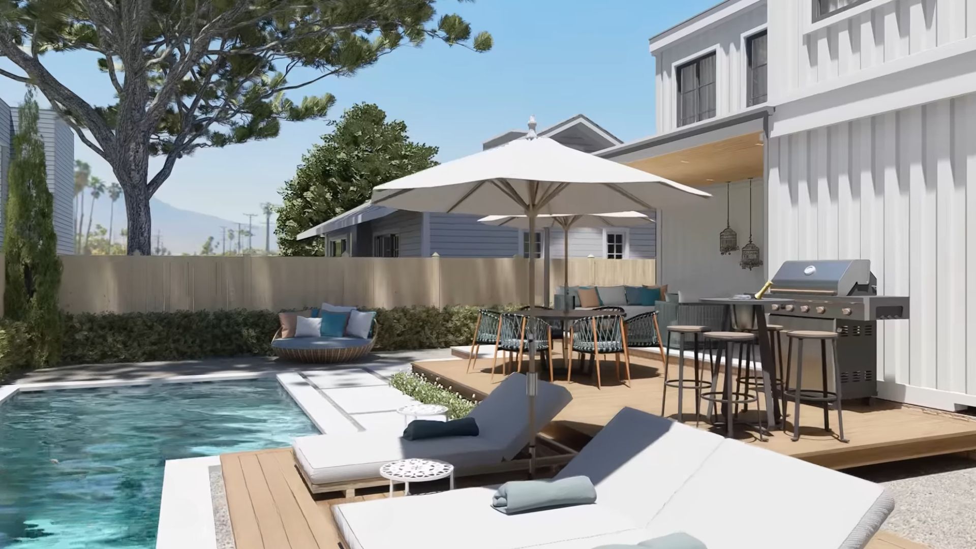
Today, it’s completely normal for a house to come with a pool, a lounge zone and everything.
I can justify this pool by saying the cost of building a container house isn’t as high as building a traditional house. So, there’s room to spare money and channel it into a pool build.
This modern house comes with a nice pool and something I love even more now that I’m a grown-up: a terrace with lots of shade and a grill! Priorities change after you stop being a teen.
Modern Elegance As The Safest Choice
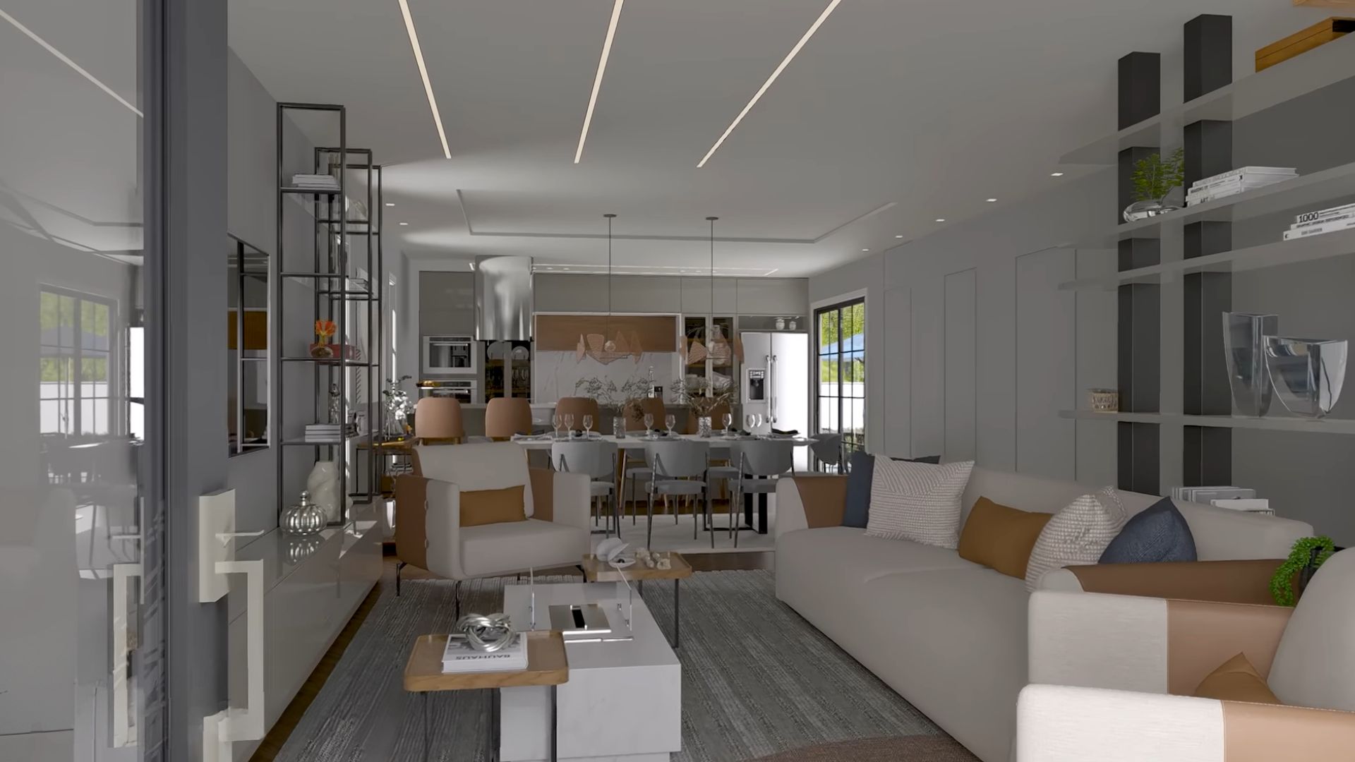
Of course, I was expecting an open concept inside! What else? Do we really need to build walls we don’t need? Open-concept is so much better than the separate rooms we used to build thirty years ago.
As soon as you step inside the house, you’re greeted by the simplicity of colors and lines. The living room part features bright furniture with earthy brown details on throw pillows and on the sides.
The combination of three elements as a coffee table is the effective centerpiece this part of the house needs. It’s a place where you tuck your feet under you, grab a cup of whatever you love to drink, and enjoy the clean style around you.
Dine Like The Great Ones
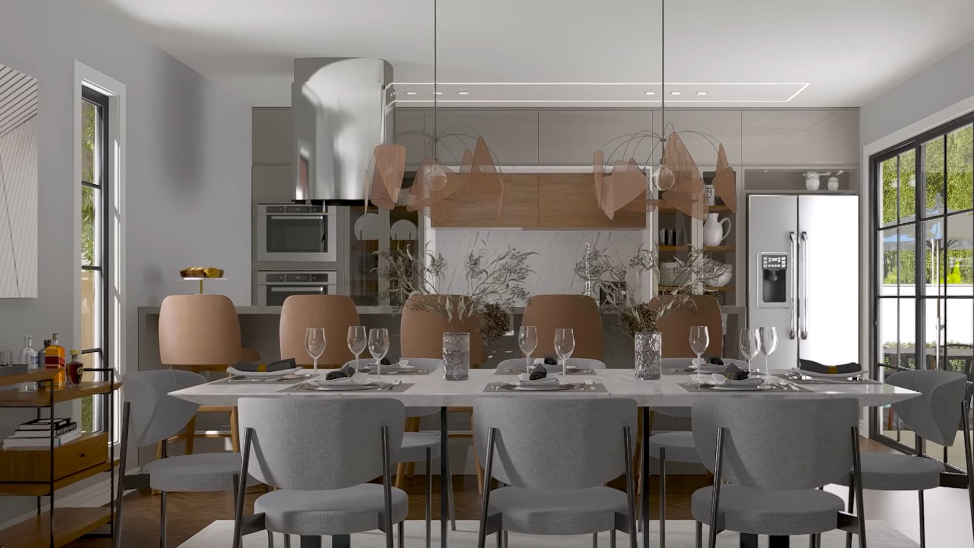
The combination of living room dining room, and kitchen, precisely in that order, works great every time. You have your kitchen way in the back so no one bothers you and you don’t bother anyone while you’re cooking.
The dining table with eight chairs is a place where fancy dinner parties happen and you know you have to host one ASAP. I love the style of these grey dining chairs. They border with industrial, but thanks to their shape, they’re still modern and elegant.
My favorite piece so far has to be the two light fixtures above the dining table. They add a dash of romance into a room that almost seems a bit too modern.
How Big Kitchen You Want? Yes.
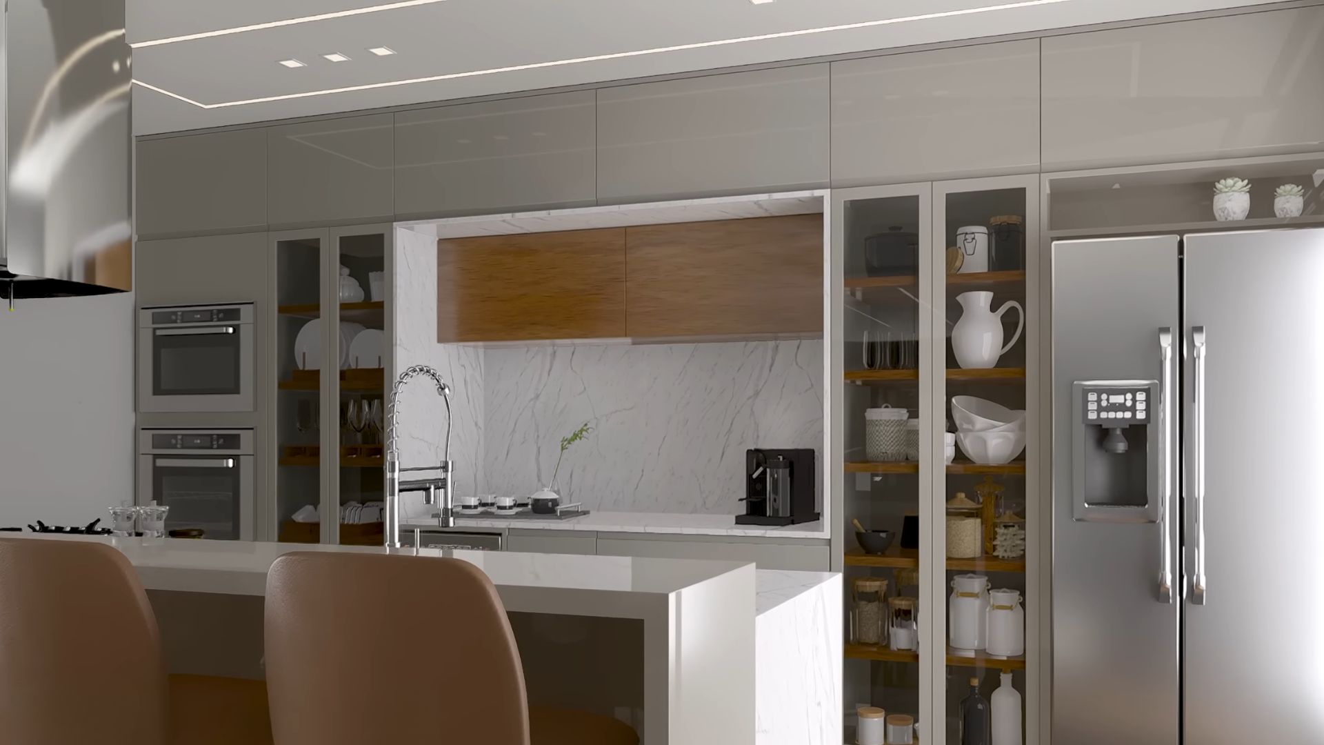
Yeah, that’s the only logical answer. A big kitchen, taking up the entire back wall was the only option. Combined with a kitchen island and a breakfast counter by it, this part of the house is grandiose. A whole new world!
The kitchen is a combination of white and a lovely light grey, with occasional wooden elements such as the shelves or the cabinets in the middle. Although kitchen appliances take up lots of space, the symbiosis of the fridge and double ovens with glass cabinets is incredible.
Technically, it’s not a huge kitchen in terms of cupboards, but it is large thanks to all the things that it in here.
I love this unique unity of a kitchen and I know every housewife in the area would feel jelly they can’t cook in here.
Half, But Enough
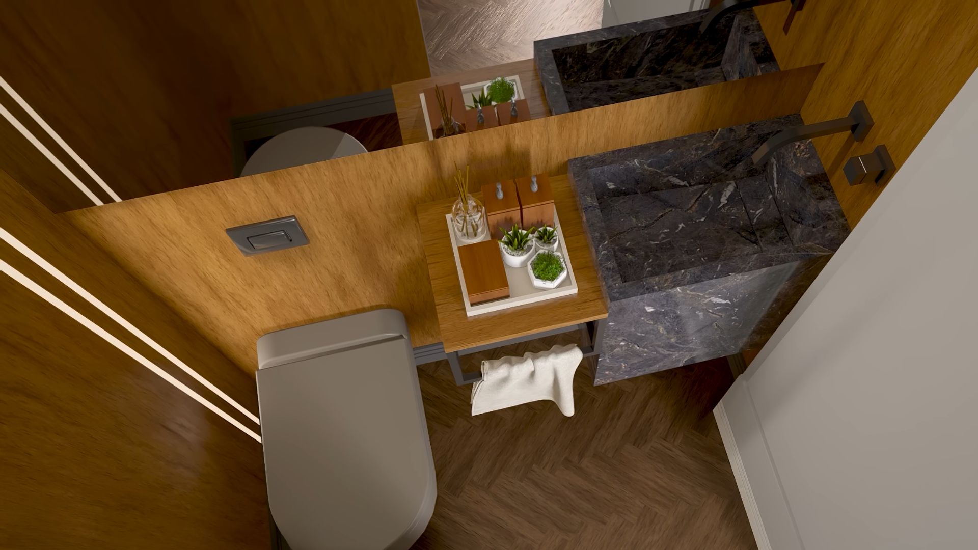
The ground floor is reserved for guests, hence the half bathroom we have here.
There’s really not much to say about this toilet other than how beautiful the woodwork is here. The fishbone wooden floor and the smooth wall siding make this simple toilet a work of art.
Guests will love using this bathroom and you’ll love the many compliments you’ll get for having it.
Cleanest Form Of Simplicity
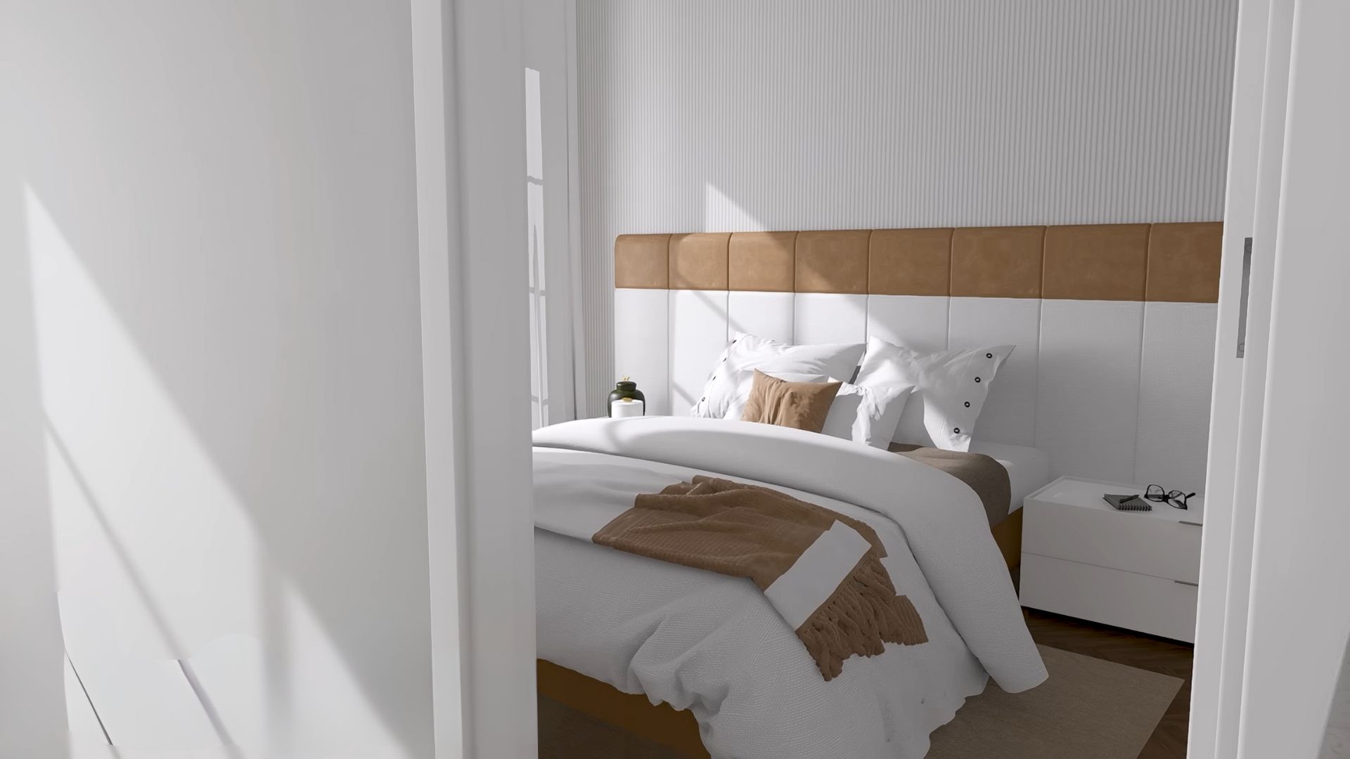
For me, the main focus of the bedroom should be on comfort. A nice, cozy bed with a good mattress and a high-quality bedding is all you need.
Personally, I don’t like too many things in the room where I sleep. I don’t like overcrowding. Give me a simple, cleanest form of simplicity, and I’ll be happy.
The same goes for combining colors in bedrooms. It’s a place where you relax, so no hypnotic patterns and detailed wallpapers. A white and creamy brown combination like the one in this bedroom will do.
Is it just me or does the headboard look like a box of chocolate and vanilla ice cream? The reason to love this bedroom even more!
Is There Something Behind The Bed?
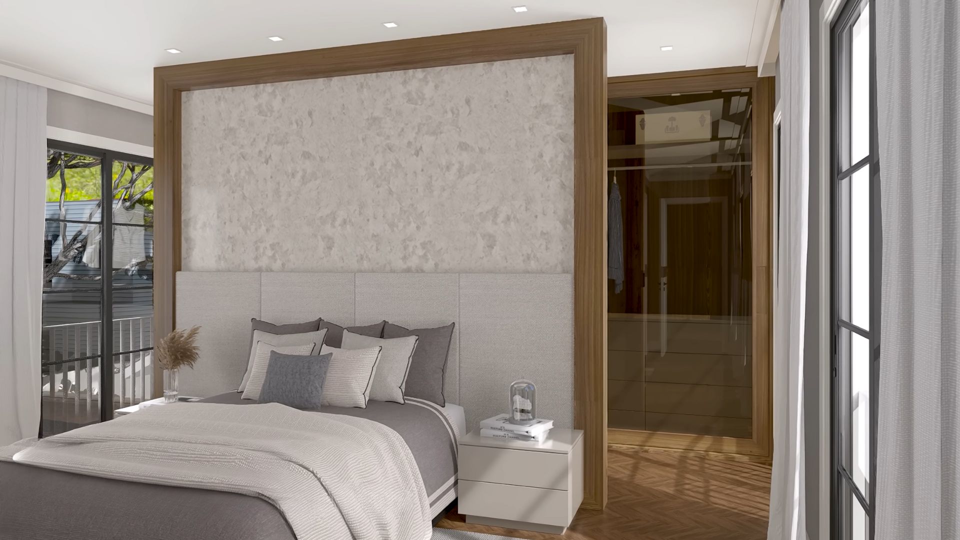
Ure, the bed is nice and looks comfortable, but that’s not what I’m wondering about. As one of four bedrooms in this container house, this is the only one that comes with a surprise you’re gonna love.
See something with a glass door on the right? That’s actually a part of the glass closet behind the bed, an innovation that makes you want this bedroom all for yourself.
Ah, such a better decision than the regular wooden closet in the corner!
Going ‘Round The Room
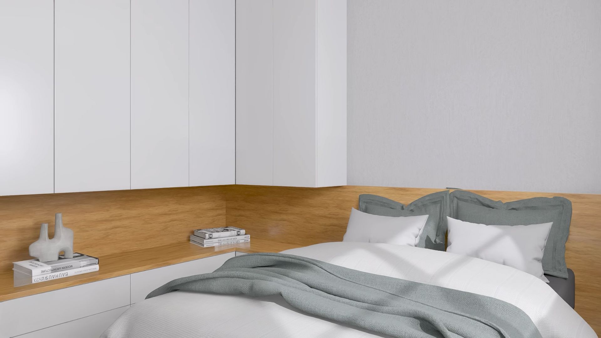
As you may notice, all four bedrooms have simple beds and simple bedding. There’s nothing too special about them.
Still, the designer found a way to make something special in every room.
In the third bedroom, the closet is a normal closet… almost! Well, it does stop at the middle and continues as bottom counters. The middle parts are reserved for some work surfaces or shelves and as a nightstand.
How neat is this idea? I’d trade my regular nightstand for this now.
You’ll Love The Upgraded Beadwork
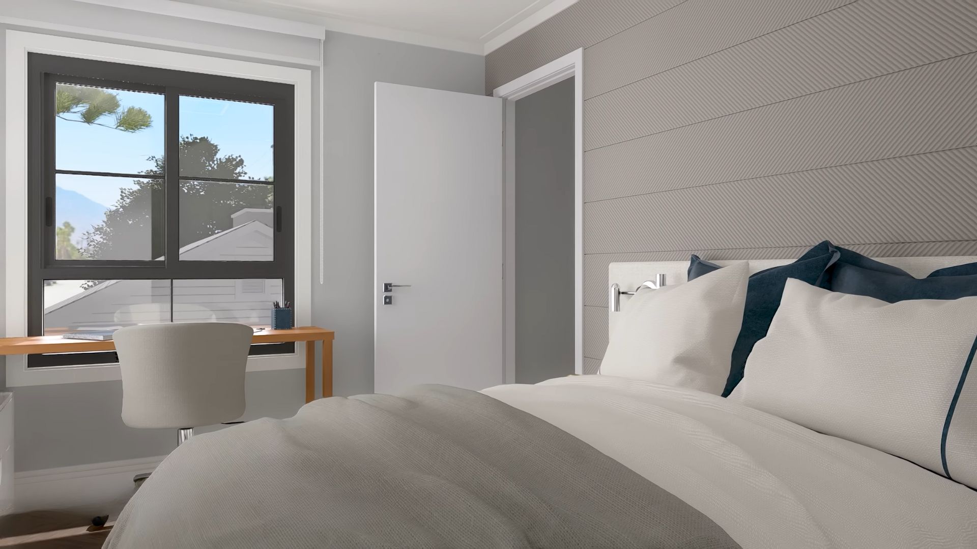
The extra part in the last bedroom is something you probably didn’t expect.
At first glance, there’s a bed and a desk by the window, nothing special. However, zoom in, sharpen your sight, and tell me what you see above the bed.
It’s beadwork, texturized one, and it’s absolutely beautiful!
Simple details like this one can make such a difference and add a luxurious touch to the room.

