We Asked 10 Interior Designers Which Colors Always Work In A Pantry (These Shades Came Out On Top)
I used to think pantry color didn’t matter, it’s just where the snacks live, right? But after painting mine on a whim, I was shocked by how different it felt.
The right color made it look cleaner, brighter, and somehow more organized, even when it wasn’t. Turns out, designers have strong opinions on pantry paint too, and their go-to shades are far from boring.
Whether you’re giving your kitchen a refresh or just tired of staring at dull shelves, these expert-approved colors might be the secret to making your pantry feel surprisingly pulled together.
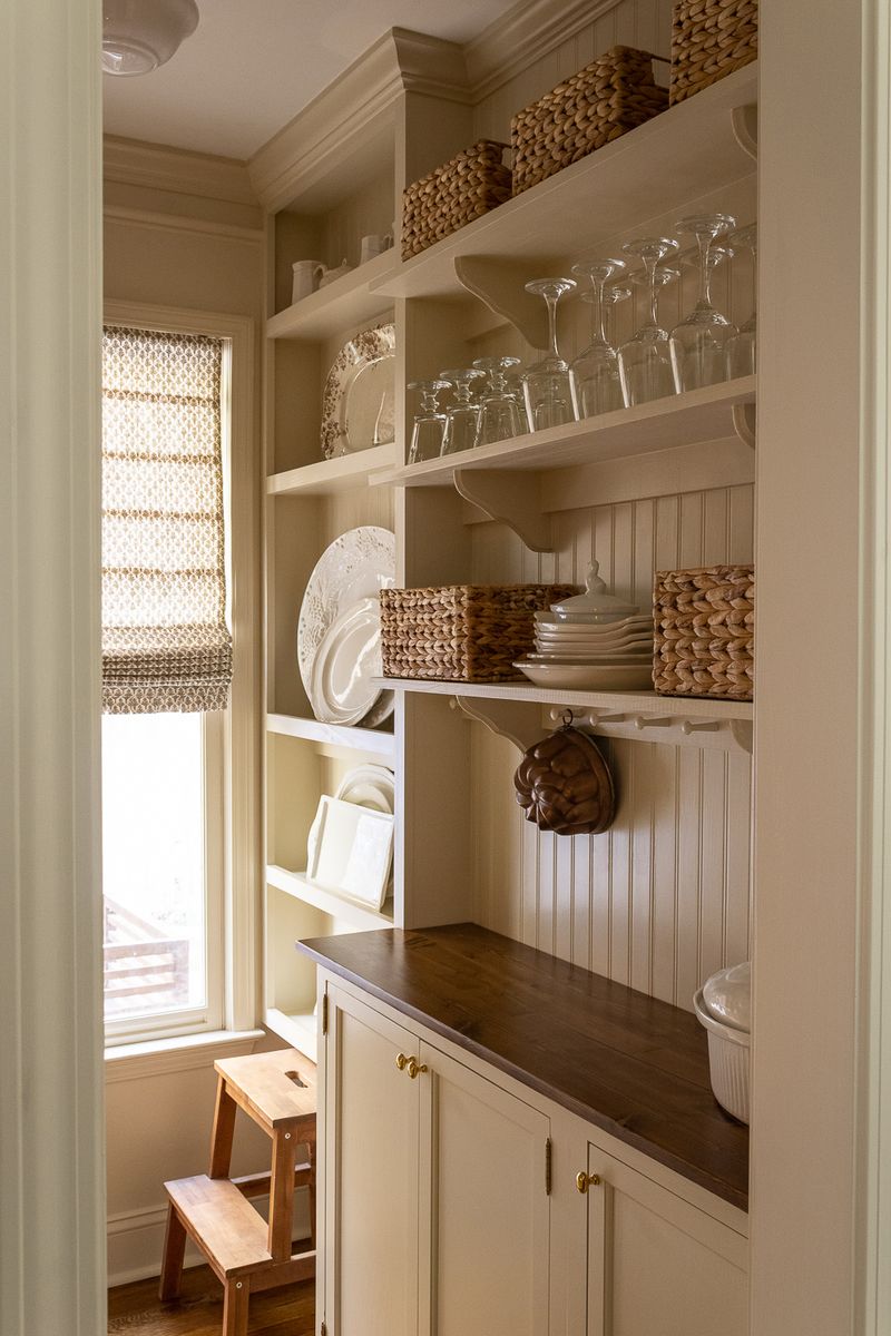
1. Crisp White
White remains the undisputed champion of pantry colors according to designer Emma Rodriguez. She swears by Benjamin Moore’s ‘Simply White’ for its clean look without harsh brightness.
Food packaging already brings plenty of color, so a white backdrop creates visual calm in what could otherwise be a chaotic space. Plus, white instantly reveals any spills or crumbs, encouraging you to keep things tidy.
Rodriguez adds that white pantries photograph beautifully for those Instagram-worthy kitchen moments.
2. Sage Green
Designer Marcus Chen champions sage green as the unexpected pantry hero. This muted, earthy tone brings the outdoors inside while hiding dust better than lighter options.
Sage pairs wonderfully with wooden shelving and wicker baskets, creating a farmers market vibe that makes even canned goods feel artisanal. Chen recommends Farrow & Ball’s ‘Lichen’ for its depth that changes subtly throughout the day.
Bonus point: studies suggest green hues can psychologically promote healthier food choices!
3. Butter Yellow
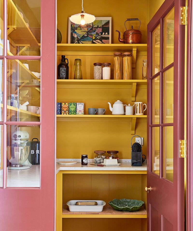
Yellow brings sunshine to windowless pantries, according to designer Sophia Williams. She loves Sherwin-Williams ‘Butter Up’ for its cheerful glow without veering into overwhelming brightness.
Yellow has practical benefits too. The warm undertones make packaged foods look more appetizing while masking inevitable food stains better than cooler colors.
Williams jokes that yellow pantries might actually encourage cooking because they feel so inviting. One client reported spending more time meal planning after their yellow pantry makeover!
4. Navy Blue
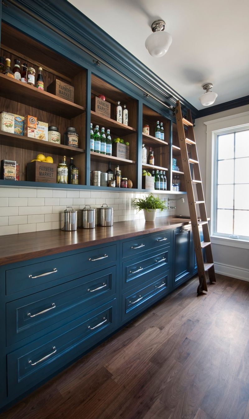
Navy blue creates unexpected drama in pantries, says designer Jackson Moore. Unlike conventional wisdom suggesting dark colors shrink spaces, navy actually recedes visually when paired with proper lighting.
Moore recommends Benjamin Moore’s ‘Hale Navy’ with brass hardware and under-shelf lighting. The contrast makes labeled containers pop dramatically against the deep background.
Fun fact: Navy conceals smudges brilliantly, making it surprisingly practical for high-traffic food storage areas where sticky fingers might touch walls.
5. Soft Gray
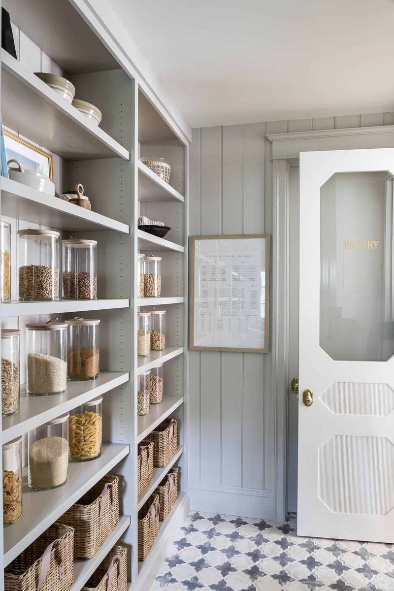
Gray offers the perfect middle ground between stark white and statement colors, according to designer Olivia Taylor. Her pick is Behr’s ‘Silver Drop’ for its chameleon-like quality that shifts between warm and cool depending on lighting.
Gray creates a neutral canvas that lets your food packaging shine without competing. Taylor notes that clients report their pantries feel instantly more organized after switching to gray.
The practical perk? Gray hides scuffs from moving items in and out, requiring less frequent touch-ups than pristine white.
6. Terracotta
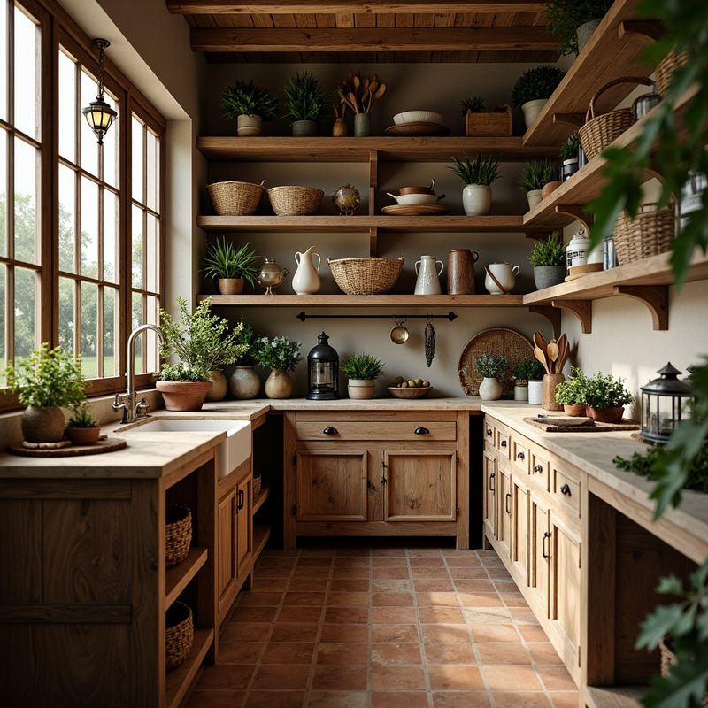
Designer Rafael Mendez brings Mediterranean warmth to pantries with terracotta tones. This earthy orange-brown creates a rustic feel that transforms mundane food storage into an old-world experience.
Mendez pairs Sherwin-Williams ‘Cavern Clay’ with wooden shelving and woven baskets. The combination feels intentionally designed rather than merely functional.
Terracotta especially complements homes with global cooking styles, as the color evokes spice markets and clay cooking vessels from around the world.
7. Mint Green
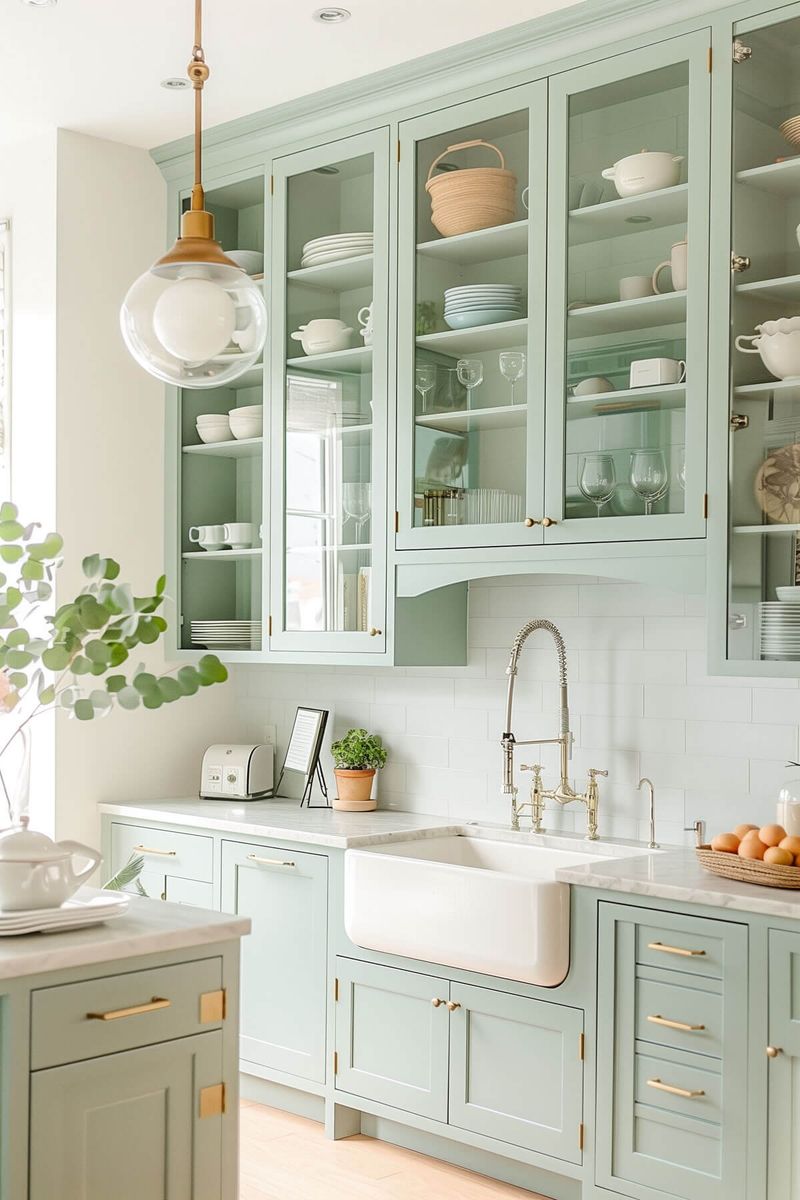
Mint green brings retro charm to modern pantries, according to designer Amelia Park. She loves how this playful pastel nods to vintage kitchens while feeling fresh and clean.
Park recommends Benjamin Moore’s ‘Fresh Mint’ paired with white shelving. The combo creates a subtle soda shop vibe that makes everyday ingredients feel special.
The psychological bonus? Mint green has cooling properties that subconsciously make pantries feel fresher, which Park says clients appreciate when storing perishables.
8. Charcoal With Contrast
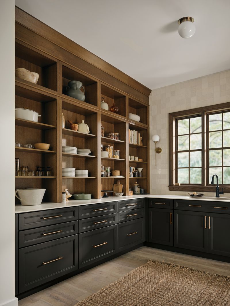
Designer Thomas Wilson pushes boundaries with nearly-black charcoal pantries. The secret? High contrast with bright white shelving and clear containers.
Wilson uses Farrow & Ball’s ‘Railings’ as his go-to dark shade. Against this dramatic backdrop, even ordinary pasta and cereal become artistic displays when stored in transparent containers.
Surprisingly practical too. Wilson notes that dark walls hide shadows in deep pantries where light struggles to reach corners, creating a more visually consistent space.
9. Pale Blue
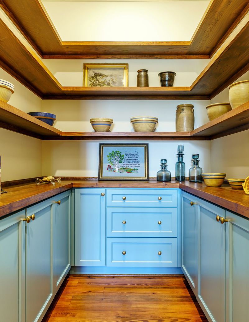
Pale blue creates optical illusions in pantries, says designer Grace Chen. This airy shade makes tight spaces feel more expansive while adding subtle personality.
Chen recommends Sherwin-Williams ‘Mild Blue’ for its barely-there quality that reads as a neutral from a distance. The color works magic in windowless pantries, mimicking daylight’s cool glow.
Her clients report feeling calmer when organizing pale blue pantries, perhaps because the shade subconsciously connects to clear skies and open spaces.
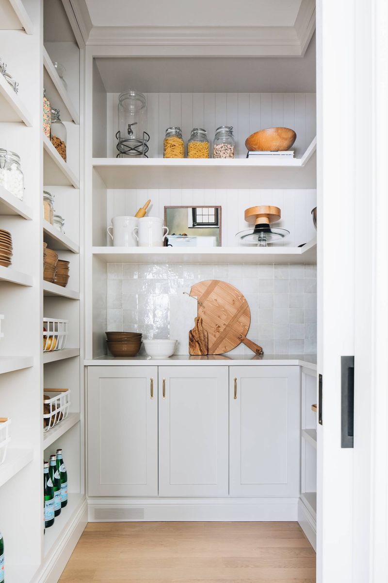
10. Warm Cream
Designer Elena Rodriguez champions warm cream for pantries as the perfect not-quite-white option. Her favorite is Benjamin Moore’s ‘Swiss Coffee’ for its subtle warmth without yellow undertones.
Cream softens the utilitarian nature of pantries, making them feel like intentional extensions of living spaces rather than mere storage. Rodriguez pairs cream walls with natural wood shelving for maximum coziness.
The practical advantage? Cream hides dust and minor stains better than stark white while maintaining that clean, bright feeling.