15 Colors To Never Pair With Blue According To Interior Designers (Plus 5 Even Worse Combinations)
Blue is hands-down one of my favorite colors to decorate with, it’s calming, classic, and goes with just about everything… or so I thought. Turns out, not every color plays nicely with blue, and I learned that the hard way after pairing it with a shade that totally clashed.
Interior designers have strong feelings about which hues shouldn’t share space with blue, and once you see the mismatches, you can’t unsee them.
Some combos just throw the whole room off balance. If you’re planning a color refresh, these are the pairings you’ll want to think twice about.
1. Neon Orange With Blue
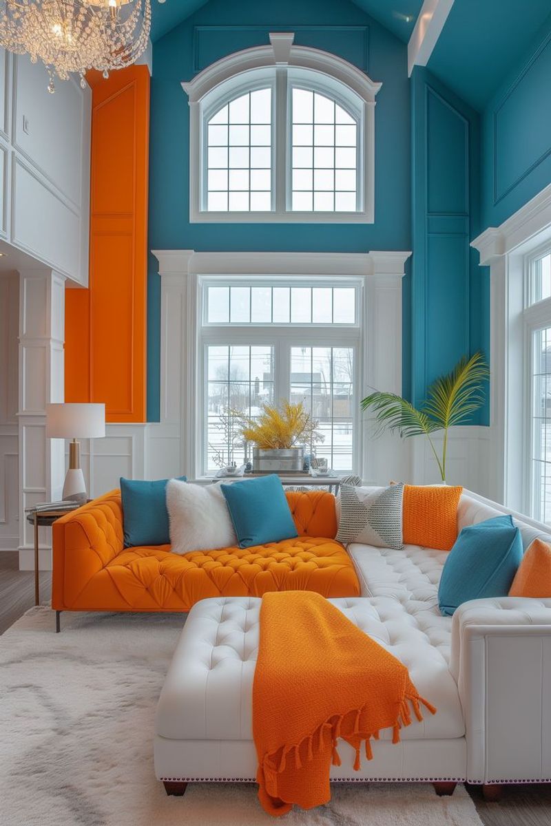
Neon orange screams for attention like a toddler in a grocery store checkout line. When paired with blue, it creates a visual assault that makes your eyes work overtime trying to process the clash.
Professional designers avoid this combo because it triggers headaches and makes spaces feel chaotic. The high contrast creates an unsettling energy that prevents relaxation.
Instead of neon orange, try coral or peach tones that complement blue without causing retinal damage.
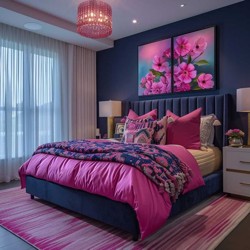
2. Hot Pink And Blue Together
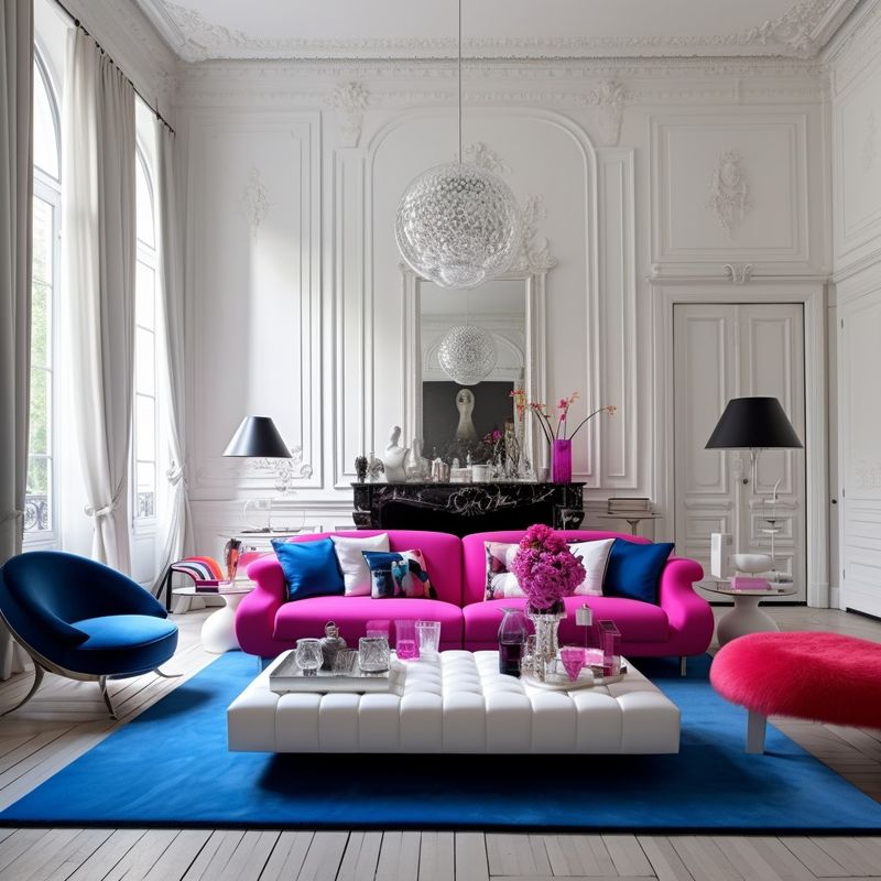
Hot pink thinks it’s the star of every show, demanding center stage wherever it goes. Against blue backgrounds, this diva color creates a combination that feels more like a cotton candy explosion than sophisticated design.
The pairing reminds most people of children’s toys or carnival prizes rather than adult living spaces. Both colors fight for dominance, creating visual tension that makes rooms feel juvenile.
Soft blush or dusty rose work beautifully with blue instead of this aggressive pink.
3. Lime Green With Blue Walls
Lime green bounces off walls like a hyperactive ping pong ball, especially when blue tries to contain its energy. This combination feels like mixing tropical vacation vibes with ocean depths, creating confusion about the room’s intended mood.
The clash happens because both colors are so saturated they compete rather than complement each other. Rooms end up feeling like they can’t decide between being energetic or calming.
Forest green or sage creates harmony with blue while maintaining that natural feel.
4. Bright Yellow Against Blue
Bright yellow acts like that friend who talks too loudly at restaurants, overwhelming everything around it. When blue tries to balance this sunny screamer, the result looks more like a sports team uniform than a cohesive design scheme.
The combination creates such high contrast that it can trigger eye strain and make people feel agitated rather than comfortable. Professional designers know this pairing works better in logos than living rooms.
Soft butter yellow or cream provides warmth without the visual shouting match.
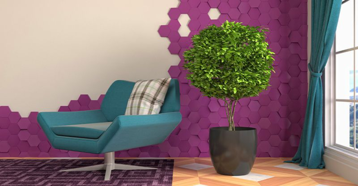
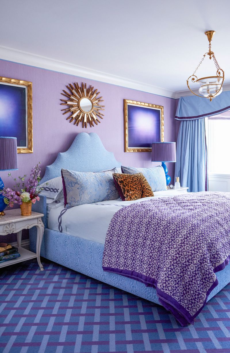
5. Purple And Blue Combination
Purple and blue are like distant cousins who look too similar to hang out comfortably together. Both colors share red undertones, but when combined, they create a muddy, bruised appearance that lacks clarity.
The pairing often results in spaces that feel heavy and oppressive rather than fresh and inviting. Colors blend together instead of creating distinct zones, making rooms feel smaller and more confined.
Choose either purple or blue as your main color, then add neutral accents for better balance.
6. Red And Blue Pairing
Red and blue together scream patriotic themes louder than a Fourth of July parade. Unless you’re decorating a themed restaurant or sports bar, this combination feels more appropriate for campaign headquarters than comfortable homes.
Both colors are so strong they create visual competition that makes spaces feel aggressive rather than welcoming. The high contrast can be overwhelming for daily living, causing eye fatigue and restlessness.
Try burgundy or wine red with blue for a more sophisticated approach to this classic pairing.
7. Turquoise With Navy Blue
Turquoise and navy create a blue overload that makes rooms feel like they’re drowning in a single color family. While both are beautiful individually, together they lack the contrast needed for visual interest.
The combination often results in spaces that feel flat and one-dimensional rather than dynamic and engaging. Without enough color variation, rooms can feel boring and lack personality.
Add warm neutrals like cream or soft gray to break up the blue monotony and create depth.
8. Fluorescent Green And Blue
Fluorescent green glows like a highlighter marker, creating an artificial appearance that clashes horribly with blue’s natural coolness. This combination feels more suited to emergency exit signs than comfortable living spaces.
The pairing creates such an unnatural look that it can make people feel uncomfortable or anxious in the space. Both colors are so intense they create visual chaos rather than harmony.
Natural green tones like olive or eucalyptus work much better with blue for a calming, organic feel.
9. Magenta With Blue Accents
Magenta struts around like it owns the place, demanding attention with its bold, almost electric presence. Against blue, this color creates a combination that feels more like a neon sign than sophisticated interior design.
The pairing often triggers headaches because both colors are so saturated they create visual stress. Rooms end up feeling more like nightclub interiors than comfortable homes where people want to relax.
Soft rose or mauve tones provide pink accents without the aggressive visual impact of magenta.
10. Chartreuse And Blue Walls
Chartreuse dances between yellow and green like it can’t make up its mind, creating confusion when paired with blue’s steady presence. This unusual combination feels more experimental than practical for everyday living.
The pairing often makes spaces feel unstable or unsettled because the colors don’t share enough common ground to create harmony. Rooms can feel like they’re trying too hard to be different rather than simply beautiful.
Stick with traditional greens or yellows that have clearer relationships with blue for better results.
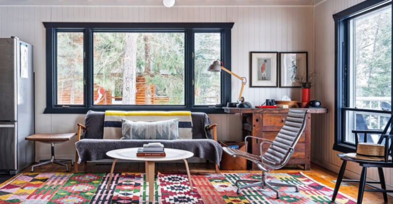
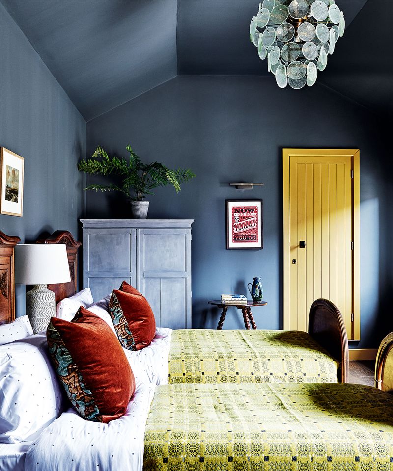
11. Brown And Blue Together
Brown and blue together feel like a throwback to 1970s decor that should stay buried in design history. This combination often creates spaces that feel heavy, dated, and lacking in freshness or contemporary appeal.
The pairing can make rooms feel masculine to the point of being unwelcoming to others. Both colors are so grounded they create an atmosphere that feels more like a man cave than a shared living space.
Try gray or cream instead of brown to create a more modern, balanced look with blue.
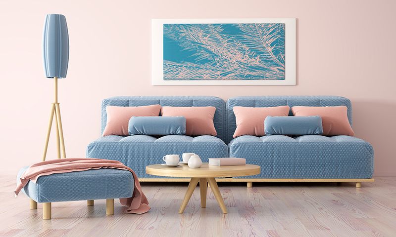
12. Coral Pink With Blue
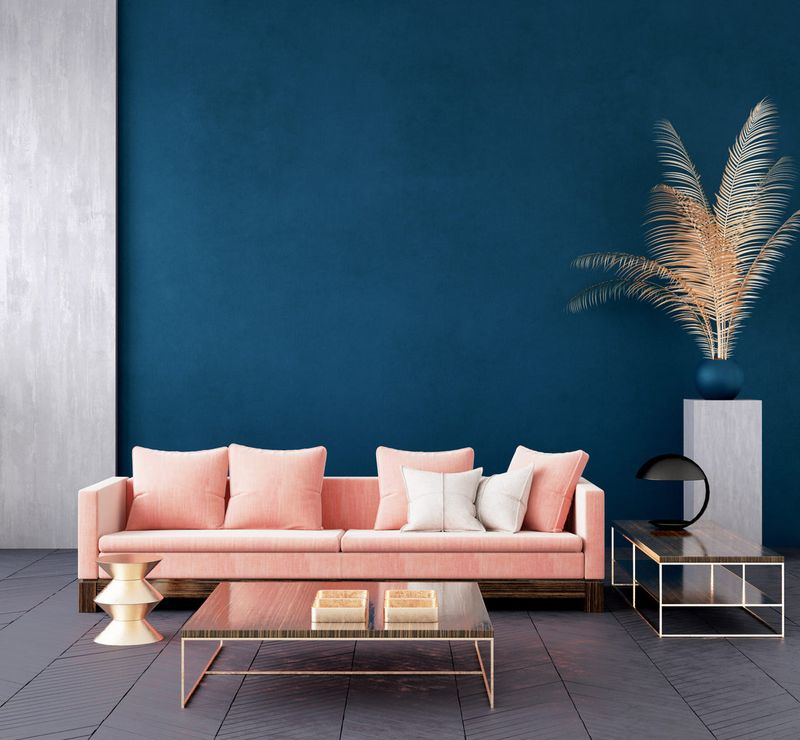
Coral pink tries to be the sweet, approachable cousin of hot pink, but against blue it creates a combination that feels more like a children’s nursery than an adult space. The pairing often results in rooms that feel overly sweet or juvenile.
While less aggressive than hot pink, coral still competes with blue for attention in ways that create visual tension. The combination can make spaces feel more appropriate for young children than sophisticated adults.
Soft peach or cream tones provide warmth without the childlike associations of coral pink.
13. Teal And Royal Blue
Teal and royal blue create a blue family reunion that nobody asked for, resulting in spaces that feel confused about their color identity. Both colors are beautiful alone but together they create muddy, unclear combinations.
The pairing lacks the contrast needed to create visual interest, making rooms feel flat and one-dimensional. Without enough variation, spaces can feel boring and lack the energy that comes from thoughtful color contrast.
Choose one blue tone as your main color and add neutral or warm accents for better balance.
14. Lavender With Blue Tones
Lavender whispers sweetly but gets lost when blue joins the conversation, creating a combination that feels wishy-washy rather than intentional. Both colors are so soft they blend together without creating clear definition.
The pairing often results in spaces that feel unclear or indecisive about their color direction. Rooms can end up feeling more like they happened by accident rather than being thoughtfully designed.
Choose either lavender or blue as your main color, then add crisp white or cream for clarity and definition.
15. Mustard Yellow And Blue
Mustard yellow carries the weight of 1960s kitchens wherever it goes, and paired with blue it creates combinations that feel more retro than timeless. This pairing often dates spaces rather than making them feel current.
The combination can feel heavy and oppressive because both colors are so saturated they compete for attention. Rooms end up feeling more like period pieces than contemporary living spaces.
Soft butter yellow or cream provides warmth with blue without the dated associations of mustard tones.
1. Beige With Blue Walls
Beige plays it so safe it practically disappears, and when paired with blue it creates combinations that feel more boring than balanced. This pairing often results in spaces that lack personality or visual interest.
The combination feels like it’s trying not to offend anyone, but ends up pleasing no one instead. Rooms can feel generic and forgettable rather than memorable and inviting.
Try warm cream or soft gray instead of beige to create more interesting relationships with blue tones.
2. Black And Blue Combination
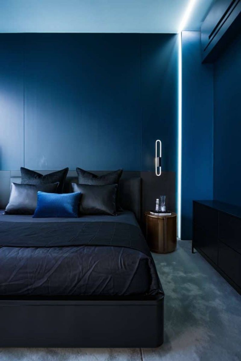
Black and blue together create atmospheres so heavy they feel more like storm clouds than welcoming interiors. This combination often makes spaces feel oppressive and can negatively impact mood and energy levels.
The pairing lacks the lightness needed to create comfortable living spaces, making rooms feel more like caves than homes. Both colors are so dark they absorb light rather than reflecting it.
Add white or cream accents to lighten the mood, or choose charcoal gray instead of pure black for softer contrast.
3. Mint Green With Blue
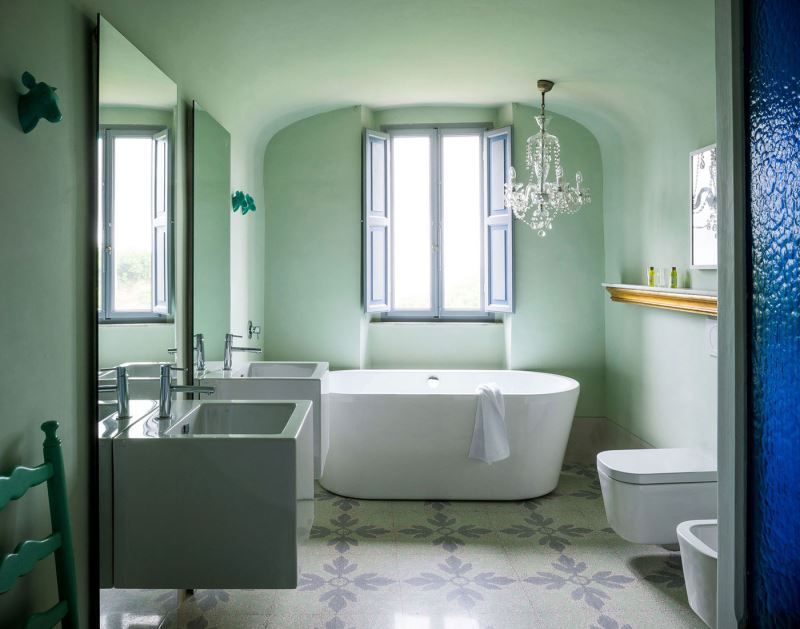
Mint green and blue create a cool color combination that feels more like a frozen tundra than a warm, welcoming space. Both colors are so cool they lack the warmth needed for comfortable living.
The pairing often makes rooms feel cold and uninviting, like stepping into a refrigerator rather than a home. Without warmer accents, spaces can feel sterile and unwelcoming.
Add warm wood tones or cream accents to balance the coolness, or choose warmer green tones like sage instead.
4. Peach And Blue Pairing
Peach and blue whisper so softly they practically fade into the background, creating combinations that feel more like watercolor paintings than bold interior statements. This pairing often lacks the punch needed for engaging spaces.
The combination can make rooms feel too sweet or juvenile, like they belong in a baby’s nursery rather than adult living areas. Both colors are so soft they don’t create enough contrast for visual interest.
Try coral or salmon tones instead of peach to create more dynamic relationships with blue colors.
5. Gold And Blue Together
Gold demands royal treatment wherever it appears, but paired with blue it creates combinations that feel more like sports team colors than sophisticated interiors. This pairing often feels too bold and aggressive for comfortable living.
The combination can make spaces feel more like hotel lobbies than homes, lacking the warmth and intimacy needed for daily living. Both colors are so strong they create visual competition rather than harmony.
Try brass or bronze metallic accents instead of gold to create warmer, more subtle relationships with blue tones.