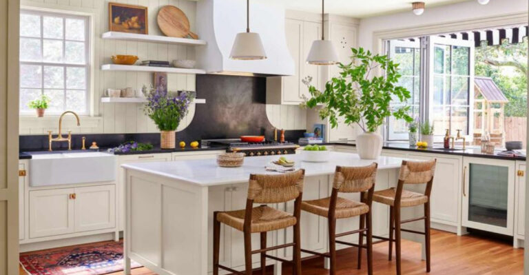
15 Colors You Should Never Pair With White, According To Interior Designers
White is often the go-to color for many homeowners looking to create a clean, bright space. But not every color plays nicely with white! Interior designers have strong opinions about which color combinations can turn your dreamy white room into a decorating disaster.
Before you grab that paintbrush or order new furniture, check out these expert-identified color combos that might make your white walls weep.
1. Muddy Brown
Nothing kills the crisp freshness of white faster than a murky, muddy brown. When these two colors meet, instead of creating contrast, they often produce a dingy, unintentional look.
Professional designers warn that this pairing can make your space feel dated and dirty rather than warm and earthy. If you’re drawn to earth tones, opt for richer chocolates or caramels that have more depth and intentionality.
2. Neon Yellow
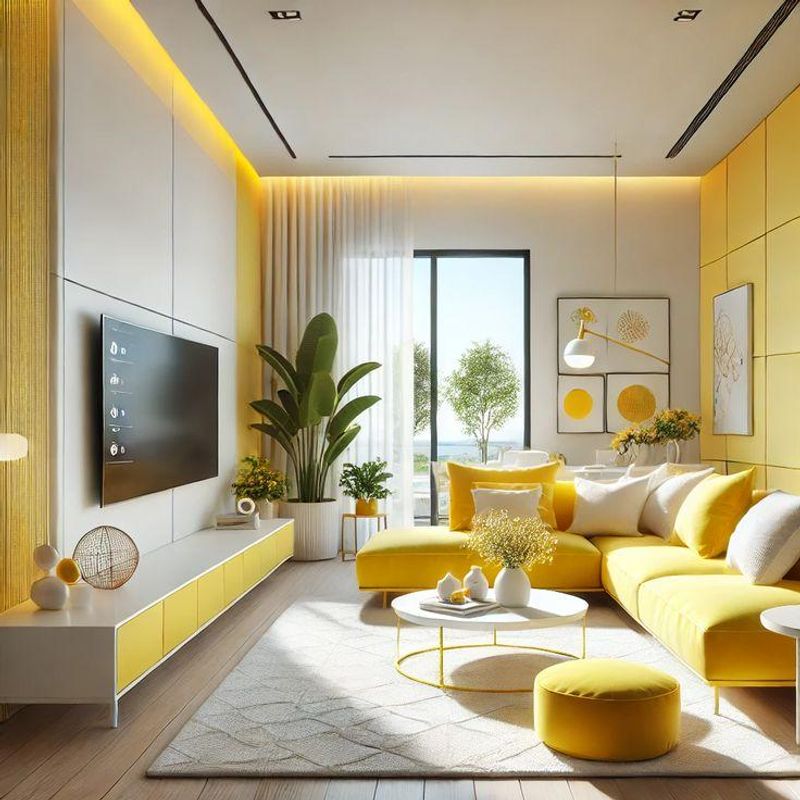
While bold can be beautiful, the marriage of neon yellow with white often creates a jarring, visually exhausting environment. Your eyes simply don’t know where to rest in this high-contrast combo.
Many designers compare it to living inside a highlighter pen! The intense brightness can create an unsettling, anxious feeling in a space meant for relaxation. Save the neon yellow for tiny accents if you must use it at all.
3. Salmon Pink
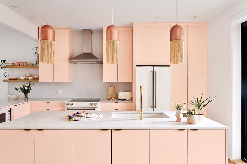
Ever wondered why salmon pink and white together make designers cringe? This peachy-pink shade paired with white often evokes dated 1980s bathrooms or grandma’s guest bedroom.
The combination lacks sophistication and can appear washed out, making both colors lose their impact. When the salmon isn’t quite vibrant enough, it can even look like faded fabric or dirty white, creating an unintentionally shabby appearance that’s hard to rescue.
4. Olive Green
You might think this earthy tone would create a natural vibe, but olive green and white often clash in unexpected ways. The yellowish undertones in olive can make white walls appear dingy or cream-colored when that wasn’t the intention.
Designers note that this combination frequently feels military or institutional rather than homey. If you love green with white, consider more vibrant emeralds or softer sages that create cleaner, more harmonious contrasts.
5. Burgundy
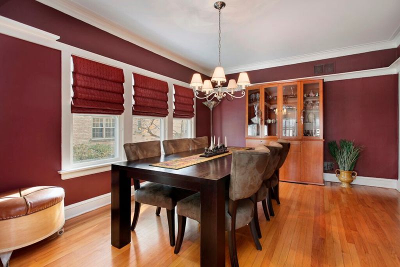
Remember those formal dining rooms from the 1990s? That’s exactly what comes to mind when burgundy meets white. This rich wine-colored shade can look incredibly dated when paired with stark white.
Interior experts point out that the combination often feels stuffy and overly traditional. The high contrast between these colors creates a visual heaviness that can make spaces feel smaller and more confined. Modern designers typically avoid this pairing unless going for deliberate vintage vibes.
6. Hospital Green
Just hearing the name should give you pause! That pale, institutional mint-green shade paired with white instantly transports people to medical facilities—not exactly the cozy feeling most homeowners are after.
When combined with white, this clinical green creates spaces that feel cold, sterile, and devoid of personality. Designers recommend avoiding this combination unless you’re actually decorating a medical office. Even then, modern healthcare design has largely moved away from this anxiety-inducing color scheme.
7. Beige
Surprisingly, beige and white together create one of design’s most underwhelming combinations. Without sufficient contrast, these two neutral tones blend into each other, creating a flat, dimensionless space that lacks visual interest.
Many designers describe this pairing as “the room that forgot to have a personality.” The subtle differences between these colors can also highlight flaws—making whites look dingy or beiges appear dirty. If you’re aiming for a neutral palette, consider adding texture or a third color for depth.
8. Navy Blue With Yellow Undertones
At first glance, navy and white seems like a classic combination. However, when the navy has strong yellow undertones, interior designers start to worry. This particular shade of navy paired with white can create a nautical theme that quickly veers into tacky territory.
The yellow undertones fight against the crispness of white, creating visual tension. Designers recommend testing several navy samples before committing, as the wrong undertone can make your sophisticated vision look like a themed children’s bedroom.
9. Mustard Yellow
Whoever thought mustard yellow and white would make good neighbors was sorely mistaken! This combination creates a jarring visual experience that designers compare to living inside a fast-food restaurant from the 1970s.
The acidic quality of mustard yellow fights against white’s purity, creating a clash that feels unintentional and dated. The pairing can also make whites look dingy by comparison. For yellow lovers, designers suggest either softer buttercream shades or deeper golds that complement white more harmoniously.
10. Mauve
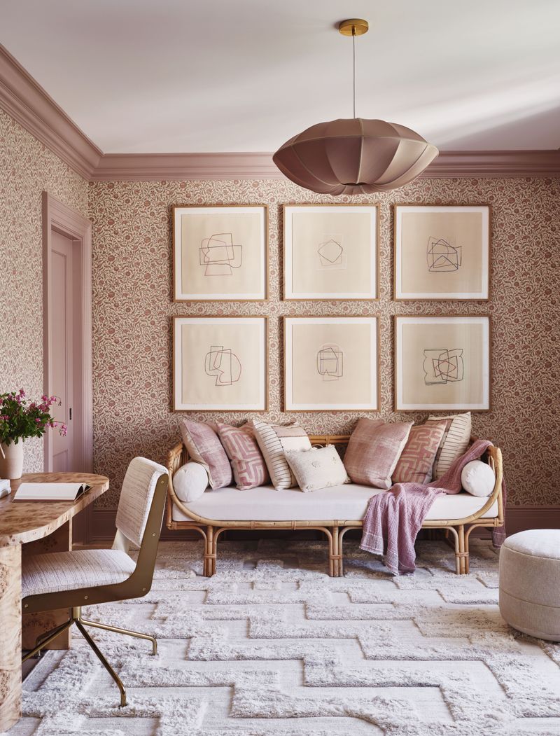
If you’re hoping to avoid a space that screams “1980s corporate office,” steer clear of mauve and white. This dusty purple-pink was everywhere during the shoulder-pad era, and designers say it hasn’t aged well, especially with white.
The combination often feels dated, bland, and uninspired. Mauve’s muted quality can make white look harsh by comparison, while white can make mauve appear even more faded and tired. Modern designers recommend more saturated purples or cleaner pinks if you’re set on these color families.
11. Bright Orange
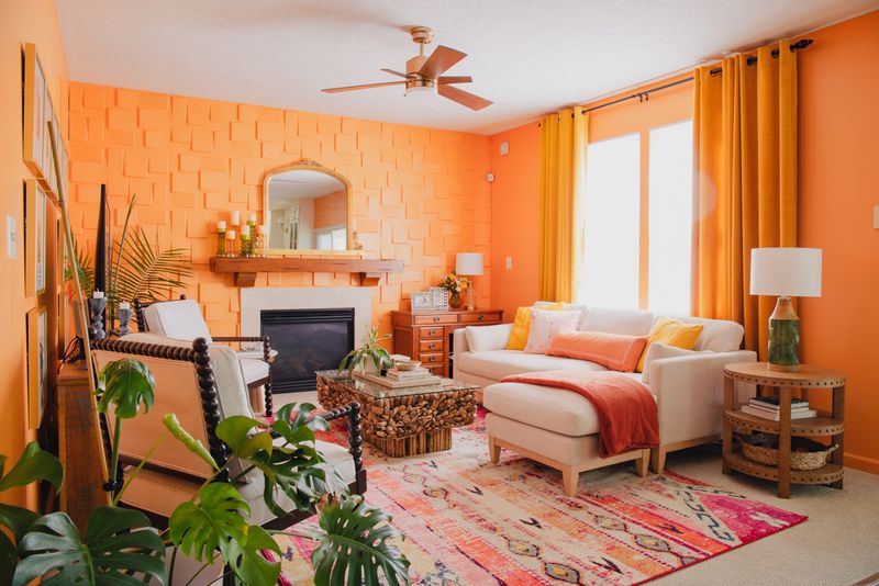
Feeling like you’re living inside a traffic cone isn’t most people’s design goal! When bright orange partners with white, the result is often visually overwhelming and anxiety-inducing.
Design professionals note that this high-energy combination rarely allows for relaxation in a space. The vibrant orange dominates everything, making it impossible to focus on anything else in the room. If you love orange, designers suggest toned-down terracottas or burnt oranges that create a more balanced relationship with white.
12. Hunter Green
Once the darling of 1990s interiors, hunter green paired with white now sends designers running for the hills. This deep, slightly dull green creates a heavy, dated look when combined with white walls or trim.
The contrast is stark without being refreshing, often evoking country-style homes from decades past. Designers note that this combination can make spaces feel smaller and darker than they actually are. For a more contemporary green-and-white pairing, look to emerald, sage, or even forest green.
13. Pastel Peach
Miami Vice called—it wants its color scheme back! Pastel peach paired with white creates a distinctly retro vibe that screams 1980s Florida condo. This combination lacks the sophistication most contemporary homeowners are seeking.
When these colors meet, they often create a washed-out, dated appearance that can feel unintentionally juvenile. Design experts point out that this pairing can also make skin tones look unflattering in the space, an important consideration for rooms where you entertain or take photos.
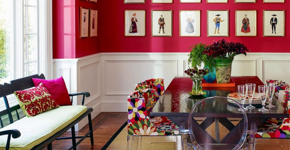
14. Bright Red
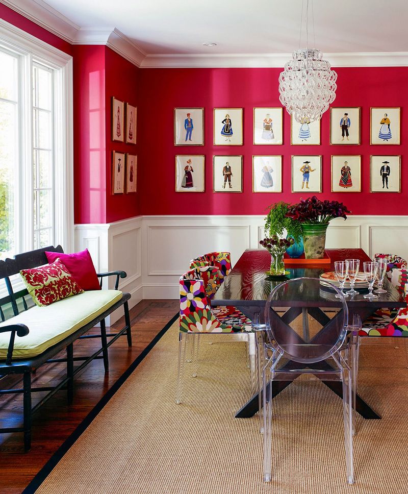
Unless you’re decorating a candy cane factory or Santa’s workshop, bright red and white together can be problematic. This high-contrast combination quickly overwhelms a space, creating visual tension that many find uncomfortable.
Designers caution that this pairing often reads as temporary or seasonal rather than sophisticated. The intensity of bright red tends to advance visually, making spaces feel smaller and more crowded. For a more livable red, consider deeper burgundies or muted brick tones that don’t fight so aggressively with white.
15. Lavender
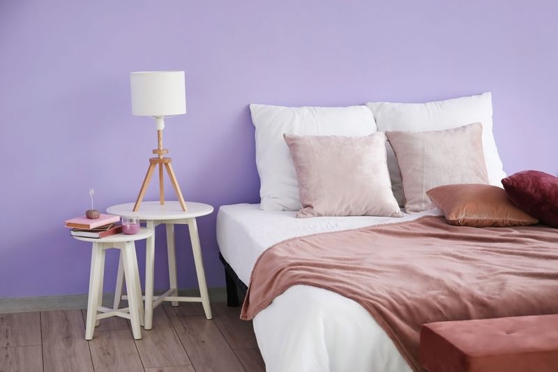
While seemingly innocent, lavender paired with white often creates spaces that feel unintentionally childish or elderly. This combination frequently evokes either a little girl’s bedroom or a senior living facility—rarely the sophisticated vibe most homeowners desire.
Design professionals note that this pairing can feel saccharine and dated. The softness of lavender can also make whites look harsh and clinical by comparison. If purple tones appeal to you, designers suggest deeper plums or more complex periwinkles that create more sophisticated relationships with white.