17 Paint Colors Designers Say To Avoid On Exterior Trim
Choosing the right paint color for your home’s exterior trim can make or break your curb appeal. Professional designers know that some colors simply don’t work well on trim, creating eyesores rather than accents.
Before you pick up that paintbrush, check out these expert-identified trim colors that might be sabotaging your home’s exterior look.
1. High-Gloss Jet Black
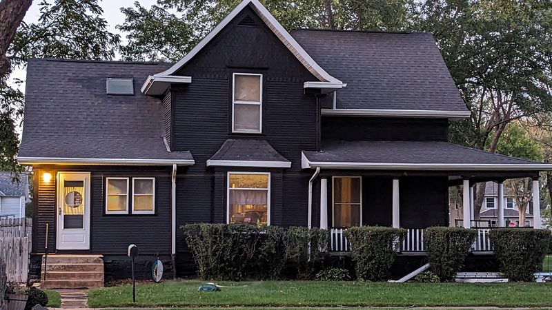
Ever noticed how fingerprints show up instantly on glossy black surfaces? The same principle applies to exterior trim. High-gloss jet black attracts dust, shows every imperfection, and creates harsh contrasts that overwhelm most home exteriors.
Additionally, black trim absorbs heat, potentially causing warping and faster deterioration in sunny climates. Save this dramatic shade for accent doors instead!
2. Neon Yellow

Imagine driving down a peaceful suburban street when suddenly—BAM!—a house with neon yellow trim jolts your senses. While bold choices can work, this particular shade rarely complements architectural styles or natural surroundings.
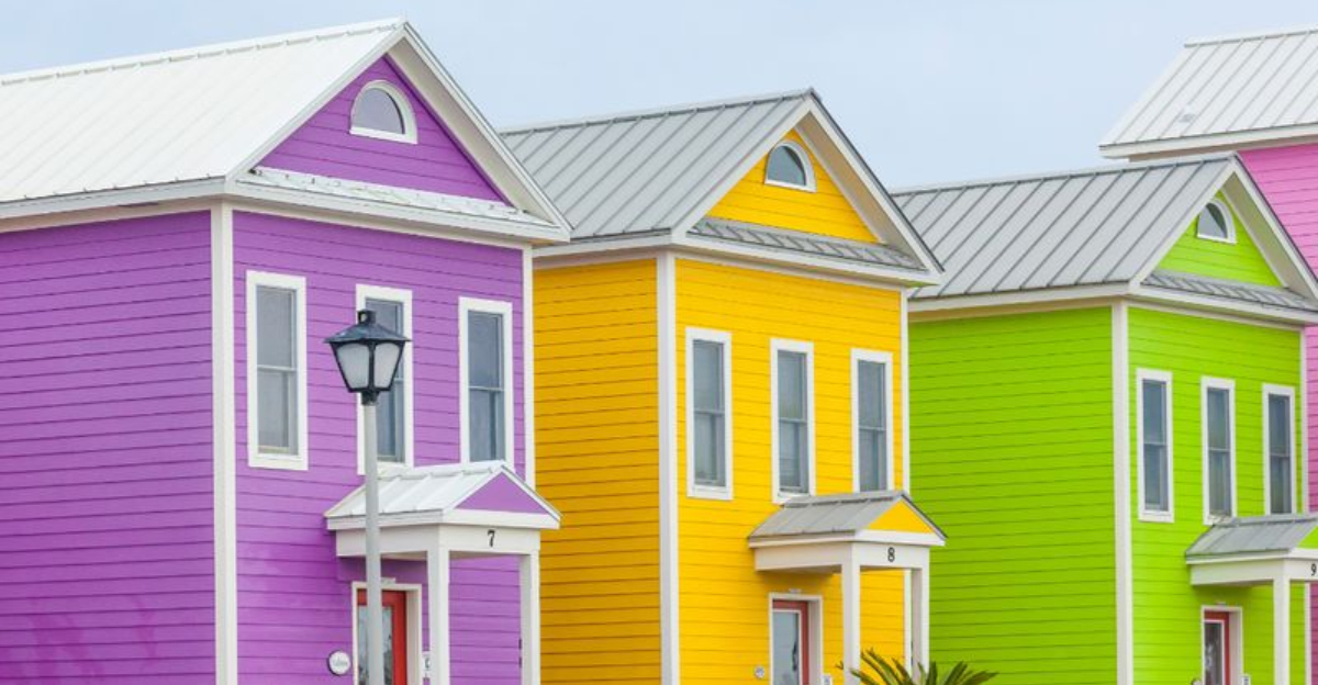
Beyond being visually jarring, neon yellow fades unevenly and becomes an eyesore quickly. Homeowners associations often specifically prohibit this attention-grabbing color for good reason!
3. Cool-Toned Lavender
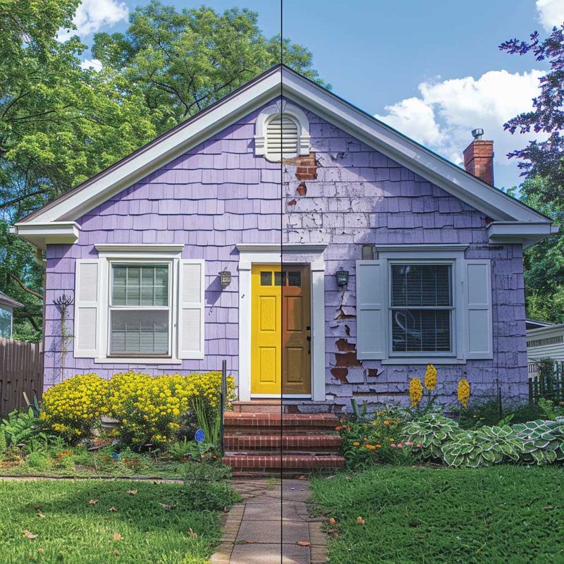
Whimsical as it might seem for your garden cottage dreams, cool-toned lavender rarely translates well to exterior trim. When exposed to sunlight, it quickly fades to an unintentional grayish-purple that appears dirty rather than deliberate.
Most exterior materials simply don’t pair harmoniously with this color family. If purple speaks to your soul, consider deeper eggplant tones or save lavender for seasonal door wreaths instead.
4. Primary Red
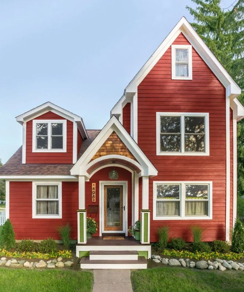
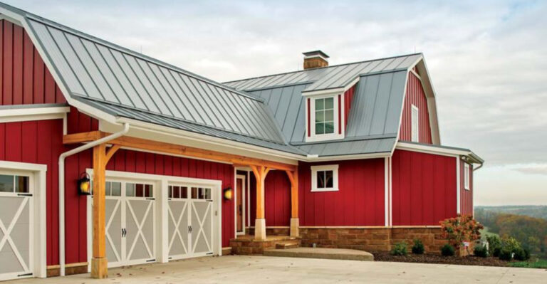
Unless you’re decorating a barn or a schoolhouse, primary red trim often screams for attention in all the wrong ways. Its intensity competes with rather than complements most architectural styles and landscaping elements.
Sunlight accelerates fading, transforming vibrant red into an inconsistent pinkish-orange over time. For those craving red, designers suggest burgundy or brick-inspired hues that offer sophistication without the visual shouting match.
5. Builder Beige
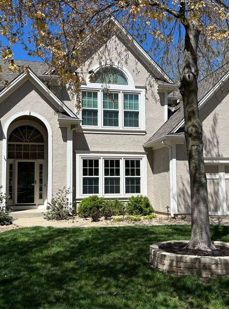
Playing it safe sometimes backfires! Builder beige—that flat, uninspired neutral from the 1990s—makes trim virtually disappear instead of defining architectural features. Without proper undertones to complement your siding, it quickly transforms from safe to sad.
Dirt and environmental staining show prominently on this color, requiring frequent cleaning. Modern designers recommend upgrading to greige, taupe, or cream with appropriate undertones for a more sophisticated neutral approach.
6. Electric Blue
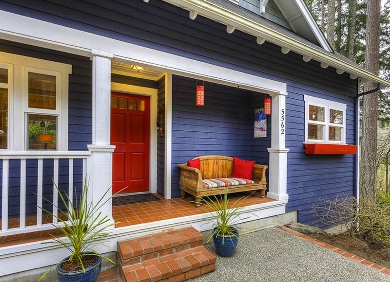
Want your house to look like it belongs in a cartoon? Electric blue trim might accomplish exactly that! This intensely saturated shade creates a jarring visual disconnect with most exterior materials and natural surroundings.
Beyond aesthetic concerns, it typically fades unevenly, creating maintenance headaches. If you really love blue, designers recommend navy, slate, or colonial blue tones that offer character without sacrificing sophistication or neighborhood harmony.
7. Flat White (No Tint)
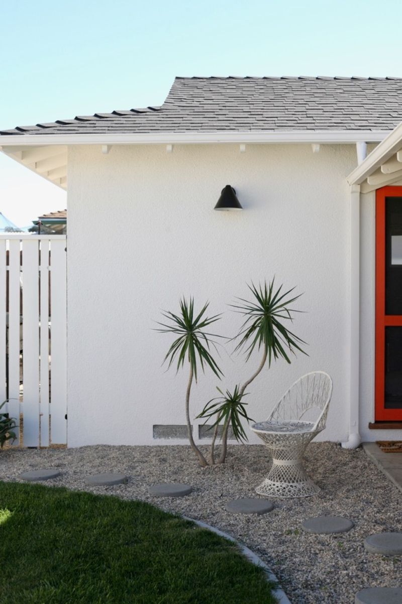
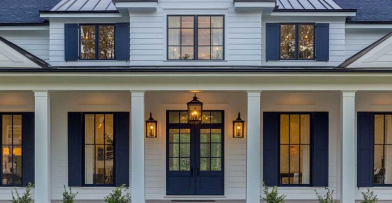
Stark, untinted white might seem like a classic choice, but designers consistently warn against this common mistake. Without warmth or subtle undertones, flat white trim appears chalky, institutional, and surprisingly cheap-looking on most homes.
Maintenance becomes a nightmare as pure white shows every speck of dirt and mildew. Instead, choose whites with slight cream, gray, or beige undertones that complement your siding while still reading as “white” to the casual observer.
8. Mint Green
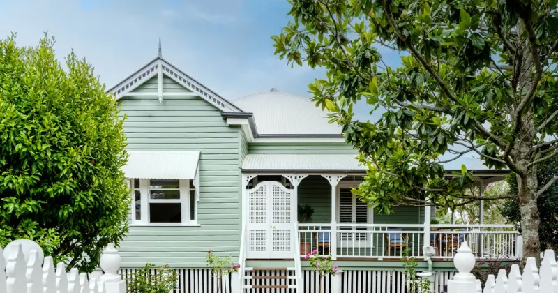
Flashback to 1950s appliances! Mint green trim creates an unavoidable retro vibe that rarely integrates well with contemporary home designs. When exposed to sunlight, it quickly fades to an unintentional pastel that often clashes with roof colors and landscaping.
If you’re drawn to green, designers suggest sage, olive, or forest tones that complement natural surroundings. Save the mint for vintage-inspired interior accents where its charm can truly shine.
9. Dark Forest Green (Outdated Version)
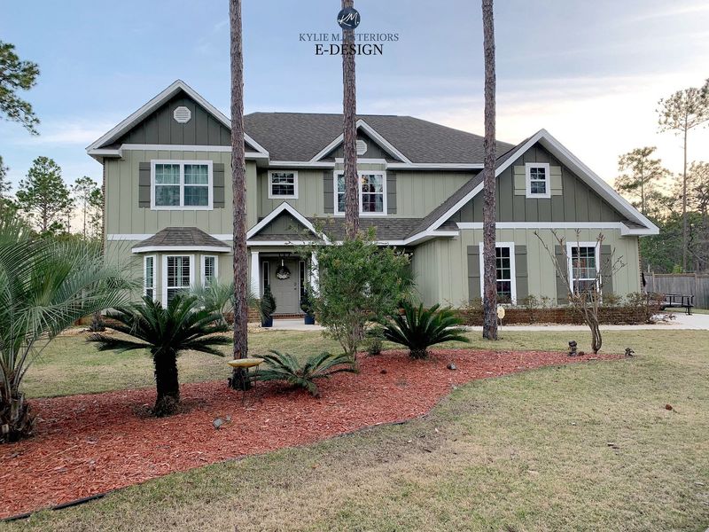
Not all greens are created equal! The specific dark forest green popular in the 1990s—with its heavy blue undertones—instantly dates your home. Unlike modern sophisticated greens, this particular shade tends to look muddy and artificial against most exterior materials.
UV exposure often causes it to fade inconsistently, creating maintenance headaches. For a timeless green, designers recommend options with olive or sage undertones that feel connected to the natural landscape.
10. Soft Peach

Channeling Miami Vice might work for a beach bungalow, but soft peach trim quickly becomes problematic for most homes. Sunlight exposure accelerates fading, transforming intended peach into an unintentional, washed-out salmon that rarely complements other exterior elements.
Dirt and environmental staining show prominently against this delicate hue. If you love warm tones, designers suggest terracotta, clay, or warm tans that offer similar warmth with greater staying power.
11. Rose Pink
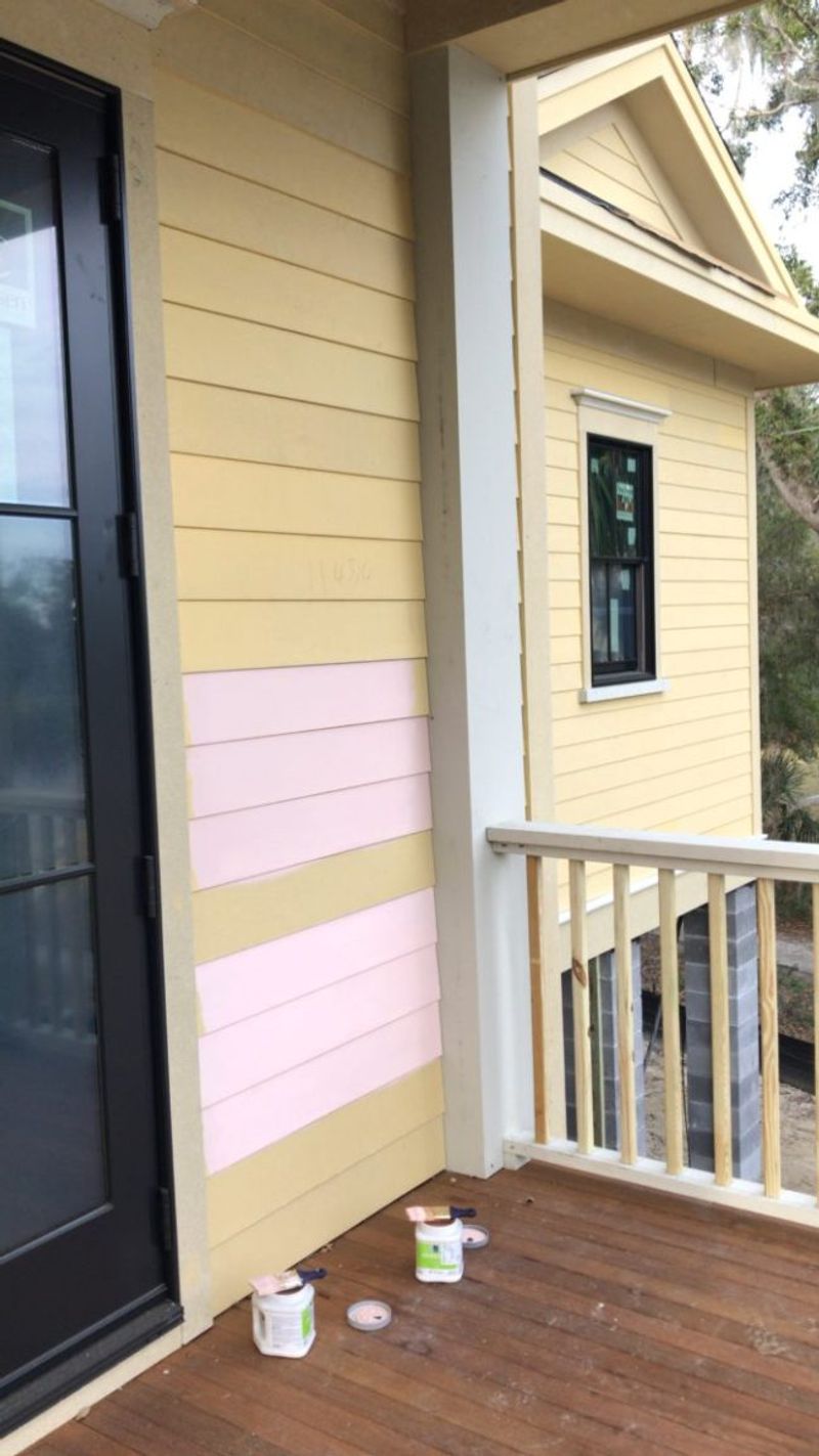
Unless your goal is creating a life-size dollhouse, rose pink trim sends the wrong message on most architectural styles. Beyond initial aesthetic concerns, this color fades dramatically and unevenly when exposed to sunlight, creating an unintentional patchwork effect.
Neighborhood compatibility becomes an issue as this distinctive color rarely harmonizes with surrounding homes. If pink speaks to you, consider using it for seasonal door decorations rather than permanent trim elements.
12. Maroon
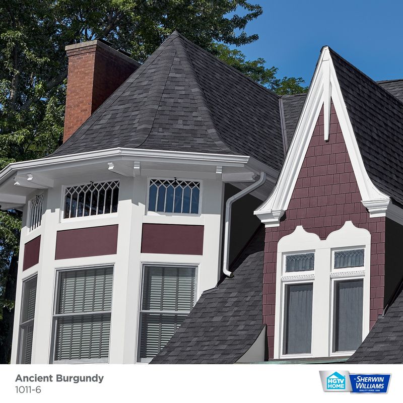
Go team? Maroon trim unintentionally evokes high school sports colors rather than sophisticated architecture. This muddy red-brown tends to look heavy and dated against most siding colors and materials. When exposed to sunlight, it often fades to an unattractive brownish-pink.
If you’re seeking rich, deep colors, we recommend burgundy or wine tones with proper undertones that complement your home’s specific exterior materials and architectural style.
13. Highlighter Orange
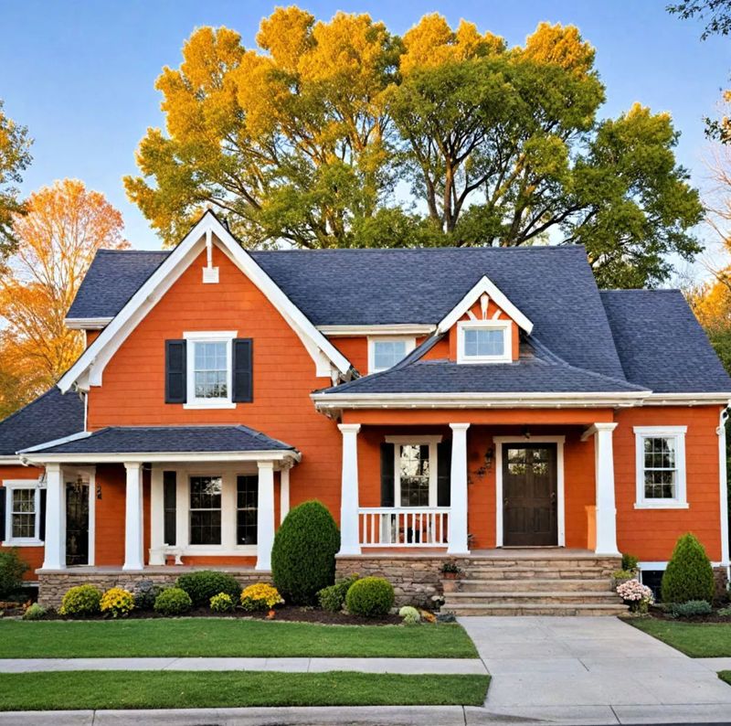
Looking to ensure emergency vehicles can find your house? Highlighter orange trim certainly accomplishes that! This attention-grabbing shade creates extreme visual tension with virtually all architectural styles and natural surroundings. It fades dramatically and unevenly, requiring frequent repainting.
If orange appeals to you, designers suggest terracotta, rust, or burnt orange options that offer warmth and character without the visual equivalent of shouting.
14. Slate Blue (When Paired with Tan Siding)
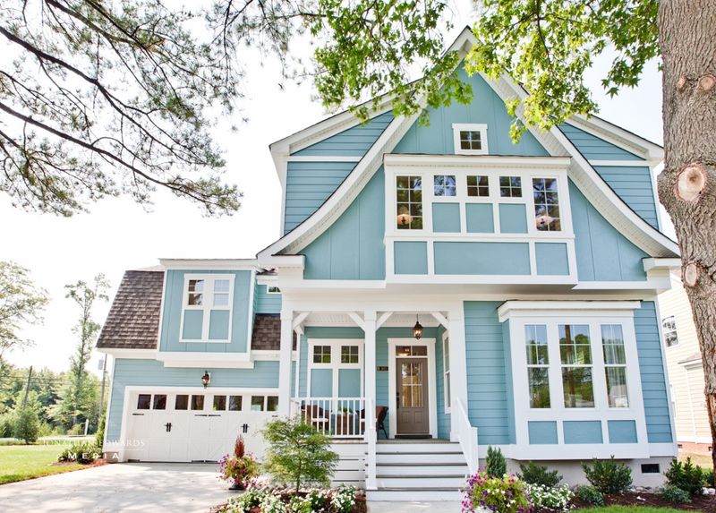
Context matters enormously! While slate blue can work beautifully with certain exteriors, pairing it specifically with tan siding creates a dated 1980s effect that most designers avoid. The undertones fight each other rather than creating harmonious contrast.
Finding complementary accent colors becomes challenging with this combination. If you have tan siding, designers recommend trim colors with similar undertones—warm whites, creams, or browns—that enhance rather than compete with your home’s primary color.
15. Bright Aqua

Dreaming of a tropical getaway? Bright aqua trim might remind you of Caribbean waters, but it rarely translates well to most residential neighborhoods. Unless you’re in a coastal vacation community, this bold choice often appears jarring and contextually inappropriate.
Water-inspired trim works best in muted teal, soft harbor blue, or deep navy—each delivering oceanic vibes without causing visual disruption.
16. Eggplant Purple
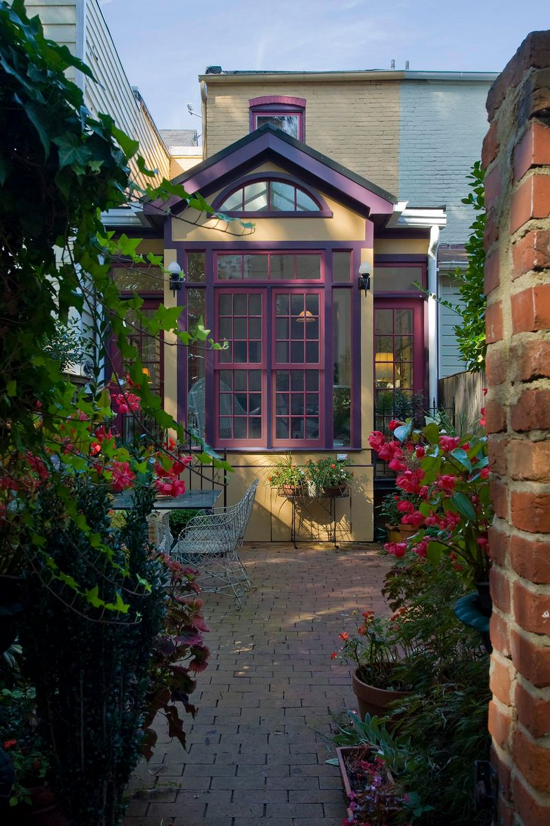
Royal aspirations aside, eggplant purple trim creates striking—and not always positive—curb appeal. While it can work for Victorian or historic homes, this deep purple overwhelms most contemporary architectural styles and creates challenging color harmony issues with landscaping.
Sunlight exposure often causes it to fade to an unflattering grayish-purple. Designers suggest plum tones with brown undertones that offer sophistication without the dramatic statement.
17. Dingy Gray
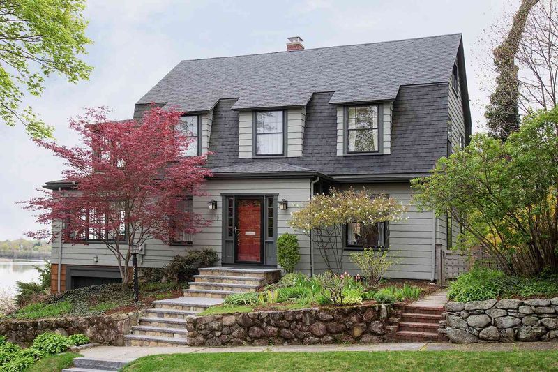
Attempting gray without understanding undertones leads straight to dingy territory. Poorly chosen gray trim—particularly with green or purple undertones—can make your entire home appear dirty rather than deliberately designed.
Weather exposure often enhances problematic undertones. Successful gray trim starts with warm greige or cool slate shades chosen to match the siding’s color and material, avoiding that perpetually unwashed look.

