15 Color Themes That Work Best For Your Home
Choosing colors for my home used to totally overwhelm me, there are just so many options. But once I realized how much a color can shift the mood of a room, it became kind of fun.
A warm terracotta makes my living room feel extra cozy, while soft blues in the bedroom help me unwind. It’s like each space gets its own personality.
Whether you’re tackling a full-house makeover or just freshening up a corner, finding the right color theme can make all the difference. These ideas helped me create rooms I actually love spending time in, and I think they’ll help you too.
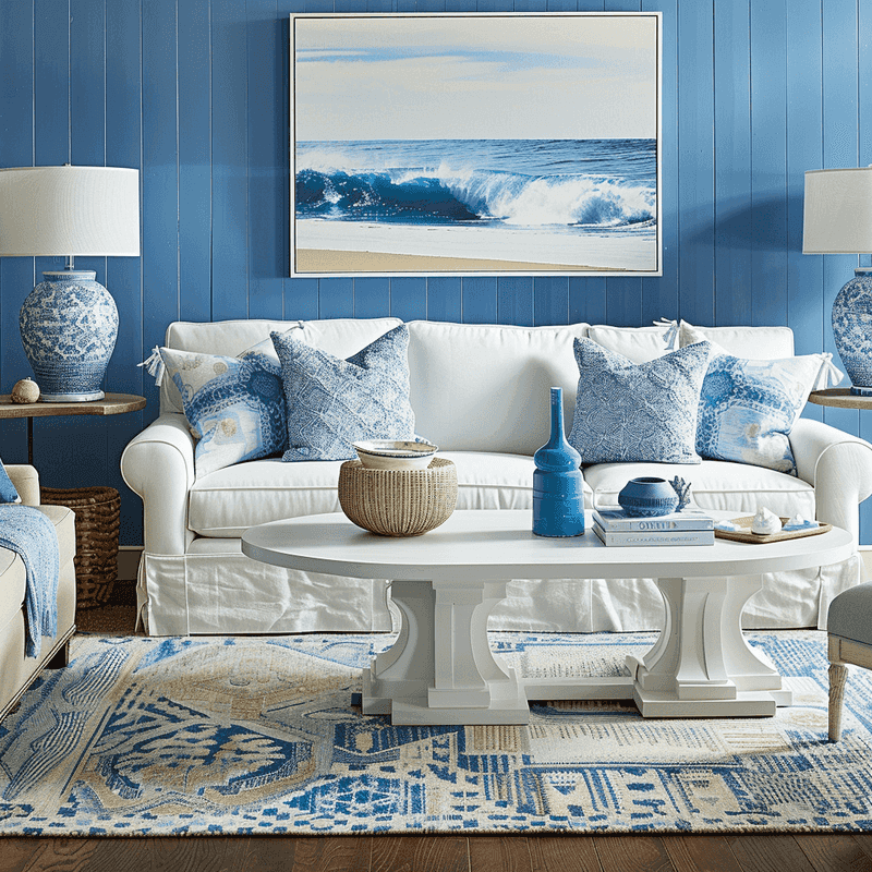
1. Coastal Cool Blues
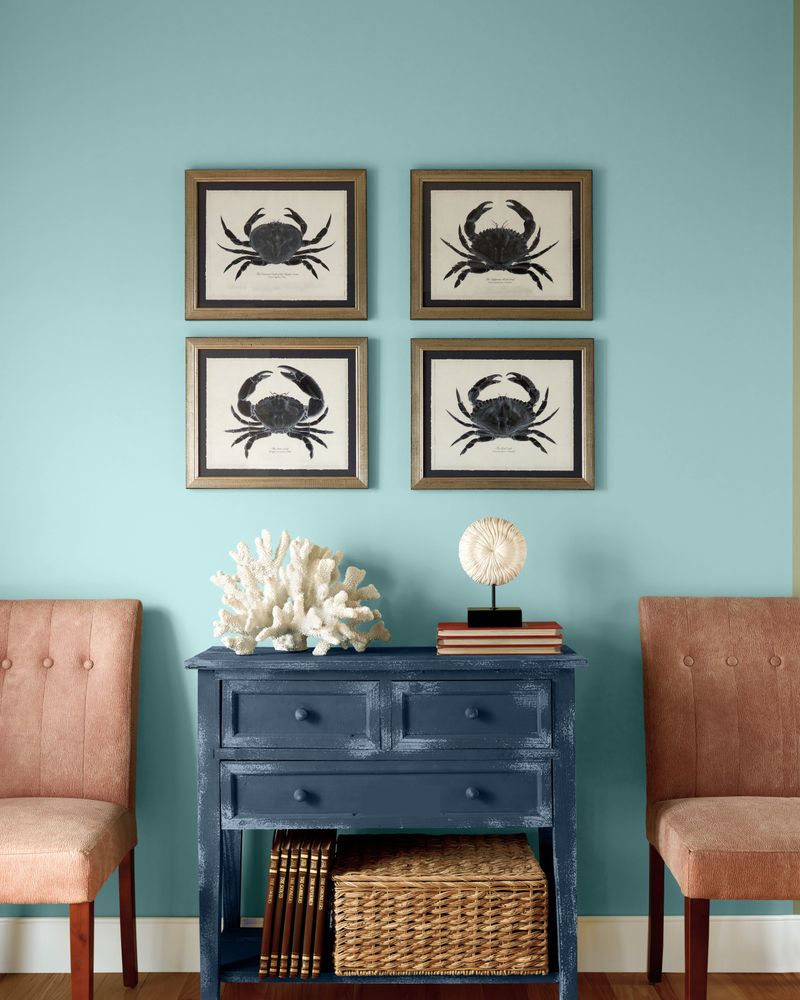
Ocean-inspired blues paired with crisp whites create a breezy, vacation-like vibe in any room. Light aqua walls with white trim remind folks of gentle waves lapping at sandy shores.
Throw in some beige accents that mimic beach sand, and you’ve got yourself a mini getaway right at home! Wicker furniture and jute rugs complete this laid-back look without trying too hard.
2. Earthy Terracotta
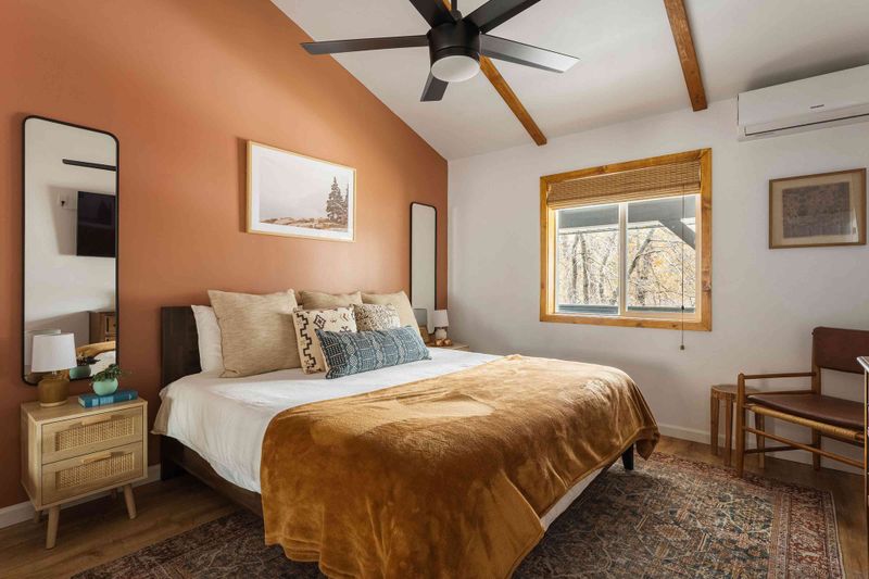
Warm terracotta tones bring the Southwest right into your living space. Clay-colored walls hug a room like a cozy blanket, while sage green accents add just the right touch of nature.
If you’re looking for homey without being old-fashioned, this combo hits the sweet spot! Natural woods and woven textiles play nicely with these earthy hues, making spaces feel grounded and welcoming.
3. Scandinavian White
Clean, bright whites paired with light woods create that famous Nordic feel everyone’s after. Minimal and fuss-free, this theme works magic in small spaces by bouncing light around and making rooms feel bigger than they are.
Though some folks think white is boring, smart decorators know better! Add pops of black for contrast and maybe one bold color accent—like a yellow chair or blue vase—to keep things interesting.
4. Moody Forest Green
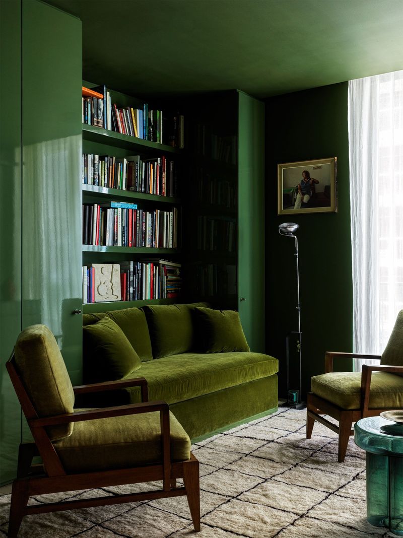
Forest greens mixed with rich woods and brass accents create spaces that feel like fancy libraries or cozy mountain lodges. Green walls wrap around you like a hug from Mother Nature herself.
People who pick this color scheme often love books, rainy days, and hot drinks! Layer in some cream-colored textiles to lighten things up, or the room might feel too dark on gloomy days.
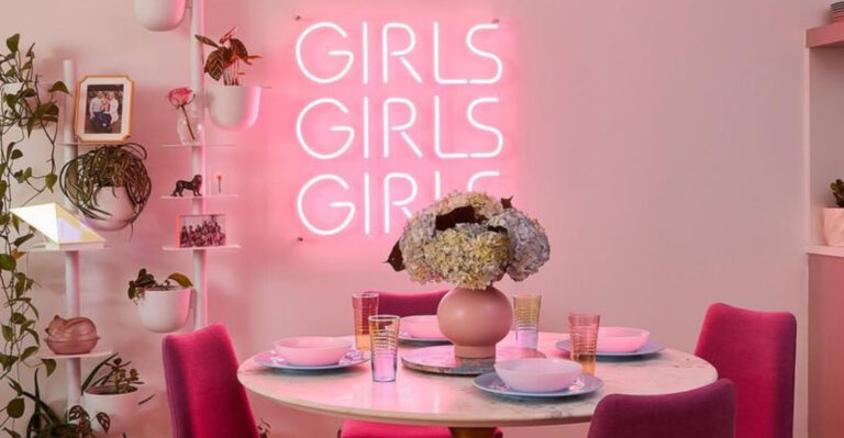
5. Blush And Gold
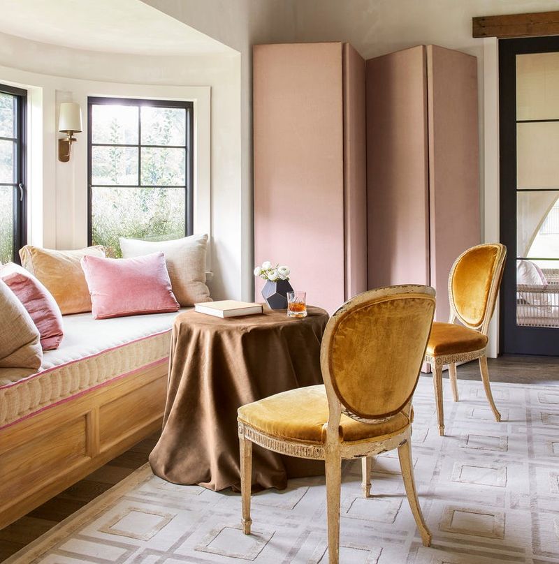
Soft pink walls with gold accents bring a touch of glamour without going overboard. This combo works surprisingly well in bedrooms, dining rooms, and even powder rooms where a little fancy touch feels just right.
Contrary to what some think, blush isn’t just for little kids’ rooms! When paired with sophisticated golds and maybe some black details, it grows up real fast. Gray furniture keeps this theme from floating away into cotton candy territory.
6. Monochromatic Grays
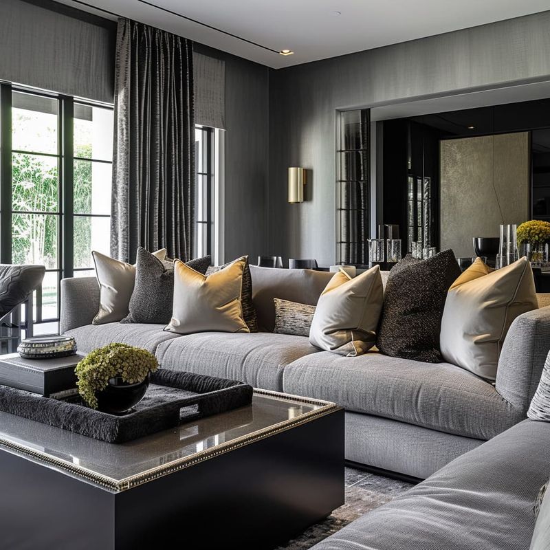
Gray isn’t dull when you layer different shades from almost-white to charcoal. Playing with texture becomes super important here—think fuzzy pillows against smooth walls against rough stone.
Many designers swear by this foolproof palette because it’s so flexible. Want to change things up? Just swap out colorful accessories without repainting!
Gray works as your canvas, letting other elements shine without fighting for attention.
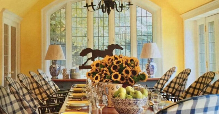
7. Sunny Yellow Kitchen
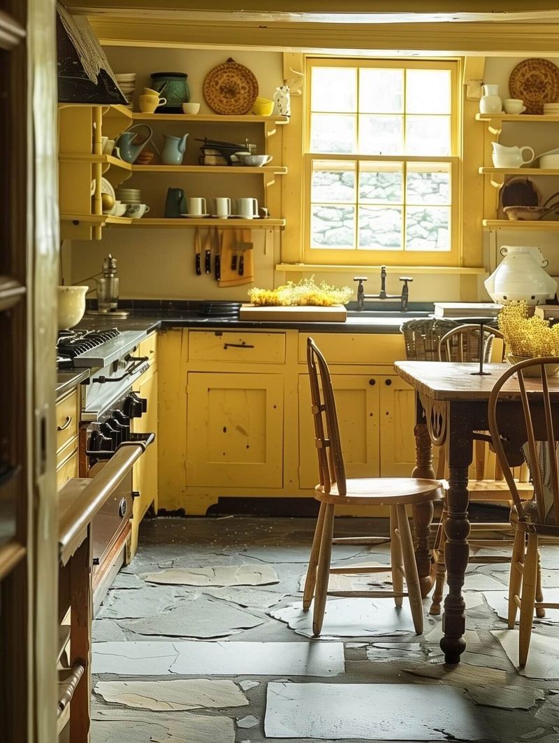
Yellow kitchens make even Monday mornings feel cheerful! Buttery walls or cabinets paired with white countertops create spaces that feel clean yet warm at the same time.
Studies show yellow stimulates appetite and conversation—perfect for where families gather! Blue accents (think dishes or tea towels) make yellow pop even more because they’re opposite on the color wheel.
Just don’t go too bright unless you want your kitchen to feel like a fast-food restaurant!
8. Black And White Drama
High-contrast black and white never goes out of style! Whether you choose bold striped wallpaper or simply black furniture against white walls, this combo packs a visual punch.
Smart homeowners know to add texture to prevent this theme from feeling flat or cold. Fuzzy rugs, shiny surfaces, and plants bring life to this stark palette.
For those who can’t decide on colors, this timeless duo solves the problem while still looking super intentional!
9. Jewel Tone Luxury
Rich emeralds, sapphires, and rubies translated into wall colors and furniture create spaces fit for royalty! These deep, saturated hues work best in rooms where you entertain or want to make a big impression.
Unlike pastel rooms that feel casual, jewel tones command attention and respect. Metallic accents in gold or silver make these colors shine even brighter. Warning: once you go jewel tones, it’s hard to go back to beige!
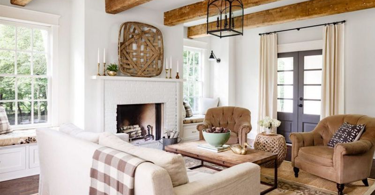
10. Farmhouse Neutrals
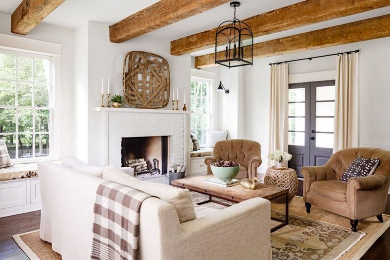
Creamy whites, soft tans, and gentle grays create that popular farmhouse vibe everyone loves. Unlike stark minimalist whites, these warmer neutrals feel lived-in and comfy from day one.
Wood accents in weathered finishes add character without trying too hard. What makes this theme work? The secret lies in mixing textures—smooth ceramics next to rough linens next to distressed woods.
Even city apartments can feel like countryside retreats with this approachable palette!
11. Mediterranean Blues And Whites
Cobalt blue and crisp white transport you straight to a Greek island! This high-contrast combo feels clean yet exotic at the same time.
Terracotta pots and natural woods keep this theme from feeling too stark or theme-parky. Perfect for bathrooms and outdoor spaces, these colors naturally make people think of water and relaxation.
Fun fact: blue is proven to lower blood pressure and heart rate, making it perfect for bedrooms too!
12. Retro Pastels
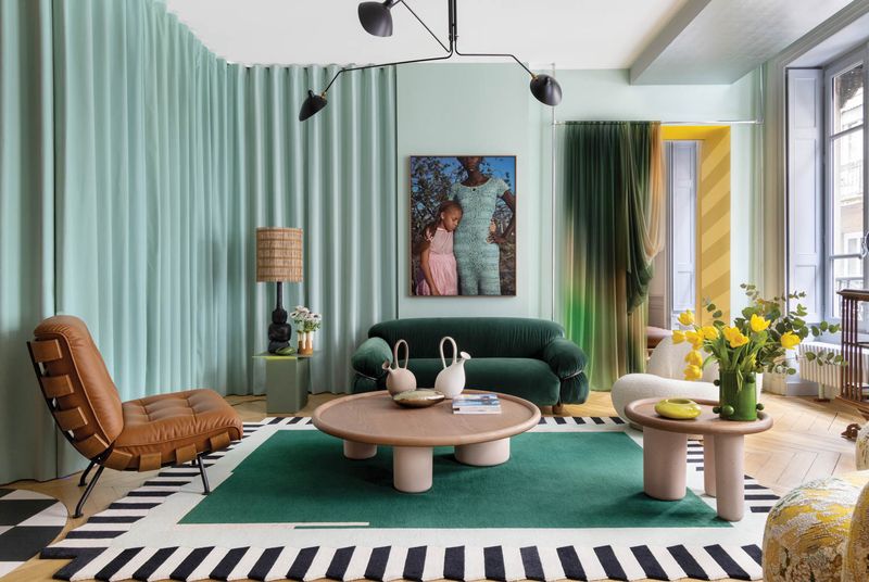
Mint green, pale pink, and light yellow create spaces that feel cheerfully vintage without being stuck in the past. These soft hues remind folks of 1950s diners and old-school ice cream parlors in the best possible way!
Modern furniture keeps these colors from feeling dated or too cutesy. Great for kitchens and kids’ rooms that adults can enjoy too.
Want to make this theme really pop? Add some black accents for unexpected contrast that grounds all that sweetness.
13. Industrial Charcoal And Rust
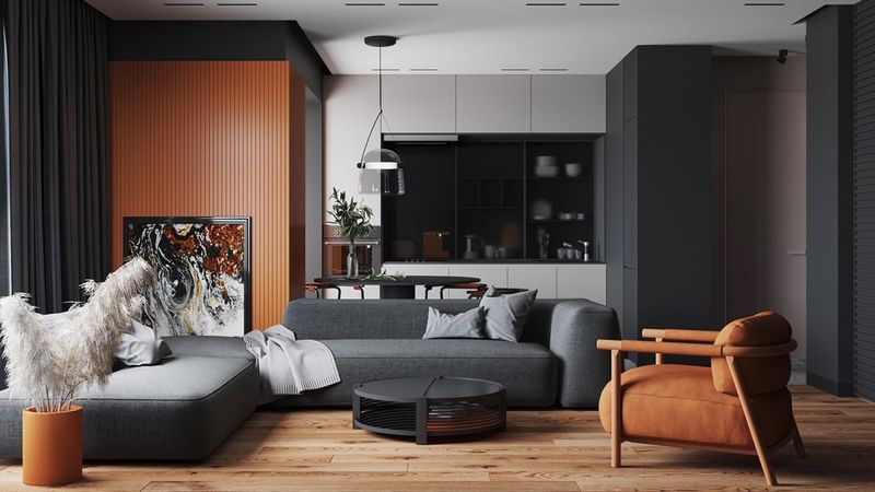
Charcoal walls paired with rusty oranges and browns create spaces with an urban edge. This combo screams modern loft living even if your home is nowhere near a converted warehouse!
Exposed metals, concrete elements, and leather furniture naturally complement these colors. People who hate fussy decorating love this straightforward palette.
When softened with plants and textiles, even the most industrial spaces feel livable rather than like you’re camping in a factory.
14. Purple And Gray Sophistication
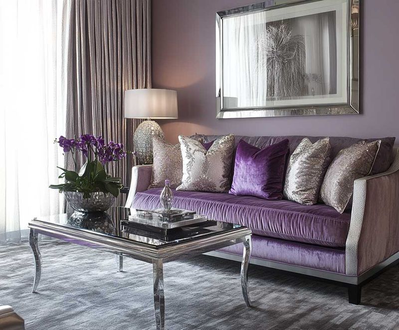
Lavender or deeper purple tones paired with soft grays create spaces that feel both creative and calming. Unlike loud primary colors, this combo whispers rather than shouts.
Silver accents enhance the sophisticated vibe without trying too hard. Many creative types gravitate toward purple because it stimulates imagination while still feeling grown-up.
Bonus tip: purple and gray bedrooms have been linked to better sleep quality in some studies!
15. Nature-Inspired Greens And Browns
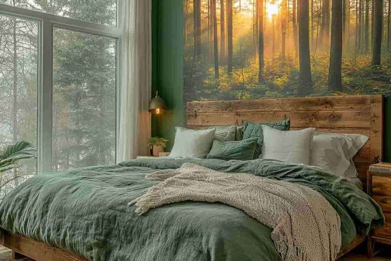
Various shades of green paired with earthy browns mimic the feeling of walking through a forest. This palette works wonders for people who want to feel connected to nature even when stuck indoors.
Plant lovers naturally gravitate toward these hues since they showcase actual greenery so beautifully. Wood furniture feels right at home here, creating spaces that help lower stress levels.
Even small doses of these colors in urban apartments can help fight the concrete jungle blues!