
Ever felt your living space seems more like a mismatched quilt than a harmonious haven? Decorating with a color scheme can transform chaos into calm, creating an environment that not only reflects your style but also provides a cohesive look.
It’s not just about picking your favorite colors – it’s about blending shades, textures, and patterns to tell a story.
With these 24 tips, you’ll learn how to masterfully wield the color wheel, ensuring your home is as inviting as it is stylish.
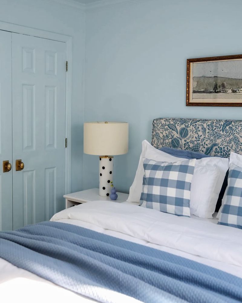
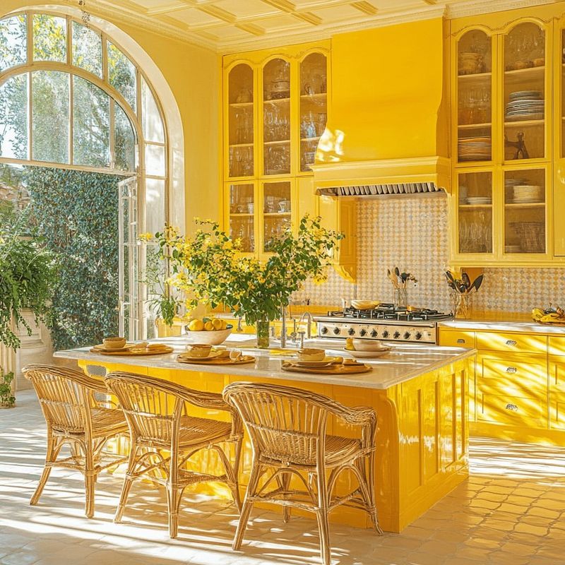
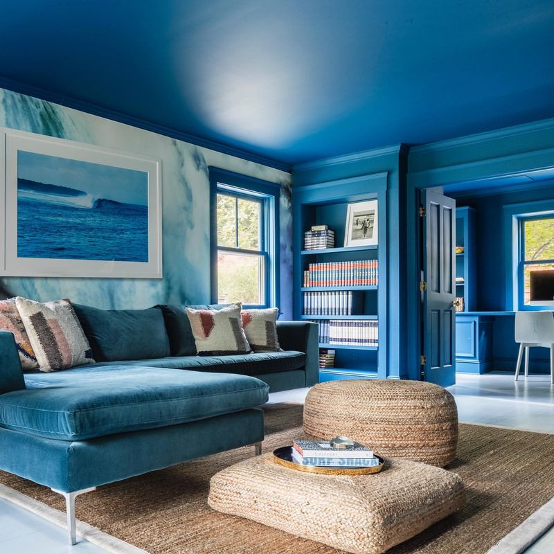
1. Choose a Dominant Hue
Imagine your room as a canvas; the dominant hue is your background. Select a color that speaks to your soul – whether it’s a calming blue or a vibrant red. This hue will anchor your design choices, creating a foundation for all other colors to build upon.
Keep in mind the room’s function when selecting this color. A soothing shade is perfect for a bedroom, while a lively color might energize a kitchen or office space. Let this choice set the mood and guide your palette.
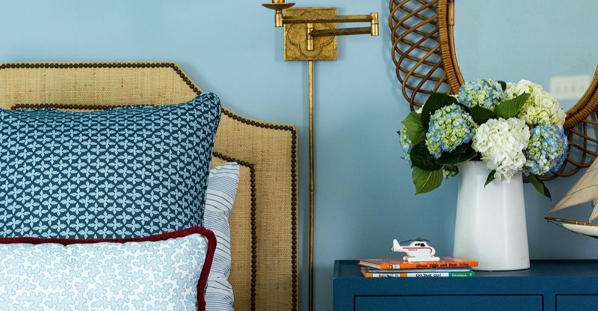
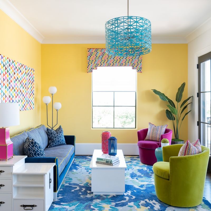
2. Incorporate Accent Colors
Accent colors are like the cherry on top of your decorative cake. After your dominant hue is set, choose one or two accent shades to enhance your space. Consider them the supporting actors in your color play, adding depth and interest.
These colors can appear in smaller decor items like cushions, vases, or picture frames. The key is to ensure they complement, not overshadow, your main color. A well-chosen accent can tie the room together beautifully, leaving a lasting impression.
3. Play with Patterns
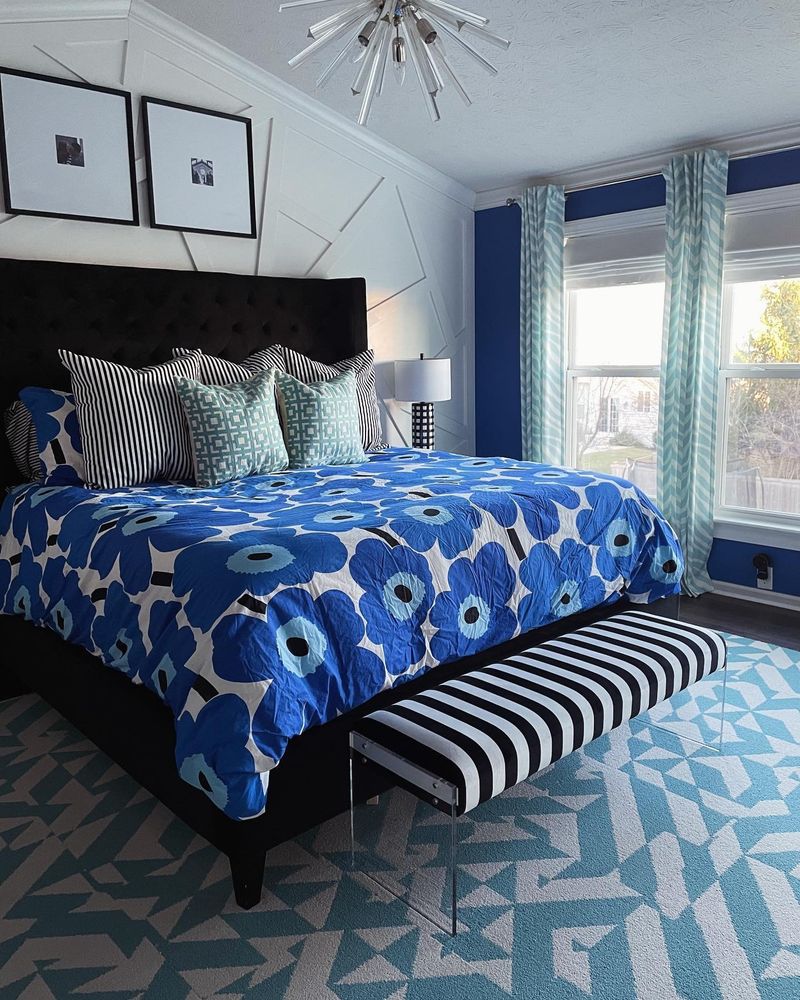
Patterns add personality to your color scheme. Stripes, florals, or geometrics can breathe life into a space. Combining patterns may sound daunting, but stick to a common color theme and it’s a breeze.
Mix patterns of varying scales for visual interest. A big floral print paired with narrow stripes can create a delightful contrast, making your decor pop. It’s all about balance and having fun with your style, ensuring your space feels lively yet coordinated.
4. Balance Bold and Neutral
Bold colors grab attention, while neutrals provide a calming backdrop. Finding the right balance between these can transform a room from chaotic to chic.
Use bold colors sparingly, perhaps on a feature wall or in select furniture pieces, against a neutral canvas. This contrast highlights the boldness without overwhelming the senses. Imagine a vivid painting on a simple wall, showcasing the art without noise.
Balance is key, so let your bold and neutral tones dance together.
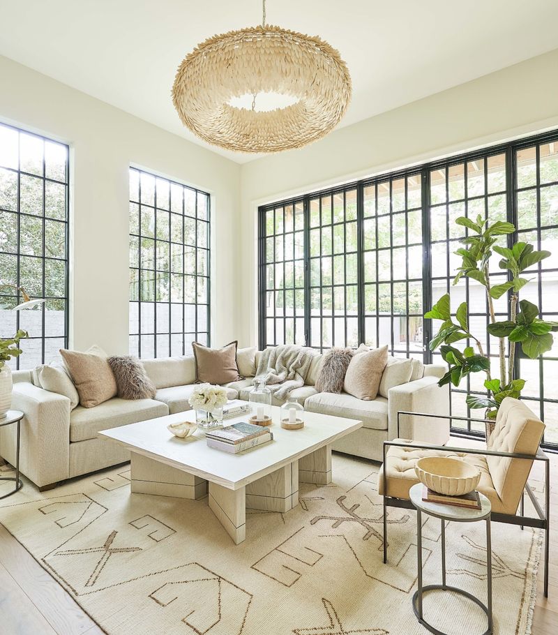
5. Layer Textures
Textures add depth to your color scheme, much like spices enrich a dish. Combining different textures creates a rich visual landscape, making your room feel inviting and complete.
Think of soft throws paired with smooth leather, or a rough jute rug against silky drapes. This interplay adds dimension, making colors appear more dynamic. When texture meets color, the room transforms into an experience, appealing to both sight and touch. Dive into the tactile world of design!
6. Choose Seasonal Palettes
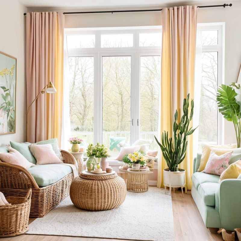
Why stick to one palette when you can celebrate the seasons? Adapting your color scheme with the seasons brings freshness to your home.
Incorporate light pastels in spring, vibrant hues for summer, rich tones during fall, and cool shades in winter. This not only keeps your space dynamic but also aligns with seasonal moods. It’s like dressing your home for the weather, ensuring it always feels current and inviting, no matter the time of year.
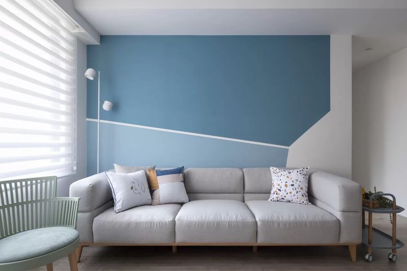
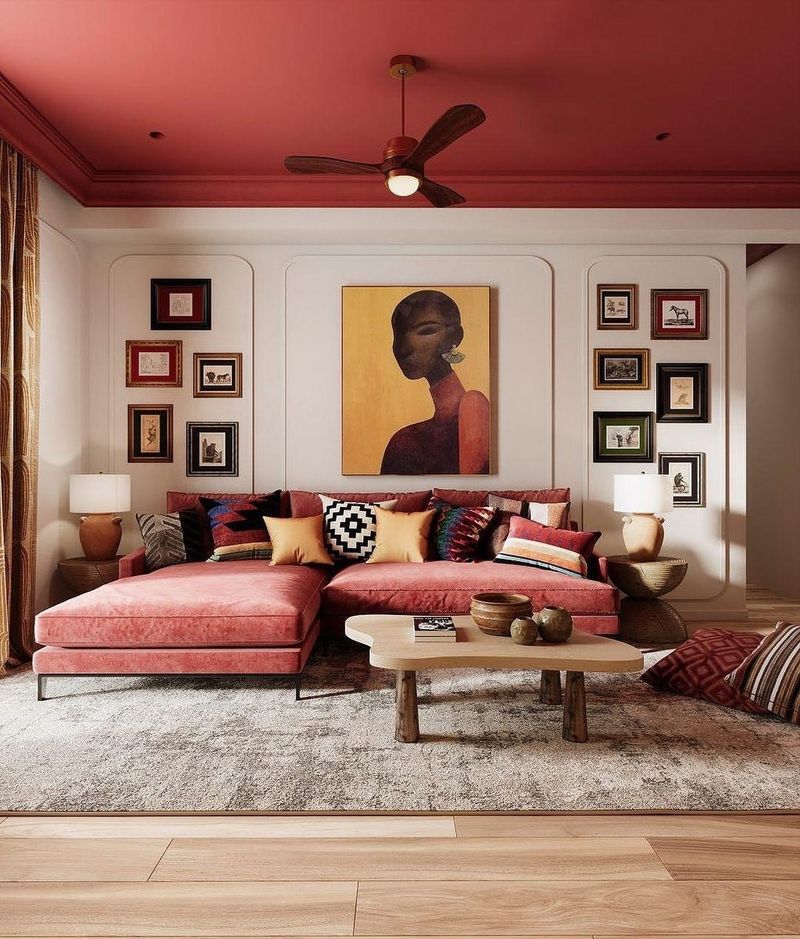
7. Focus on Focal Points
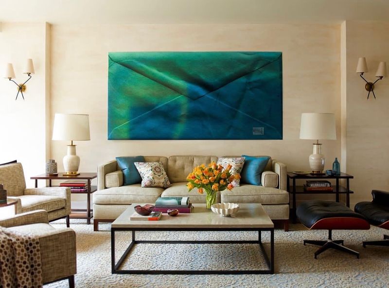
Focal points draw the eye, anchoring your color scheme amidst the decor. A vivid artwork or a brightly colored piece of furniture can serve this purpose beautifully.
Ensure your focal point stands out by surrounding it with complementary or neutral tones. This spotlight effect showcases your design prowess, making your space memorable. It’s like having a star performer on stage, captivating the audience with flair and charm.
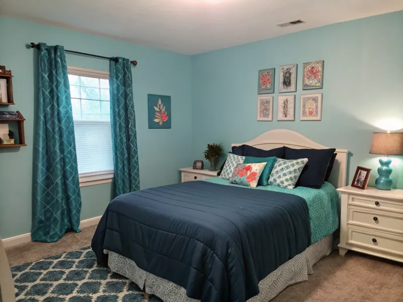
8. Utilize Color Psychology
Colors can speak to our emotions, so why not let them do the talking in your decor? Understanding color psychology can transform how a room feels.
Think of blues for calm, greens for balance, and yellows for happiness. This knowledge helps tailor a room’s mood to its purpose, ensuring your space not only looks good but feels right too. Harness the power of color to create rooms that resonate with positive vibes and enhance your well-being.
9. Coordinate with Flooring
The floor is often overlooked but plays a crucial role in your color scheme. Matching your flooring with your decor can create a seamless look.
Whether it’s matching wood tones or coordinating with carpet colors, aligning your floor with your scheme ensures harmony. This connection ties the room together from top to bottom, enhancing flow and unity. Think of it as laying the foundation for your color masterpiece, making every step stylish.
10. Apply the 60-30-10 Rule
Imagine your room as a pie chart with colors as the slices. The 60-30-10 rule helps balance these slices perfectly: 60% dominant color, 30% secondary color, and 10% accent color.
This guideline ensures a cohesive look, preventing color chaos. Use your primary hue for the walls and larger furniture, the secondary for upholstery, and the accent for decor. This method creates visual balance, making your space feel both dynamic and harmonious. Rules can be fun, especially in design!
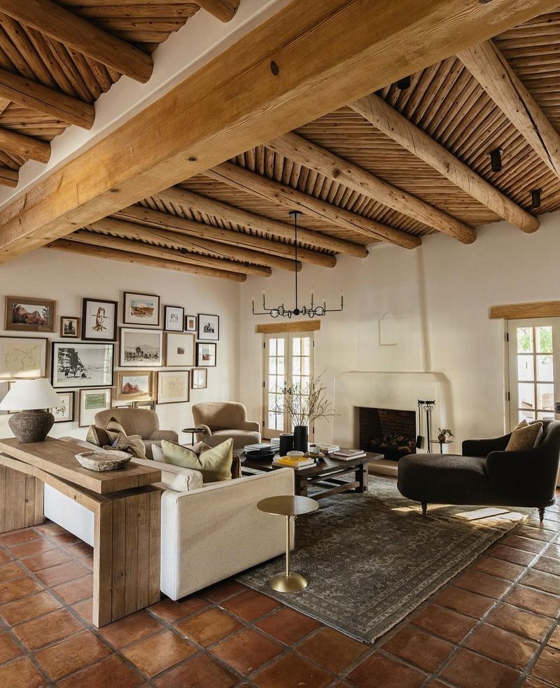
11. Complement Architectural Features
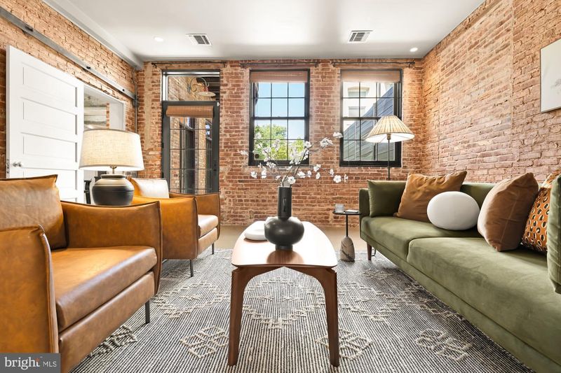
Architectural features offer a unique opportunity to play with color. Exposed brick, beams, or unique moldings can enhance your scheme.
Highlight these elements by choosing colors that complement their natural tones. This not only respects the architecture but also adds character to your design.
These features become part of the color conversation, making the room feel cohesive and thoughtfully designed. It’s architecture and color in perfect harmony.
12. Use Natural Light to Your Advantage
Natural light can be your best ally in a color scheme, making colors appear more vivid and true. Large windows or strategic lighting can transform how colors are perceived.
Consider the direction of light; northern light is cooler, whereas southern light is warmer. This knowledge assists in selecting colors that shine in your space. It’s like using the sun as your design partner, enhancing every hue with its natural glow, creating spaces that feel alive.
13. Incorporate Metallics
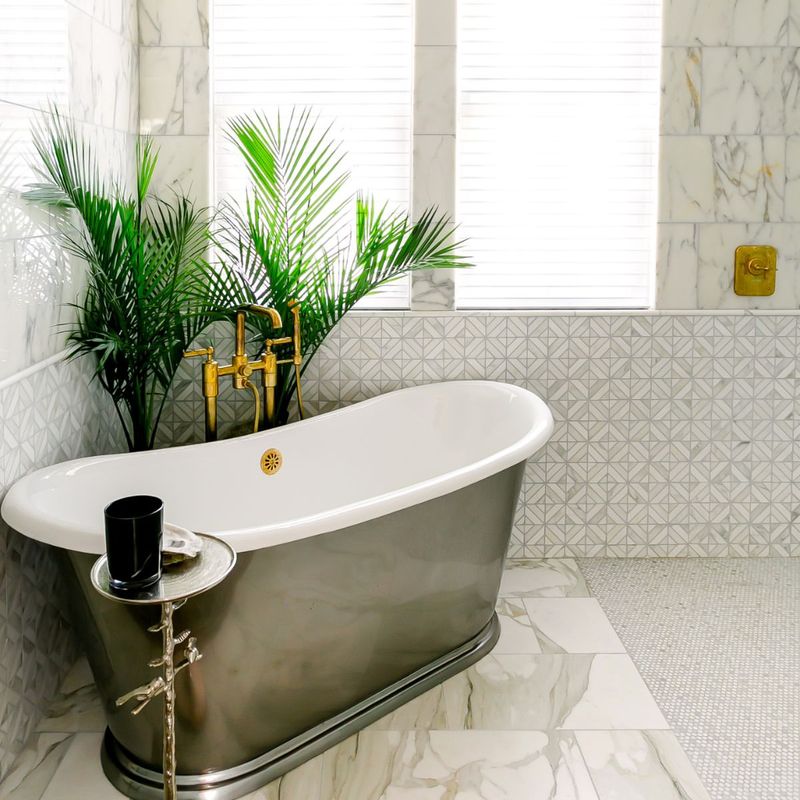
Metallics are the jewels in your color scheme, adding sparkle and sophistication. Gold, silver, or bronze can elevate your decor, catching the eye with their luster.
Incorporate metallics in light fixtures, frames, or decorative elements. They reflect light, creating a dynamic interplay with colors. Think of these as your space’s accessories, adding a touch of glamour. It’s the little bling that pulls everything together, ensuring your room shines with style.
14. Add Black for Depth
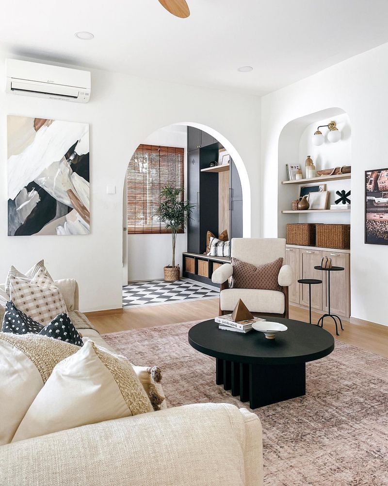
Black might seem bold, but it’s a powerful tool for depth and contrast. It grounds your color scheme, adding sophistication and definition.
Use black sparingly as accents or outlines – it highlights and frames your colors beautifully. Imagine a picture frame; it focuses attention and adds elegance. Black anchors your palette, ensuring your colors stand out without competing. It’s like adding a touch of mystery, making your room intriguing and stylish.
15. Create Harmony with Furniture
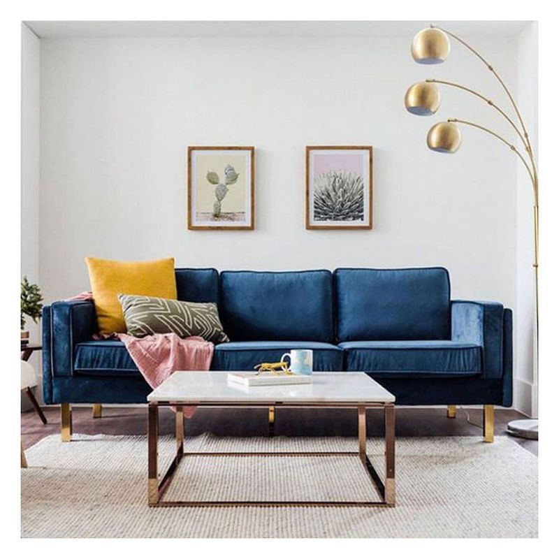
Furniture is more than functional; it’s a color scheme ally. Choosing pieces that complement your palette creates cohesion.
Consider color, material, and style when selecting furniture. A blue sofa in a sea of neutrals or a wooden piece that matches your scheme harmonizes the space. It’s about more than matching; it’s about creating a dialogue between the colors.
This harmony enhances flow, making your space feel thoughtfully curated and inviting.
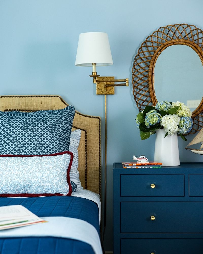
16. Utilize Monochromatic Schemes
Monochromatic schemes offer simplicity with impact. They involve using one color in various shades and tints, creating a unified yet dynamic look.
This approach is perfect for those who love subtlety and sophistication. Mixing textures and patterns within a single hue keeps it interesting. It’s like painting with one color, yet creating a masterpiece.
Monochrome doesn’t mean monotony; it’s about depth, harmony, and elegance, making your space a serene sanctuary.
17. Rely on Rugs
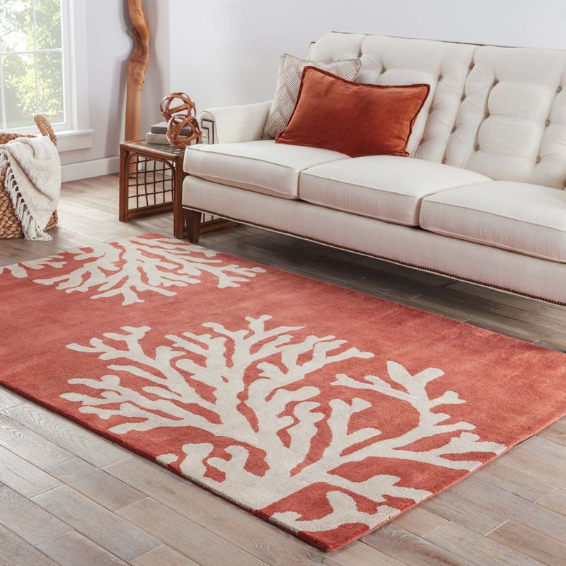
Rugs are the unsung heroes of a color scheme, anchoring a room with warmth and style. They can tie together various elements, bringing cohesion to your palette.
Choose a rug that complements your scheme or introduces a new accent. Its colors can echo the room’s palette, enhancing unity. Imagine it as the ground beneath your design, where all elements converge. Rugs offer both comfort and style, grounding your color choices beautifully.
18. Opt for Open Shelving
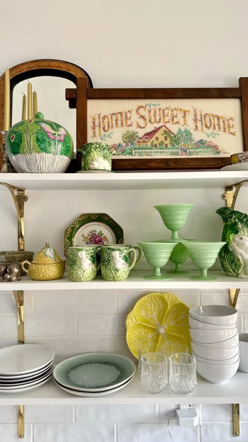
Open shelving is a stage for your color scheme, offering a chance to display coordinated decor and dishware. It’s a practical yet stylish element.
Select items that complement your color palette, making even utilitarian spaces chic. This openness adds interest and accessibility, allowing colors to shine. Imagine a curated display where every piece has a purpose and place. Open shelving invites creativity, making everyday items part of your design narrative.
19. Explore Eclectic Mixes
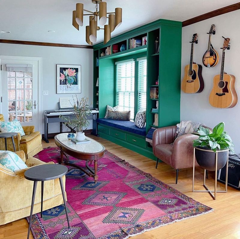
Eclectic doesn’t mean chaotic; it’s an artful mix of styles and colors. This approach allows for creativity, juxtaposing elements for a vibrant look.
Mix vintage with modern, bold with subtle – let your personality guide you. It’s like composing a jazz piece, where unexpected harmonies create excitement. The key is balance, ensuring no element overwhelms.
An eclectic mix celebrates diversity, turning your space into a lively tapestry that’s uniquely yours.
20. Add Greenery for Freshness
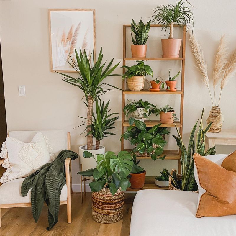
Plants are nature’s color accents, adding vibrancy and freshness to your decor. They bring life and a natural element to any color scheme.
Whether it’s a towering ficus or delicate succulents, greenery enhances every palette. It’s like inviting nature indoors, adding texture and color. These living elements complement any hue, making them a versatile addition. Plants purify the air and uplift the space, ensuring your home feels alive and thriving.
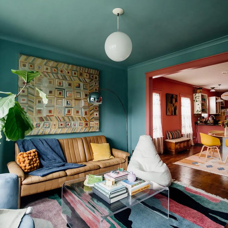
21. Consider Ceiling Colors
Ceilings are often overlooked, but they offer a canvas for creativity. Painting your ceiling can add height, depth, or drama to your color scheme.
Choose a shade that complements the walls or go bold for contrast. It’s like adding a crown to your decor, elevating the room’s ambience. This unexpected element can surprise and delight, ensuring your space feels complete. Ceilings are no longer just overhead – they’re an essential part of your design story.
22. Reflect with Mirrors
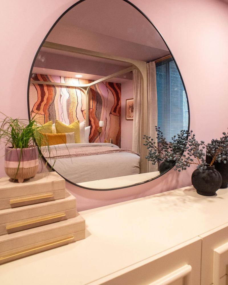
Mirrors are magical in a color scheme, amplifying light and space. They reflect colors, making them appear more vibrant and expansive.
Strategically place mirrors to bounce light and highlight your palette. It’s like doubling your design efforts, creating a sense of space and luminosity. Mirrors add elegance and functionality, ensuring your room feels open and inviting.
They play both supporting and starring roles in your decor, making every corner shine.
23. Mix Old with New
Blending old and new elements creates a timeless design. Incorporate vintage pieces into a modern color scheme to add depth and character.
This contrast highlights the best of both worlds, creating a dynamic and layered look. It’s like time traveling through design, where history meets the present.
Mixing styles encourages creativity, ensuring your space doesn’t just follow trends but tells a story. It’s harmony across time, making your decor both stylish and meaningful.
24. Enhance with Lighting
Lighting is the unsung hero in a color scheme, dramatically affecting how colors appear. Layered lighting can highlight your palette and set the mood.
Use ambient, task, and accent lighting to create depth and interest. It’s like painting with light, ensuring every shade shines. Well-chosen lighting adds warmth and drama, transforming spaces from ordinary to extraordinary.
Illuminate your design with thoughtful lighting, making colors come alive and enhancing every detail.