15 Color Rules For Neutral Schemes Plus 5 Simple Ways To Make A Neutral Room More Exciting
Ever walked into a neutral-colored room and felt something was missing, but couldn’t quite put your finger on it? Neutral color schemes offer timeless elegance and versatility, but mastering them requires understanding some key principles.
Whether you’re redecorating your living room or designing a new space, these color rules and excitement-boosting tips will transform your neutral palette from boring to breathtaking.
1. Mix Multiple Neutrals Together
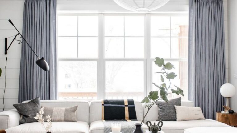
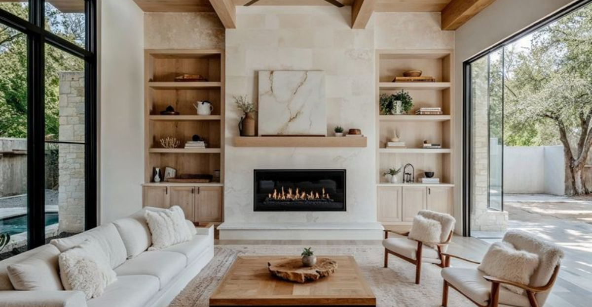
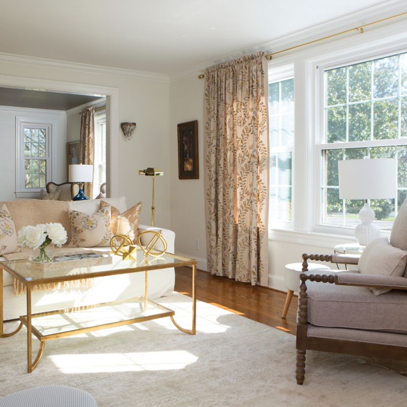
Creating depth in neutral spaces isn’t about using just one shade of beige. Combine several neutrals—think creamy whites, soft taupes, and gentle grays—to build visual interest without overwhelming the senses.
When layering these colors, consider how natural light affects each tone throughout the day. This thoughtful mixing prevents your room from falling flat and instead gives it a sophisticated, multi-dimensional quality.
2. Understand Undertones

Hidden beneath every neutral shade lies an undertone that can make or break your color scheme. Some beiges lean pink, while certain grays might have blue or green undertones lurking beneath the surface.
Hold samples against a pure white background to reveal these secret hues. Matching complementary undertones creates harmony, while clashing ones can make your carefully selected neutrals look oddly mismatched, even if you can’t immediately identify why.
3. Follow the 60-30-10 Rule
Balance is key when working with neutrals! Allocate 60% of your space to a dominant neutral (typically walls and large furniture), 30% to a secondary color (accent furniture and textiles), and 10% to accessories or pops of contrast.
This golden ratio creates visual harmony while preventing monotony. Your eyes need places to rest and points of interest, and this formula delivers both without overwhelming the senses.
4. Create Contrast with Varying Shades
Whispers and shouts of the same color family can coexist beautifully! Pairing light ivory with deep chocolate brown creates dramatic depth while maintaining your neutral theme.
Your brain craves contrast to distinguish elements in a space. Without it, everything blurs together. By incorporating both pale and rich neutrals, you’ll define zones and highlight architectural features that might otherwise disappear in a sea of sameness.
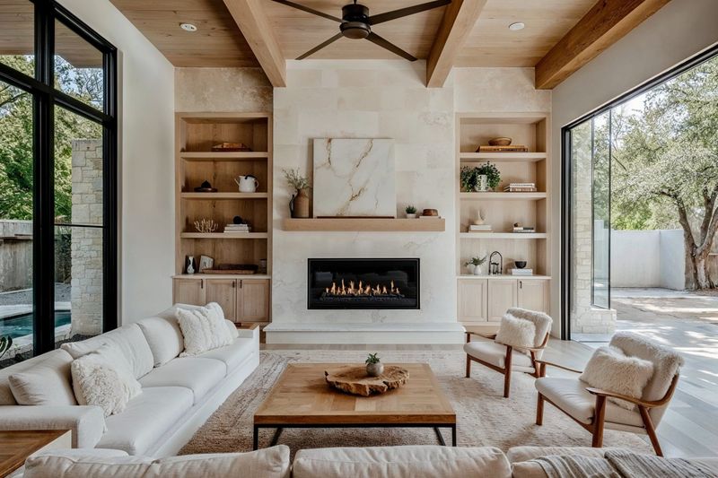
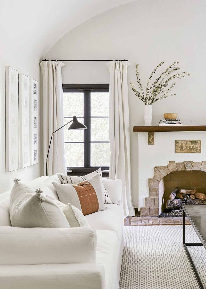
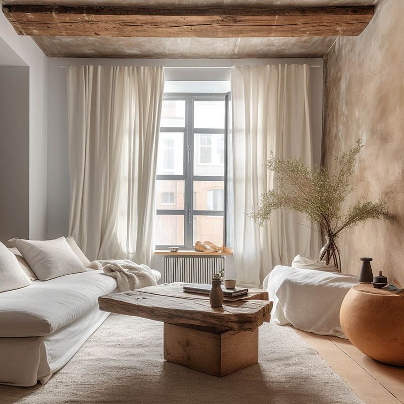
5. Incorporate Natural Materials
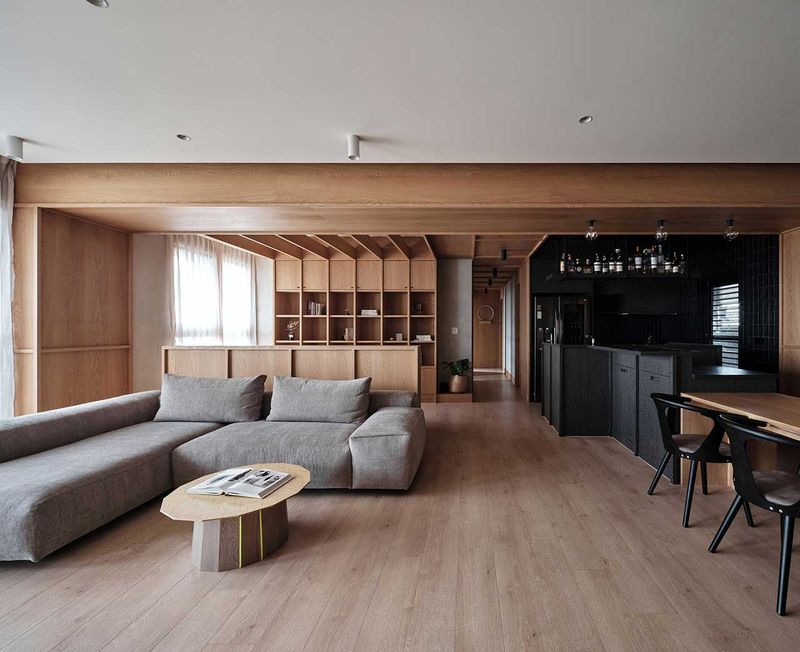
Mother Nature mastered neutrals long before interior designers! Wooden furniture, stone countertops, jute rugs, and linen curtains introduce authentic neutral colors with built-in character.
These materials bring organic variation and visual texture that manufactured products often lack. Plus, they age beautifully, developing patinas that add depth and history to your space over time, making your neutral palette feel grounded and timeless.
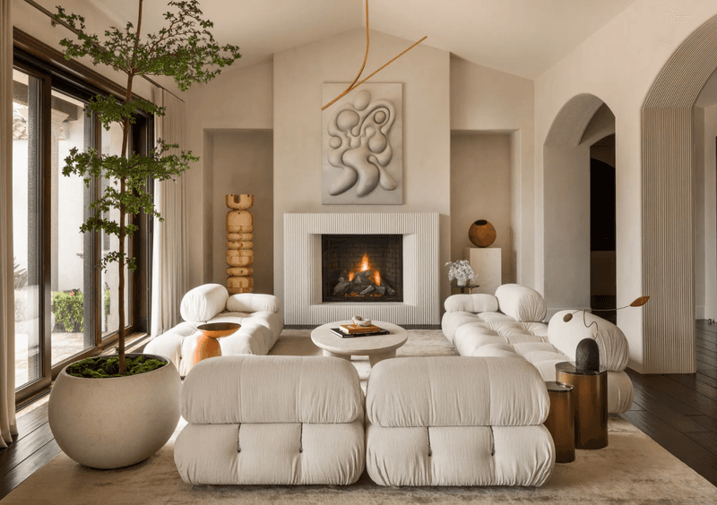
6. Layer Different Textures
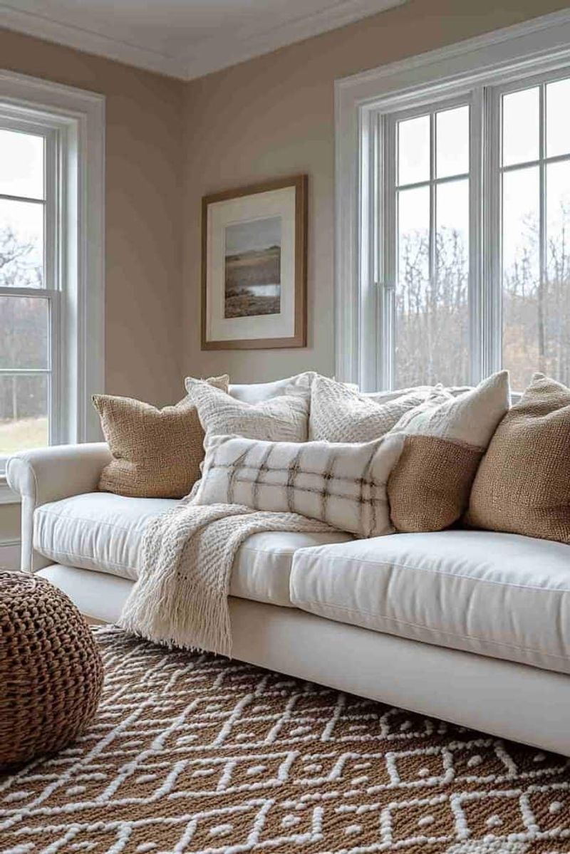
When colors don’t shout, textures must speak up! A velvet pillow nestled against a linen sofa, topped with a chunky knit throw creates tactile interest that compensates for limited color contrast.
Texture adds dimension through light and shadow play. Running your fingers across different surfaces creates a sensory experience that flat, one-dimensional spaces lack. This tactile diversity prevents neutral rooms from feeling sterile or boring.
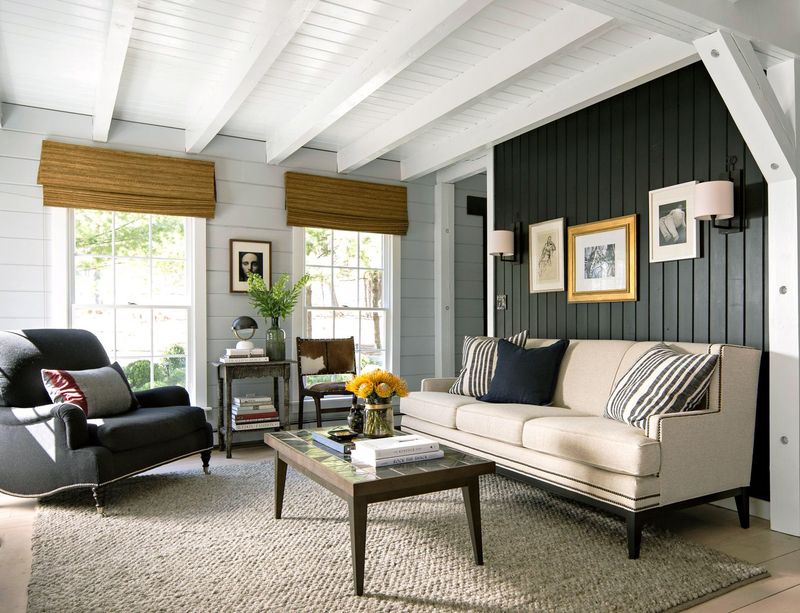
7. Balance Warm and Cool Neutrals
Imagine your room as a temperature map. Warm neutrals (beiges, creams, tans) create coziness, while cool neutrals (grays, whites) offer sophistication and calm.
Mixing both temperature families prevents a space from feeling too stuffy or too sterile. For instance, cool gray walls balanced with warm wooden furniture creates perfect equilibrium. This temperature balancing act is particularly important in rooms that need both relaxation and energy.
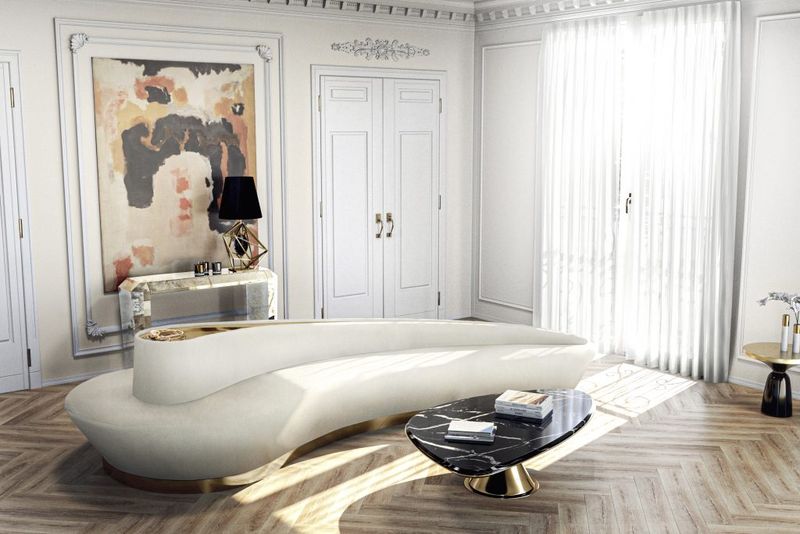
8. Use Black as an Anchor
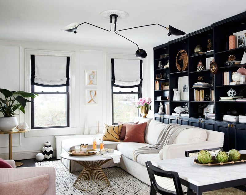
A touch of black works like punctuation in a neutral space! Without it, your room might read as one long, run-on sentence of beige and cream.
Black picture frames, lamp bases, or door hardware provide visual stopping points. These anchoring elements give the eye places to rest and create definition. Just like a perfectly placed period completes a thought, these black accents complete your design composition.
9. Consider Lighting Effects
Northern light casts blue tones while southern exposure brings out yellows in your neutrals. What looks perfect in daylight might appear completely different under artificial lighting at night.
Test paint samples on multiple walls and observe them throughout the day. Smart lighting choices—warm bulbs for cool neutrals and cooler bulbs for warm neutrals—can balance and enhance your color scheme regardless of natural light conditions.
10. Embrace Architectural Elements
Crown moldings, wainscoting, and ceiling medallions provide built-in contrast through shadows and highlights, even when painted the same color as surrounding surfaces.
In neutral spaces, these architectural details become even more important as they create visual interest through dimension rather than color. A simple trick: paint trim one shade lighter or darker than walls to subtly emphasize these features without breaking your neutral palette.
11. Follow the Rule of Three
Magic happens in threes! When selecting your neutral palette, choose three main colors and repeat them throughout your space for cohesion.
Perhaps ivory walls, greige upholstery, and taupe accents become your signature trio. This repetition creates rhythm and prevents the chaotic feeling that comes from too many competing neutrals. Like a well-composed song, these repeated notes create harmony rather than noise.
12. Pay Attention to Finishes
Matte, satin, gloss—oh my! Varying the sheen of your neutrals adds another dimension of contrast without introducing new colors.
A matte wall paired with glossy trim creates subtle distinction even when they’re the same color. Metallic finishes like brushed nickel, antique brass, or chrome introduce reflective qualities that catch light differently throughout the day, adding sparkle to an otherwise subdued palette.
13. Ground the Space with Darker Floors
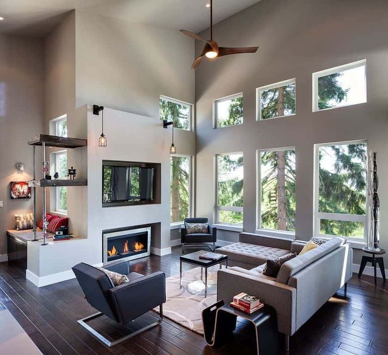
Floors act as your room’s foundation both literally and visually. Darker neutral flooring creates a grounding effect that anchors lighter elements above.
Just as the earth is darker than the sky, this natural progression feels instinctively right to our eyes. Walnut hardwood, charcoal tile, or deep chocolate carpet provides a solid base that allows lighter neutrals to feel airy and weightless by comparison.
14. Maintain Consistent Intensity
Not all neutrals are created equal! Some whisper while others command attention. For a sophisticated look, choose neutrals with similar color intensity or saturation levels.
Pairing a bold greige with a timid off-white creates imbalance. Instead, match the strength of your neutrals—either all soft and muted or all rich and saturated. The consistency creates flow between spaces and prevents any single element from awkwardly standing out.
15. Use the Color Wheel for Undertone Selection
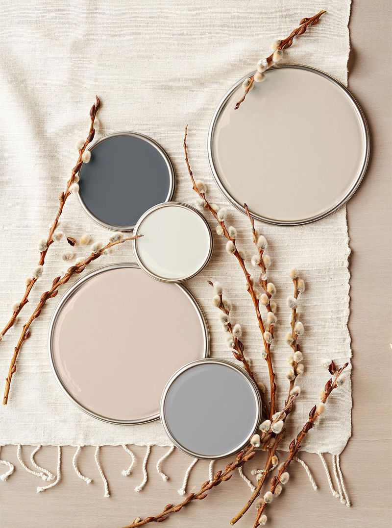
Even neutrals follow color theory! Identify your neutral’s undertone (yellow, pink, blue, green), then consult the color wheel for harmonious pairings.
Neutrals with blue undertones pair beautifully with those carrying purple undertones (adjacent on the color wheel). Understanding these relationships helps you build sophisticated neutral palettes that feel intentional rather than accidental.
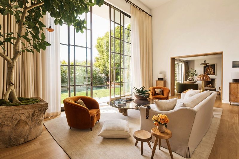
16. Add a Statement Plant
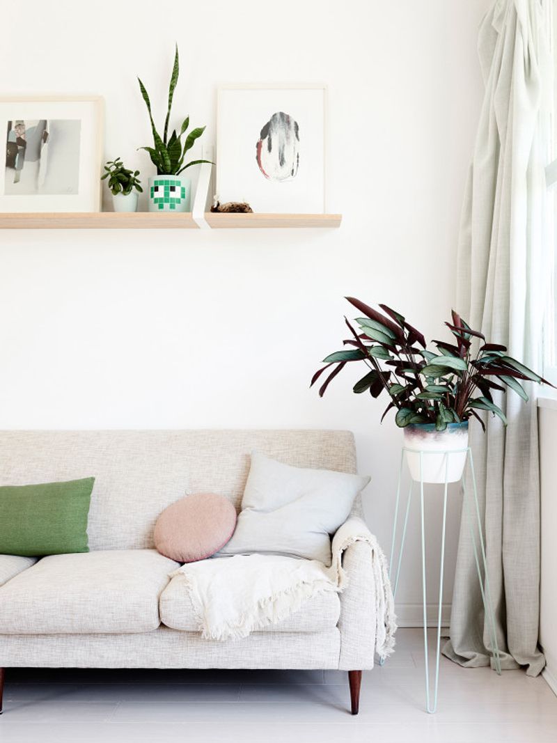
Nothing breathes life into neutrals like verdant greenery! A fiddle leaf fig, monstera, or cascading pothos introduces natural color that somehow never clashes with any neutral palette.
Plants provide the perfect organic contrast to man-made elements. Their irregular shapes and varied textures break up the predictability of neutral furnishings. Plus, they improve air quality while adding that crucial touch of nature that makes spaces feel complete.
17. Incorporate Bold Artwork
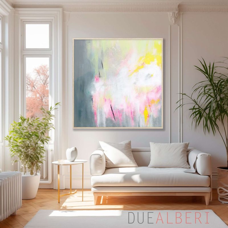
A vibrant painting against neutral walls creates magnetic focal points that transform your space! Think of your neutral room as a gallery where colorful art becomes the star of the show.
The contrast between quiet backgrounds and expressive artwork creates dramatic impact. Choose pieces that incorporate small hints of your neutral palette to maintain connection. Such strategy allows you to enjoy bold colors without committing to them on larger, more permanent surfaces.
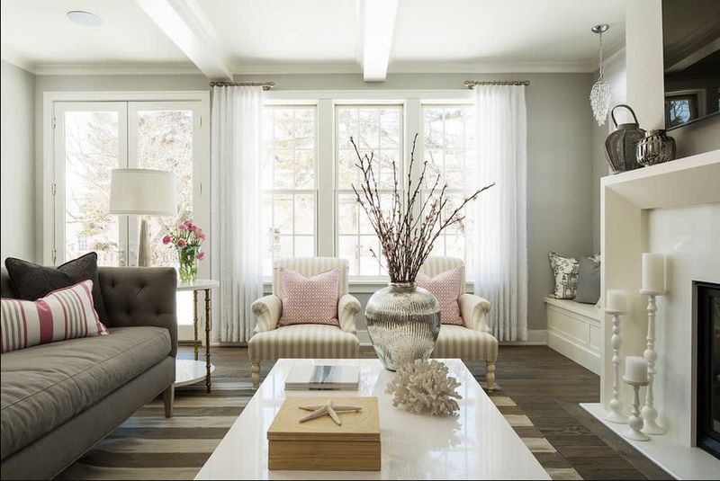
18. Use Colorful Textiles as Accents
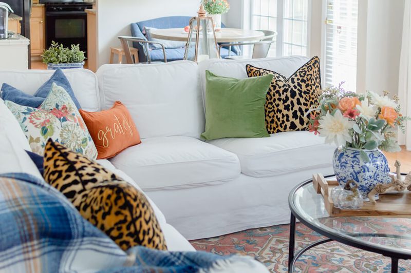
Swapping pillows and throws is far easier than repainting walls! Introduce seasonal color through these temporary textiles while maintaining your neutral foundation.
Perhaps burnt orange pillows for fall, emerald green for winter, and coral for summer. These easy changes refresh your space without major commitment. The beauty of neutrals is their chameleon-like ability to complement virtually any accent color you introduce.
19. Install Statement Lighting
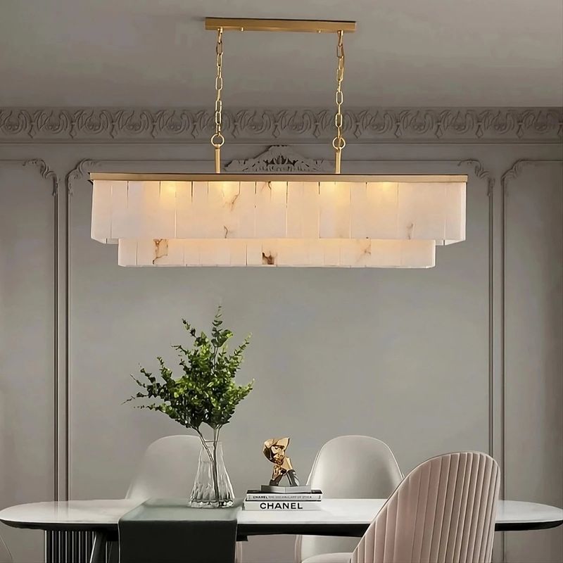
A chandelier isn’t just illumination—it’s jewelry for your ceiling! Sculptural lighting fixtures add personality and visual interest to neutral spaces, especially when they feature unique materials or unexpected forms.
Metallic finishes like brass or copper introduce warmth and reflection. The shadows cast by distinctive fixtures create patterns that add another layer of visual texture. When the fixture itself is a work of art, your neutral backdrop allows it to shine.
20. Incorporate Patterns Strategically
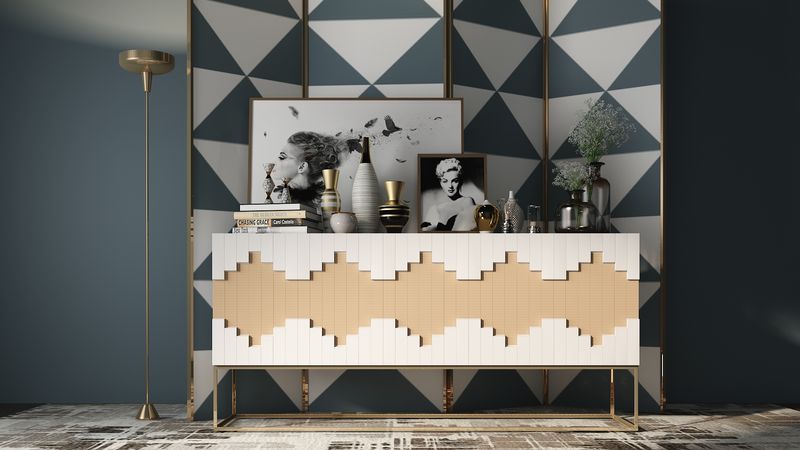
Patterns add movement and energy to static neutral spaces! Herringbone floors, striped rugs, or subtle geometric wallpaper introduces visual rhythm without disrupting your color scheme.
Tone-on-tone patterns (same color, different textures) add sophistication without overwhelming the senses. For maximum impact with minimal risk, concentrate patterns on smaller items like pillows or on a single accent wall rather than throughout the entire space.