
Ever wondered why certain colors just seem to pop and others flop? Imagine strolling through a gallery of hues, each whispering a secret in your ear about why they make you feel the way you do.
This isn’t magic – it’s color psychology – a designer’s hidden tool! Join us as we spill the paint on 26 closely-guarded secrets that reveal how colors can influence moods, decisions, and even perceptions.
Whether you’re a designer looking to brush up on your skills or simply color-curious, these vibrant tips will add a splash of insight to your palette!
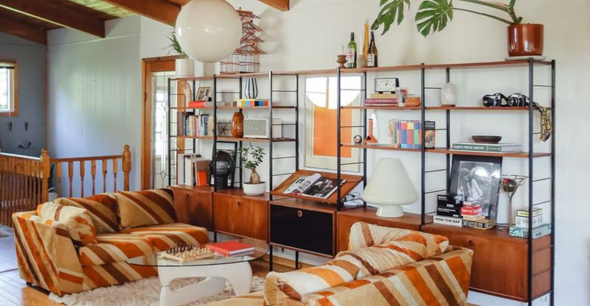
1. The Power of Red
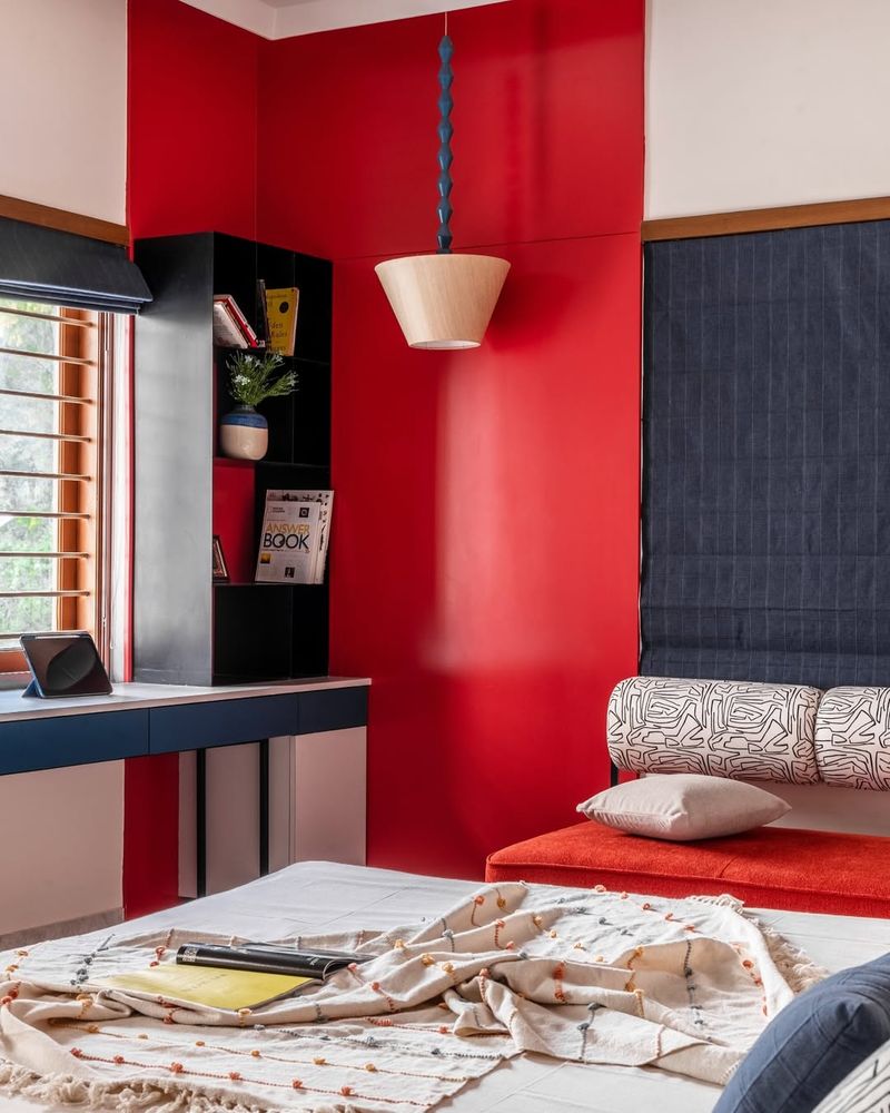
Feeling a bit daring today? Red might just be the color for you! This hue is known for its ability to boost energy levels and create a sense of urgency. Perfect for those clearance sale signs!
Red’s boldness can even stimulate appetite, making it a popular choice for restaurant design. But beware, too much red can feel overwhelming.
Use red as an accent to draw attention to key elements or to inject a burst of passion into a space. It’s all about balance when playing with fire!
2. Calming Blues
Ever noticed how looking at the ocean can instantly calm you down? That’s the magic of blue! Associated with tranquility and trust, blue is often used in offices to promote productivity and focus.
Its soothing effect makes it ideal for spaces meant for relaxation, like bedrooms and bathrooms. But don’t go overboard—too much blue can feel cold and distant.
Pairing blue with warmer tones can create a balanced environment. Dive into the depths of creativity with this cool, collected color!
3. Yellow: A Ray of Sunshine
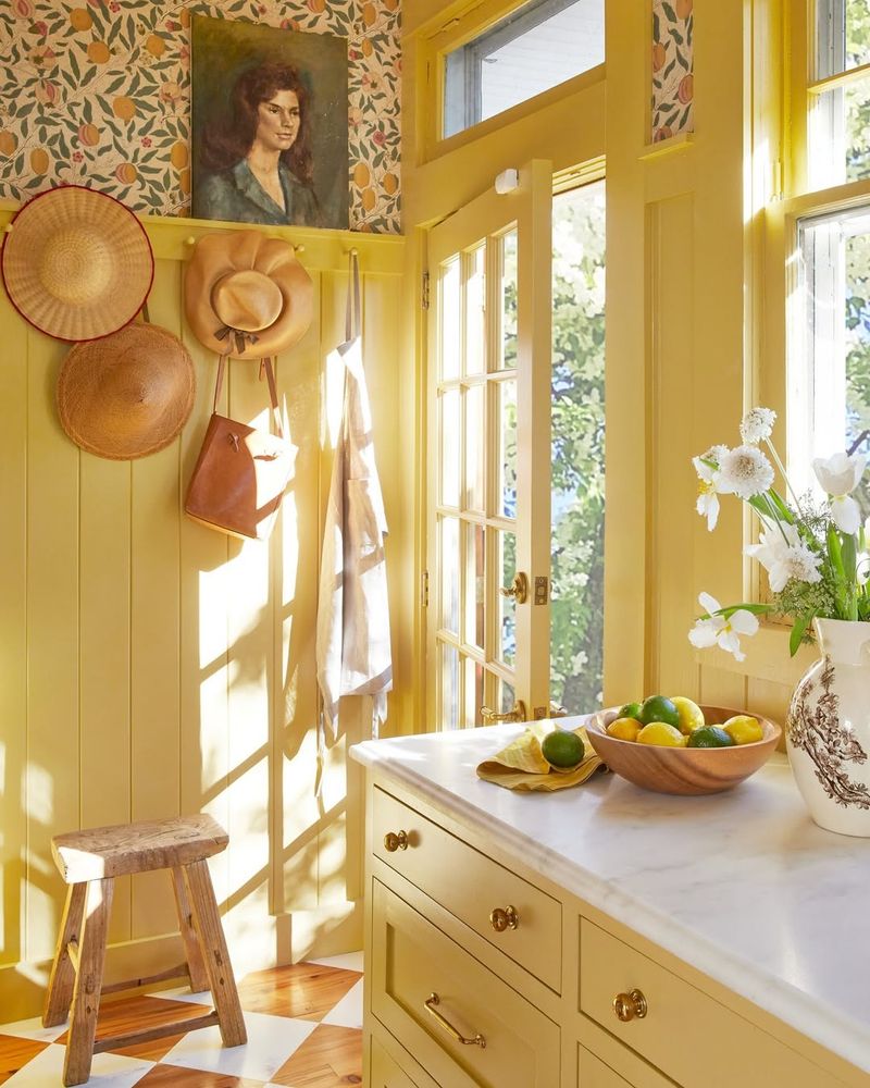
Need a pick-me-up? Surround yourself with yellow! This cheerful color is synonymous with happiness and positivity, often used to grab attention and lift spirits.
Yellow is perfect for playrooms and kitchens, where energy and creativity are key. However, too much yellow can lead to irritation, so sprinkle it sparingly.
Use yellow to highlight important features or to convey warmth and optimism. It’s the color that says, “Everything will be alright!” without uttering a word.
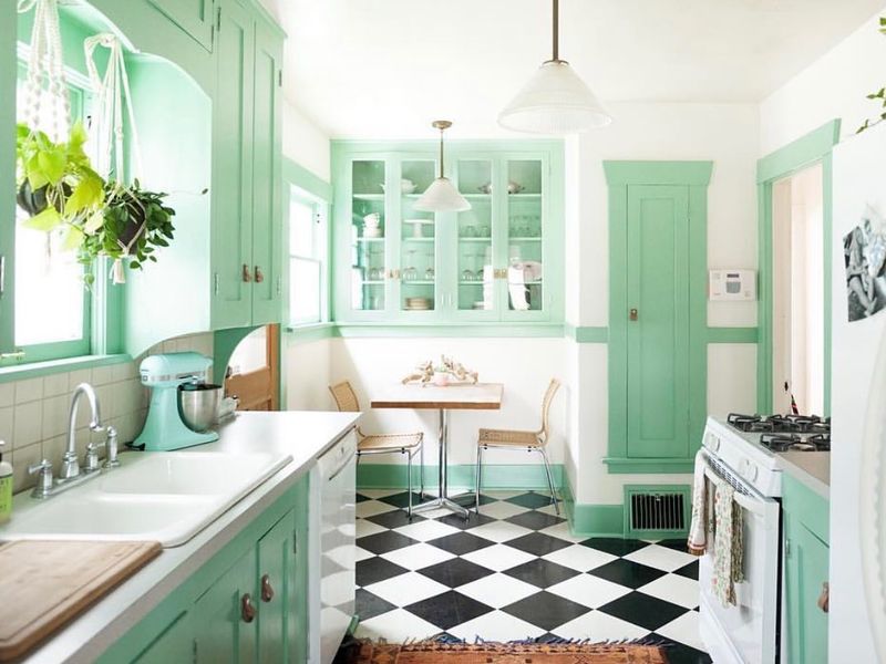
4. Green’s Natural Harmony
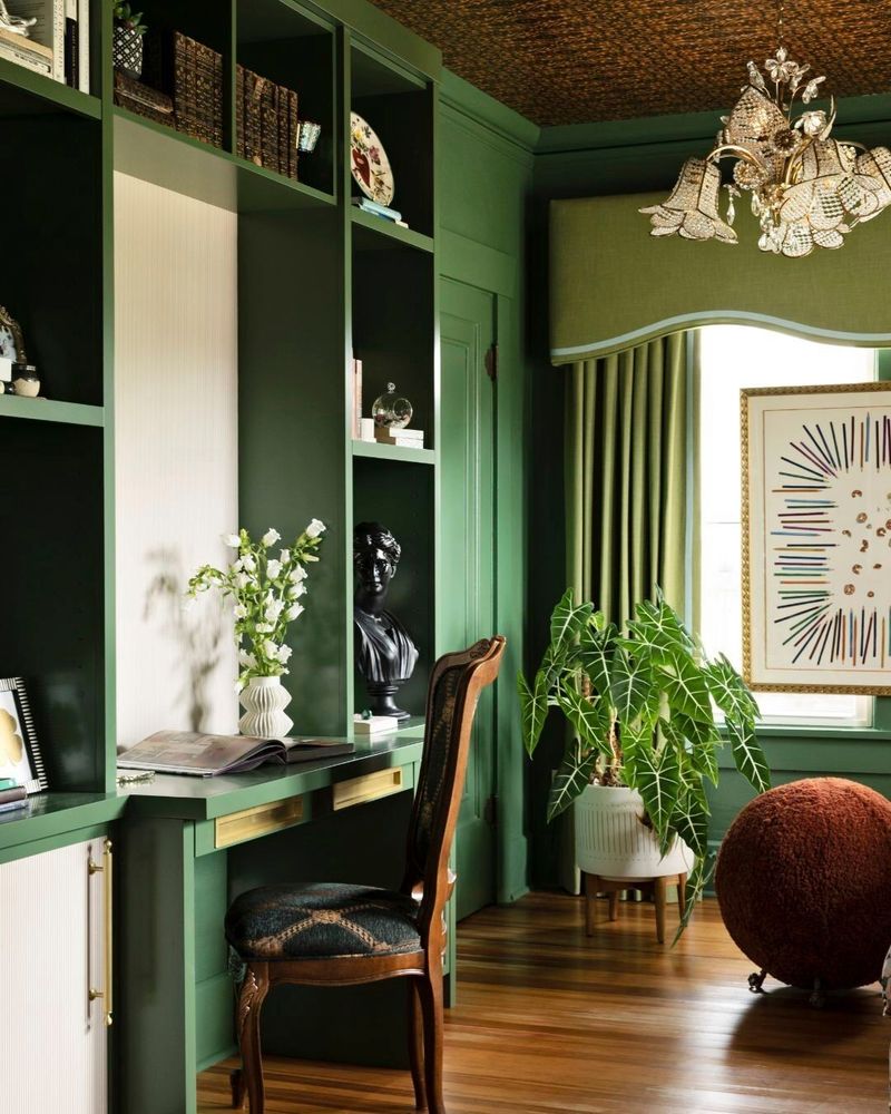
Green is the color of balance and nature, bringing the outdoors inside. Known for its calming properties, it helps reduce stress and creates a sense of harmony.
Ideal for living rooms and study areas, green fosters concentration and serenity. It bridges the gap between modern living and the natural world.
Too much green, however, can become monotonous. Mix it with other colors to keep things fresh and lively. Embrace the tranquility and peace that green offers!
5. Purple’s Royal Touch
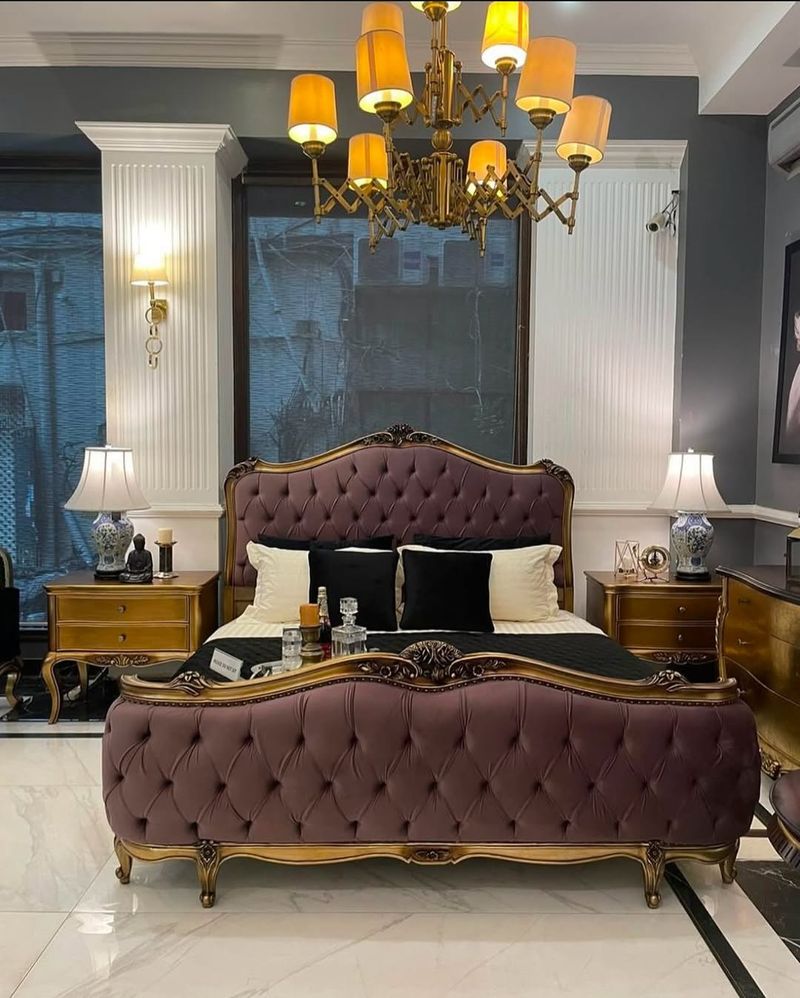
Fancy a touch of royalty? Purple’s your go-to! Historically associated with luxury and wisdom, it can add a sense of mystique to any design.
Perfect for creative spaces, purple stimulates imagination and intrigue. It works wonders in artistic environments where ideas flow freely.
Remember, a little goes a long way—too much purple can be overwhelming. Balance it with neutral tones for a regal yet approachable look. Unleash your inner king or queen!
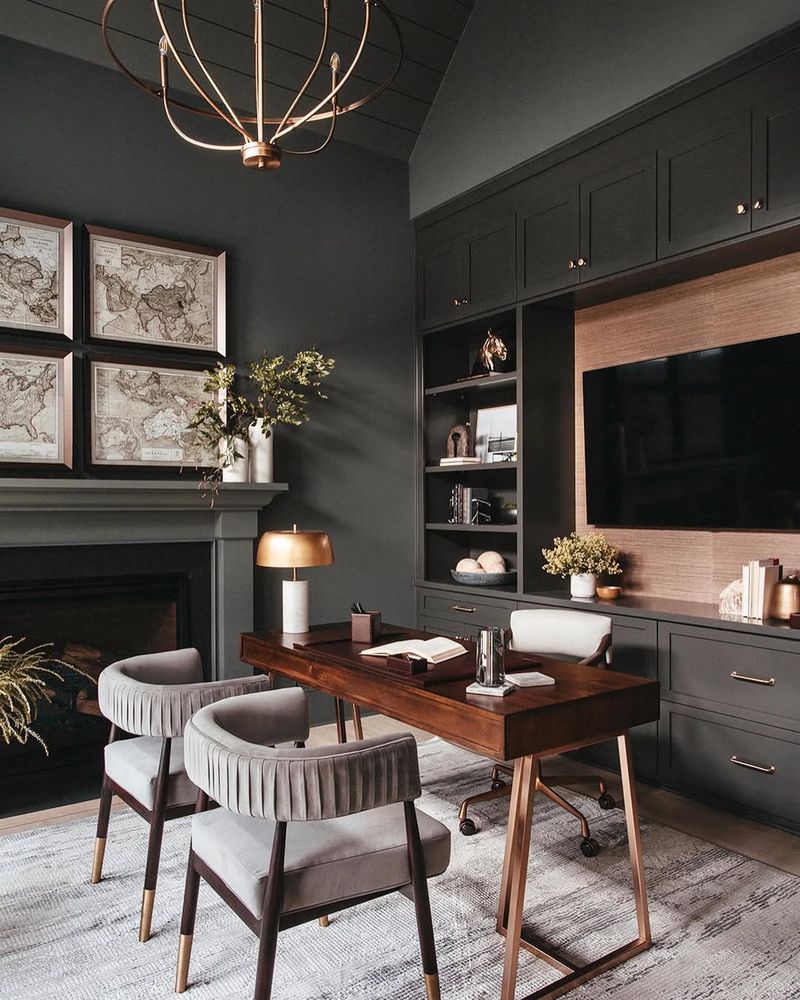
6. The Elegance of Black
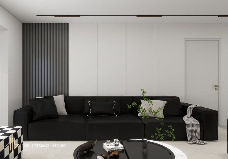
Black never goes out of style. Its elegance and sophistication can elevate any space, making it a staple in modern and chic design.
While black can create drama and depth, it should be used thoughtfully to avoid a gloomy atmosphere. Combining black with lighter shades creates balance and contrast.
Use black to add a touch of mystery and elegance to your design. It’s the color of authority and style, but remember, a little mystery goes a long way!
7. White’s Clean Slate
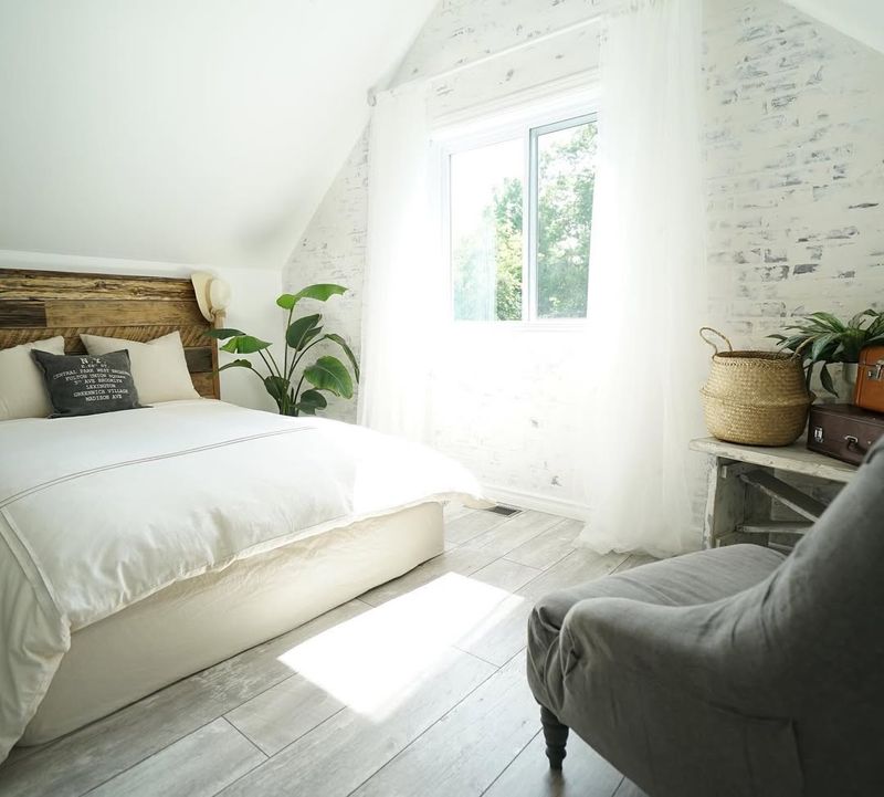
White represents purity and simplicity, providing a blank canvas for creativity. It’s the go-to color for creating a sense of space and light in smaller areas.
While it exudes cleanliness, too much white can feel sterile. Pair it with textures and color accents to add warmth and character.
Use white to refresh and rejuvenate a space, making it feel open and airy. It’s the color that whispers, “Let’s start anew!”
8. Orange: The Social Butterfly
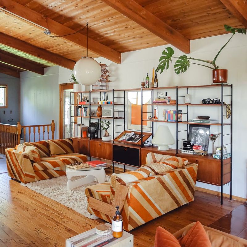
Orange you glad this color exists? Known for its social and friendly vibe, orange is perfect for spaces meant for interaction and fun.
It’s energetic and enthusiastic, making it ideal for family rooms and workout spaces. Use orange to foster communication and a sense of community.
Too much orange, though, can feel overwhelming, so balance it with cooler hues. It’s the color that says, “Let’s get together and have a good time!”
9. The Mystery of Gray
Gray, the silent observer, brings balance and sophistication to any space. This neutral tone is versatile, complementing both bold and subtle designs.
Its calming presence makes it a favorite for offices and bedrooms, where concentration and relaxation are key. Gray’s neutrality offers a backdrop for other colors to shine.
Use gray to create an understated elegance, a quiet strength in design. Embrace the mystery and versatility that gray provides.
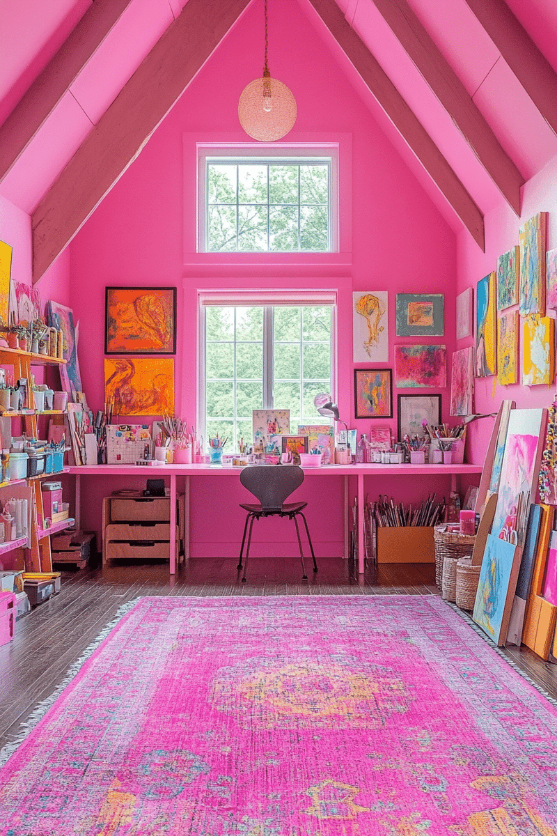
10. Pink’s Playful Elegance
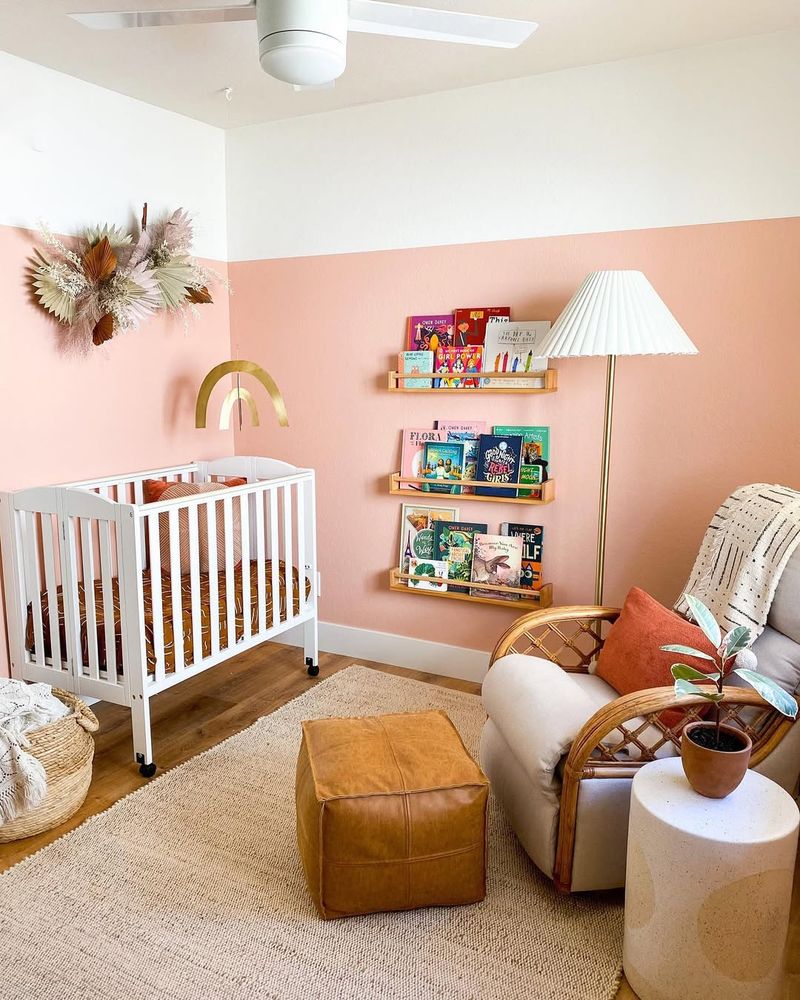
Tickled pink by this color’s charm? Traditionally seen as playful and romantic, pink brings an element of fun with sophistication.
Perfect for nurseries and bedrooms, pink’s soothing quality promotes calmness and tenderness. It adds a gentle touch to any space.
Pair pink with neutral tones to balance its sweetness, creating a graceful and inviting environment. It’s the color that says, “Stay a while and smile!”
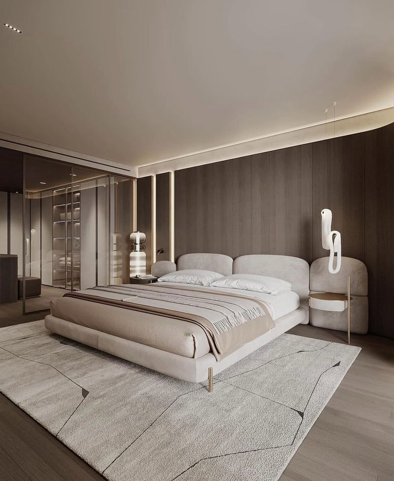
11. Beige: The Understated Neutral
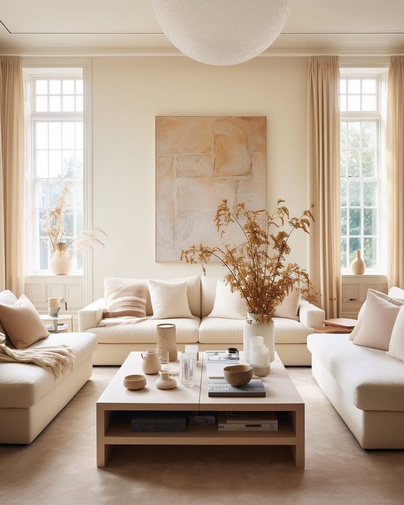
Beige may seem simple, but it carries a quiet elegance. This neutral hue offers warmth and versatility, often used to create a cozy and welcoming atmosphere.
Ideal for living rooms and common areas, beige complements various styles without overpowering them. It’s the perfect backdrop for creativity.
Be cautious, as too much beige can become bland. Pair it with bold colors or textures to add depth and interest. Beige whispers, “You’ve got this, stay grounded.”
12. Turquoise: The Refreshing Breeze
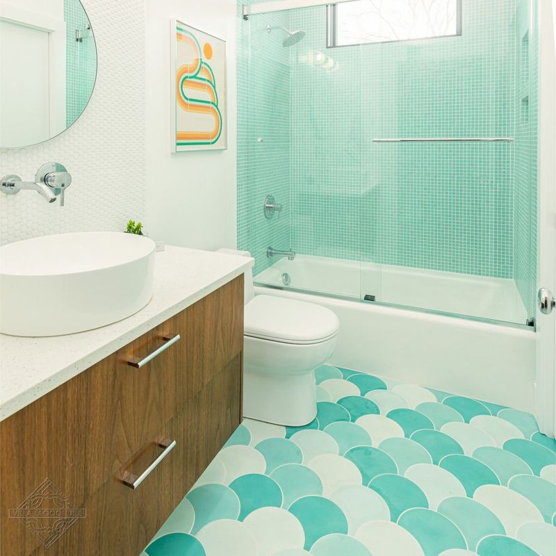
Turquoise, the ocean’s whisper, combines the calmness of blue with the energy of green. It offers a refreshing and invigorating feel to any design.
Ideal for bathrooms and chill-out zones, turquoise promotes relaxation and rejuvenation. It brings a touch of the tropics to your space.
Too much turquoise might overwhelm, so balance it with neutral tones.
13. The Vibrancy of Magenta
Magenta screams bold and confident! This vibrant hue is perfect for making a statement and adding flair to any design.
It’s ideal for creative spaces like studios and galleries, where imagination runs wild. Use magenta to inject passion and excitement into a room.
Be mindful, as too much magenta can overpower a space. Balance it with softer tones and textures. Magenta shouts, “Be fearless, be fabulous!”
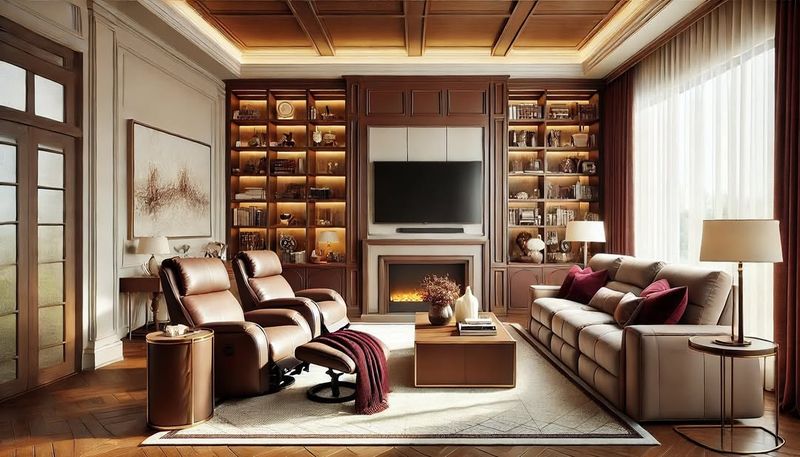
14. Brown’s Earthy Comfort
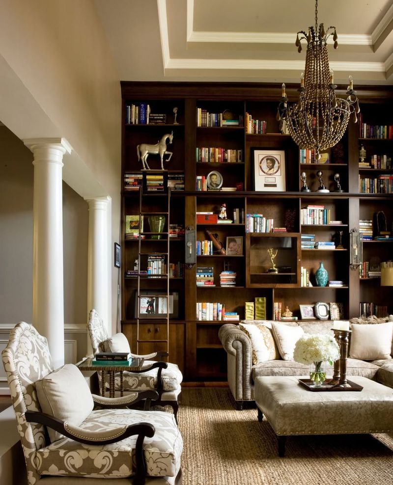
Craving comfort? Brown’s earthy tones provide warmth and stability, making it a favorite for rustic and natural designs.
Ideal for family rooms and libraries, brown fosters a sense of security and relaxation. It connects a space with its natural surroundings.
Too much brown can feel heavy, so mix it with lighter colors.
15. The Freshness of Mint
Mint, the breath of fresh air, combines the tranquility of green with a hint of zest. It’s rejuvenating and refreshing, perfect for kitchens and bathrooms.
This color promotes cleanliness and vitality, giving a space a lively and invigorating feel. Use mint to add a touch of freshness to your design.
A little mint goes a long way—too much can take over the space. Let it shine by pairing it with neutral tones for a refreshing, balanced look.
16. Ivory’s Timeless Grace
Ivory, the epitome of timeless elegance. This off-white hue exudes sophistication and grace, often used in formal and luxurious settings.
Ideal for dining rooms and ballrooms, ivory creates a sense of refinement and classic charm. It complements both traditional and modern designs.
An overdose of ivory can fall flat—bring it to life with bold colors or rich textures for a striking contrast.
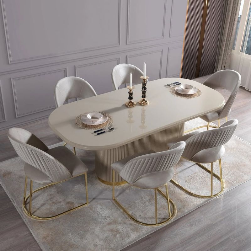
17. Gold’s Opulent Glow
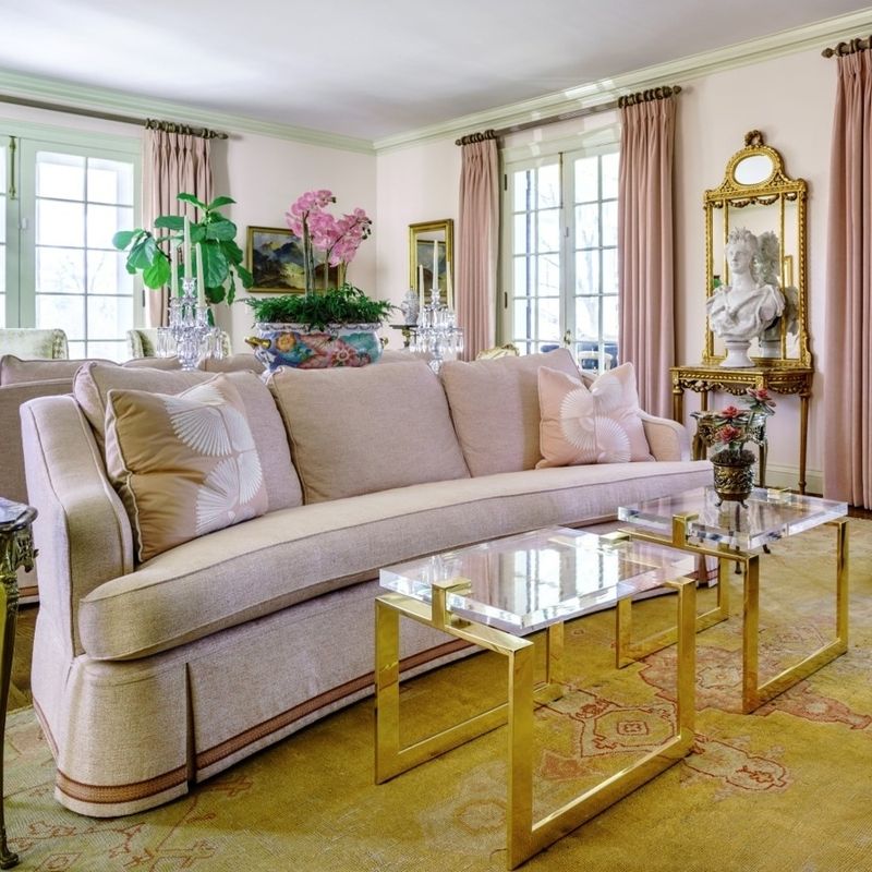
Gold, the symbol of opulence and grandeur. This lavish color adds a touch of luxury and warmth to any space.
Ideal for living rooms and upscale areas, gold radiates sophistication and wealth. Use it to highlight architectural details or to add a touch of glamour. Pair it with neutral tones to keep it elegant.
18. Lavender’s Subtle Serenity
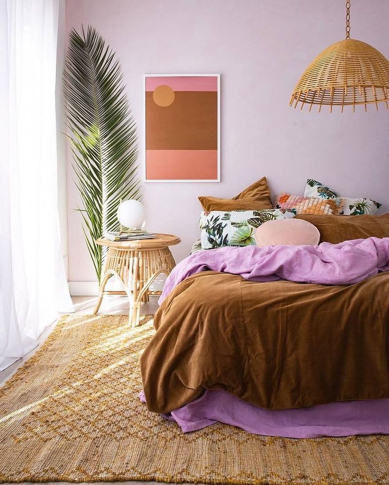
Lavender, the soft whisper of serenity. This gentle hue promotes calmness and relaxation, perfect for bedrooms and meditation spaces.
Its soothing quality helps reduce stress and anxiety, creating a tranquil environment. Lavender pairs well with whites and grays for a peaceful palette.
Lavender in excess can lose its charm—give it depth by pairing it with bold, contrasting hues.
19. Coral’s Cheerful Charm
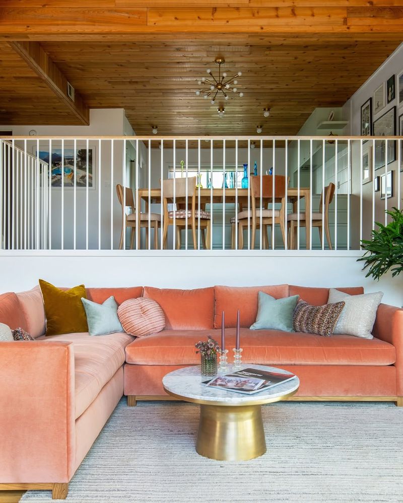
Coral, the burst of happiness. This vibrant color exudes warmth and joy, making it perfect for spaces meant for socializing and fun.
Ideal for living rooms and dining areas, coral encourages interaction and positivity. It’s the color that lifts spirits and brightens moods. Balance it with cooler tones.
20. Peach’s Subtle Sweetness
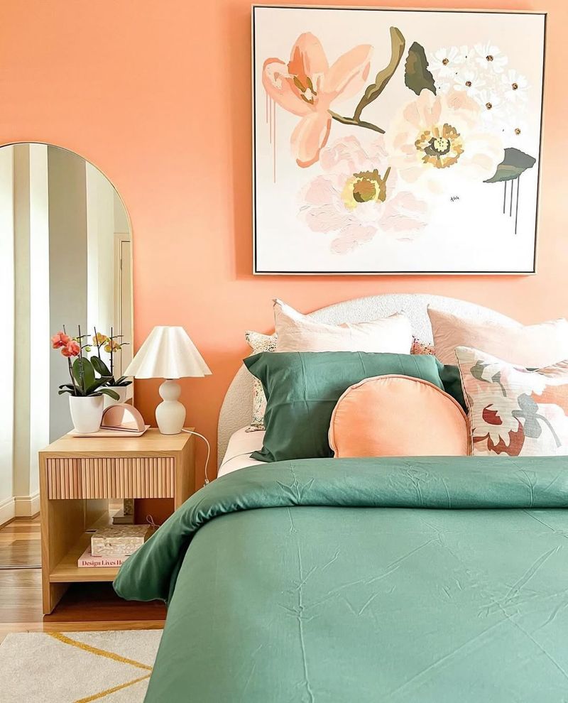
Peach offers a gentle touch of sweetness and warmth. This soft hue is perfect for creating a cozy and inviting atmosphere.
Ideal for bedrooms and living rooms, peach promotes relaxation and comfort. It adds a touch of cozy elegance to any space.
An overload of peach can turn overly sweet—temper it with cooler tones for a refreshing balance.
21. The Charisma of Teal
Teal, the captivating blend of blue and green. This color exudes sophistication and creativity, making it perfect for study and artistic spaces.
Ideal for libraries and offices, teal promotes focus and innovation. It adds depth and richness to a design.
An excess of teal can overwhelm—soften its depth with warm neutrals or crisp whites for a balanced, refreshing look.
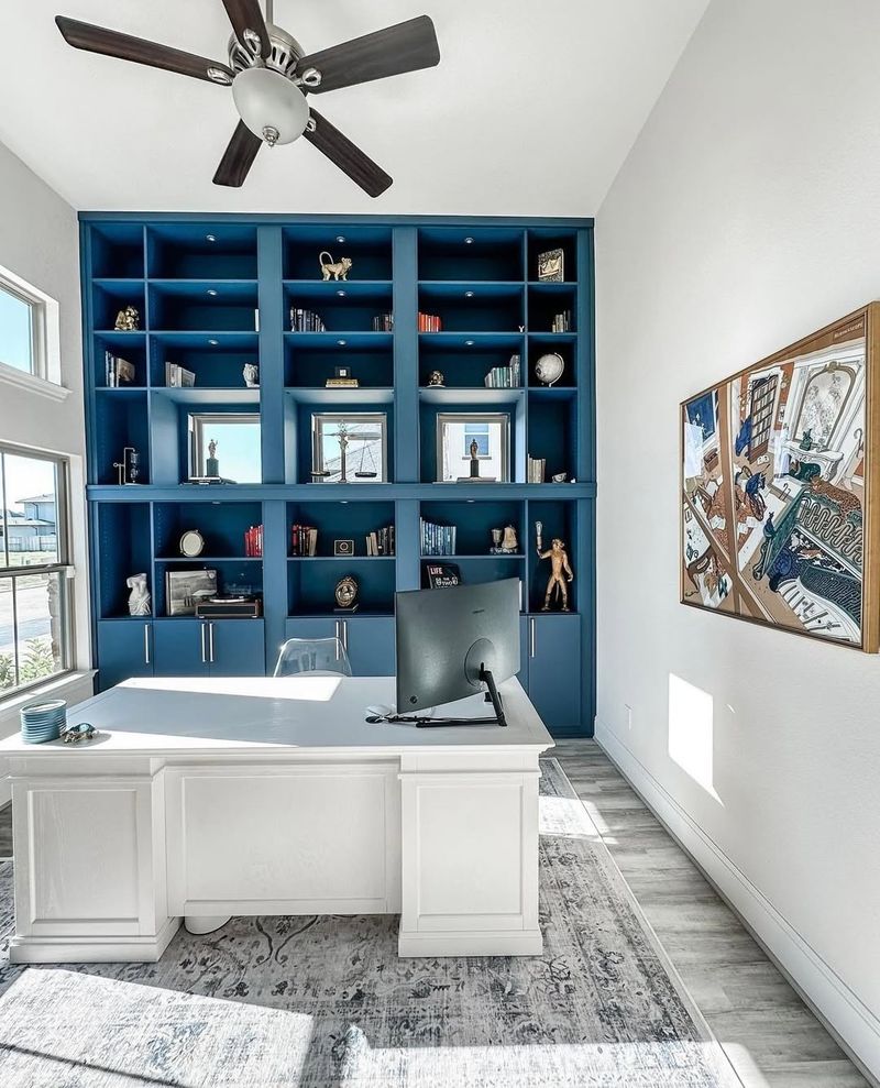
22. Navy’s Classic Authority
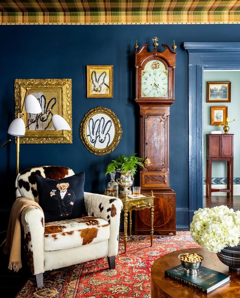
Navy, the color of classic authority and strength. This deep blue offers a sense of stability and reliability, perfect for formal and professional spaces.
Ideal for studies and offices, navy promotes focus and professionalism. It pairs well with golds and whites for a sophisticated look.
23. Lime’s Fresh Energy
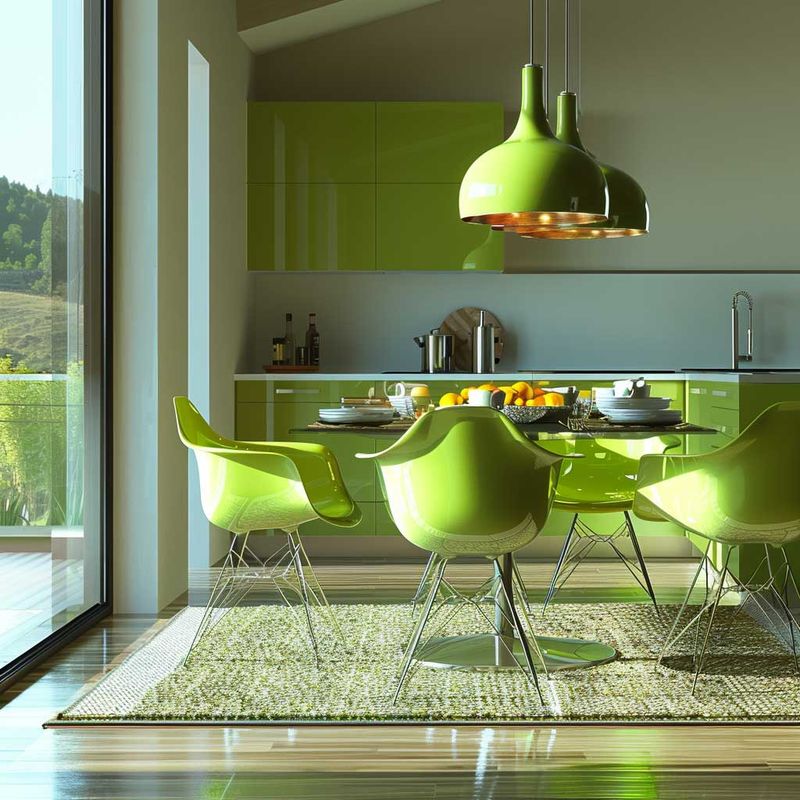
Lime, the zestful pop of energy! This lively color invigorates any space, making it perfect for kitchens and playrooms.
Ideal for energetic environments, lime promotes activity and creativity. It’s the color that wakes you up and gets you moving.
An overload of lime can feel electric—ground its vibrancy with soothing, muted tones for a well-balanced look.
24. Olive’s Earthy Sophistication
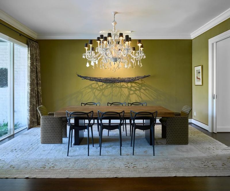
Olive, the subtle nod to nature. This sophisticated hue offers an earthy elegance, perfect for dining and living areas.
Ideal for creating a relaxing and grounded environment, olive complements neutral and natural materials. It adds depth and character without overpowering.
An abundance of olive can weigh a space down—lift it up with brighter hues for a fresh, dynamic contrast.
25. Maroon’s Warm Embrace
Maroon, the warm embrace of comfort and elegance. This rich color adds depth and luxury to any space.
Ideal for reading nooks and lounges, maroon promotes relaxation and sophistication. It pairs well with golds and neutrals for a cozy, inviting look.
Too much maroon can feel heavy – balance it with lighter shades.
26. Taupe’s Understated Elegance
Taupe, the color of understated elegance and sophistication. This versatile hue offers a neutral backdrop that complements various styles.
Ideal for living rooms and bedrooms, taupe promotes calmness and refinement. It pairs well with both bold and subtle colors, adding depth to a design.