18 Color Mistakes That Instantly Ruin Your Home’s Flow And Cohesion
Have you ever stepped into a house that just felt…off, but you couldn’t quite put your finger on why? I’ve definitely been there, and more often than not, it’s the color choices throwing everything out of whack.
The colors we pick can either tie our spaces together beautifully or make them feel cramped, cold, or like every room belongs in a different house.
If your home feels a bit disjointed, don’t worry, I’ve got you covered. Here are some common color mistakes that might be sabotaging your space and find easy ways to bring harmony back into your home!
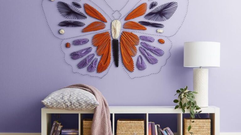
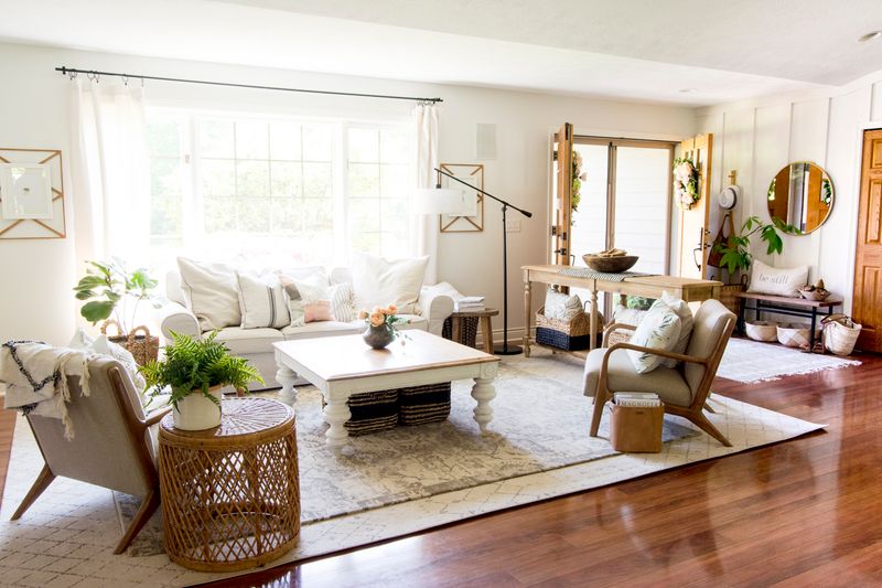
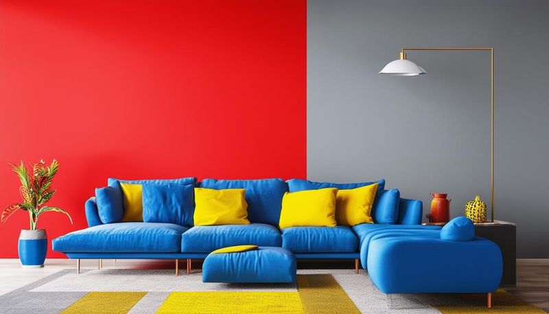
1. Going Rainbow Crazy
Painting each room a completely different color from the rest of your house creates a jarring experience as you move from space to space. Your home starts feeling like a patchwork quilt rather than a cohesive sanctuary.
Try selecting colors from the same family or temperature range instead. Pick a neutral base palette and add pops of different colors through accessories.
This approach maintains your creative spirit while giving your home that put-together feel visitors will notice immediately.
2. Ignoring Natural Light Sources
Room colors transform dramatically depending on how much sunshine they get! That perfect sage green can look muddy and dull in a north-facing room with minimal light.
Before committing to gallons of paint, test samples on different walls and check them throughout the day. Morning light differs from afternoon glow, and artificial evening lighting changes everything again.
Colors that work in sunny spots might fall flat in shadowy corners, creating an accidental patchwork effect.
3. Forgetting About Hallways
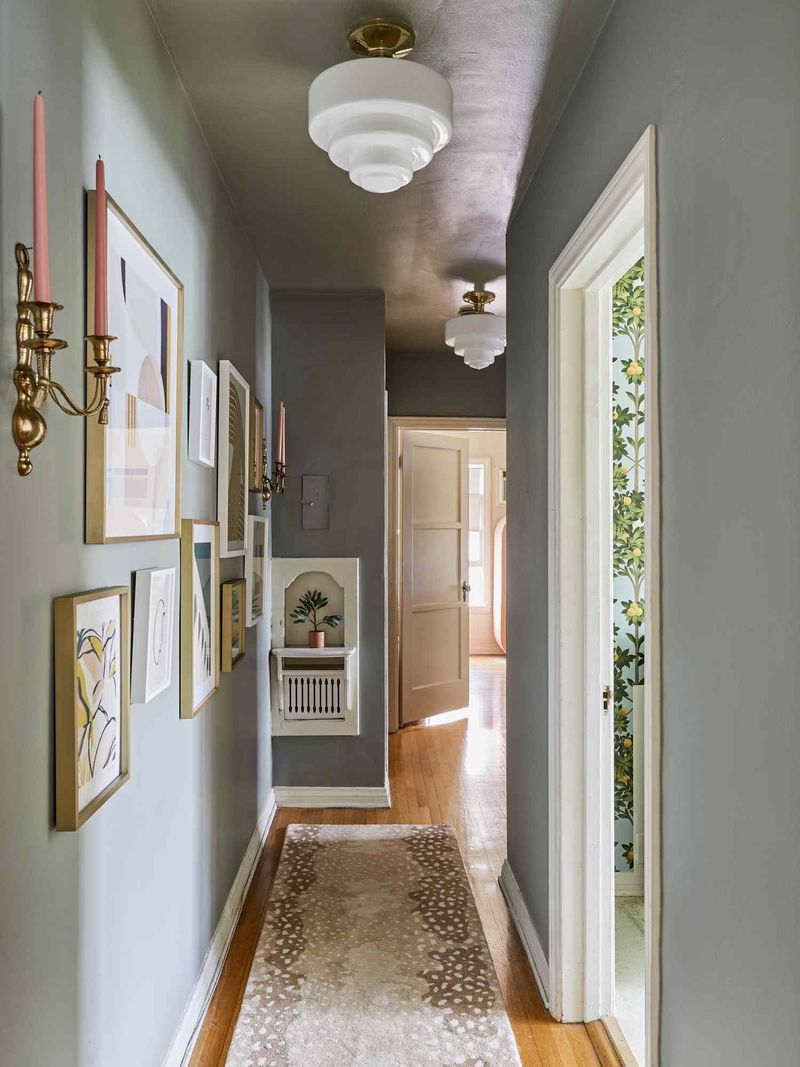
Hallways often become the forgotten stepchildren of home design. Many folks paint them boring white or ignore them entirely while focusing on ‘important’ rooms.
These transition spaces actually hold your home’s story together! When hallways clash with adjoining rooms, the visual journey through your house feels choppy and disconnected.
Consider hallways as connective tissue – they should complement both spaces they connect, creating a smooth color transition that guides visitors naturally from room to room.
4. Too Matchy-Matchy
Using the exact same color for absolutely everything creates a flat, boring space that lacks dimension. When your walls, trim, furniture and accessories are all the same shade of beige, your room becomes a beige blob with no personality.
Color needs contrast to shine! The eye craves visual interest and definition between elements. Create depth by varying shades within a color family or introducing complementary colors.
Even monochromatic rooms need texture variations and subtle shade differences to avoid the dreaded ‘furniture disappearing into walls’ syndrome.
5. Skipping The Color Test
Falling in love with a paint chip at the store often leads to color heartbreak at home. Those tiny squares can’t possibly show how a color will dominate an entire wall!
Paint samples directly on your walls – and not just in one spot. Check how the color looks in corners, near windows, and under different lighting conditions.
What looks perfect in daylight might turn murky at night. Many paint disasters could be avoided with this simple step that costs just a few dollars and saves hundreds in repainting expenses.
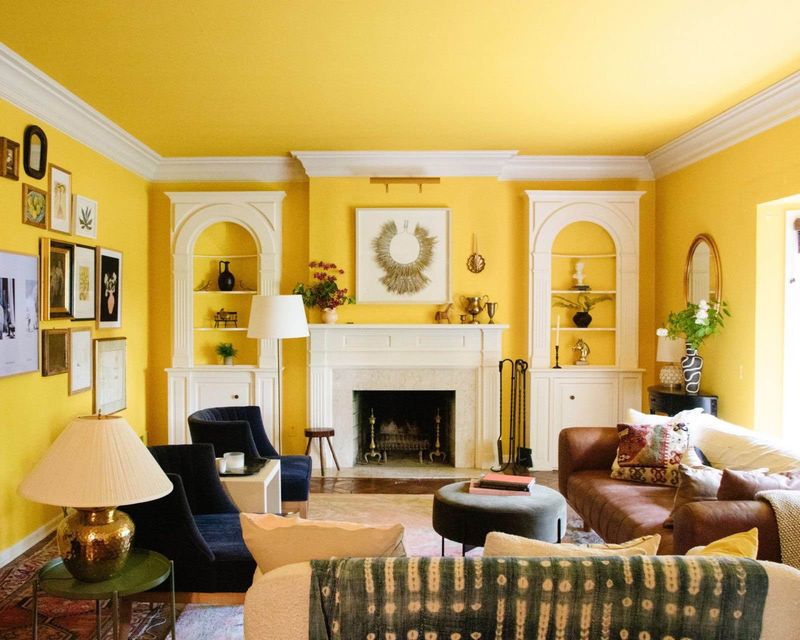
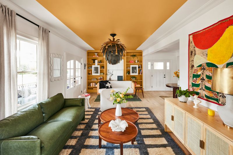
6. Ceiling Color Neglect
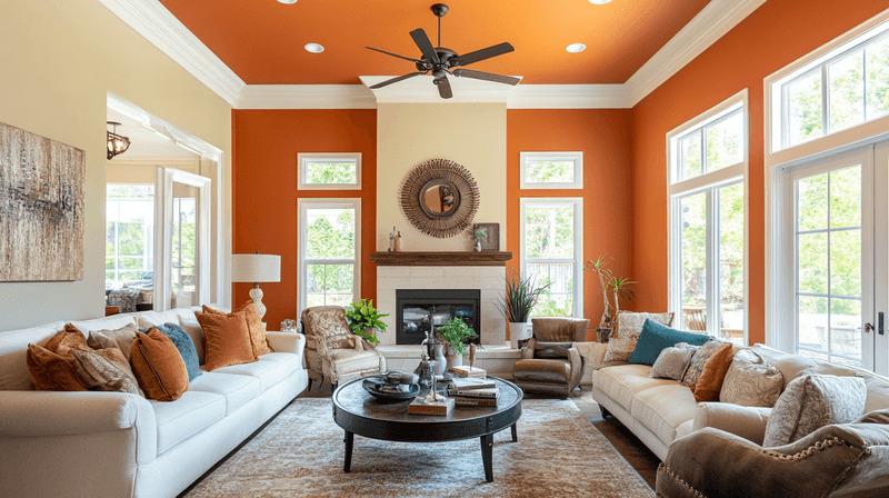
The ceiling makes up one-sixth of your room’s surface area, yet most people automatically slap on plain white paint without a second thought. This creates an abrupt color stop that can make rooms feel chopped off and unfinished.
Your ceiling deserves attention too! Consider painting it a lighter version of your wall color for a cozy, cohesive feeling.
In small rooms, continuing wall color onto the ceiling can actually make the space feel larger. Bold folks might even try a complementary color for an unexpected wow factor.
7. Bathroom Color Rebellion
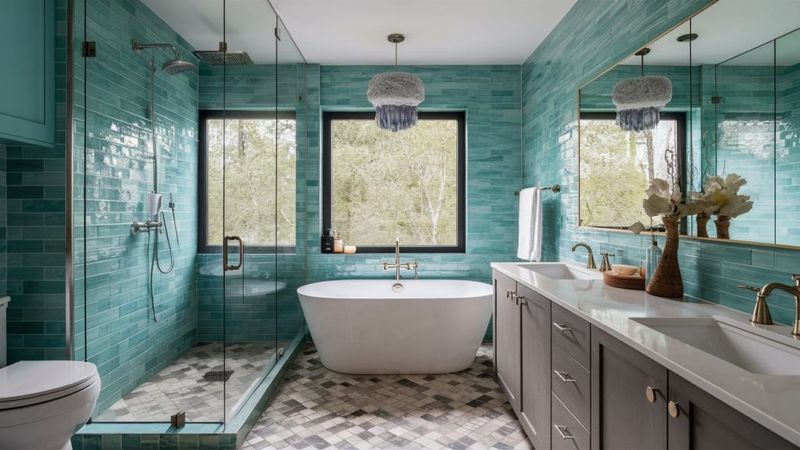
Bathrooms often become color experiments gone wild! People think small spaces need bright colors or busy patterns to compensate for their size.
The result? A jarring bathroom experience that feels completely disconnected from the rest of your home. While bathrooms can handle more personality, they shouldn’t feel like they belong to a different house. Pull subtle color notes from adjacent rooms for continuity.
You can still be playful with accessories and towels while maintaining the overall flow of your home’s color story.
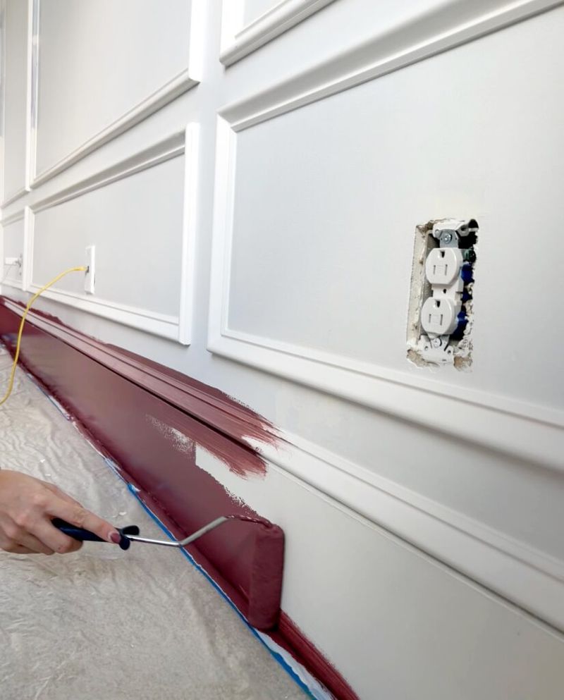
8. Trim Color Confusion
White trim isn’t always the right answer! Using the same bright white trim throughout a home with varying wall colors can create harsh contrasts in some rooms while looking perfect in others.
Consider your trim as part of your overall color scheme rather than an afterthought. Warm-toned rooms might need cream or off-white trim instead of stark white.
Some spaces even shine with trim painted in a complementary color or darker shade of the wall color. Consistent trim color throughout your home creates an important visual thread.
9. Open Floor Plan Chaos
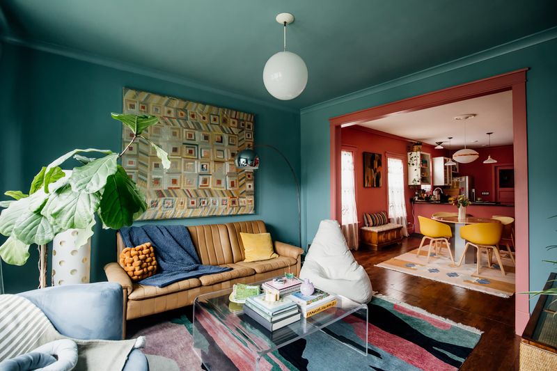
Open concept homes present unique color challenges. Some homeowners treat each ‘zone’ as a separate room, creating color boundaries where none physically exist. The kitchen becomes blue, the dining area red, and the living room green – all within the same visual field!
Open spaces need a cohesive approach. Choose a main color that flows throughout, then use furniture and accessories to define different functional areas.
This creates visual harmony while still allowing each zone to have its own personality without the jarring color-blocking effect.
10. Trend Chasing Without Context
Jumping on color trends without considering your home’s architecture can create serious disconnect. That trendy charcoal gray might look amazing in a modern loft but completely wrong in your Victorian cottage with its warm wood details.
Honor your home’s bones when selecting colors. Traditional homes generally shine with classic color palettes, while contemporary spaces can handle more experimental hues.
This doesn’t mean you can’t be current – just adapt trends to suit your specific home rather than forcing a square peg into a round hole.
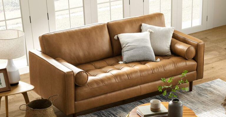
11. Furniture-Wall Clashes
Selecting wall colors without considering your furniture is like buying shoes without thinking about your outfit. That gorgeous teal wall might look spectacular on Pinterest but terrible behind your burgundy sofa!
Always factor in your existing furniture when choosing paint. Bring fabric swatches to the paint store or hold paint samples against your furniture in natural light.
The goal is harmony, not competition. If you love bold furniture, consider more neutral walls that let your pieces shine instead of fighting for attention.
12. Flooring Forgetfulness
Floors ground your entire color scheme, yet many people choose wall colors without giving their flooring a second thought. The undertones in your hardwood, carpet, or tile dramatically affect how paint colors appear.
Red-toned wood floors can make certain wall colors look pink or orange. Cool gray tiles might make warm beige walls appear dingy.
Always test paint samples next to your flooring to see how they interact. The right wall color should complement your floors rather than compete with them or create unexpected color shifts.
13. Accent Wall Accidents
Accent walls can add personality, but when poorly executed, they create visual confusion. Random accent walls without purpose or placed on the wrong wall disrupt your home’s flow rather than enhance it.
An accent wall should highlight an architectural feature or frame an important element like a bed headboard or fireplace. Choose a color that relates to your overall scheme rather than coming out of nowhere.
The goal is to draw attention in a purposeful way, not create a random splash of color that leaves visitors wondering, “Why that wall?”
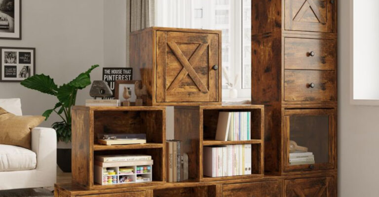
14. Kitchen Cabinet Confusion
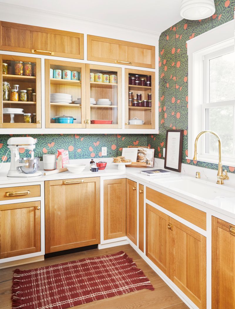
Kitchen cabinets dominate the visual space, yet many homeowners choose their cabinet color without considering how it will flow with adjacent rooms.
This creates an island effect where your kitchen feels cut off from the rest of your home. Since kitchens often open to other living areas, cabinet colors should complement the broader color story of your home.
White cabinets might look crisp and clean but can create harsh contrast in a home otherwise filled with warm tones. Consider your kitchen as part of the whole rather than a separate entity.
15. Undertone Unawareness
Colors have hidden undertones that aren’t obvious until they’re on your walls. That “perfect neutral” beige might actually have pink, yellow, or green undertones that clash with everything else in your home.
Train your eye to spot undertones by comparing similar shades side by side. What looks like plain gray might actually be blue-gray, green-gray, or purple-gray.
Consistent undertones throughout your home create subtle cohesion, while mixed undertones create that unsettling “something feels off” vibe that’s hard to pinpoint.
16. Front Door Disconnect
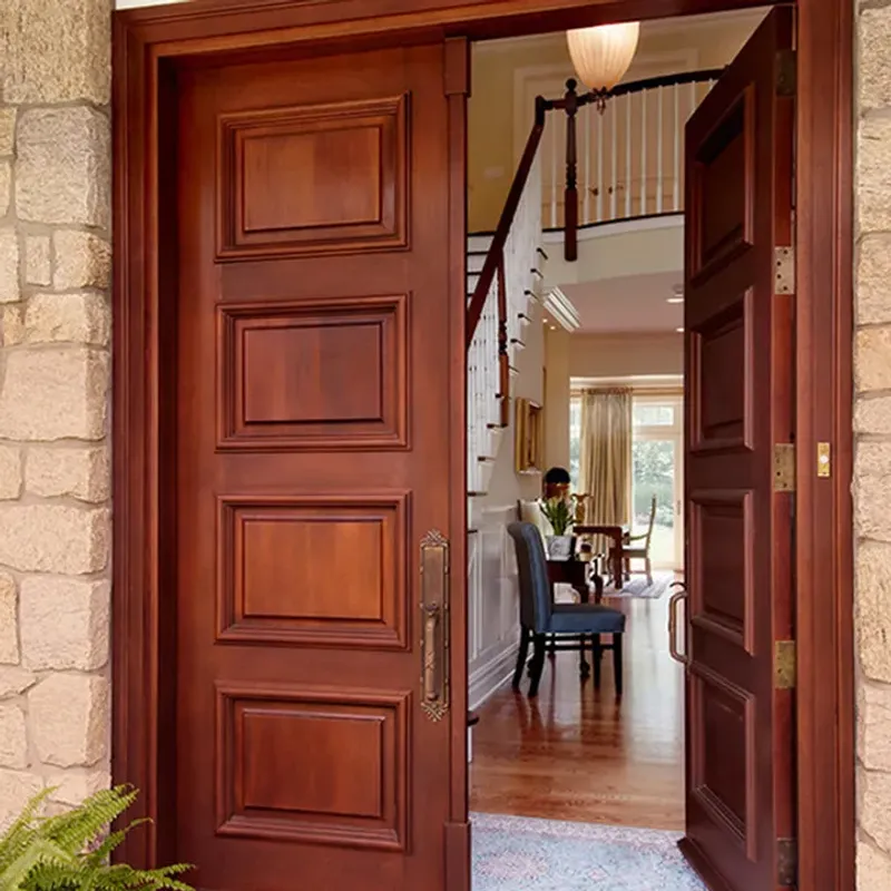
Your front door makes the first color impression, yet many homeowners choose door colors with zero connection to their interior palette. This creates an immediate disconnect the moment someone steps inside.
While your door can certainly be bold and welcoming, consider selecting a color that hints at what’s to come inside. This creates a thoughtful transition from exterior to interior.
Even subtle connections – like pulling a door color from interior accent pieces – can create that satisfying sense of intention that makes a house feel like a well-designed home.
17. Sheen Selection Slip-ups
Paint sheen might seem like a minor detail, but using the wrong finish can make colors appear completely different from what you expected. High-gloss paint in a living room can make even subtle colors feel overwhelming and harsh.
Each sheen serves a purpose. Flat paint hides imperfections but isn’t very washable. Semi-gloss stands up to cleaning but highlights every wall flaw. Consistent sheen throughout connected spaces helps maintain color continuity, while random sheen changes can make the same color look different from room to room.
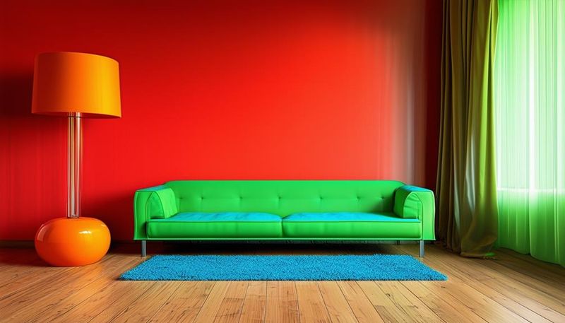
18. Mood Mismatch Mistakes
Colors create emotional responses, and conflicting moods throughout your home can cause psychological disconnect. A stimulating bright red office next to a supposedly calming blue bedroom creates emotional whiplash as you move between spaces.
Consider the purpose of each room and how you want to feel in it. Then create intentional transitions between spaces with different functions.
Bedrooms and bathrooms might feature calming hues, while social spaces can handle more energy. The key is creating purposeful mood shifts rather than accidental emotional chaos.