
Color combinations can completely transform a space, outfit, or design project. Blue, one of the most versatile colors in the spectrum, plays well with many partners but truly shines with certain companions.
Whether you’re redecorating your home, planning your wardrobe, or working on a creative project, these color matches will help you create stunning visual harmony with blue as your base.
1. Crisp White
Nothing says ‘timeless elegance’ quite like blue and white together. This classic nautical pairing evokes images of Mediterranean coastlines and breezy summer days.
The contrast creates a clean, refreshing atmosphere that works in any room. White amplifies blue’s calming properties while providing a neutral backdrop that lets blue truly pop.
2. Soft Gray
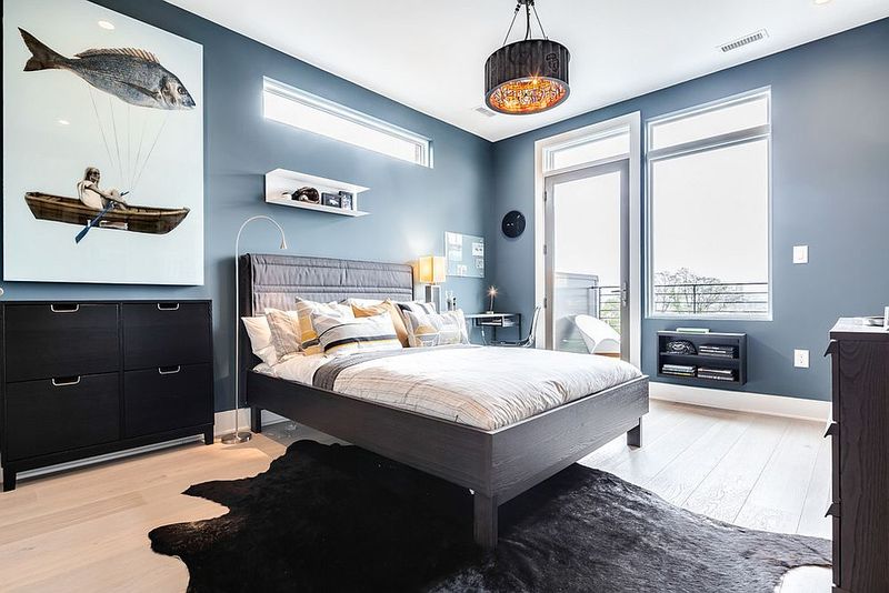
Want to know the secret to sophisticated spaces? Gray and blue create a serene, balanced atmosphere that feels both modern and timeless.
The subtle nature of gray allows blue to maintain its presence without competition. Together they form a peaceful backdrop that’s perfect for bedrooms and living spaces where relaxation is key.
3. Warm Beige
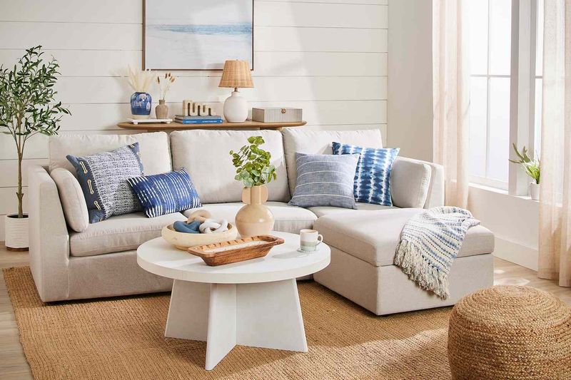
Imagine walking along a sandy beach beneath a clear blue sky. That’s exactly the feeling this combination evokes!
Beige brings warmth to blue’s coolness, creating balance that feels naturally harmonious. This pairing works beautifully in living spaces where you want a calming yet inviting atmosphere.
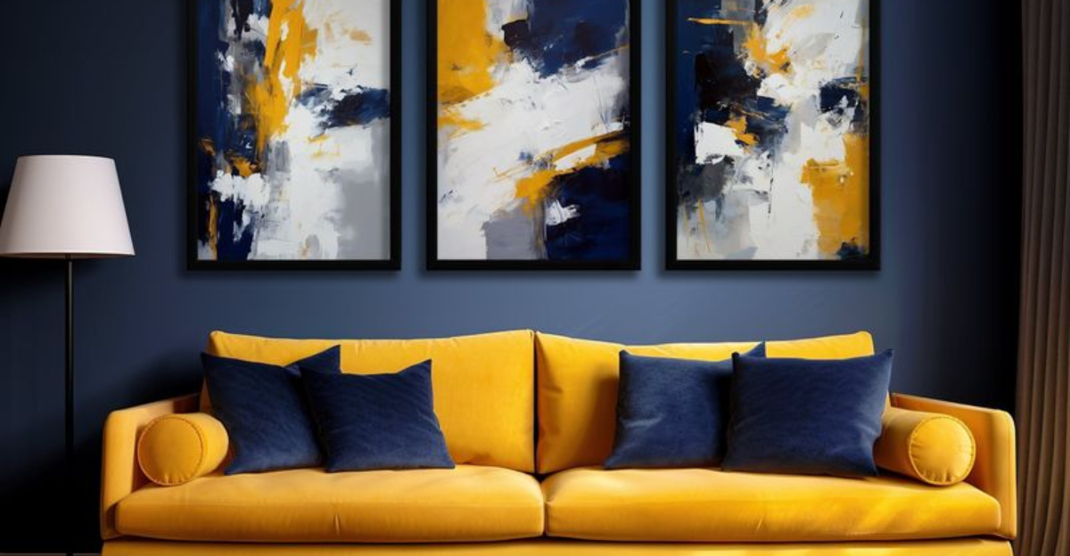
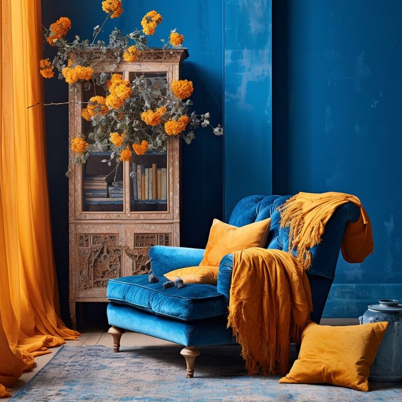
4. Mustard Yellow
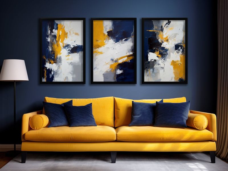
Feeling bold? Mustard yellow alongside blue creates an eye-catching contrast that commands attention without overwhelming the senses.
These complementary colors sit opposite each other on the color wheel, explaining their natural harmony. The warmth of mustard perfectly balances blue’s coolness, creating a dynamic energy that works wonderfully in social spaces.
5. Blush Pink
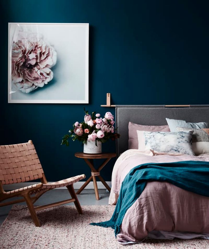
Sweetness meets serenity when blush pink partners with blue. This unexpected duo creates a gentle, dreamy quality that feels both modern and timeless.
Gender-neutral and versatile, this combination works beautifully in nurseries, bedrooms, and creative spaces. The soft contrast creates visual interest without overwhelming the senses.
6. Burnt Orange
Fire meets water in this dramatic pairing! Burnt orange brings warmth and energy that perfectly complements blue’s cool tranquility.
As complementary colors, they create a vibrant contrast that feels balanced rather than jarring. This combination works especially well as an accent pairing in neutral spaces, adding personality without overwhelming.
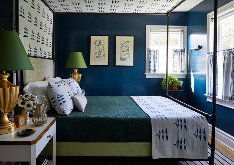
7. Forest Green
Mother Nature herself approves of this earthy combination. Forest green and blue together evoke lush landscapes meeting clear skies.
Both colors have cool undertones, creating a harmonious blend that feels grounded and natural. This pairing works beautifully in spaces where you want to bring the outdoors in, creating a serene, biophilic atmosphere.
8. Charcoal
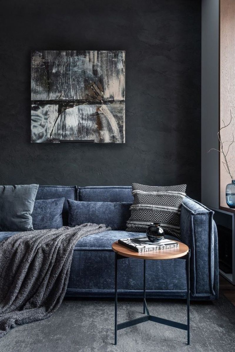
Sophistication levels skyrocket when charcoal meets blue. The dramatic pairing creates depth and dimension that feels luxurious and grounded.
Charcoal provides a strong anchor that allows blue to shine without competing. Perfect for creating statement walls or elegant furniture combinations, this duo works especially well in spaces where you want to create atmosphere.
9. Lavender
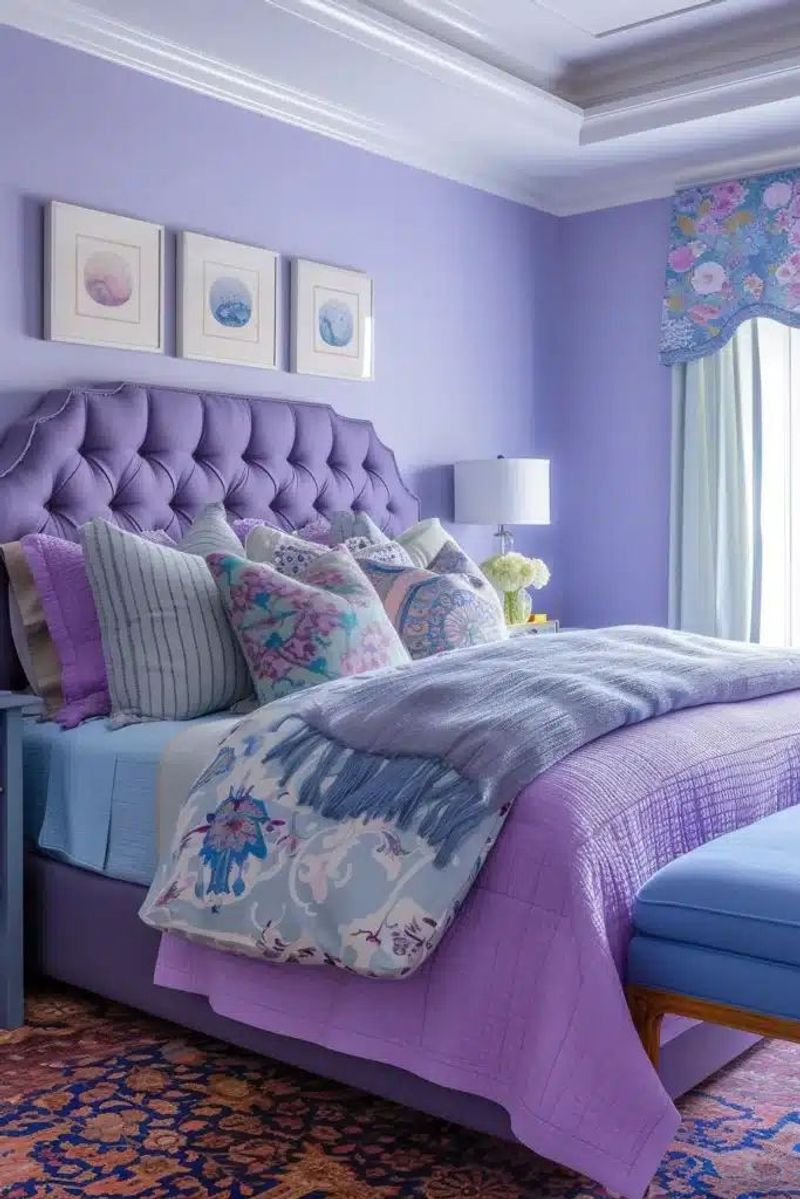
Lavender adds a touch of whimsy while keeping things elegant. Paired with blue, these cool tones blend into a soft, dreamy vibe full of charm and calm.
The purple undertones in lavender complement blue beautifully, creating a harmonious blend that feels both calming and uplifting. This combination works wonderfully in bedrooms and creative spaces.
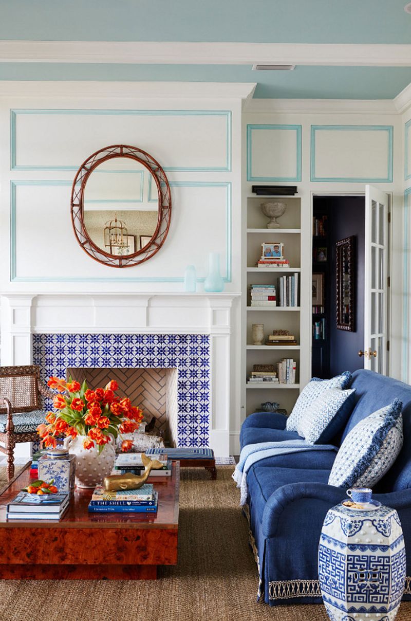
10. Coral
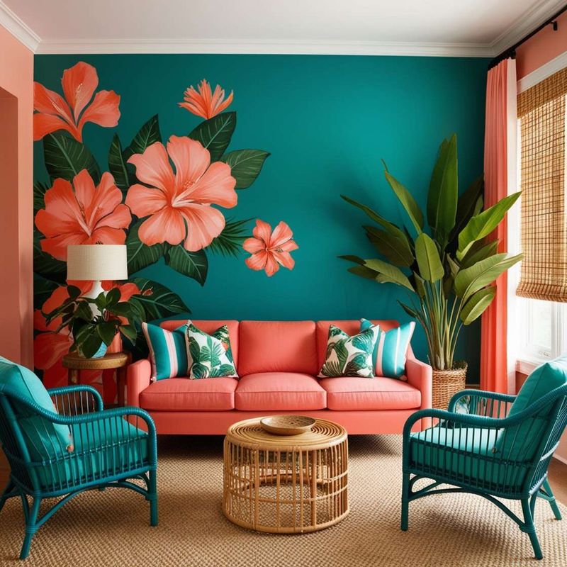
Looking for a combination that feels like summer all year round? Coral’s warm, peachy-pink tones create a joyful contrast with blue’s coolness.
This pairing evokes tropical beaches and sunset skies, bringing energy and cheerfulness to any space. Particularly effective in spaces where you want to create a happy, uplifting atmosphere.
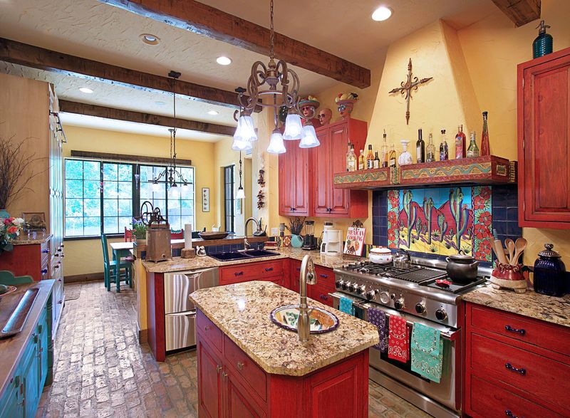
11. Terracotta
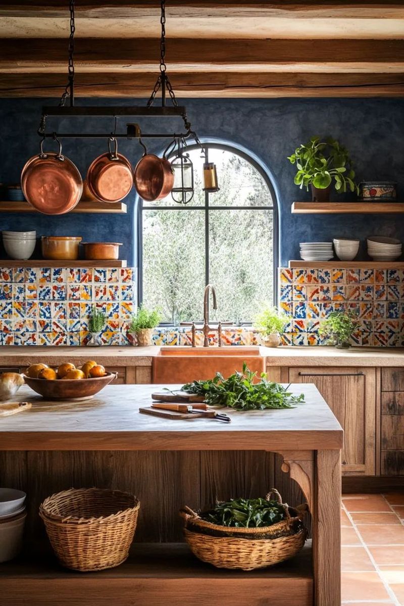
Ancient civilizations knew what they were doing when they paired terracotta with blue! This earthy, rustic orange-brown brings warmth and history to blue’s coolness.
The contrast feels grounded yet vibrant, evoking Mediterranean and Southwestern aesthetics. Perfect for creating spaces with character and a connection to natural elements.
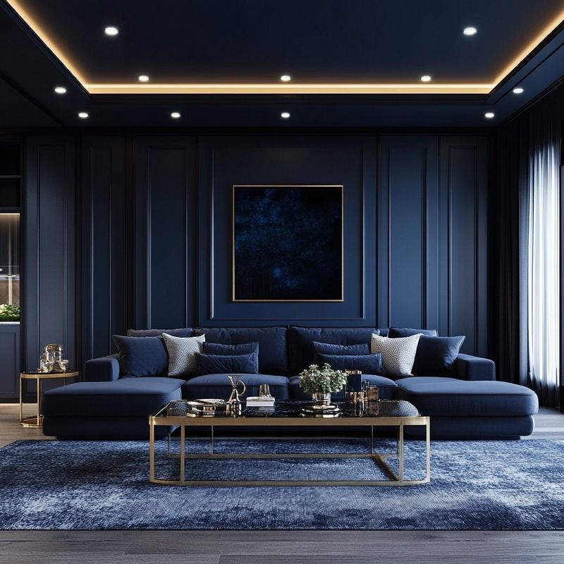
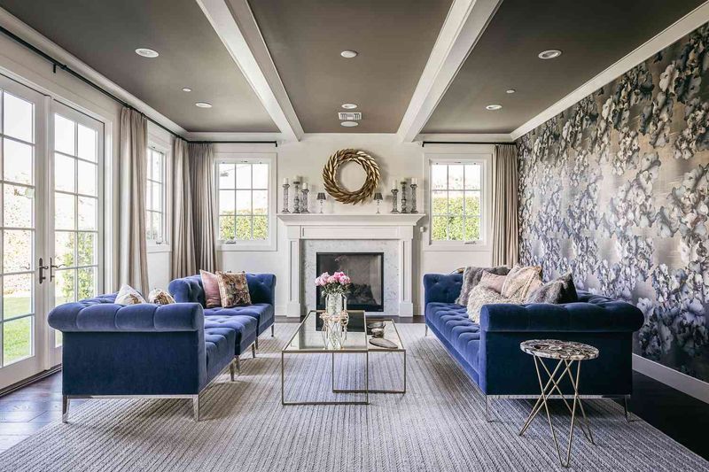
12. Gold
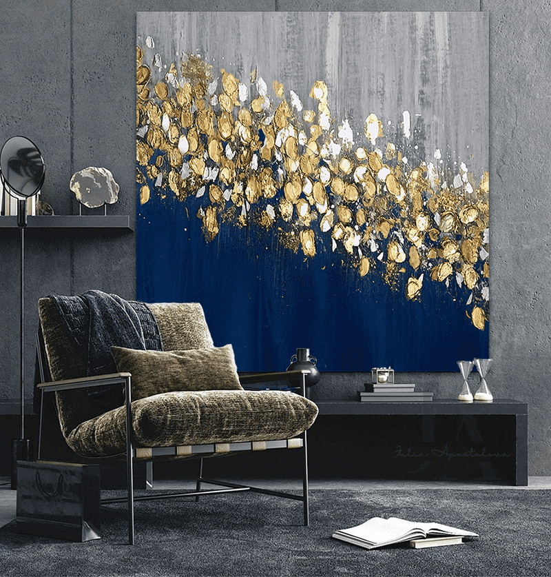
Royalty enters the chat when gold pairs with blue! This luxurious combination has adorned palaces and fine art for centuries, and for good reason.
Gold’s warmth and metallic sheen creates a regal contrast with blue’s cool depth. Even small touches of gold against blue create an immediate sense of elegance and sophistication.
13. Teal
When cousins collaborate, magic happens! Teal and blue create a dimensional, layered effect that adds depth and interest to any space.
This monochromatic pairing feels sophisticated yet playful, creating a harmonious blend that’s easy on the eyes. The green undertones in teal complement blue beautifully, creating a fresh, aquatic feel.
14. Navy (tone-on-tone)
Depth and dimension reach new heights when different shades of blue come together. Navy anchors lighter blues, creating a sophisticated layered effect that’s both calming and visually interesting.
This monochromatic approach feels cohesive and intentional, perfect for creating serene spaces with subtle complexity. The result is a rich, nuanced look that never feels flat.
15. Taupe
Understatement becomes an art form when taupe meets blue. This sophisticated neutral brings warmth without overwhelming blue’s natural beauty.
The grayish-brown quality of taupe creates a subtle contrast that feels elegant and timeless. Perfect for creating spaces that feel both contemporary and classic, this pairing works especially well in minimalist designs.
16. Copper
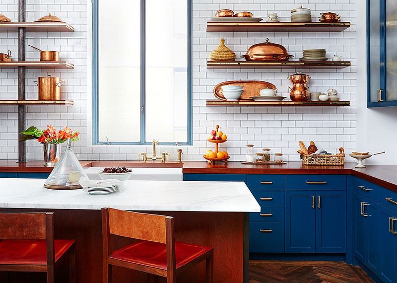
Chemistry class taught us that copper turns blue when oxidized – perhaps explaining why these colors seem made for each other!
The warm, rosy metallic sheen of copper creates a stunning contrast against blue’s cool tones. This pairing feels both industrial and luxurious, adding warmth and character to contemporary spaces.
17. Olive Green
Borrowed from nature’s perfect palette, olive green and blue create a sophisticated, organic harmony that feels both fresh and timeless.
The earthy, muted quality of olive softens blue’s coolness, creating a balanced look that works beautifully in living spaces. This combination evokes Mediterranean landscapes and creates a grounded, natural atmosphere.
18. Marigold
Sunshine meets clear skies in this joyful combination! Marigold’s vibrant yellow-orange tone creates an energetic contrast with blue’s coolness.
The effect is both uplifting and balanced, perfect for spaces where you want to create a positive atmosphere. Even small pops of marigold against blue make a strong, cheerful statement.
19. Clay Red
Earth meets sky in this grounded yet vibrant pairing. Clay red brings a rich, earthy warmth that contrasts beautifully with blue’s cool serenity.
The result feels both natural and sophisticated, evoking Southwestern landscapes and global textiles. This combination works especially well in spaces where you want to create a cozy yet visually interesting atmosphere.
20. Aubergine
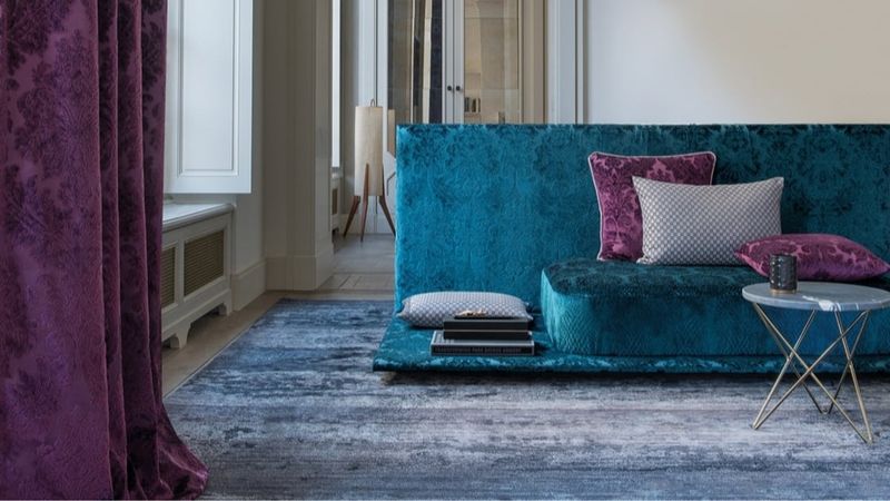
Mysterious and regal, aubergine (eggplant purple) creates a sophisticated, dramatic partnership with blue. This deep, rich purple brings warmth without brightness, creating a luxurious depth.
The result feels both contemporary and timeless, perfect for creating statement walls or elegant furniture combinations. This pairing works beautifully in spaces where you want to create atmosphere and visual interest.