10 Iconic Color Combinations That Never Work In Living Rooms And 5 Complete Fails
Choosing colors for your living room can make or break the entire feel of your home.
While some color pairings create harmony and balance, others clash so badly they can actually cause headaches! From jarring neon combinations to muddy, depressing palettes, certain color duos should be avoided at all costs.
1. Neon Pink + Lime Green

Walking into a room with this eye-searing combo feels like being trapped inside a 1980s workout video gone wrong. The vibrant intensity of both colors creates visual tension that makes relaxation impossible.
Instead of calming your nerves after a long day, this pairing actually increases anxiety levels and makes the space feel chaotic rather than comforting.
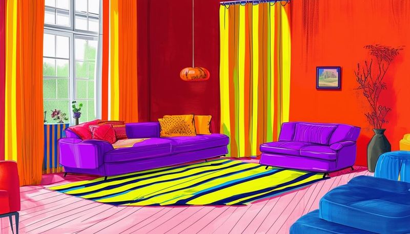
2. Bright Orange + Purple
Imagine trying to unwind in a space that resembles a Halloween party all year round! The competing warm orange and cool purple create a visual tug-of-war that exhausts the eyes.
Despite both being bold choices individually, together they fight for attention rather than complementing each other, making your living area feel like a chaotic costume shop rather than a sophisticated space.
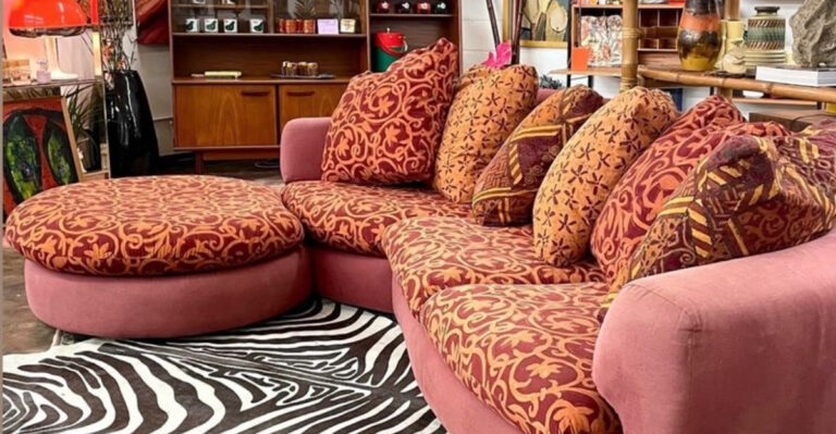
3. Brown + Black (Too Heavy and Dull)
Combining these two dark neutrals creates a cave-like atmosphere that swallows light and crushes the spirit. Without proper contrast, furniture disappears into walls, making the room feel smaller and oppressively heavy.
Many homeowners mistakenly believe this pairing looks sophisticated, but the result typically feels dreary and uninspiring, like being stuck in a perpetual rainy day.
4. Yellow + Gray (When Overused and Muddy)
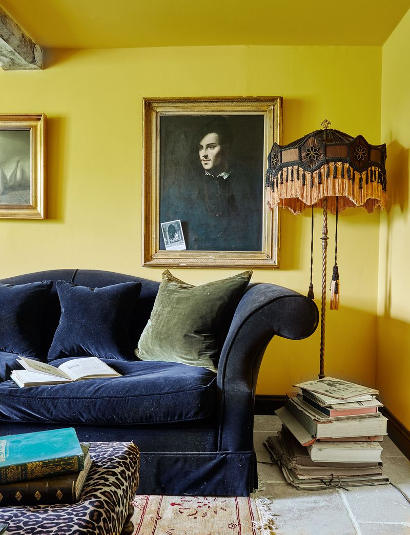
Once a trendy duo, this pairing often goes terribly wrong when the yellow turns mustard and the gray leans muddy.
What starts as an attempt at cheerful sophistication quickly devolves into a dingy, jaundiced look. Rooms decorated with this unfortunate combo often remind visitors of neglected office spaces rather than welcoming homes where people actually want to gather.
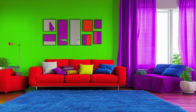
5. Red + Blue (Often Feels Like a Sports Arena)
Stepping into a red and blue living room immediately triggers thoughts of team rivalries rather than relaxation. The patriotic punch of these primary colors creates a space that feels more like a fan zone than a sophisticated living area.
Kids might love it, but adults will find the combination stimulating rather than soothing—exactly the opposite of what most people want for their evening wind-down space.
6. Beige + Yellow (Washed Out and Bland)
Attempting to create a sunny, neutral space? This pairing typically results in a room that feels like a faded photograph. The similar tonal values create a flat, dimensionless space lacking visual interest or energy.
Visitors often can’t put their finger on why the room feels off—they just know it makes them feel slightly depressed, like being in a room that’s perpetually dusty.
7. Hot Pink + Red
Mixing these passionate hues creates a visually overwhelming experience that’s more headache-inducing than heart-warming. The similar intensity levels with slightly different undertones fight against each other rather than harmonizing.
Guests might need sunglasses indoors! This aggressive pairing creates a space that feels emotionally overwhelming—like being trapped in someone’s Valentine’s Day fever dream rather than a balanced living environment.
8. Dark Green + Bright Orange
Reminiscent of moldy pumpkins, this unfortunate pairing creates a bizarre seasonal confusion in your living space. The earthy, sophisticated potential of dark green gets completely undermined by the shouty brightness of orange.
While nature occasionally pairs these colors in autumn leaves, bringing them inside at full intensity creates a jarring effect that makes comfortable conversation nearly impossible. Your eyes simply don’t know where to rest.
9. Blue + Brown (Clashes in Tone)
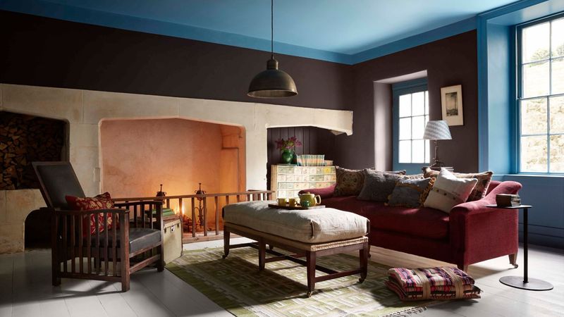
Despite both being found in nature, most blue and brown combinations create a disjointed, awkward feeling in living spaces. Cool blues typically fight against warm browns, creating an unresolved tension that never quite settles.
Unless carefully selected with matching undertones (which few homeowners manage), the result often looks like someone combined two different design plans without consulting each other first.
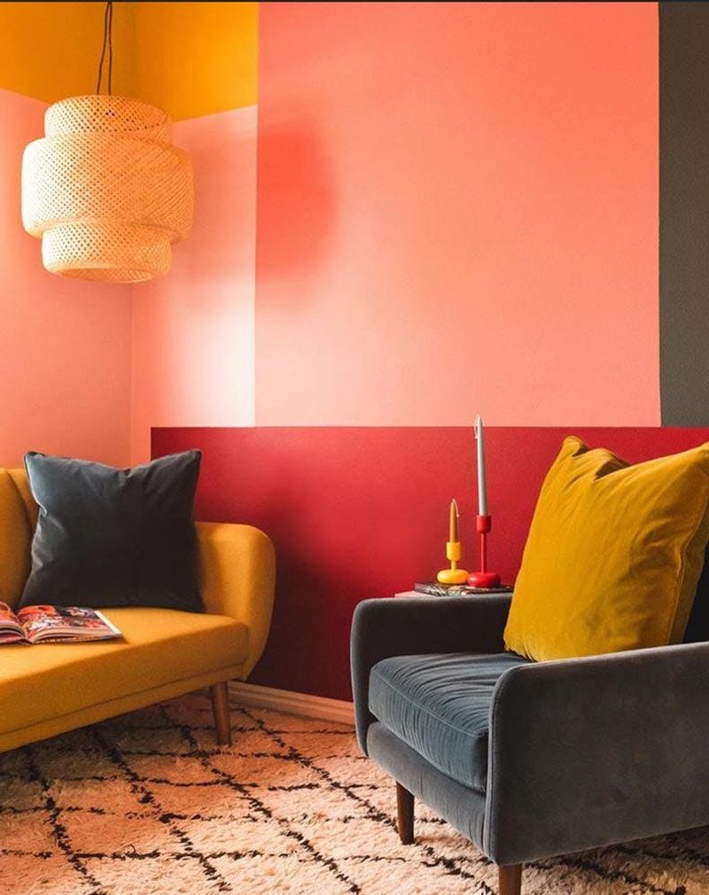
10. Purple + Yellow (Too Harsh on the Eyes)
As complementary colors on the color wheel, purple and yellow create maximum contrast—and maximum visual strain. The royal ambitions of purple clash violently with yellow’s sunny disposition, creating a space that feels perpetually conflicted.
Looking at this combination for extended periods can actually cause eye fatigue! Most people find they can’t truly relax in a space with this high-contrast, visually demanding color scheme.
11. Rust Orange + Neon Blue — Clash of Intensity, Zero Harmony
Vintage meets futuristic in the worst possible way with this jarring combination. The earthy, muted quality of rust orange gets completely undermined by the artificial electric shock of neon blue.
Attempting to combine these creates a visual civil war in your living room. The disconnect is so severe that it actually makes it difficult to focus on conversations or activities happening in the space.
12. Mustard Yellow + Bright Pink — Too Loud, No Balance
Combining these attention-demanding colors creates a room that’s constantly screaming for attention. The acidic quality of mustard yellow combined with the candy-brightness of pink creates a space that feels perpetually agitated.
Even minimal use of this combination tends to dominate everything else in the room. Guests often report feeling strangely anxious or unable to concentrate during conversations in spaces with this frenetic color pairing.
13. Olive Green + Bright Red — Holiday Overkill, All Year Round
Stuck in Christmas mode forever? This combination creates the unfortunate effect of permanent holiday decor, regardless of the season.
The military seriousness of olive green clashes bizarrely with the celebratory nature of bright red. The psychological confusion creates an unsettled feeling rather than comfort.
14. Pastel Blue + Neon Yellow — Disjointed and Jarring
Gentle meets aggressive in this uncomfortable pairing that never finds harmony. The soft, receding quality of pastel blue gets visually assaulted by the forward-charging energy of neon yellow.
Living with this combination creates a perpetually unresolved feeling, like listening to music where the instruments are playing in different keys. Your brain constantly tries to reconcile the irreconcilable, leading to subtle but persistent discomfort.
15. Charcoal Gray + Electric Green — Too Stark, Too Shocking
Gaming room or sophisticated living space? This combination confuses the purpose of your room with its harsh, digital feel. The corporate seriousness of charcoal gray gets undermined by the artificial intensity of electric green.
While potentially appropriate for a teenager’s gaming corner, this combo lacks the nuance and warmth needed for a welcoming living area. Guests often feel like they’re in a tech startup office rather than a home.