
Ever walked into someone’s living room and instantly felt something was off? Chances are, it was their color choices. The wrong color combinations can turn even the most expensive furniture into a visual disaster.
Today, I’m spilling the tea on the color pairings that scream ‘bargain basement’ and five catastrophic color failures you should avoid at all costs.
1. Burgundy & Hunter Green: The ’90s Time Capsule
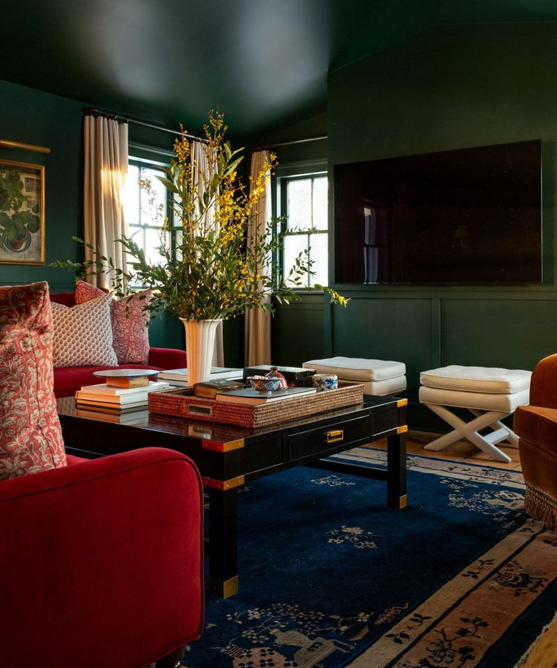
Nothing dates a living room faster than this duo straight from the Clinton era. The deep reds paired with forest greens instantly transport visitors back to when flip phones were cutting-edge technology.
Walk into a room with this combo and you’ll half expect to find a wicker basket collection and potpourri. It’s giving ‘country kitchen catalog that arrived in the mail’ energy – and not in a charming, retro way.
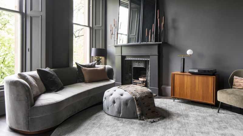
2. Gray & Beige: The Indecision Nightmare
Ah, ‘greige’ – when you can’t commit to either gray or beige, so you choose the muddiest middle ground possible. This non-committal combo doesn’t read as sophisticated; it reads as apartment complex special.
Rooms awash in these tones feel like they’re apologizing for existing. The cool undertones of gray fight with the warmth of beige, creating a space that feels perpetually unfinished – like someone gave up halfway through decorating.
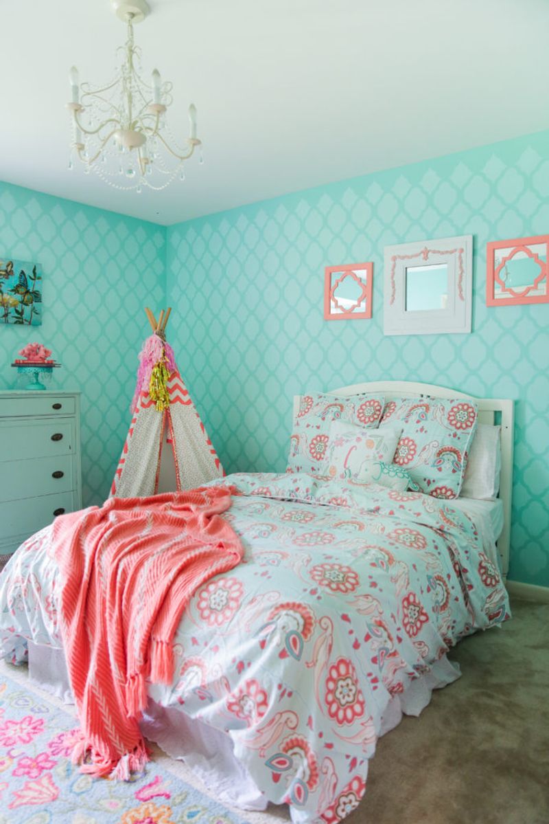
3. Candy Pink & Lime Green: The Tween Dream Gone Wrong
Unless you’re decorating for a 12-year-old who’s obsessed with watermelon aesthetics, this eye-searing combo belongs nowhere near your living space. The juvenile pairing screams ‘I designed this after watching too many Nickelodeon shows.’
The visual vibration between these two hues creates actual physical discomfort. Guests won’t remember your conversation – they’ll remember the headache they developed while trying to focus against a backdrop that belongs on a limited-edition can of Arizona iced tea.
4. Navy & Black: The Depression Pit
Dark colors can create drama, but this combo just creates gloom. Navy and black together form a light-sucking vortex that makes even sunny rooms feel like a bat cave.
Rather than cozy, this pairing reads as oppressive. The similar depth but slightly different undertones create a ‘is-that-navy-or-faded-black?’ confusion that looks like a decorating mistake. Even worse, every speck of dust shows up like a spotlight on this somber duo.
5. Orange & Brown: The 1970s Basement Special
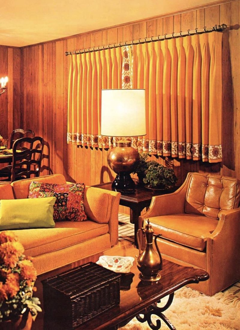
Nothing says ‘I furnished this room from a thrift store time capsule’ quite like orange and brown. This combo doesn’t whisper retro – it shouts ‘I’ve preserved my parents’ basement exactly as it was during the Watergate hearings.’
The muddy undertones fight each other while simultaneously aging everything in the room. Wood paneling optional, but the vibe of a room where someone’s uncle once installed a conversation pit is mandatory with this pairing.
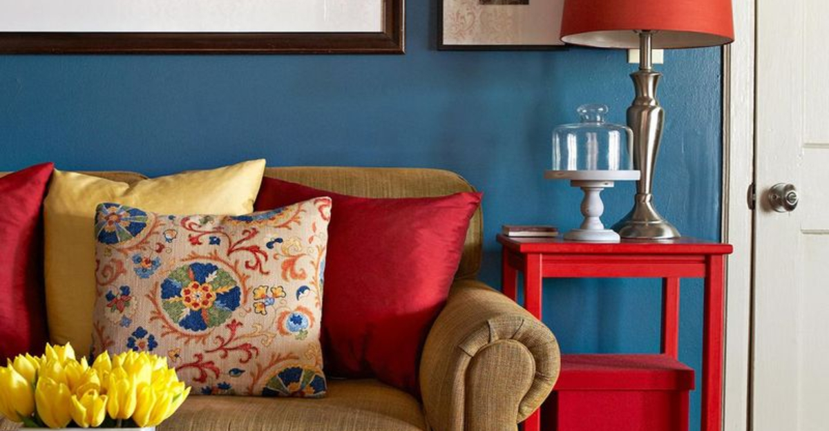
6. Primary Red & Royal Blue: The Fast Food Restaurant
Walk into a room with this combo and you’ll be subconsciously looking for the kids’ meal toys. These primary colors together create an unsophisticated, commercial feel that’s reminiscent of every budget hotel and fast-food chain.
The intensity of these hues fighting for attention creates visual chaos rather than harmony. It’s the color equivalent of someone shouting at you. Your living room should feel like a sanctuary, not like you’re waiting to place an order at the counter.
7. Pastel Everything: The Easter Egg Explosion
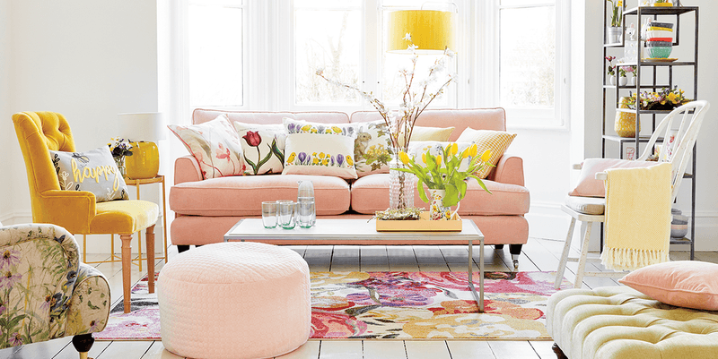
Pastels can be lovely, but using multiple pastel hues together creates a saccharine overload. Your living room shouldn’t remind visitors of a baby shower or a basket of marshmallow Peeps.
The lack of contrast in a multi-pastel room creates a washed-out effect where nothing stands out. Everything blends into a sugary fog. Even worse, these light tones show every scuff and stain, quickly transforming your Easter egg fantasy into a dingy disappointment.
8. Chocolate Brown & Turquoise: The Pinterest Hangover
Once the darling of 2010s Pinterest boards, this combo now screams ‘I decorated when chevron was cool.’ The jarring contrast between these specific shades creates a dated look that’s impossible to modernize.
The brown tends to look muddy against the brightness of turquoise. What was intended as ‘bold and modern’ now reads as ‘I still have an active Etsy shop selling mustache-themed items.’ This pairing has become the visual equivalent of a ‘Live, Laugh, Love’ sign.
9. Cool Gray & Warm Yellow: The Undertone War
This clash of temperature creates visual discord that’s subtly unsettling. The cool, blue-based gray makes the yellow appear sickly, while the yellow makes the gray look dirty and drab.
It’s like wearing silver jewelry with a gold watch – something feels off even if you can’t immediately identify what. Your brain registers the conflict between warm and cool tones, creating a space that feels perpetually imbalanced and poorly planned, like someone designed it while colorblind.
10. Builder Beige & White: The Landlord Special
Nothing screams ‘I’ve never personalized this space’ quite like the infamous landlord palette. This non-combo creates a room so devoid of character it could double as a witness protection program hideout.
The flat, yellowish beige against stark white creates a contrast that highlights the blandness of both. It’s the color equivalent of unseasoned chicken. Your guests will be checking their watches and inventing emergencies just to escape the beige purgatory you’ve created.
11. Silver & Gold: The Metallic Meltdown
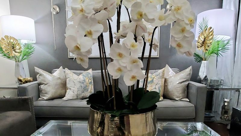
Mixing metals can work, but throwing silver and gold together without intention creates a chaotic, nouveau riche vibe. It’s the interior design equivalent of wearing all your jewelry at once.
This combo often appears in rooms trying too hard to look luxurious but achieving the opposite effect. The clash of cool silver with warm gold creates visual tension that reads as unsophisticated rather than eclectic. It’s giving ‘I bought everything labeled “glam” at HomeGoods’ energy.
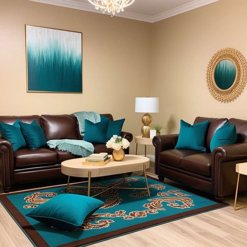
12. Teal & Coral: The Vacation Rental Nightmare
This beachy combo should have stayed at the all-inclusive resort where it belongs. Nothing says ‘I decorated my entire house based on a trip to Cancun’ quite like this pairing.
The intensity of these saturated hues creates a perpetual holiday feel that quickly becomes exhausting to live with. Your living room should be a sanctuary, not a constant reminder of that time-share presentation you sat through for free margaritas. It’s beach-themed decor for people who think seashells are a personality.
13. Purple & Green: The Cartoon Villain Lair
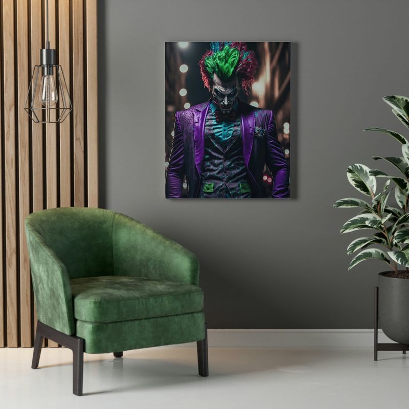
Unless you’re decorating for Halloween or a comic book convention, this combo creates a space that feels like a supervillain’s hideout. These opposing colors on the color wheel create such vibration that they’re actually stressful to look at for extended periods.
The Joker might approve, but your guests will feel like they’re sitting in a children’s television set rather than an adult living space. Even in muted tones, this pairing has a costume-y quality that’s impossible to shake – it’s giving ‘evil stepmother’s castle’ vibes.
14. Mauve & Forest Green: The Dentist Office Flashback
This combo instantly transports everyone back to sitting in a waiting room, thumbing through outdated magazines while dreading the sound of the drill. The dusty pink paired with deep green screams ‘professional office space circa 1992.’
There’s something inherently institutional about this pairing that no amount of trendy accessories can overcome. Add in some brass accents and you’ve got the full waiting room experience. Your guests will be unconsciously checking in with an imaginary receptionist.
15. All White Everything: The Sterile Laboratory
The all-white room isn’t chic minimalism – it’s a cleaning nightmare pretending to be a design choice. This non-palette creates a space so devoid of warmth it feels like a clinical setting rather than a home.
White-on-white-on-white doesn’t read as luxurious; it reads as someone afraid of commitment or color. It creates a harsh, unwelcoming environment that visitors find actively uncomfortable. Plus, it shows every speck of dirt, turning your pristine vision into a visible catalog of every crumb and coffee splash.
16. Black & Neon Anything: The Failed Nightclub
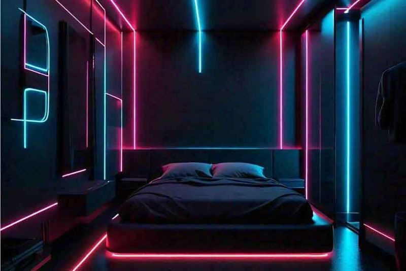
This combo attempts to be edgy but lands squarely in ‘failed nightclub from a bad ’80s movie’ territory. Black walls with neon accents aren’t sophisticated; they’re a teenage rebellion that never grew up.
The harsh contrast creates a space that feels like it should have a cover charge and a sticky floor. Your living room shouldn’t look like it’s waiting for a DJ to arrive. Even worse, this combo creates shadows and eye strain that make the room actively unpleasant to spend time in.