
Color isn’t just decoration – it shapes how we feel in a space. The shades we surround ourselves with can subtly lift our mood or quietly bring it down.
Some tones create calm and joy, while others cast a shadow without us even realizing it. In home design, the impact of color goes far beyond aesthetics – it taps into emotion, energy, and comfort.
This guide explores 8 colors that may dampen your spirits and 8 uplifting alternatives that fill your home with warmth and positivity. It’s time to design with feeling.
1. Pale Gray
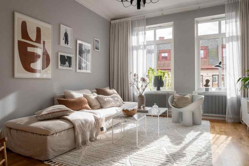
If you ever find yourself dreaming in monochrome, pale gray might be to blame. This muted hue whispers neutrality, but its lack of warmth can sometimes translate into a lack of joy.
Though subtle, its presence can evoke feelings of emptiness, much like a cloudy day that never seems to end. Pairing it with brighter accents might offer a cheerful counterpoint.
2. Dark Brown
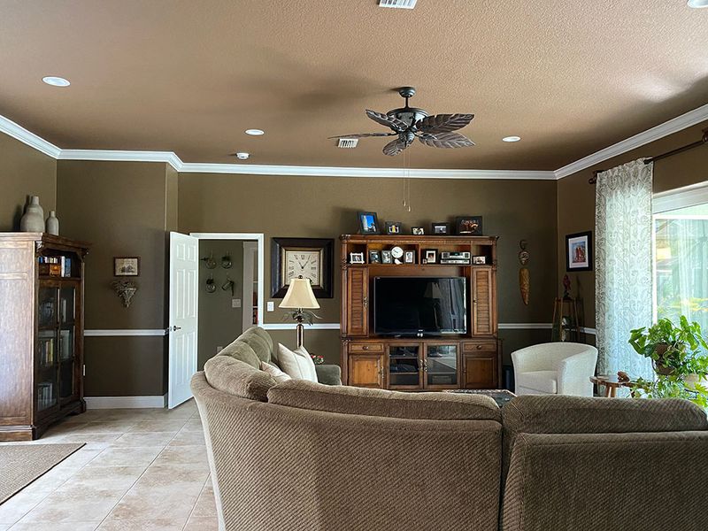
Should your home feel more like a bear’s hibernation den than a vibrant oasis, dark brown might be the culprit.
While it’s a color associated with stability, it can also wrap a room in a somber hug, blocking out the brightness of life.
Dark brown’s heavy presence can weigh down your mood, making spaces feel smaller and more oppressive than they truly are.
3. Beige Overload
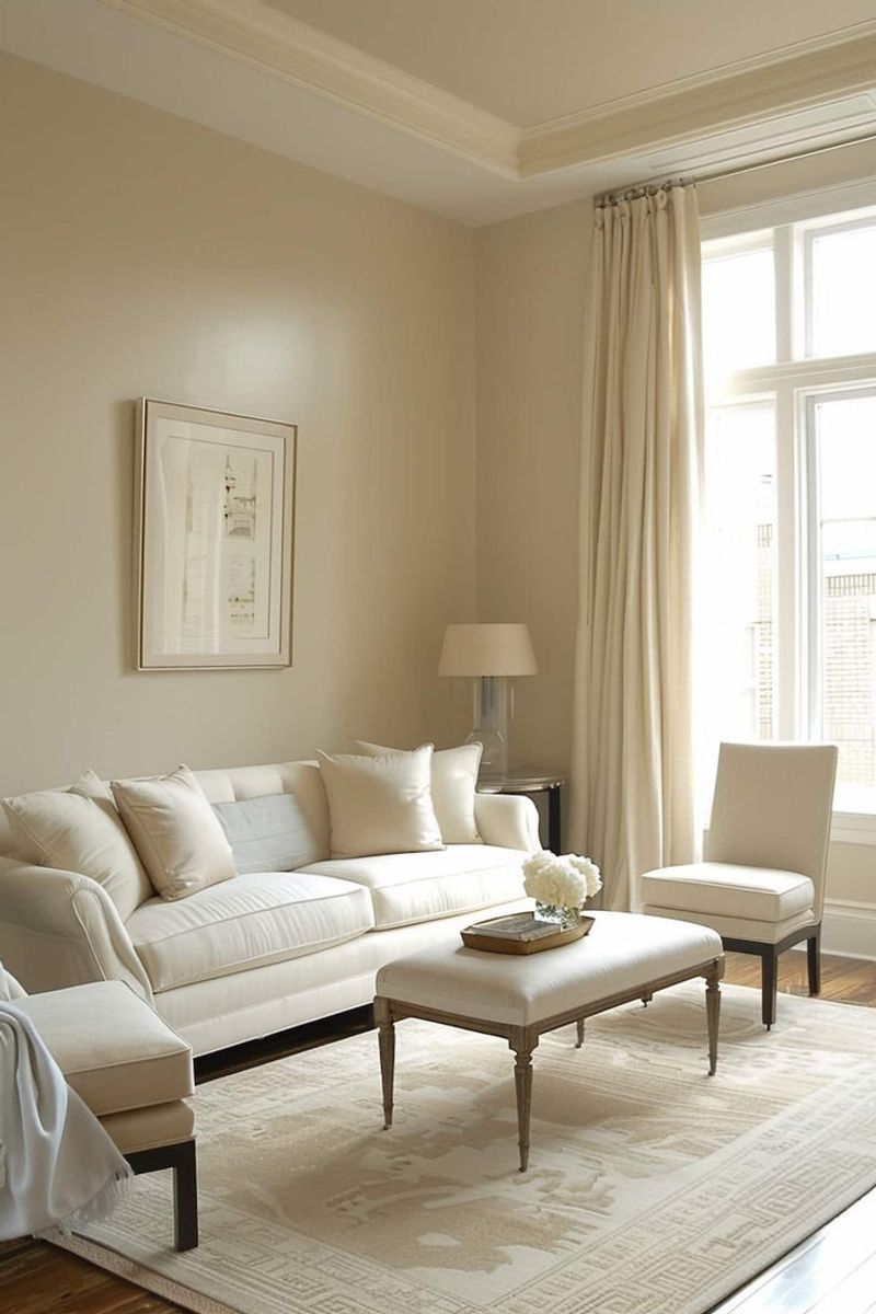
Beige may be the king of neutrality, but too much of it can turn your home into a beige desert, devoid of life and vibrancy.
This color, often chosen for its safe and sophisticated appeal, can lead to an uninspiring environment when overused.
A touch of color might be the oasis needed in this beige wilderness to restore energy and interest.
4. Dusty Pink
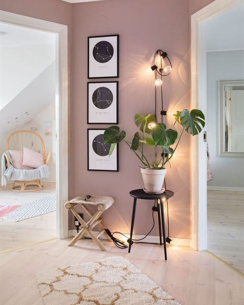
Despite being charming and retro, dusty pink can occasionally transform a vibrant room into a scene from an old photograph.
This gentle color may bring back fond memories, but it can also arouse feelings of nostalgia or longing that verges on melancholy.
Dusty pink can absorb the vitality of the space and leave it in a nostalgic haze if it isn’t counterbalanced with more vibrant hues.
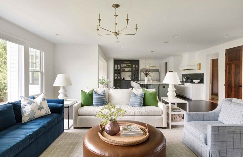
5. Navy Blue
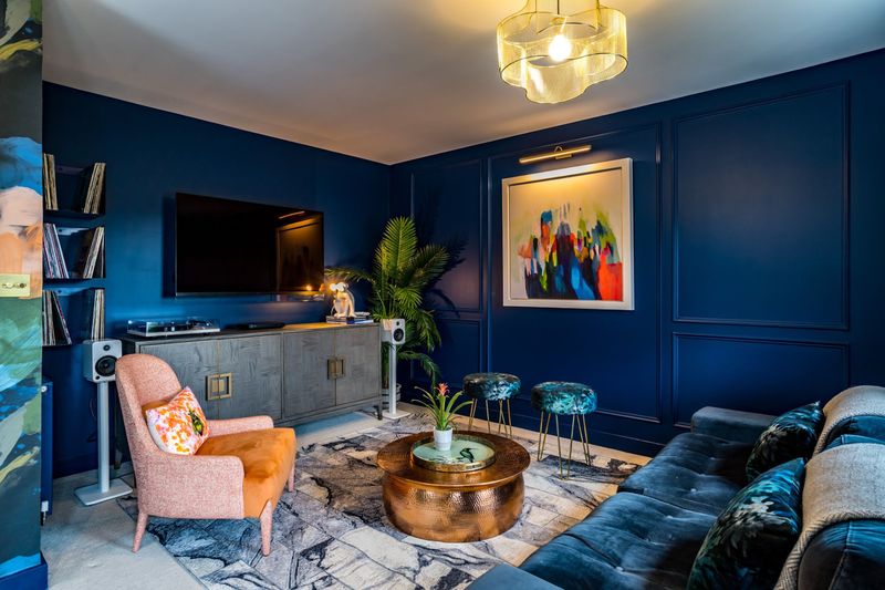
The weight of navy blue, which conjures images of midnight skies and deep seas, may occasionally feel stifling. Although it’s a deep and authoritative color, its intensity can turn a room into a naval museum rather than a vibrant home.
It’s simple to understand how the color blue could evoke thoughts of solitude or calm when you imagine a ship stranded in a huge ocean. Vibrant accents could contribute to a more lively atmosphere.
6. Muted Teal
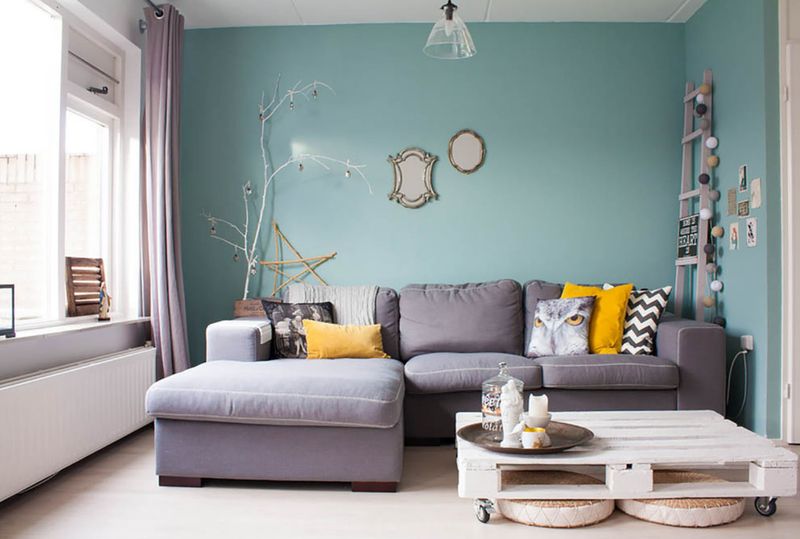
With its calming undertones, muted teal occasionally has a whispery rather than a spoken quality. Though soothing, this muted tone could deplete a space, like a silent lagoon that hides more than it shows.
Muted teal can be the silent culprit if silence begins to reverberate throughout your house. The latent energy in the area may be roused by adding a pop of vibrant artwork or warmer hues.
7. Charcoal Black
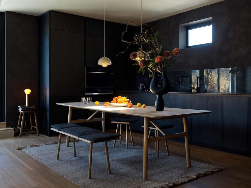
Even though charcoal black is unquestionably stylish, it may occasionally cast shadows that make a space feel more like a cocoon than a canvas. Imagine a starless night sky that reverberates with mystery and quiet.
Despite being contemporary and edgy, this color has the power to fill a space with a feeling of seclusion and closure. Even if it could have a dramatic effect, a little contrast is necessary to make sure the space is lively rather than evocative of loneliness.
8. Dull White
Dull white, though often chosen for its simplicity, can sometimes make a space feel like a blank page—uninspiring and lacking in character.
This shade, devoid of warmth, can leave a room feeling unfinished, like an artist’s canvas waiting for the first brushstroke. Infusing the space with colorful accents could be the key to transforming dull white into a backdrop for creativity and warmth.
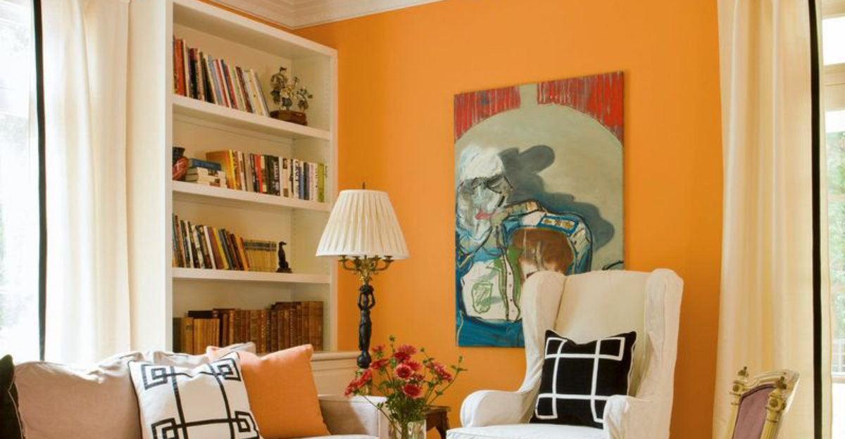
1. Electric Orange
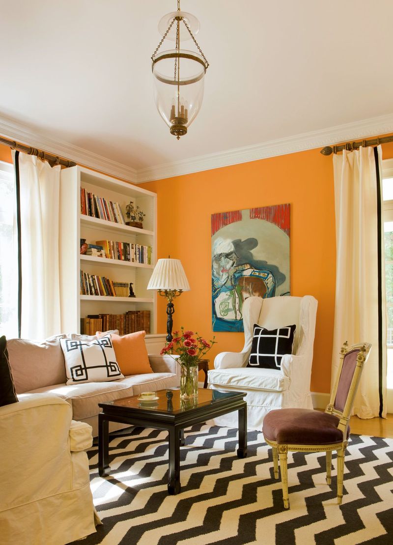
Imagine walking into a room bursting with energy, where the walls seem to pulse with life. Electric orange is an audacious choice that immediately grabs attention. This color is not just a visual treat; it’s an experience.
The vibrant hue is invigorating, sparking creativity and enthusiasm. It pairs beautifully with neutrals or can be used as an accent to uplift a more subdued palette.
Incorporating electric orange requires a bold spirit, but the payoff is a space that feels dynamic and alive, perfect for those who thrive on adventure.
2. Mint Green
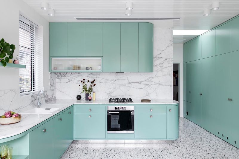
Like a cool wind on a hot day, mint green carries a hint of peace and freshness. A room can feel spacious and open thanks to this color scheme, which is evocative of springtime rebirth.
Mint green is so adaptable that it works well with both modern and rustic styles. It looks great in bathrooms or kitchens where a little bit of nature is welcome.
The color’s calming undertones encourage relaxation, which makes it the perfect option for anyone wishing to create a calm haven away from the bustle of everyday life.
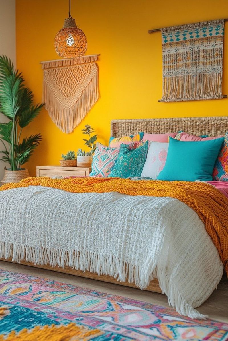
3. Sunny Yellow
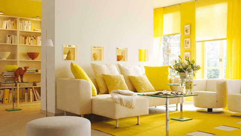
With its warm, inviting warmth, sunny yellow is the color of happiness. No matter the weather, it’s like having sunshine all the time.
This vibrant color accentuates natural light, giving rooms a feeling of openness and spaciousness. It’s a great option for communal spaces like sunrooms or dining rooms.
Sunny yellow promotes creativity and optimism, making it the perfect color for people who enjoy entertaining or who just want their house to feel warm and inviting.
4. Coral Pink
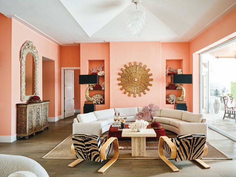
A lovely combination of pink and orange, coral pink radiates coziness and style. It gives any decor a classy yet fun touch.
This adaptable tint provides a bright and welcoming flash of color that complements both traditional and modern styles.
For individuals who want to create a space that is both fashionable and happy, coral pink is ideal since it effortlessly combines comfort with a hint of glitz.
5. Emerald Green
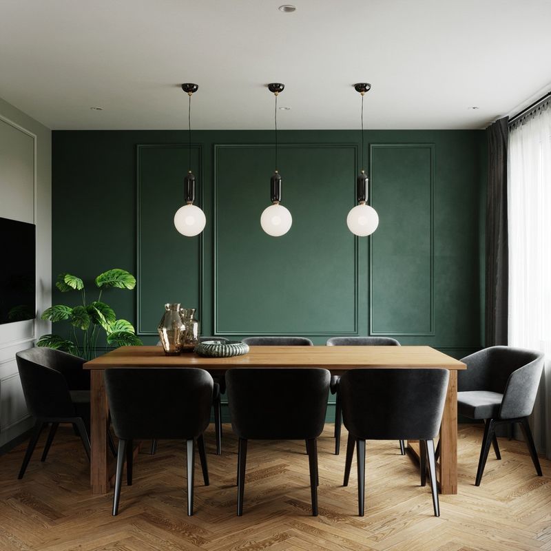
Emerald green is all about opulence and richness, bringing a luxurious feel to any setting. This deep, lush color is both calming and invigorating, reminiscent of the natural world’s grandeur.
Incorporating emerald green into your home can elevate a space, adding depth and sophistication. It pairs beautifully with metallics, enhancing its regal charm.
For those looking to make a bold yet classic statement, emerald green offers a timeless beauty that’s hard to resist.
6. Violet Blue
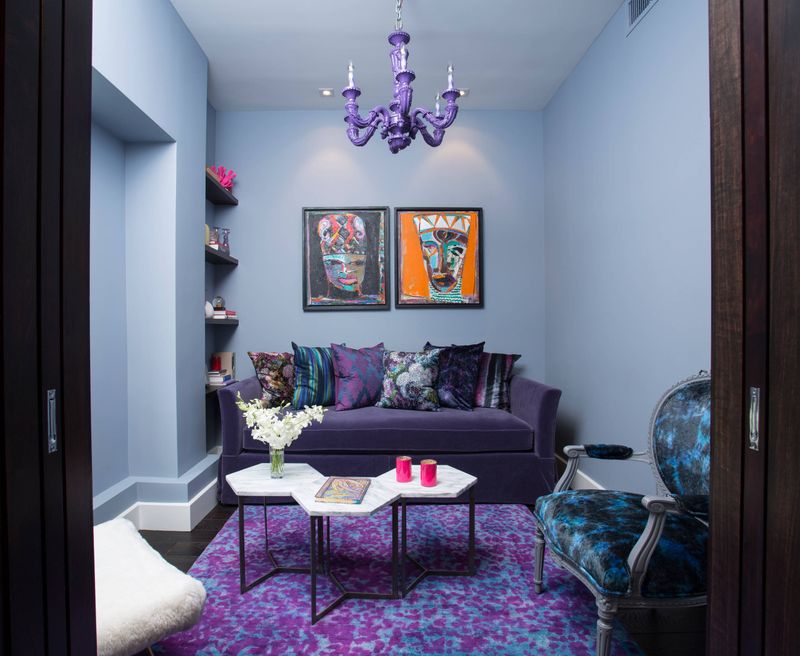
A captivating combination of two soothing hues, violet blue produces a surreal, almost ethereal impression. This hue is ideal for areas intended for creativity and leisure.
It might be the ideal background in a nursery or creative studio and blends well with gentle pastels.
Violet blue provides a calm yet motivating atmosphere, making it the perfect choice for anyone who want to bring a sense of wonder and imagination into their house.
7. Lemon Zest
The vibrant, upbeat hue of lemon zest energizes the senses, akin to a citrus explosion on a bright day. It’s a colorful option that infuses any room with happiness and vitality.
This vibrant color is ideal for kid-friendly spaces where having fun and being creative are key considerations. It fosters spontaneity and playfulness, resulting in a vibrant environment.
Lemon zest is for people who enjoy adding a little whimsy and brightness to their homes, which makes every day feel new and bright.
8. Lavender Blush
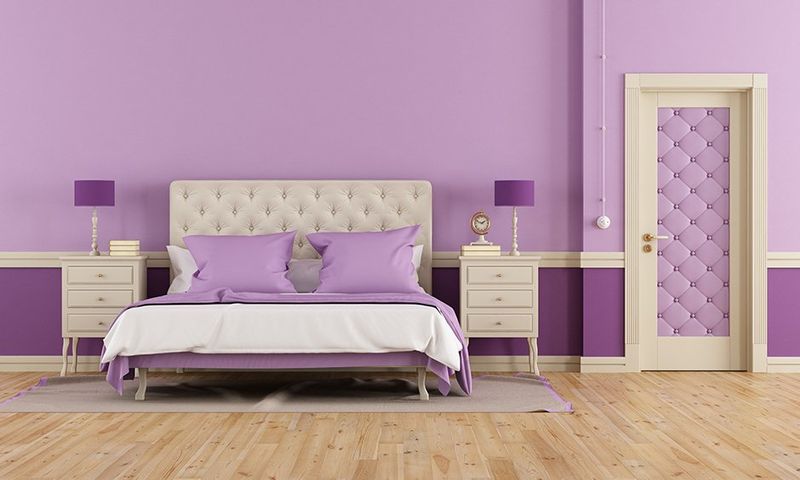
Lavender blush is the essence of calm and sophistication, a gentle blend that whispers elegance. It’s a tranquil choice that brings a sense of peace and serenity.
This soft hue works beautifully in bedrooms or reading nooks, spaces where relaxation is key. It pairs well with other pastels, creating a cohesive, harmonious look.
Lavender blush is ideal for those seeking to create a soothing sanctuary within their home, enveloping residents in a cocoon of comfort and grace.