15 Color Choices That Make Homes More Attractive To Buyers And 10 Which They Instantly Refuse
Choosing the right paint color might not seem like a big deal – until you’re trying to sell your house and buyers start making faces.
Some shades make a space feel fresh, open, and irresistibly move-in ready… others practically chase people back to the driveway. Whether it’s the magic of a soft greige or the horror of a neon accent wall, color has serious power.
In this guide, I’m diving into 15 hues that buyers love – and 10 that make them run for the hills. If walls could talk, these ones would have opinions. Let’s find out which colors really seal the deal!
1. Soft Beige
Can you imagine walking into a room that feels like a warm hug? Soft beige creates this welcoming aura, wrapping guests in a sense of comfort and calm. Its neutral tone acts as a chameleon, seamlessly blending with various styles and furnishings, ensuring compatibility with any decor preference.
This versatile shade is not just about blending in; it highlights architectural features without overpowering them. Buyers often appreciate how beige provides a clean slate, enabling them to envision personal touches. A splash of soft beige whispers elegance and subtle sophistication.
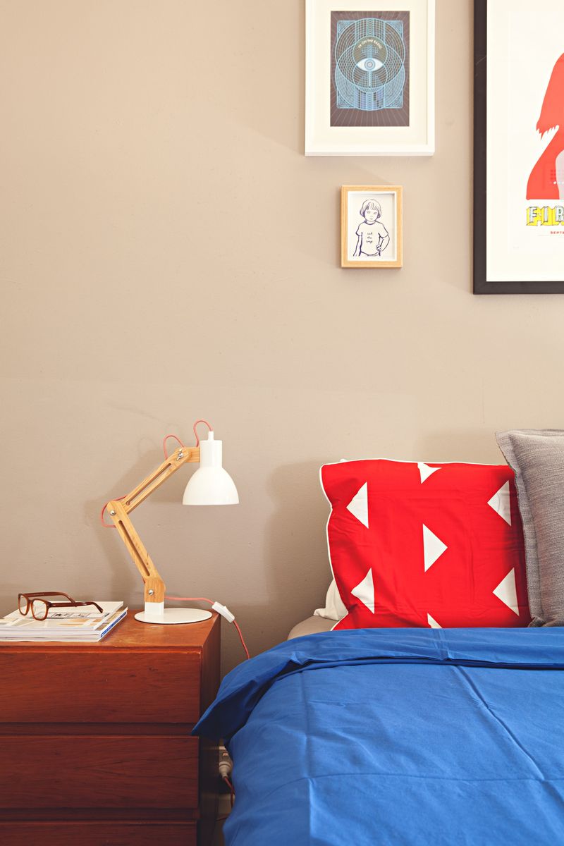
2. Calming Blue
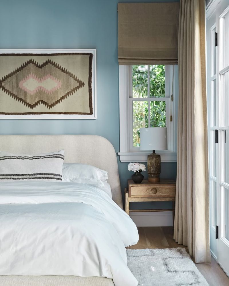
Ever felt the tranquility of the sea? Calming blue channels that serene vibe right into your home. It’s like a gentle wave washing over the room, soothing and refreshing every corner. This color works wonders in bedrooms, creating a restful retreat from the daily hustle.
Buyers are drawn to this hue for its ability to make spaces appear larger and more open, while instilling a sense of peace. It’s no wonder blue is often a top choice when aiming to create a tranquil abode.
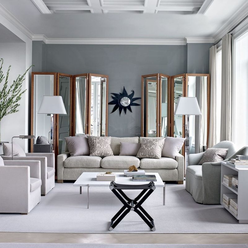
3. Elegant Gray
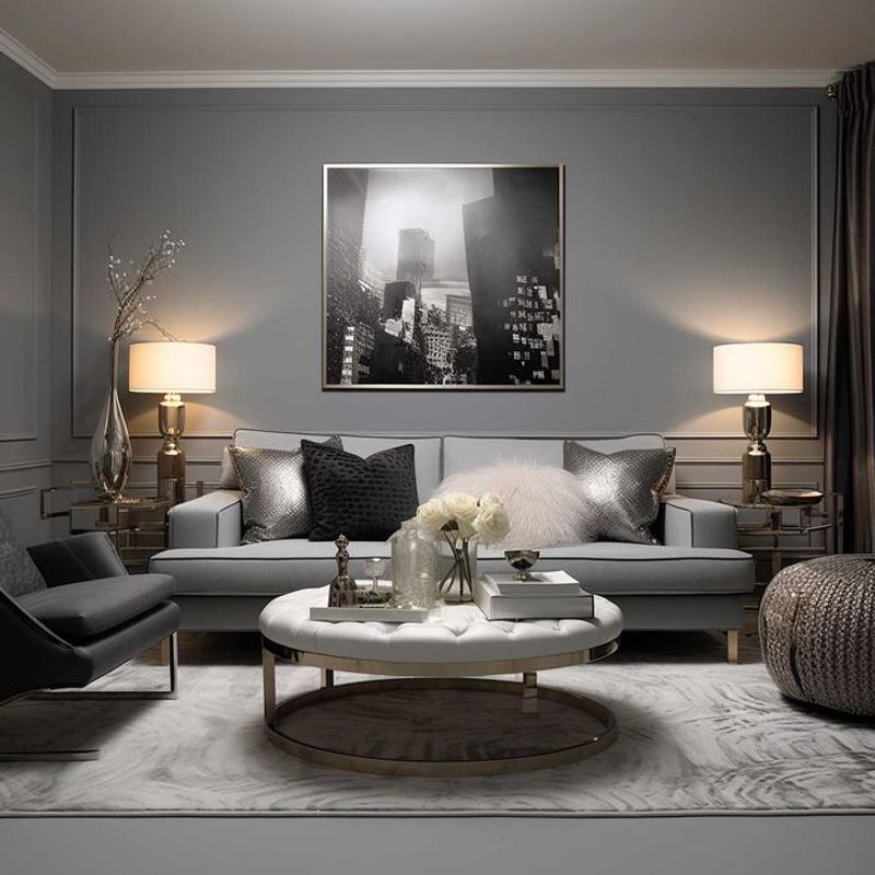
Gray is the epitome of modern elegance – a color that embodies sophistication without shouting for attention. It’s the perfect backdrop for both vibrant and muted accent colors, offering versatility that buyers love.
Its understated charm makes gray a favorite in contemporary designs, as it provides a neutral base that can handle bold accessories. The subtlety of gray transforms spaces into sleek and stylish havens, appealing to those with a taste for the finer things.
4. Warm Taupe
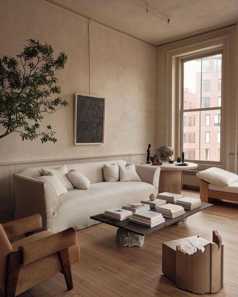
There’s something about warm taupe that stirs a sense of nostalgia and coziness. It’s like being wrapped in a comforting blanket of color.
Buyers are charmed by taupe’s versatility, as it beautifully complements both traditional and modern decor. This color invites guests to relax and stay awhile, making it a popular choice for spaces where family and friends gather. A touch of taupe turns a house into a home.
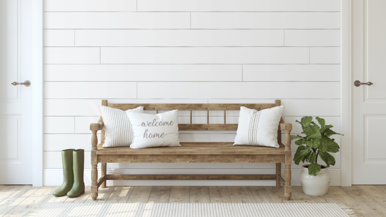
5. Classic White
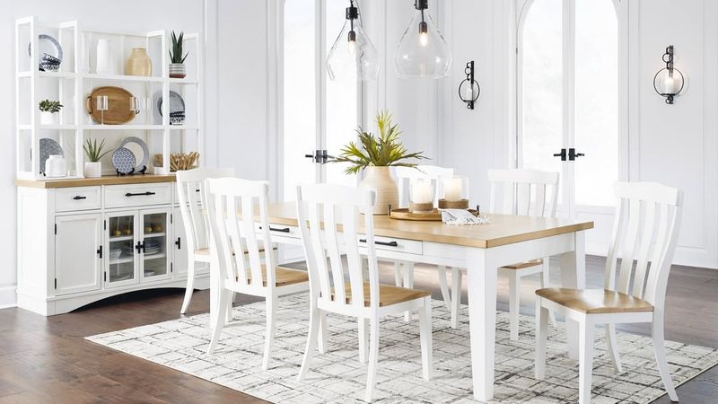
No, white isn’t just a color – it’s a canvas of endless possibilities! How about a dining room bathed in classic white, where light dances effortlessly across the walls, creating an atmosphere of openness and purity. Its simplicity is its greatest strength.
It provides the perfect backdrop for art and furniture, allowing personal style to shine. Classic white exudes a timeless elegance that never goes out of fashion, making it a perennial favorite.
6. Peaceful Green
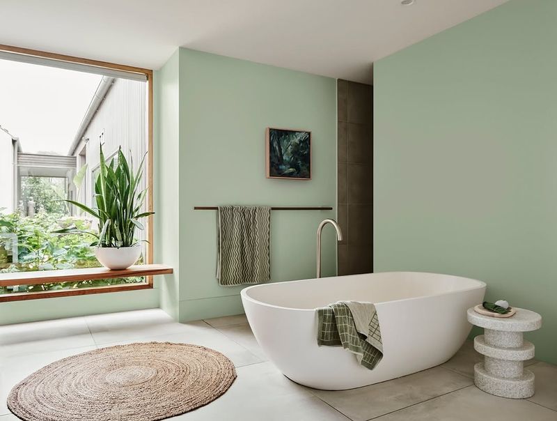
If serenity had a color, it would be peaceful green. This refreshing hue invites nature indoors, creating a sanctuary of calm and rejuvenation.
It is appreciated how much this color connects to nature without leaving the comfort of home. It’s an ideal choice for those seeking a tranquil retreat, as green promotes relaxation and well-being. Peaceful green is more than a color; it’s an escape to tranquility.
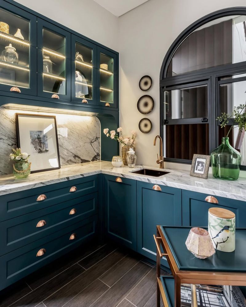
7. Rich Navy
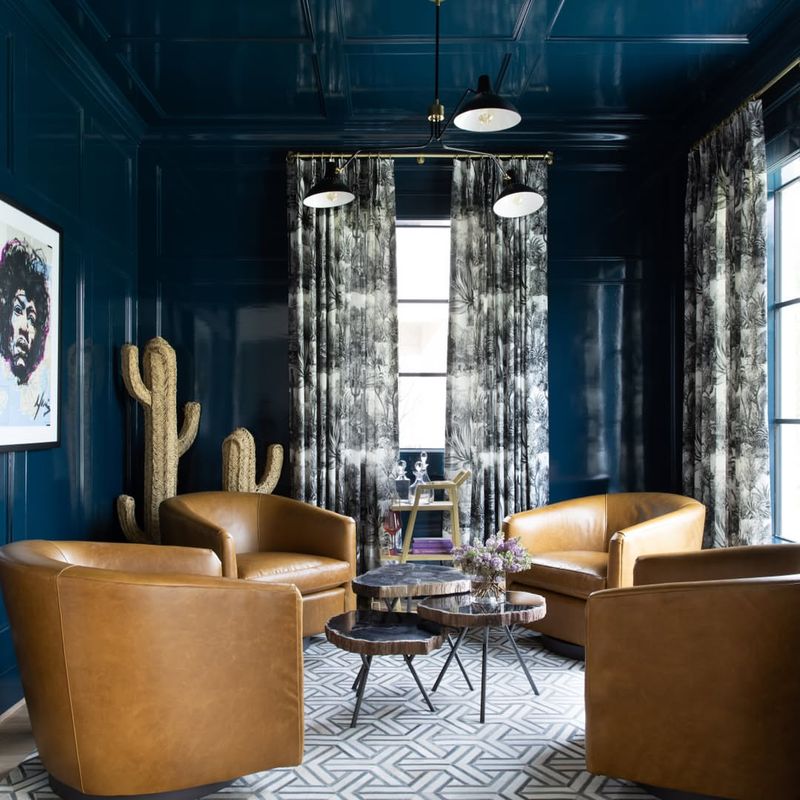
Step into a world of sophistication with rich navy. This deep, luxurious hue transforms any study into a bastion of intellect and style. Imagine walls that envelop you in an atmosphere of depth and character, where ideas flow as freely as the ink from a fountain pen.
Its bold yet timeless appeal makes it a very popular choice that people are quite drawn to. It pairs beautifully with metallic accents and natural woods, creating a regal ambiance. Rich navy isn’t just a color but a statement of elegance and power.
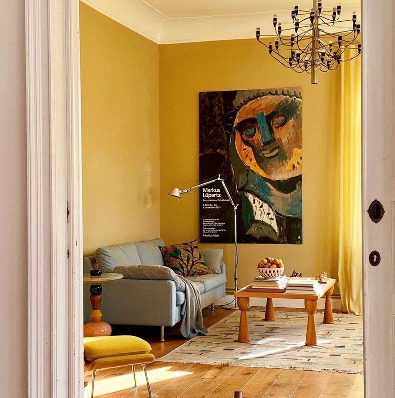
8. Bright Yellow
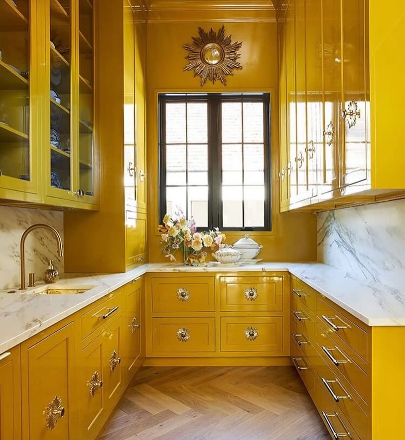
Can a color actually smile at you? Bright yellow certainly seems to, with its sunny disposition and cheerful energy. A kitchen bathed in this joyful hue, where every morning begins with a burst of positivity and warmth, sounds lovely doesn’t it?
It’s a fantastic choice for kitchens, as it fosters an inviting and lively atmosphere. Bright yellow isn’t just a splash of color; it’s a daily dose of sunshine that makes any house feel like home.
9. Sophisticated Charcoal
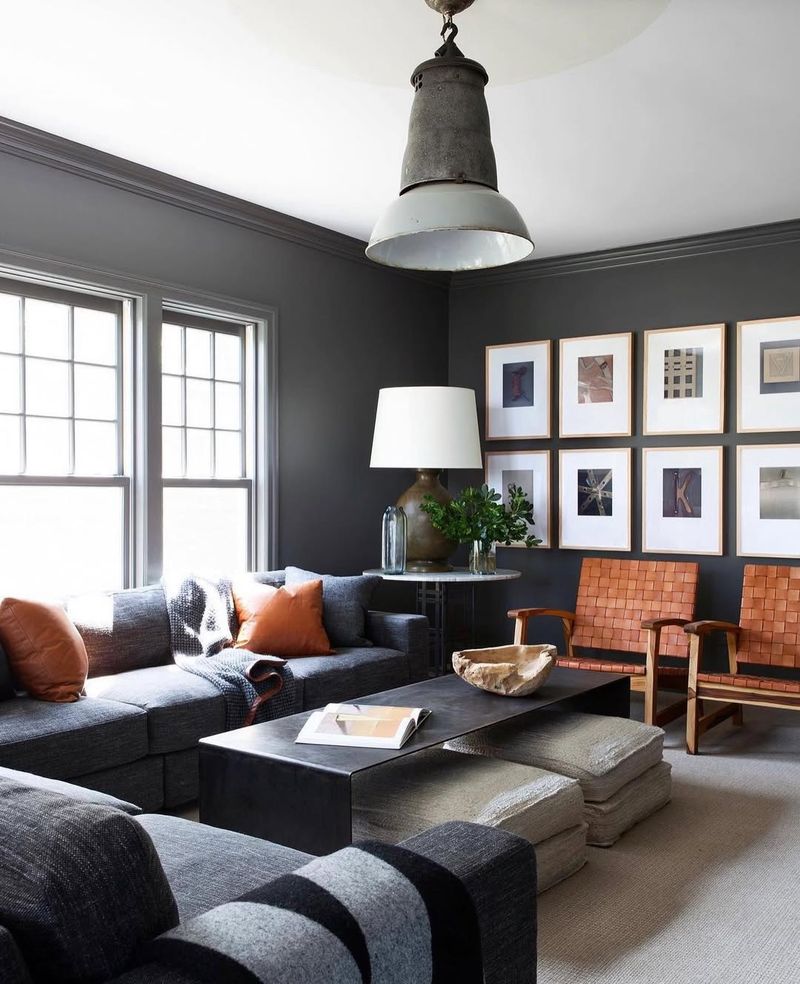
Charcoal exudes a sense of drama and sophistication that is hard to match. Envision a living room where sophisticated charcoal sets the stage for elegance and style, grounding the space with its deep, rich tones.
Buyers adore charcoal for its modern allure and versatility, as it pairs well with bold and muted accents alike. It adds depth and dimension, making it a preferred choice for those who appreciate contemporary design. Sophisticated charcoal is more than just a color; it’s a statement of class.
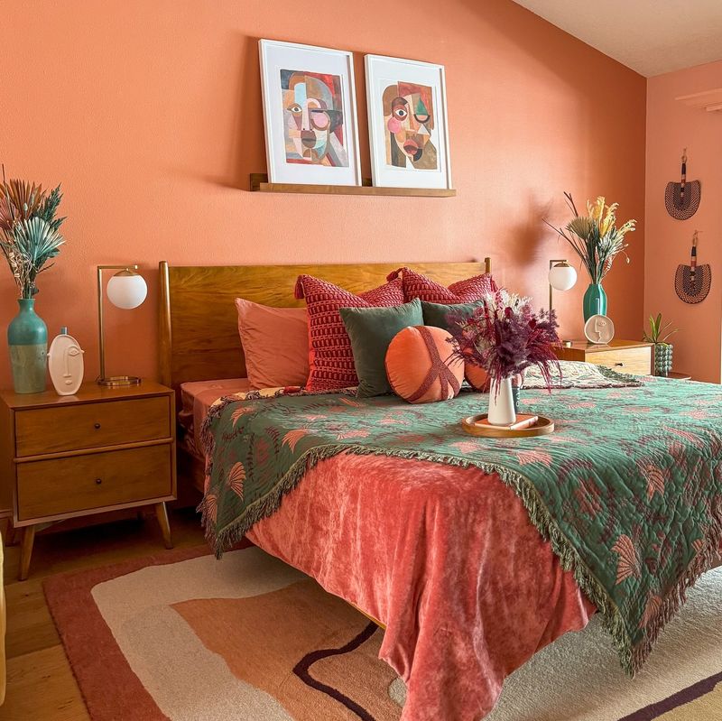
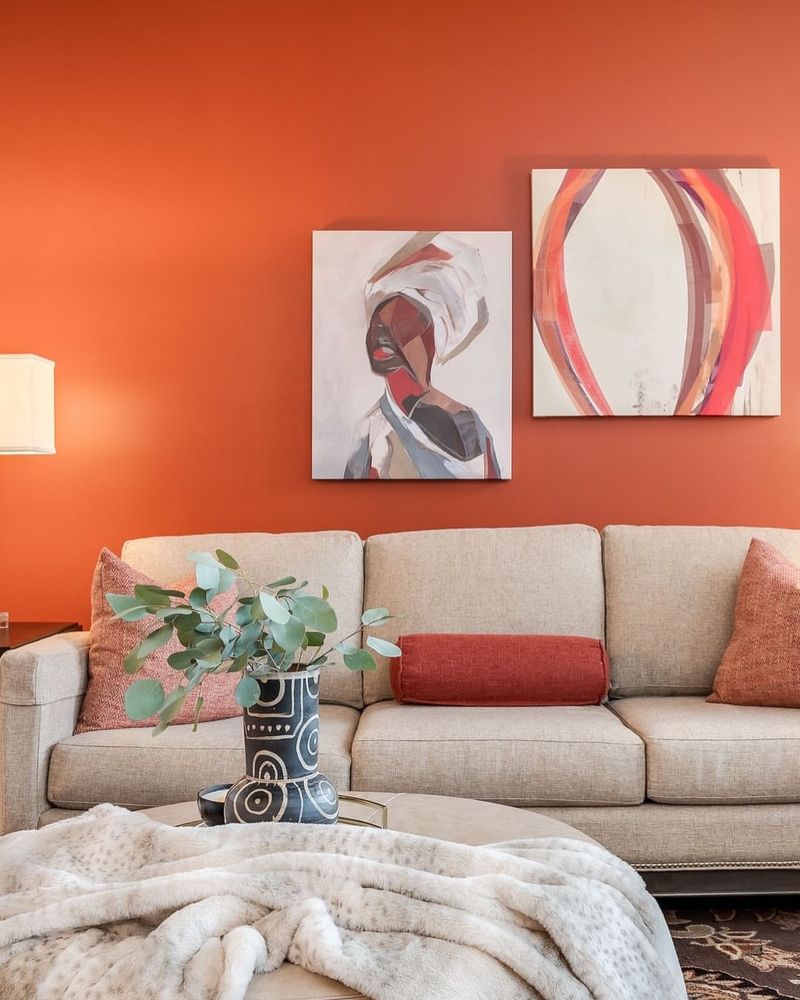
10. Earthy Terracotta
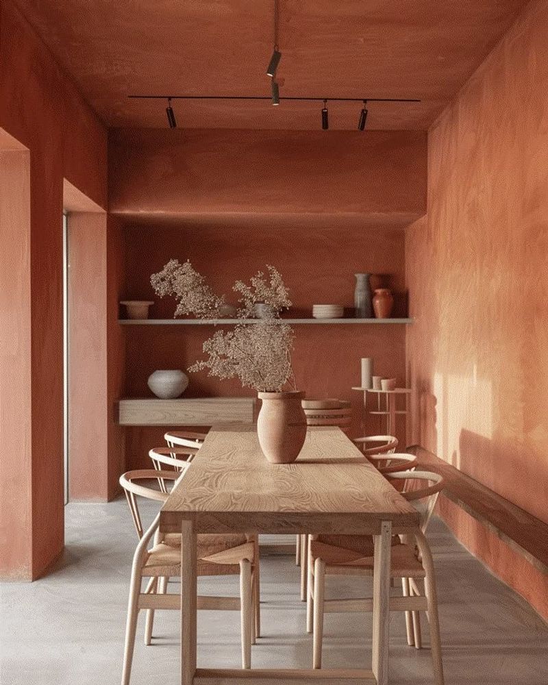
Whispering the tales of sun-drenched landscapes and earthy warmth is the gorgeous terracotta. Wouldn’t a dining area embracing this rich hue, where meals are shared under the glow of rustic elegance be a total win? It’s a color that radiates warmth and invites conviviality.
This earthy tone brings a touch of the outdoors inside, creating a welcoming and grounded environment. Earthy terracotta isn’t just a shade; it’s an invitation to gather, connect, and savor the simple pleasures of life.
11. Playful Coral
Brimming with vitality and charm, coral is the color world’s lively soul. It is a color that moves with warmth and vitality.
Coral appeals to buyers because it adds personality and charm to rooms. It creates an atmosphere that encourages creativity and is ideal for kids’ rooms or creative spaces. Playful coral is an invitation to dream and explore, not just a color.
12. Moody Black
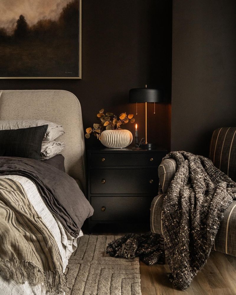
For individuals who are feeling edgy, black is the bold option. Imagine a dark, brooding bedroom where mystery and atmosphere are paramount. It’s an eye-catching hue that provides a striking background for individual expression.
Black’s ability to create drama and refinement appeals to buyers. Moody black turns rooms into cozy havens when paired with opulent textiles and textures. This color is a canvas for the daring and daring, not just a shade.
13. Fresh Mint
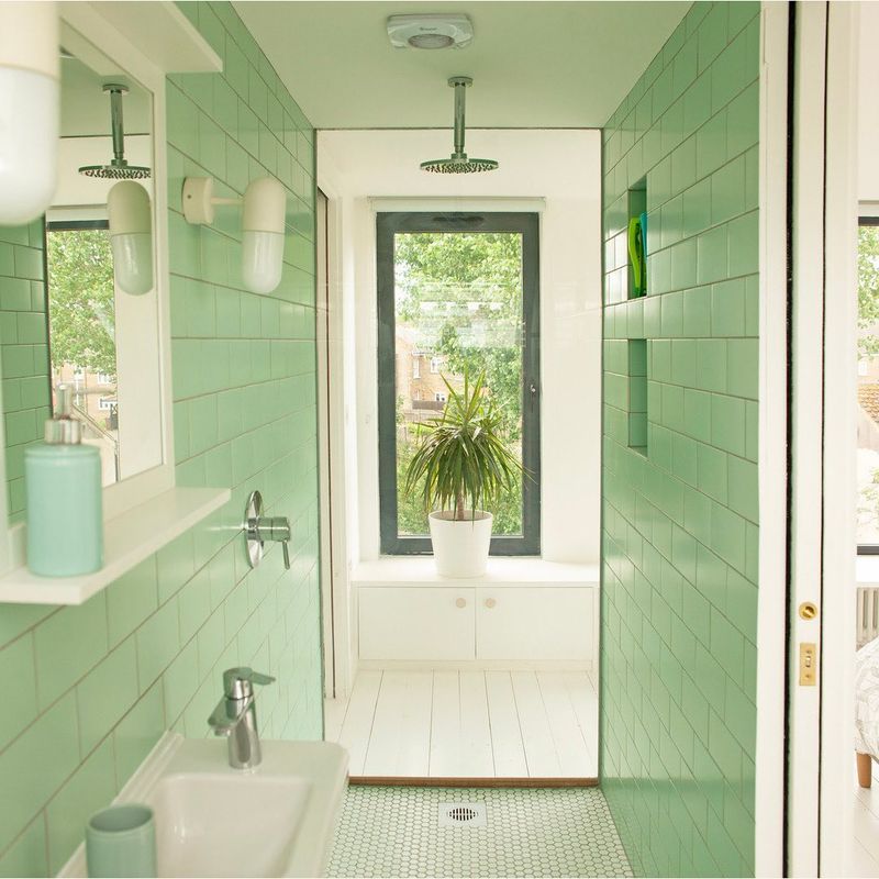
Any environment is revitalized by the refreshing shade of mint, which is like a cold wind on a sweltering day. This color conveys a feeling of cleanliness and vigor, perfect for a bathroom.
Customers are mesmerized by mint’s capacity to enliven environments while preserving a tranquil atmosphere. It creates a light, open space and goes well with white and natural wood. Fresh mint is a subtle reminder of fresh starts and renewal, not just a color.
14. Lively Teal
Infusing interiors with vitality and inventiveness, teal is the life of the party. It is a color that enlivens the spirit and excites the mind.
The vibrancy and adaptability of teal frequently enchant buyers. It provides a colorful background for unique décor and looks well in imaginative settings. Lively teal is more than simply a pop of color; it’s a call to creativity and imagination.
15. Gentle Lavender
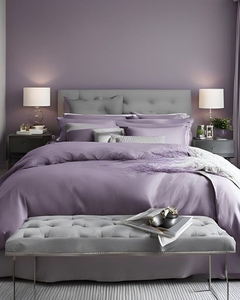
Lavender is a calming and comforting tint that is like the soft murmur of a lullaby. It’s the ideal color to create a peaceful atmosphere.
Lavender’s relaxing effects and understated elegance attract buyers. It encourages calm and sound sleep, making it the perfect option for nurseries and bedrooms. Calm lavender is more than just a hue; it’s a symbol of calm and tranquility.
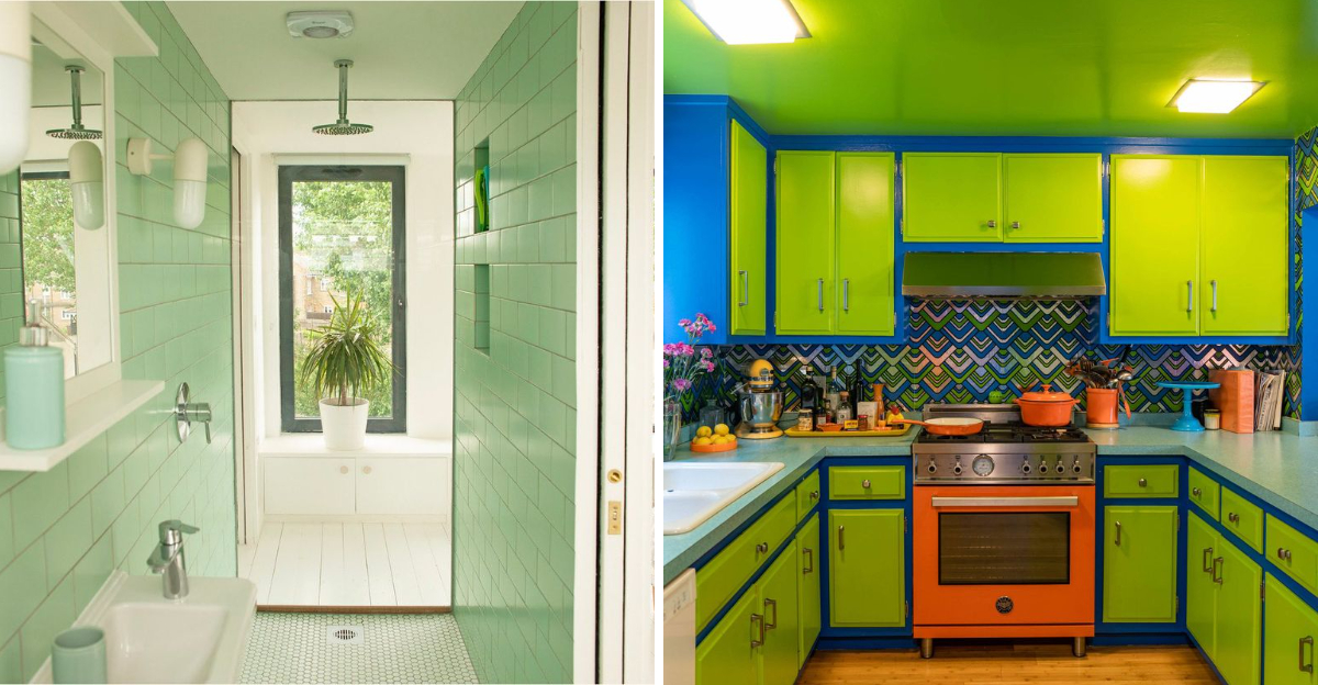
1. Neon Green
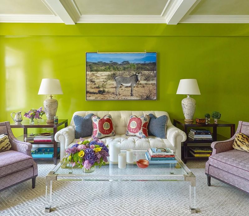
There’s bold, and then there’s blinding. Neon green might have felt fun once upon a dorm room wall or as an accent in a kid’s playroom, but as a main color in a home? It’s overwhelming.
Buyers walk into a space like that and instantly start calculating how many coats of primer they’ll need. It doesn’t pair easily with furniture, lighting, or flooring, and it rarely reads as intentional.
Instead of playful, it just feels jarring – and not in a “make a statement” kind of way.
2. Dark Brown
While a rich espresso wall can be moody and elegant in the right setting, covering entire rooms in dark brown makes everything feel smaller, heavier, and less inviting.
This color is often associated with old faux Tuscan decor or overly masculine spaces that haven’t been refreshed in decades. It eats light and rarely photographs well.
Even if the rest of the home is lovely, this shade tends to overshadow everything – literally and stylistically.
3. Rental Beige
Beige might seem like a safe bet, but when it’s that dull, pinkish-tan version you see in outdated apartments, it drains the life out of a room.
It doesn’t read as cozy or classic – it reads as tired. It doesn’t highlight architectural details or pair well with modern fixtures, and instead of being a blank canvas, it feels flat and uninspired.
Neutrals are fine, but there’s a world of better options than this dated go-to..
14. Mustard Yellow
It’s bold, yes – but it’s also tricky. Too much warmth and it veers into dingy territory, like aged Tupperware or questionable carpeting from the ’70s.
In the wrong lighting, it turns muddy and oppressive, rather than cheerful. While some trendy interiors can make mustard work in small doses, most buyers aren’t interested in figuring out whether they’re looking at a statement wall or a mistake.
5. Deep Red
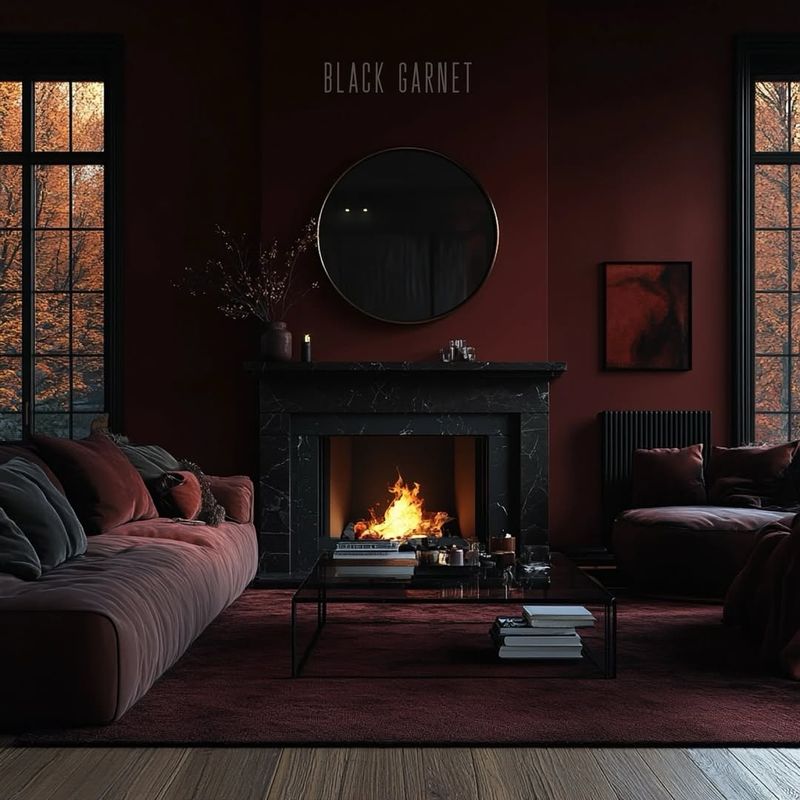
Red can be rich, dramatic, even romantic – but when it dominates a space, especially in darker, maroon-heavy shades, it feels dated and claustrophobic.
It’s also a polarizing color emotionally – too intense for many, too specific for others. Even if the finish is flawless, the instinct is almost always to repaint it.
Instead of feeling bold or luxurious, it tends to make rooms feel boxed in and emotionally charged in all the wrong ways.
6. Bright Lime
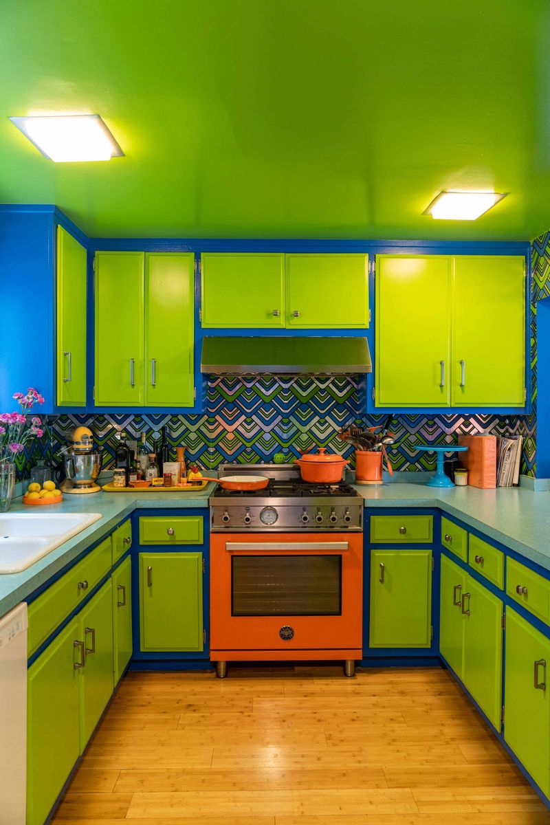
Bright lime walls are loud, bold, and nearly impossible to pair with furniture, flooring, or sanity. It’s the kind of color that dominates a space and leaves buyers blinking.
Even if the home is well-maintained, this electric hue distracts from everything else. Instead of appreciating the room’s layout or flow, potential buyers are mentally swatching paint samples.
It’s a color choice that insists on being noticed, but not in a way that wins anyone over. Loud doesn’t always equal lively – it often just feels exhausting.
7. Bright Orange
Even a sophisticated burnt orange is a tough sell, but bright or pumpkin tones? That’s where buyers start seeing dollar signs for primer and paint.
Orange is loud, assertive, and completely unforgiving if the lighting isn’t perfect. It overwhelms trim, flooring, and even ceiling color. Even if used sparingly, it’s one of those hues that distracts from everything else, pulling focus away from what the room actually offers.
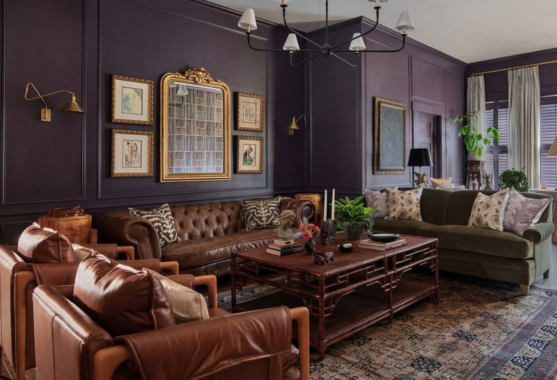
8. Deep Purple
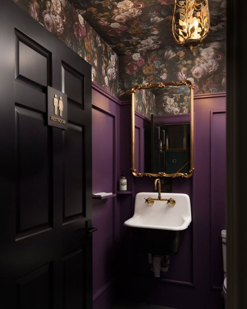
Deep purples might have a moody, luxurious reputation in theory, but in practice, they rarely land well. Eggplant tones absorb light and make spaces feel smaller and more somber.
They’re hard to decorate around and rarely complement a wide range of finishes. To most buyers, it feels like a bold statement they never would’ve made – and now have to deal with.
It’s not just a color; it’s a whole aesthetic, and not one that fits the average buyer’s vision of a fresh start or a move-in-ready space.
9. Cold Gray
Gray had a long, strong run as the trendy neutral of the decade, but now the overly cool, almost blue-toned versions just feel sterile and impersonal.
In certain lighting, these shades can even make walls look icy or flat – especially in homes with limited natural light. Buyers are moving toward warmer, earthier tones that feel more welcoming.
10. Turquoise
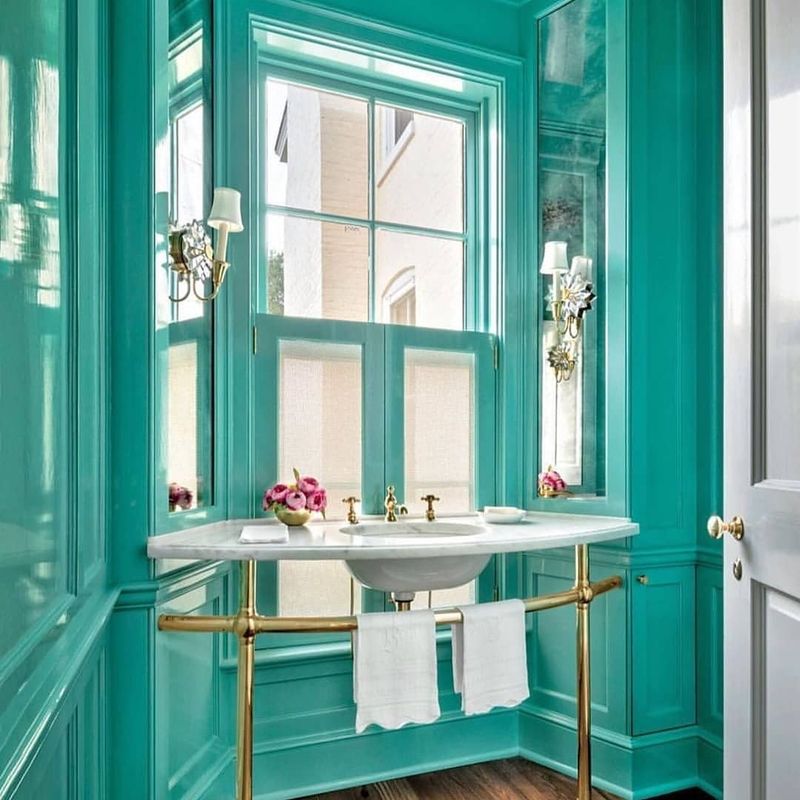
This bright, beachy hue might look fun in small doses, but as a wall color, it’s overwhelming. It’s too intense to fade into the background and too specific to appeal broadly.
In person, it can feel chaotic. In photos, it dominates everything else in the frame. Turquoise also tends to fight with other tones – wood floors, beige carpets, even white trim can look off next to it.
It’s not that it can’t work – it’s that it rarely does, especially when the goal is broad appeal.