Master The Art Of Choosing Paint Colors For Your Entire Home
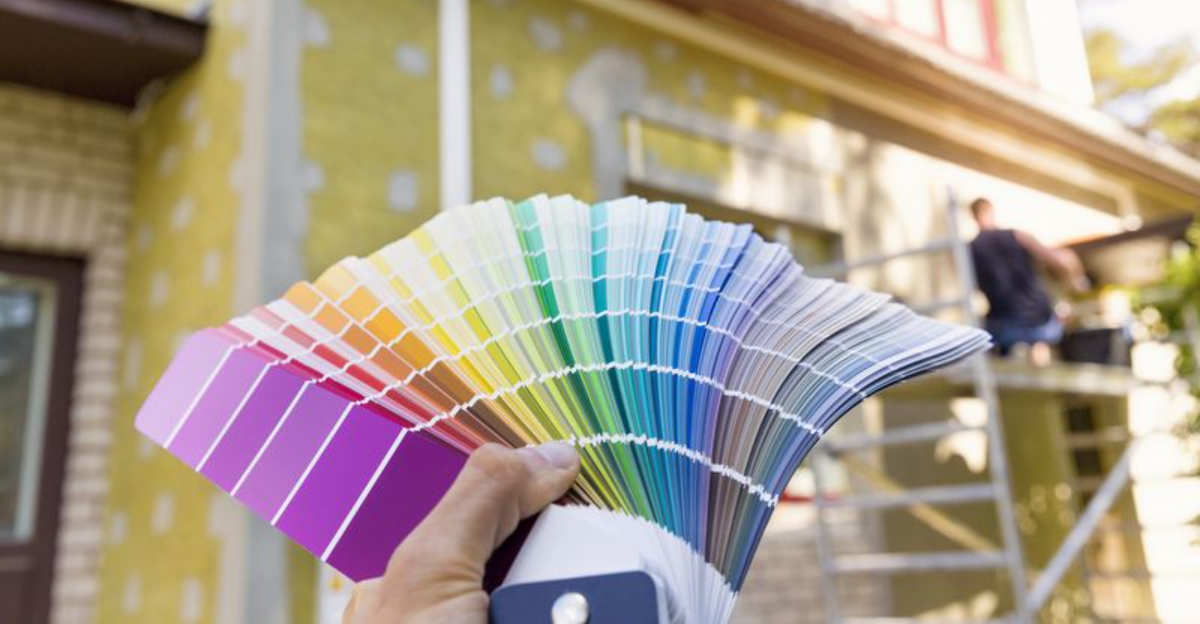
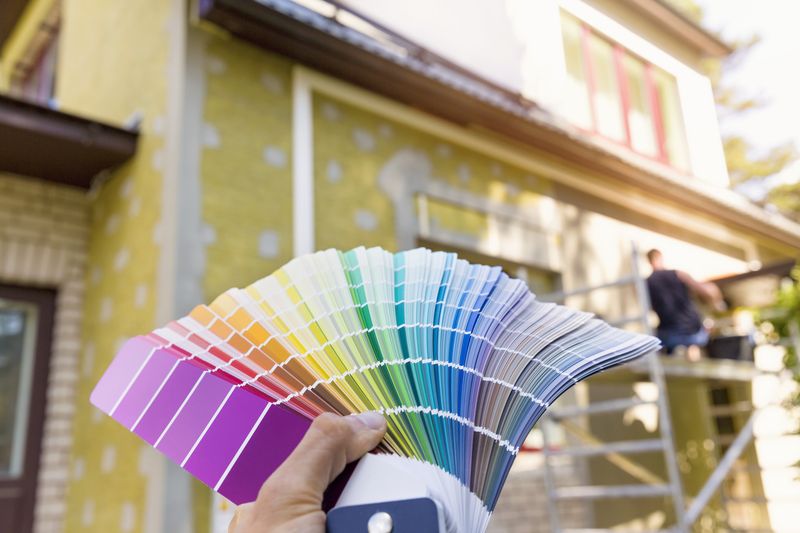
Choosing paint colors for my entire house once felt like trying to solve a giant, impossible puzzle, staring at endless paint chips left me completely overwhelmed.
I know I’m not alone in feeling stuck when every shade starts to blur together. But here’s the good news: picking the perfect palette doesn’t have to be a stressful guessing game.
With a few simple tricks and a little planning, I discovered how to make my home feel cohesive and personal, with colors that flow beautifully from room to room while still letting my own style shine through.
1. Start With A Whole-House Palette
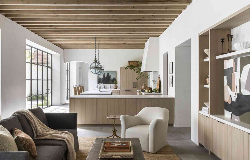
Think of your home as one big story instead of separate chapters. A cohesive color palette helps rooms connect naturally as you walk through your house.
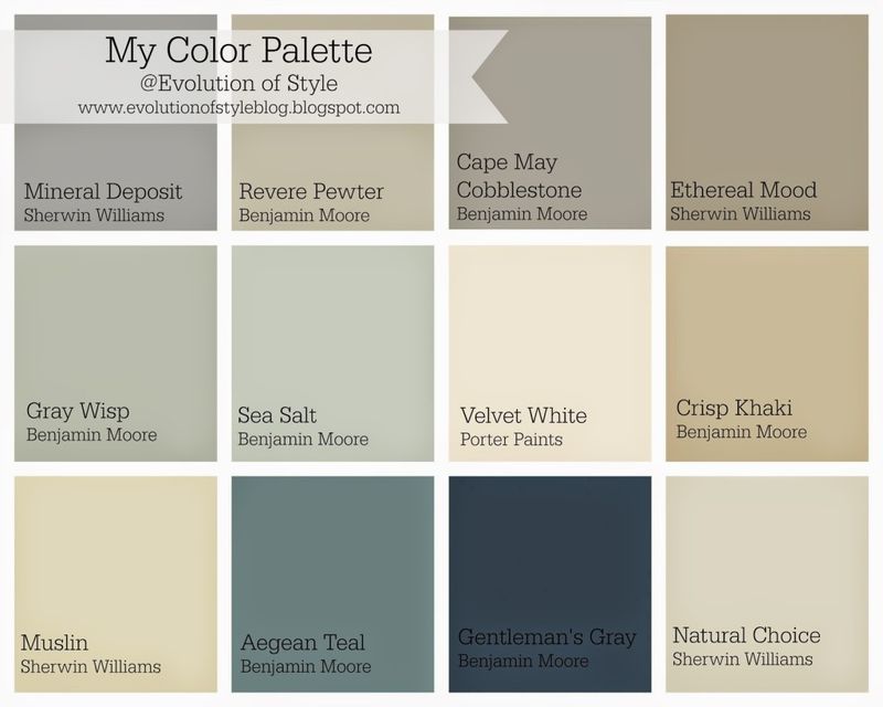
Grab those paint deck booklets from hardware stores and pull out 5-7 colors that make you happy when grouped together. Include neutrals, medium tones, and at least one bold accent.
This limited palette becomes your home’s color foundation, making future decisions much easier since you’re choosing from a manageable selection rather than thousands of possibilities.
2. Pick A Base Neutral
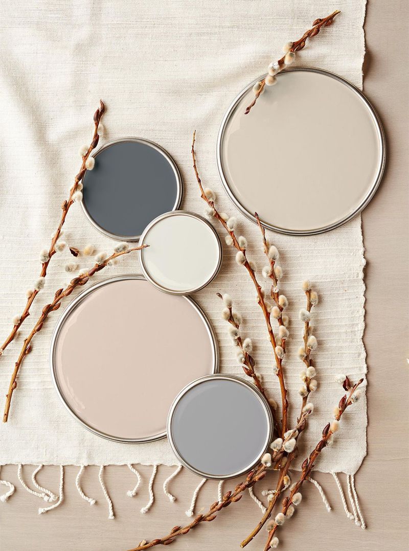
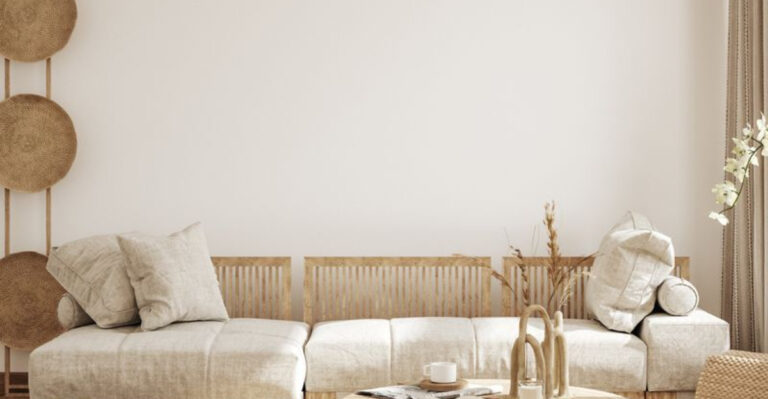
Every great paint scheme needs a trusty sidekick – your base neutral! This color will appear throughout your home, creating that ‘backbone’ feeling that ties everything together.
Look for soft whites, warm beiges, or cool grays that feel good to your eye. The perfect neutral shouldn’t scream ‘look at me’ but rather whisper ‘notice how good everything else looks.’
Use this color in hallways, connecting spaces, and any room where you want a sense of calm. It’s your palette’s best friend!
3. Let Your Favorite Color Lead
Got a color crush? Maybe it’s that perfect blue that makes your heart sing or a green that reminds you of favorite camping trips. Make this beloved hue your starting point!
Choose different strengths of this color – lighter versions for larger spaces, bolder versions for accents or smaller rooms. Your color crush can appear throughout the house in varying intensities.
When you build around a color you truly love, the whole house will feel more ‘you’ and less like something from a catalog that anyone could have.
4. Consider Room Function
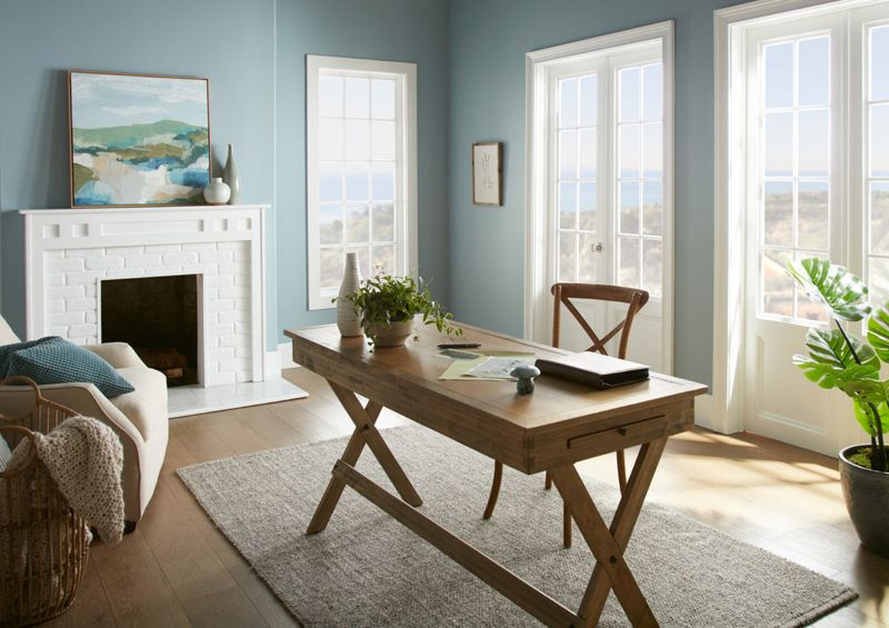
Kitchens and bathrooms love colors that feel clean and fresh. Bedrooms call for restful tones that help you wind down. Home offices might need energizing colors that keep your brain buzzing.
Match your color to what happens in each space! Busy rooms with lots of activity can handle stronger colors, while quiet spaces benefit from softer hues.
The magic question isn’t just ‘Do I like this color?’ but ‘Does this color help this room do its job?’ When colors support activities, your home works better for everyone.
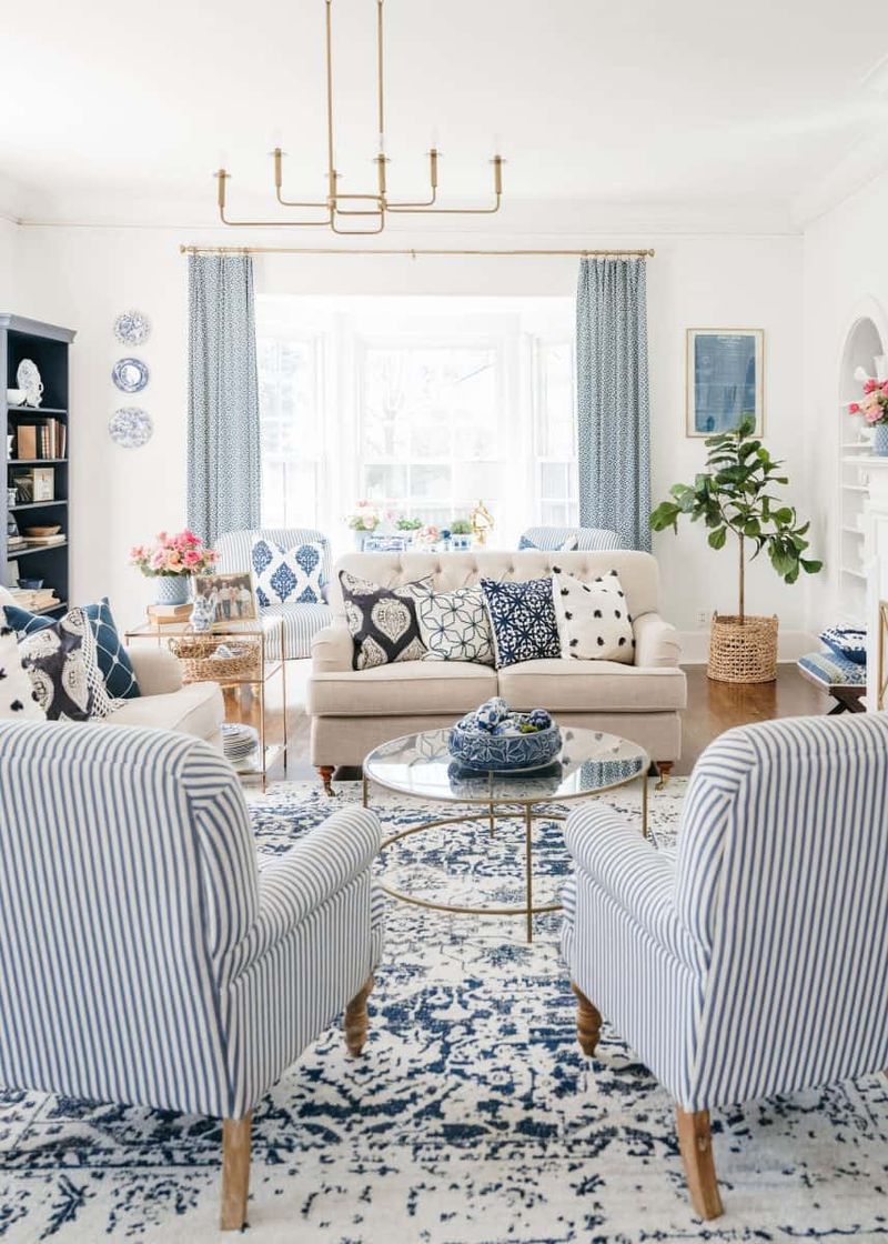
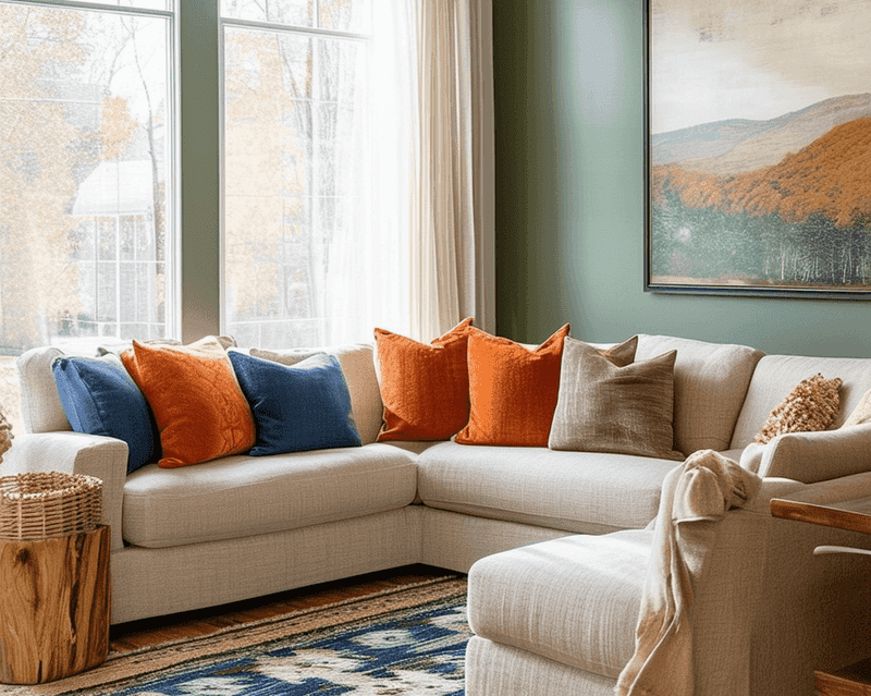
5. Use The 60-30-10 Rule
Think of each room like an outfit – you need a main color, supporting colors, and accessories! The 60-30-10 rule gives you perfect balance every time.
Your main color covers about 60% of the room (usually walls). A secondary color takes up roughly 30% (maybe trim, doors, or large furniture). The final 10% comes from accent colors in artwork, pillows, or decorative items.
This simple formula prevents rooms from feeling chaotic or boring. Even color beginners can create designer-worthy spaces just by sticking to these proportions!
6. Test Colors In Different Lights
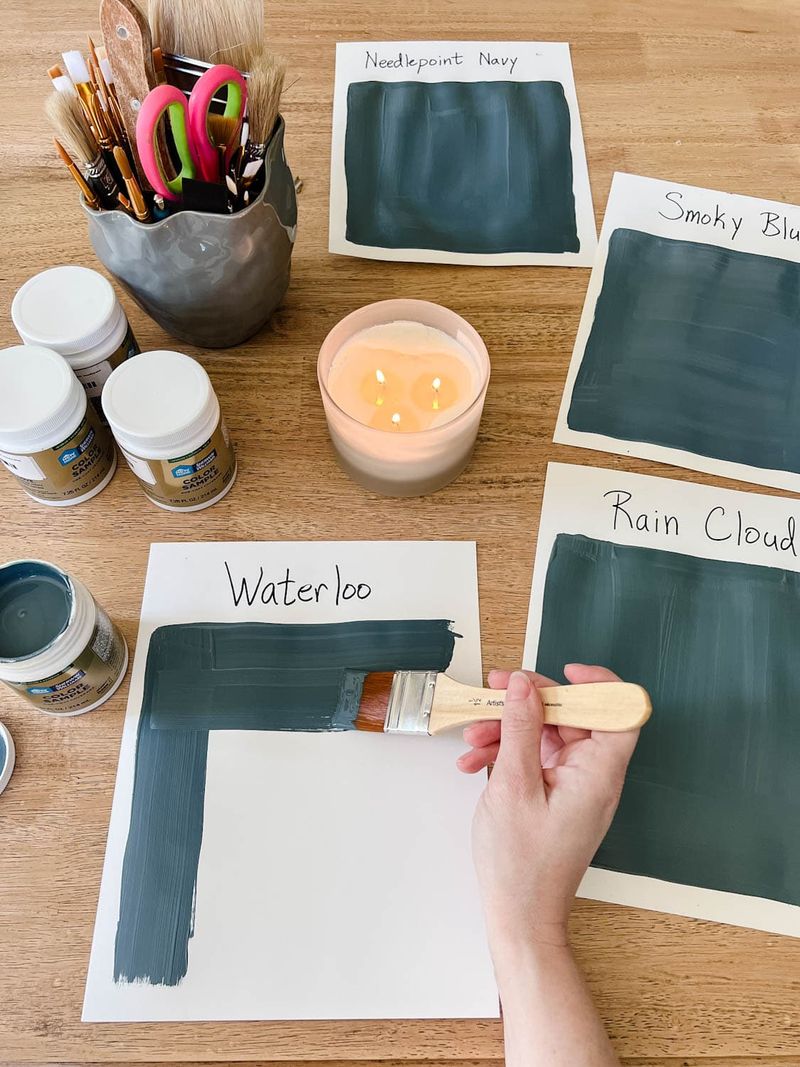
Paint is sneaky – it changes its mood depending on the lighting! That perfect gray in the store might look purple in your north-facing bedroom.
Buy sample pots and paint large squares on different walls in each room. Check them in morning light, afternoon sun, and with lamps on at night. Take photos with your phone to compare how drastically they change.
Never skip this step! I once painted an entire kitchen without testing, only to discover my ‘warm beige’ turned baby-poop yellow under my kitchen lights. Learn from my mistake!
7. Flow With Undertones
Undertones are the secret personalities hiding in every color. That beige might be secretly pink. That gray could be harboring blue or green undertones.
Group your paint chips on white paper and squint – suddenly you’ll see which ones have similar undertone families. Colors with matching undertones play nicely together across rooms, even if they’re different hues.
Want a foolproof trick? Look at the bottom color on any paint strip – this darkest shade reveals the true undertone that might be hiding in lighter versions above it.
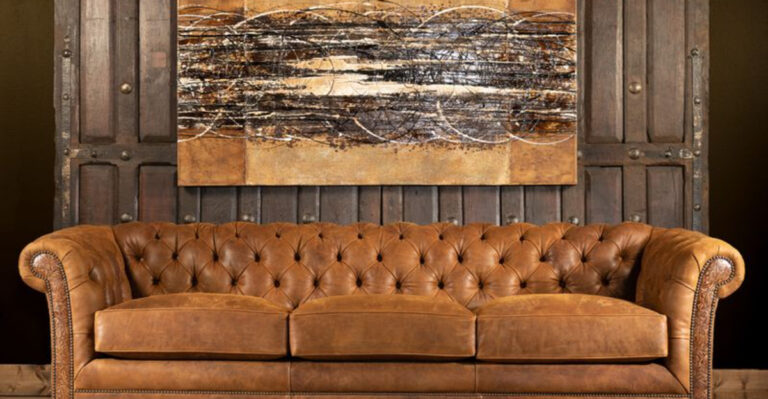
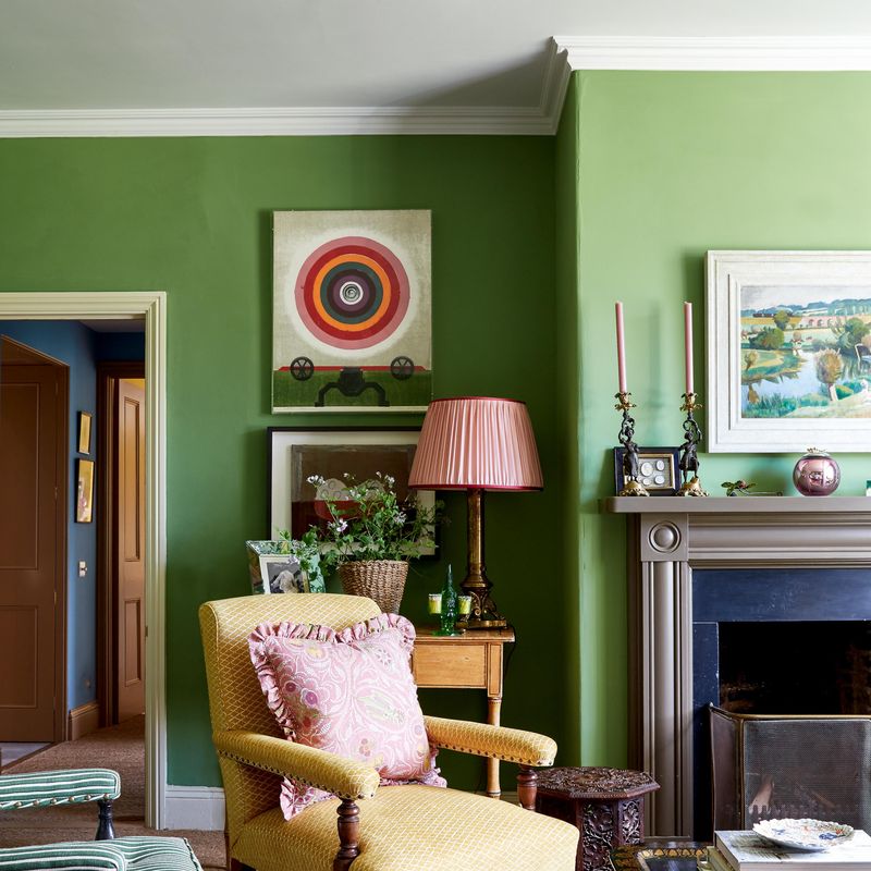
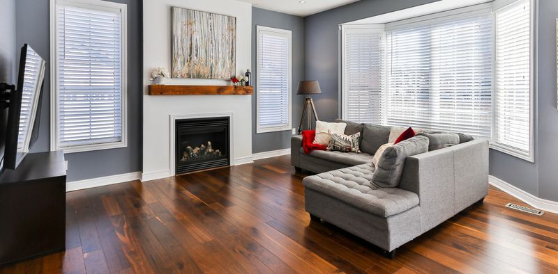
8. Highlight Architecture
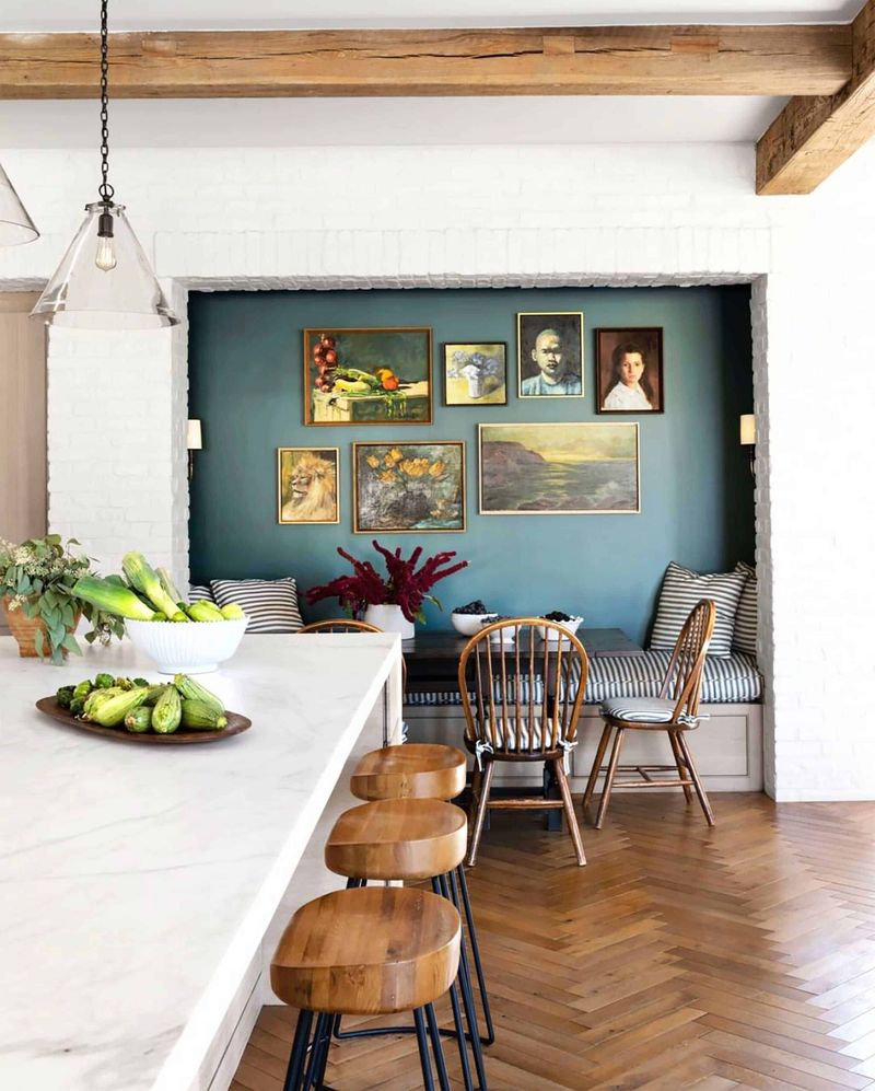
Got crown molding that deserves attention? A fireplace that should be the star? Use paint to make your home’s best features pop!
Contrasting colors draw the eye to architectural details. A darker wall color makes white trim stand out like a picture frame. Or flip the script with colorful trim against neutral walls for unexpected charm.
Paint can also hide flaws! That awkward ceiling bump? Paint it the same color as walls to help it disappear. Strategic color placement turns architectural oddities into intentional design choices.
9. Coordinate Ceilings And Trim
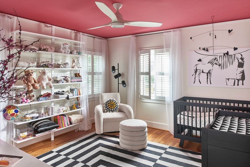
Ceilings aren’t just boring white canvases! A ceiling painted 25% lighter than your wall color creates subtle depth. Bold folks might try a contrasting ceiling color for major wow-factor.
For trim, white isn’t your only option. Try greige trim with blue walls or black trim with pale colors for dramatic flair. Matching your trim to wall color creates a cozy, enveloping feeling in bedrooms or studies.
Remember the rule: the more transitions between colors in a room, the busier it feels. Sometimes using the same color for walls and trim creates peaceful simplicity in small spaces.
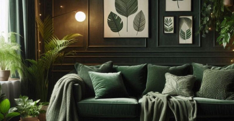
10. Vary Saturation, Not Just Hue
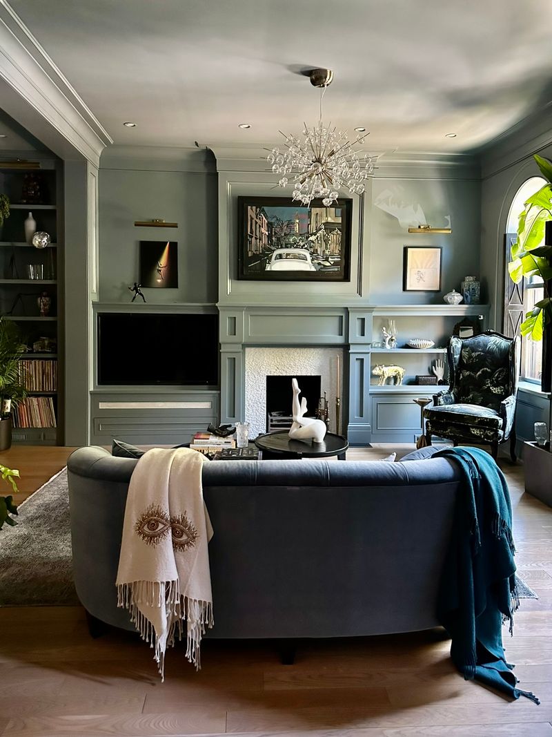
Color rookies focus only on different colors. Color pros know the secret is playing with intensity! Instead of jumping between totally different colors, try variations of saturation within your favorite hues.
A muted sage green in the living room can connect beautifully to a more saturated emerald in the powder room. The family relationship between colors creates flow while still giving each space its own personality.
This approach prevents that rainbow-explosion feeling while still giving you plenty of variety. Your home feels intentional rather than like a paint store exploded inside it!
11. Connect Open Spaces
Modern homes with open floor plans need special color consideration. When you can see multiple rooms at once, jarring color changes can make spaces feel chopped up.
Use color to define zones without walls! Perhaps the kitchen area gets a slightly deeper version of your living room color. Or keep walls consistent but change accent colors between functional areas.
Look for natural breaking points like corners, archways, or ceiling changes where color transitions make sense. Never change colors mid-wall unless you’re creating an intentional accent feature!
12. Reflect Your Personality
Your home should feel like YOU, not a hotel! If you love travel, maybe colors from your favorite vacation spot inspire your palette. Garden enthusiast? Bring those flower hues inside!
Look at your clothes closet for color clues. We typically wear colors we love, so your wardrobe can reveal your true color preferences. Check your jewelry too – gold lovers often prefer warm paint colors, while silver fans lean cooler.
Don’t get bullied by trends! That “Color of the Year” doesn’t belong in your house unless it genuinely makes you happy when you see it.
13. Think About Resale Value
Planning to sell someday? Super-specific colors might limit your buyer pool. That doesn’t mean boring beige everywhere, but consider mainstream appeal for larger spaces.
Save bold color choices for rooms that are easy to repaint, like bathrooms or bedrooms. Keep living areas, kitchens and exteriors in colors with broader appeal. Neutral doesn’t have to mean boring – greiges, soft blues, and gentle greens have wide appeal.
When in doubt, drive around neighborhoods you like and note exterior colors that attract you. These community-approved hues often have strong resale potential.
14. Tie In Flooring And Furniture
Your floors aren’t going anywhere, so make friends with them! Pull wall colors from subtle undertones in your flooring for foolproof coordination. Red oak floors? They’ll sing with warm wall colors. Gray tile? Cool wall tones will be your best bet.
Large furniture pieces should influence your color choices too. That massive blue sofa becomes a design feature, not a problem, when your wall color complements it.
Grab a pillow, rug, or fabric swatch you love and have it color-matched for paint. This guarantees your fixed elements and wall colors will live happily ever after!
15. Have Fun With Small Spaces
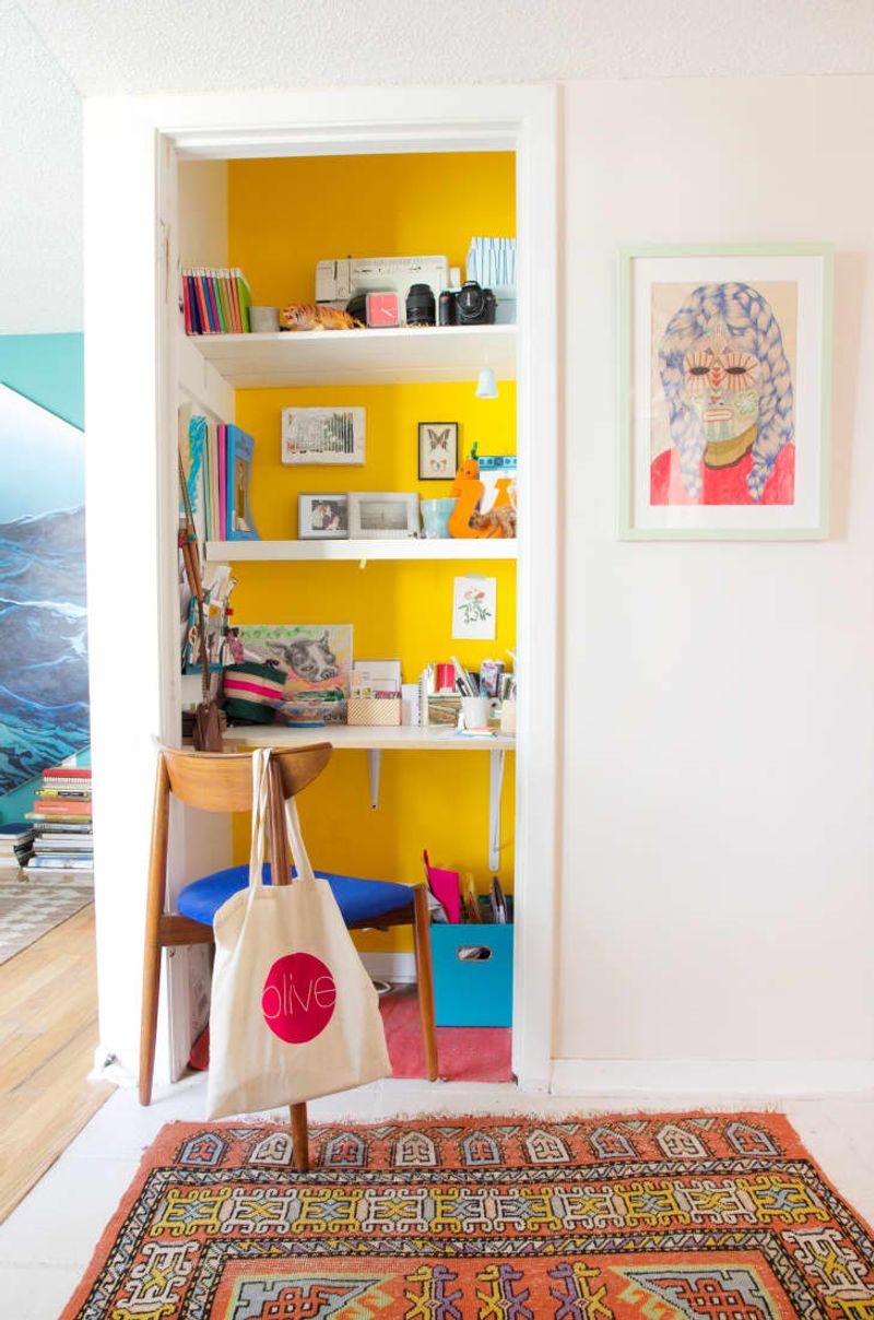
Powder rooms, laundry areas, and closets are your color playgrounds! These small spaces with limited time exposure are perfect for bold choices you might not brave in main living areas.
Always wanted a fire-engine red room but feared the commitment? Your half bath is the perfect candidate! These mini color moments become delightful surprises throughout your home.
Bonus tip: small spaces with bold colors actually feel larger and more intentional than when painted timid colors. That tiny hallway becomes a memorable transition space rather than just forgotten square footage!