19 Ways To Choose Interior Colors That Work Together Every Time
Picking interior colors sounds easy – until you’re staring at twenty swatches wondering why none of them feel right together. We’ve all been there.
The truth is, color harmony isn’t just about instinct – it’s about knowing a few tricks that designers swear by. Whether you’re refreshing a single room or planning a whole-home palette, the right combos can completely change how a space feels.
These 19 tips will help you take the guesswork out of color coordination, so your rooms flow effortlessly and look like they were pulled straight from a design magazine – without the stress or second-guessing.
1. Follow the 60-30-10 Rule
Ever wondered why some rooms just feel “right”? Professional designers swear by this simple formula. Your dominant color covers about 60% of the room (walls, large furniture), a secondary color takes up 30% (accent furniture, curtains), and an accent color adds the final 10% punch (accessories, artwork).
This balanced approach prevents any single color from overwhelming the space while ensuring visual interest. Think of it as creating a team where each color has its specific role to play!
2. Use a Color Wheel
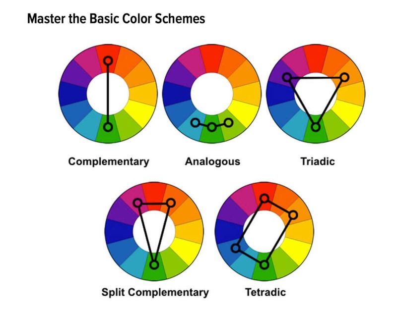
That circular rainbow chart from art class is actually your secret weapon for foolproof color matching! Colors opposite each other (complementary) create energetic combinations, while colors next to each other (analogous) feel harmonious and relaxing.
When in doubt, grab a basic color wheel from any craft store. It takes the guesswork out of combining colors and helps explain why certain combinations feel right while others seem off.
3. Look to Nature for Inspiration
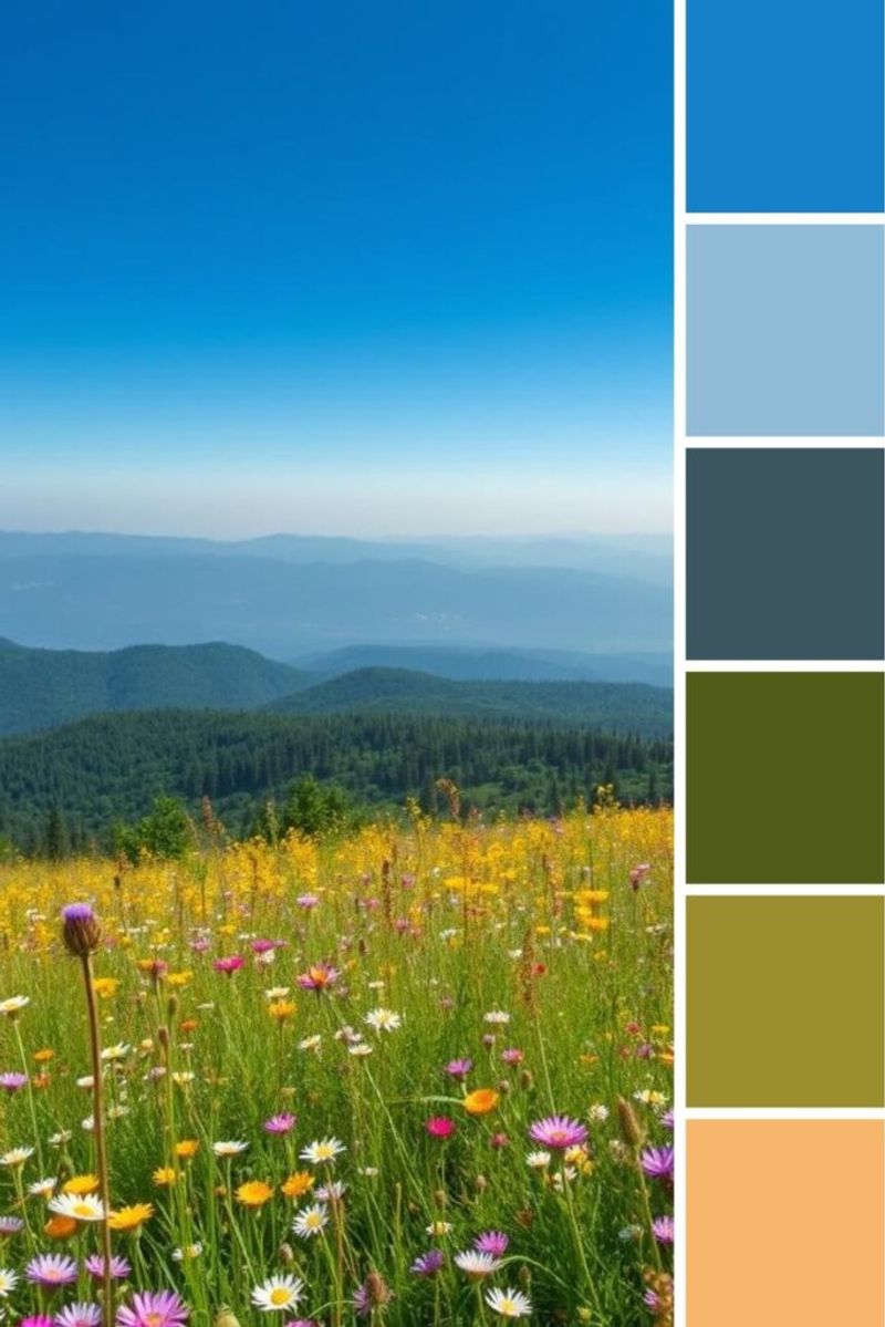
Mother Nature never gets color wrong! Take a walk outside and notice how colors appear together naturally – the soft blues and tans of a beach scene, or the rich greens and browns of a forest.
Snap photos of outdoor scenes that make you feel good, then pull your interior colors directly from these images. A sunset might inspire a gorgeous living room in soft oranges, purples and blues.
4. Start with a Statement Fabric
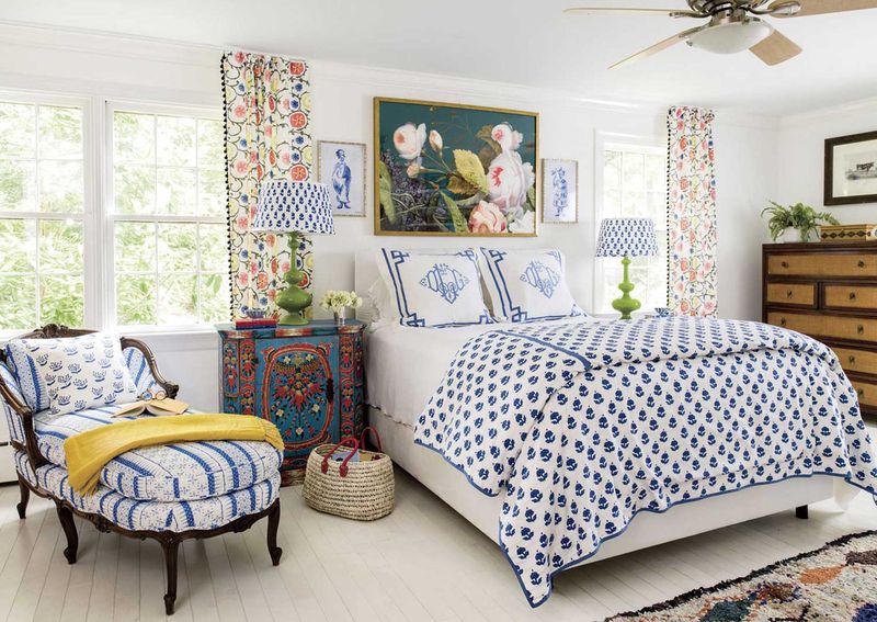
Struggling with where to begin? Find a multi-colored fabric pattern you absolutely love – like a beautiful floral pillow, patterned rug, or bold curtain fabric. The designer who created that pattern has already done the color-matching work for you!
Simply pull out 3-5 colors from your chosen fabric to use throughout the room. The main color becomes your wall color, while the others appear in furniture and accessories.
5. Consider Color Temperature
Colors aren’t just hues – they’re also temperatures! Warm colors (reds, oranges, yellows) feel cozy and energizing, while cool colors (blues, greens, purples) create calm, spacious vibes. Mixing temperatures can create tension if done incorrectly.
For harmony, choose mostly warm or mostly cool colors for a room, with small touches of the opposite for balance. A primarily cool blue room feels complete with tiny pops of warm orange or gold.
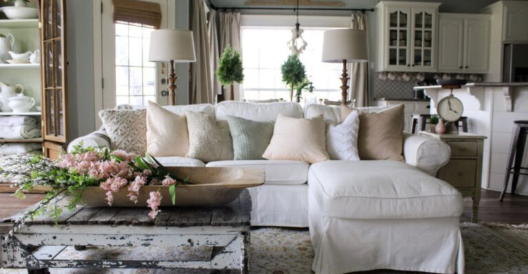
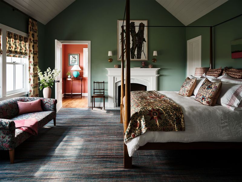
6. Try Monochromatic Schemes
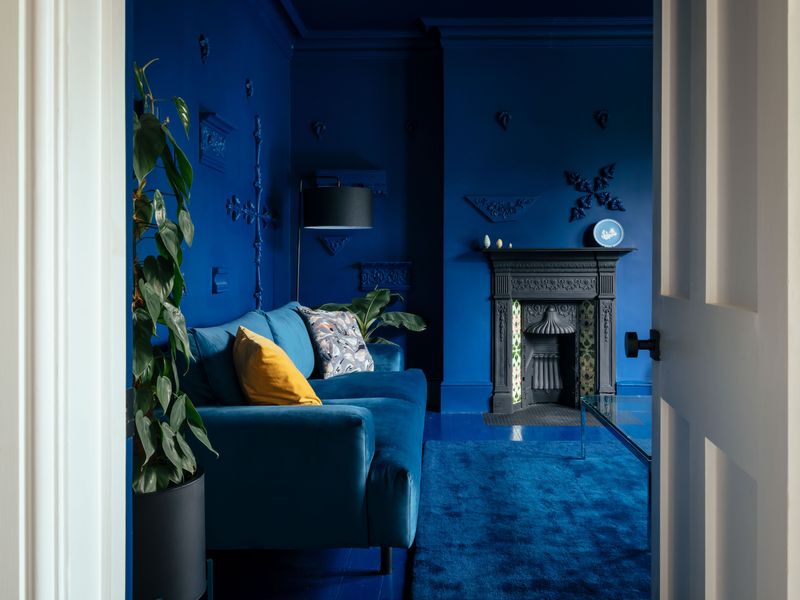
Afraid of making color mistakes? You can’t go wrong with various shades of a single color! A monochromatic scheme uses different values (light to dark) of one color throughout a space.
For a blue bedroom, combine pale sky blue walls, medium blue bedding, and navy accents. Add interest with different textures rather than different colors.
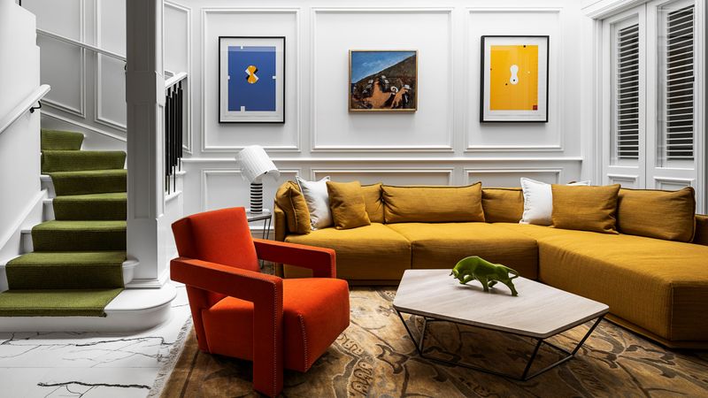
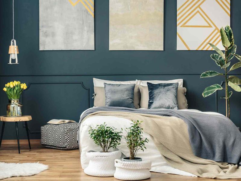
7. Follow the Rule of Three
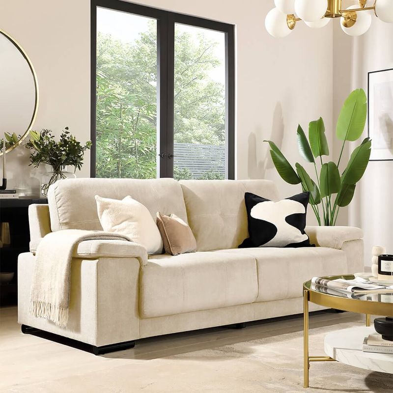
Three is the magic number in interior design! Limiting your palette to just three colors creates visual harmony without overwhelming the space. Choose one neutral (white, beige, gray) and two colors that complement each other.
Your eyes naturally find balance in groups of three. This principle works because it provides enough variety to be interesting without becoming chaotic.
8. Use the Same Undertones
Squint at a color and you’ll notice hidden undertones – those subtle hints of yellow, pink, blue, or green lurking beneath the main color. When colors clash mysteriously, mismatched undertones are usually the culprit!
All colors in a room should share the same undertone family. If your beige sofa has yellow undertones, pair it with warm-toned accessories rather than cool ones.
9. Paint Color Cards Are Your Friends
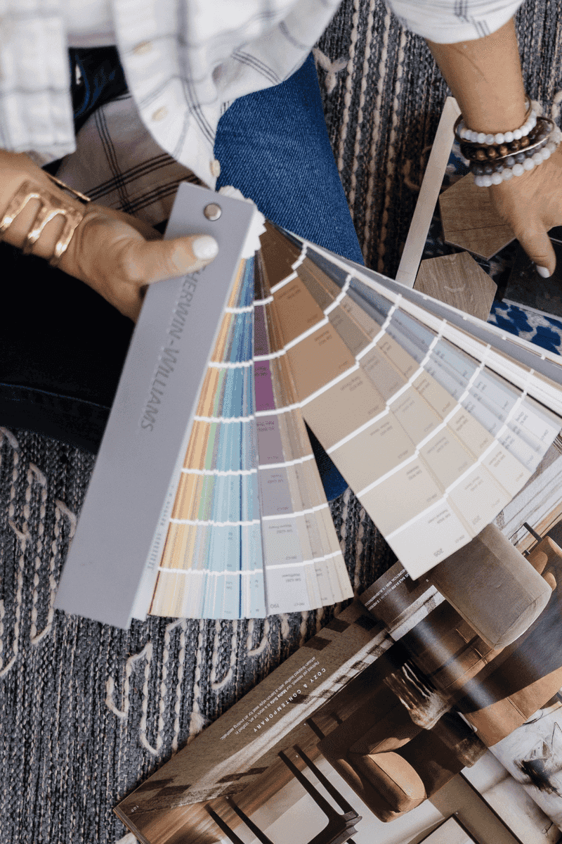
Those strip cards at the paint store aren’t just for choosing wall colors! Grab paint cards in colors you like – they’re already organized into perfectly coordinating families by professional colorists.
Use the lightest shade for large areas like walls, medium shades for furniture, and the darkest for accents. The colors will always work together because they share the same base pigments. This designer trick takes advantage of work that color experts have already done for you!
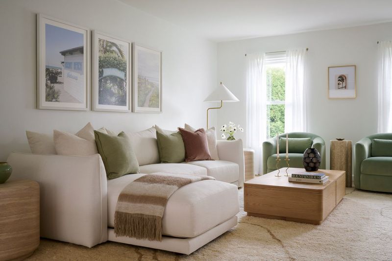
10. Go Neutral for Big Commitments
Playing it safe isn’t boring – it’s smart! Reserve neutral colors (whites, beiges, grays) for expensive, long-term items like sofas, cabinets, and flooring. Then add personality with colorful accessories that are easy to switch out.
This approach gives you flexibility as trends change. When you tire of teal throw pillows, simply swap them for coral ones without repainting your entire room.
11. Embrace the New Neutrals
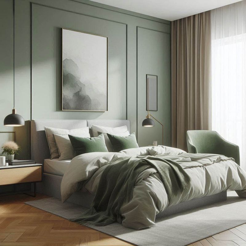
Gray isn’t the only neutral in town anymore! Soft, muted versions of traditional colors – dusty blue, sage green, blush pink – now function as sophisticated neutrals that play well with others.
These “new neutrals” have enough color to be interesting but are subdued enough to serve as backgrounds. A dusty blue wall works like a neutral while offering more personality than beige. Pair these versatile hues with both warm and cool accent colors for spaces that feel current without being trendy.
12. Test Before Committing
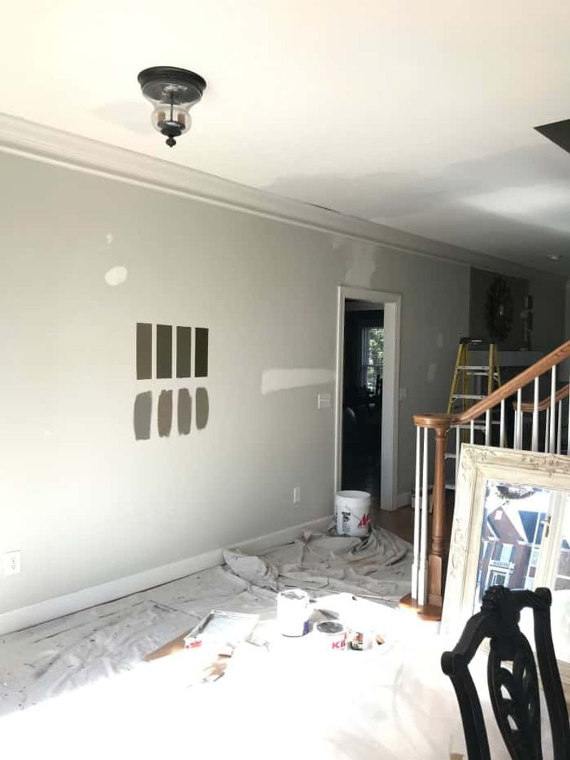
Don’t blindly trust those tiny paint chips! Colors change dramatically depending on lighting, room size, and surrounding elements. What looks perfect in the store might feel overwhelming on your walls.
Always test large samples in your actual space before committing. Paint 2-foot squares on different walls and observe them throughout the day as natural light changes. This extra step prevents expensive mistakes and color regret.
13. Consider Room Function
Different rooms serve different purposes, and colors should support those functions! Bedrooms benefit from calming blues and greens that promote rest, while home offices might need energizing yellows to stimulate productivity.
Think about how you want to feel in each space. Color psychology isn’t just designer talk – it genuinely affects mood and behavior. Let the room’s purpose guide your color choices for spaces that function as beautifully as they look.
14. Distribute Colors Evenly
Balance is key to color harmony! When colors appear only in one area of a room, the space feels lopsided and unfinished. The secret is distributing each color in at least three places throughout the room.
If you have blue pillows on one side, add something blue to the opposite side too – perhaps artwork or a vase. This triangulation technique guides the eye around the space and creates a sense of intentional design. Even small touches count toward this distribution, making the entire room feel cohesive.
15. Look to Historical Color Schemes
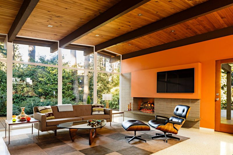
Certain color combinations have stood the test of time for good reason – they simply work! Historic color palettes from different design periods offer pre-vetted combinations that feel harmonious and balanced.
Victorian schemes feature rich jewel tones, while Mid-Century Modern embraces earthy oranges and olive greens. Art Deco combines black with metallics and bold colors. These time-tested palettes eliminate guesswork since their color harmony has already been proven through decades (or centuries) of use.
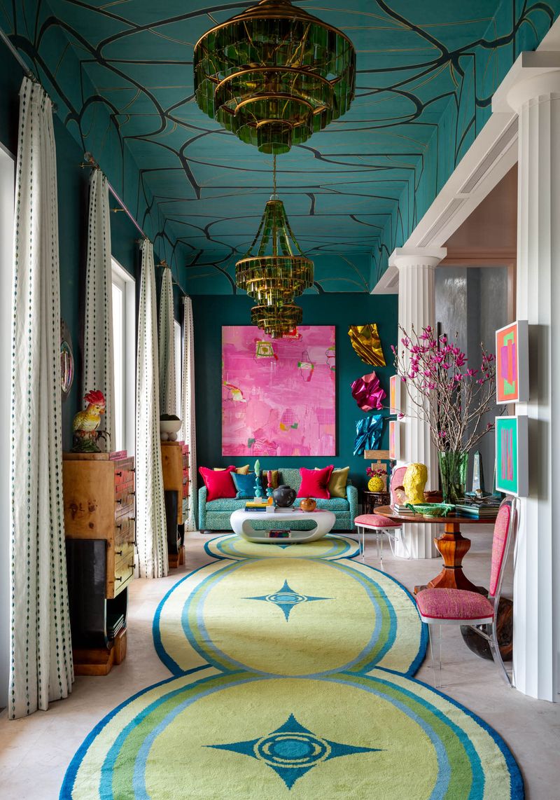
16. Remember the Ceiling
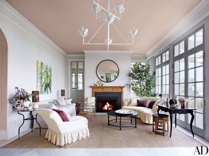
Don’t forget the “fifth wall”! Your ceiling color dramatically affects how other colors look in the room. A stark white ceiling can create harsh contrast with colored walls, while a softly tinted ceiling enhances the overall color scheme.
For cohesion, paint ceilings a lighter version of your wall color or choose a soft, warm white rather than bright white. This subtle approach makes rooms feel complete and intentional.
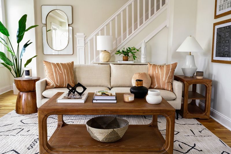
17. Pick Colors from Artwork
Already have art you love? Let it choose your color scheme! Favorite paintings or prints contain perfectly coordinated colors selected by the artist that you can borrow for your room.
Pull the background color for your walls, then use the painting’s accent colors for furniture and accessories. This technique guarantees colors that harmonize while creating a meaningful connection between your art and space.
18. Consider Lighting Effects
Sunshine completely transforms colors! North-facing rooms receive cool, bluish light that enhances cool colors but can make warm colors appear dull. South-facing rooms get warm, yellow light that makes cool colors appear more vibrant.
Choose colors that compensate for your lighting situation. A strategic approach like this ensures colors look as intended rather than being distorted by natural lighting conditions.
19. Flow with Neighboring Spaces
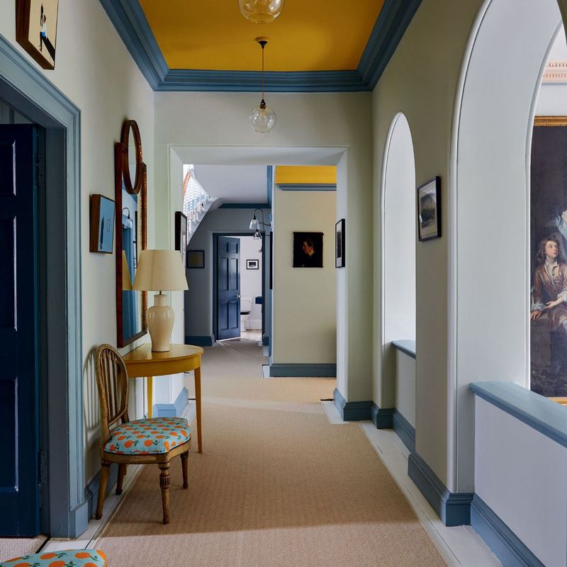
Colors shouldn’t stop abruptly at doorways! For a harmonious home, adjacent rooms should relate to each other through coordinated (not matching) colors. This creates visual flow as you move through your space.
One effective technique is color progression – gradually shifting from warmer to cooler tones as you move through the house. Another approach is using different intensities of related colors.