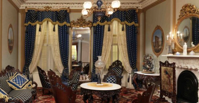
21 Ceiling Paint Colors You Will Regret, According To Designers
Ah, the ceiling, often overlooked yet so impactful in the overall vibe of your space. While it might be tempting to venture into bold color territory, design experts caution against certain shades.
These are the hues that might seem appealing on a paint swatch, but can lead to endless regret once applied overhead.
Whether it’s casting an unflattering shadow or simply clashing with your decor, the wrong ceiling color can be a decor disaster. Let’s explore the 21 ceiling paint colors that designers often advise you to avoid.
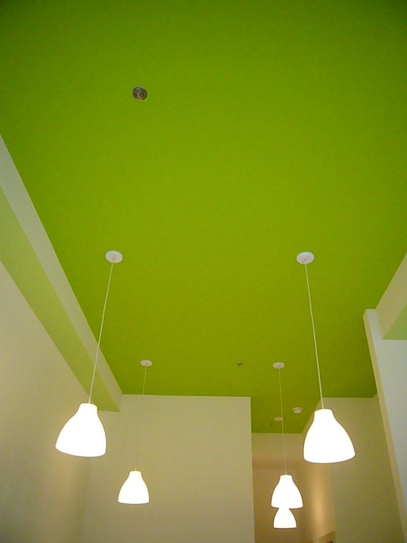
1. Bright Neon Green
Ever feel like living inside a highlighter? A neon green ceiling could make that dream, or nightmare, a reality. While it might seem fun at first, the novelty wears off quicker than you’d think. This glaring hue can turn your home into a perpetual St. Patrick’s Day parade, minus the charm.
The color reflects vividly, giving everything a sickly cast. Not to mention, it distracts from any chic decor you might have worked hard on. Best keep this electrifying color for party accessories.
2. Dark Chocolate Brown
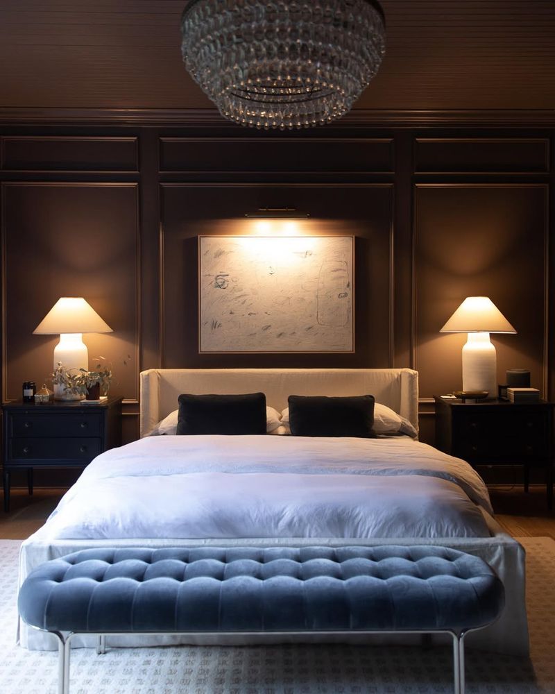
Who doesn’t love chocolate? But on your ceiling, it might be a bit too much! Dark chocolate brown can make a room feel as though it’s closing in on you. Instead of cozy, it becomes cavernous, absorbing all the light you wish to have.
Let’s not forget, this color can bring about a permanent dusk-like atmosphere. It might make you yearn for brighter, happier surroundings. Consider saving this rich tone for a more appropriately-sized accent wall or a plush throw instead.
3. Deep Crimson Red
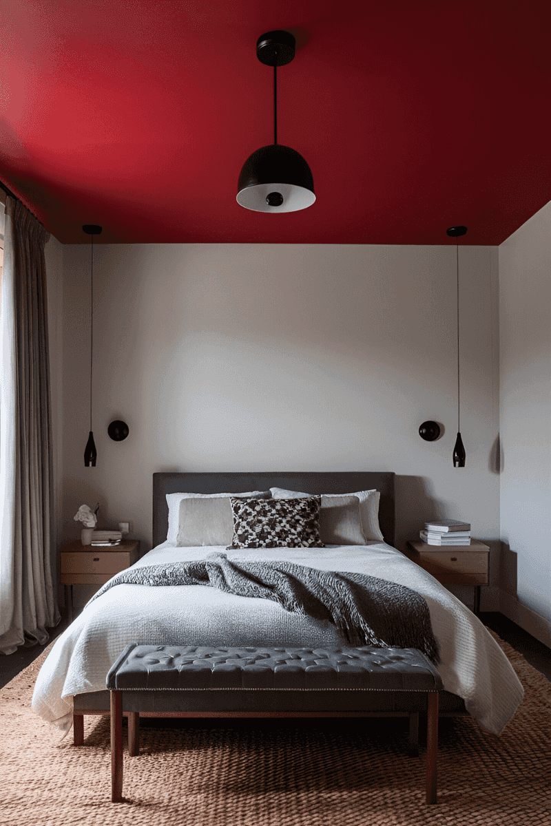
Feeling passionate about your ceiling? A deep crimson red might seem tempting. However, it often casts an oppressively intense vibe over a room. Red is known for its ability to stimulate and energize, but above your head, it might be more overwhelming than invigorating.
This color can clash with softer decor elements and make a space feel tense rather than tranquil. For a pop of red, try a statement piece or a piece of art, where it can shine without overshadowing.
4. Jet Black
While sleek and modern, a jet black ceiling can feel like a storm cloud has taken permanent residence above you. It absorbs light and can make even the sunniest rooms feel gloomy. This choice is a commitment to a dark, moody ambiance that might not always be welcome.
Black is bold but can easily overpower other design elements, leading to a space that feels more dungeon than dwelling. Opt for black accents instead, which can offer drama without dominating.
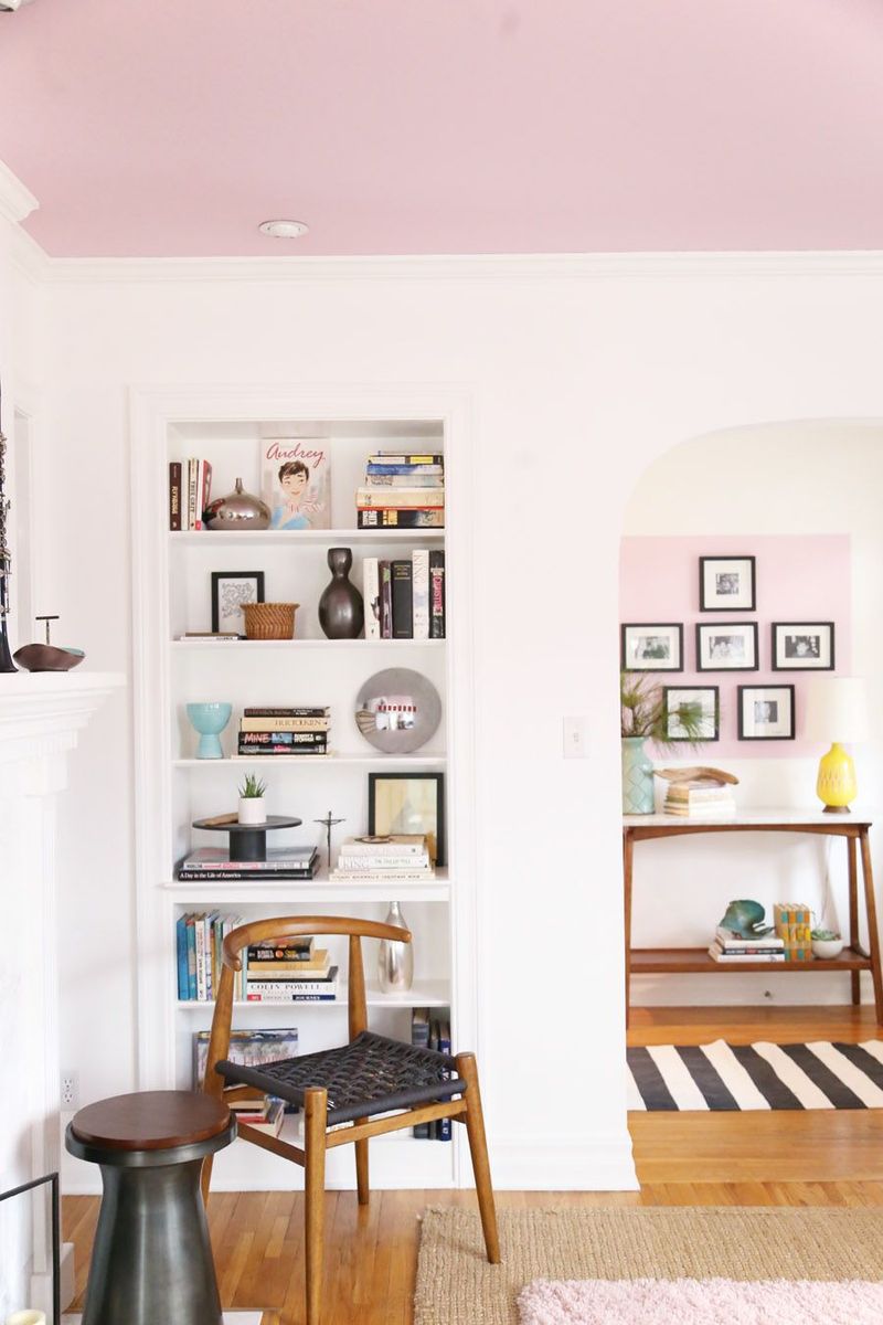
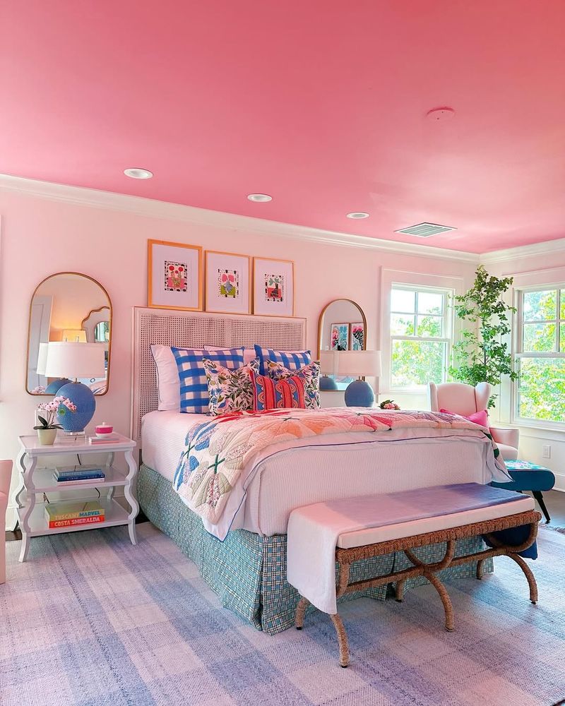
5. Pastel Pink
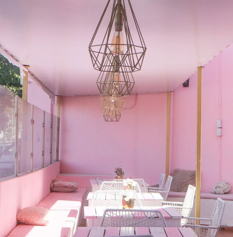
Pastel pink ceilings might remind you of cotton candy and fairy tales, but in reality, they can quickly become saccharine and overbearing. While lovely in moderation, this shade overhead can feel like you’re trapped in a candy store.
It tends to cast a rosy hue on everything below, altering the intended color palette of your decor. Rather than an all-over ceiling treatment, consider using pastel pink in smaller doses, such as in artwork or accent pieces.
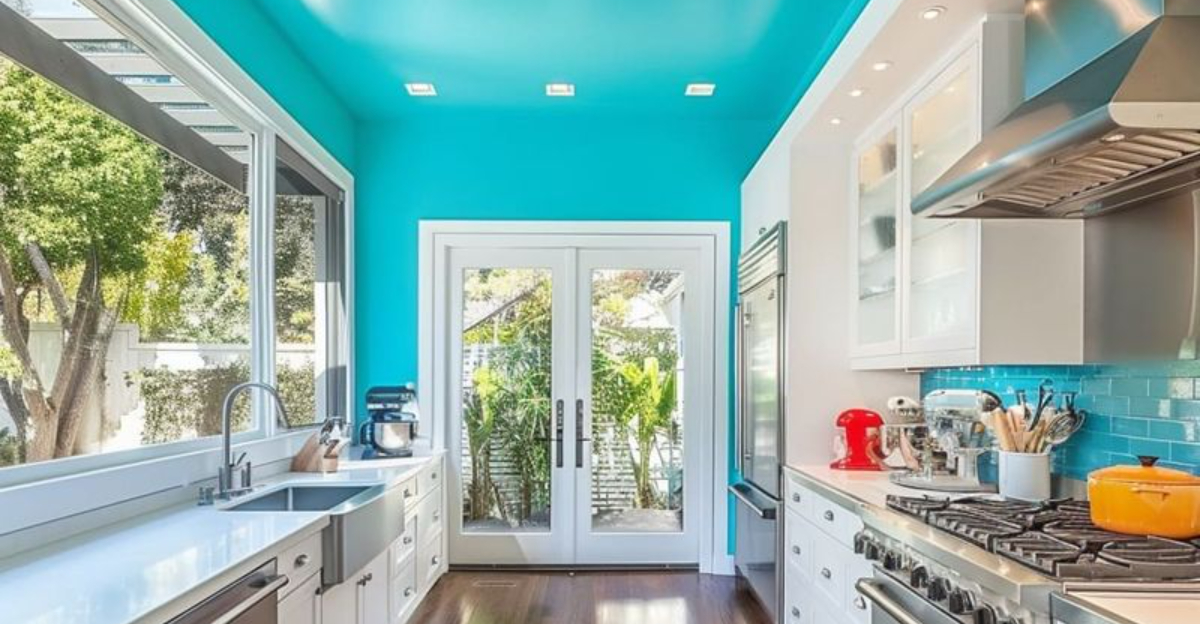
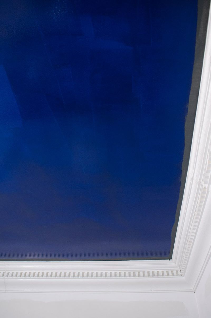
6. Electric Blue
Nothing says ‘wake up’ like an electric blue ceiling. While it might seem energizing, it can quickly veer into overstimulation territory. This color has a way of making every room feel like you’re in the center of a lightning storm.
Electric blue is bold but often clashes with more neutral interior elements, leading to a discordant design. For those who love this hue, incorporating it in smaller, controlled doses can keep its energy without overwhelming your senses.
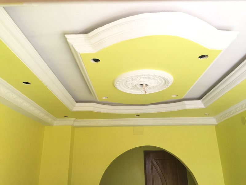
7. Sunflower Yellow
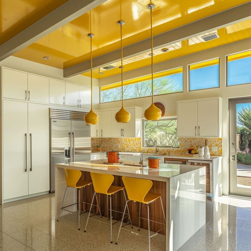
Sunflower yellow is a color that screams sunshine but when placed on a ceiling, it might just scream. The brightness can become blindingly intense, creating a glare rather than a glow. It tends to dominate a room, making other colors struggle to be seen and appreciated.
Sunflower yellow is best enjoyed in moderation, perhaps as a cheerful accent pillow or a piece of vibrant art, where its sunny disposition can be appreciated without taking over.
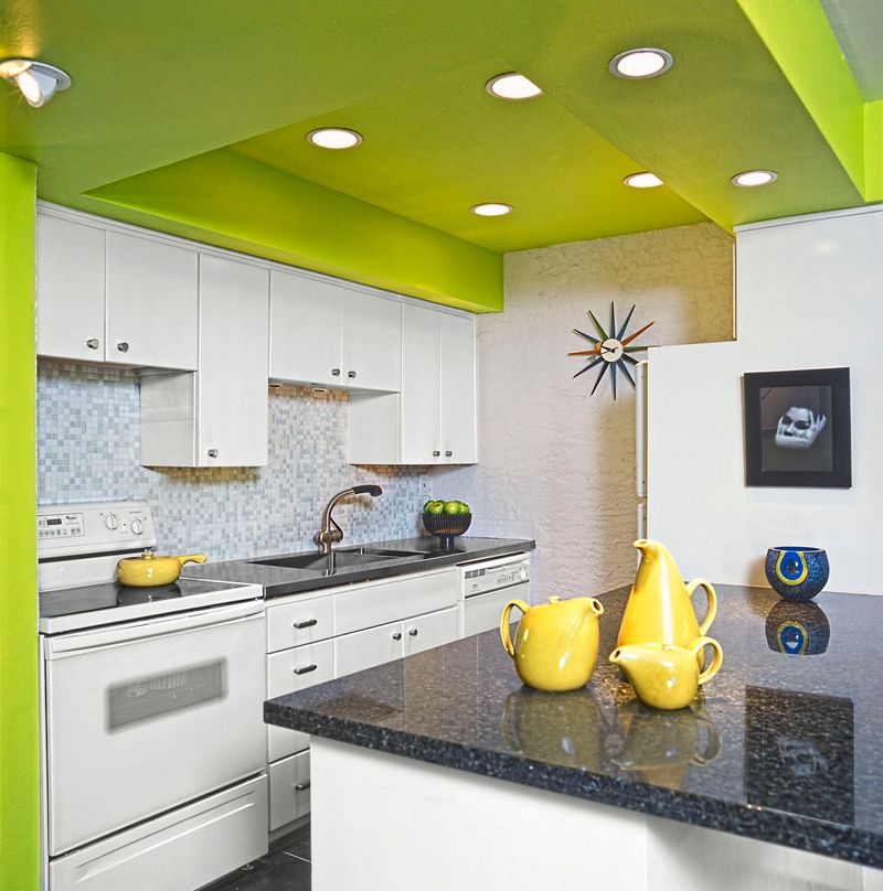
8. Lime Green
Lime green might make you think of a refreshing mojito, but on a ceiling, it can be as overwhelming as a sugar rush.
This vibrant hue tends to overshadow other elements in a room, leaving decor pieces in its neon wake. While it’s invigorating, it might be more suitable for a fun accent wall or decor item, where it can share the spotlight rather than steal it. Lime green’s zest is best in small, controlled bursts.
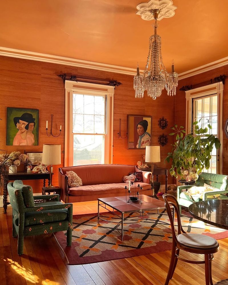
9. Pumpkin Orange
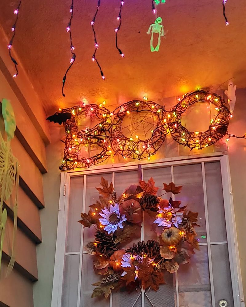
Feeling festive? A pumpkin orange ceiling might provide more trick than treat! What starts as a warm, inviting shade can soon feel like you’re stuck in a never-ending Halloween party. The color dominates, creating a monochromatic ambiance that can clash with diverse decor.
Instead of a ceiling color, pumpkin orange shines in seasonal decorations or as part of an autumnal accent piece, where its warmth can be appreciated without overwhelming the senses.
10. Metallic Silver
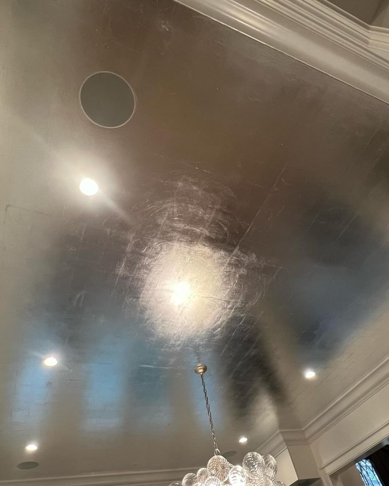
Dreaming of the future? A metallic silver ceiling might seem like a spaceship dream come true, but often, it feels more cold and sterile than chic. The reflective nature of metallic silver can create an unwelcoming glare, making spaces feel less personal and more clinical.
While it’s tempting for an ultramodern twist, this hue works better in small doses, such as in fixtures or hardware. This way, it adds a modern touch without making your home feel like a sci-fi set.
11. Vibrant Purple
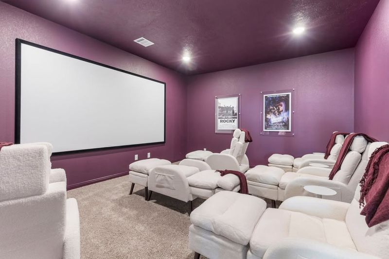
Purple reigns in creativity and luxury, but a vibrant purple ceiling might have you thinking twice about its nobility. While it speaks of royalty, on a ceiling, it can become more of a royal pain, overtaking the room’s atmosphere entirely.
This color can clash with other elements, making harmonious design difficult to achieve. Vibrant purple can still hold court as an accent color, where its majesty is appreciated without overshadowing the rest of your decor.
12. Lemon Yellow
Lemon yellow is like a burst of sunshine, but on your ceiling, it might just burst your bubble. This bright, cheerful color can quickly become overpowering, making every room feel more like a lemonade stand than a living space.
Its intensity tends to wash out other design elements, leading to a singular, overly sunny aesthetic. Instead of full coverage, lemon yellow can be a delightful accent that brings cheer in small doses, brightening rather than blinding.
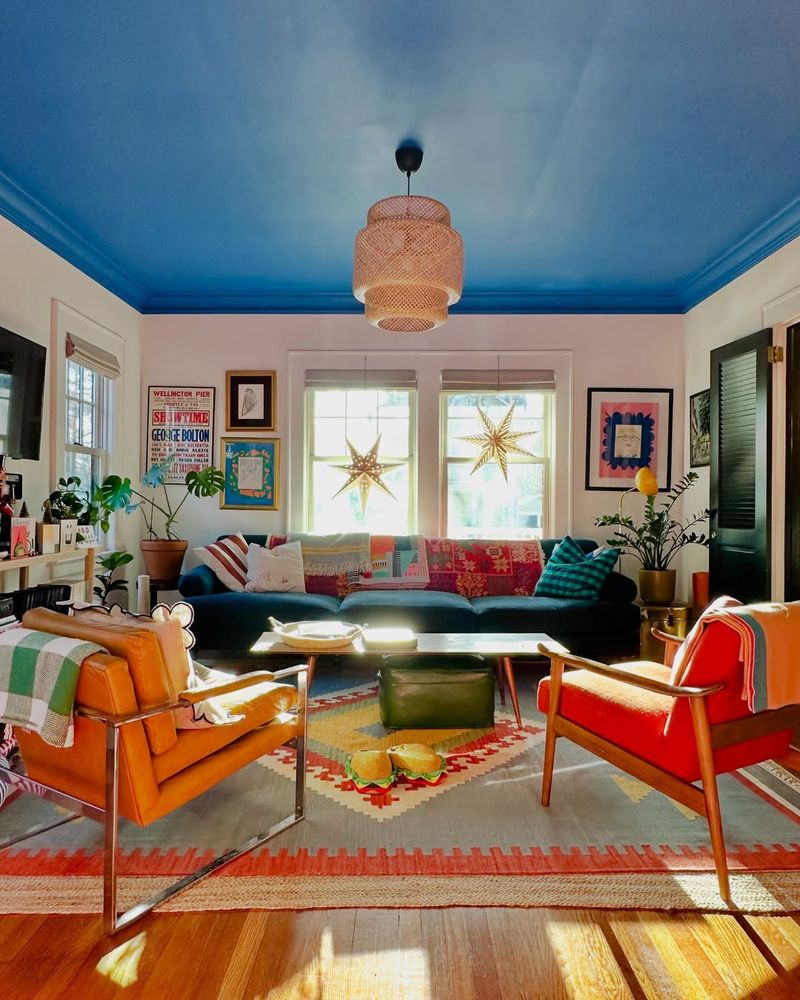
13. Royal Blue
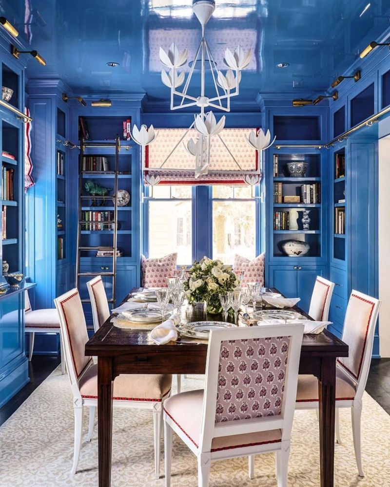
Blue is calming, right? Not when it’s royal blue on your ceiling! While it exudes elegance, its intensity overhead can turn regal into oppressive. This color can cast a shadow over other design elements, making a room feel more somber than serene.
Instead of a full ceiling treatment, royal blue works beautifully as a feature wall or in smaller decorative pieces, allowing its majesty to enhance rather than overshadow the space.
14. Seafoam Green
Envisioning a beachy paradise? Seafoam green might seem like the perfect choice, but it often leaves rooms feeling washed out rather than relaxed. This color can make ceilings appear lower, creating a sense of confinement rather than calm.
While it’s soothing, seafoam green tends to clash with warmer hues and can disrupt a room’s harmony. As an accent piece or in coastal decor, this color can evoke the sea’s tranquility without drowning out other elements.
15. Cherry Blossom Pink
Cherry blossoms are enchanting, but cherry blossom pink on your ceiling might be a different tale. While intended to be delicate, it can turn saccharine and overly sweet in large doses. This color tends to dominate, casting a pinkish glow on everything below and altering the overall color palette.
Instead of an all-over ceiling color, cherry blossom pink works beautifully in small accents or decor pieces, where its softness can add to, rather than take over, the room’s charm.
16. Cobalt Blue
Cobalt blue is striking and bold, but overhead, it can become a bit too much of a good thing. This color demands attention, often clashing with other hues and making it difficult for any decor to share the spotlight.
While it can be invigorating, cobalt blue is best suited for smaller applications, such as an accent wall or a statement piece. This way, it can energize a space without dominating it, allowing for a harmonious and balanced design.
17. Burnt Orange
Burnt orange evokes warmth and autumn vibes, but as a ceiling color, it can be all too consuming. Instead of providing comfort, it casts a heavy, relentless hue that can clash with other decor elements.
This robust color might make a room feel smaller and more enclosed, turning cozy into claustrophobic. Burnt orange can still bring warmth when used thoughtfully, such as in smaller accents or seasonal decor, where its richness complements rather than confines.
18. Turquoise
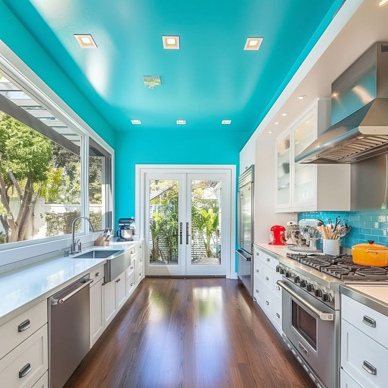
Turquoise evokes images of tropical waters, but on a ceiling, it can feel more like a tidal wave of chaos. While it’s refreshing, this color can be overwhelming, clashing with other elements and making coordination a challenge.
As a ceiling color, turquoise might cast an unwanted hue over your meticulously curated decor. Instead, use this lively shade in smaller applications, such as in decorative items or accent walls, to capture its spirit without drowning your design.
19. Pepto Pink
Ah, Pepto pink, reminiscent of a certain stomach-soothing liquid. On a ceiling, it can feel just as medicinal, casting a sugary sweet hue that might make you feel a bit queasy. This color has a way of dominating the space, casting a pink glow that clashes with other decor.
Instead of an all-over treatment, Pepto pink can bring a quirky touch in smaller accents or decor pieces, where it can add a fun splash without engulfing the entire room.
20. Slate Gray
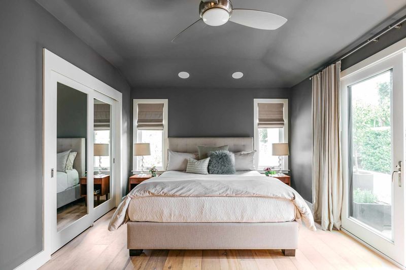
Slate gray might seem chic and modern, but on a ceiling, it can feel like a storm cloud looming overhead. This heavy color tends to absorb light, casting a shadowy atmosphere that can feel oppressive rather than open.
While gray is sophisticated, slate gray is best used sparingly, such as in accent furniture or decor items. This way, it adds depth and interest without making the space feel like it’s perpetually overcast.
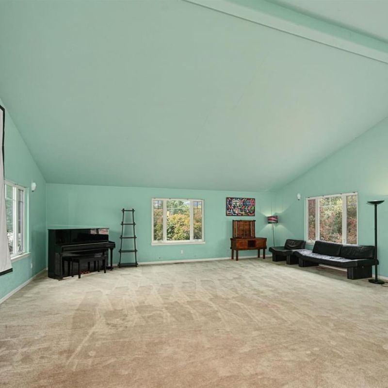
21. Mint Green
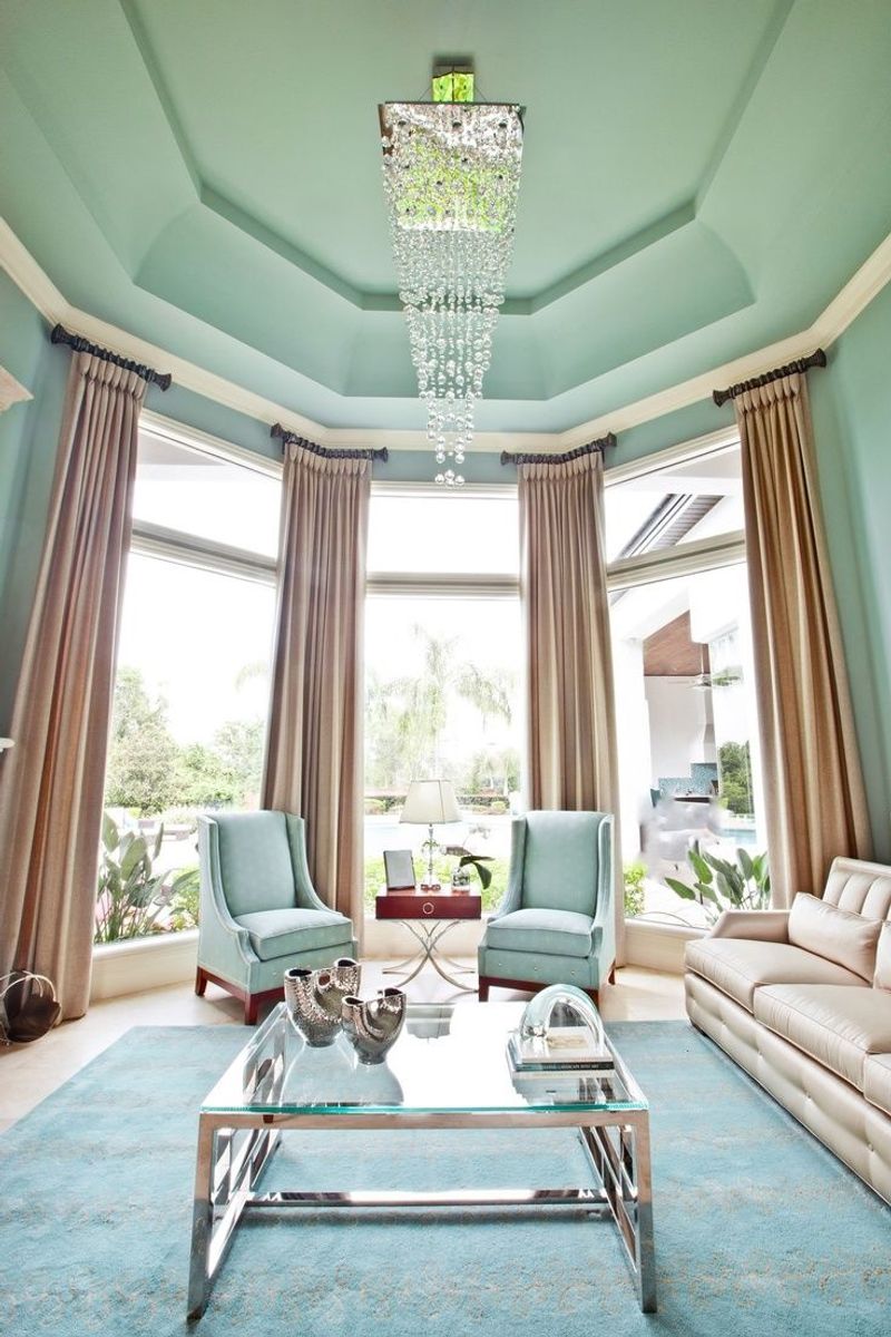
Mint green is refreshing and crisp, but on a ceiling, it can feel like you’ve been submerged in a sea of toothpaste. This pale hue can wash out other colors, leading to a space that feels more like a dental office than a living room.
While mint green is soothing, it’s best as an accent color, where it can add a touch of freshness without overpowering the room’s design. This way, it remains charming without overshadowing.