18 Calming Kitchen Colors That Will Make This Hardworking Space Instantly More Serene
The kitchen often ends up being one of the busiest, most chaotic spaces in a home – buzzing with activity, clatter, and constant motion. But it doesn’t have to feel that way.
The right color palette can shift the entire mood of your kitchen, creating a calm, grounded atmosphere even on your busiest days. Soft hues, earthy tones, and soothing neutrals help balance the energy, making the space feel more inviting and peaceful.
These 18 calming kitchen colors will bring a sense of ease and serenity to this hardworking heart of the home.
1. Pale Sky Blue
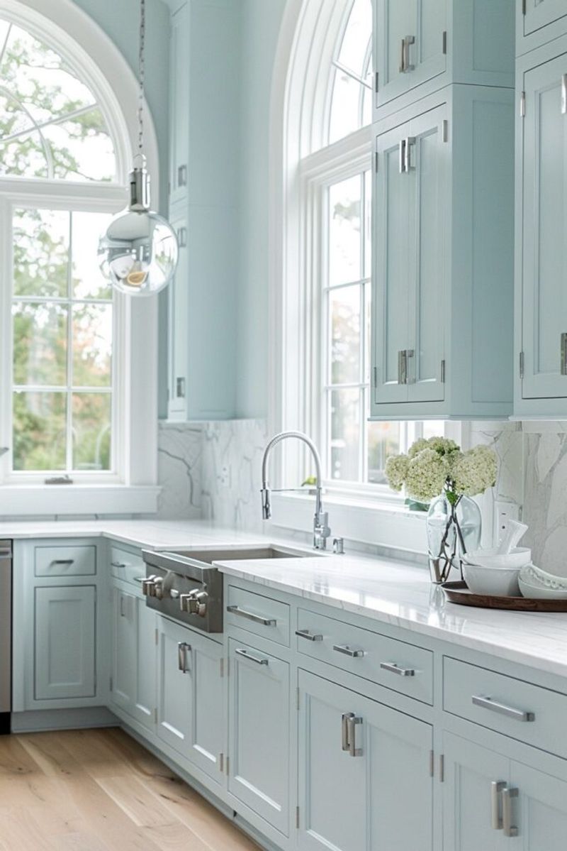
Looking up at a clear sky instantly soothes our minds, and bringing that same color into your kitchen creates similar magic. Pale sky blue evokes feelings of expansiveness and possibility.
When applied to walls or cabinets, this gentle color recedes visually, making smaller kitchens feel more spacious. The subtle coolness counterbalances the heat generated from cooking, establishing a refreshing equilibrium in your culinary workspace.
2. Warm Greige

Not quite gray, not quite beige – greige offers the perfect middle ground for those seeking neutrality with warmth.
This chameleon-like color adapts beautifully to changing light throughout the day. The undertones complement natural materials like wood, stone, and plants, creating a harmonious environment where everything feels intentionally connected.
3. Muted Lavender
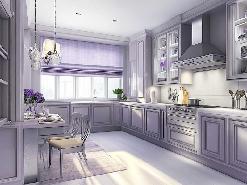
Who knew that a whisper of purple could create such a peaceful kitchen? Muted lavender brings unexpected serenity while adding personality that plain neutrals simply can’t match.
The gentle purple undertones have been shown to reduce appetite slightly – helpful for mindful eating habits! When paired with crisp whites and natural textures, lavender creates a kitchen that feels both fresh and soothing, perfect for both morning coffee rituals and evening wind-downs.
4. Creamy Vanilla
Nothing says “welcome home” quite like the warm embrace of creamy vanilla.
The subtle warmth in this timeless shade reflects light beautifully, brightening spaces without harsh glare. Vanilla creates the perfect backdrop for displaying colorful cookware or fresh produce, allowing the vibrant elements of your kitchen life to truly shine.
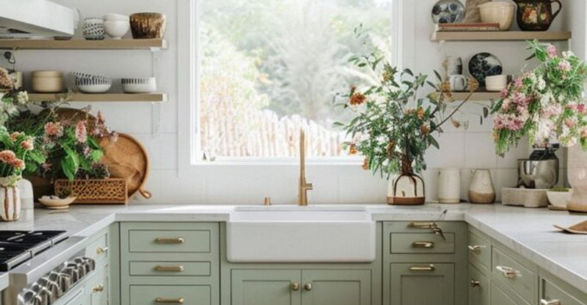
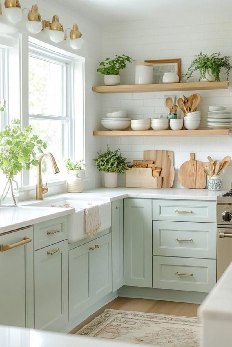
5. Soft Sage Green
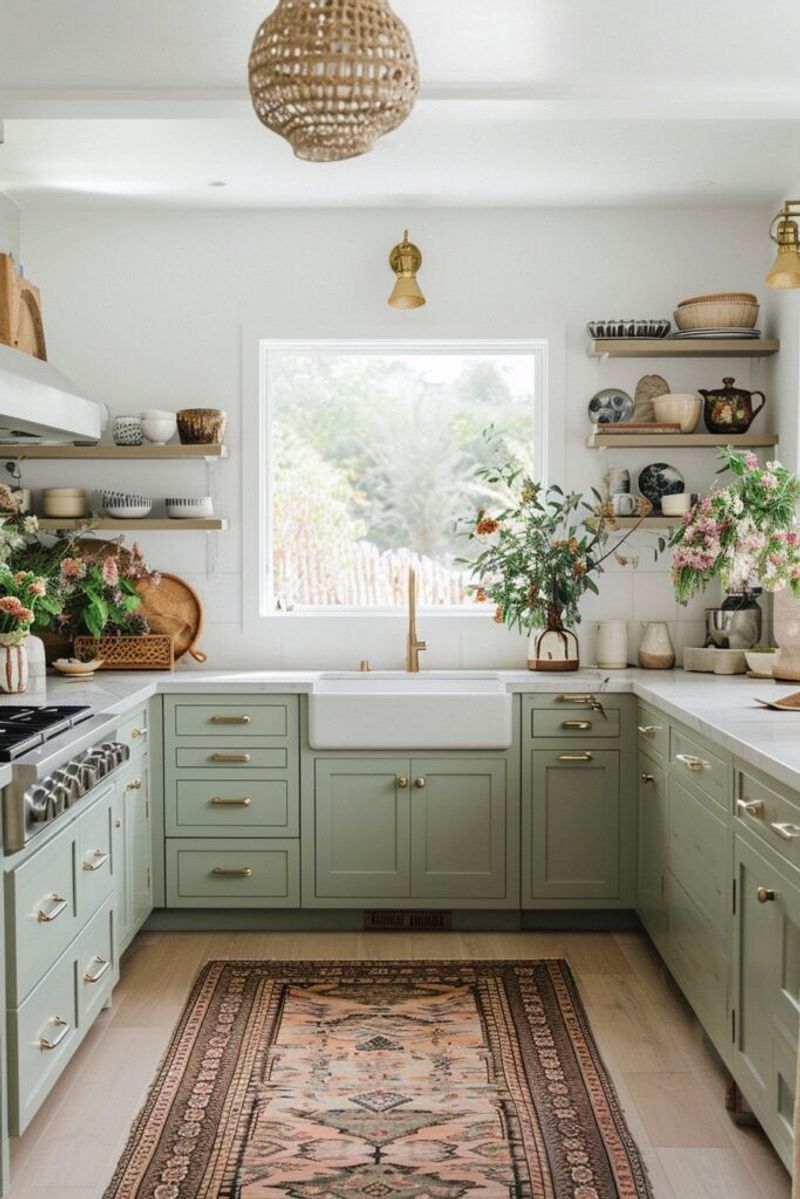
Imagine walking into a kitchen that feels like a breath of fresh air! Soft sage brings the tranquility of nature indoors without overwhelming your senses.
This versatile hue pairs beautifully with both light and dark wood tones, creating a balanced atmosphere that encourages mindful cooking. +
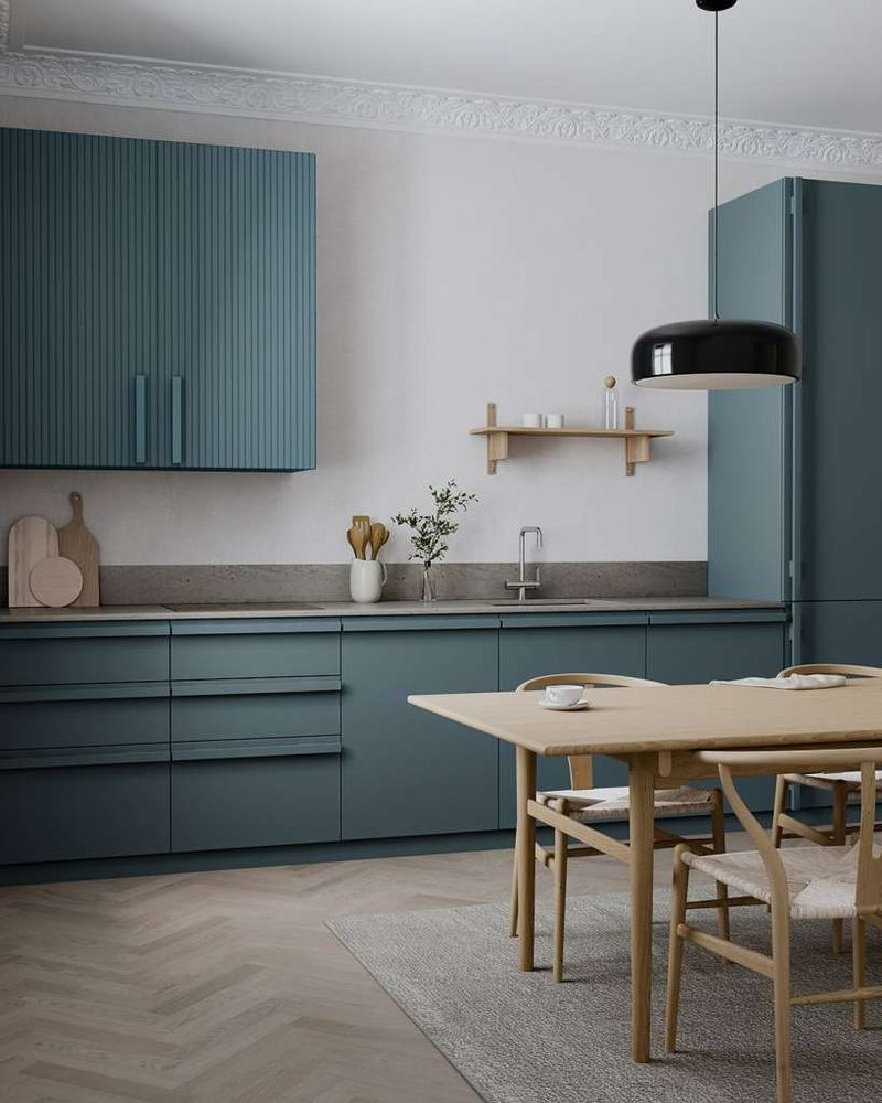
6. Dusty Blue
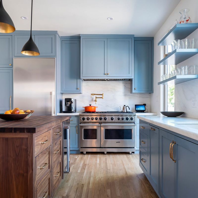
Between vibrant navy and pale blue lies the perfectly balanced dusty blue – sophisticated yet approachable. This versatile color works magic in kitchens with both modern and traditional designs.
The slightly grayed undertones create a visual softness that’s easy on the eyes during long cooking sessions.
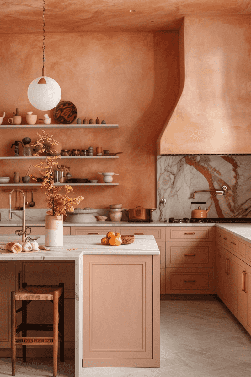
7. Soft Terracotta
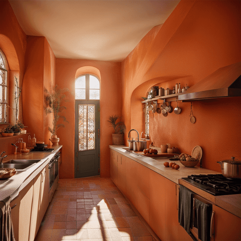
Feeling the Mediterranean sunshine in your kitchen is entirely possible with soft terracotta! This earthy hue brings warmth without intensity, creating a naturally grounding environment.
The beauty of terracotta lies in its connection to earth and clay, materials humans have used for cooking throughout history. When used on a kitchen island or as an accent wall, this color creates a focal point that feels both nurturing and elegant.
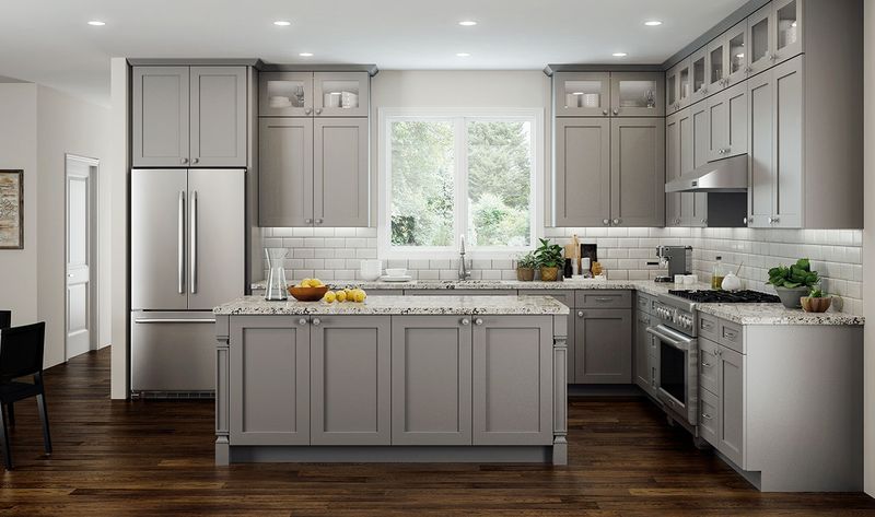
8. Misty Gray
Wrapped in the gentle embrace of morning fog, misty gray creates a kitchen that feels both sophisticated and serene.
The versatility of misty gray is unmatched – it complements virtually every accent color and material. Many interior designers choose this shade as a foundation because it creates a calm backdrop while allowing other elements like textiles and accessories to take center stage.
9. Pale Mint
Just a hint of mint can transform your kitchen into a refreshing oasis! This delicate green-blue shade carries the psychological benefits of both colors – the renewal of green and the tranquility of blue.
What’s particularly special about pale mint is how it seems to purify the visual environment. Even on busy cooking days, this color maintains a sense of cleanliness and order. The subtle coolness also creates a pleasing contrast to the warmth of cooking activities.
10. Cloudy Blue-Gray

Have you ever gazed at the sky before a gentle rain? That’s the feeling cloudy blue-gray brings to your kitchen – peaceful anticipation and calm reflection.
This sophisticated hybrid color changes subtly throughout the day as light shifts, creating a kitchen that feels alive yet serene. The balance of blue and gray creates visual comfort that’s particularly beneficial in busy cooking spaces where multiple tasks demand attention.
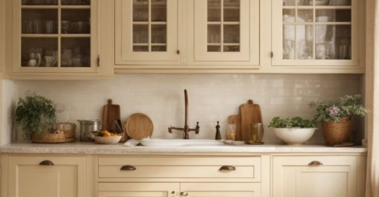
11. Buttery Cream
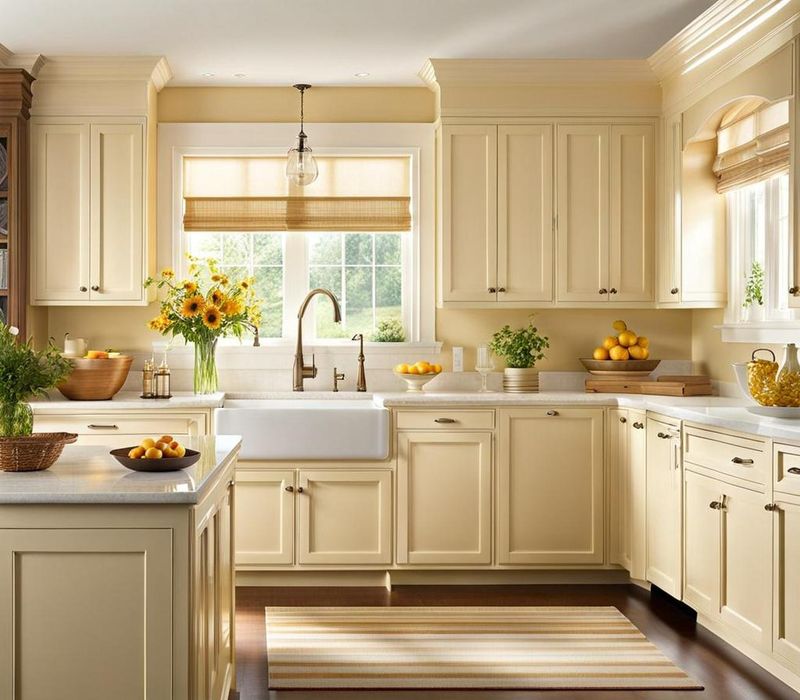
Wrapped in the comfort of buttery cream, kitchens become instantly more inviting.
The psychological effect of this color is remarkable – it promotes feelings of optimism while maintaining visual calm. Buttery cream also has practical benefits, hiding minor marks and stains better than brighter whites.
12. Muted Teal
Somewhere between blue and green lies the perfect balance of muted teal – a color that brings both the tranquility of ocean depths and the freshness of nature. This sophisticated shade creates a kitchen with personality while maintaining serenity.
What makes muted teal special is its versatility across different lighting conditions. Even as natural light changes throughout the day, this color maintains its calming presence.
13. Soft Mushroom
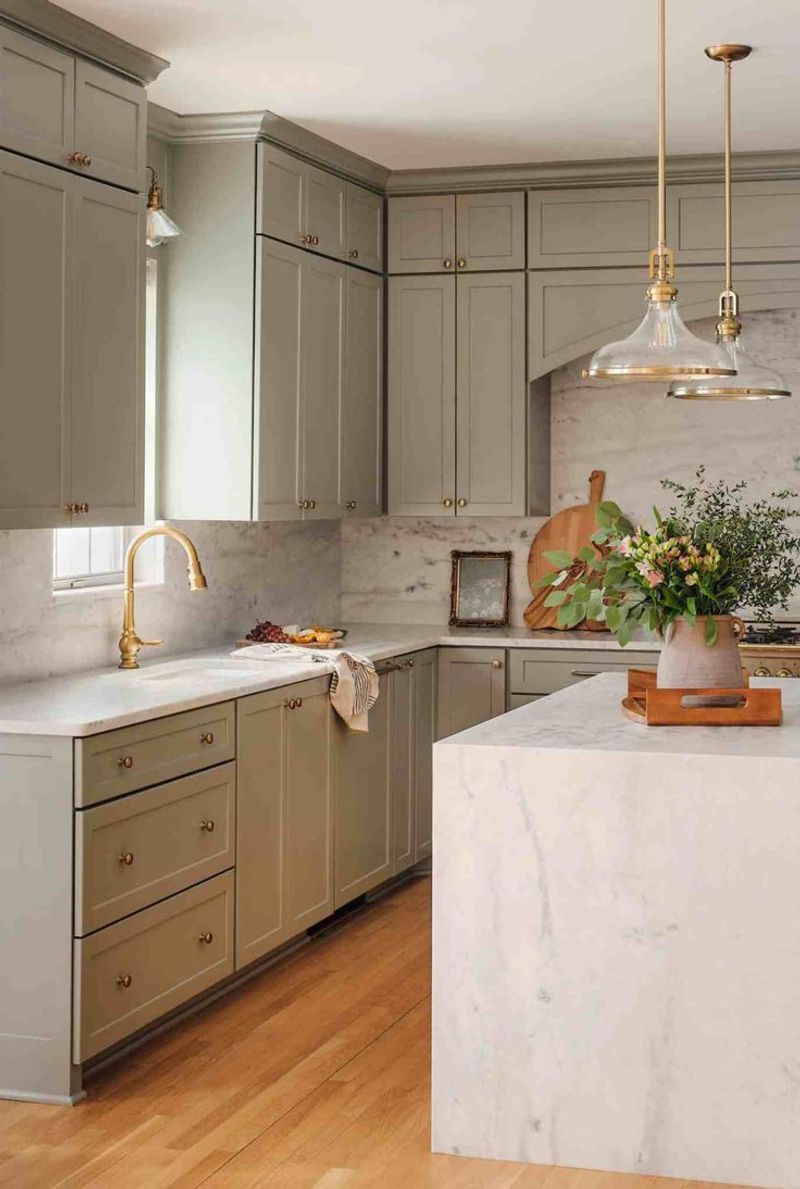
Earthy and grounding, soft mushroom creates a kitchen that feels connected to nature’s quiet beauty. This complex neutral carries subtle purple-gray undertones that add sophistication beyond basic beige.
The visual texture of mushroom tones creates depth that flat colors simply can’t match. When used on cabinets or walls, this color creates a cocooning effect that makes kitchens feel both intimate and expansive.
14. Pale Eucalyptus
Capturing the essence of spa-like tranquility, pale eucalyptus brings gentle invigoration to kitchen spaces. This sophisticated green carries subtle gray undertones that prevent it from becoming too vibrant or overwhelming.
The natural associations with eucalyptus – freshness, cleanliness, and healing – create a psychological environment that promotes mindful cooking.
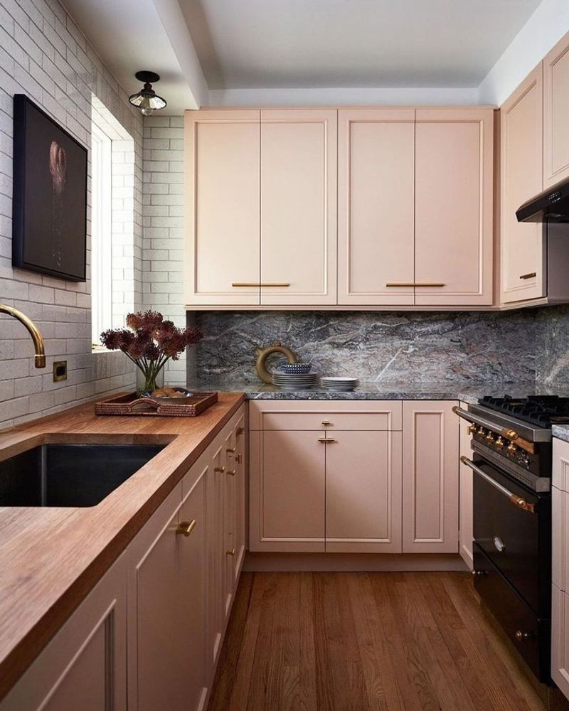
15. Gentle Peach
Blushing with subtle warmth, gentle peach creates a kitchen that feels perpetually bathed in the golden hour light. This delicate hue flatters all skin tones, making everyone look and feel their best.
The subtle rosy undertones promote feelings of nurturing and care, perfect for a space dedicated to nourishing yourself and loved ones.
16. Dove Gray
Floating between white and gray, dove gray creates a kitchen with sophisticated neutrality and timeless elegance. This versatile shade adapts beautifully to both modern and traditional design approaches.
The subtle warmth in dove gray prevents it from feeling cold or industrial. When applied to cabinets or walls, it creates a soft backdrop that allows other elements – from colorful dishware to copper pots – to stand out beautifully without competition.
17. Dusty Rose
Forget the 1980s pink – today’s dusty rose is sophisticated, subtle, and surprisingly serene. This muted pink carries gray undertones that create visual softness perfect for creating a gentle kitchen atmosphere.
The psychological effects of this color are fascinating – it promotes feelings of nurturing while reducing stress responses.
18. Misty Aqua

Capturing the ethereal quality of morning mist over water, misty aqua brings subtle freshness to kitchen spaces. This delicate blue-green shade creates a feeling of cleanliness without the starkness of pure white.
What makes this color special is its ability to make time seem to slow down – perfect for encouraging mindful cooking rather than rushed meal preparation.