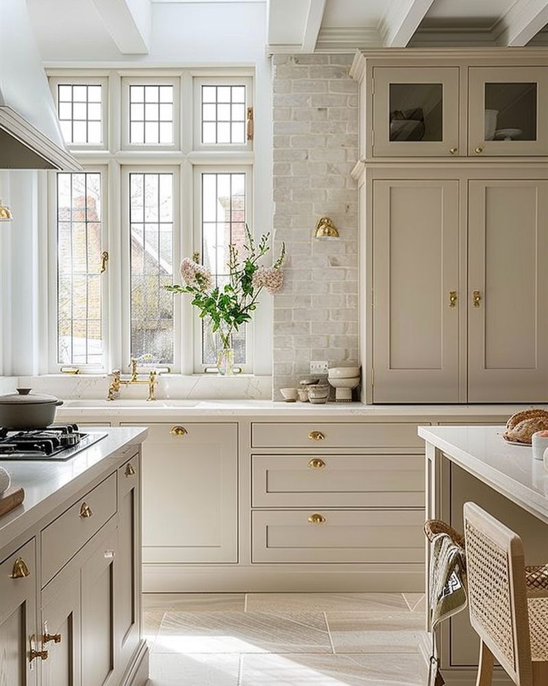
In the world of interior design, kitchens hold a special place as the heart of the home. However, even in this beloved space, certain trends have overstayed their welcome.
As designers, we often encounter features that no longer serve their purpose or simply clash with modern aesthetics.
In this blog post, I’ll walk you through 22 kitchen features that interior designers are eager to say goodbye to. From outdated materials to cumbersome appliances, let’s explore what’s best left in the past.
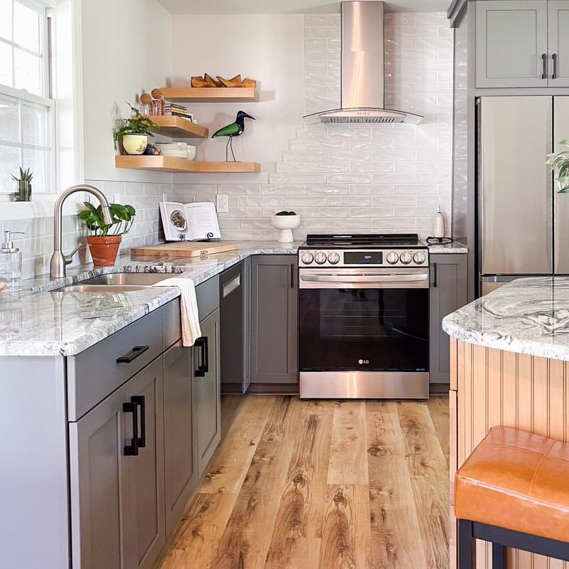
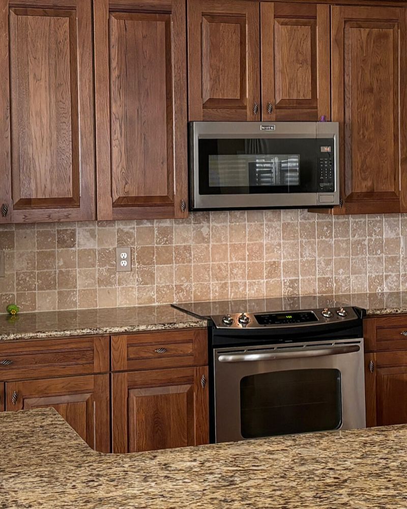
1. Granite Countertops
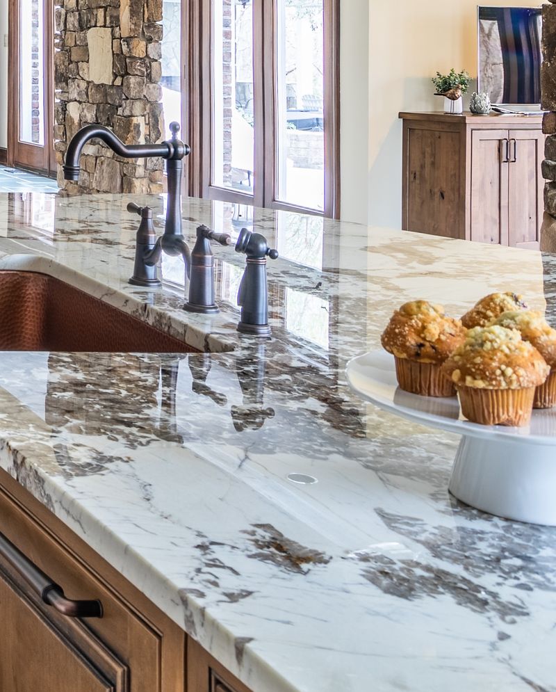
Oh, granite countertops. Once the darling of kitchen design, they now evoke a sense of nostalgia more than anything else. While they were all the rage in the early 2000s, their heavy, speckled appearance doesn’t quite fit the sleek and minimalist aesthetics of today’s kitchens.
We designers find ourselves cringing at their bulky presence, wishing for something lighter and more refined.
In modern homes, materials like quartz and concrete offer a cleaner, more contemporary look. So let’s leave granite where it belongs—in the annals of design history.
2. Overhead Pot Racks
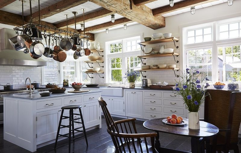
Overhead pot racks, with their clunky metal frames and dangling cookware, are more frustrating than functional.
Once seen as a statement of culinary prowess, they now just scream ‘clutter!’ On countless occasions, I’ve bumped my head on a wayward pan or ducked to avoid a swinging skillet. Today, kitchens benefit from clean lines and open spaces, making these racks more of a hazard than a help.
Consider sleek cabinetry or a well-organized drawer instead. Let’s hang up pot racks for good—except maybe in a rustic cabin.
3. Track Lighting
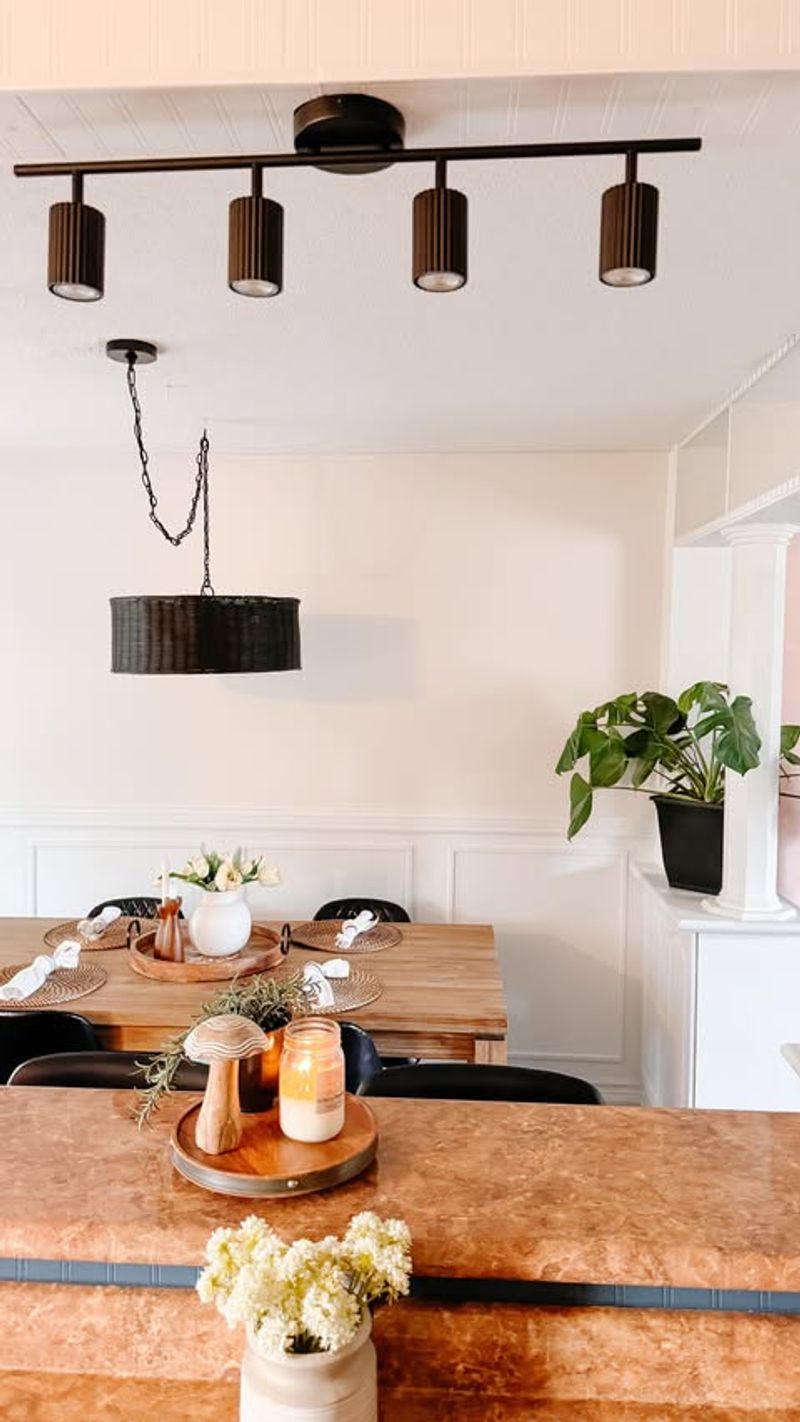
Track lighting was once the go-to for transforming kitchens into modern marvels. Yet, its time in the spotlight is dimming. Casting awkward shadows and harsh beams, track lighting often fails to provide the warm, ambient glow a kitchen deserves.
I’ve seen countless kitchens where the lights spotlight nothing but dusty corners.
In our quest for cozier spaces, recessed lighting or stylish pendants create a more inviting atmosphere. So, let’s track down better lighting solutions and leave those tracks behind.
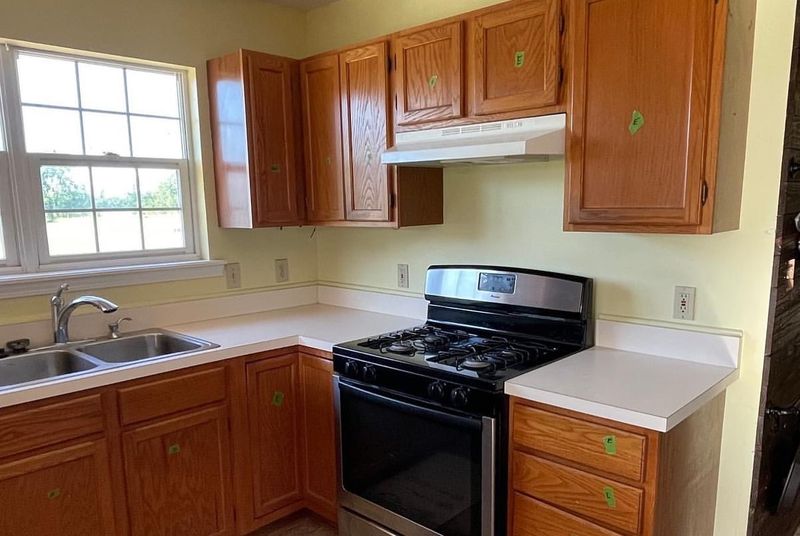
4. Builder-Grade Cabinets
Builder-grade cabinets are like the plain bagel of kitchen design—ubiquitous and uninspiring. Their lifeless, cookie-cutter appearance offers little in the way of personality or charm. I’ve walked into kitchens where these cabinets drain the room of its potential vibrancy.
Homeowners are opting for custom cabinetry or at least semi-custom options that allow for a pop of color or unique finishes. Say goodbye to bland and embrace the endless possibilities of personalized cabinetry.
5. Ornate Cabinet Handles
Ornate cabinet handles are the ruffles of kitchen fashion—overdone and often unnecessary. In their attempt to add flair, they end up cluttering a kitchen’s clean lines. I’ve seen many a kitchen where these handles distract from otherwise beautiful design elements.
Simplified hardware, like sleek bar pulls or knobless doors, complements today’s streamlined kitchen designs. Let’s handle this one with grace and opt for subtlety over extravagance.
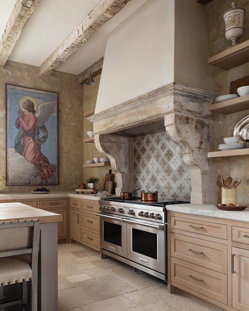
6. Tuscan Themes
Ah, the Tuscan kitchen theme—a tribute to warm Italian villas, yet often executed with a heavy hand. Terracotta tiles, faux finishes, and wrought iron details can make a kitchen feel dated rather than dreamy.
I’ve encountered many a kitchen overdone with this theme, longing instead for fresh, airy vibes.
Modern design favors subtlety and clean lines. Incorporate a touch of Tuscany with a muted color palette or a single statement piece, and say arrivederci to full-on Tuscan immersion.
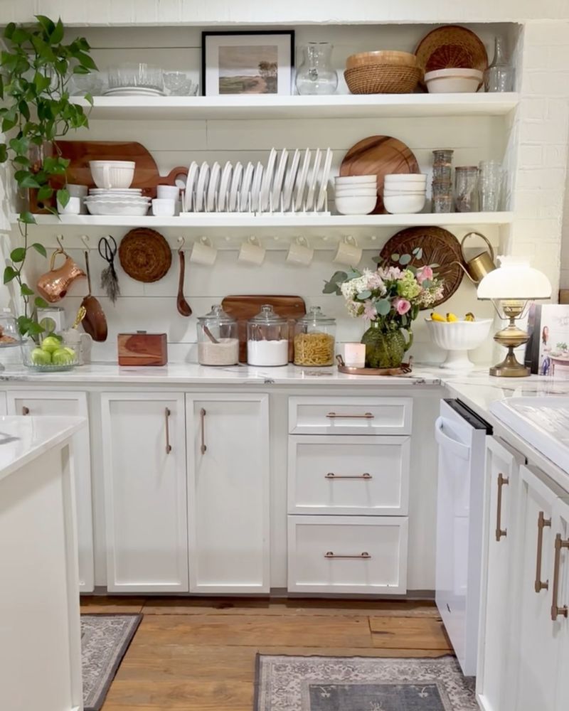
7. Open Shelving
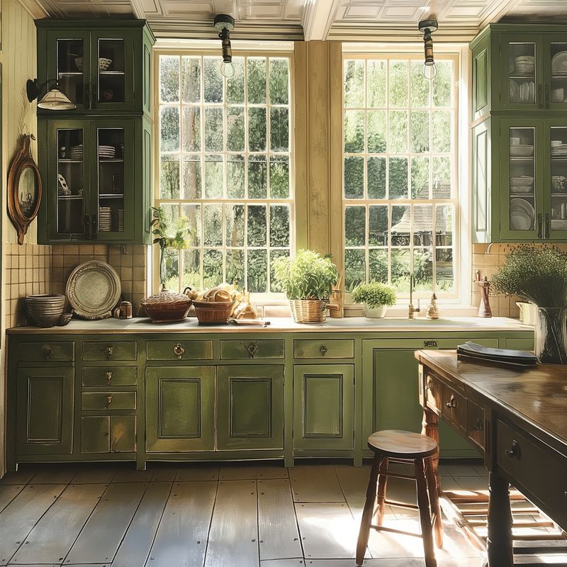
Open shelving in kitchens seemed revolutionary, offering a chance to showcase curated collections. But in reality, they often become a cluttered mess. Dust, grease, and everyday chaos quickly turn them into a nightmare. I’ve stood in kitchens where open shelves are a visual overload.
Cabinets with glass doors or concealed storage offer the same display potential without the upkeep. It’s time to close the door on open shelving.
8. Stainless Steel Appliances
Stainless steel appliances are the neutral suit of kitchens—everywhere and lacking distinction. They once symbolized modern sophistication, but now they feel cold and impersonal. I’ve wandered through countless kitchens where these appliances do little to enhance the overall ambiance.
Colored or custom panel appliances can integrate seamlessly with cabinetry, adding warmth and personality. Let’s move beyond the stainless era and embrace more vibrant options.
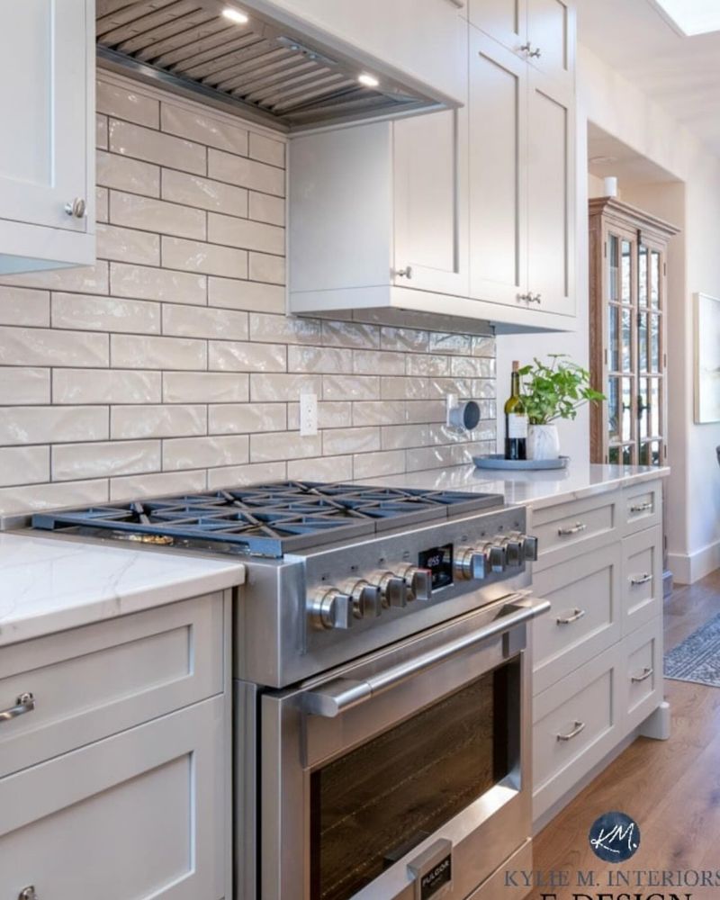
9. Tiny Subway Tiles
Tiny subway tiles have grouted themselves into kitchen history, sometimes for the worse. While they can add charm, in excess, they create a busy and overwhelming backdrop. I’ve seen backsplashes where the multitude of lines confuses rather than complements.
Larger format tiles or a seamless slab offer a more cohesive and modern look. Let’s tile our way to a more balanced and visually pleasing kitchen space.
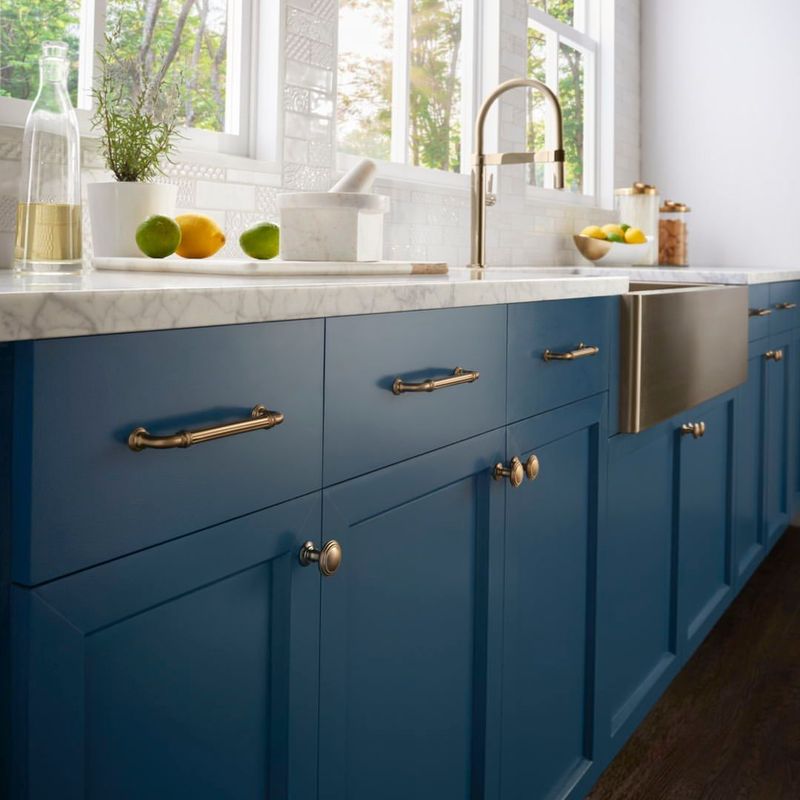
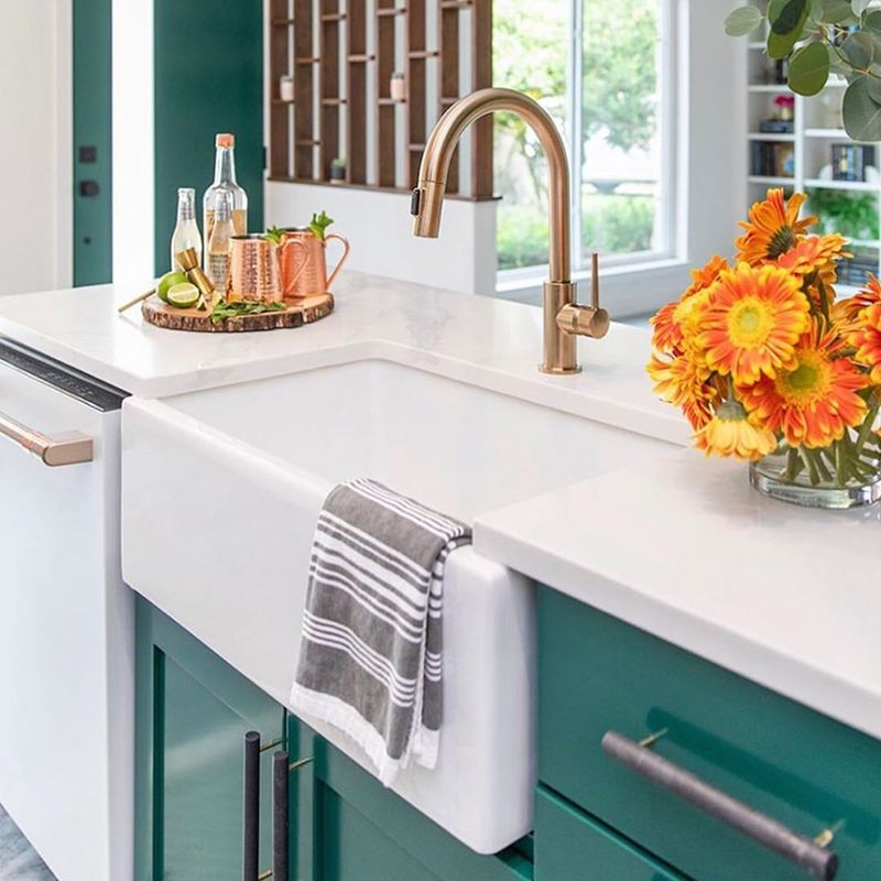
10. Farmhouse Sinks
Farmhouse sinks, with their deep basins and apron fronts, evoke rustic charm but often clash with contemporary designs. As much as I love the idea of washing vegetables in one, they’re sometimes impractical in smaller kitchens.
I’ve encountered spaces where these sinks take over, leaving little room for anything else.
Undermount or integrated sinks provide a sleek alternative that blends with the countertop. Let’s farm out those farmhouse sinks to where they truly belong—on a farm.
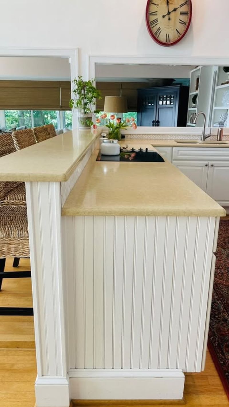
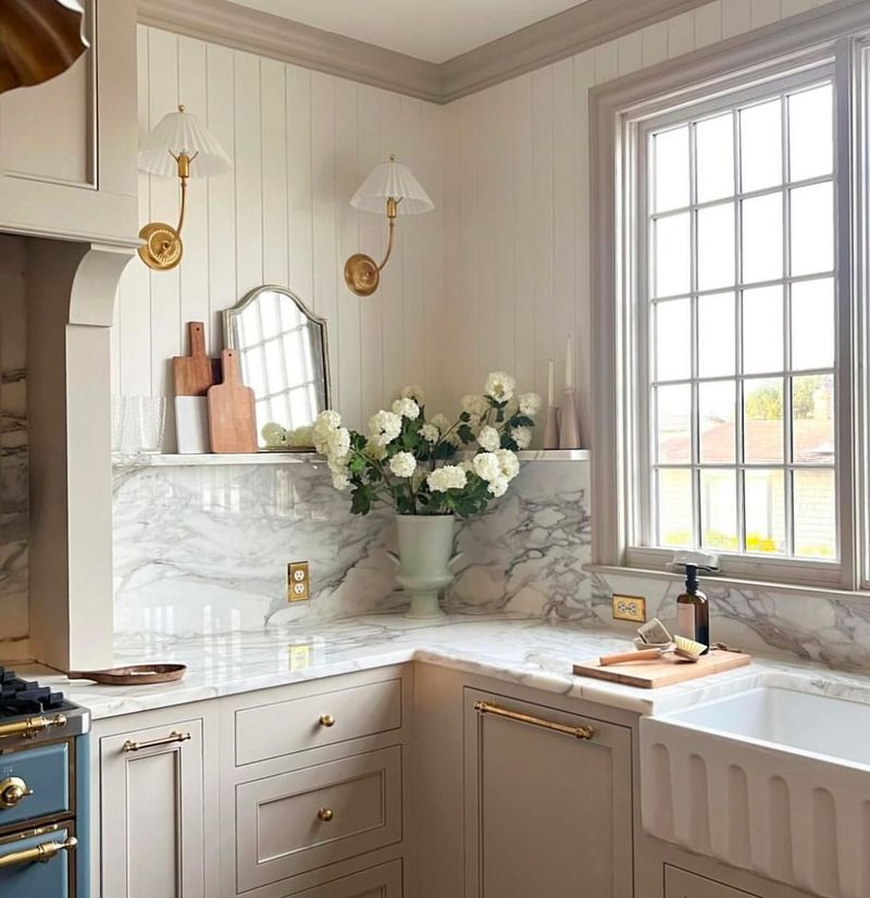
11. Beadboard Paneling
Beadboard paneling, with its cottage appeal, brings more fussiness than functionality to a kitchen. Often, it adds unnecessary texture that can clash with modern simplicity. I’ve visited kitchens where beadboard seems more of a relic than a relevant feature.
Sleek, flat panels or smooth walls can offer a cleaner, updated aesthetic. It’s best to keep beadboard reserved for a charming seaside retreat.
12. Faux Finishes
Faux finishes, once a hallmark of luxury, now feel like a blast from the past. These finishes attempt to mimic natural materials but often miss the mark, looking tacky instead of tasteful. I’ve witnessed kitchens where faux finishes do little more than confuse the eye.
Natural stone or authentic materials resonate more with today’s design sensibilities. Let’s keep it real and ditch the faux in favor of authenticity.
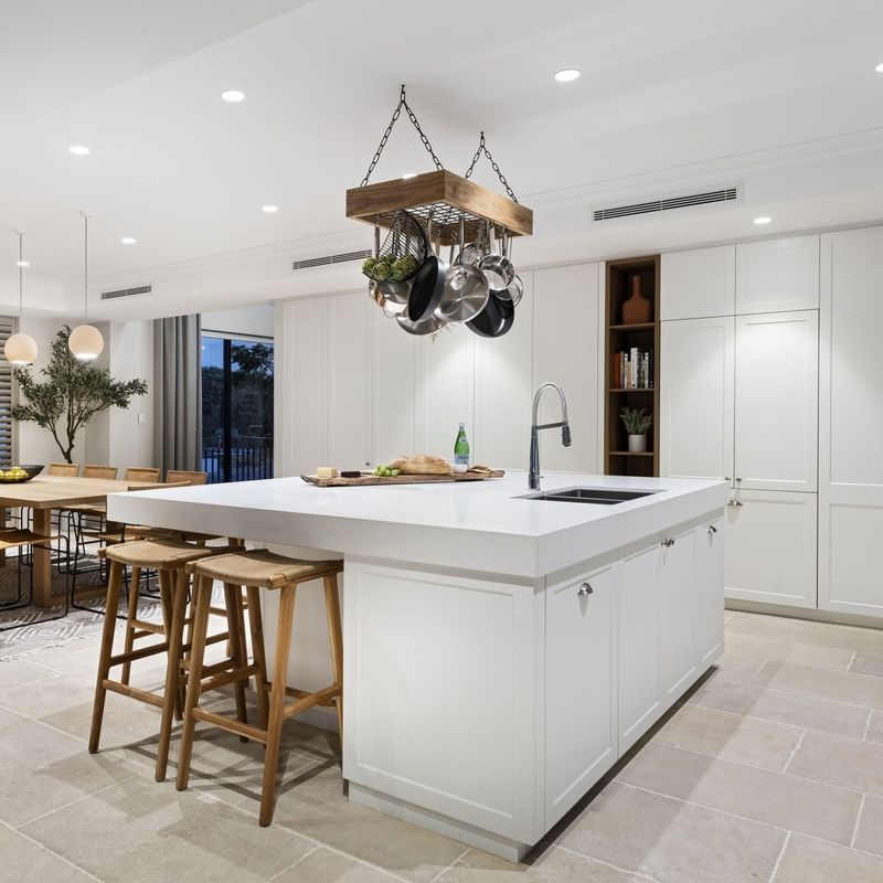
13. Oversized Islands
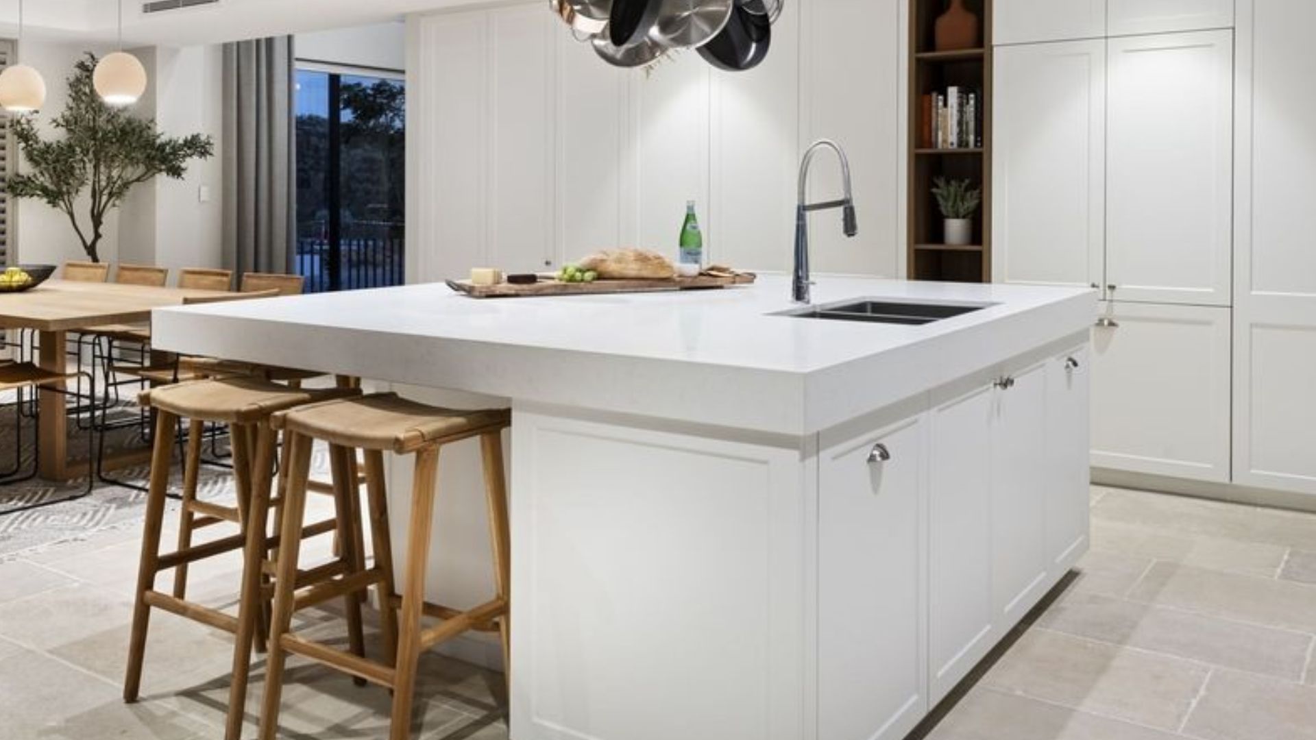
Oversized islands can dominate a kitchen, turning it into a sea of countertop with little room for anything else. While they promise extra space, they often disrupt the flow and functionality. I’ve stood in kitchens where navigating around these giants feels like a workout.
Smaller, more proportionate islands or mobile carts can enhance space without overwhelming it. Let’s scale down and find balance in our kitchen islands.
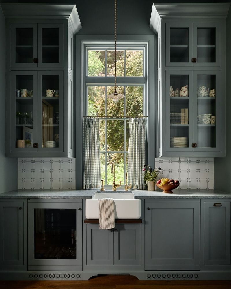
14. Glass-Front Cabinets
Glass-front cabinets promise elegance but deliver chaos, showcasing every mismatched mug and forgotten spice jar. They demand perfect organization, which, let’s face it, isn’t always practical. I’ve glanced into kitchens where these cabinets highlight more mess than style.
Solid doors or frosted glass can provide the same sophistication without exposing the clutter. Let’s keep it classy and conceal the chaos.
15. Dark Wood Finishes
Dark wood finishes can weigh down a kitchen, creating an atmosphere that feels more like a medieval banquet hall than a modern culinary space. They often absorb light, making the room feel smaller and more enclosed.
I’ve walked into kitchens where these finishes overshadow any potential brightness.
Lighter woods or painted finishes can rejuvenate a space, offering a more open and inviting feel. Let’s lighten up and let our kitchens breathe.
16. Matching Everything
The overly matched kitchen, where every element is a carbon copy, lacks personality and innovation. Coordinated colors and patterns are good, but too much uniformity can feel sterile and uninspired. I’ve seen kitchens where the matchy-matchy approach leaves little room for creativity.
Mixing different textures, materials, and shades can add depth and interest. Let’s embrace diversity and let our kitchens tell unique stories.
17. Over-the-Range Microwaves
Over-the-range microwaves, while a space saver, often end up compromising both ventilation and aesthetics. They sit awkwardly above the stove, making cooking less ergonomic and more cumbersome. I’ve witnessed kitchens where these microwaves hog prime real estate meant for a beautiful hood.
Consider a built-in microwave drawer or a countertop model tucked away. Let’s stage a microwave revolution and free our ranges for better designs.
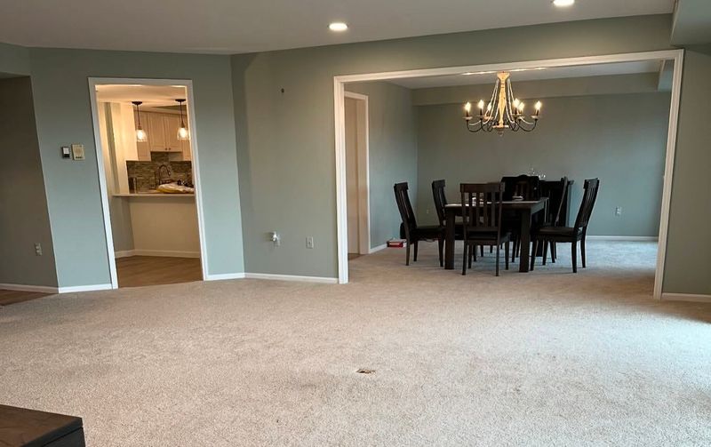
18. Wall-to-Wall Carpeting
Wall-to-wall carpeting in the kitchen? It’s a recipe for disaster and an outdated one at that. Spills, stains, and crumbs are almost guaranteed. I’ve walked into kitchens where carpet seems more of a liability than a comfort.
Hardwood, tile, or even vinyl offers durability and ease of cleaning while maintaining style. Let’s step away from the carpet and make a floor plan that works.
19. Excessive Themes
Excessively themed kitchens, where every detail screams a single motif, can feel overwhelming and kitschy. While themes can guide design, going too far often results in a caricature rather than a cozy cooking space. I’ve giggled through kitchens that resemble movie sets rather than homes.
Subtle nods to a theme or blending styles can offer a more sophisticated look. Let’s tone down the themes and let our kitchens reflect our true selves.
20. Appliance Garages
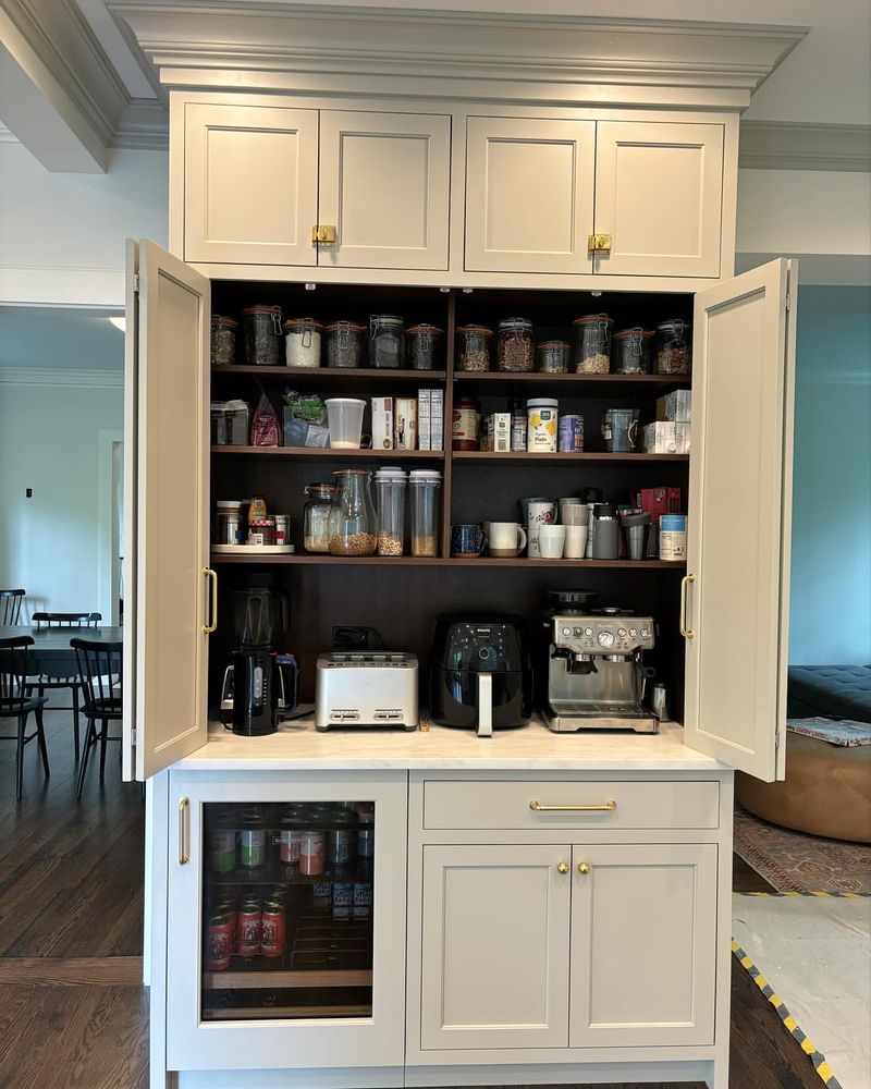
Appliance garages, those little cubbies meant to hide toasters and blenders, often end up gathering dust rather than serving their purpose. They interrupt the flow of counter space and can become more of a nuisance than a help.
I’ve peeked into kitchens where these garages are more neglected than used.
Smooth, open counter space or pull-out shelves offer more practical solutions. Let’s drive away from the appliance garage and park our appliances with pride.
21. Fake Plants
Fake plants in kitchens, meant to add a dash of greenery, often fall flat, gathering dust instead. While they require no maintenance, they also bring no life or vibrancy. I’ve examined kitchens where these faux flora do little more than fill space awkwardly.
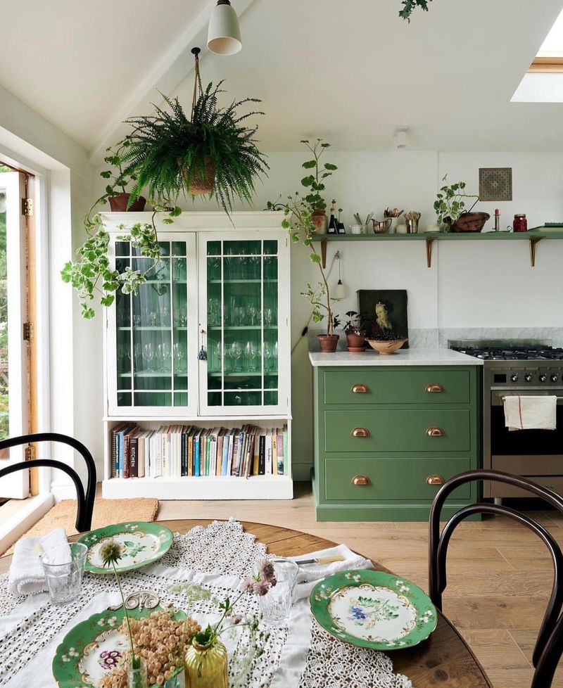
Real plants or herbs can provide fresh air and a touch of nature. Let’s root for authenticity and bring genuine greenery into our kitchens.
22. Popcorn Ceilings
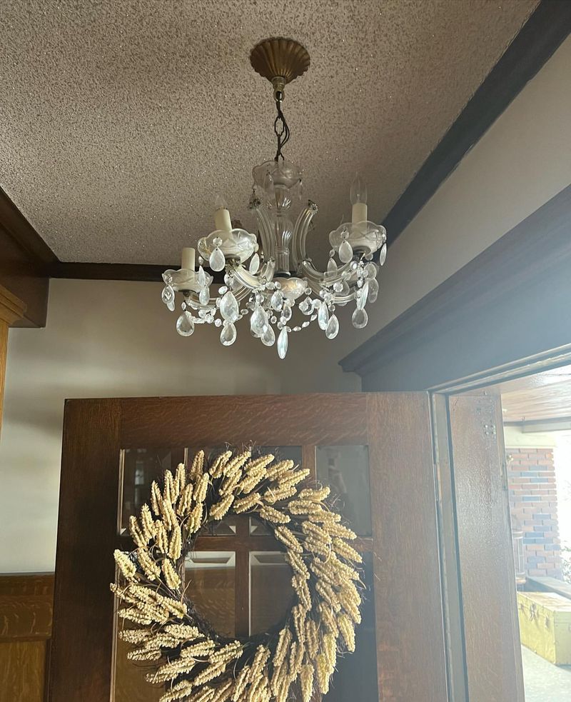
The dreaded popcorn ceiling, a relic of past design, adds nothing but texture and dust to a kitchen. It’s a ceiling treatment that’s universally loathed for its outdated appearance and challenging cleaning.
I’ve cringed at kitchens where these ceilings overshadow any attempt at elegance.
Smooth or subtly textured ceilings can create a clean, modern look. Let’s scrape away the past and smooth out our kitchen experiences.

