Is Black And White A Good Color Combo For Kitchen Design? You Be The Judge – Here Are 20 Striking Examples
Black and white kitchens have this timeless vibe that always catches my eye, but I’ve wondered myself, do they really work day-to-day in real homes? Some folks swear by that crisp, bold contrast, while others worry it might feel a bit too cold or clinical.
If you’re thinking about giving your kitchen a makeover or just curious about this classic look, I’ve gathered some real-life examples that show how monochrome kitchens can feel warm, inviting, and anything but boring.
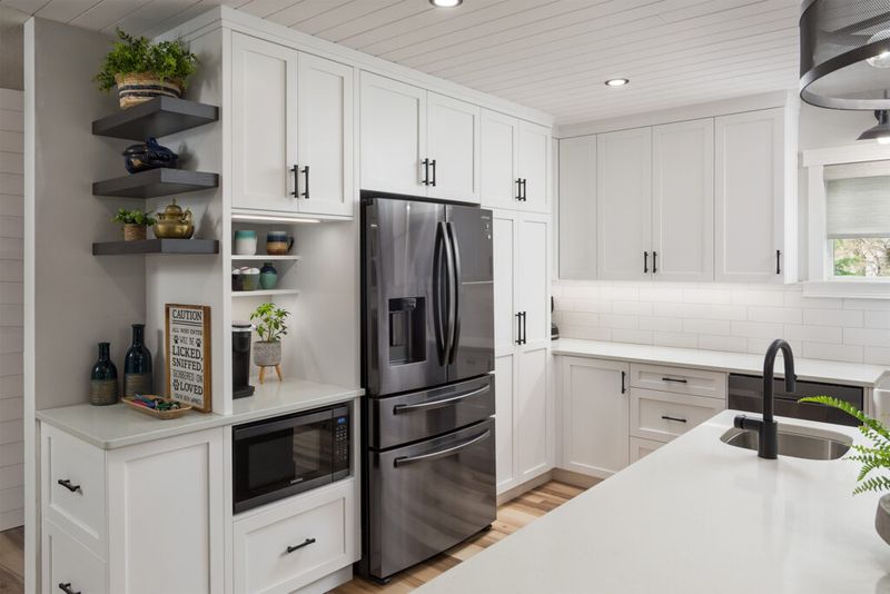
1. Farmhouse Charm Meets Modern Edge
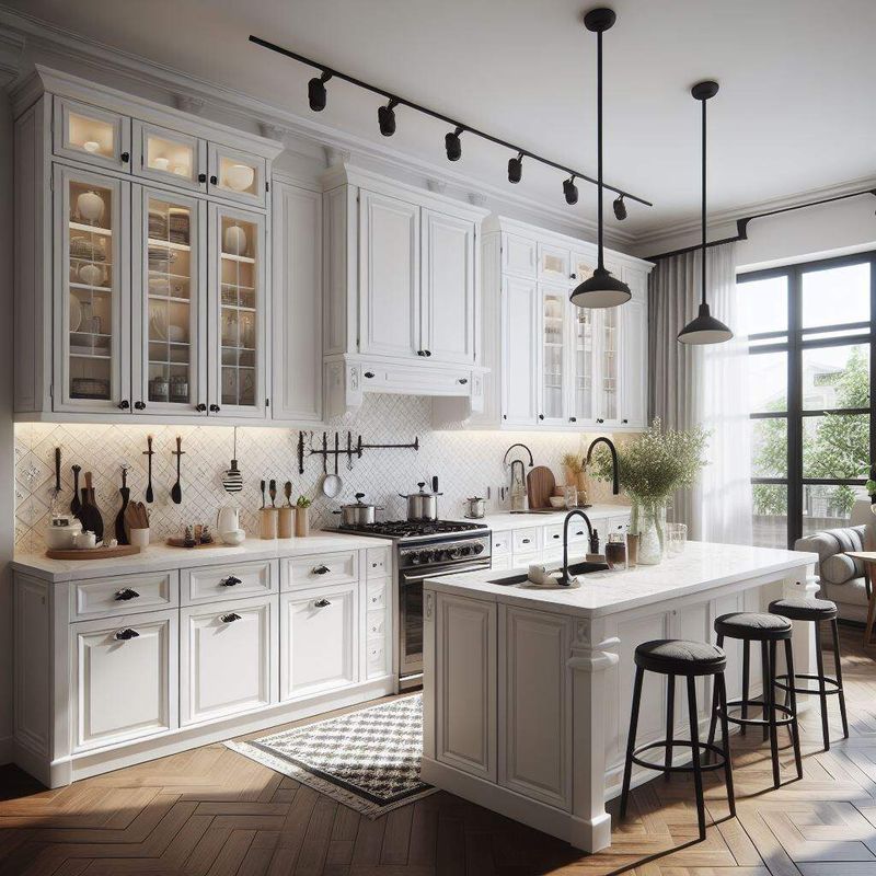
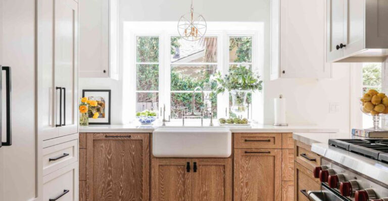
Farmhouse style gets a major upgrade when you mix crisp white cabinets with dark countertops. The combination creates instant visual interest without overwhelming your space.
White shaker-style doors paired with black granite or quartz surfaces bring together old-world charm and contemporary functionality.
Add some vintage hardware and you’ve got a kitchen that feels both nostalgic and totally current. This look works especially well in homes with lots of natural light streaming through windows.
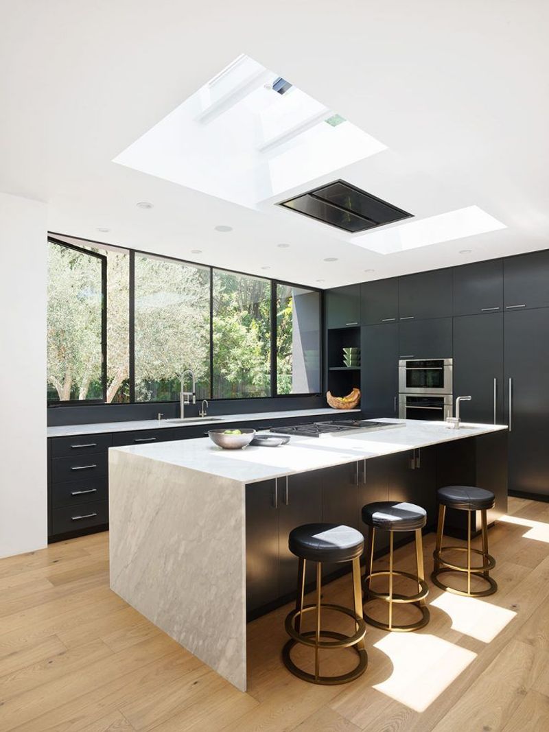
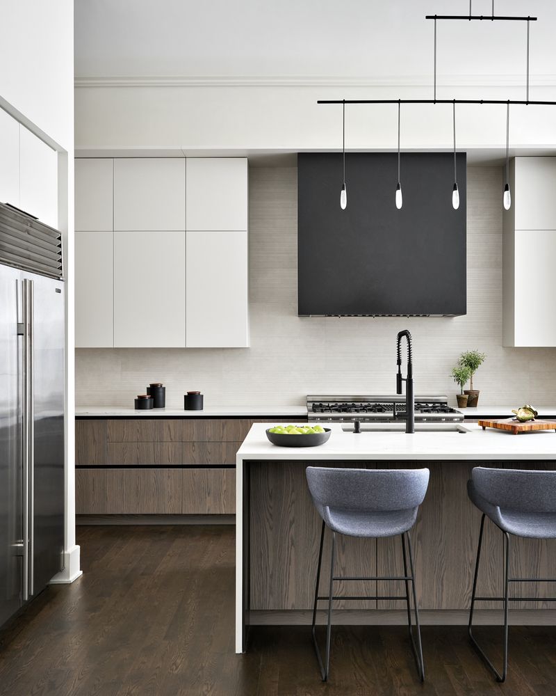
2. Bold Statement With Black Cabinets
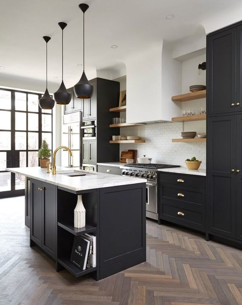
Sometimes you need to flip the script and go dark on the bottom. Black lower cabinets create a grounding effect that makes your kitchen feel more substantial and less likely to show everyday wear.
When paired with white uppers, the contrast draws your eye upward and makes ceilings appear higher. This trick works wonders in smaller kitchens where you want maximum visual impact.
Plus, darker base cabinets hide fingerprints and scuff marks better than their lighter counterparts.
3. Subway Tile Magic In Monochrome

Classic subway tiles get a personality boost when you use black grout instead of the usual white. This simple switch transforms an ordinary backsplash into something that actually catches attention.
The grid pattern created by dark grout lines adds texture and visual interest to your walls. It’s like giving your kitchen a subtle geometric wallpaper that never goes out of style.
Best part? Subway tiles are budget-friendly, so you can achieve this designer look without breaking the bank.
4. Checkerboard Floors That Actually Work
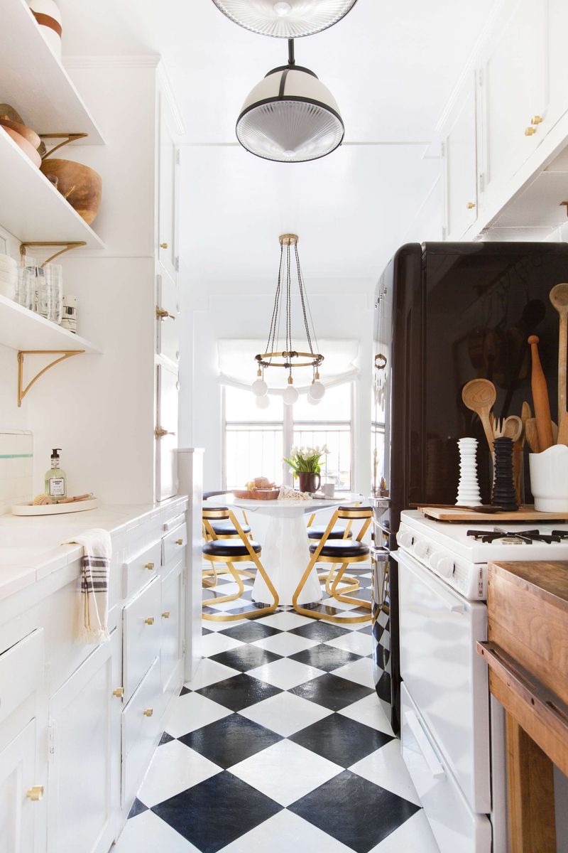
Yes, checkerboard floors can work in modern homes if you do them right. The key is keeping everything else relatively simple so the floor becomes the star of the show.
This pattern adds instant personality and makes even the most basic kitchen layout feel intentional and designed. It’s like wearing a statement necklace with a simple black dress.
Choose larger tiles for a more contemporary feel, or go with smaller squares for that authentic retro vibe.
5. Industrial Chic With Exposed Elements
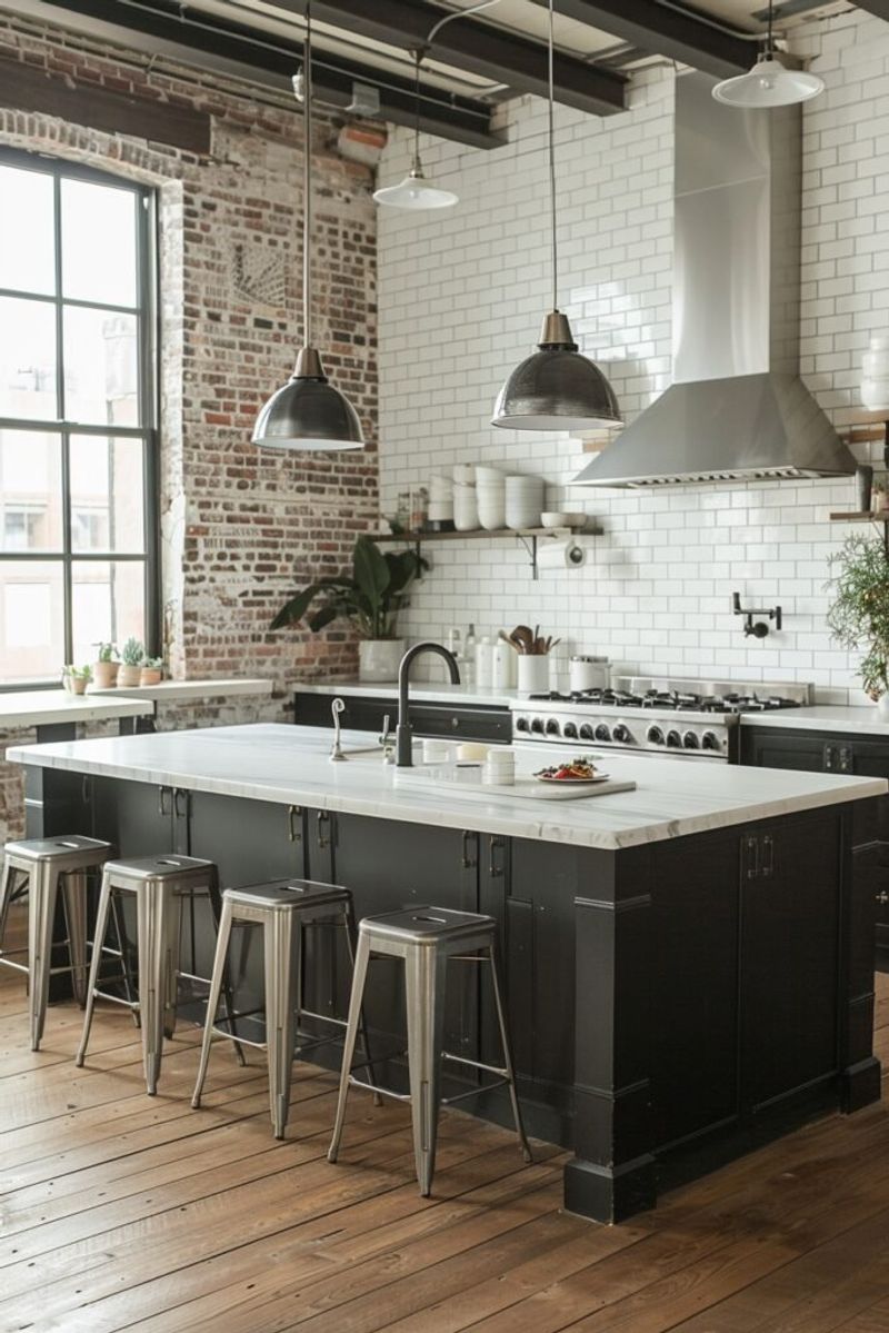
Factory-inspired kitchens prove that black and white doesn’t have to mean traditional. Raw materials like exposed brick, concrete, and steel create an urban loft feeling that’s both edgy and practical.
Black metal cabinets against white brick walls deliver serious visual punch. The contrast highlights the texture of both materials, making each element more interesting than it would be on its own.
This style works particularly well in open-concept homes where the kitchen flows into living areas.
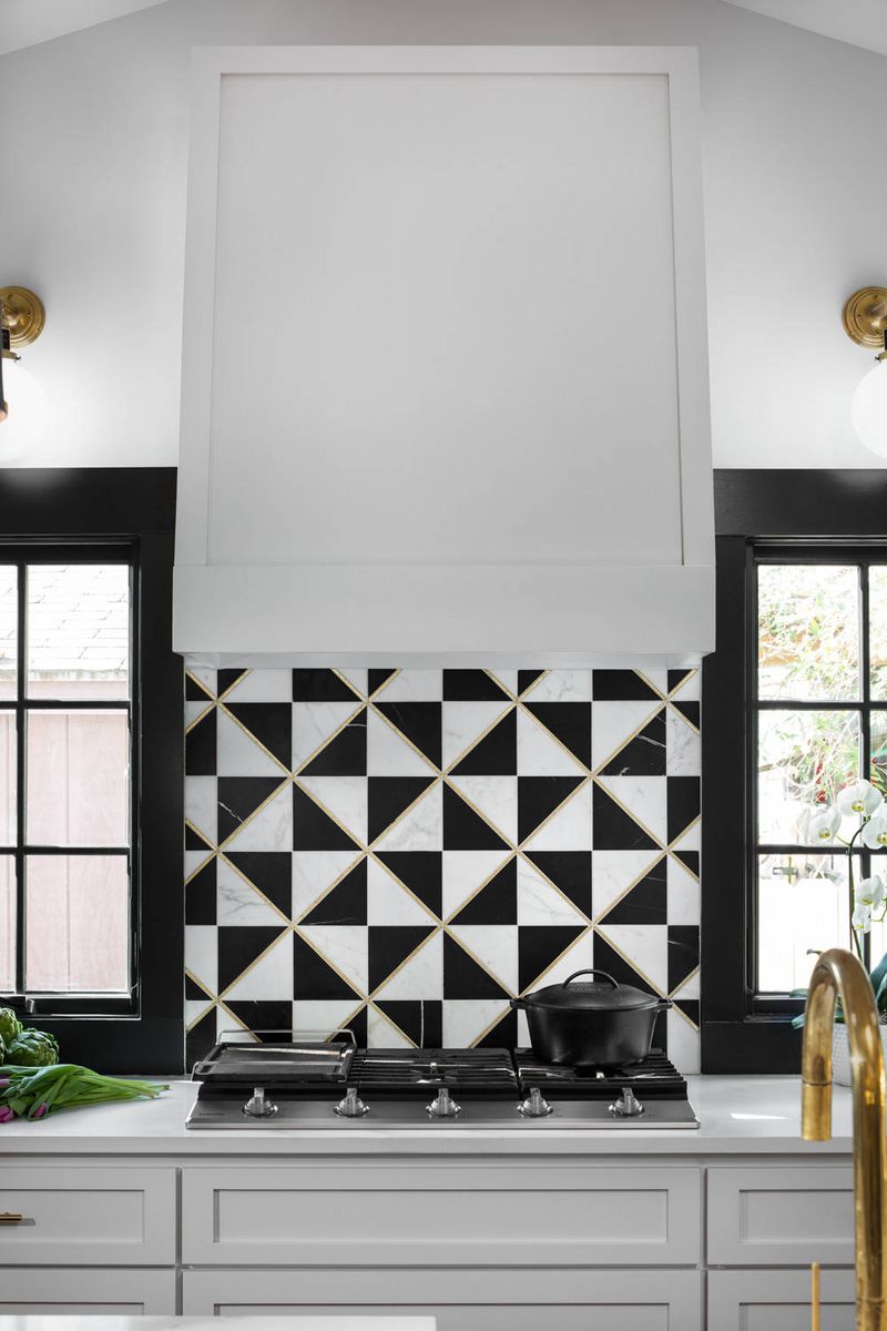
6. Marble Madness In Perfect Balance
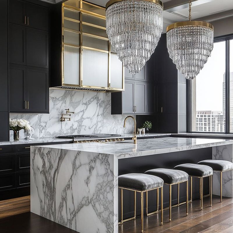
Mother Nature already perfected the black and white combo in marble, so why not let her do the heavy lifting? Carrara or Calacatta marble brings natural veining that creates visual movement without busy patterns.
The organic lines in marble soften the stark contrast between pure black and white elements. It adds sophistication while keeping things from feeling too rigid or geometric.
Even budget-friendly marble-look quartz can achieve this same balanced effect in your space.
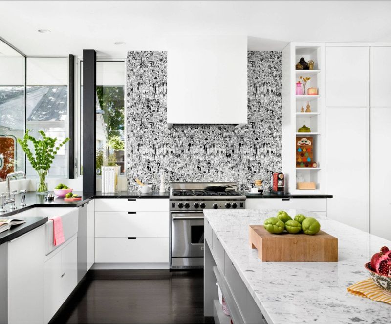
7. Gallery Wall Drama Above The Sink
Who says kitchens can’t have art? A gallery wall of black and white photos above your sink turns a functional space into something that feels more like a curated room.
Mix different frame sizes and photo subjects to create visual interest. Family photos, architectural shots, or abstract images all work when they share the same monochrome palette.
This approach lets you personalize your kitchen without introducing colors that might clash with your black and white scheme.
8. Hardware That Steals The Show
Sometimes the smallest details make the biggest impact. Switching out basic hardware for substantial black pulls and knobs instantly elevates your entire kitchen without major renovation costs.
Oversized hardware creates a custom, high-end look that makes even builder-grade cabinets appear more expensive. It’s like adding statement jewelry to a simple outfit.
Mix different shapes and sizes for added visual interest, but stick to the same finish for cohesion.
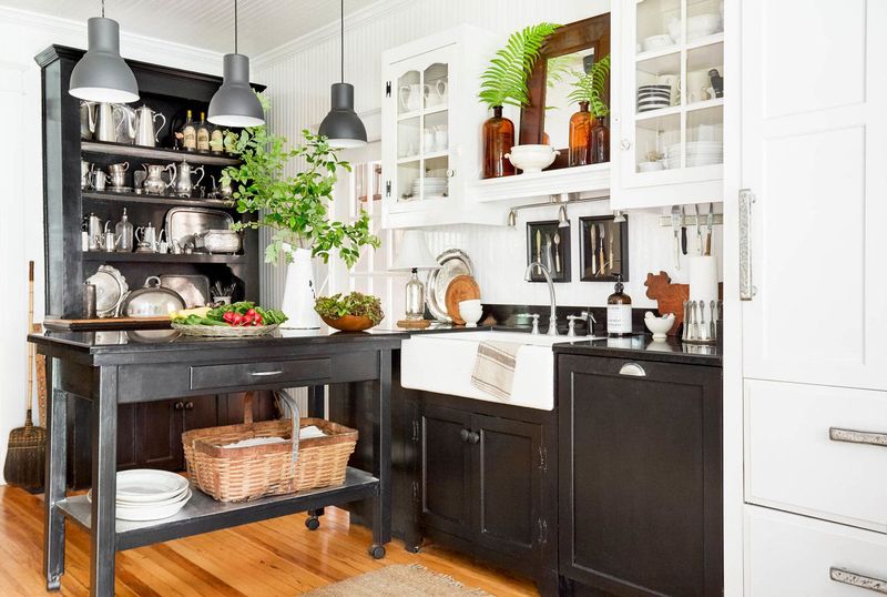
9. Open Shelving With Curated Display
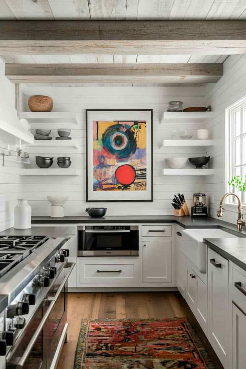
Open shelves give you the perfect opportunity to showcase your black and white dish collection. Alternating colors creates rhythm and keeps things from looking too matchy-matchy.
Stack white plates with black bowls, or display black pottery next to white serving pieces. The key is maintaining some visual breathing room so individual pieces can shine.
This approach works especially well when you want to add personality without introducing additional colors into your palette.
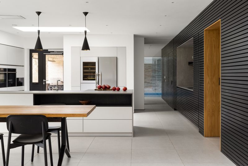
10. Lighting That Commands Attention
Pendant lights over your island create the perfect opportunity for drama. Black fixtures against white backgrounds become sculptural elements that define your space even when they’re turned off.
Choose fixtures with interesting shapes or textures to maximize visual impact. Whether you prefer industrial cage styles or modern geometric forms, black pendants add instant sophistication.
Group odd numbers of lights for the most pleasing arrangement, and make sure they’re properly scaled to your island size.
11. Appliance Integration Done Right
Black stainless steel appliances bridge the gap between your white cabinets and dark countertops. They’re like the perfect middle child that gets along with everyone in the family.
Unlike traditional stainless steel, black versions don’t compete with your color scheme. They blend seamlessly while still providing that professional, high-end appliance look you want.
This choice eliminates the need to hide appliances behind cabinet panels, saving money while maintaining your monochrome aesthetic.
12. Window Treatments With Purpose
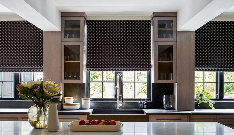
Black window frames create natural boundaries that make your views look like framed artwork. When paired with crisp white window treatments, they add architectural interest without blocking precious natural light.
Roman shades or simple panels in white fabric soften the contrast while maintaining privacy when needed. The combination feels intentional rather than afterthought.
This treatment works particularly well in kitchens with garden or landscape views that you want to highlight.
13. Bar Stool Mixing That Works
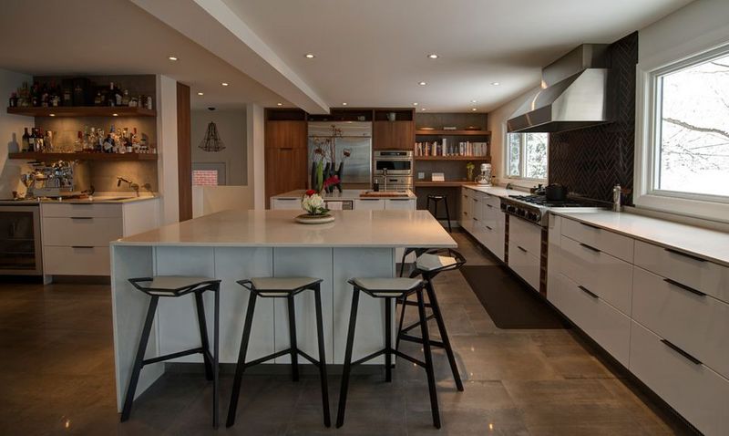
Alternating black and white bar stools creates a playful rhythm that keeps your seating area from feeling too serious. It’s like adding a subtle pattern without overwhelming your space.
This approach works especially well when you can’t decide between colors. Why choose when you can have both and create something more interesting than either option alone?
Make sure the stool styles are similar enough to maintain cohesion while the colors provide the visual interest you’re after.
14. Accent Wall With Geometric Flair
One black accent wall can transform your entire kitchen without the commitment of painting everything dark. It creates a focal point that anchors your space and makes other elements pop.
Add white geometric shapes or patterns to prevent the dark wall from feeling too heavy. Simple stripes, hexagons, or even painted rectangles can add visual texture.
This technique works particularly well behind your stove or sink area where you want to create definition.
15. Ceiling Drama You Can’t Ignore
Painting your ceiling black might sound scary, but it actually makes your kitchen feel more intimate and cozy. It’s like adding a dramatic canopy that brings everything together.
The contrast with white walls and cabinets below creates a sophisticated look that feels intentional rather than accidental. It works especially well in kitchens with high ceilings that might otherwise feel cavernous.
Add some recessed lighting to prevent the space from feeling too dark or closed in.
16. Texture Play With Mixed Materials
Mixing textures within your black and white palette adds depth and prevents your kitchen from feeling flat. Combine matte and glossy finishes, rough and smooth surfaces for maximum visual interest.
Glossy white subway tiles next to matte black cabinets create contrast beyond just color. Add concrete countertops or wood elements to introduce natural texture that softens the stark palette.
This layered approach makes your kitchen feel more sophisticated and thoughtfully designed than single-finish spaces.
17. Vintage Touches In Modern Spaces
Vintage black and white accessories bring personality to modern kitchens without requiring major changes. Think classic diner mugs, checkered tea towels, or retro small appliances in your color scheme.
These touches add character and warmth to spaces that might otherwise feel too sterile or contemporary. They’re conversation starters that make your kitchen feel more personal and lived-in.
Shop flea markets and vintage stores for authentic pieces that tell a story while maintaining your monochrome aesthetic.
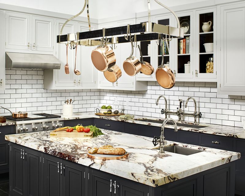
18. Island Contrast That Pops
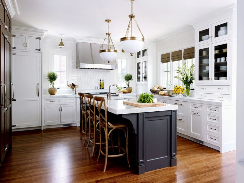
Making your island a different color from your perimeter cabinets creates a furniture-like piece that anchors your space. A black island against white cabinets becomes a dramatic focal point that defines your layout.
This approach works particularly well in open-concept homes where your island needs to feel substantial enough to separate spaces. The contrast helps define the kitchen area without building walls.
Top it with a white countertop to maintain balance and provide workspace that doesn’t show every crumb.
19. Minimalist Magic With Maximum Impact
Sometimes less really is more. A minimalist black and white kitchen strips away all distractions to focus on pure form and function. Clean lines and geometric shapes create visual drama without clutter.
Handleless cabinets and hidden storage maintain the streamlined look while providing all the functionality you need. Every element serves a purpose and contributes to the overall aesthetic.
This approach works best when you’re naturally organized and prefer spaces that feel calm and uncluttered.
20. Pattern Mixing Without The Chaos
Mixing patterns in black and white feels less risky than combining multiple colors. Stripes, polka dots, and geometric shapes can coexist peacefully when they share the same palette.
The key is varying the scale of your patterns. Pair large geometric tiles with small polka dot accessories, or mix wide stripes with narrow ones for visual balance.
This approach adds personality and prevents your monochrome kitchen from feeling too serious or sterile while maintaining overall cohesion.