The 12 Best Front Door Colors For A White House (And 5 To Avoid)
Your white house deserves a front door that truly stands out and makes neighbors pause in admiration. I’ve learned that picking the perfect color can completely change your home’s personality, boosting both curb appeal and even property value.
Whether you’re like me and love making bold, eye-catching statements or prefer to keep things timeless and classic, the right front door color sets the tone for every visitor’s first impression.
If you’re ready to give your home that unforgettable entrance, I’m excited to share tips that helped me find the perfect shade for my own front door.
1. Classic Navy Blue

Navy blue never goes out of style, making it the ultimate safe bet for white houses. This color brings just enough drama without screaming for attention.
Homeowners love how navy complements both modern and traditional architecture. The deep shade creates stunning contrast against white siding while maintaining that sophisticated look real estate agents adore.
Plus, navy works beautifully with any accent colors you choose for shutters or trim.
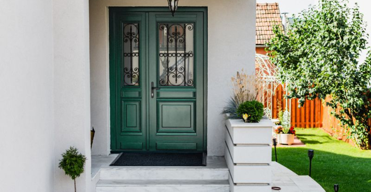
2. Forest Green Elegance

Forest green brings nature right to your doorstep, creating an inviting entrance that feels both fresh and grounded. This earthy tone pairs wonderfully with white exteriors, especially when you add some potted plants nearby.
Many designers recommend this shade because it photographs beautifully and never looks dated. The rich green works particularly well on colonial and farmhouse styles.
Consider adding brass or black hardware to complete the look perfectly.
3. Bold Red Statement

Red doors have welcomed guests for centuries, symbolizing hospitality and good fortune in many cultures. This vibrant choice instantly transforms any white house into a showstopper that radiates warmth and personality.
The color works especially well on colonial and Cape Cod styles. Red creates an eye-catching focal point that makes your home memorable to visitors and passersby alike.
Just remember to choose the right shade for your specific white tone.
4. Charcoal Gray Sophistication

Charcoal gray offers a modern twist that feels both contemporary and timeless. This neutral choice works beautifully with white houses, creating a sophisticated look that appeals to buyers of all ages.
Unlike black, charcoal provides depth without being too stark or dramatic. The color photographs well and complements various architectural styles from modern to transitional.
Silver or brushed nickel hardware enhances the overall contemporary feel of this color choice.
5. Sunny Yellow Warmth

Yellow doors radiate happiness and create an instantly welcoming entrance that makes everyone smile. This cheerful color works particularly well on cottage and farmhouse styles, bringing a touch of sunshine to your white exterior.
The key lies in choosing the right shade – think buttery yellow rather than neon bright. This warm hue pairs beautifully with white trim and looks stunning against various white house tones.
Add some colorful flowers nearby to complete the cheerful garden cottage vibe.
6. Deep Teal Drama

Teal brings an unexpected pop of color that feels both bold and sophisticated. This blue-green hybrid works wonderfully with white houses, creating a unique look that stands out from typical door colors.
The shade works particularly well on Victorian and craftsman styles, where it enhances architectural details beautifully. Teal photographs amazingly and creates a memorable first impression that guests will talk about.
Pair with brass or copper hardware for an extra touch of warmth and character.
7. Rich Burgundy Depth

Burgundy offers all the warmth of red with added sophistication and depth. This wine-inspired color creates a luxurious entrance that works beautifully against white siding, especially during fall months.
The rich tone complements traditional architecture styles and pairs wonderfully with brass or bronze hardware. Burgundy never looks cheap or trendy, making it a solid long-term choice.
This color works particularly well if you have brick accents or warm-toned landscaping elements around your entrance.
8. Glossy Black Classic

Black doors create the ultimate classic look that never goes out of style. This timeless choice works with virtually any white house style, from modern to traditional, creating crisp contrast that photographs beautifully.
The key lies in choosing the right finish – high gloss black looks most polished and professional. This color makes your entrance feel formal and sophisticated while maintaining broad appeal.
Brass or chrome hardware both work wonderfully with black, depending on your overall style preferences.
9. Soft Sage Green

Sage green brings a calming, organic feel that works beautifully with white exteriors. This muted tone feels fresh and modern while maintaining that timeless appeal homeowners love.
The color works particularly well on farmhouse and cottage styles, where it enhances the natural, relaxed vibe. Sage photographs beautifully and creates a welcoming entrance that feels both sophisticated and approachable.
Consider adding some greenery or herb planters nearby to enhance the natural garden feel this color creates.
10. Warm Coral Surprise

Coral brings unexpected warmth and personality to white houses, especially those in coastal or warm climate areas. This peachy-pink tone creates a welcoming entrance that feels both sophisticated and playful.
The color works beautifully with white trim and complements various architectural styles from beach cottages to modern homes. Coral photographs wonderfully and creates a memorable first impression that feels fresh and current.
Pair with white or cream hardware to keep the overall look clean and coastal-inspired.
11. Deep Plum Richness

Plum offers a sophisticated alternative to traditional purple, bringing rich depth and luxury to white house exteriors. This jewel tone creates an elegant entrance that feels both dramatic and refined.
The color works particularly well on Tudor and craftsman styles, where it enhances architectural character beautifully. Plum never looks childish or trendy, making it a solid choice for homeowners seeking something unique.
Dark bronze or black hardware complements this rich color perfectly, creating a cohesive upscale look.
12. Crisp Turquoise Pop
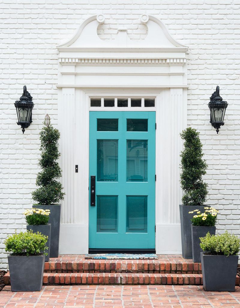
Turquoise brings a fresh, beachy vibe that works wonderfully with white houses, especially in coastal or southwestern areas. This blue-green shade creates an instantly recognizable entrance that radiates vacation vibes year-round.
The color photographs beautifully against white exteriors and works well with both modern and Mediterranean architectural styles. Turquoise feels both timeless and current, making it a great choice for adventurous homeowners.
Silver or white hardware keeps the overall look clean and contemporary with this vibrant color choice.
13. Bright Orange Disaster

Bright orange might seem fun and energetic, but it often overwhelms white houses rather than complementing them. This color can appear cheap and dated, especially when photographed for real estate purposes.
The harsh contrast creates an unbalanced look that distracts from your home’s architectural features. Orange also fades quickly in sunlight, leaving you with an unattractive peachy mess within a few seasons.
Most potential buyers find bright orange off-putting, potentially hurting your home’s resale value significantly.
14. Neon Pink Nightmare

Neon pink screams for attention in all the wrong ways, creating a jarring contrast that makes your white house look unbalanced and unprofessional. This color choice often appears juvenile and temporary rather than thoughtful and permanent.
The harsh fluorescent quality photographs poorly and can make your entire home look cheap in listing photos. Pink also tends to fade unevenly, creating an even more unappealing appearance over time.
Real estate professionals consistently advise against such bold, polarizing color choices for front doors.
15. Muddy Brown Mistake

Muddy brown creates a dull, lifeless entrance that does nothing to enhance your white house’s appeal. This color often appears dirty even when freshly painted, giving your home an unkempt appearance.
Brown lacks the warmth of richer earth tones and the sophistication of deeper colors, falling into an awkward middle ground that pleases no one. The color also shows dirt and wear more readily than other choices.
Most design experts recommend avoiding muddy brown entirely, as it adds no visual interest or curb appeal value.
16. Electric Blue Overload

Electric blue creates an artificial, almost plastic appearance that clashes harshly with white house exteriors. This overly bright shade often looks cheap and temporary rather than carefully chosen and permanent.
The color photographs poorly in most lighting conditions and can make your entire home appear unbalanced in real estate photos. Electric blue also tends to fade quickly, leaving you with an unattractive faded mess.
Professional designers consistently recommend avoiding such artificial-looking bright blues for front door applications on white houses.
17. Lime Green Catastrophe

Lime green creates one of the most jarring color combinations possible with white house exteriors, often appearing more like a mistake than a design choice. This acidic shade overwhelms rather than complements your home’s architecture.
The color looks particularly bad in photographs and can make your entire property appear unprofessional or poorly maintained. Lime green also fades unevenly, creating an even more unappealing striped or patchy appearance over time.
Real estate professionals universally advise against this color choice for its negative impact on curb appeal.