
The colors we choose for our bedrooms can dramatically impact our sleep quality and overall well-being.
Science has shown that certain hues can lower blood pressure, reduce stress, and create the perfect environment for restorative sleep.
If you’ve been struggling with insomnia or just want to transform your bedroom into a sleep sanctuary, these expert-recommended colors might be the simple solution you’ve been searching for.
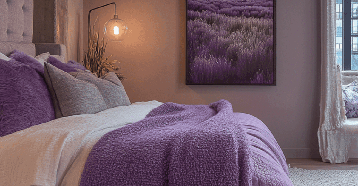
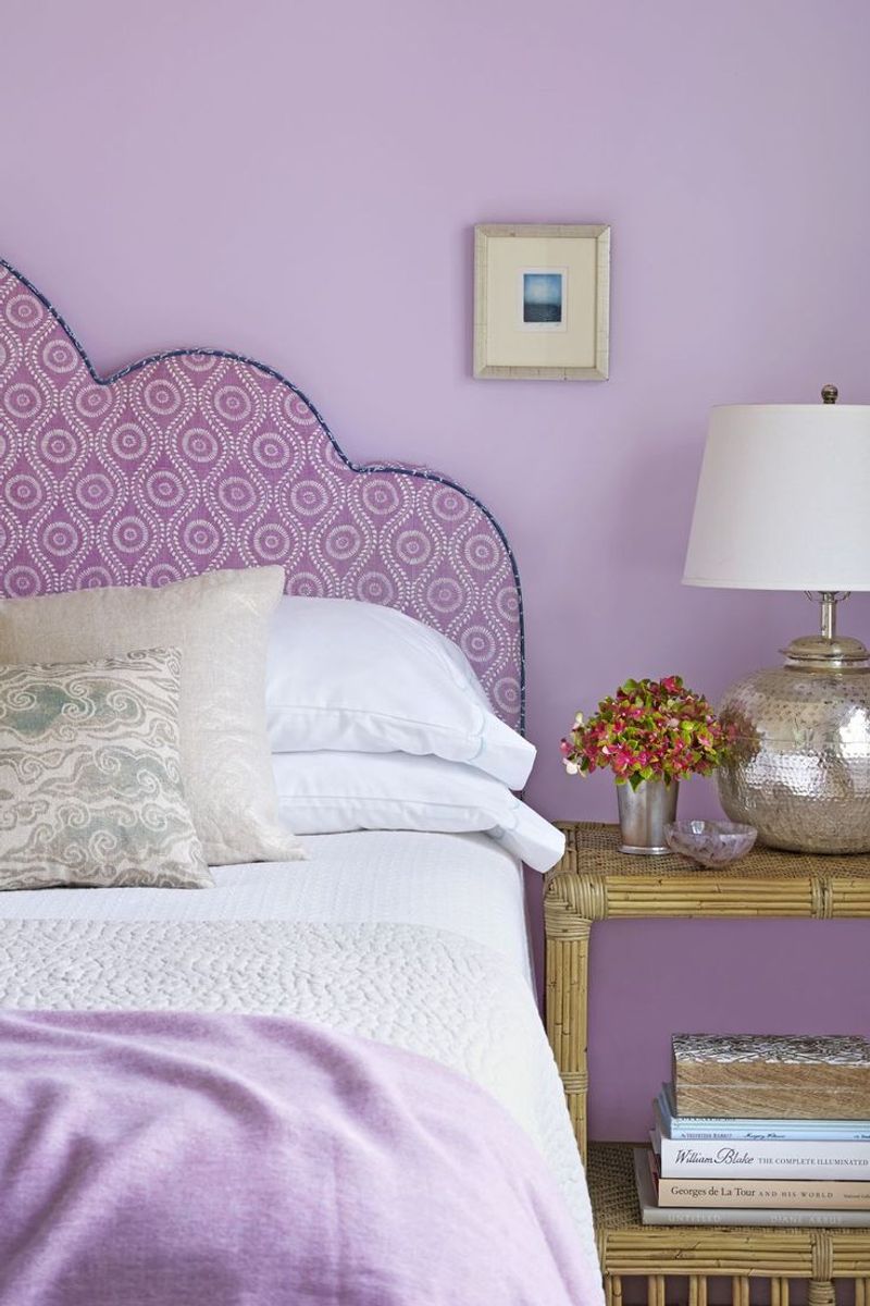
1. Soft Lavender
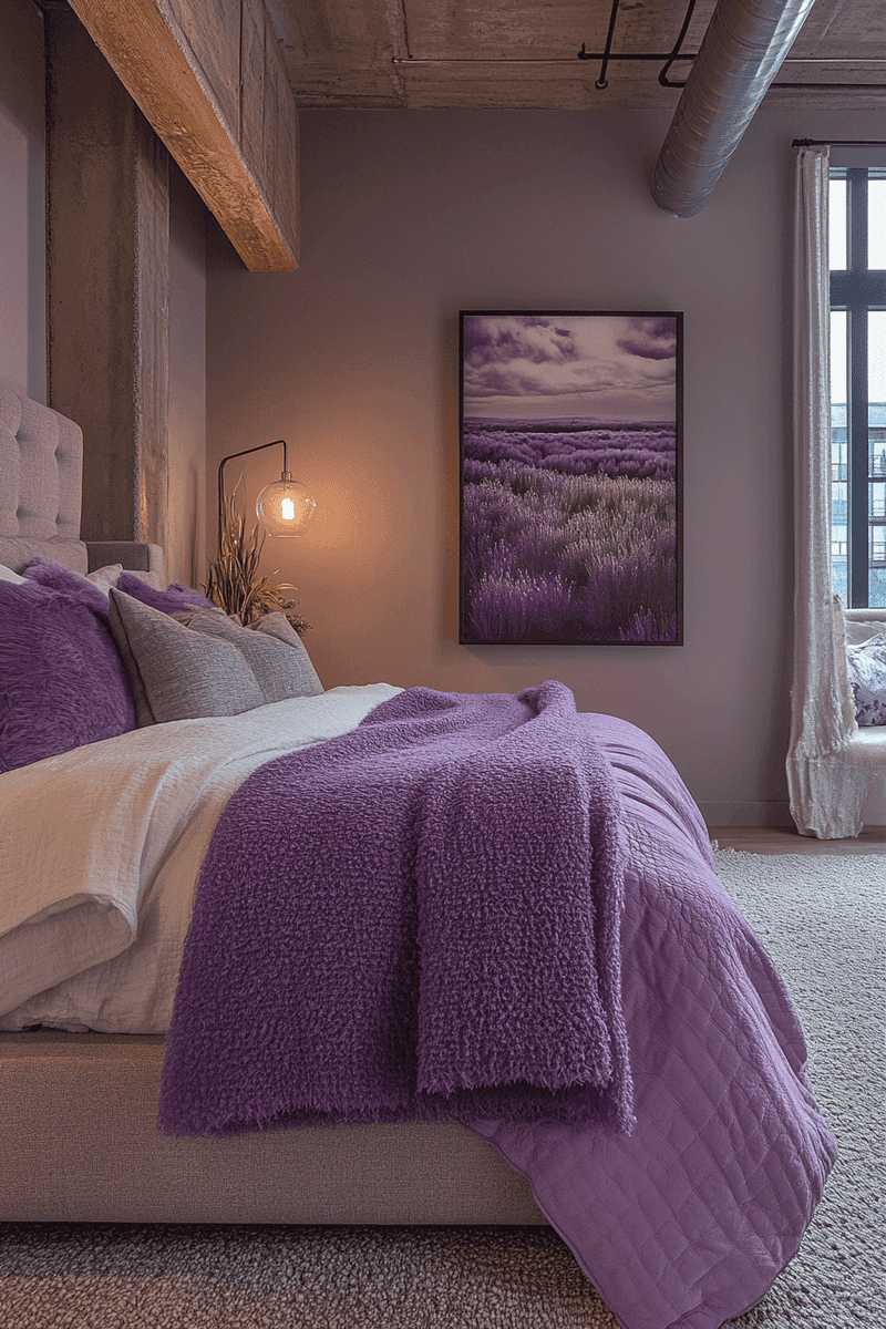
Whispered about in sleep therapy circles as the ultimate relaxation shade, soft lavender works wonders on restless minds. This gentle purple hue mimics the calming properties of its namesake plant, known for centuries as a natural sleep aid.
Many interior designers recommend this color for people who struggle with racing thoughts at bedtime. The subtle floral undertones create a sense of being cradled in a fragrant garden, easing tension in both body and mind.
2. Pale Blue
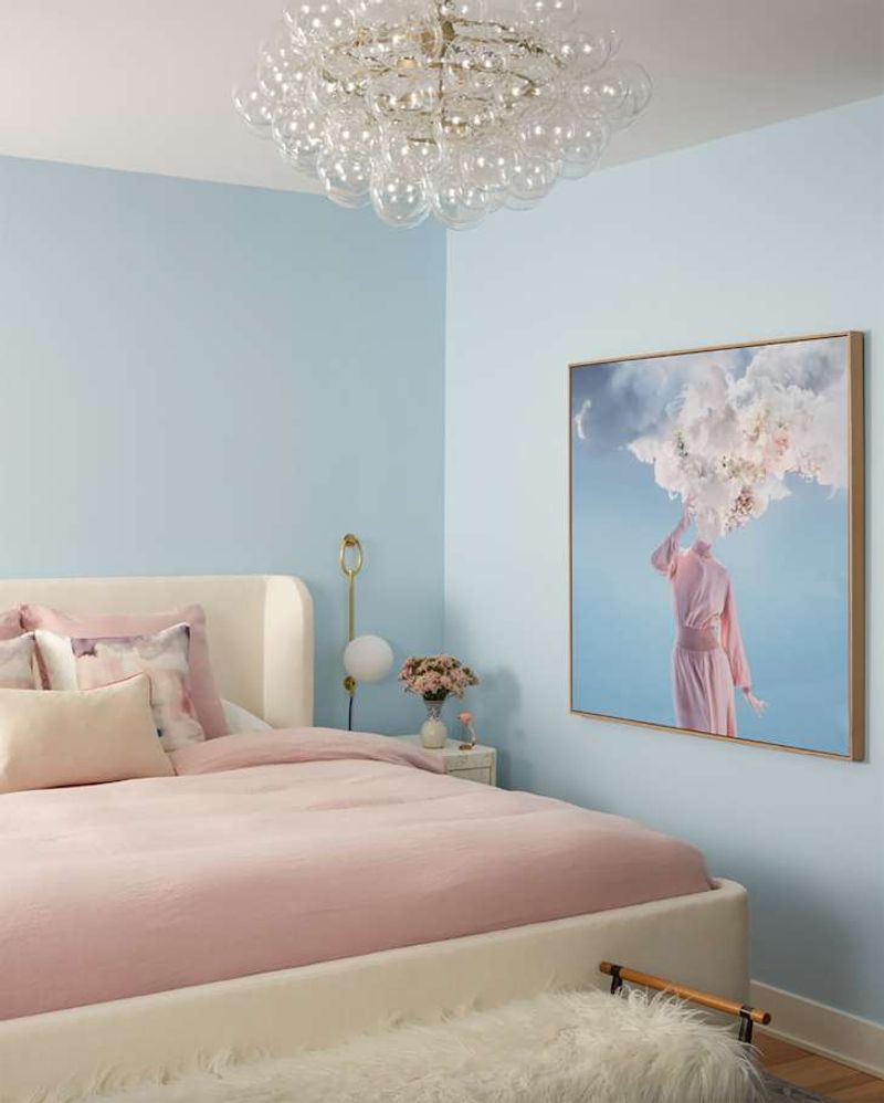
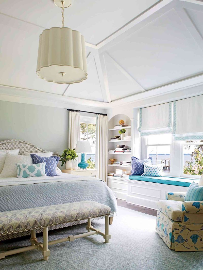
Ever noticed how gazing at a clear blue sky instantly calms your nerves? Pale blue mimics this natural tranquility, making it a top choice among sleep specialists. The color’s association with open skies and still waters triggers an automatic relaxation response in our brains.
Unlike energetic bright blues, this softer shade lowers blood pressure and reduces heart rate, creating ideal physiological conditions for drifting off to dreamland. When the sun sets and your room dims, pale blue takes on an especially soothing quality.
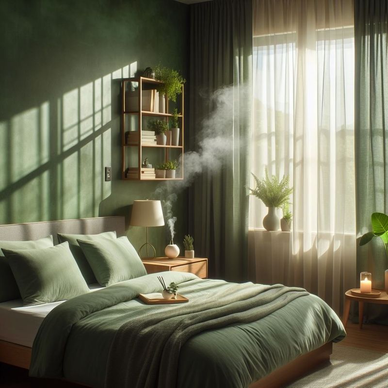
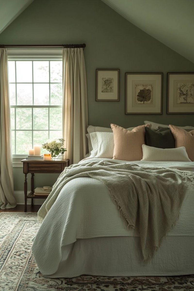
3. Sage Green
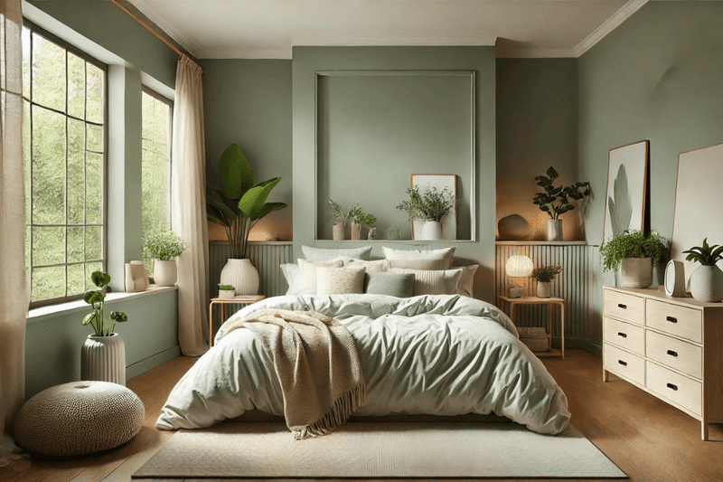
Bringing the outdoors inside has never been more beneficial than with sage green walls surrounding your sleep sanctuary. This earthy, muted tone connects us to nature’s calming influence while providing a neutral backdrop that doesn’t overstimulate the senses.
According to color psychologists, sage green strikes the perfect balance – neither too warm nor too cool – making it ideal for year-round comfort. Its subtle complexity means it shifts beautifully throughout the day, appearing differently in morning light versus evening shadows.
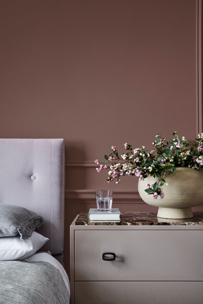
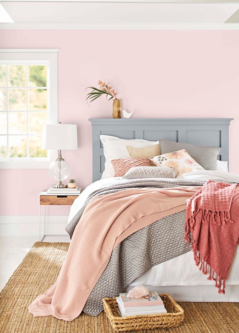
4. Dusty Pink
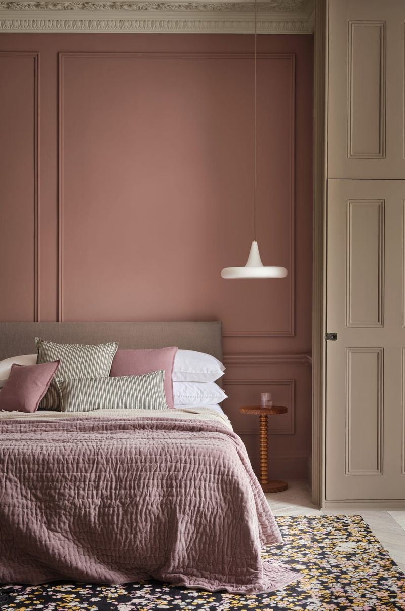
Forget the outdated notion that pink is just for children’s rooms! Modern interior experts are embracing dusty pink as a sophisticated sleep enhancer for adults of all genders. This muted, slightly grayed version of pink creates a cocooning effect that feels both protective and nurturing.
Research shows that being surrounded by this gentle hue actually lowers aggressive feelings and promotes feelings of safety. The subtle warmth it casts makes skin tones look healthier and more radiant – a psychological boost that helps release tension before sleep.
5. Soft Gray
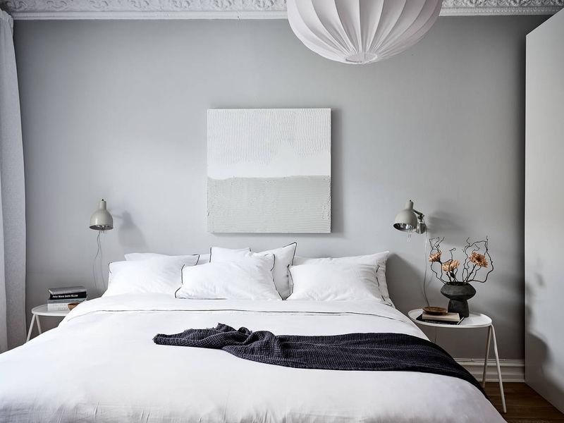
Nothing whispers neutrality and calm quite like the perfect soft gray. Soft gray creates a cozy envelope of comfort that recedes into the background of consciousness.
Interior designers frequently recommend this versatile shade because it pairs beautifully with virtually any accent color while maintaining its inherent tranquility. The lack of strong pigmentation means your eyes and brain don’t have to process intense visual information when you should be winding down.
6. Muted Terracotta
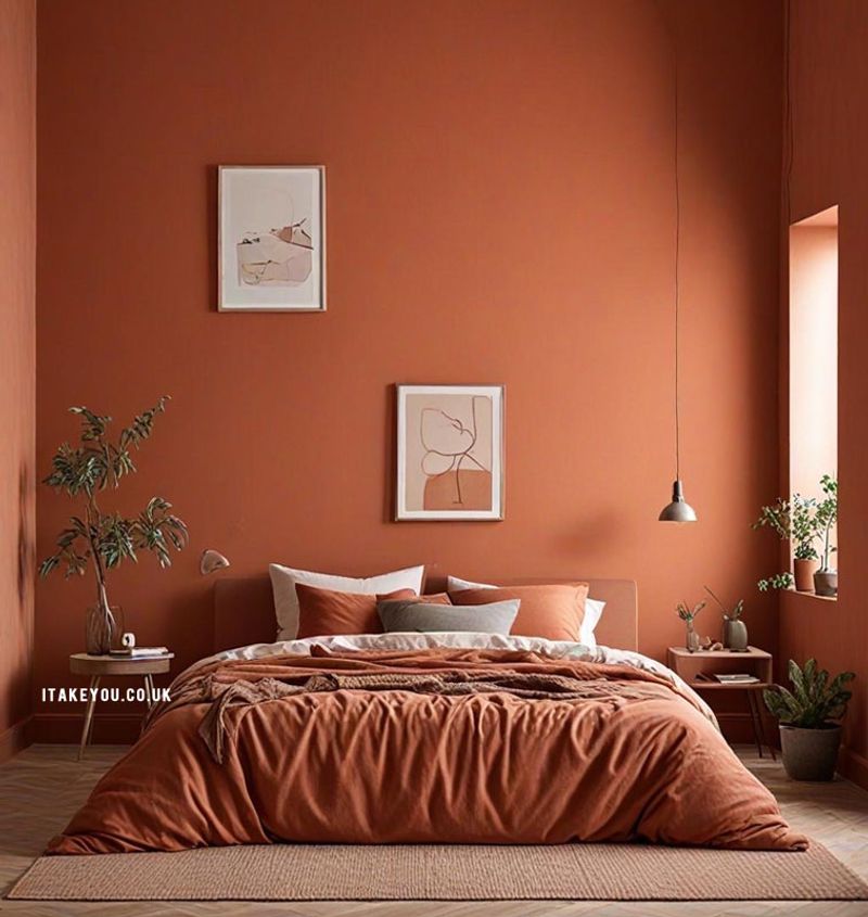
Wrapping yourself in the embrace of muted terracotta walls feels like being held in the warm glow of sunset – exactly the signal your body needs to prepare for sleep. This earthy, reddish-brown hue connects us to ancient building materials used across cultures for millennia.
Terracotta’s muted quality creates a grounding, womb-like environment. Color psychologists note its effectiveness for people who struggle with feeling secure enough to surrender to sleep.
7. Pale Seafoam
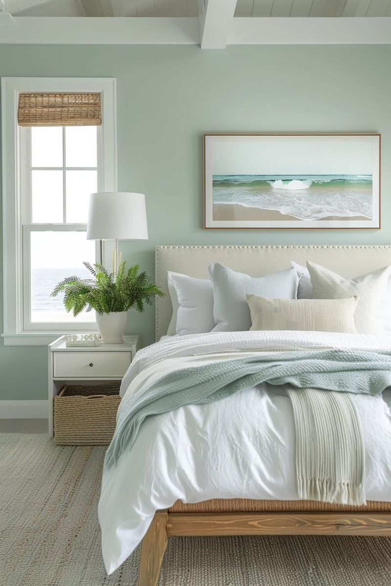
Memories of gentle waves lapping at sandy shores come flooding back when surrounded by pale seafoam walls. This delicate blue-green shade captures the tranquil essence of coastal retreats where stress seems to melt away naturally.
Sleep researchers have found that colors associated with water environments can actually lower blood pressure and slow breathing rates – physiological changes essential for quality sleep. The subtle mint undertones in seafoam add a refreshing quality without becoming too stimulating or cold.
8. Warm Taupe
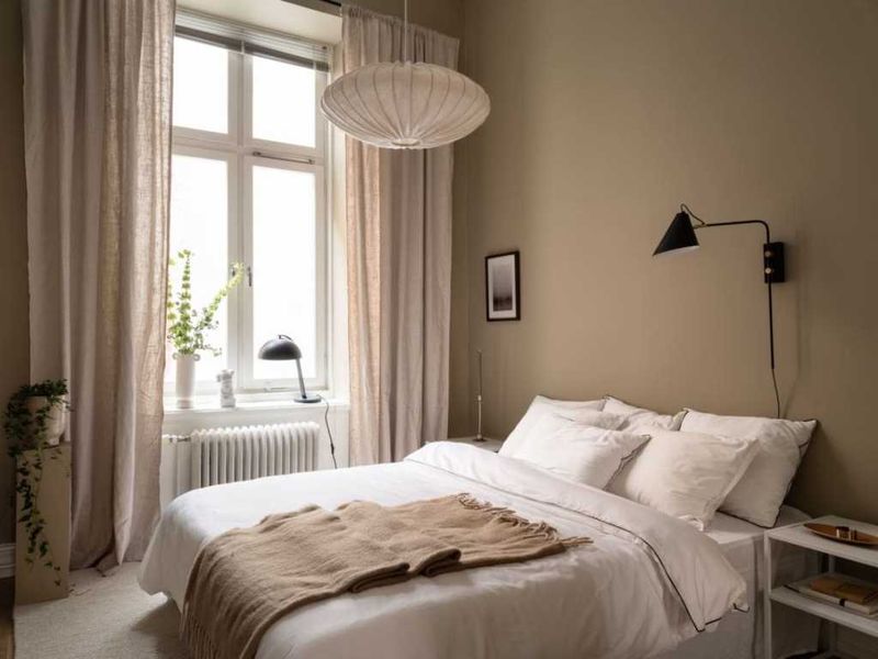
Straddling the perfect balance between gray and brown, warm taupe creates a sophisticated cocoon that neither stimulates nor bores the senses. This complex neutral has risen in popularity among sleep experts for its remarkable ability to make bedrooms feel simultaneously cozy and spacious.
The chameleon-like quality of taupe means it shifts beautifully throughout the day, appearing differently in morning light versus evening shadows – a subtle variation that works with our natural circadian rhythms. Its earthy undertones connect us to nature without overwhelming the senses.
9. Pale Celadon
Ancient Chinese potters knew the mesmerizing quality of celadon glazes, and today’s sleep experts recognize this pale green-gray shade as equally captivating for bedroom walls. The historical significance of this color brings an unconscious sense of timelessness and permanence – feelings that help anxious minds settle.
Unlike brighter greens that energize, celadon’s muted quality creates a misty, dreamy atmosphere perfect for transitioning from wakefulness to sleep. The subtle blue undertones keep the space feeling cool and clean without becoming clinical or cold.
10. Soft Cream
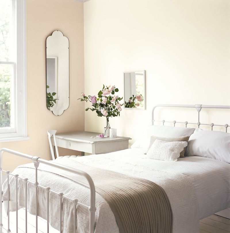
Imagine being enveloped in warm sunshine without the harshness of direct light – that’s the effect soft cream walls create in a bedroom.
Psychologists note that this barely-there color allows the mind to rest without processing strong visual information, making it ideal for sensitive sleepers. The versatility of cream means it works beautifully in any lighting condition and with any architectural style.
11. Dusty Blue
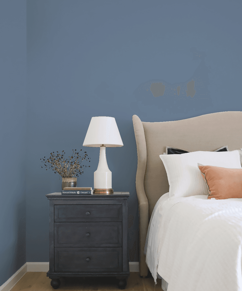
Somewhere between a traditional blue and a sophisticated gray lies dusty blue – a color that carries the tranquility of blue with the maturity of gray. This muted, slightly desaturated shade evokes twilight skies just as the stars begin to appear.
Sleep researchers have found that dusty blue creates the perfect visual temperature for bedrooms – cool enough to lower body temperature (essential for good sleep) without feeling cold or unwelcoming. The subtle gray undertones add sophistication while tempering blue’s sometimes overwhelming coolness.
12. Soft Eucalyptus
Imagine being surrounded by the gentle, medicinal aroma of eucalyptus – that’s the psychological effect this soft, gray-green shade creates in a bedroom. This muted tone mimics the dusty surface of eucalyptus leaves, creating a subtle connection to nature’s healing properties.
Enhance this color’s sleep-promoting qualities with natural linens, minimal pattern, and perhaps one actual eucalyptus plant for a multi-sensory approach to better sleep.
13. Muted Sage
Walking through an herb garden after a gentle rain shower – that’s the sensory experience muted sage walls recreate in your bedroom. Unlike brighter greens that energize, this dusty, gray-infused sage creates a misty, dreamy quality perfect for sleep.
Color psychologists point to muted sage as particularly effective for urban dwellers who lack regular access to nature, as it provides the subconscious benefits of plant life without overstimulation. Its natural pigmentation means it shifts beautifully throughout the day, appearing differently in morning light versus evening shadows.
14. Dusty Mauve
Carrying the sophistication of purple without its intensity, dusty mauve creates a bedroom atmosphere that feels both elegant and deeply calming. This complex color – a muted purple with generous gray undertones – has historical associations with luxury and rest.
Balance this color’s inherent coolness with warm metallic accents like brass or copper, and incorporate plush textures to create a sleep sanctuary that feels like a luxury boutique hotel dedicated entirely to your rest.
15. Muted Periwinkle
Floating somewhere between blue and purple, muted periwinkle creates a bedroom that feels like twilight captured in color form – that magical moment when day surrenders to night. This gentle hue carries blue’s tranquility with just a hint of purple’s dreaminess.
Balance periwinkle’s cool undertones with warm natural elements like brass fixtures and honey-toned woods to create a sleep sanctuary that feels both refreshing and cozy – the perfect combination for quality rest.
16. Pale Blush
Barely-there blush creates a bedroom that feels like being inside the gentlest sunrise – that magical moment before the day’s demands begin. This whisper of pink carries the warmth of red without any of its stimulating properties.
Research shows that gentle blush tones actually flatter all skin tones, creating a subtle glow that makes everyone look healthier and more rested – a psychological boost that helps release tension before sleep.
17. Cool Dove Gray
Floating through your bedroom like morning mist, cool dove gray creates a serene backdrop that encourages the mind to quiet itself naturally. This sophisticated neutral has gained favor among sleep specialists for its remarkable ability to make bedrooms feel both spacious and cocooning.
Dove gray’s subtle blue undertones create an airy, expansive feeling that helps alleviate anxiety and racing thoughts. The lack of strong pigmentation means your eyes and brain don’t have to process intense visual information when you should be winding down.
18. Misty Lilac
Hovering between gray and purple, misty lilac creates a bedroom atmosphere that feels both sophisticated and slightly magical. This ethereal shade carries purple’s historical associations with spirituality and dreams without becoming too saturated or childish.
According to color psychologists, lilac’s subtle complexity engages the mind just enough to distract from anxious thoughts without stimulating new ones – the perfect balance for transitioning to sleep. Its cool undertones help create the slight drop in body temperature that signals to your brain it’s time for rest.
19. Gentle Greige

Standing at the perfect intersection of gray and beige, gentle greige has become the secret weapon of sleep-focused interior designers. This chameleon-like neutral adapts beautifully to changing light throughout the day, appearing warmer in morning light and cooler in evening shadows – mimicking our natural circadian rhythms.
Unlike stark grays that can feel industrial or yellowed beiges that date quickly, greige maintains a timeless quality that creates a backdrop for rest rather than demanding attention. Its complex undertones mean it works with both warm and cool accent colors.