8 Times It’s Okay Your Accent Wall Is Lighter And 8 Times You’ll Want It Darker Than The Rest Of Your Room
Accent walls can transform a room from ordinary to extraordinary with just a can of paint. Whether you go lighter or darker than your main wall color makes a huge difference in how your space feels.
The right choice depends on your room’s size, lighting, and the mood you want to create. Let’s explore when to lighten up and when to embrace the dark side of accent walls.
1. Go Lighter: In North-Facing Rooms
North-facing rooms naturally receive cooler, less direct sunlight throughout the day. A lighter accent wall can bounce what little light enters the space, preventing the room from feeling like a cave.
Choose soft creams, pale yellows, or light blush tones to create warmth. The contrast with slightly darker surrounding walls creates visual interest while maximizing the limited natural light.
2. Go Lighter: When Highlighting Architectural Features
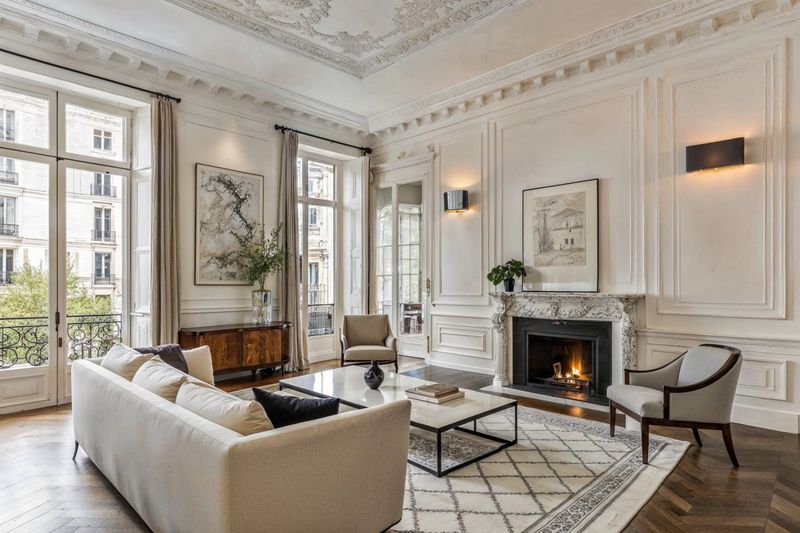
Beautiful crown molding, wainscoting, or built-in shelves deserve attention! A lighter accent wall makes these architectural details pop without overwhelming them.
The subtle contrast creates shadows and depth that showcase craftsmanship. Think of it as using a highlighter rather than a marker – gentle emphasis that draws the eye without shouting for attention.
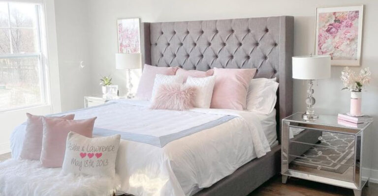
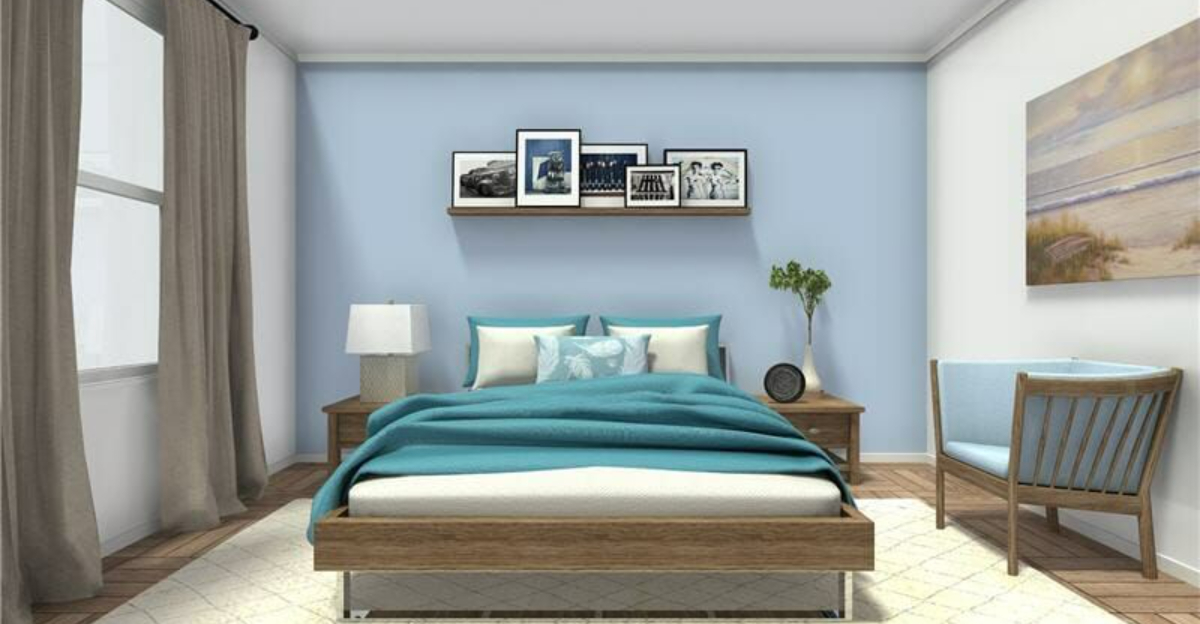
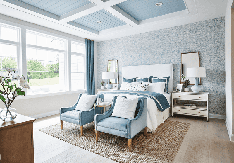
3. Go Lighter: In Cramped Bedrooms
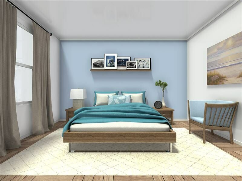
Small bedrooms can feel claustrophobic with too many dark surfaces. A lighter accent wall behind your bed creates an illusion of depth, visually pushing that wall back.
Soft blues, gentle greens, or airy lavenders work beautifully here. The subtle contrast with slightly darker surrounding walls adds dimension without sacrificing the spacious feel you need for restful sleep.
4. Go Lighter: For Scandinavian-Inspired Spaces
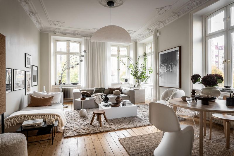
Scandinavian design embraces brightness and minimalism. A pale accent wall in soft white, light gray, or the palest blush perfectly complements this aesthetic.
The gentle contrast creates subtle interest without disrupting the clean, airy vibe. Pair with natural wood tones and textured textiles for that quintessential Nordic feel that remains bright even during long, dark winters.
5. Go Lighter: When Showcasing Colorful Artwork
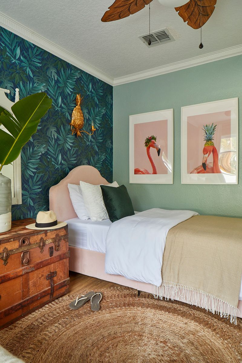
Vibrant artwork deserves a backdrop that complements without competing. A lighter accent wall creates the perfect gallery-like setting for your colorful pieces.
Soft cream, pale gray, or light sage green provides just enough contrast from standard white walls to be interesting. Your artwork becomes the star of the show while the wall adds subtle depth to the overall composition.
6. Go Lighter: For Low-Ceiling Rooms
Low ceilings can make rooms feel squished and uncomfortable. A lighter accent wall paired with a white ceiling creates an uplifting effect that seems to raise the height of the room.
Pale blues and soft greens work particularly well here. The subtle contrast with your slightly darker surrounding walls adds interest without visually lowering your ceiling further.
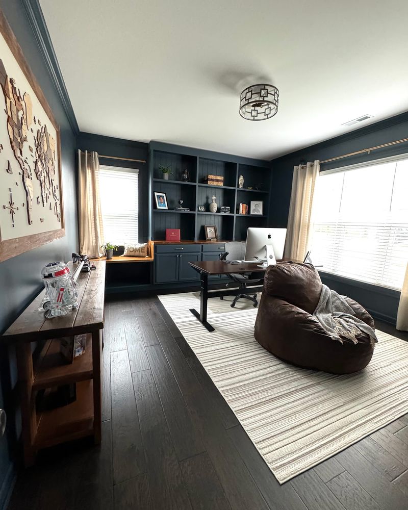
7. Go Lighter: In Multi-Functional Spaces

Work-from-home areas, craft corners, or playroom-office combos need versatility. A lighter accent wall creates a flexible backdrop that works for various activities without dominating the space.
Soft neutrals with subtle undertones adapt well to changing light throughout the day. This creates a pleasant environment that remains functional whether you’re working, creating, or relaxing in your multi-purpose space.
8. Go Lighter: When Using Textured Treatments
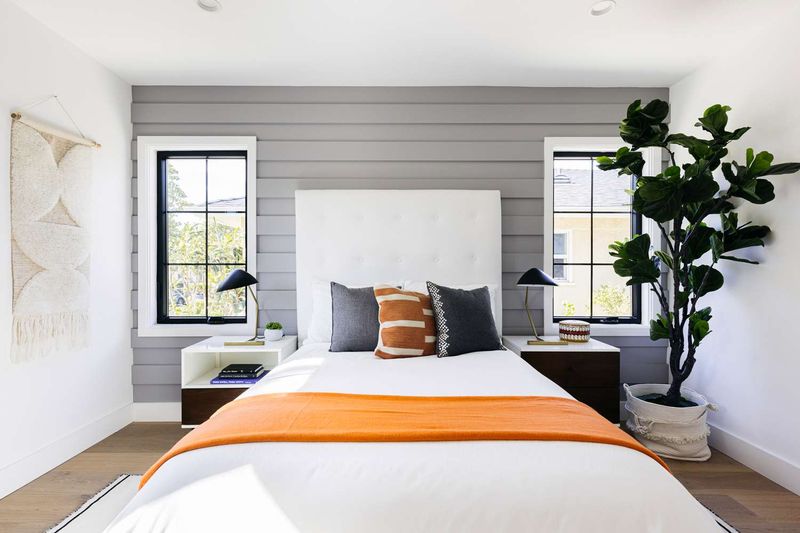
Textured wall treatments like shiplap, grasscloth, or stenciling create visual interest through physical dimension. A lighter accent wall allows these textures to cast subtle shadows that highlight the craftsmanship.
Soft whites, creamy beiges, or pale grays let the texture be the star. The gentle contrast with slightly darker surrounding walls creates a sophisticated look without overwhelming your senses.
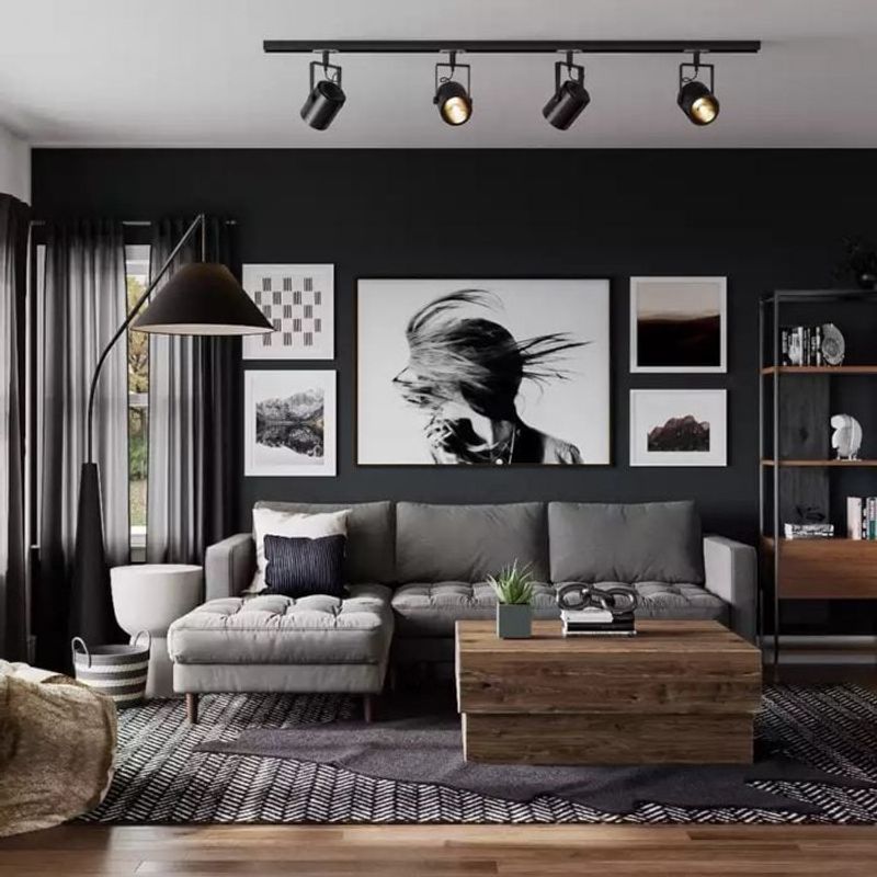
9. Go Darker: In Oversized Living Rooms
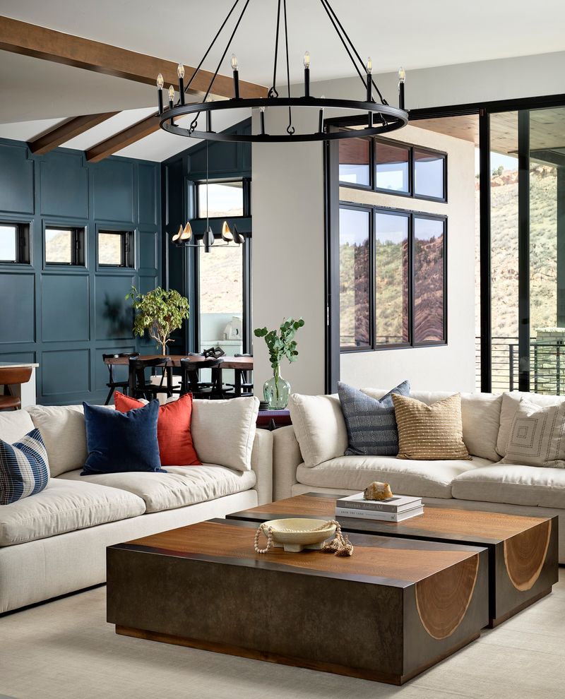
Massive living rooms can feel impersonal and cavernous. A darker accent wall visually pulls that surface closer, creating a more intimate, cozy atmosphere in an otherwise overwhelming space.
Deep blues, rich greens, or charcoal grays add warmth and definition. The stronger contrast anchors floating furniture arrangements and helps define conversation areas within larger open-concept spaces.
10. Go Darker: Behind Media Centers
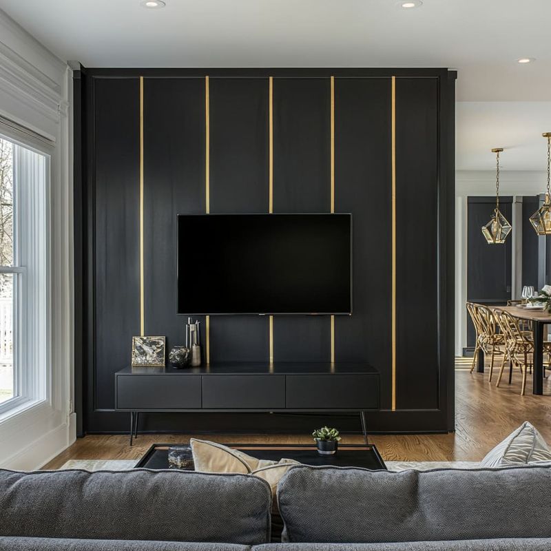
TV screens look their best against darker backgrounds. A deep-toned accent wall reduces the harsh contrast between your screen and the wall when watching movies, preventing eye strain.
Charcoal, navy, or deep brown create a theater-like experience. The dramatic contrast with lighter surrounding walls frames your entertainment center while the darker shade minimizes the visual impact of cords and equipment.
11. Go Darker: For Zoom Call Backgrounds
Home office video calls benefit enormously from a darker accent wall. Rich jewel tones or deep neutrals create professional-looking backgrounds that help you stand out clearly on camera.
Emerald green, navy blue, or deep plum provide flattering contrast. The stronger difference between your wall and surrounding lighter walls adds depth to your video presence without requiring fancy lighting setups.
12. Go Darker: In Dining Rooms
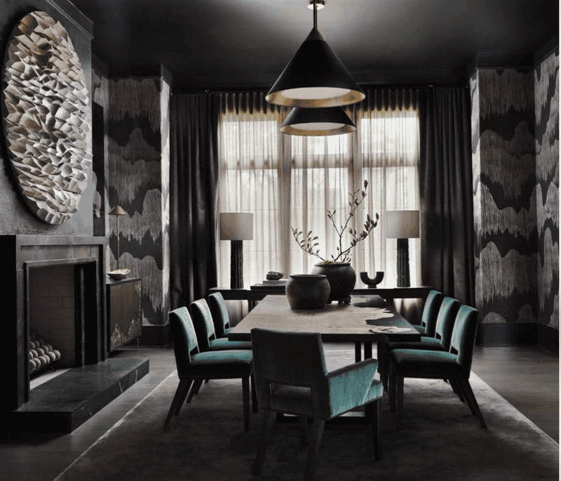
Dinner parties feel more sophisticated against a darker accent wall. Deep colors create an intimate atmosphere that encourages lingering conversations and memorable meals.
Burgundy, forest green, or chocolate brown add richness and depth. The dramatic contrast with lighter surrounding walls frames your dining table like a beautiful painting, making everyday dinners feel more special.
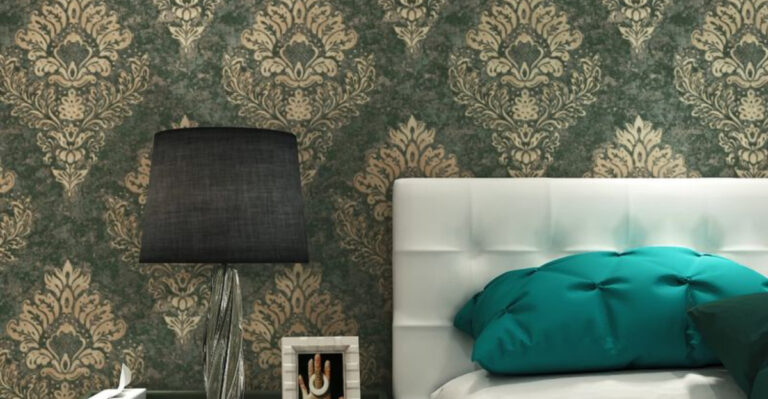
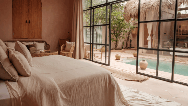
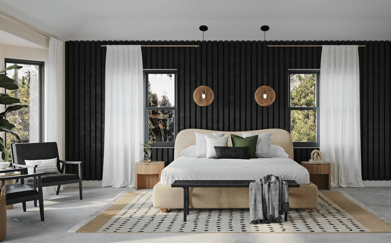
13. Go Darker: For Dramatic Bedroom Headboard Walls
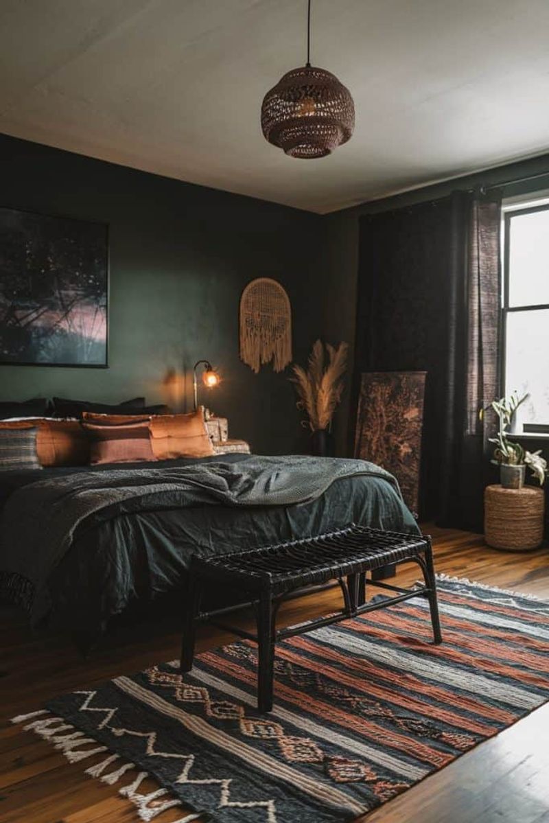
The wall behind your bed creates a natural focal point. A deeper, richer accent color here adds drama and frames your bed beautifully without overwhelming the entire room.
Moody blues, deep teals, or charcoal grays create a cocoon-like feeling. The stronger contrast with lighter surrounding walls adds sophistication while keeping the overall space balanced and restful.
14. Go Darker: In Rooms With Abundant Natural Light
Sun-drenched spaces with multiple windows can handle deeper accent colors without feeling gloomy. A darker accent wall adds visual weight and prevents the washed-out feeling too much brightness can create.
Deep olive, slate blue, or rich terracotta absorb some of that intense light. The dramatic contrast with lighter surrounding walls adds architectural interest to rooms that might otherwise feel flat and overly bright.
15. Go Darker: To Highlight Statement Furniture
Got a gorgeous light-colored sofa or stunning marble dining table? A deeper accent wall creates the perfect backdrop to showcase light-colored statement pieces.
Indigo, charcoal, or deep sage make light furniture pop dramatically. The stronger contrast creates a gallery-like setting where your special pieces become the stars of the show against their rich, sophisticated backdrop.
16. Go Darker: In Transitional Spaces
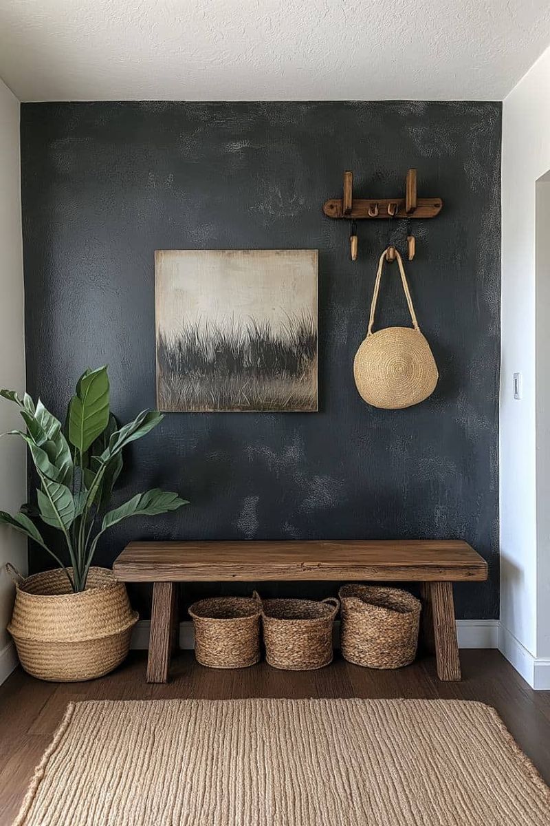
Hallways, entryways, and stairwells benefit from deeper accent walls that create rhythm and movement through your home. These transitional spaces can handle bold color choices without overwhelming daily life.
Deep berry, navy, or charcoal create dramatic moments between rooms. The stronger contrast with lighter surrounding areas creates natural breaks in your home’s flow, making each room feel more intentional and distinct.