
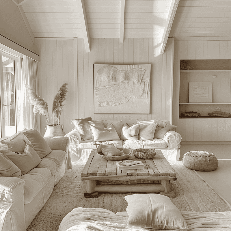
You don’t need crashing waves outside your window to bring the ease of coastal living into your home.
The right color palette can evoke that same calm, breezy feel wherever you are. Soft blues, sandy neutrals, sun-washed whites — these hues instantly relax the eye and the mind.
Ready to infuse your space with a little seaside serenity? These 15 coastal color schemes will help you channel beachside tranquility, no ocean required.
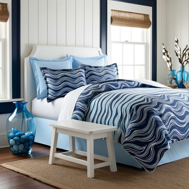
1. Classic Navy and White
What says nautical like the timeless combination of navy and white? These contrasting colors create a crisp, clean aesthetic that instantly brings to mind sailboats and maritime adventures.
Add natural wood accents to warm up the space and prevent it from feeling too stark. For a touch of authenticity, incorporate rope details or weathered metals that mimic elements found on vintage sailing vessels.
2. Sandy Beige and Sea Glass Green
Walking barefoot along the shoreline inspired this earthy yet refreshing palette. The warm beige resembles sun-kissed sand while the soft sea glass green mirrors the shallow waters where waves gently break.
For visual interest, incorporate different textures like woven baskets, linen upholstery, and glazed ceramics. A few carefully chosen seashells or beach finds displayed in a glass bowl can complete the subtle coastal reference without becoming kitschy.
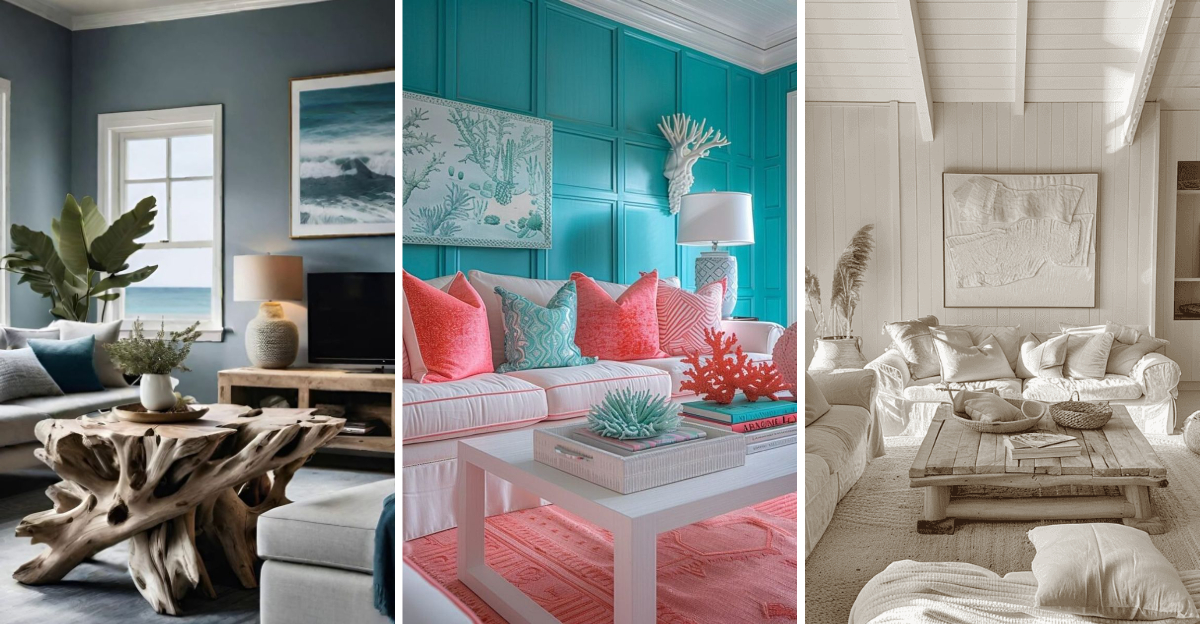
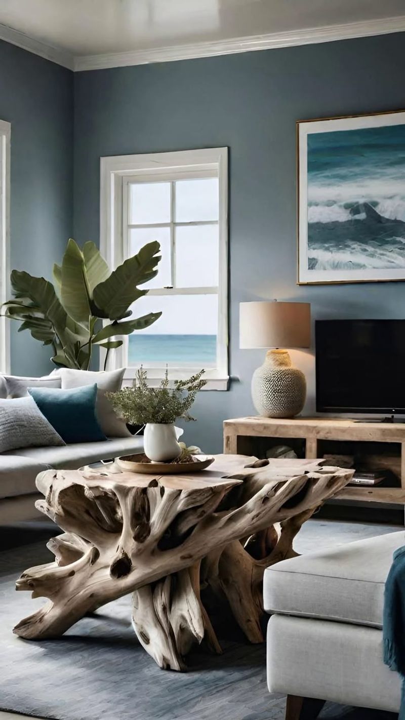
3. Driftwood Gray and Foggy Blue

Imagine a misty morning on a northern beach – that’s the mood this sophisticated color scheme captures. Weathered gray tones reminiscent of driftwood create a neutral foundation, while soft foggy blues add depth and intrigue.
This palette works beautifully in spaces where you want to encourage relaxation and contemplation. Consider incorporating actual driftwood pieces as sculptural elements or opt for furniture with a weathered, silvery finish to enhance the coastal connection.
4. Coral Reef and Turquoise
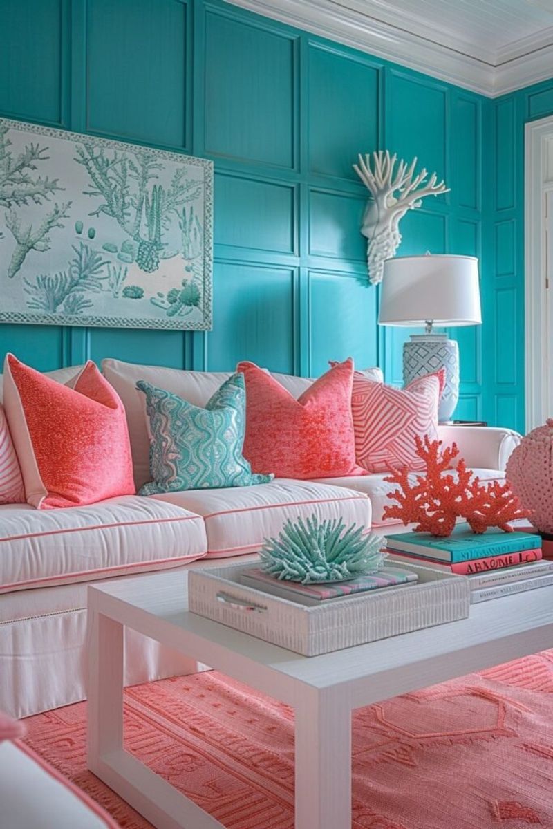
For those who crave a more vibrant coastal vibe, this tropical-inspired palette delivers energy and joy. The warm coral tones evoke exotic flowers and sunset skies, while turquoise recalls the crystal-clear waters of tropical lagoons.
Use these colors strategically – perhaps coral for accent pillows and artwork against a backdrop of white walls with turquoise accessories. This approach prevents the bright hues from overwhelming the space while still capturing that carefree island atmosphere.
5. Soft Aqua and Creamy White
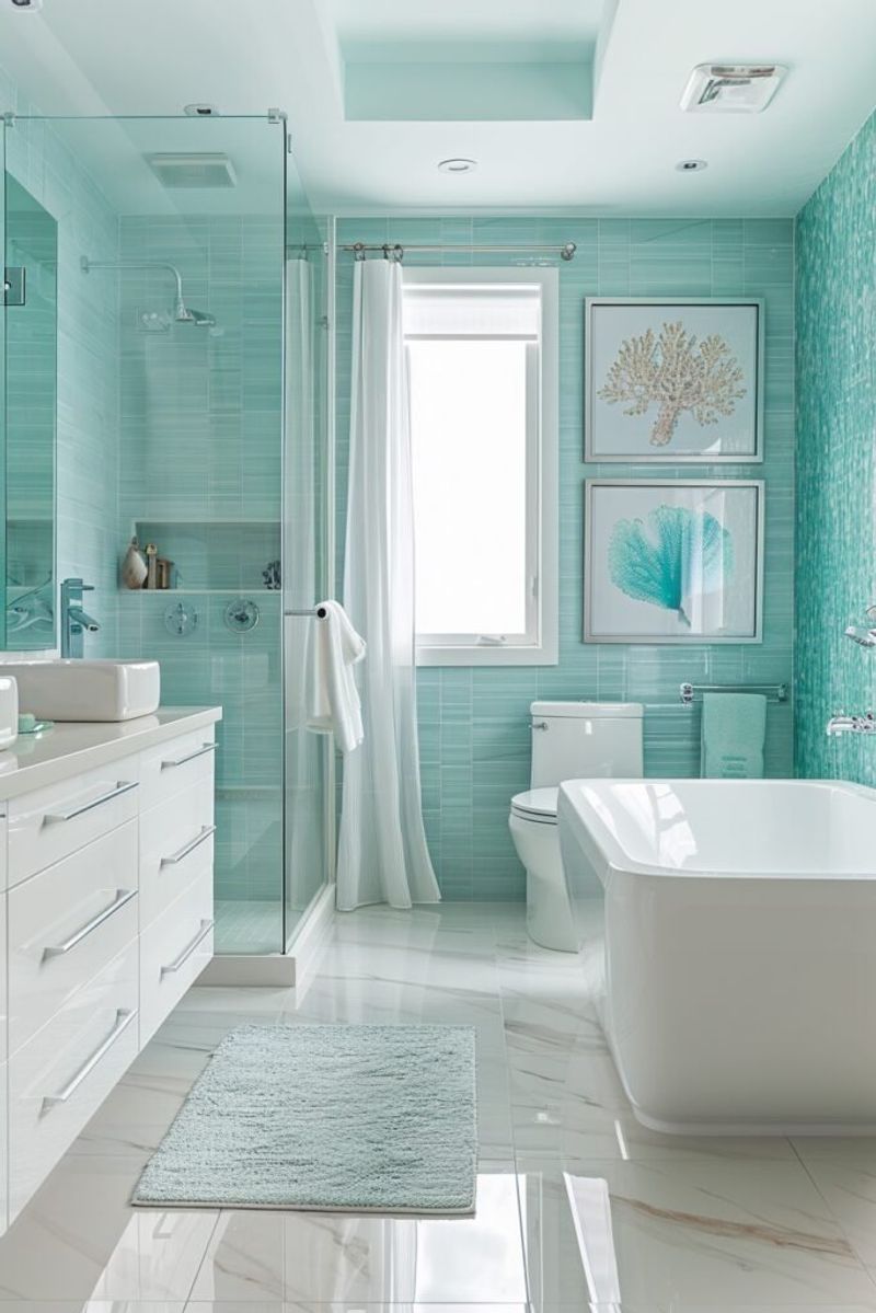
Reminiscent of frothy sea foam against pale sand, this delicate color combination creates spaces that feel light, airy, and incredibly peaceful. The soft aqua brings a hint of color without overwhelming the senses.
Perfect for smaller rooms or spaces that receive limited natural light, this palette visually expands boundaries. Layering different shades of white – from warm ivory to cool alabaster – adds subtle dimension while maintaining the serene, uncluttered aesthetic that defines coastal style.
6. Pale Dune and Sea Lavender
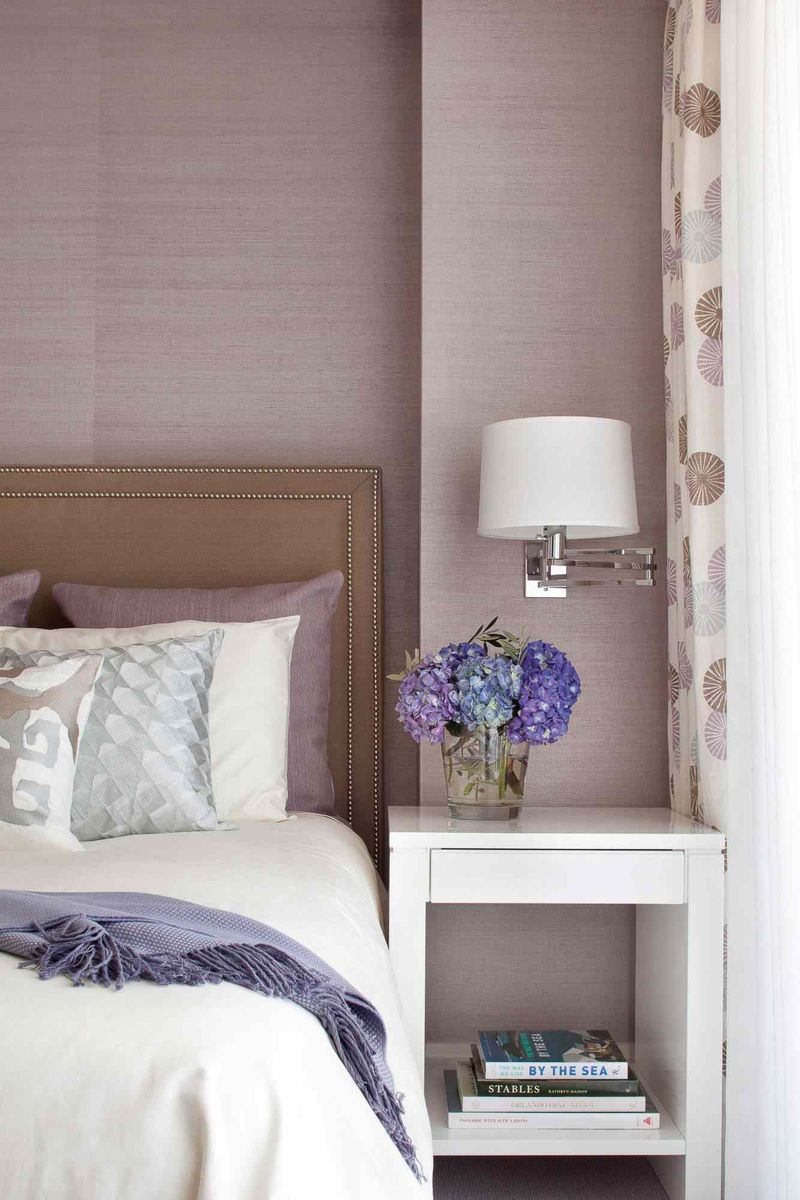
Inspired by coastal meadows where wild lavender meets sandy paths, this unexpected color combination offers a fresh take on beach-inspired decor. The neutral dune color provides a warm foundation while the muted lavender adds a subtle, sophisticated accent.
Especially lovely in bedrooms or reading nooks, this palette promotes relaxation and gentle contemplation. Add textural elements like chunky knit throws, raw linen, and matte ceramics to enhance the organic, windswept quality that makes coastal landscapes so appealing.
7. Weathered Teak and Ocean Blue
Channel the spirit of old sailing vessels with this rich, character-filled palette. The warm, golden-brown tones of weathered teak create a cozy foundation, while various shades of ocean blue add depth and maritime charm.
Particularly effective in living rooms or studies, this combination feels both masculine and timeless. Incorporate leather elements, brass hardware, and vintage nautical maps or instruments to enhance the seafaring narrative while maintaining an elegant, lived-in comfort.
8. Seashell Pink and Soft Sand
Strolling along the shore and collecting delicate pink shells inspired this gentle, feminine palette. The blush tones add warmth and subtle color while the neutral sand creates a soothing backdrop that feels inherently coastal.
Ideal for bedrooms or powder rooms, this combination feels fresh yet timeless. Layer in different textures – perhaps a cashmere throw, mother-of-pearl accessories, or a sisal rug – to create visual interest while maintaining the delicate, harmonious balance.
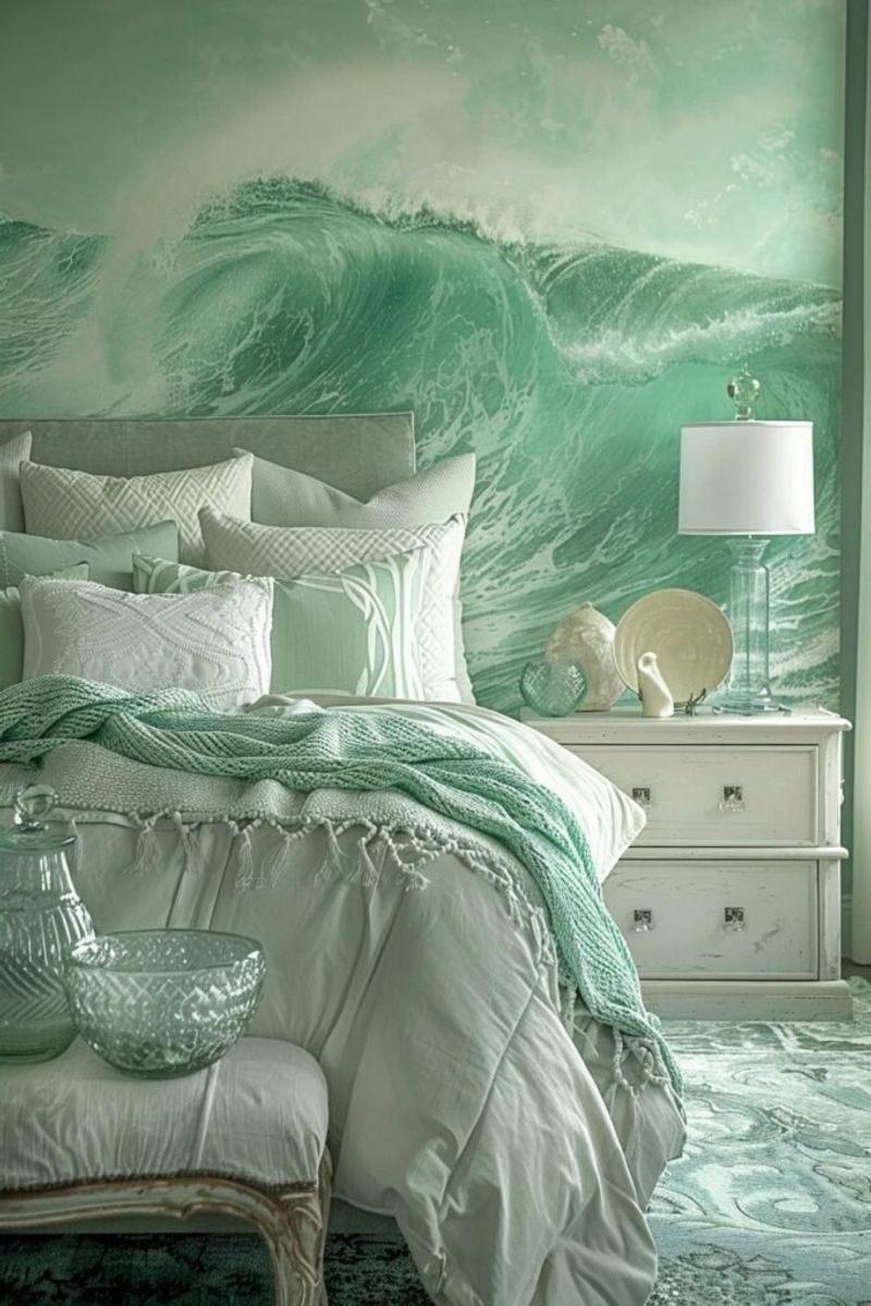
9. Seafoam Green and Driftwood Beige
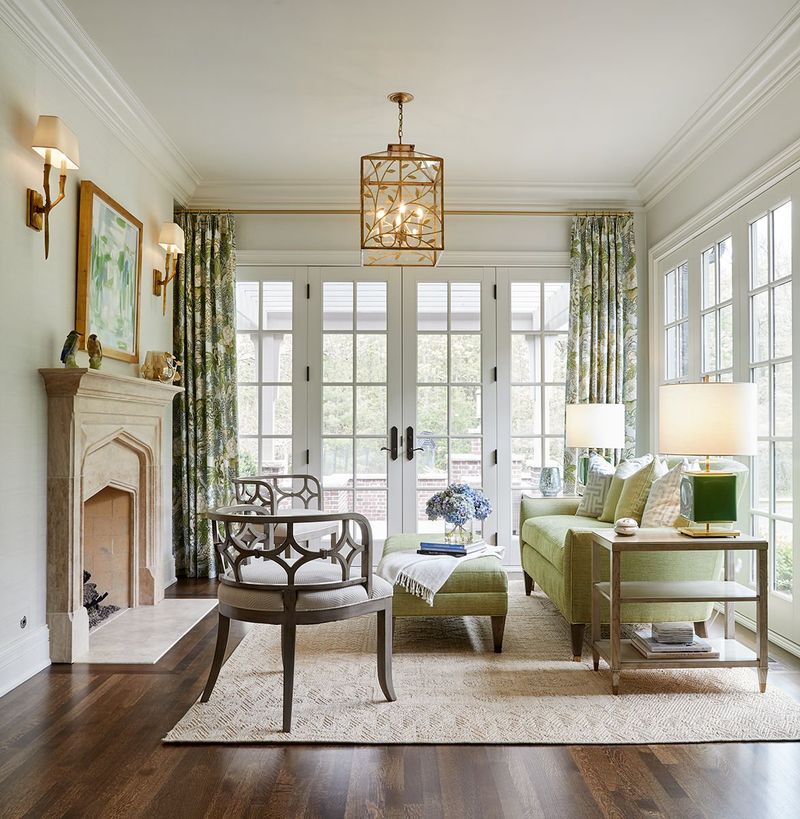
Gentle waves leaving behind traces of foam on sandy shores inspired this subtle, nature-based palette. The soft green has a vintage quality that feels nostalgic yet fresh, while the warm beige grounds the space.
This combination works wonderfully in sunrooms or breakfast nooks where morning light can enhance the delicate color play. Incorporate plenty of plants – perhaps succulents or air plants – to reinforce the connection to coastal ecosystems and add life to the space.
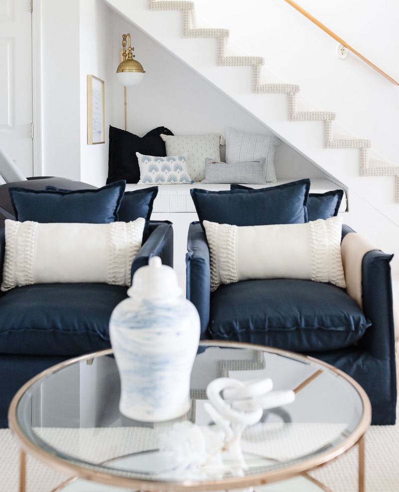
10. Indigo Blue and Sandy Taupe
Twilight at the beach – when deep blue skies meet sandy shores – inspired this sophisticated color scheme. The rich indigo adds depth and drama while the warm taupe provides balance and approachability.
Layer in textural elements like chunky knit throws, sisal rugs, and linen upholstery to enhance the coastal connection without relying on obvious beach motifs.
11. Misty Gray and Pale Blue
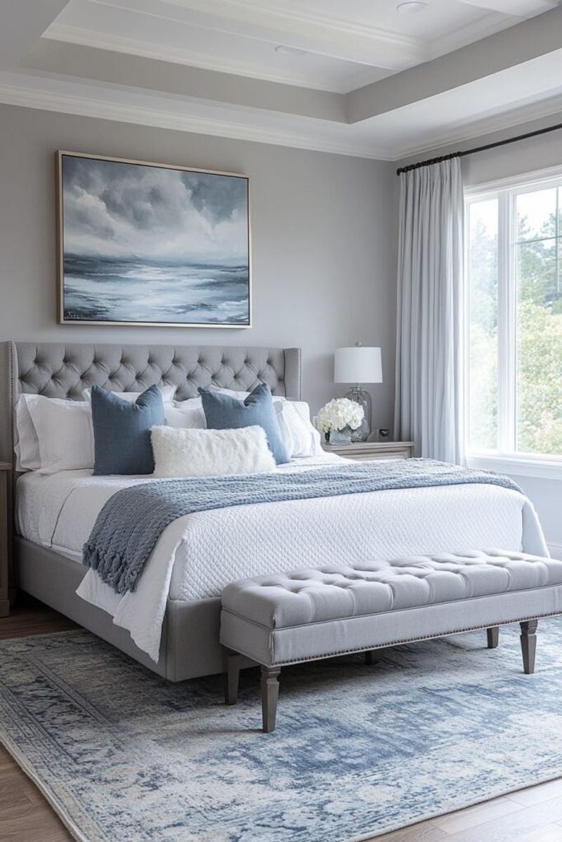
Foggy coastal mornings when the boundaries between sky, sea, and land blur into a dreamy haze inspired this ethereal color scheme. The soft gray creates a neutral foundation while whispers of pale blue add subtle dimension.
This combination creates spaces that feel peaceful and contemplative. Consider incorporating reflective elements like mirrors or glass to enhance the misty quality, and keep furnishings simple and streamlined to maintain the serene, uncluttered aesthetic.
12. Sunset Orange and Dusky Blue
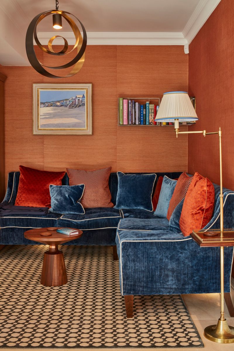
Capturing that magical moment when the sun dips below the horizon and paints the sky and sea in dramatic hues, this bold palette brings energy and warmth to any space. The vibrant orange evokes joy while the dusky blue adds sophistication.
Use this combination strategically – perhaps with neutral walls and furniture enhanced by orange and blue accessories that can be swapped seasonally. This approach allows you to enjoy the coastal sunset vibe without committing to bold permanent elements.
13. Pale Sage and Bleached Sand
Coastal dunes dotted with resilient sage plants inspired this subtle, organic color scheme. The soft green has a gray undertone that feels sophisticated rather than bright, while the nearly-white sand color creates airiness and light.
This combination works beautifully in transitional spaces like hallways or entryways. Consider incorporating natural fiber rugs, woven baskets, and botanical prints to enhance the connection to coastal landscapes while maintaining a refined, understated aesthetic.
14. Maritime Blue and Cloud White
Gazing up at billowing white sails against a perfect blue sky inspired this classic nautical palette. The saturated blue feels energetic yet timeless, while the crisp white adds freshness and light.
Particularly effective in children’s rooms or outdoor living spaces, this combination feels both playful and sophisticated. Add red accents sparingly for an extra nautical touch, or keep it simple with just blue and white for a more serene, streamlined interpretation of maritime style.
15. Tropical Teal and Coconut White
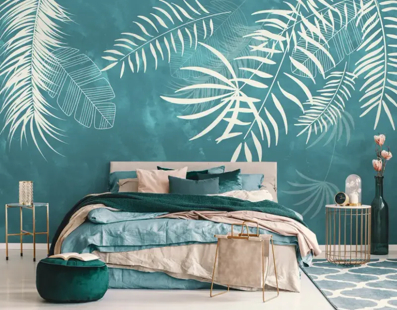
Swaying palm trees against turquoise waters inspired this vibrant yet balanced palette. The rich teal brings energy and personality while the warm white prevents the space from feeling overwhelming or chaotic.
Especially effective in dining rooms or kitchens where a bit of energy is welcome, this combination feels fresh and inviting. Incorporate natural materials like rattan, bamboo, and tropical hardwoods to enhance the island vibe while maintaining a sophisticated edge.