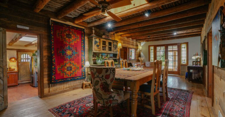
10 Kitchen Floor Colors That Make Your Space Look Small (Plus 5 Options Making It Even Worse)
I’ve made my fair share of design missteps over the years, but nothing shocked me more than how much a bad floor color can mess with a kitchen.
What seemed like a simple decision ended up making the whole room feel darker and tighter. Turns out, certain shades can completely throw off the balance of your space, making it feel cramped or closed-in.
If you’re dreaming of a kitchen that feels airy and open, floor color matters way more than you might think.
1. Dark Chocolate Brown
Dark brown floors absorb light instead of reflecting it, creating a cave-like effect in your kitchen. The deep tones make walls appear closer than they actually are.
If you combine these floors with dark cabinets, you’ll create a kitchen black hole where space disappears forever! Even with good lighting, chocolate brown flooring creates heavy visual weight that anchors the room downward.
2. Jet Black Tiles
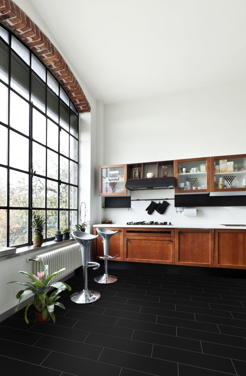
Black floors might look sleek in magazines, but in real kitchens, they’re space-eaters! Light vanishes into these floors like quarters into a sofa cushion.
Your kitchen will feel like it’s wearing a too-tight turtleneck. Sometimes people think black creates drama, but the only drama you’ll get is wondering where your kitchen space went!
Black flooring creates a bottomless pit effect that shrinks the visual boundaries.
3. Busy Patterned Vinyl
Where did your kitchen go? It disappeared under that dizzying floor pattern! Busy patterns with contrasting colors create visual chaos that overwhelms the space.
Your eyes never rest when looking at these floors, making the room feel cluttered even when it’s clean.
Though some patterns look amazing in samples, when spread across your entire kitchen floor, they become the spatial equivalent of wearing horizontal stripes to Thanksgiving dinner.
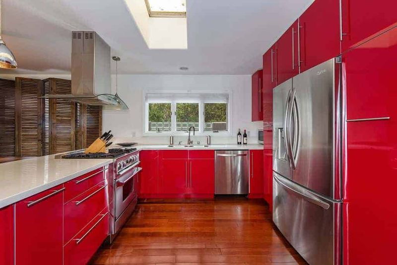
4. Cherry Red Hardwood
Cherry red floors scream for attention like a toddler at bedtime. This demanding color creates a bottom-heavy room that feels compressed and tight.
The intensity of red advances visually, making walls seem closer than they are. If you want your kitchen to feel like a tiny red-bottomed boat, go ahead with cherry floors!
Otherwise, this warm but overwhelming tone will shrink your kitchen faster than a wool sweater in hot water.
5. Large Format Dark Gray Tiles
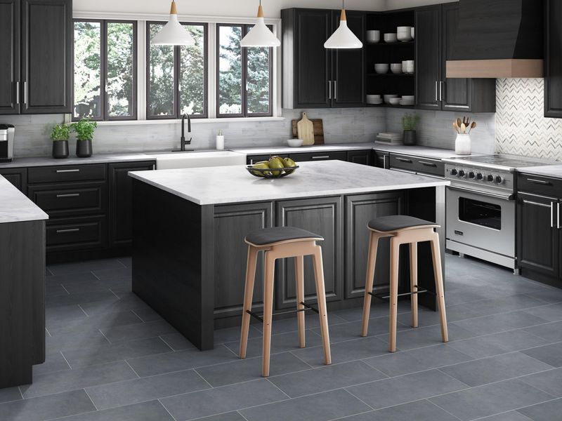
Gray might seem neutral, but dark gray floors are sneaky space-stealers. They create a heavy base that weighs down your kitchen visually.
Large format tiles with dark grout lines compound the problem by creating a grid effect that boxes in your space. Your kitchen will feel like it’s wearing concrete shoes!
The industrial vibe might be trendy, but your kitchen square footage will seem to shrink with every shade darker you go.
6. High-Gloss Burgundy
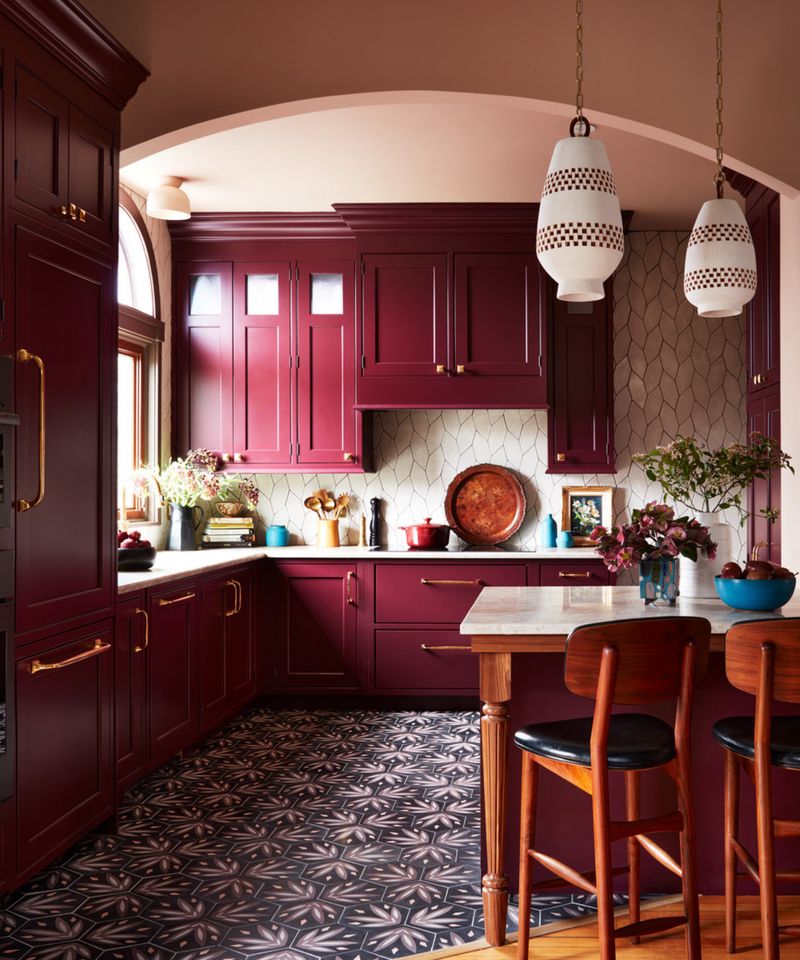
Shiny burgundy floors reflect like a mirror but not in a good way! The deep wine color absorbs light while the glossy finish creates distracting reflections.
Your kitchen will feel like a tiny wine cellar instead of a cooking space. Though the rich color might seem luxurious, it creates a bottom-heavy effect that compresses your room visually.
The reflective quality also creates confusing spatial cues that make the room feel chaotic and smaller.
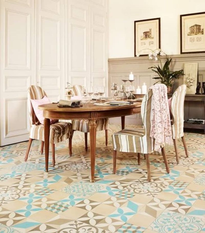
7. Multi-Colored Mosaic Tiles
Rainbow floors might sound fun until they make your kitchen disappear! Multi-colored mosaics create visual busyness that overwhelms the space.
Your eyes never know where to rest, making the room feel cluttered and small. If your kitchen floor looks like confetti exploded, it’s creating visual noise that shrinks your space.
The competing colors break up the floor plane, preventing that expansive, flowing feeling that makes rooms feel larger.
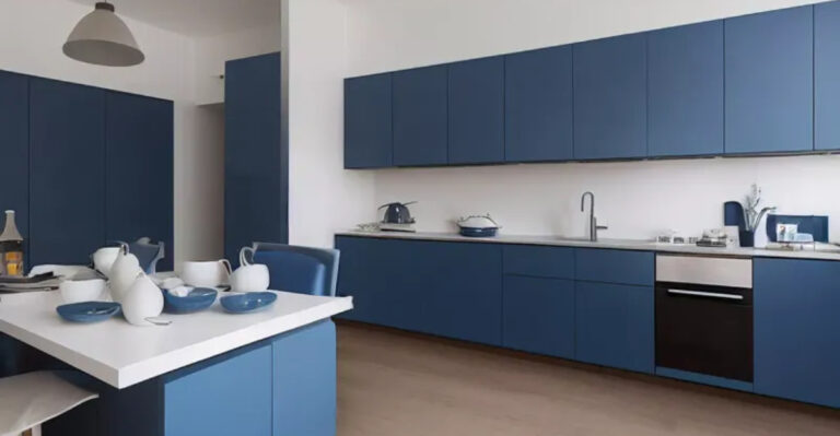
8. Navy Blue Ceramic
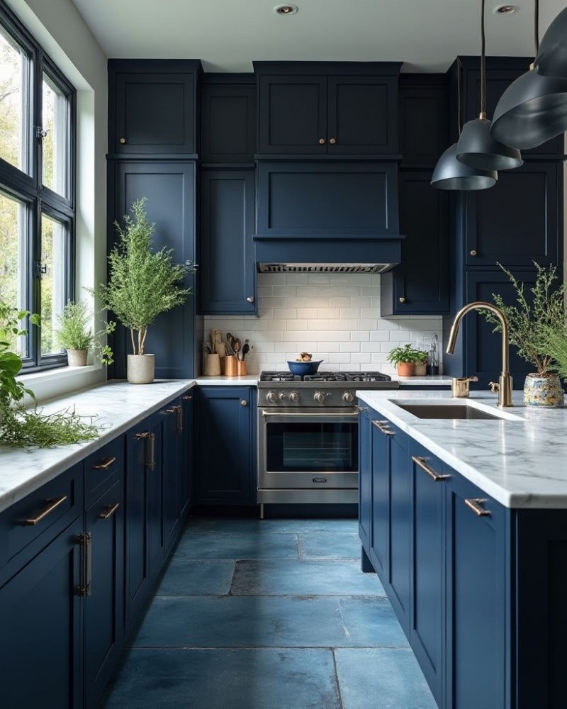
Navy might work on Yankees caps, but on kitchen floors, it’s a space-sucker! This deep blue creates a bottomless ocean effect that makes your kitchen feel tiny.
The dark tone absorbs light instead of reflecting it, making walls seem closer together. While navy can look sophisticated, it creates a heavy visual weight that anchors the room down.
Your kitchen will feel like it’s wearing a wool suit in summer – restricted and uncomfortable.
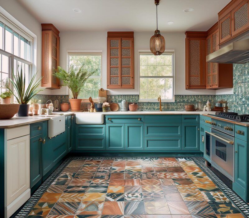
9. Terracotta With Dark Grout
Terra cotta tiles might remind you of sunny Mediterranean villas, but paired with dark grout, they chop your kitchen into tiny visual pieces! Each tile becomes highlighted, creating a busy grid effect.
Your floor transforms into a checkerboard that draws too much attention. Though the warm color is lovely, the high contrast with dark grout lines breaks up the visual flow of your space.
The result? A kitchen that feels like it’s wearing fishnet stockings – all lines and boundaries!
10. Diagonal Black And White Checkerboard
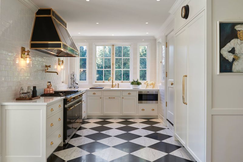
Chess fans beware! This classic pattern might look cool in diners, but it turns your kitchen into a dizzying optical illusion.
The high contrast between black and white creates visual vibration that’s exhausting to look at. Your eyes bounce from square to square, never finding rest.
Though designers love this pattern for making statements, the statement your kitchen makes will be “Help! I’m trapped in a tiny checkered box!” The diagonal layout only adds to the visual confusion.
11. Glossy Blood Red Tiles
Nothing says “shrinking kitchen” quite like floors that look like a crime scene! Glossy blood red creates an alarming visual that dominates the space.
The intense color advances toward the eye, making walls seem closer than they are. Your kitchen will feel like it’s closing in on you!
The reflective quality adds another layer of visual confusion, creating distracting highlights and shadows that further fragment the space.
12. Metallic Copper Epoxy
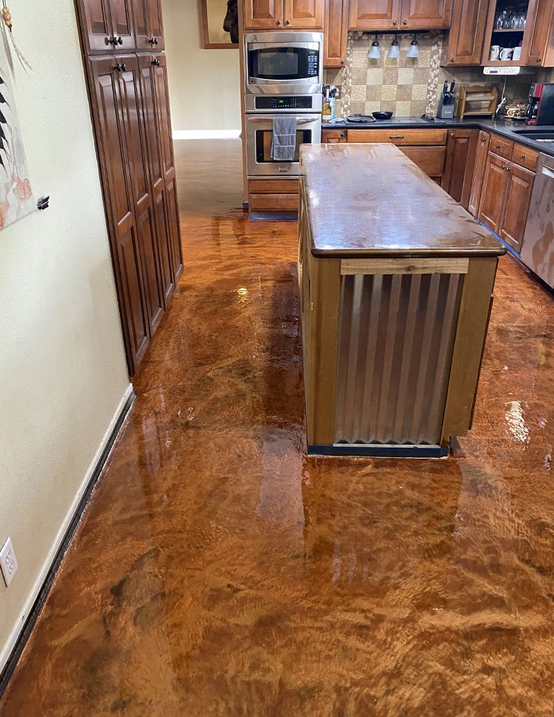
Copper floors might seem luxurious, but they’re space-stealing showoffs! The reflective metallic finish creates confusing light patterns that disorient the eye.
Your kitchen will feel like the inside of a penny jar – cramped and chaotic. Though the warm tone is appealing, the high-shine finish fragments the visual plane of your floor.
Every footstep becomes visible, creating a busy, distracting surface that makes your kitchen feel like a fun house mirror rather than a cooking space.
13. Purple Stained Concrete
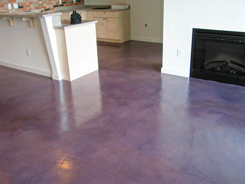
Purple might be royal, but on floors, it’s a space-stealing tyrant! This unconventional color creates a heavy, unnatural base that dominates the room.
Your kitchen will feel like it’s floating on an alien planet instead of being a comfortable cooking space. The unusual color draws attention downward, making the ceiling feel lower.
Though concrete can be industrial-chic, this purple variation creates a visually dense foundation that compresses your kitchen from below.
14. 3D Illusion Vinyl
Floors with 3D patterns might seem fun until they make you dizzy reaching for the refrigerator! These optical illusions create visual chaos that confuses the brain.
Your kitchen will feel like a video game level rather than a functional space. Though these floors are conversation starters, the conversation will mostly be “Why does my kitchen feel so small and disorienting?”
The constant visual movement prevents your eye from perceiving the true dimensions of the room.
15. High-Contrast Herringbone
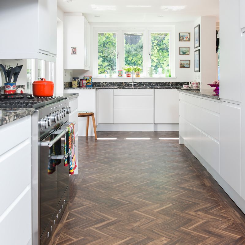
Herringbone patterns can be elegant, but in high-contrast colors, they turn your kitchen into a zigzagging nightmare! The busy visual effect creates restless energy underfoot.
Your eyes follow the pattern rather than seeing the whole space. If you want your kitchen to feel like it’s wearing a too-tight tweed jacket, go for it!
Otherwise, this high-energy pattern with sharp color differences chops up your floor plane, preventing that spacious, continuous feeling that makes rooms feel larger.