
Ready to transform your space without breaking the bank or calling in professionals? Over the years, we’ve gathered some seriously game-changing decorating wisdom.
These tried-and-true tips have helped countless readers turn ordinary rooms into stunning spaces that reflect their unique personalities. Grab your notepad—you’ll want to remember these!
1. The 60-30-10 Color Rule
Struggling with color choices? This simple formula is your new best friend! Use your dominant color for 60% of the room (walls, large furniture), a secondary color for 30% (accent chairs, curtains), and an accent color for 10% (accessories, artwork). When these proportions are balanced, your space feels harmonious rather than chaotic. Even design beginners can nail this technique!
2. Hang Curtains High and Wide
Would you believe something as simple as curtain placement can completely transform your room? Mount curtain rods close to the ceiling (not the window frame) and extend them 8-12 inches beyond the window’s width on each side. This clever trick creates the illusion of taller ceilings and bigger windows. Your space instantly feels more luxurious and spacious!
3. The Rule of Threes
Odd numbers are magical in decorating! Grouping items in threes (or fives) creates visual interest and balance that even-numbered groupings can’t match. Try arranging candles, vases, or frames in triangular formations. Your brain finds asymmetrical arrangements more appealing and memorable than perfectly symmetrical ones. This simple trick works for shelves, coffee tables, and mantels!
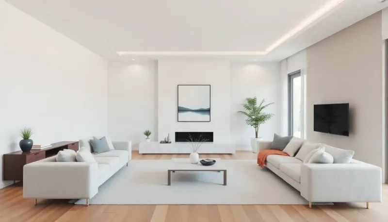
4. Create Conversation Areas
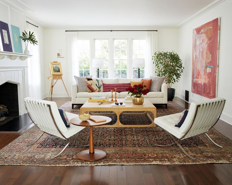
Forget pushing all furniture against walls! Instead, arrange seating so people face each other, ideally no more than 8 feet apart. This creates natural conversation zones that feel intimate and welcoming. A well-designed conversation area might include a sofa facing two chairs with a coffee table between them. Your guests will naturally gravitate toward these cozy, functional arrangements.
5. Layer Your Lighting
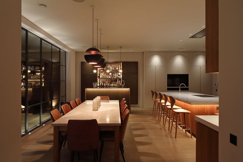
One ceiling light just won’t cut it! Professional designers always incorporate three lighting types: ambient (general overhead lighting), task (reading lamps, under-cabinet lights), and accent (table lamps, sconces) in every room. Multiple light sources at different heights create depth, eliminate harsh shadows, and allow you to adjust the mood. Your space will feel instantly more sophisticated!
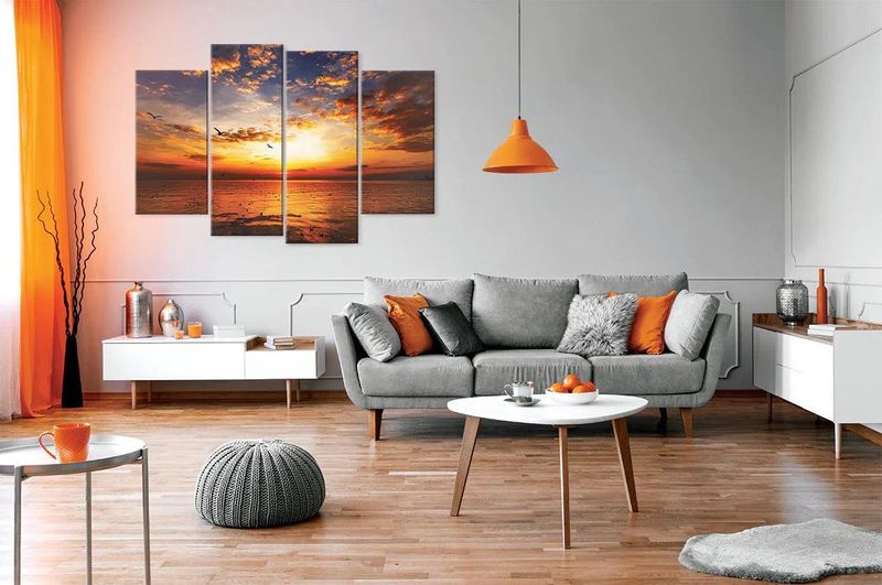
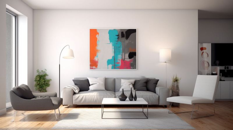
6. The 2/3 Rule for Art
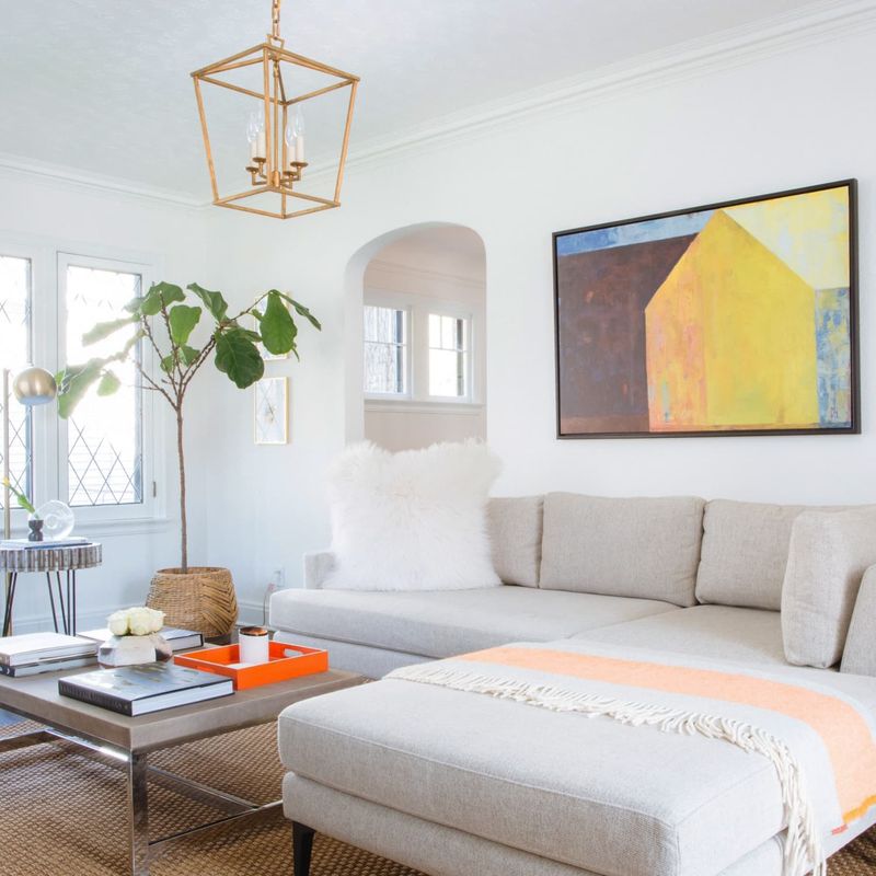
Wondering how big your artwork should be? For above a sofa or bed, choose pieces that are about two-thirds the width of the furniture beneath. This proportion creates visual balance without overwhelming the space. Art hung too small looks awkward and disconnected from the furniture below. Remember this simple ratio and you’ll nail perfect art placement every time!
7. Incorporate Natural Elements
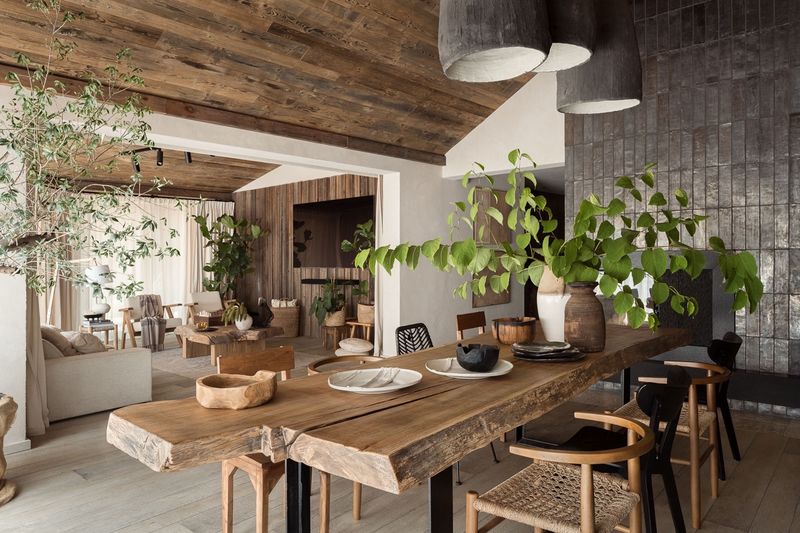
Houses without plants or natural materials often feel sterile and uninviting. Adding wooden pieces, stone accents, and especially live greenery brings warmth and life to any space instantly. Even if you lack a green thumb, try low-maintenance options like snake plants or pothos. Natural elements connect us to the outdoors and have been proven to reduce stress levels!
8. Follow the Rug Rules
A properly sized rug anchors your space and defines zones in open floor plans. In living rooms, all furniture should either sit completely on the rug or have front legs on it. For dining rooms, ensure the rug extends at least 24 inches beyond the table edge. Too-small rugs are among the most common decorating mistakes! They make spaces feel disconnected and awkward.
9. Mix Textures, Not Just Colors
Even monochromatic rooms pop when you incorporate varied textures! Combine smooth (glass, polished metal), rough (jute, reclaimed wood), and soft elements (velvet, wool) to create depth and visual interest. Without texture variation, rooms fall flat regardless of color scheme. Try adding a chunky knit throw to a leather sofa or placing a rough ceramic vase on a glossy table!
10. The Cantaloupe Rule
Here’s a quirky but effective tip: avoid decorative accessories smaller than a cantaloupe! Tiny knickknacks create visual clutter and collect dust. Instead, choose fewer, larger statement pieces for a cleaner, more sophisticated look. If you love small items, group them together on a tray or in a shadow box. This creates one larger visual unit rather than scattered small objects.
11. Perfect Pillow Combinations
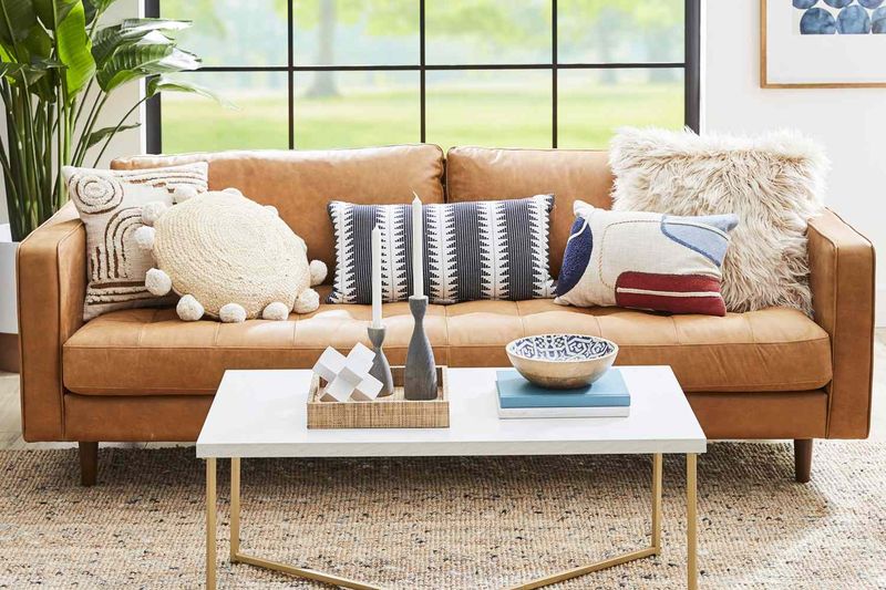
Never underestimate the power of perfectly arranged pillows! For a designer look, use odd numbers (three or five) with varying sizes, patterns, and textures. Start with largest pillows at the outer edges, working inward to smallest. Mix solids with patterns following the 60-30-10 rule: 60% dominant pattern, 30% secondary pattern, 10% accent pattern or solid. Your couch will instantly look magazine-worthy!
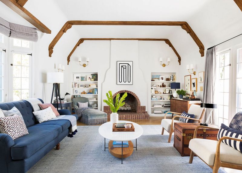
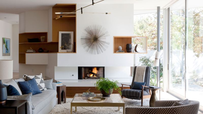
12. Create a Focal Point
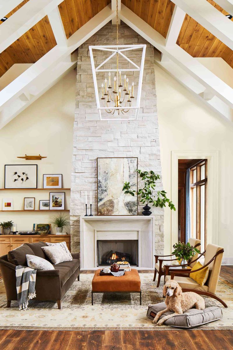
Every room needs something that immediately draws the eye! Without a focal point, spaces feel directionless and unmemorable. Natural focal points include fireplaces or large windows, but you can create one with an oversized artwork, dramatic light fixture, or bold furniture piece. Arrange other elements to complement—not compete with—your focal point for a cohesive, purposeful design.
13. The 10-30-60 Finish Rule
Balance is key when mixing finishes! Aim for 10% shiny (mirrors, chrome, glass), 30% matte (flat paint, linen), and 60% in-between (leather, satin fabrics). Too much shine feels cold and clinical; too much matte appears flat and lifeless. This balanced approach creates visual interest while maintaining harmony. Your eye needs variety but also cohesion to feel comfortable in a space.
14. Leave Breathing Room
Resist the urge to fill every inch! Designers call empty space “negative space” and it’s crucial for a balanced, peaceful environment. Allow at least 15% of surfaces to remain empty, and ensure furniture has room to “breathe” with clear pathways around it. Overcrowded rooms feel chaotic and smaller than they actually are. Your eyes—and mind—need rest spots to truly appreciate your beautiful pieces.
15. Follow the Rule of Sight Lines
What’s the first thing you see when entering a room? That view should be intentional and pleasing! Consider sight lines from doorways and main seating positions when arranging furniture and art. Avoid placing the backs of large furniture pieces toward entrances when possible. Instead, create an inviting pathway that naturally guides the eye through the space to something beautiful.
16. Scale Your Furniture Properly
Furniture that’s too large or too small for your space creates awkward, uncomfortable rooms. Measure before buying and leave at least 30-36 inches for walkways and 18 inches between the coffee table and seating. For visual harmony, vary furniture heights. If everything is the same level, your eye gets bored! Mix low seating with taller bookcases or floor lamps for dynamic interest.
17. Use the 80/20 Style Rule
Want a timeless home that still feels fresh? Keep 80% of your decor classic (neutral furniture, traditional architecture) and 20% trendy (accent pieces, art, smaller items that are easier to swap out). This approach gives you freedom to experiment with current trends without major investments. When the trend fades, simply update your 20% while maintaining your timeless foundation!
18. Test Paint Colors Properly
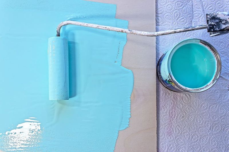
Never choose paint from tiny swatches! Colors look dramatically different depending on lighting, room size, and surrounding elements. Paint large sample boards (at least 2’×2′) and move them around the room at different times of day. View them against existing furniture and flooring. What looks perfect in the store often appears completely different at home where lighting conditions vary throughout the day.