17 Coffee Table Mistakes That Date Your Entire Living Room
Your coffee table sits at the heart of your living room, making a huge statement about your style and taste.
Unfortunately, many of us are unknowingly making mistakes that can instantly make our living spaces look outdated or poorly designed.
From cluttered arrangements to mismatched proportions, these common coffee table blunders can drag down even the most beautiful rooms.
1. Glass Table Overload
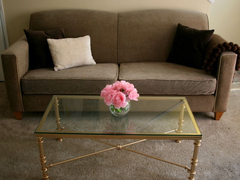
Remember the 80s and 90s when every home showcased a glass-topped coffee table with gold or brass edges? While glass tables have their place, clinging to dated designs with ornate metal frames instantly ages your space.
Modern glass options feature cleaner lines and contemporary materials like matte black metal or natural wood bases.
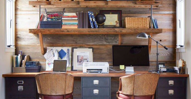
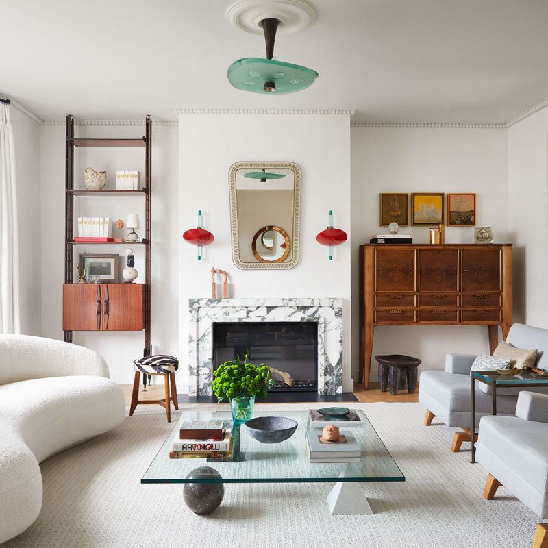
2. Matchy-Matchy Furniture Sets
Walking into a room where the coffee table perfectly matches the end tables, entertainment center, and bookshelf feels like stepping into a furniture showroom—not in a good way. This coordinated approach lacks personality and creativity.
Design-savvy homeowners know that intentional mixing creates visual interest. Try pairing a wooden coffee table with metal side tables, or a painted piece with natural wood accents elsewhere in the room. This curated approach feels more collected and timeless.
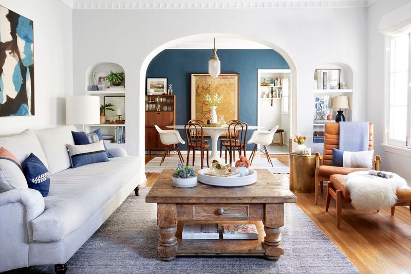
3. Too-Small Tables
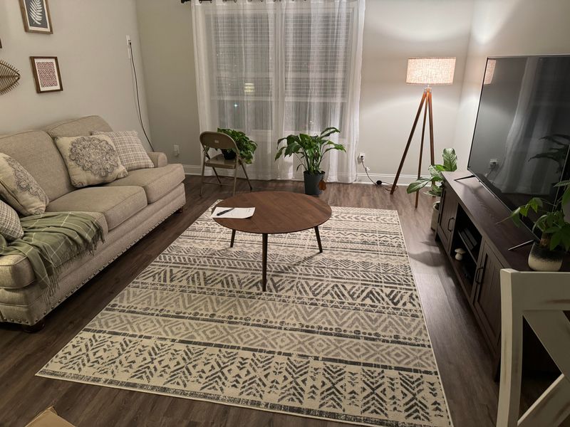
Imagine trying to balance drinks, books, and remotes on a tiny surface that’s constantly overflowing. A miniature coffee table in a spacious seating area creates an awkward, unbalanced look that screams “design mistake.” For proper proportions, your coffee table should ideally be about two-thirds the length of your sofa. This gives you ample space for both function and style, while maintaining visual harmony in your living room.
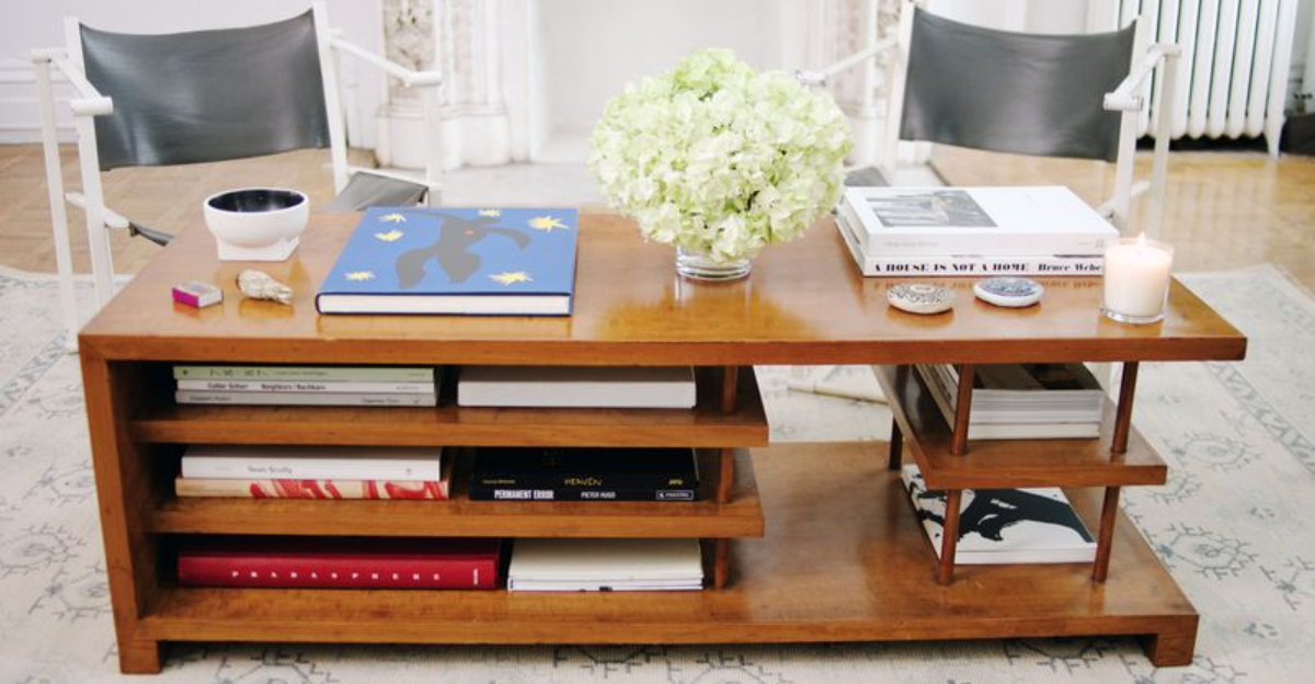
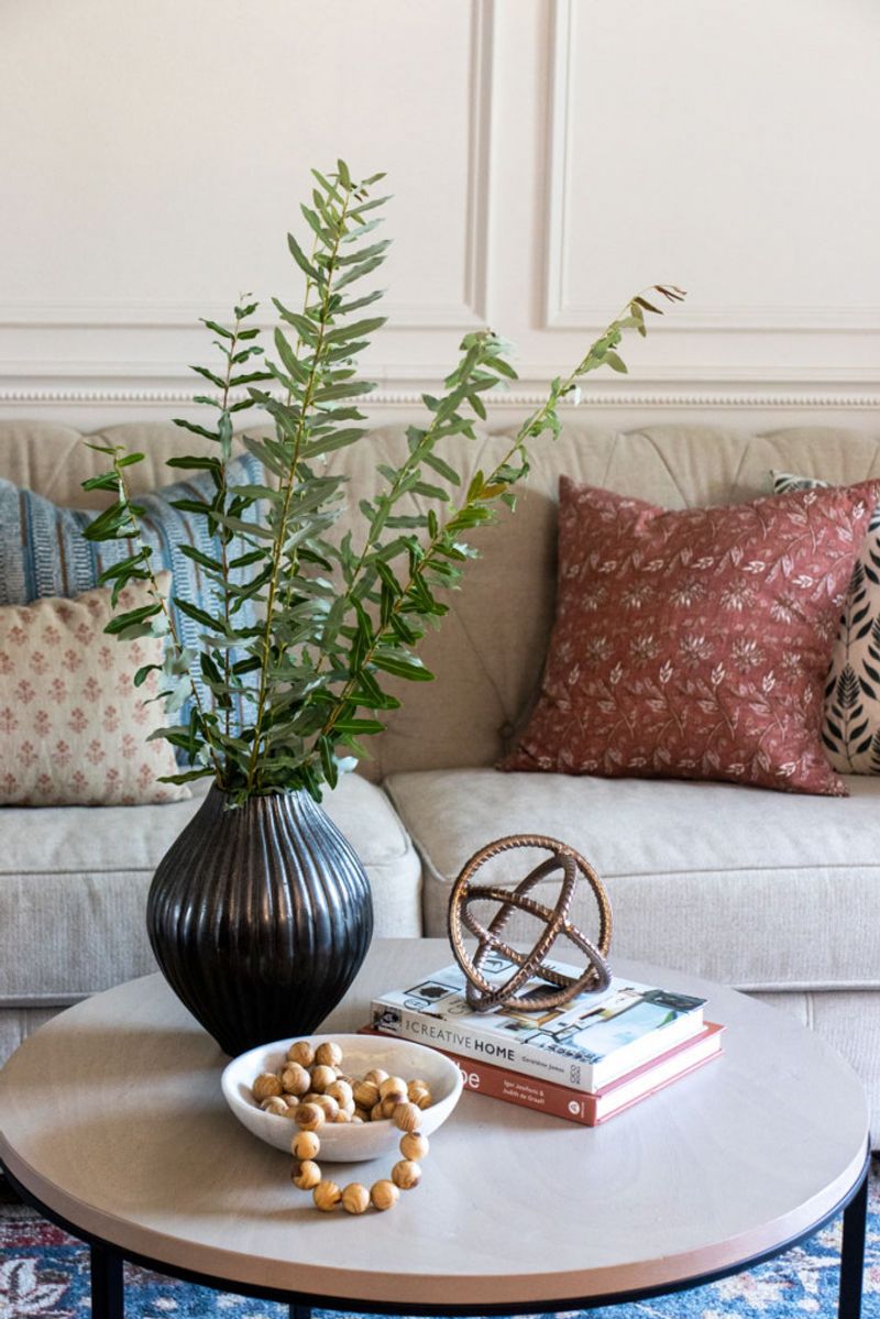
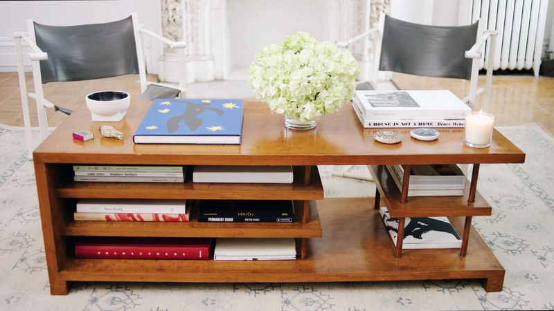
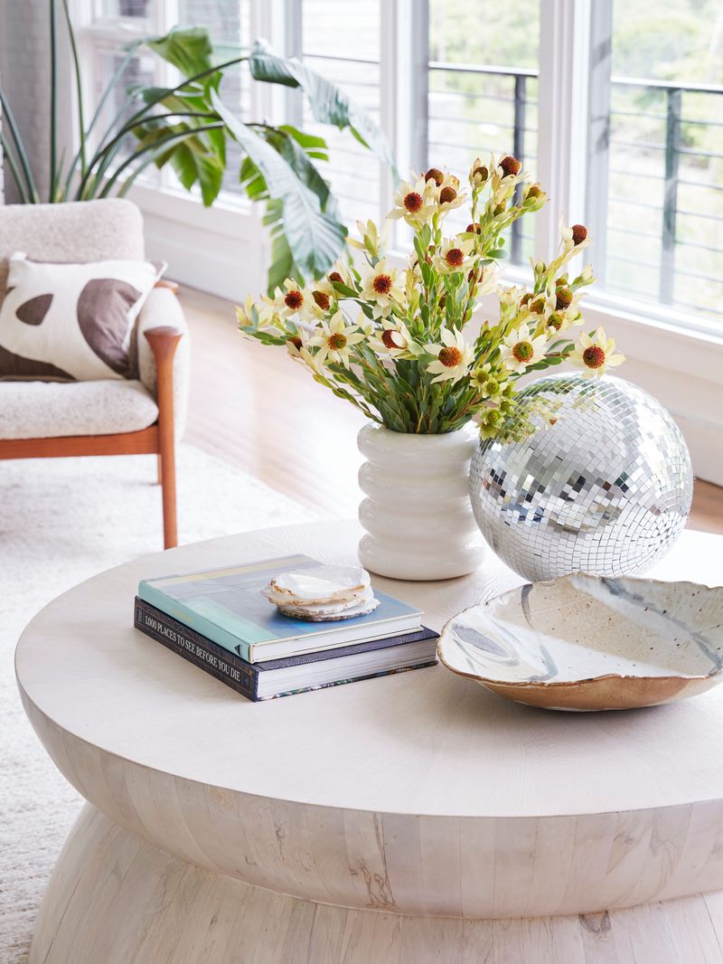
4. Cluttered Tabletop
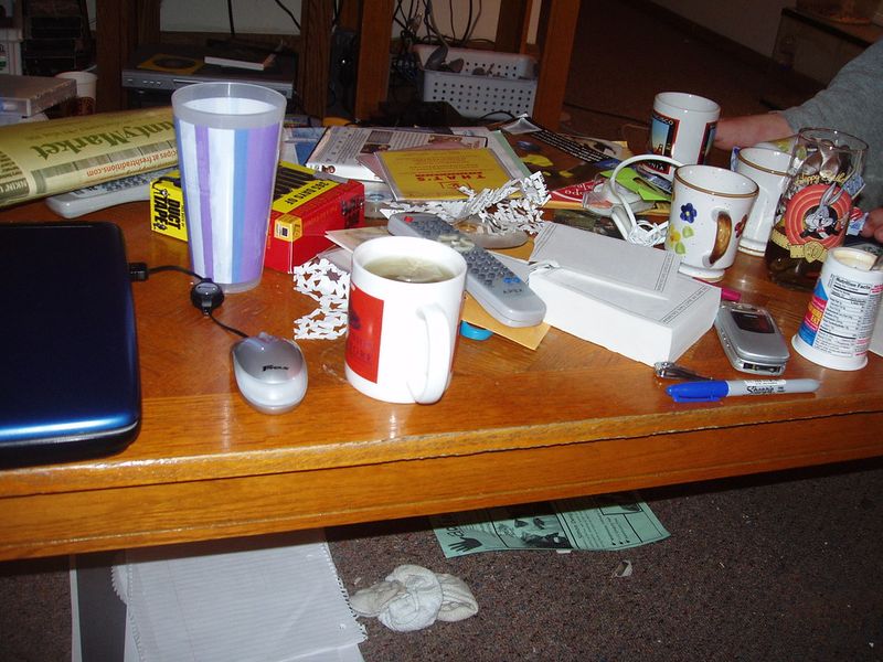
Has your coffee table become a landing pad for mail, magazines, remote controls, and random household items? Nothing dates a living room faster than a surface drowning in clutter.
Professional designers follow the rule of three—grouping decorative items in odd numbers creates visual harmony. Try arranging a stack of books, a small plant, and a decorative object with plenty of negative space between them. Keep everyday items tucked away in stylish boxes or baskets.
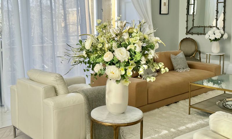
5. Oversized Centerpieces
You’ve seen them—those massive floral arrangements or sculptural pieces that dominate coffee tables, making conversation (and seeing the TV) nearly impossible. Gigantic centerpieces were popular in formal living rooms of decades past.
Today’s approach favors lower-profile arrangements that don’t block sight lines or conversation. A simple, low bowl of succulents or a cluster of varied-height candles provides interest without obstruction.
6. Ignoring Height Proportions
Nothing feels more awkward than reaching way down (or up) from your sofa to grab your coffee mug. When your coffee table height is dramatically different from your seating, both comfort and style suffer.
For perfect proportions, your table should sit about 1-2 inches below your sofa seat height. This creates a harmonious visual line while keeping drinks and snacks within comfortable reach. Adjustable-height options can be a smart solution for unusual seating arrangements.
7. Faux Books and Empty Boxes
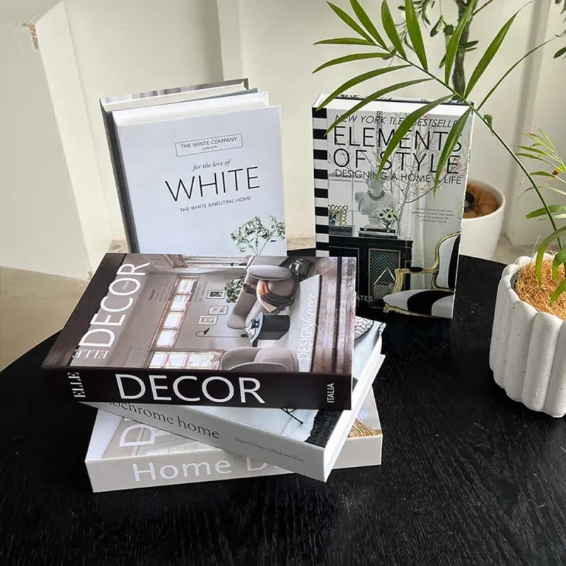
Let’s be honest—those decorative book stacks with generic titles or empty decorative boxes fooling nobody. This staging trick from the early 2000s reads as artificial and impersonal in today’s authenticity-focused design world.
Instead, display books you actually love and boxes that serve a purpose. Your coffee table should reflect your genuine interests and lifestyle. A photography book you actually flip through or a beautiful box storing your remote controls adds both personality and practicality.
8. Bulky Storage Ottomans
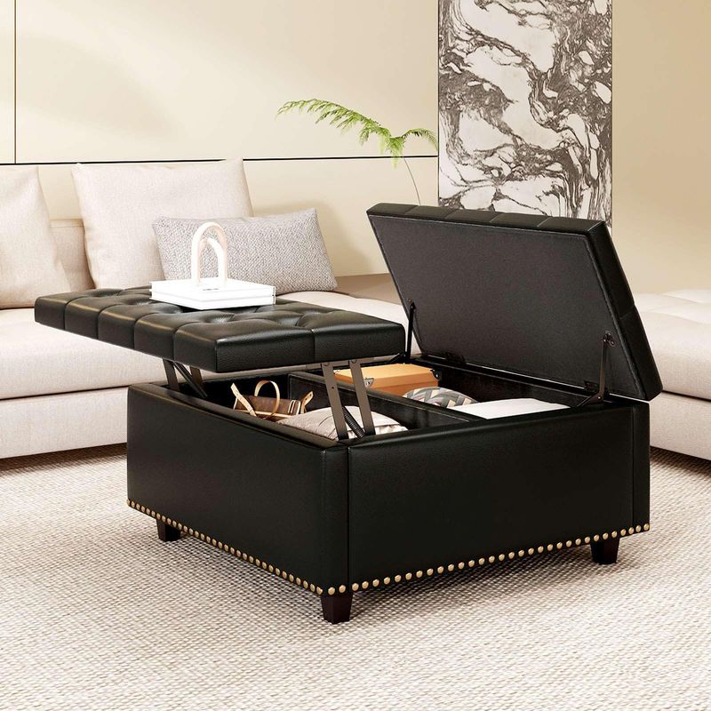
While the idea of hidden storage sounds appealing, those chunky, overstuffed leather or fabric ottomans with hinged tops were everywhere in the early 2000s—and now they’re a telltale sign of dated decor.
If you need storage, modern solutions include sleeker designs with cleaner lines or coffee tables with subtle drawers. Alternatively, consider a stylish basket tucked underneath an open coffee table. This approach maintains visual lightness while still providing practical storage.
9. Overly Themed Décor
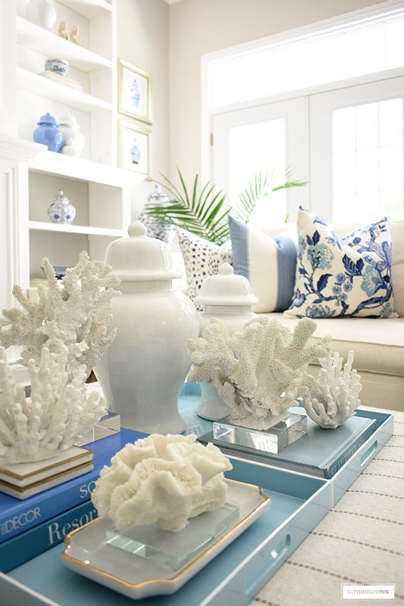
Beach-themed coffee tables with seashell collections or rustic tables covered in country-cottage accessories feel like relics from the 90s themed decorating craze. When your coffee table screams a specific theme, it dates your entire room.
Contemporary styling favors subtlety over obvious themes. If you love the beach, incorporate one elegant coral specimen rather than an entire ocean display.
10. Neglecting Functionality
Your gorgeously styled coffee table might look magazine-worthy, but if you have to clear everything off to use it, you’ve missed the point. Form without function is a classic decorating mistake that feels increasingly dated.
Modern living embraces practical beauty. Leave open space for actual coffee cups, books in progress, or game night activities. The most current approach balances carefully curated décor with plenty of usable surface area, acknowledging that beautiful spaces should also be livable.
11. Coaster Collections
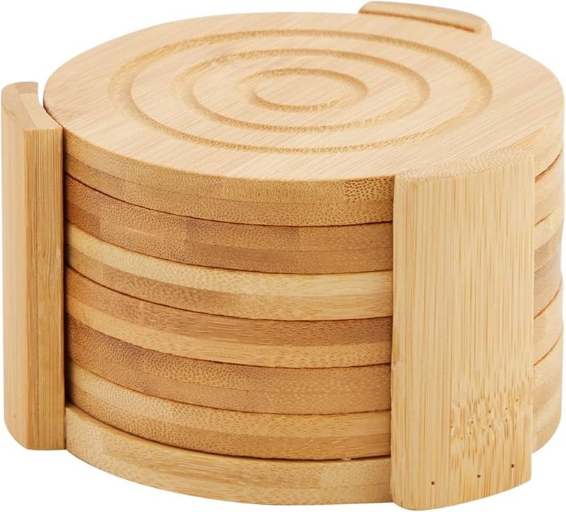
Those matching sets of coasters in their special holder have become a visual shorthand for outdated décor. Often featuring themed images or inspirational quotes, these uniform sets lack the personality and style of contemporary homes.
Instead of the matching set, try artisanal ceramic coasters, natural stone versions, or leather options that develop a beautiful patina.
12. Artificial Flower Arrangements
Faded silk flower arrangements collecting dust have become the universal symbol of stuck-in-time living rooms. Those permanent bouquets in heavy ceramic vases instantly signal that your décor hasn’t been updated in years.
Fresh flowers bring life and seasonal change to your space, but if maintenance is an issue, today’s high-quality dried arrangements or preserved botanicals offer beautiful alternatives.
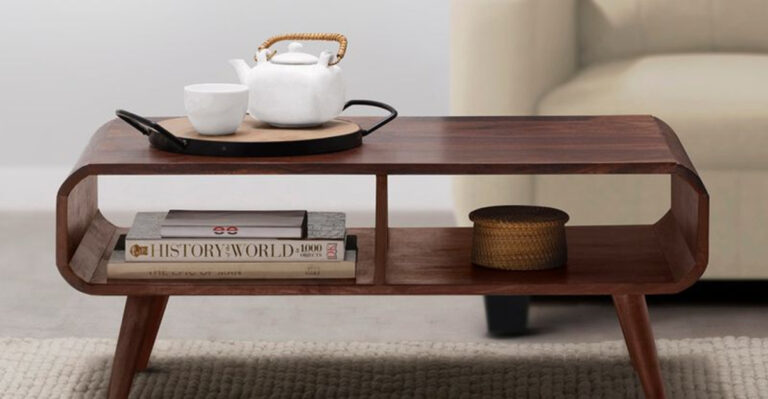
13. Outdated Materials
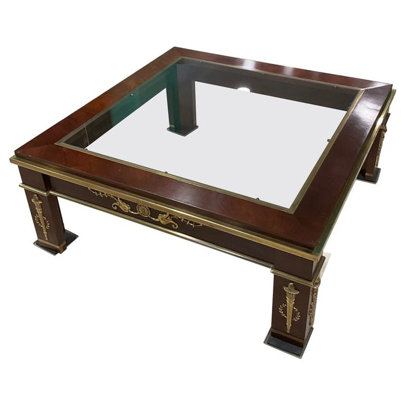
That glass-and-brass combination or heavily lacquered wood with visible wood grain patterns instantly identifies your coffee table as a relic from decades past. Materials and finishes cycle through popularity, and some have become clear time markers.
Today’s fresh options include natural woods with matte finishes, concrete, stone, or mixed material designs. Even traditional materials can look current when the silhouette is updated.
14. Forgetting Texture Variety
When everything on your coffee table shares the same finish—all shiny objects or all matte items—the result feels flat and one-dimensional. This uniform approach was common in catalog-decorated homes of previous decades.
Creating visual interest requires mixing textures thoughtfully. Try combining a smooth ceramic vessel with rough-hewn wooden beads and the soft texture of a small plant.
15. Formal Symmetrical Arrangements
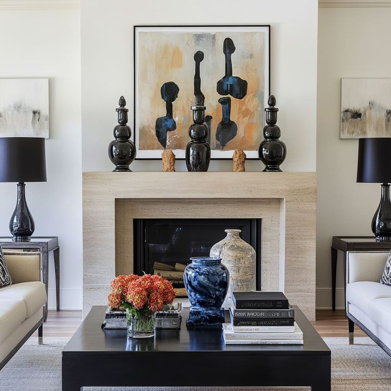
Perfect symmetry—identical items mirrored on either side of a centerpiece—gives off a stuffy, formal vibe reminiscent of staged model homes from the 90s. This rigid styling approach feels calculated rather than lived-in. Contemporary styling embraces thoughtful asymmetry.
Try arranging objects in organic groupings of varying heights and visual weights. This balanced-but-not-perfect approach creates a more relaxed, evolved feeling that suggests your space came together over time rather than in one shopping trip.
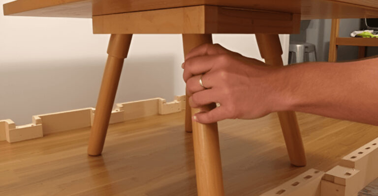
16. Neglected Table Legs
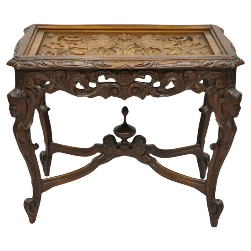
While you might focus on styling the tabletop, those chunky, ornate legs with scrollwork or fussy details are a dead giveaway of an outdated piece. Furniture silhouettes evolve dramatically over decades, and legs often reveal a table’s age.
Contemporary tables feature cleaner lines—whether sleek metal hairpin legs, minimalist wooden supports, or interesting geometric bases.
17. Mismatched Scale of Accessories

Tiny figurines scattered across a substantial coffee table or oversized décor dominating a delicate surface create visual confusion. This haphazard approach to accessorizing was common before interior design principles became widely understood.
Professional stylists consider the rule of thirds when decorating surfaces. Try grouping items of varying heights with the tallest being approximately one-third the height of the next tallest item.