10 Design Mistakes That Are Making Your Home Look Less Than Dreamy And 5 We’re Embarrassed Of
Ever walked into a room and felt something was off but couldn’t pinpoint what? It might be one of these common design blunders lurking in your space.
We’ve all made decorating mistakes, even professional designers! Let’s explore the top culprits making your home less magical and a few we’re sheepishly guilty of ourselves.
1. Pushing Furniture Against Walls
Creating a moat of empty space in your living room? Rookie move! Furniture needs breathing room and conversation-friendly arrangements.
Try floating your sofa or pulling chairs away from walls to create intimate gathering spots. This simple adjustment transforms cold, cavernous rooms into cozy, welcoming spaces that actually function for real life.
2. Mismatched Wood Tones Everywhere
Wood chaos creates visual confusion faster than you can say “eclectic.” When every piece sports a different finish, your eye has nowhere to rest.
Instead of the furniture rainbow, select 2-3 complementary wood tones and stick with them. Consistency creates harmony, while deliberate contrast pieces become statements rather than eyesores. Your brain will thank you for the visual break!
3. Artwork Hung Too High
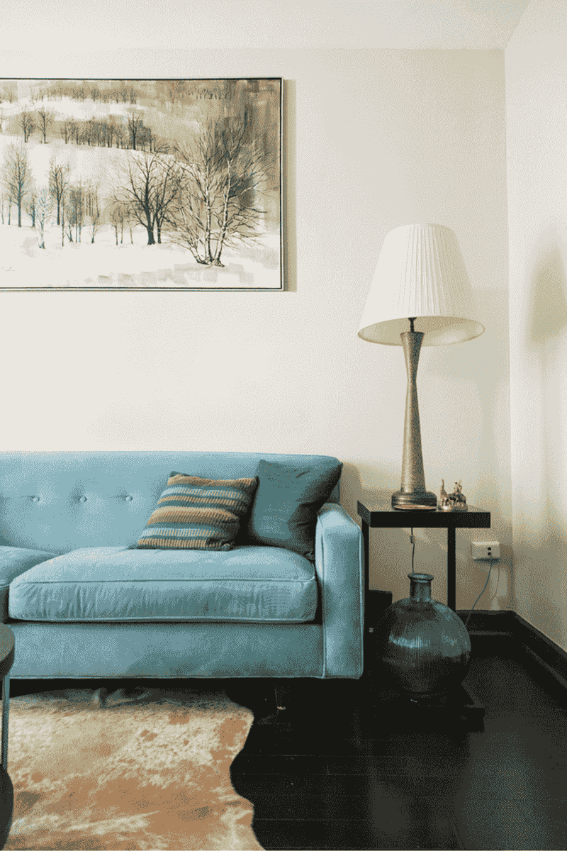
Why are your gorgeous paintings practically touching the ceiling? Art should connect with viewers, not hover mysteriously above them.
Gallery rules suggest hanging pieces at eye level—approximately 57-60 inches from the floor to the center of the artwork. When positioned correctly, art integrates with your space rather than floating awkwardly overhead like displaced UFOs.
4. Rug Island Syndrome
Undersized rugs make rooms feel disjointed and strangely proportioned, like little decorative postage stamps lost in space.
For living areas, ensure your rug is large enough that at least the front legs of all furniture rest comfortably on it. In bedrooms, extend the rug beyond the sides of the bed. This simple fix grounds your space and creates visual cohesion instantly.
5. Matching Furniture Sets
Walking into a room that looks exactly like the showroom display? Yawn! Cookie-cutter furniture sets scream “I lacked imagination” and rob your space of personality.
Mix complementary pieces instead of buying the whole catalog page. Thoughtfully curated rooms tell your unique story and evolve naturally over time. Your home should reflect your life journey, not a single afternoon at the furniture store.
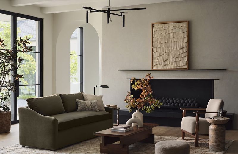
6. Insufficient Lighting Layers
Relying solely on overhead lighting is like wearing only foundation without blush or bronzer—flat and unflattering!
Every room needs three lighting types: ambient (general illumination), task (for specific activities), and accent (highlighting features). Table lamps, floor lamps, and sconces create depth and atmosphere. Proper lighting transforms spaces from harsh and clinical to warm and inviting.
7. Curtains Hanging Too Short
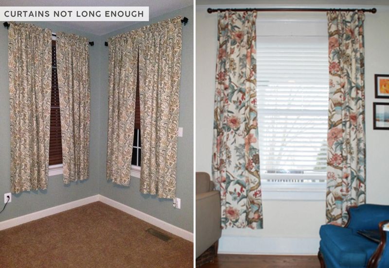
High-water curtains make your windows look like they’re wearing pants that don’t fit! This awkward length instantly cheapens your entire room.
Hang curtain rods close to the ceiling and let panels kiss the floor or pool slightly. This designer trick makes ceilings appear higher and windows more generous. The flowing fabric adds softness and elegance that transforms ordinary windows into architectural features.
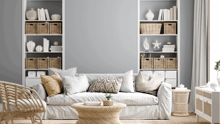
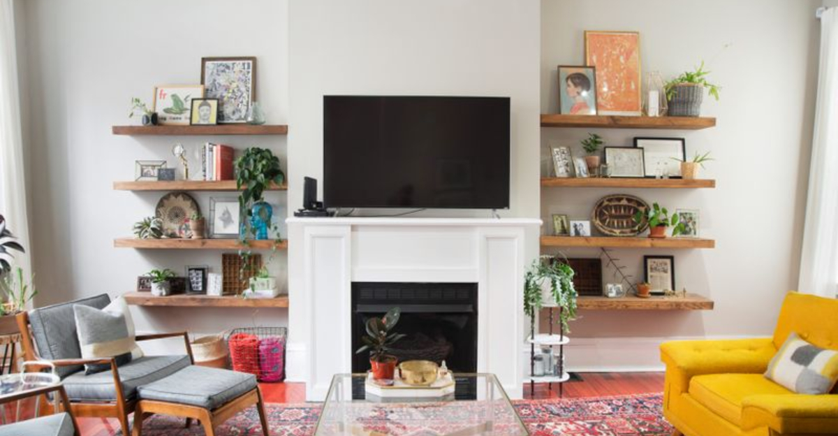
8. Cluttered Open Shelving
Those Instagram-worthy open shelves require serious editing skills! Overcrowded shelves create visual noise that overwhelms even the most beautiful spaces.
Follow the rule of thirds: display items in varying heights, leave breathing room between objects, and incorporate negative space. Group similar items for impact, and remember—not everything deserves shelf real estate. Curated shelves tell a story; cluttered ones simply shout.
9. Ignoring Scale and Proportion
Tiny coffee tables floating before massive sofas or dainty lamps perched beside substantial beds create visual discord that subtly bothers everyone.
Furniture should relate proportionally to surrounding pieces and the room itself. A general rule: coffee tables should be two-thirds the sofa length; lamps should be tall enough to cast light appropriately. These relationships create balance that feels innately right to the human eye.
10. Paint Colors Chosen From Tiny Swatches
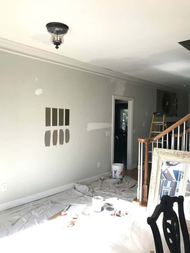
Selecting paint from those itty-bitty color chips is like choosing a spouse from a thumbnail photo—there’s so much you’re not seeing!
Light dramatically affects how color appears on walls. Always test large sample patches in different areas and view them at various times throughout the day. Colors that looked perfect in the store often transform into something entirely different in your actual space.
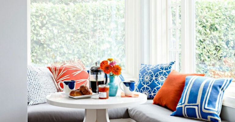
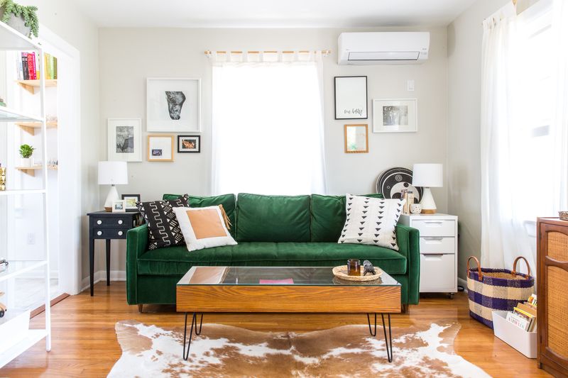
11. Excessive Throw Pillows
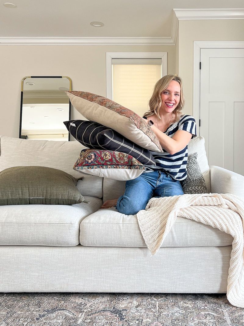
When guests need to perform an archaeological dig just to find a place to sit, you’ve crossed into pillow territory! The bed-turned-pillow-fortress is equally problematic.
Quality trumps quantity here. Select a few statement pillows in varying sizes and textures rather than an army of matching ones. Remember: pillows should enhance comfort and style, not become obstacles to actually using your furniture.
12. Impulse Décor Purchases
Falling for every trendy item that catches your eye leads to homes filled with disconnected pieces that never quite work together. We’ve all done it!
Before buying, ask: “Does this align with my overall vision? Where exactly will it go?” Create a design plan and stick with it. Thoughtful curation over time builds spaces that feel authentic and purposeful rather than random collections of stuff.
13. Fear of Empty Space
Horror vacui—the fear of empty space—plagues many homeowners who feel compelled to fill every surface and corner. Sometimes less truly is more!
Negative space gives eyes places to rest and allows special pieces to shine. Think of it as punctuation in your design sentence. Without pauses between statements, everything becomes a meaningless run-on paragraph of visual information that nobody wants to read.
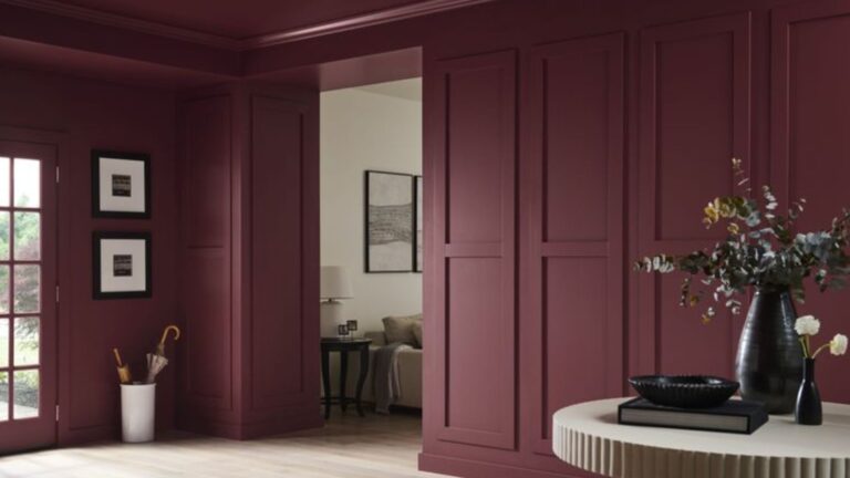
14. Neglecting Entryways
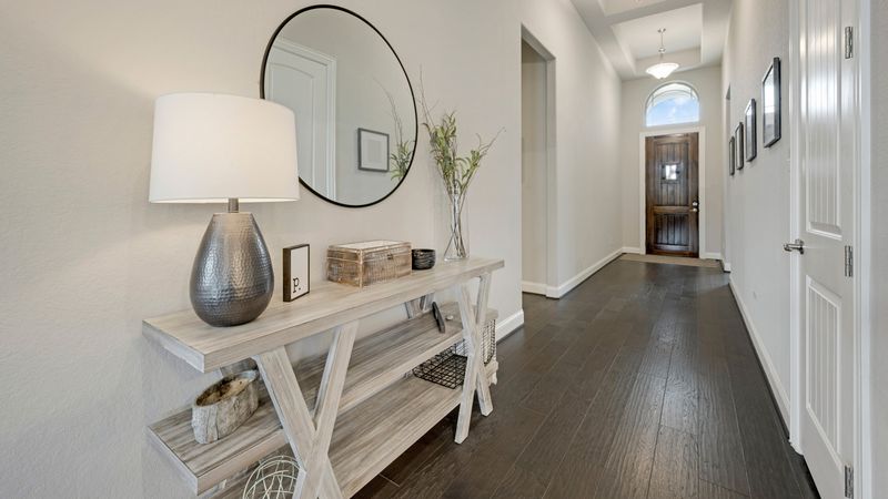
First impressions matter! Yet many of us treat our entryways as mere pass-through zones rather than important transitional spaces.
Even small foyers deserve thoughtful design treatment—a mirror, slim console table, decorative hook, or small bench creates function and welcome. This often-overlooked area sets the tone for your entire home experience and deserves more than becoming a dumping ground for keys and mail.
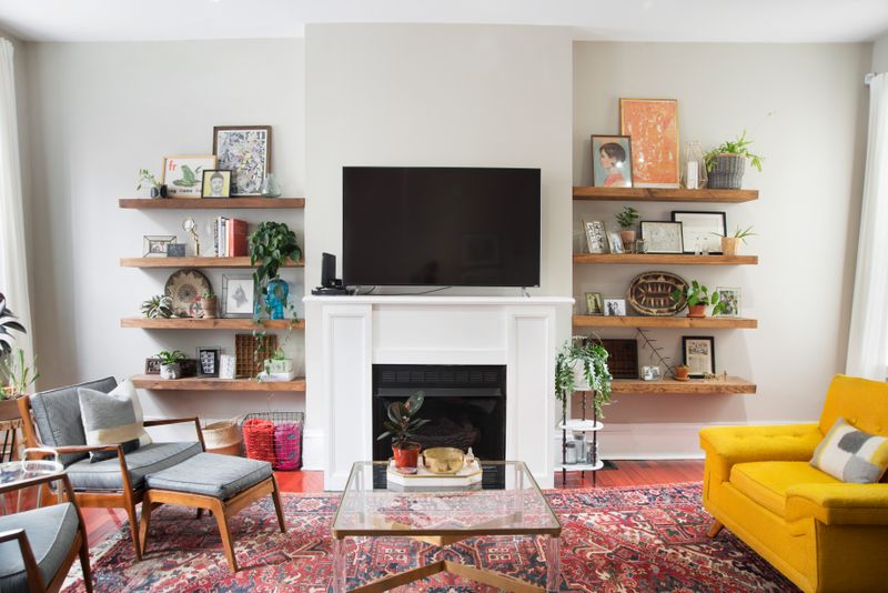
15. TV as Room Focal Point
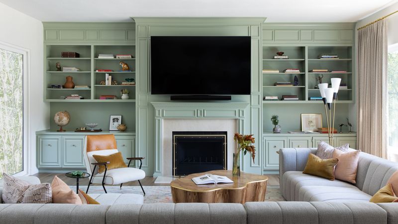
When your living room resembles a home theater with furniture arranged in worship of the television gods, something’s amiss in your design hierarchy.
Consider alternative focal points—a fireplace, stunning artwork, or window with a view. The TV needn’t disappear entirely, but it shouldn’t dominate. Balance technology with conversation-friendly arrangements that encourage human interaction rather than passive screen time.