19 Paint Colors That Make Kitchens Look Instantly Custom
Painting my kitchen was hands-down one of the quickest and most satisfying upgrades I’ve ever done. I didn’t knock down walls or splurge on new cabinets, I just picked the right color, and suddenly the whole space felt fresh, stylish, and totally mine.
It’s wild how something so simple can make it look like a designer came in and worked their magic. If your kitchen’s feeling tired or just kind of blah, trust me, a fresh coat of paint can work wonders.
These color ideas might be all the inspiration you need to finally grab that roller and get started.
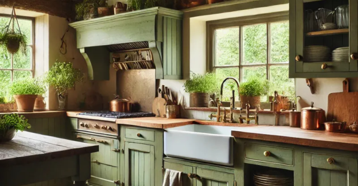
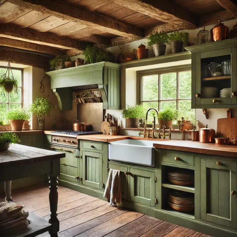
1. Sage Green Serenity
Imagine walking into a kitchen bathed in soft sage green. This earthy hue brings the outdoors in while creating a calming backdrop for meal prep and family gatherings.
If you’re tired of sterile white kitchens, sage offers a refreshing alternative that pairs beautifully with wood tones and brass hardware.
Sometimes the most sophisticated choices aren’t bold at all – this subtle green works in both modern farmhouse and contemporary spaces.
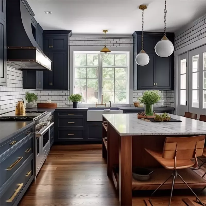
2. Midnight Navy Drama
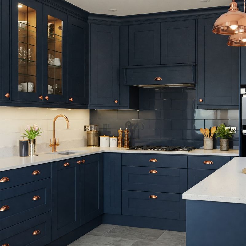
Navy blue kitchens pack a punch without feeling trendy or temporary. The deep, inky tone creates instant drama while somehow remaining timeless and classic.
Where lighter kitchens can show every speck of dirt, navy hides cooking splatters like a champ. Pairing it with marble countertops or gold fixtures elevates the look from ordinary to magazine-worthy in seconds flat.
3. Butter Yellow Charm
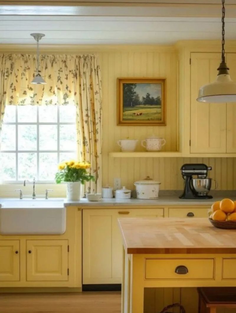
Yellow kitchens radiate happiness – it’s practically science! This sunny shade transforms even the darkest cooking space into a cheerful gathering spot.
Unlike harsh primary yellows, butter yellow offers a softer approach with creamy undertones that feel sophisticated rather than childish.
Pairing it with crisp white trim creates a fresh look that’s both timeless and unexpected.
4. Matte Black Mystery
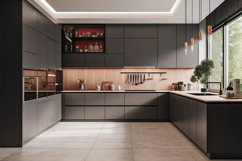
Black kitchens aren’t just for bachelor pads anymore! This bold choice creates instant architectural interest and a high-end custom feel.
Choosing a matte finish rather than glossy prevents the space from feeling like a nightclub. Mixing in natural elements like wood cutting boards or plants prevents the darkness from overwhelming the space.
5. Terracotta Warmth
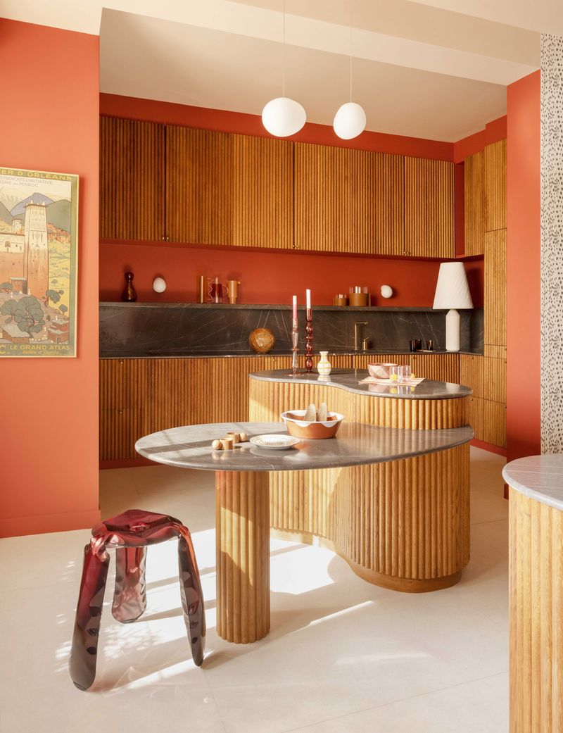
Forget beige – terracotta is the warm neutral taking kitchens by storm! This earthy orange-brown instantly adds Mediterranean vibes to any space.
While it might sound scary, terracotta creates a cozy backdrop that makes white dishes and green plants pop.
Using it on lower cabinets while keeping uppers light prevents the color from overwhelming smaller kitchens.
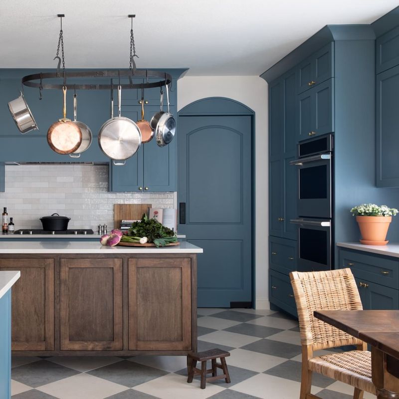
6. Dusty Blue Tranquility
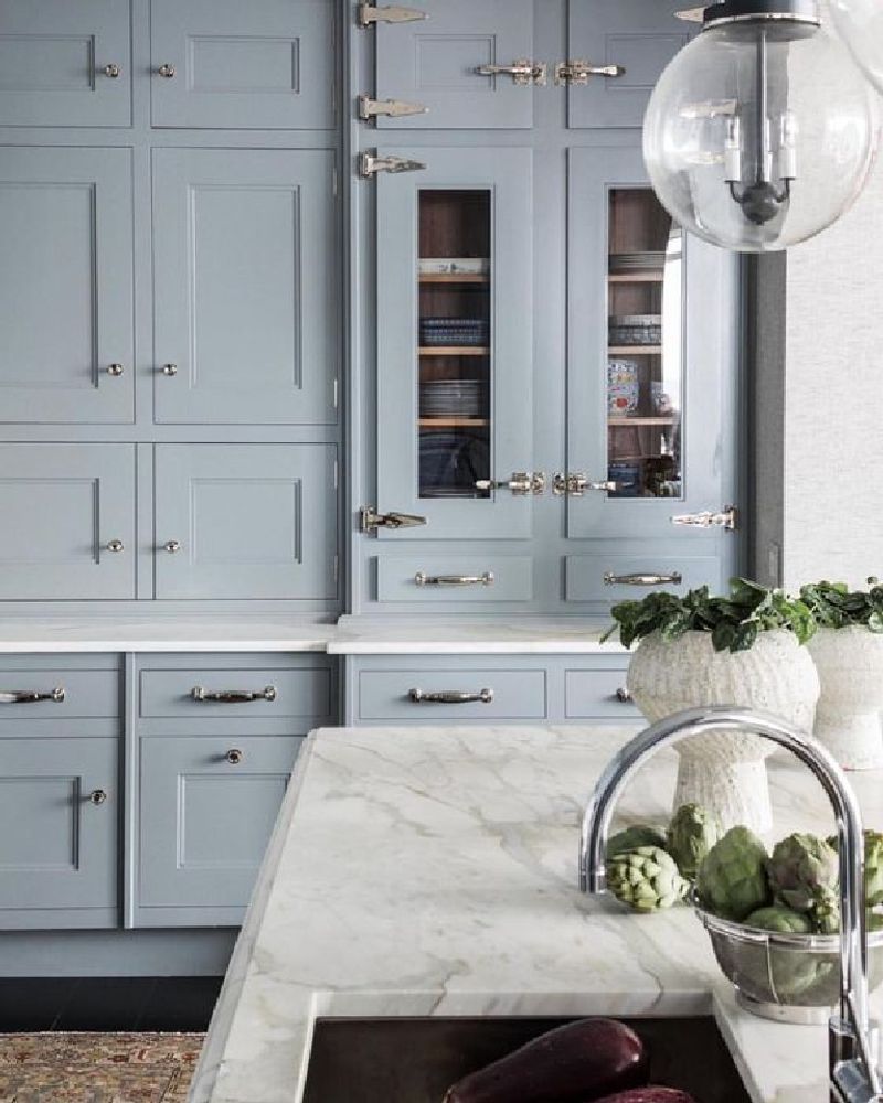
Looking for something different than navy but still blue? Dusty blue offers a softer approach that feels both fresh and vintage at once.
This muted shade plays well with many countertop materials from butcher block to concrete. The slightly grayish undertones make it more sophisticated than baby blue while still maintaining a light, airy feel.
7. Hunter Green Elegance
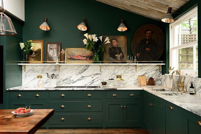
Hunter green kitchens feel like they belong in an English country estate – even if you live in a suburban ranch house! This rich, deep green exudes quiet luxury without trying too hard.
Unlike trendy emerald, hunter green has staying power and won’t feel dated next year. The forest-inspired hue creates a cozy atmosphere that makes lingering over morning coffee feel extra special.
8. Blush Pink Surprise
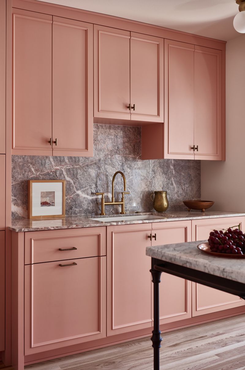
Pink in the kitchen? Absolutely! Blush pink operates as a neutral when done right, offering unexpected warmth without screaming for attention.
The key is choosing a dusty, muted version rather than bubblegum brightness. Pairing it with matte black hardware creates enough edge to keep things from feeling too precious or girly.
9. Charcoal Gray Sophistication
When black feels too harsh but you still want drama, charcoal gray delivers sophisticated vibes without the heaviness. This versatile neutral works with any accent color you can imagine.
The slight blue or green undertones in most charcoal paints add depth that plain gray can’t match. Using it on an island while keeping perimeter cabinets light creates a focal point without overwhelming the space.
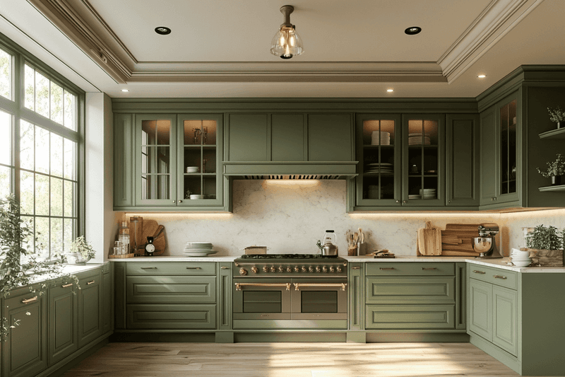
10. Olive Green Earthiness
Olive green brings natural, earthy vibes to kitchens without feeling like a passing trend. The yellow-brown undertones create warmth that cooler greens can’t match.
This color looks especially stunning with brass or copper accents that highlight its golden notes. For those hesitant to commit, painting just lower cabinets olive while keeping uppers white creates balance and visual interest.
11. Crisp Mint Freshness
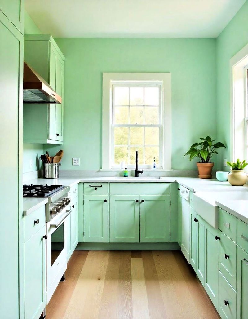
Mint green kitchens feel like a breath of fresh air! This retro-inspired shade adds personality without overwhelming the senses.
The key to keeping mint from feeling too 1950s is pairing it with modern elements like sleek hardware and minimal styling.
Adding warm wood tones prevents the coolness of mint from making the space feel cold or clinical.
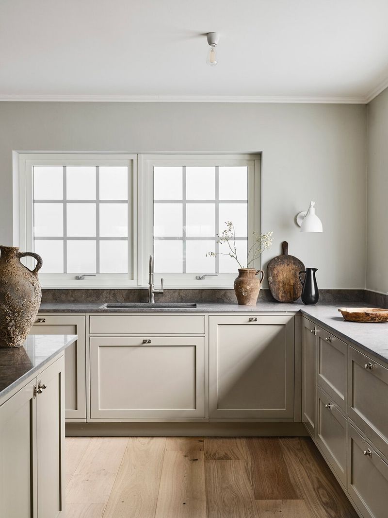
12. Mushroom Taupe Neutrality
Mushroom taupe might sound boring, but this complex neutral creates depth that plain beige can’t touch. The grayish-brown tone hides dirt while providing a sophisticated backdrop.
This chameleon color shifts throughout the day as light changes, sometimes appearing more gray, sometimes more brown. Using it on cabinets with white walls creates subtle contrast that feels intentional rather than bland.
13. Deep Plum Drama
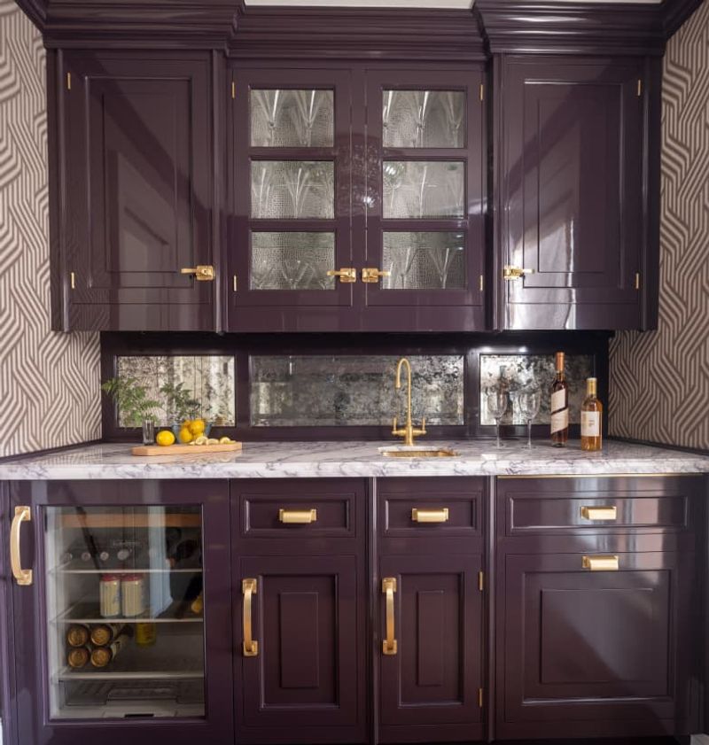
Purple in the kitchen? Yes! Deep plum creates unexpected drama while still feeling grounded thanks to its brown undertones.
While not for the faint of heart, this rich hue pairs beautifully with brass hardware and marble countertops for a luxurious look.
Using it on an island or just lower cabinets lets you experiment without committing your entire kitchen to the purple family.
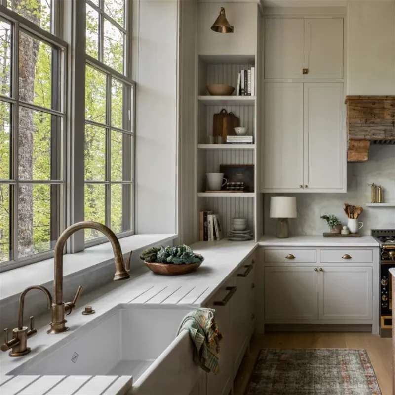
14. Creamy Buttermilk Softness
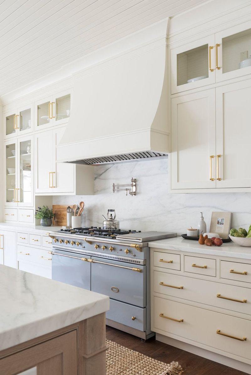
White kitchens will never die, but stark whites can feel cold and clinical. Enter buttermilk – the softer, creamier cousin that feels warm without veering into yellow territory.
The subtle warmth makes this shade particularly flattering in north-facing kitchens that get cooler light. Adding texture through backsplash tiles or natural elements prevents the space from feeling flat or boring.
15. Slate Blue Versatility
Slate blue straddles the line between gray and blue, creating a sophisticated look that works year-round. The chameleon-like quality shifts with lighting throughout the day.
This versatile hue pairs beautifully with both warm and cool accents, from brass to chrome. Using it on cabinets with a white countertop creates enough contrast to feel intentional without screaming for attention.
16. Rustic Red Warmth
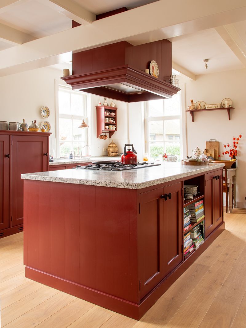
Red kitchens make a statement! Choosing a rustic, brick-inspired red rather than fire-engine brightness creates warmth without overwhelming the space.
This earthy red has enough brown undertones to feel grounded rather than shouty. Using it on just one wall or the island prevents the color from taking over while still adding personality and charm.
17. Moody Teal Depth
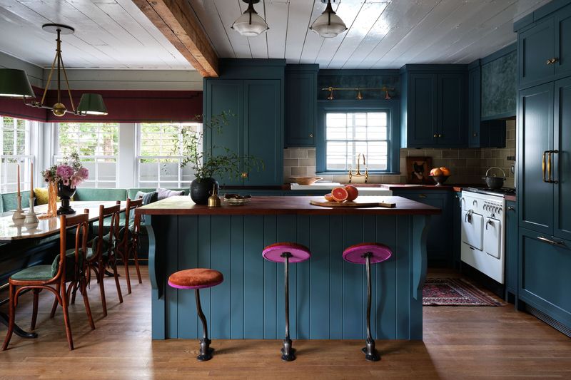
Teal combines the tranquility of blue with the earthiness of green, creating a complex color that adds instant character. The jewel-toned richness feels both trendy and timeless.
When used on cabinetry, this shade creates a stunning backdrop for simple white dishes and copper accents. Balancing it with light countertops prevents the space from feeling too dark or heavy.
18. Warm Greige Balance
Can’t decide between gray and beige? Greige offers the perfect compromise with warmth that cool grays lack. This chameleon color works with virtually any accent shade.
The versatility makes it perfect for homes where the kitchen opens to other spaces. Choosing a warmer greige rather than a cool one prevents the kitchen from feeling sterile or unwelcoming.
19. Sunshine Orange Energy
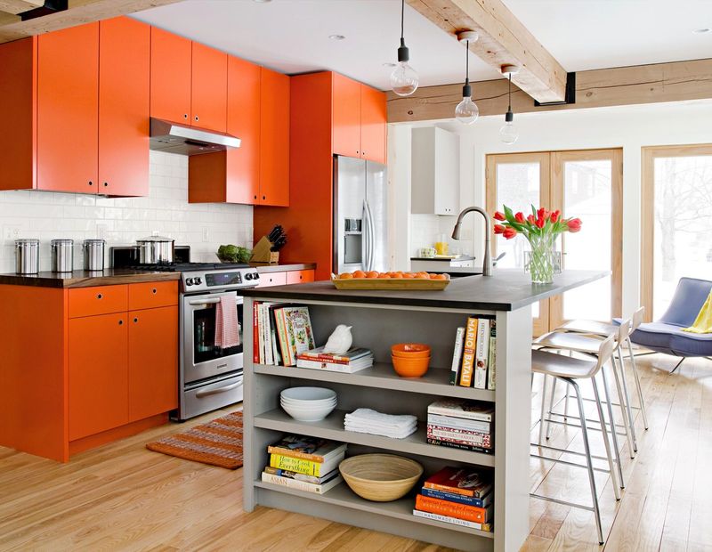
Orange might sound scary, but a muted, earthy version brings unexpected energy to kitchens. Think terracotta’s brighter, more playful cousin!
This happy hue pairs surprisingly well with navy blue accents for a complementary color scheme that pops.
Using it on just the island or a single wall lets you enjoy the cheerful vibe without committing your entire kitchen to this bold choice.