17 Color Combinations That Feel Like A Summer Night In (Not A Beach House Out)
There’s just something about summer nights that feels a little magical, the soft light, the warm air, the calm that settles in. I wanted to bring that feeling home without leaning into the usual beachy blues or seashell decor.
Don’t get me wrong, I love a coastal vibe, but sometimes it’s the mood of summer evenings I crave most. These color combos capture that perfectly, think dusky tones, warm golds, and soft shadows that make your space feel relaxed and inviting.
If you’ve ever wanted your home to feel like golden hour, these palettes might be exactly what you’re looking for.
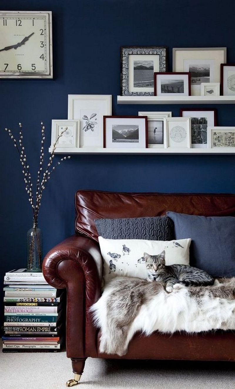
1. Midnight Blue And Copper
Midnight blue walls paired with copper accents create that perfect starry night feeling. The deep blue mimics the evening sky while copper elements catch lamplight like fireflies.
Try adding copper picture frames, light fixtures, or decorative bowls against navy walls. Your space will feel both grounded and magical at once.
When the sun sets and you turn on soft lighting, these colors transform your room into a personal planetarium.
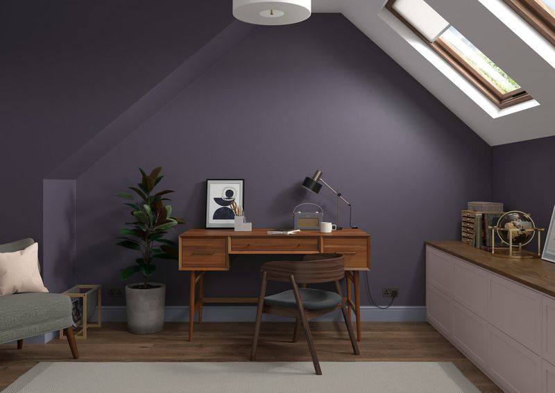
2. Eggplant Purple And Warm Gold
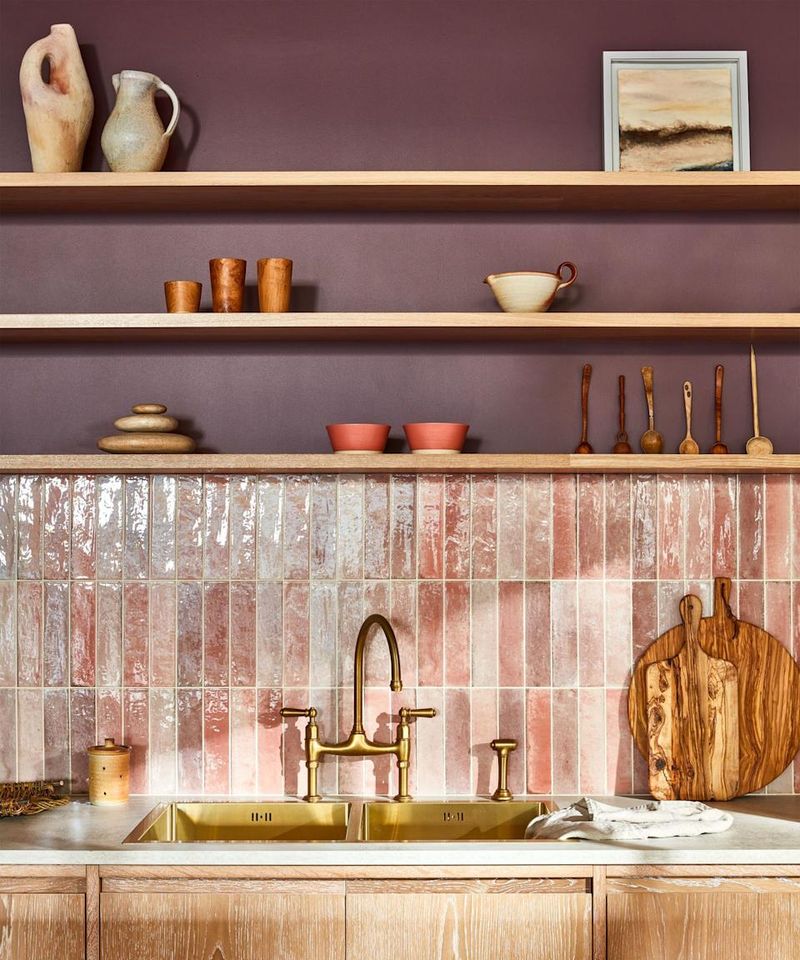
If summer nights had a taste, they’d be rich like eggplant and sweet like honey. This pairing brings that sensory experience to life in your space.
Gold-framed mirrors against aubergine walls reflect light in ways that make rooms feel both intimate and expansive. Add textured throws in golden hues to complete the look.
Sometimes the most sophisticated spaces play with this contrast between cool and warm tones.
3. Charcoal Gray And Dusty Rose
Just like twilight fading into night, charcoal and dusty rose capture that fleeting moment when day surrenders to evening. These colors feel grown-up yet soft.
Layer rose-colored pillows against a charcoal sofa or paint an accent wall in deep gray with rosy art pieces. The effect is instantly calming and sophisticated without trying too hard.
Many designers love this combo because it works in any room and never feels dated or seasonal.
4. Forest Green And Amber
Picture yourself walking through woods at dusk with lantern light guiding your way. Forest green paired with amber brings that magical feeling indoors.
Green velvet furniture with amber glass accessories creates spaces that feel both natural and luxurious. The combination works especially well in reading nooks or dining rooms.
Though these colors might seem autumnal, they perfectly capture summer nights spent telling stories around campfires.
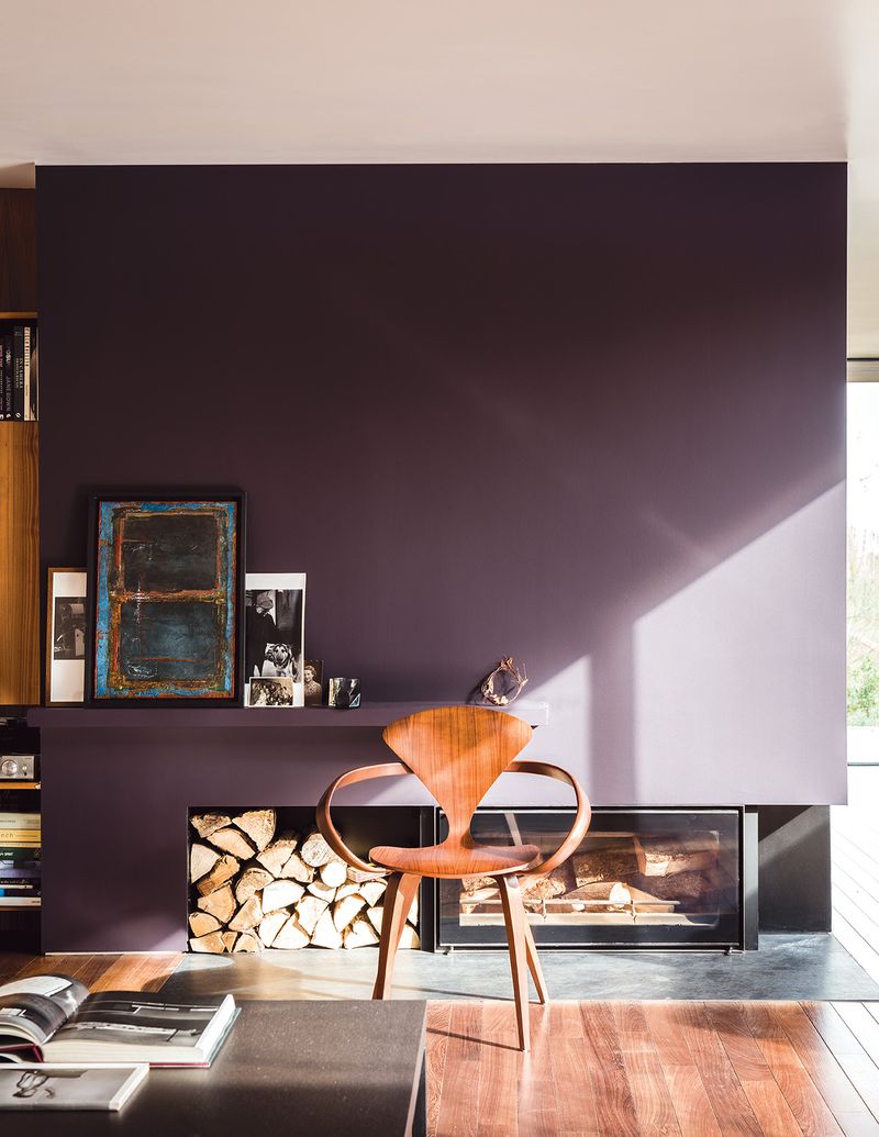
5. Plum And Brushed Silver
Plum walls with brushed silver accents feel like summer thunderstorms – dramatic yet soothing. This unexpected pairing creates spaces that feel both royal and relaxed.
Silver lamp bases, picture frames, or cabinet hardware pop against deep purple backgrounds. The contrast feels modern yet timeless.
Where other purple combinations might feel heavy, the silver lightens everything up like moonlight breaking through storm clouds.
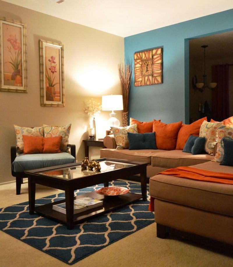
6. Terracotta And Navy
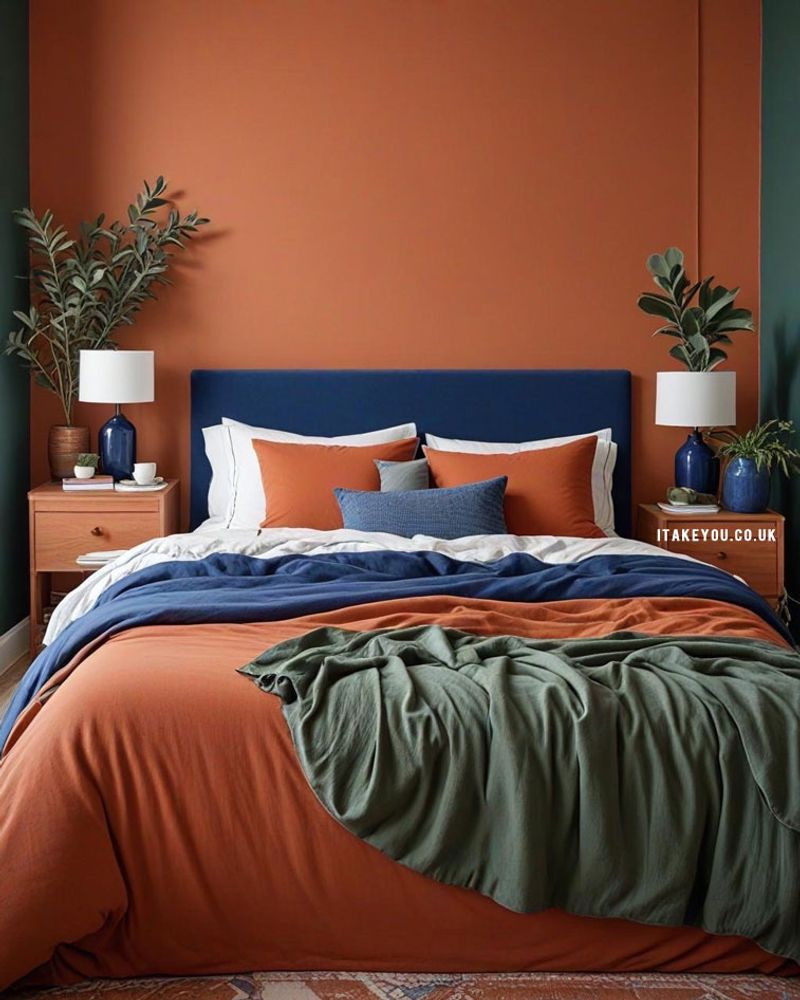
Summer evenings on a terracotta patio under navy skies inspired this earthy-meets-celestial combo. The warmth of clay paired with deep blue creates spaces that feel grounded yet dreamy.
Navy throw pillows on terracotta bedding or a navy rug under a terracotta-colored sofa makes rooms feel instantly more interesting.
These colors have conversation without competing. How wonderful that this pairing works year-round while still capturing that special summer night magic!
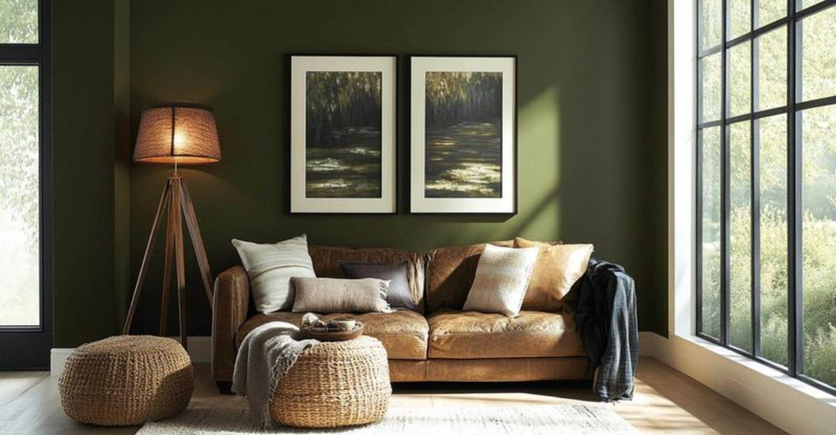
7. Olive And Burnished Bronze
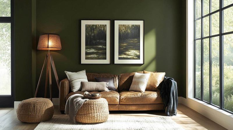
Olive walls with burnished bronze fixtures capture the feeling of summer nights spent under old trees. This combination feels naturally elegant without trying too hard.
Bronze mirror frames, light fixtures, or drawer pulls against olive backgrounds create spaces that feel established and thoughtful.
The green has enough gray to stay sophisticated. Many historic homes feature this timeless pairing that somehow feels both traditional and fresh at once.
8. Slate Blue And Amber Yellow
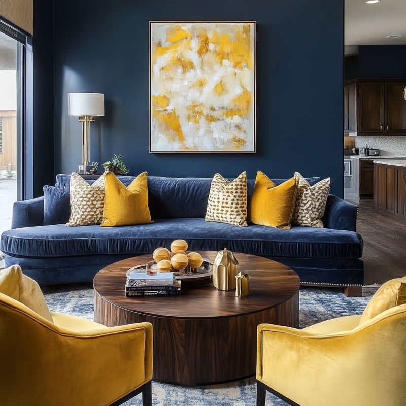
Remember watching fireflies against a darkening summer sky? Slate blue and amber yellow bring that childhood magic indoors.
Blue-gray walls with pops of golden yellow in lamps, artwork, or accent furniture create spaces that feel both nostalgic and fresh. The contrast is striking without being jarring.
Though some might consider these colors contradictory, they actually complement each other like stars against twilight.
9. Chocolate Brown And Pale Lavender
Chocolate walls with whispers of lavender create spaces that feel like summer nights spent lingering over dessert and conversation. The rich brown grounds while lavender adds mystery.
Try lavender bedding against chocolate walls or brown furniture with lavender accents. The pairing feels unexpected yet perfectly matched.
While most purple combinations feel cool, the warm brown balances everything into a perfect summer night harmony.
10. Deep Teal And Antique Gold
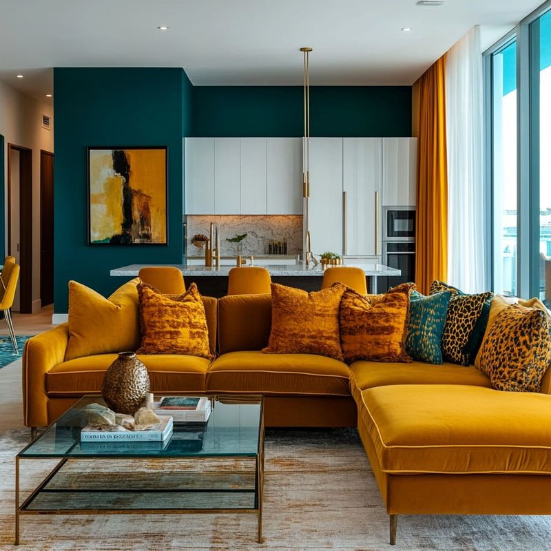
Deep teal walls with antique gold accents feel like summer nights spent in historic libraries or old-world gardens. The combination is instantly transportive.
Gold-framed mirrors, picture frames, or light fixtures against teal create dramatic yet inviting spaces. Add textured fabrics for extra dimension.
Unlike bright turquoise beach themes, this deeper teal paired with aged gold feels sophisticated and timeless like summer traditions passed through generations.
11. Charred Orange And Indigo
Charred orange isn’t bright like citrus but deep like embers, making it perfect with indigo for capturing that summer bonfire-under-stars feeling.
The combination feels both energetic and calm. Indigo sofas with burnt orange pillows or orange accent walls with indigo art create spaces with depth and interest.
Neither color overwhelms the other. Unlike typical sunset palettes, these deeper versions of orange and blue feel more sophisticated and less expected.
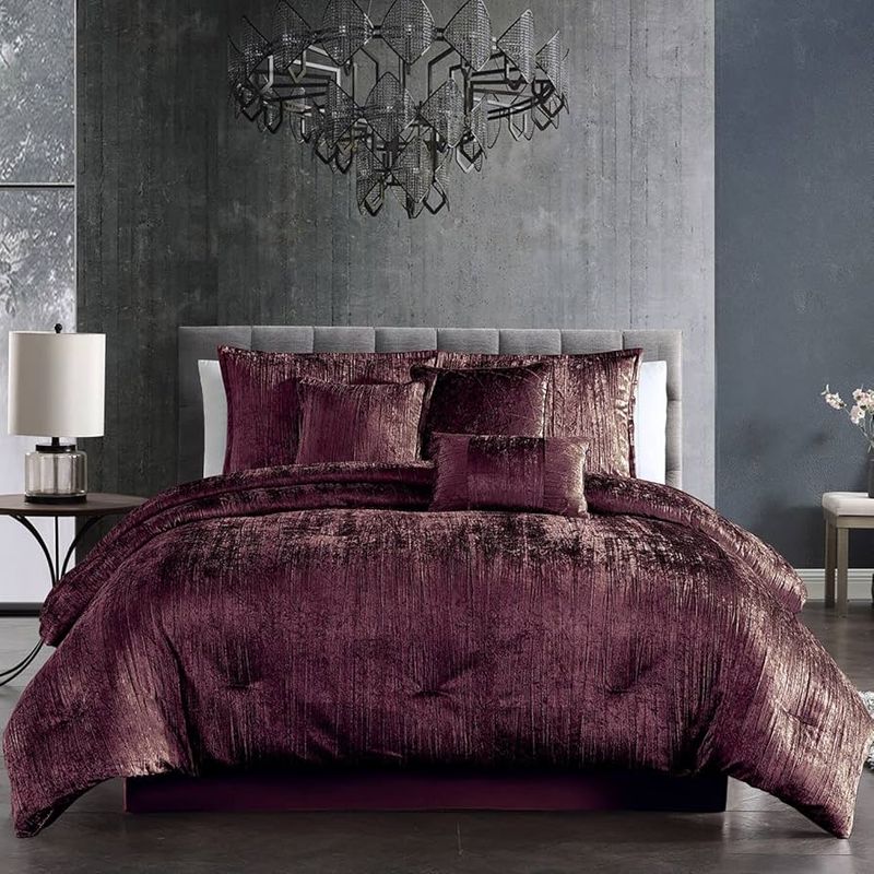
12. Burgundy And Antiqued Brass
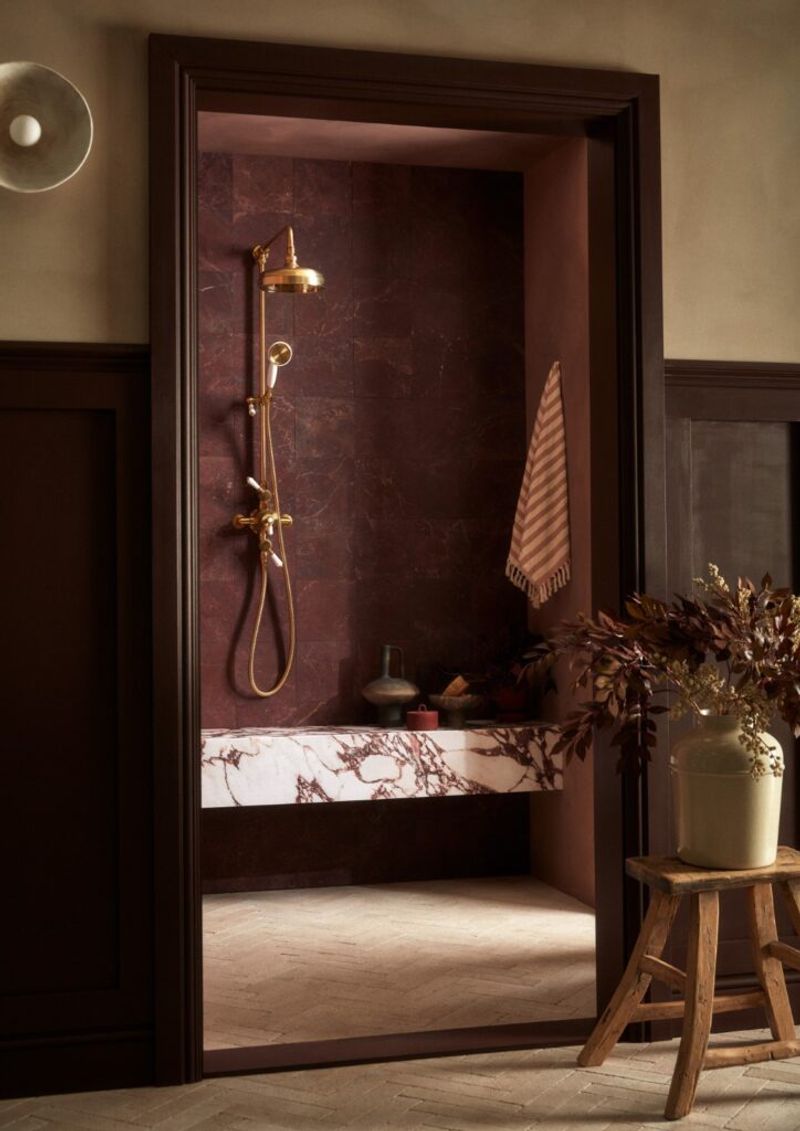
Wine-colored walls with antiqued brass fixtures feel like summer nights spent in old European cafés. The combination is rich without being stuffy.
Brass light fixtures, picture frames, or decorative objects against burgundy create spaces that feel cultured yet comfortable. The metal’s patina adds necessary dimension.
Though some might consider burgundy too heavy for summer, pairing it with brass creates a warmth perfect for evening gatherings.
13. Smoky Quartz And Blush
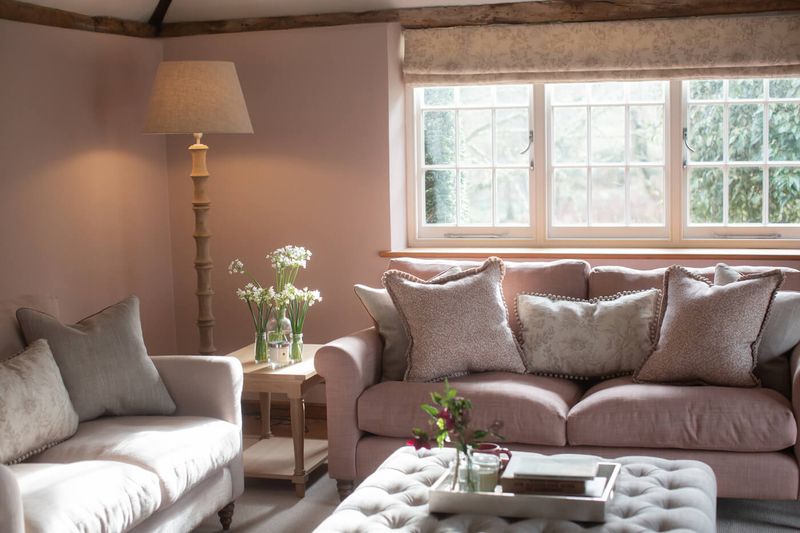
Smoky quartz – that perfect grayish-brown – paired with blush pink feels like summer dusk when everything gets that perfect rosy glow. This combination is subtle yet special.
Blush accent chairs against smoky quartz walls or vice versa creates spaces that feel both contemporary and timeless. The colors complement without competing.
Unlike stark gray and pink combinations, these softer versions feel more natural and less contrived.
14. Blackberry And Brushed Gold
Blackberry purple walls with brushed gold accents feel like summer nights picking wild berries until the last light fades. The combination is unexpectedly perfect.
Gold light fixtures, mirror frames, or cabinet hardware against deep purple create spaces that feel luxurious yet approachable. The contrast is striking but harmonious.
Unlike brighter purples, blackberry has enough black to feel sophisticated rather than youthful.
15. Juniper Green And Weathered Copper
Juniper green walls with weathered copper accents feel like summer nights in old gardens surrounded by ancient trees. The patina on the copper brings everything to life.
Copper light fixtures, decorative bowls, or picture frames against juniper green create spaces that feel established yet fresh. The green has blue undertones that keep it cool.
Though similar to forest green combinations, juniper’s blue notes paired with copper’s pink undertones create a unique color story.
16. Merlot And Pewter Gray
Merlot walls with pewter gray accents feel like summer nights spent swirling wine glasses while watching stars appear. The combination is sophisticated without being stuffy.
Gray furniture against wine-colored walls or vice versa creates spaces that feel both rich and restrained. The contrast is perfect for creating depth.
Unlike brighter reds, merlot has enough brown to feel grounded rather than energetic – perfect for evening relaxation.
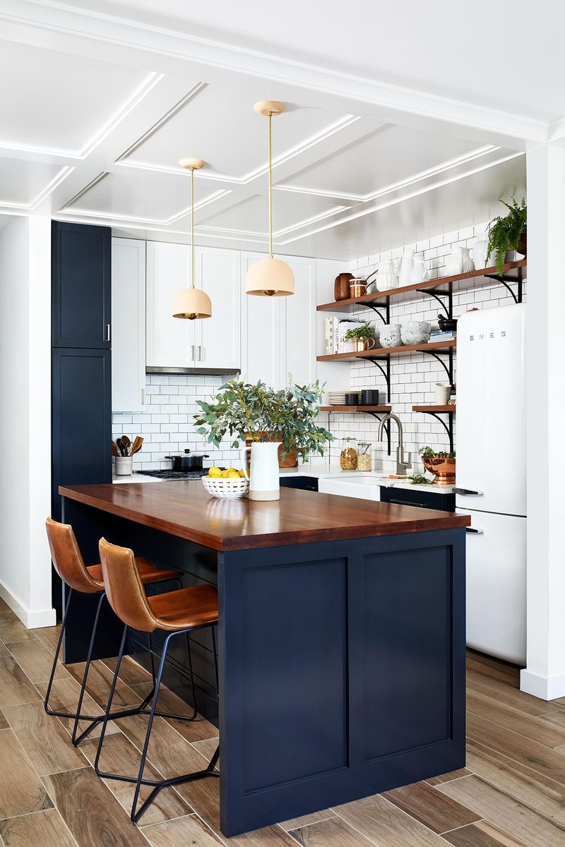
17. Inky Blue And Aged Leather
Inky blue walls with aged leather furniture create spaces that feel like summer nights spent in old libraries or studies. The combination feels intellectual yet comfortable.
Cognac leather sofas or chairs against deep blue walls create instant character in any room. Add brass accents for extra warmth and dimension.
Though dark colors sometimes feel heavy, this pairing creates spaces that feel cozy rather than cramped.