8 Color Combinations That Will Make Your Living Room Look More Expensive And 8 That Will Make It Seem Cheap
Color has the power to completely transform a space – and in the living room, the right palette can make everything feel more polished and high-end. But just as some combinations elevate a room, others can unintentionally cheapen the look, no matter how much you spent.
Designers know which color pairings add instant sophistication and which ones are best left in the past.
If you’re aiming for a space that feels refined, cohesive, and effortlessly stylish, these expert-approved tips are for you. Here are 8 color combos that make your living room look more expensive – and 8 that do the opposite.
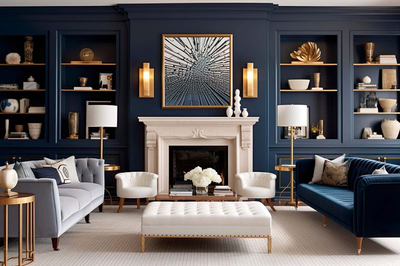
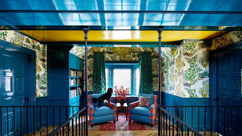
1. Navy Blue and Gold
Nothing says luxury quite like this regal pairing! The deep, rich navy creates a sophisticated backdrop while touches of gold add glamour through accessories, picture frames, or light fixtures.
Think of it as creating your personal palace. Navy walls with gold-framed mirrors and lamps can instantly elevate your space, making guests wonder if you’ve secretly won the lottery.
2. Emerald Green and Brass
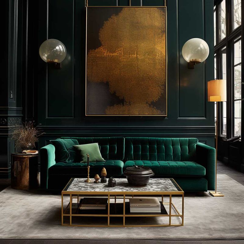
Feeling bold? This combination exudes confidence and timeless elegance. The jewel-toned green paired with warm brass creates a space that feels both classic and contemporary.
You might be surprised how this pairing can transform even the most basic furniture. Add emerald throw pillows, a statement chair, or even an accent wall alongside brass light fixtures for an instant upgrade.
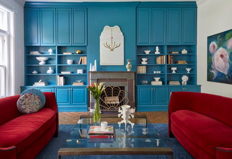
3. Charcoal Gray and Blush Pink
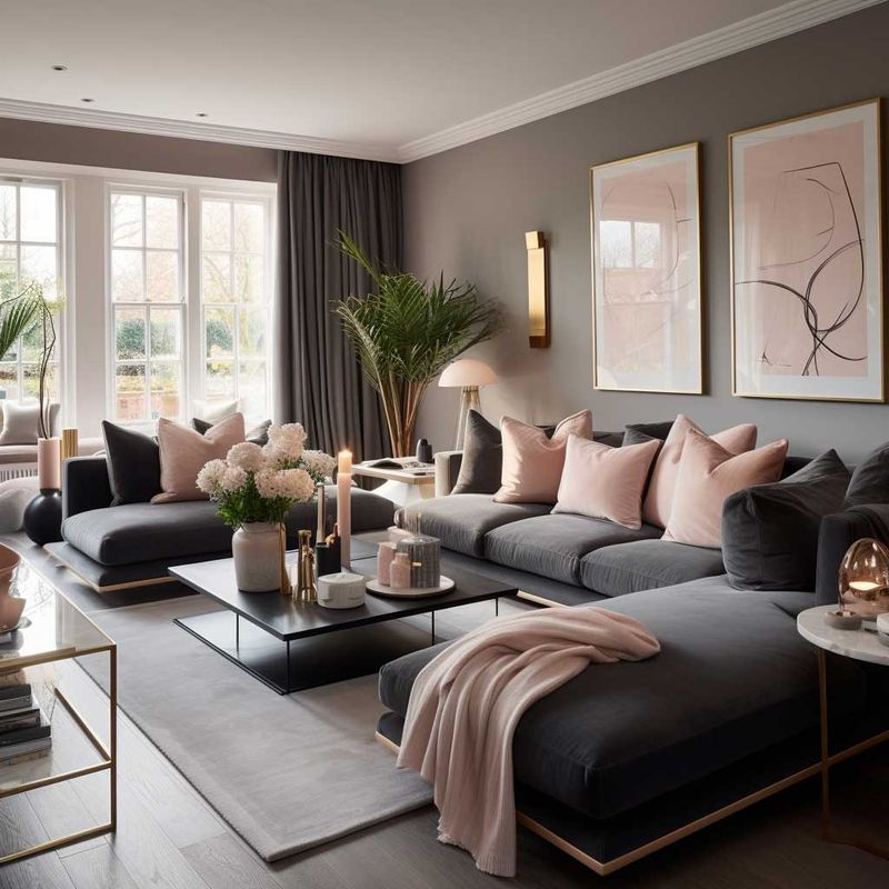
Who knew something so simple could look so expensive? The sophisticated charcoal creates depth while soft blush adds a touch of unexpected warmth that keeps the space feeling inviting.
Many high-end designers are embracing this combination for its perfect balance. The contrast between these colors creates visual interest that draws the eye around the room, making even modest spaces feel intentionally designed.
4. Chocolate Brown and Cream
Reminiscent of five-star hotel lobbies, this timeless duo brings warmth and sophistication to any space. The rich chocolate tones create a grounding effect while cream lightens and brightens.
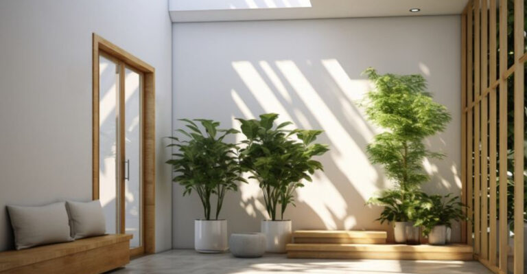
For maximum impact, layer different shades and textures. A chocolate leather sofa against cream walls with varied textiles creates depth that budget decorating often misses. Add natural elements like wood or plants for that extra touch of luxury.
5. Slate Blue and Warm Taupe
Understated elegance comes alive with this sophisticated pairing. The cool slate blue brings calm serenity while warm taupe adds an earthy sophistication that grounds the space.
Have you noticed how the most expensive homes never feel like they’re trying too hard? That’s the magic of this combination – it whispers luxury rather than shouting it. Incorporate different textures like velvet, linen, and wool to enhance the richness.
6. Olive Green and Burnished Copper
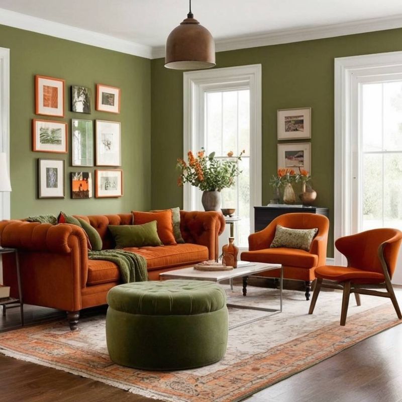
Walking into a room with this color scheme feels like discovering a hidden treasure. The earthy olive provides a sophisticated foundation while copper accents catch light in the most magical way.
Interior designers charge thousands for this kind of insight! The key is balance – use olive as your main color through paint or larger furniture pieces, then add copper through lighting, decorative bowls, or picture frames. The warm metallics will make the space glow.
7. Crisp White and Charcoal Black
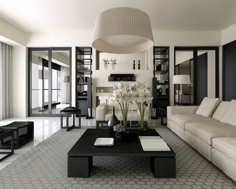
Sometimes the simplest combinations pack the biggest punch! This high-contrast pairing creates dramatic impact while maintaining timeless elegance that never goes out of style.
The secret lies in the proportions. Use white as your primary color (about 70%) with black as your accent (about 30%). Add textural elements like fluffy throws or woven pillows to prevent the space from feeling flat or sterile.
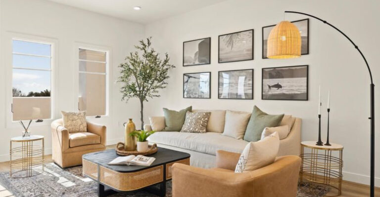
8. Dusty Sage and Warm Gold
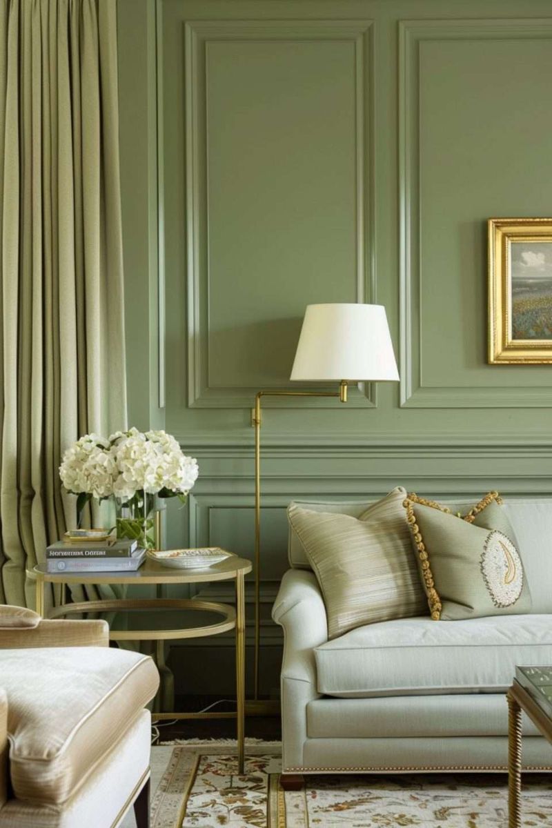
Imagine the most relaxing yet expensive spa you’ve ever visited – that’s this color combination! The muted sage creates a soothing backdrop while warm gold accents add that touch of luxury that elevates everything.
Celebrity designers love this pairing for its versatility. It works beautifully across different design styles from modern to traditional. Try sage walls with gold-framed mirrors, picture frames, or lamp bases for an instant upgrade.
1. Lime Green and Hot Pink
With a punch of lime green juxtaposed with hot pink, this color combination screams for attention. It often overwhelms rather than soothes the eyes, making the room feel more like a circus than a cozy retreat.
The boldness of lime green can clash with the already vibrant pink, creating a visual conflict. This combination might evoke a sense of chaos instead of harmony.
2. Neon Yellow and Electric Blue
Neon yellow and electric blue seem like a futuristic choice but more often result in a space that feels less refined. These colors tend to fight for dominance instead of complementing each other.
The intensity can lead to a visual overload, detracting from the room’s architectural features or furnishings.
When used improperly, such bright hues can cheapen the ambiance of what could be an elegant room.
3. Bright Red and Turquoise
While both colors have their merits, bright red and turquoise together can feel too intense for a serene living space. The bold red often dominates, overshadowing the tranquility of turquoise.
This pairing can give off an overly energetic vibe, making relaxation difficult.
Instead of working together, these two colors compete for attention, disrupting the peace that a living room should offer.
4. Coral and Bright Aqua
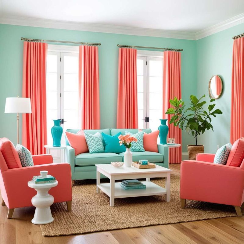
Coral and bright aqua together might feel more suitable for a beach setting than a living room. The vividness of both colors can make the space feel overly vibrant.
Instead of a serene atmosphere, the room might project a sense of unwelcome energy. Color psychology suggests that these colors may evoke strong emotions, but not always positive ones.
5. Lavender and Neon Orange
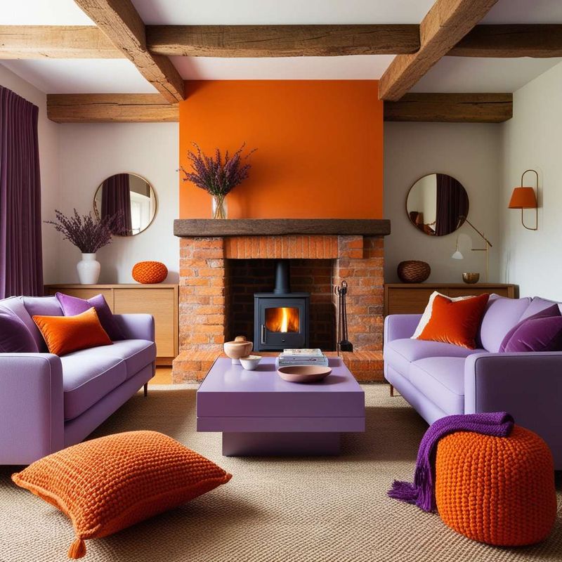
Lavender’s softness is harshly juxtaposed with the vibrancy of neon orange, leading to a discordant appearance. This combination can make the room feel disjointed and less cohesive.
The clash of calming and energetic tones can confuse the senses rather than please them. Selecting complementary colors that do not overpower each other can foster a more inviting space.
6. Pastel Pink and Bright Yellow
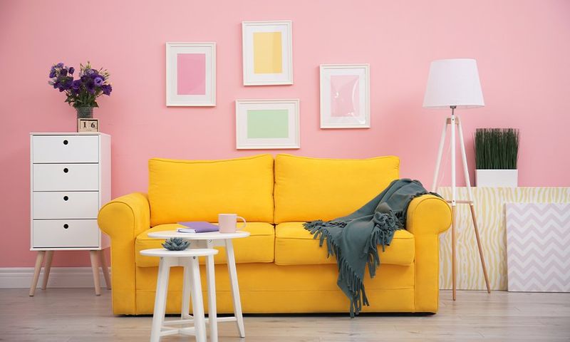
Pastel pink may evoke subtleness, but when paired with bright yellow, it can lead to a jarring contrast. The softness of the pink is overshadowed by the vivacity of the yellow.
This pairing can make the living room feel less like a cozy haven and more like a mismatched palette. Achieving balance is key to ensuring a welcoming and polished atmosphere.
7. Orange and Mint Green
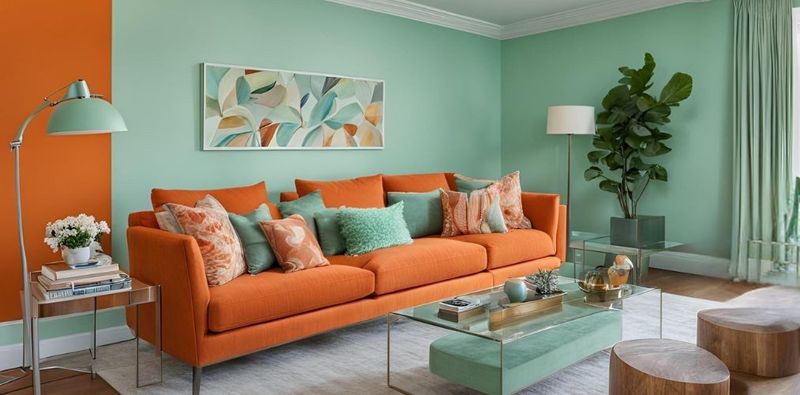
When orange and mint green collide, it can lead to an unsettling color palette. The warmth of orange contradicts the coolness of mint green.
This pairing can make the space feel unharmonious and less sophisticated. Creating a more cohesive look requires colors that whisper rather than shout.
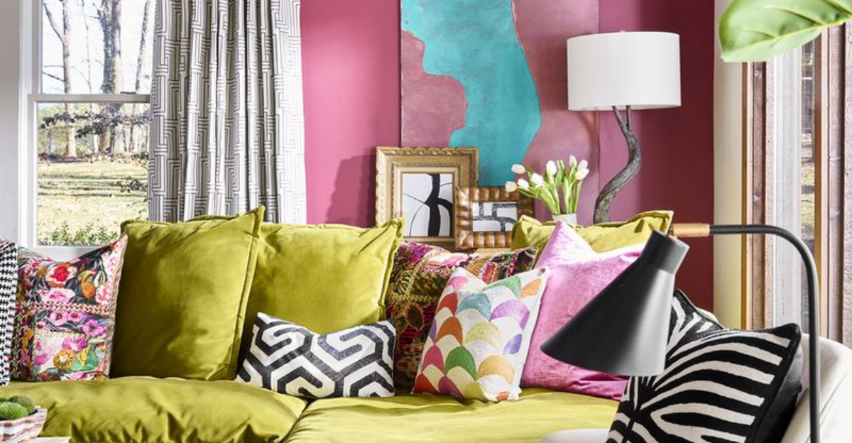
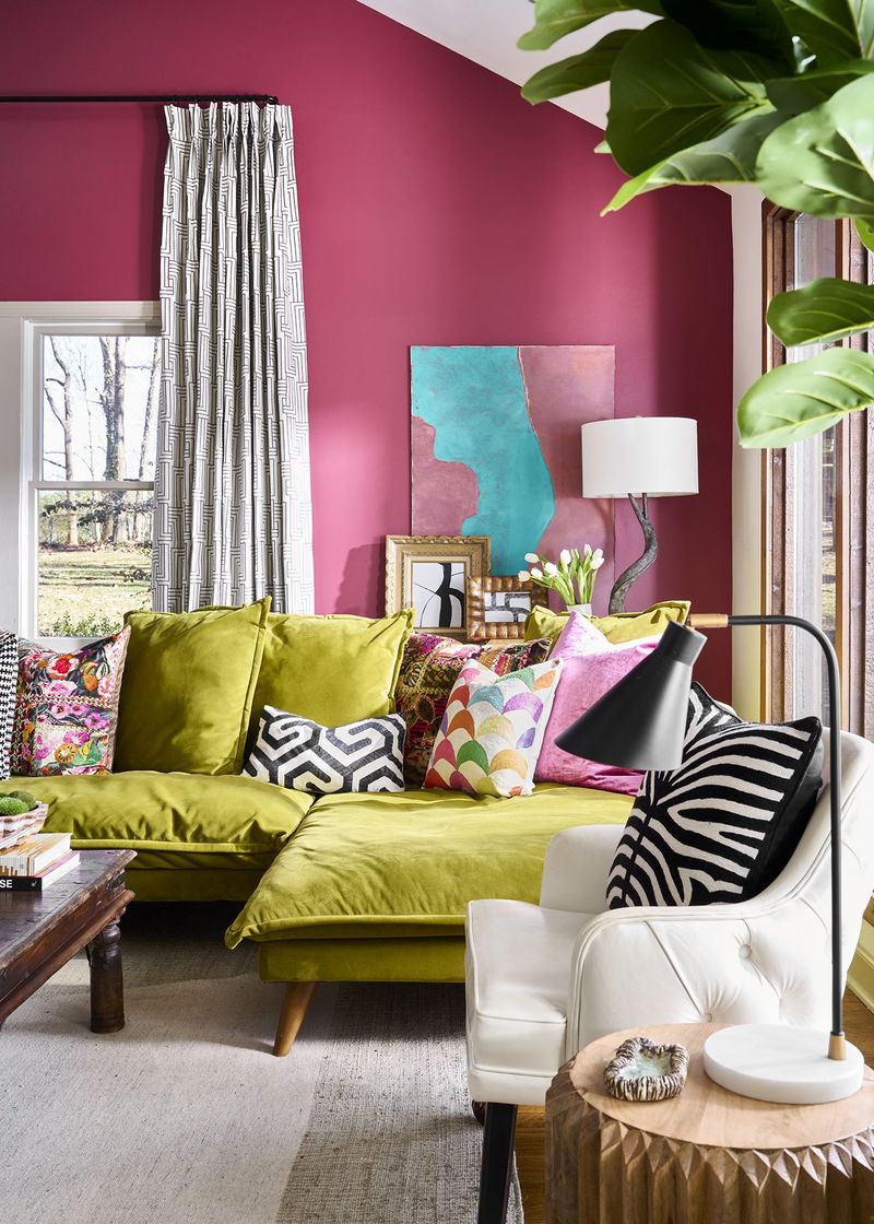
8. Fuchsia and Olive Green
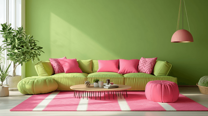
Fuchsia’s intensity may seem appealing, but when contrasted with olive green, the combination can feel dissonant. The vibrant pink clashes with the muted green, leading to an aesthetically confused space.
This combination can hinder the relaxed ambiance desired in living areas. Who knew such vibrant colors could create such tension?