20 Clear Signs Your Home Is Not Trendy Anymore According To Designers
Homes, like fashion, follow trends that evolve over time. What looked fresh and modern a few years ago might now scream ‘dated’ to professional designers.
Recognizing when your space needs an update can help you avoid getting stuck in a time warp that visitors notice but politely ignore.
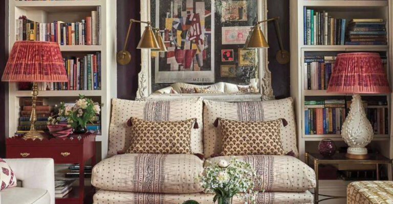
1. All-Matching Furniture Sets
Walking into a living room where every piece matches perfectly feels like stepping into a furniture showroom catalog from 2003. Modern design embraces thoughtful mixing of complementary pieces that tell a story.
Designers now recommend selecting furniture that coordinates rather than matches exactly. The matchy-matchy approach lacks personality and suggests you haven’t updated your space since purchasing that complete set years ago.
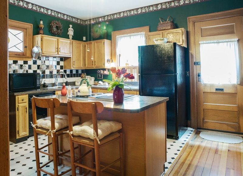
2. Tuscan Kitchen Overload
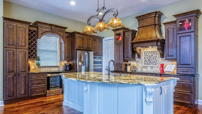
Remember when every kitchen aspired to look like a villa in the Italian countryside? The combination of dark cherry cabinets, faux-finished walls, and wrought iron accessories has officially overstayed its welcome.
Those terracotta tiles, grape motifs, and ornate corbels once signaled luxury but now date your kitchen to the early 2000s. Contemporary kitchens favor cleaner lines and lighter colors that won’t make you feel like you’re cooking in a medieval castle.
3. Word Art Everywhere
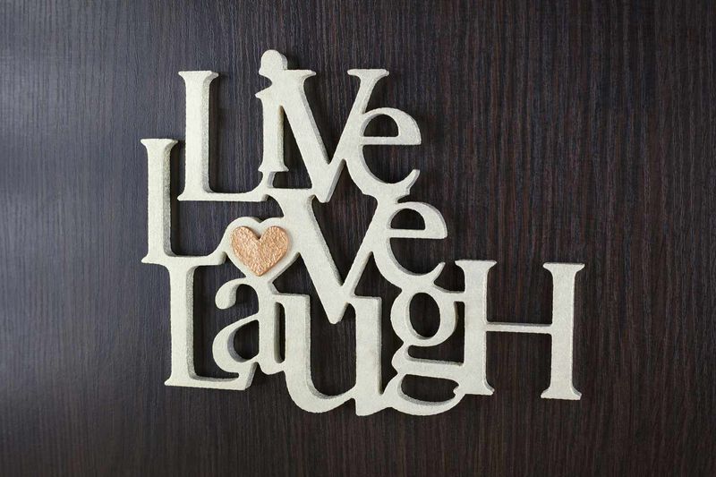
“Live, Laugh, Love” walked so other wall quotes could run—straight into design obsolescence. Those mass-produced inspirational phrases plastered across walls have become visual white noise that designers cringe at.
Words like “Blessed” or “Gather” stenciled above doorways or emblazoned on throw pillows signal a design rut. Contemporary homes favor authentic art that sparks conversation rather than spelling out generic sentiments that have lost meaning through overuse.
4. Mason Jar Everything
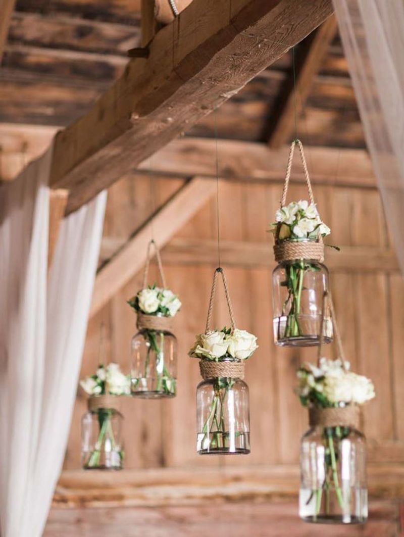
Mason jars experienced a meteoric rise from humble canning vessels to design darlings of the 2010s. Now they’ve graduated to the hall of decor clichés when used as light fixtures, soap dispensers, or drinking glasses.
While practical for actual food storage, repurposing them as chandelier components or bathroom accessories screams “Pinterest circa 2012.” Now we all prefer purpose-made items that don’t reference the farmhouse trend that has largely run its course.
5. Accent Walls in Bold Colors
That single burgundy or navy wall might have felt daring when you painted it, but it’s now a time capsule from the mid-2000s. Accent walls emerged as a low-commitment way to add drama but quickly became formulaic.
Modern interiors typically embrace cohesive color stories throughout a space rather than isolating one wall for special treatment. If you’re still living with that lone dramatic wall, designers suggest it’s time to either commit to the color throughout or move toward a more subtle approach.
6. Chevron Pattern Overload
Zigzagging its way through every home goods store around 2013, chevron pattern became unavoidable on everything from rugs to shower curtains. The distinctive up-and-down pattern rapidly shifted from trendy to tired.
While geometric patterns remain popular, today’s versions feature more subtle and varied designs that don’t immediately timestamp your decor to the early Instagram era.
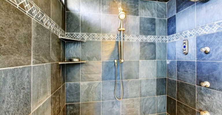
7. Hollywood-Style Vanity Lights
Globe-studded bathroom light fixtures perched above mirrors had their moment in the spotlight but have now faded to black in designer portfolios. These lights—often called “Hollywood” or “Broadway” style—cast unflattering shadows and scream early 2000s builder-grade choices.
Contemporary bathrooms feature more sophisticated lighting solutions like sconces flanking mirrors or modern pendants. The bare-bulb look has been replaced by fixtures that provide both better illumination and updated aesthetics.
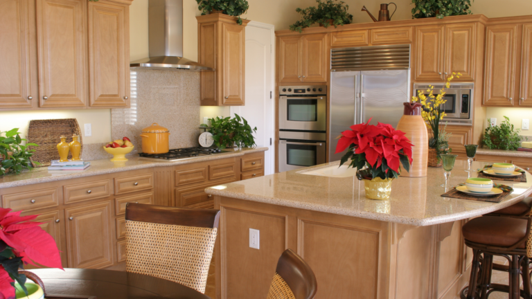
8. Granite Overload
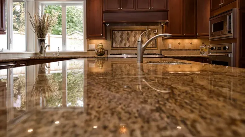
Speckled beige granite countertops were once the ultimate kitchen status symbol, but their ubiquity has diminished their appeal. The busy patterns and orange-brown tones characteristic of many granite installations have fallen from favor.
When designers see that distinctive salt-and-pepper or Baltic Brown granite, they immediately recognize a kitchen that hasn’t been updated since the early 2000s housing boom.
9. Popcorn Ceilings
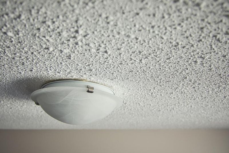
Nothing screams “time warp” quite like looking up to see a cottage cheese texture overhead. Popcorn ceilings—originally installed to hide imperfections and dampen sound—now only dampen home values and design credibility.
Beyond being dust collectors and spider havens, these textured ceilings immediately signal neglect to design professionals. Modern homes feature smooth ceilings or intentional architectural elements like coffers or beams that add character without the dated texture.
10. TV as Room Centerpiece
Rooms designed entirely around massive televisions—with furniture arranged in a perfect semicircle facing the screen—broadcast a dated approach to living spaces.
The black void of an enormous TV dominating your main wall has lost its appeal. The entertainment shrine approach signals priorities stuck in the pre-streaming era.
11. Tiled Countertops
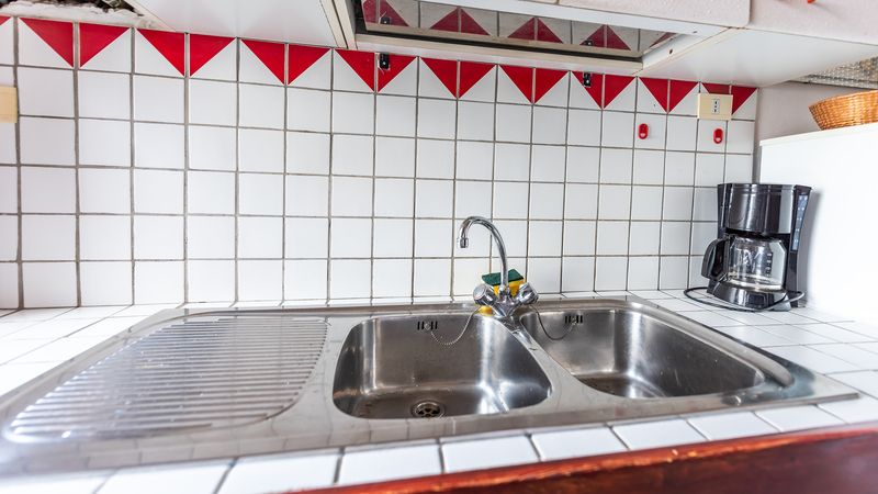
Square ceramic tiles with prominent grout lines covering kitchen or bathroom countertops immediately transport visitors back to the 1970s or 80s.
The uneven surface catches crumbs, harbors bacteria, and creates a cleaning nightmare. Beyond practical concerns, these surfaces appear distinctly outdated compared to today’s seamless options.
12. Wallpaper Borders
Those narrow strips of wallpaper running along the ceiling perimeter were once considered the perfect finishing touch. Now they’re perfect indicators of a room that hasn’t been updated since the Clinton administration.
Particularly dated are borders featuring country motifs, floral patterns, or architectural details. While wallpaper itself has made a sophisticated comeback, these horizontal strips remain firmly in design purgatory, instantly aging any room unfortunate enough to still wear them.
13. Oak Cabinets with Cathedral Arches

Golden oak cabinets with those distinctive arched tops were installed in countless homes during the 80s and 90s. Their orange-yellow tone and distinctive shape have become shorthand for “hasn’t renovated since ‘Friends’ was airing new episodes.”
Modern kitchens feature cabinet doors with cleaner lines and finishes that don’t immediately evoke Reagan-era design sensibilities.
14. Vertical Blinds
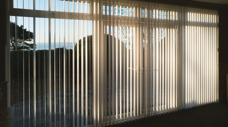
Long plastic strips clacking against sliding glass doors remain functional but have lost all design credibility. These window treatments scream “rental apartment circa 1992” rather than thoughtful home design.
Contemporary homes feature more elegant solutions for large windows and doors—from modern drapery to cellular shades or even motorized options. The sound alone of vertical blinds being drawn across a sliding door takes designers straight back to awkward apartment viewings.
15. Overstuffed Reclining Furniture
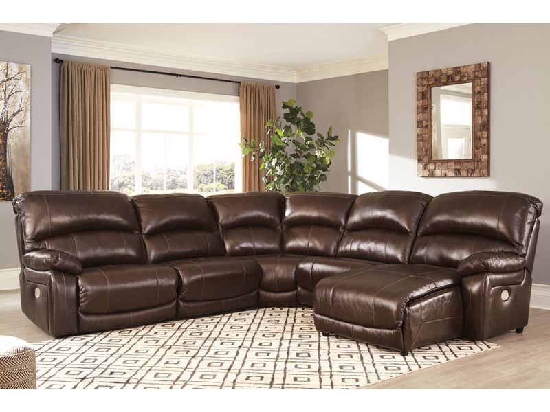
Massive leather or microfiber reclining sectionals with cup holders and hidden compartments prioritize perceived comfort over aesthetics. These bulky pieces—often in brown or black—consume entire living rooms with their overwhelming presence.
While comfort matters, designers note that modern options can provide relaxation without resembling furniture that belongs in a sports bar. The oversized scale and purely functional approach to seating arrangements signals a dated perspective on living room design.
16. Frosted Glass Light Fixtures
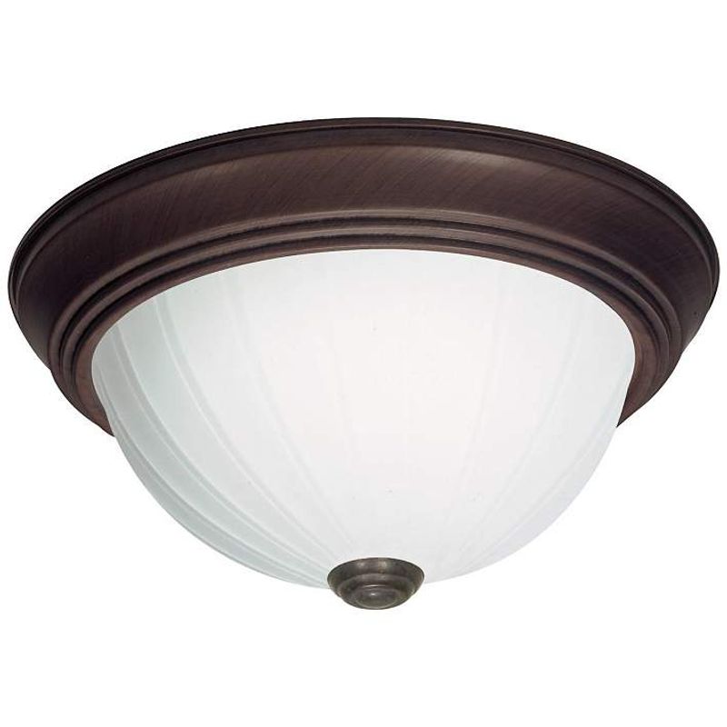
Those dome-shaped ceiling fixtures with frosted glass and metal rims have hovered over hallways and bedrooms since the ’90s, quietly aging every room they touch. Once considered practical, they’ve since become markers of uninspired design.
Updated lighting now leans into sculptural forms and bolder silhouettes, making it obvious when a space hasn’t seen a fresh fixture in decades.
17. Bathroom Carpet
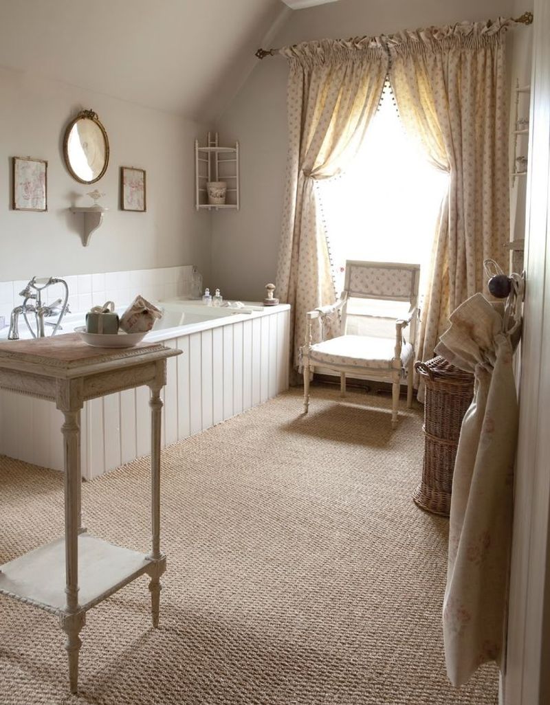
Wall-to-wall carpet in bathrooms represents perhaps the most universally rejected design choice among professionals. Once considered luxurious in the 70s and 80s, this moisture-trapping floor covering has rightfully fallen from favor. Beyond the obvious hygiene concerns, carpeted bathrooms signal a serious time warp to visitors.
18. Glass Block Windows
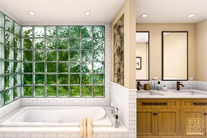
Those translucent cubes of glass stacked together in bathrooms or basements were the height of 80s and 90s architectural innovation. Now they stand as monuments to an era when Miami Vice influenced more than just fashion.
Modern alternatives like frosted glass, smart glass that changes opacity, or sleek window films accomplish the same goals without the chunky grid pattern that instantly ages a space.
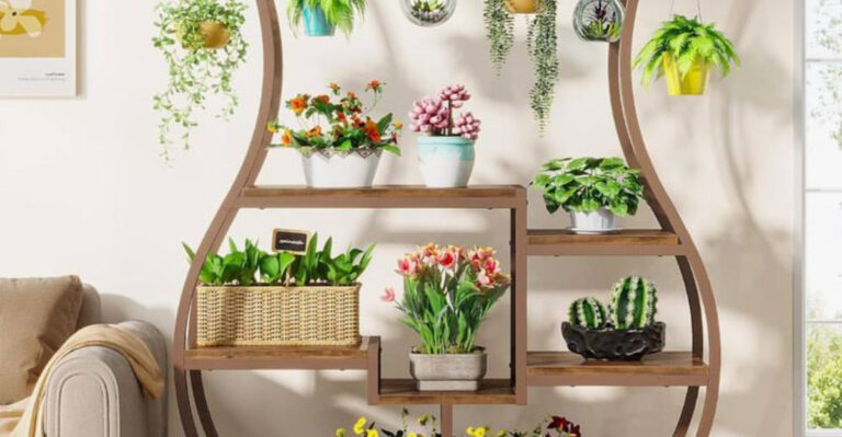
19. Artificial Plants Gathering Dust
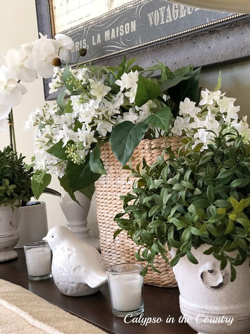
Faded silk flowers and plastic greenery perched on top of kitchen cabinets or tucked in room corners have lost their luster—literally. These once-popular alternatives to living plants now signal design stagnation to professionals.
The current plant revival embraces actual living greenery or high-quality faux options that don’t immediately announce their artificial nature. Those dust-collecting arrangements in wicker baskets, particularly when combined with dried flowers or potpourri, create an instant time capsule effect.
20. Novelty Theme Rooms
Rooms that commit fully to a single theme—be it vineyard romance or anchor-filled coastal kitsch—tend to feel more like stage sets than living spaces.
While the dedication is admirable, such spaces often clash with the rest of the home and leave little room for growth. A lighter hand with inspiration allows rooms to shift naturally over time instead of being locked in one aesthetic moment.