15 Timeless Exterior Paint Colors, Our Favorite Classic Shades
Paint isn’t just a coating—it’s the first whisper of your home’s story to the world. The right exterior shade becomes part of memory itself, standing dignified through decades of seasons and changing light.
These enduring colors have graced homes from coastal cottages to urban brownstones for generations, their quiet confidence never shouting for attention, but rather settling into the landscape like they’ve always belonged.
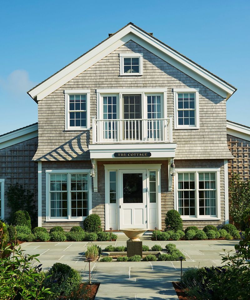
1. Colonial White | The Canvas That Breathes
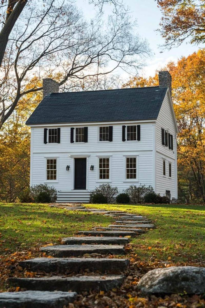
Morning mist clings differently to a colonial white facade. Neither stark nor creamy, this historical shade carries the perfect balance of warmth and crispness that New England clapboard homes have worn since the 18th century.
Colonial white transforms throughout the day—cool in morning light, golden at sunset. It provides the ultimate backdrop for black shutters and red brick chimneys, creating a timeless harmony that architects have trusted for centuries.
2. Nantucket Gray | Where Sea Meets Stone
Sailors returning home once looked for this particular shade against the horizon. Nantucket gray captures that elusive color where weathered cedar shingles surrender to salt air and summer sun.
On shingled cottages or modern farmhouses alike, it evokes coastal permanence without being overtly nautical. The undertones shift between green and blue depending on the light, much like the ocean itself, creating a living surface that belongs to its environment.
3. Charleston Green | The Porch Ceiling Secret
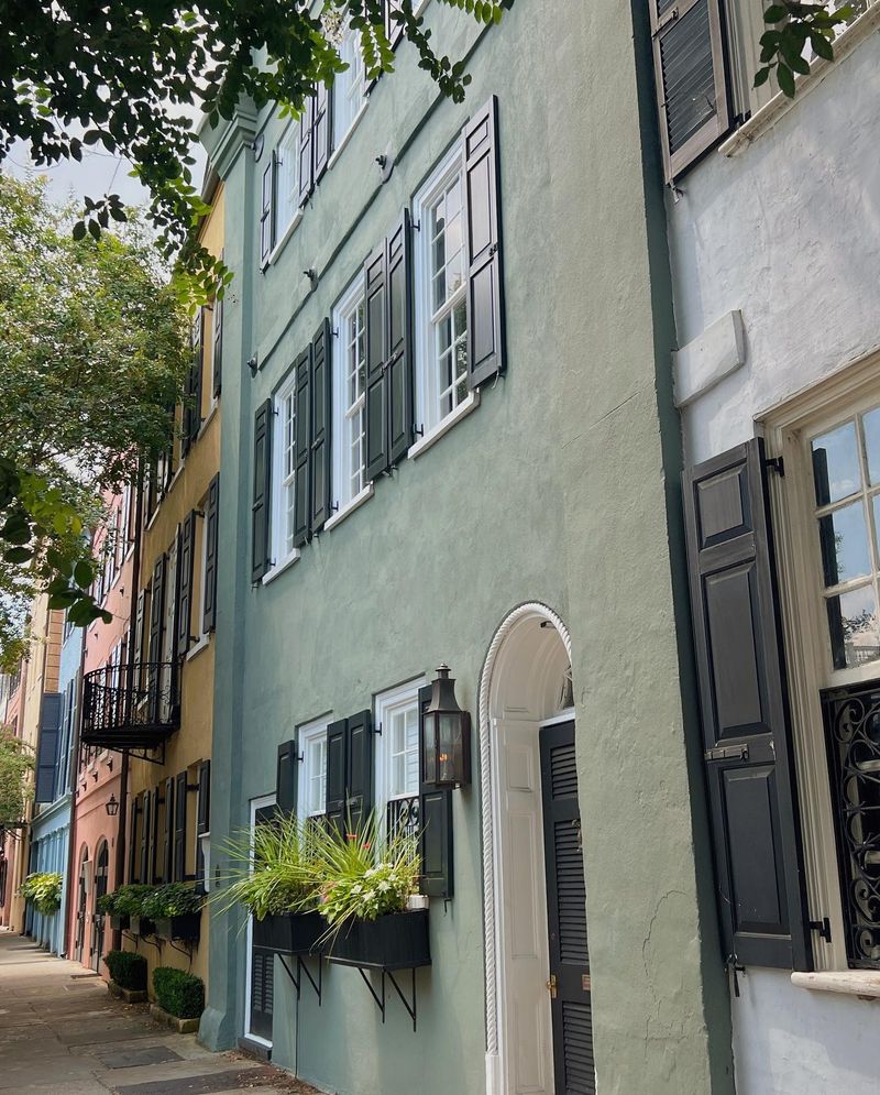
Legend claims this near-black green emerged after the Civil War when Southerners mixed leftover Union navy paint with yellow. The result? A mysterious green-black that appears purely black until sunlight reveals its verdant soul.
Charleston green adorns historic doors and shutters throughout the South, creating dramatic contrast against lighter facades. Its depth absorbs light rather than reflects it, lending gravitas to any architectural detail it touches.
4. Oyster Shell | Twilight on the Veranda
Grandmother’s pearls catching the last light of day—that’s oyster shell. This luminous neutral bridges the gap between gray and beige, carrying subtle pink undertones that warm stucco and limestone facades alike.
Victorian homes in San Francisco wear it proudly, as do Mediterranean villas and French country estates. The color holds its own against both morning fog and harsh afternoon sun, never appearing flat or lifeless, but rather developing character as shadows lengthen across its surface.
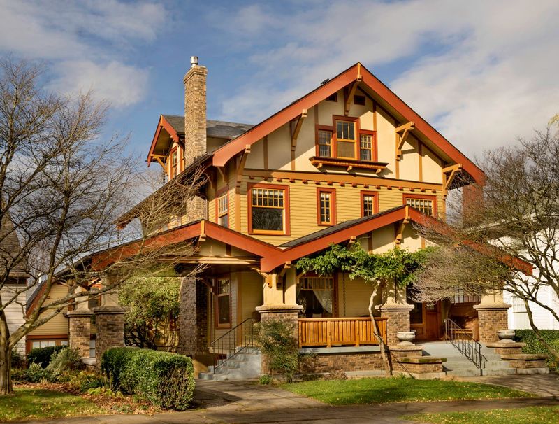
5. Wrought Iron Black | The Velvet Night
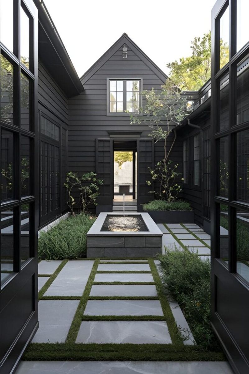
Wrought iron black pulls from the tradition of European manor houses and historic townhomes, where true black exteriors signaled both elegance and drama.
Unlike modern carbon blacks, this shade carries subtle blue undertones that prevent it from appearing flat. On Tudor facades or modern farmhouses, it creates a striking silhouette against any landscape. The color commands respect while somehow remaining humble, like a perfectly tailored tuxedo worn with quiet confidence.
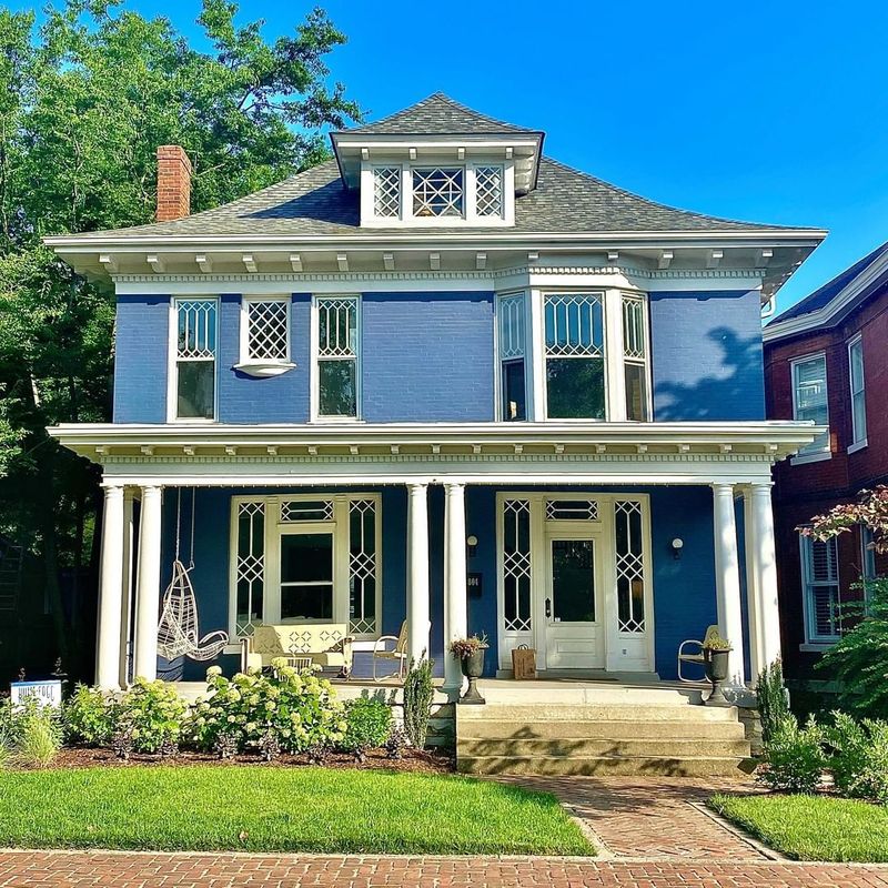
6. Hale Navy | The Captain’s Quarters
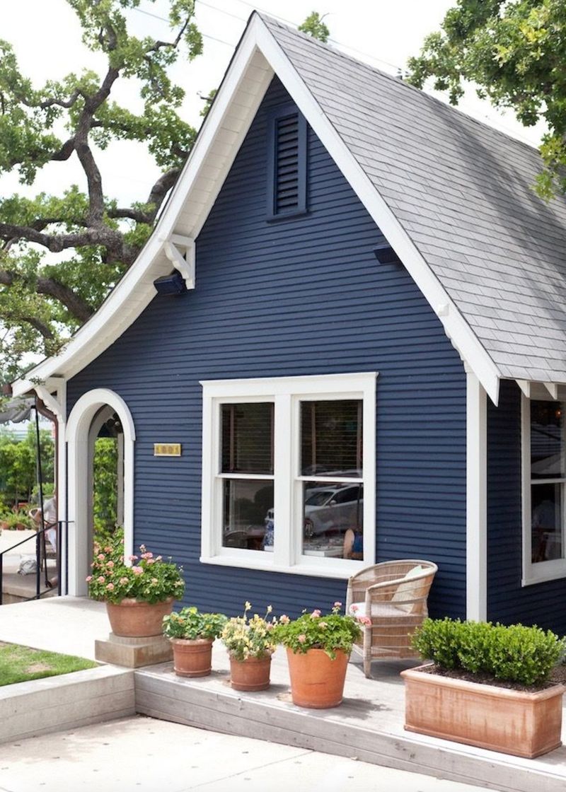
This aristocratic blue avoids the shouting brightness of maritime themes while still nodding respectfully toward nautical tradition.
Georgian colonials in coastal New England wear it with brass hardware and white trim, creating a stately presence that feels both authoritative and welcoming. Under overcast skies, it deepens to near-black; in full sun, hidden navy notes emerge like forgotten memories.
7. Sage Council | Where Herb Gardens Begin
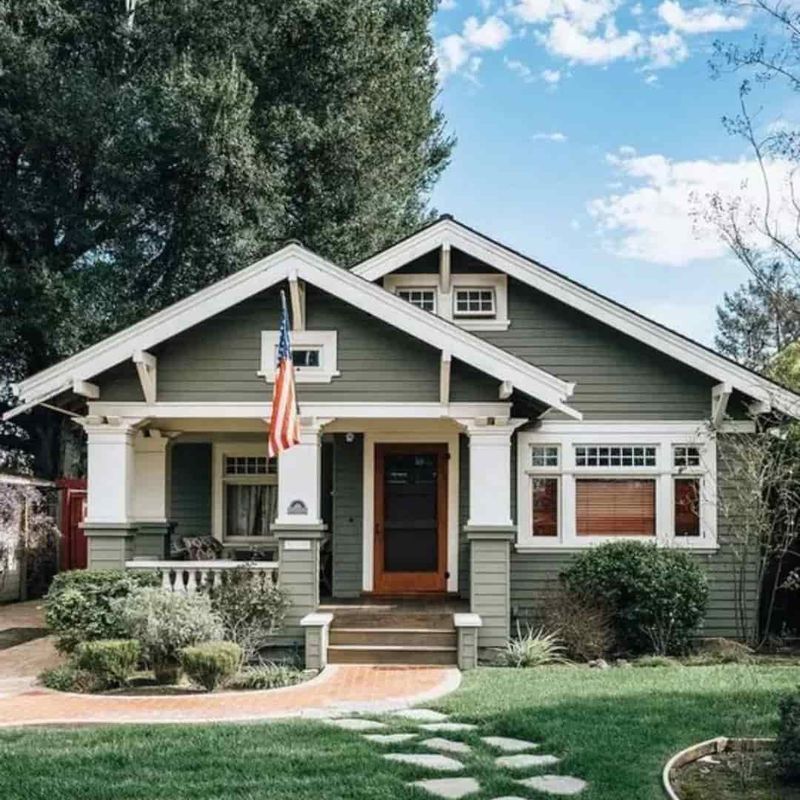
Sage Council captures that particular green-gray that emerges when morning dew settles on herb gardens—neither too vibrant nor too muted.
Craftsman bungalows embrace it naturally, the color complementing both the woodland settings they often inhabit and the earthy materials of their construction. The shade changes dramatically with the seasons, appearing more green in summer light and fading to a dusty gray under winter skies.
8. Buttermilk Cream | Sunday Morning Light
Buttermilk cream carries the warmth of fresh-churned butter with subtle depth that flat whites can never achieve.
Southern plantation homes rely on this shade to reflect brutal summer heat while maintaining a soft glow rather than a harsh glare. On clapboard or brick, it creates a welcoming envelope that seems to absorb and radiate golden hour light even on cloudy days.
9. Weathered Copper | The Verdigris Chronicles
Weathered copper captures that ephemeral moment when copper begins its journey toward green—a muted blue-green that whispers of age and permanence.
Victorian homes with complex architectural details showcase it brilliantly, the color highlighting rather than competing with gingerbread trim and ornate brackets. Against red brick chimneys or stone foundations, it creates a natural harmony that feels as though the home emerged organically from its surroundings.
10. Tobacco Leaf | The Scholar’s Study
Rich without heaviness, tobacco leaf carries amber undertones that prevent it from feeling muddy or flat on expansive surfaces.
Craftsman and Prairie-style homes wear it naturally, the color emphasizing horizontal lines while grounding the structure to its site. Unlike trendy modern browns, this shade has adorned university buildings and country estates for generations, developing a patina of respectability that only deepens with age.
11. Dove’s Wing Gray | The Poet’s Cottage
Neither fully gray nor fully white, this shade carries the softness of down feathers with just enough shadow to create depth against trim work.
Cape Cod cottages and shingled seaside retreats have worn it for generations, the color taking on different personalities depending on the light. Under stormy skies it deepens to embrace the mood; in bright sunshine it lifts to an ethereal pale that seems to float above the landscape.
12. Moss Stone | Where Ruins Remember
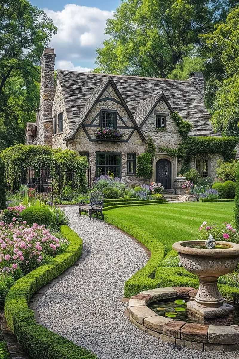
Ancient garden walls in the English countryside inspired this particular green. Moss Stone carries centuries of wisdom in its muted olive base with subtle umber undertones that prevent it from appearing too cool or clinical.
Tudor homes and stone cottages wear it naturally, as though the color were simply an extension of the surrounding landscape. It changes profoundly with the seasons—appearing more brown in autumn light, more green in spring rain—creating a living surface that breathes with its environment.
13. Brick Dust Rose | The Adobe Sunset
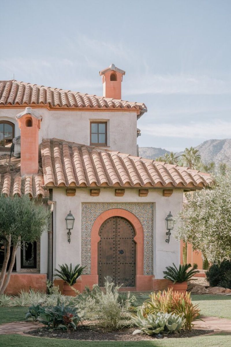
This earthen pink-terracotta isn’t the bright salmon of Florida retirement homes but rather the complex, dusty rose that appears when desert sun strikes adobe walls.
Mediterranean villas and Spanish Colonial revivals showcase it beautifully against clay tile roofs and wrought iron details. The color absorbs fierce sunlight during day, then releases it slowly as evening falls, creating a warm glow that seems lit from within.
14. Prussian Blue | The Midnight Library
Prussian blue carries historical gravitas—a near-black navy with mysterious depth that reveals itself differently under various light conditions.
Federal-style townhomes in historic districts wear it with dignity, the color creating a distinguished presence without resorting to true black’s severity. Against limestone trim or brass fixtures, it establishes immediate architectural authority while maintaining a certain approachable elegance, like an old-world gentleman who commands respect without demanding it.
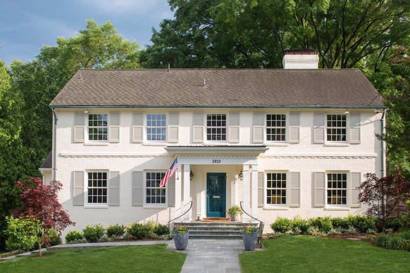
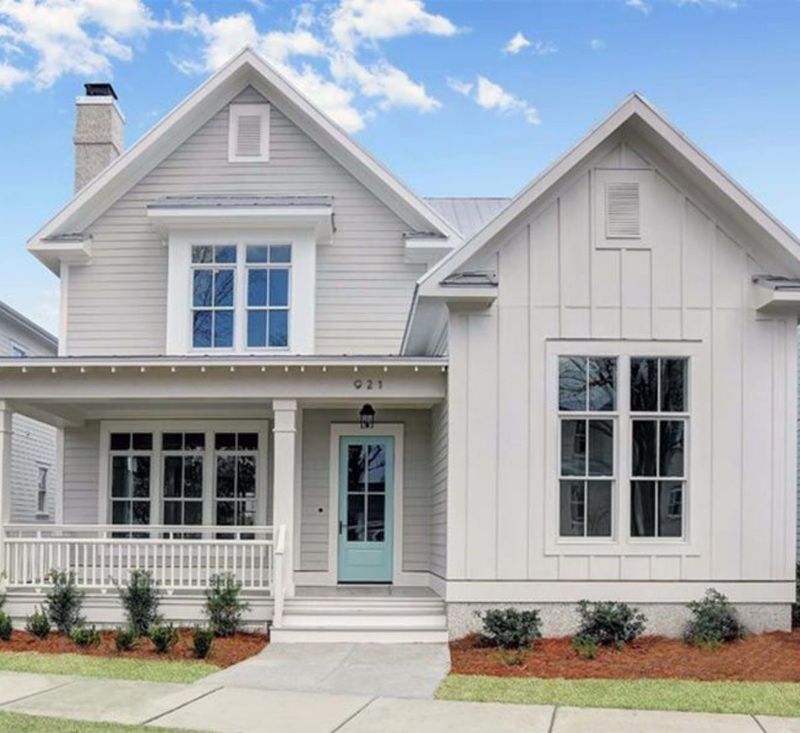
15. Linen White | The Envelope of Light
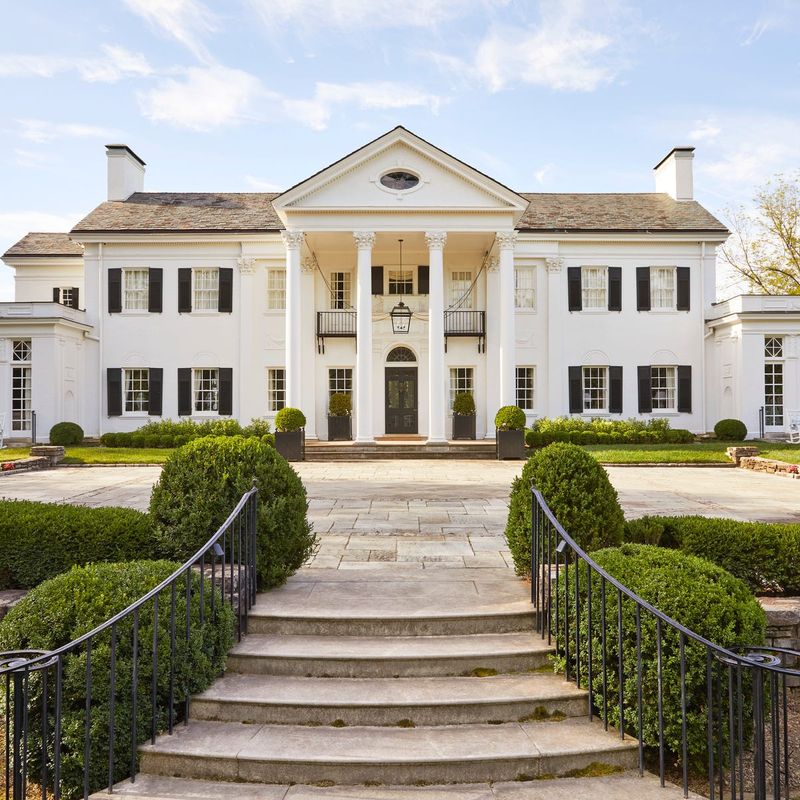
Linen white carries warmth without yellowing, texture without grit—imagine sunlight filtering through fine linen curtains and you’ll understand its particular quality.
Colonial revivals and Greek revival homes with classical columns showcase it beautifully, the color providing subtle dimension rather than stark brightness. Unlike modern bright whites, it absorbs and reflects light with equal grace, creating a soft luminosity that flatters architectural details rather than washing them out.