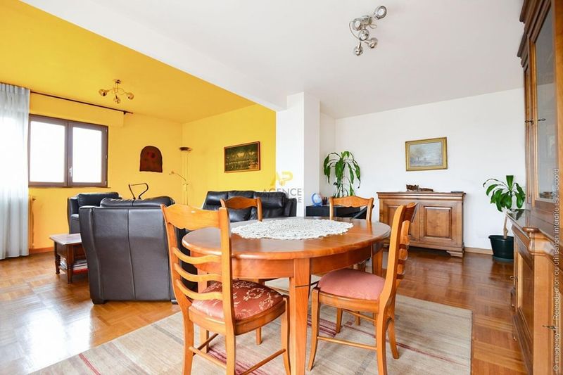
10 Paint Colors To Never Use With Oak Cabinets (Plus Few Even Worse Options)
Choosing a paint color for your kitchen sounds easy, until you’re trying to match it with oak cabinets. I learned the hard way that not every trendy shade works with that warm, golden wood.
Oak has a distinct personality, and the wrong wall color can make your kitchen feel totally off. If you’re planning a refresh, it’s just as important to know what not to pick as it is to find the perfect match.
Here are the colors that clash with oak cabinets, so you can skip the regret and get straight to a space you actually love living in.
1. Bright Cherry Red
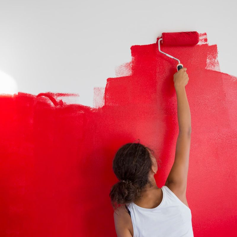
Fire engine red next to oak cabinets creates a chaotic visual battle that’ll make your kitchen feel like a fast-food restaurant. The warm undertones in both the red paint and oak wood fight for attention rather than harmonize.
Your eyes won’t know where to focus first! The combination often feels dated, reminiscent of 1990s design trends that haven’t aged well.
Most designers agree this pairing creates a space that feels smaller and more cluttered than it actually is.
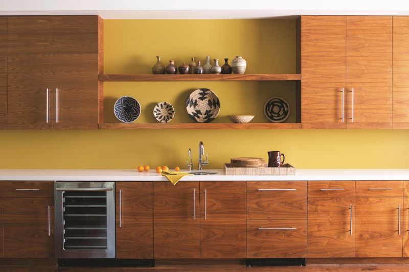
2. Sunshine Yellow
Yellow might seem cheerful, but paired with oak’s golden undertones? Yikes! The result resembles a yellow crayon that melted all over your kitchen.
Both colors share similar warm undertones, creating a monotonous, overwhelming effect. Without contrast, your cabinets will practically disappear into the walls.
Many homeowners who’ve tried this combination report feeling oddly anxious in their kitchens. Yellow’s energetic nature combined with oak’s warmth creates too much visual stimulation for comfortable daily use.
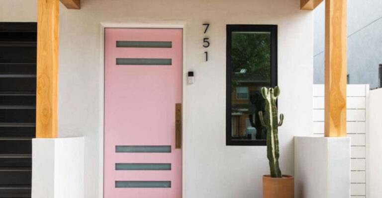
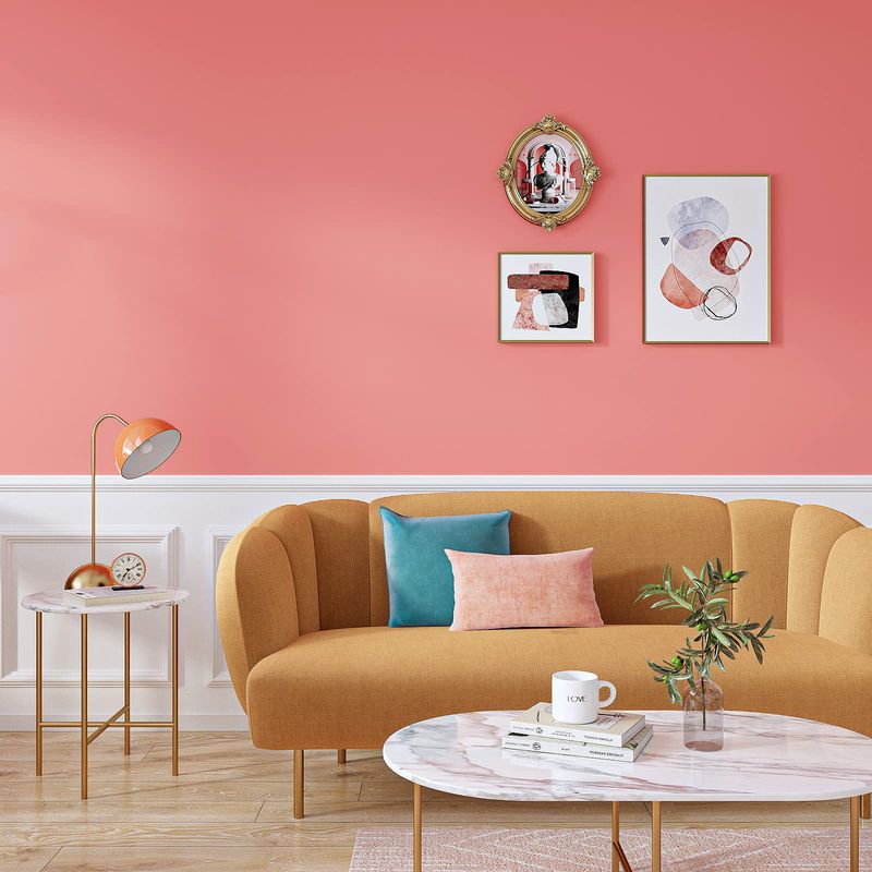
3. Bubble Gum Pink
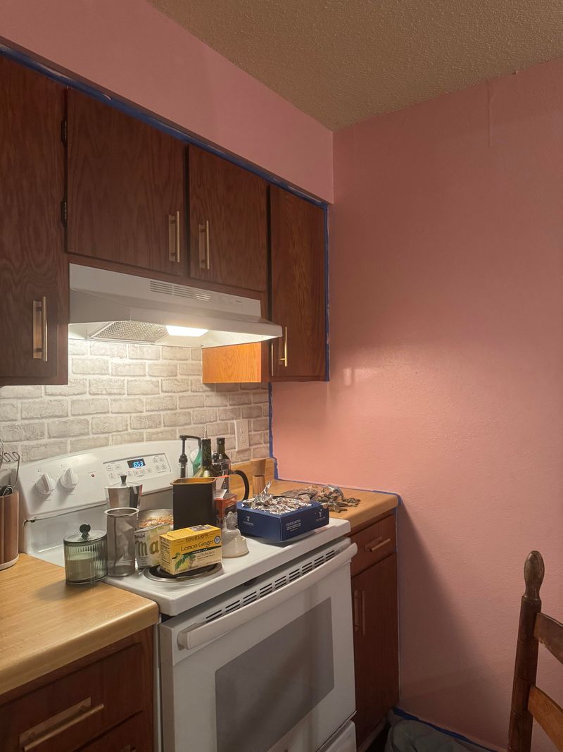
Though pink has made a comeback in home design, bubble gum shades turn oak-filled kitchens into something resembling a child’s playhouse.
The saccharine sweetness of pink clashes dramatically with oak’s natural, earthy character. If you’ve ever wondered what visual indigestion looks like, this might be it!
Professional designers often cite this combination as one that drastically reduces home resale value. The pink amplifies the orange undertones in oak, creating an unintentionally retro effect that few find appealing.
4. Emerald Green
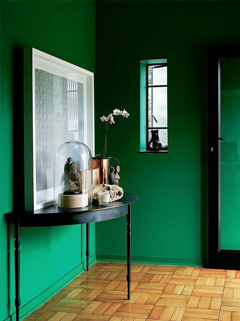
While emerald green works beautifully in many spaces, it creates a strange forest-like effect when paired with oak cabinets. The combination feels overwhelming, like being trapped in a dense woodland when you’re just trying to make breakfast.
Green’s cool undertones fight against oak’s warmth. The clash isn’t subtle – it’s like watching two strong personalities argue at a dinner party!
Several interior design surveys rank this combination among the top regretted paint choices, with homeowners often repainting within a year of this particular mistake.
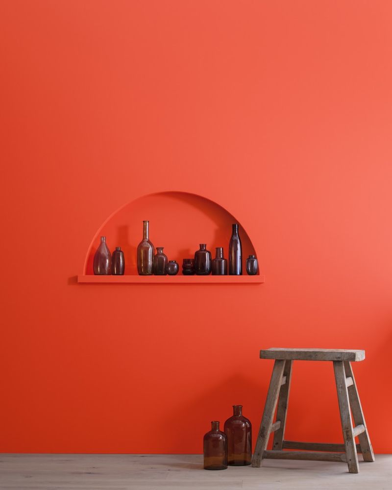
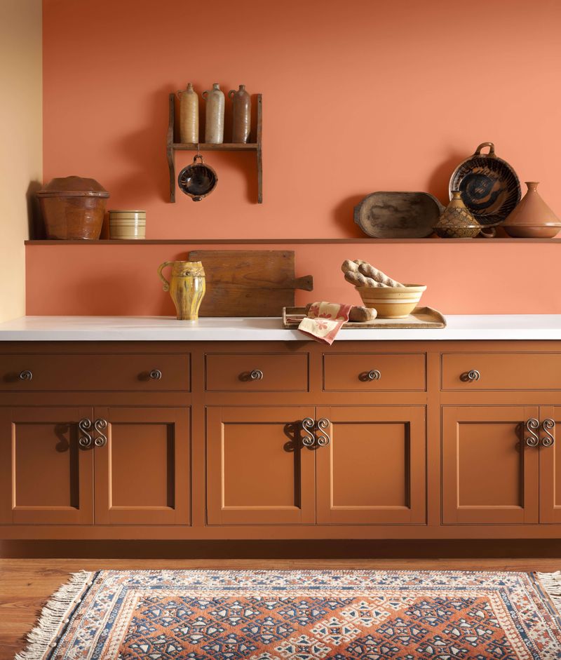
5. Burnt Orange
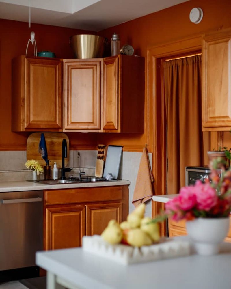
Matching similar tones usually works in design, but not when it comes to burnt orange walls with oak cabinets. The result? A monochromatic orange nightmare that feels like being trapped inside a pumpkin.
Without contrast, your kitchen elements blend together in a confusing visual soup. Your beautiful cabinet details completely disappear!
Even worse, this combination tends to make spaces feel dated and smaller than they actually are. Many real estate agents report this color combo as a top reason potential buyers walk away from otherwise lovely homes.
6. Chocolate Brown
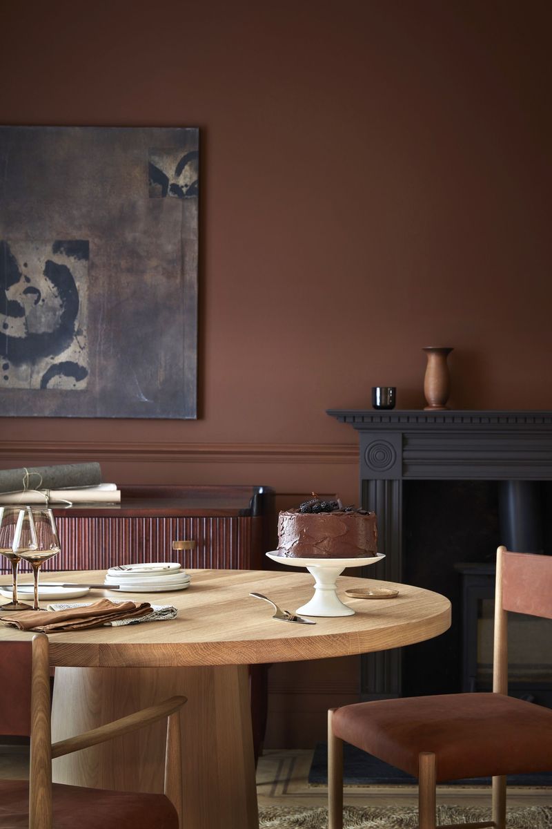
Brown might seem like a safe neutral, but pairing chocolate brown walls with oak cabinets creates a dreary cave-like atmosphere. The combination feels heavy and oppressive, like your kitchen is perpetually stuck in shadow.
Light bounces poorly in this environment, making even the brightest kitchen feel dim. Your oak cabinets’ natural beauty gets completely lost against the dark backdrop.
Many homeowners report this combination makes their kitchen feel significantly smaller and less inviting – the opposite of what most people want in the heart of their home!
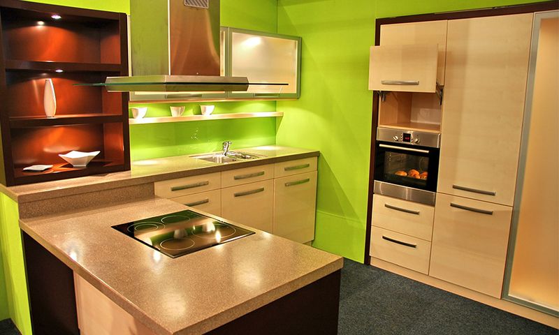
7. Neon Lime
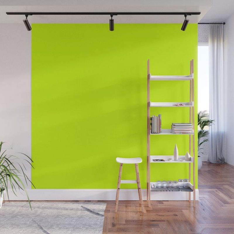
If you’re aiming for a kitchen that causes headaches, neon lime with oak cabinets will certainly deliver! This eye-searing combination creates visual tension that makes relaxing in your kitchen nearly impossible.
The acidic brightness of lime makes oak look muddy and dated by comparison. Your cabinets’ warm tones appear almost dirty against such an intense backdrop.
Kitchen designers frequently cite this pairing as one that clients request to change most urgently, usually within weeks of painting. The combination simply doesn’t allow for visual rest in what should be a functional, comfortable space.
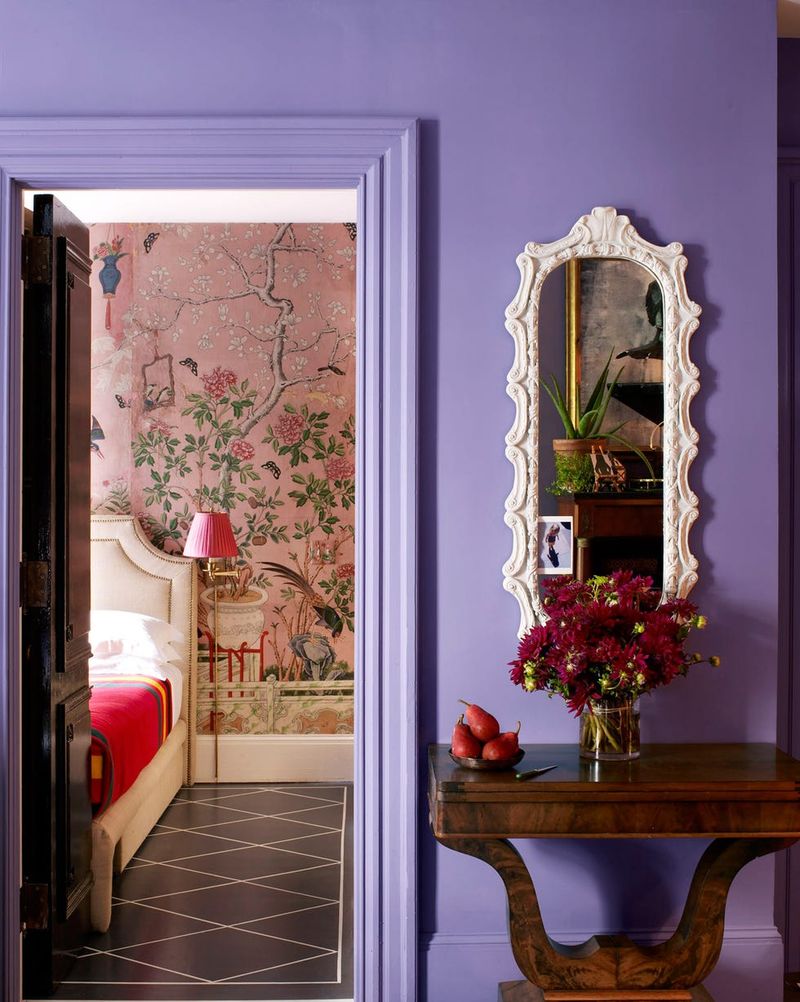
8. Pastel Lavender
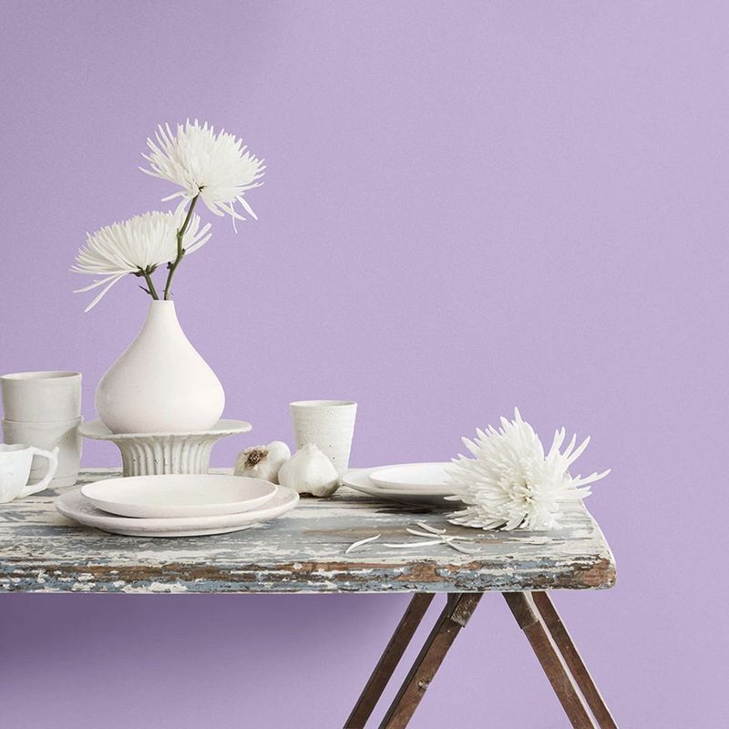
Lavender might whisper sweet nothings in other rooms, but paired with oak cabinets? It creates an awkward color story that never quite makes sense.
The purple undertones fight against oak’s warm, golden hues in a perpetual visual tug-of-war. What seems calming on a paint chip transforms into something oddly unsettling on your walls.
Many designers note that this combination often photographs poorly, looking dingy or “off” in pictures. If you’re hoping to show off your kitchen on social media or to potential buyers someday, this pairing won’t do you any favors!
9. Tomato Soup Red
Nothing says “1970s time capsule” quite like tomato soup red walls with oak cabinets. This combination screams vintage – and not in the cool, intentional way!
The orangey-red tones amplify oak’s warmth to uncomfortable levels. Your kitchen will feel perpetually hot, regardless of the actual temperature. Many homeowners report this color combination actually affects their appetite negatively.
Psychological studies suggest red stimulates hunger, but this particular pairing creates such visual discomfort that it counteracts that effect, making your kitchen feel more stressful than appetizing.
10. Electric Blue
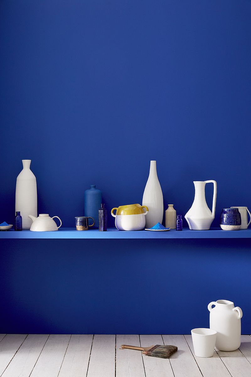
Electric blue might energize other spaces, but with oak cabinets? The result feels like a bizarre underwater theme park. This jarring combination creates such strong contrast that it’s visually exhausting to spend time in the space.
Your oak cabinets appear strangely orange against such an intense blue backdrop. Interior designers often use this pairing as an example of “complementary colors gone wrong” in their training materials.
While complementary colors (orange and blue) can work beautifully together in the right applications, this particular version creates a space that feels chaotic rather than harmonious.
11. Bubblegum Purple
Purple and oak create one of the oddest kitchen combinations imaginable. The cool, synthetic feel of bubblegum purple makes oak look jarringly outdated, like mixing clothing from completely different fashion eras.
Your cabinets’ warm undertones appear unnaturally orange against purple. Real estate agents frequently cite this combination as one that significantly extends a home’s time on the market.
The playful, youthful nature of bright purple clashes fundamentally with oak’s traditional, natural character, creating a space that feels confused about its own identity.
12. Canary Yellow
Forget creating a sunny kitchen – canary yellow walls with oak cabinets produce a space that feels like being trapped inside a yellow highlighter. The intensity overwhelms the senses and makes the oak appear oddly greenish by comparison.
Your kitchen will feel like it’s shouting at you every time you enter. Home decorating experts frequently mention this combination in their “what not to do” seminars.
The yellow-on-yellow effect (yellow walls with yellowish oak) creates a space lacking visual definition, where cabinet edges seem to blur into walls in an unsettling way.
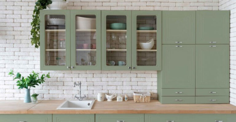
13. Mint Green
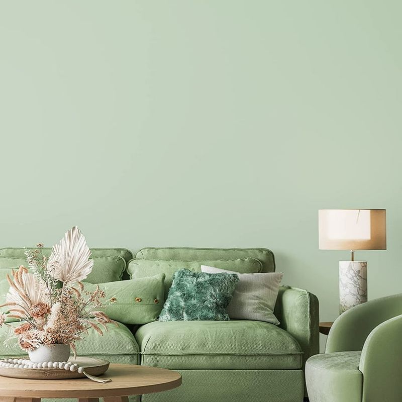
Mint might feel fresh and clean on its own, but paired with oak cabinets? The combination resembles a 1950s hospital cafeteria that never got updated. The cool, somewhat clinical feel of mint makes oak look distinctly outdated by comparison.
Your cabinets’ warm tones appear jarringly orange against the cool mint backdrop. Color psychology experts note this pairing creates an unconscious feeling of unease in most people.
The mint’s inherent sweetness clashes with oak’s natural richness, creating a space that never quite feels cohesive no matter how you accessorize it.
14. Salmon Pink
Salmon pink walls transform oak kitchens into something resembling the inside of an old-fashioned makeup compact. The peachy-pink tones merge uncomfortably with oak’s warmth, creating a fleshy, unappetizing effect that few find welcoming.
Your cabinets lose all definition against this similarly-toned backdrop. Kitchen design professionals often use this combination as a cautionary example when explaining color theory to clients.
The lack of contrast makes the space feel flat and one-dimensional, while the overall effect tends to make food look less appetizing – definitely not what you want in a kitchen!
15. Turquoise Blue
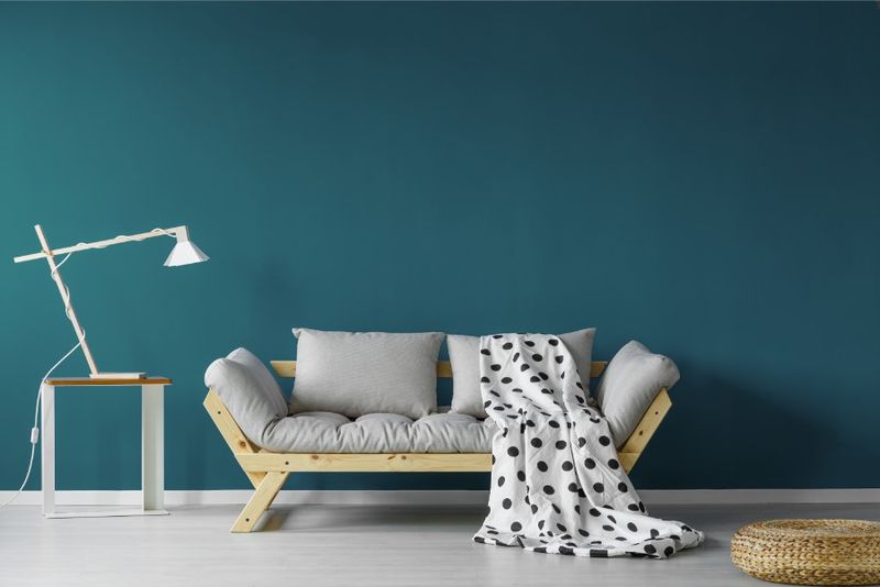
Though turquoise brings beachy vibes to many spaces, with oak cabinets it creates a confused tropical theme that never quite lands. The cool, vacation-inspired blue makes oak appear unnaturally orange and dated by comparison.
Your kitchen ends up feeling like a poorly conceived themed restaurant. Interior stylists frequently mention this combination as one that photographs especially poorly.
What might seem initially appealing quickly becomes tiresome to live with, as the visual tension between these opposing color temperatures creates a space that never feels quite settled or harmonious.
16. Mustard Yellow
Mustard yellow walls paired with oak cabinets create a kitchen that feels perpetually stuck in the 1970s. The similar undertones blend together into a muddy, monochromatic mess that lacks visual interest or definition.
Your cabinets practically disappear into the walls. Lighting designers note this combination absorbs rather than reflects light, making your kitchen feel perpetually dim.
Even worse, this particular yellow tone tends to cast an unflattering yellow tinge on everything – including food and faces – making both your meals and your selfies look less appetizing!
17. Burgundy Red
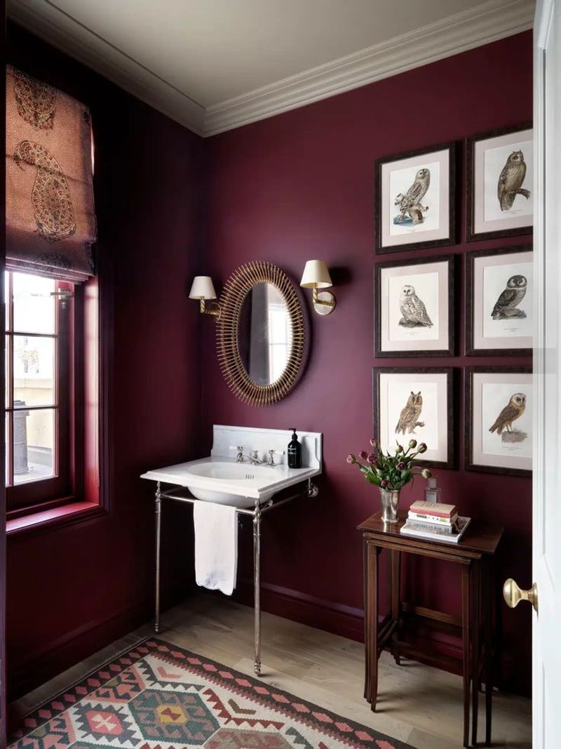
Burgundy might seem sophisticated elsewhere, but with oak cabinets it creates a heavy, oppressive atmosphere reminiscent of an old-fashioned steakhouse. The combination feels overwhelmingly warm and dated, like being trapped in a 1990s restaurant.
Your kitchen will appear perpetually dark and smaller than it actually is. Lighting experts note that this color combination absorbs an unusual amount of light.
The red undertones in both the paint and the oak create a space that feels claustrophobic rather than cozy, with the similar warm tones competing rather than complementing each other.
18. Lime Green
Lime green walls make oak cabinets look like they’re having an identity crisis. The acidic brightness of lime brings out every orange undertone in oak, creating a strange citrus-themed kitchen you never intended to have.
Your cabinets appear oddly dated against such a contemporary color. Color psychology experts note this particular combination creates feelings of restlessness rather than the calm cooking environment most people desire.
The stark contrast between the natural wood and the artificial-feeling green creates a space that never quite feels cohesive or intentionally designed.
19. Peach
Peach walls with oak cabinets create a kitchen that feels like it’s perpetually blushing. The similar warm undertones blend together into a peachy-orange blur that lacks definition or visual interest.
Your cabinets practically melt into the walls in this monochromatic nightmare. Lighting designers note this combination creates particularly unflattering light reflections on skin tones.
The overall effect tends to make the space feel dated rather than timeless, reminiscent of 1980s design trends that haven’t aged well and continue to be a top regret among homeowners who’ve tried this combination.
20. Royal Purple
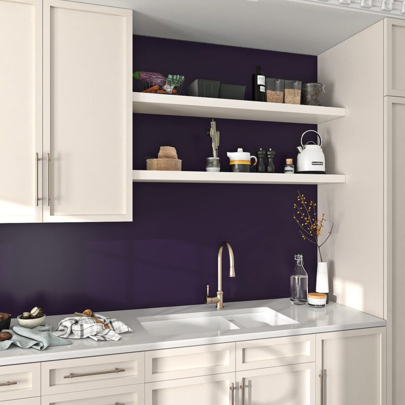
Royal purple might suggest luxury in other contexts, but with oak cabinets? The result feels like a confused medieval theme park. This dramatic color makes oak look surprisingly orange and outdated by comparison.
Your kitchen will feel like it’s having an identity crisis. Design psychologists note this combination creates an unusually high level of visual tension.
The regal associations of purple clash fundamentally with the humble, homey nature of oak, creating a space that never quite feels comfortable or cohesive no matter how carefully you accessorize or coordinate other elements.