20 Kitchen Colors Designers Say You Should Try In 2025 Instead Of Many Shades Of Green
Green has dominated kitchen spaces for years now, from sage cabinets to olive islands to forest backsplashes. But designers are finally ready to call it: we’ve reached peak green fatigue.
Fresh palettes are emerging that offer personality without defaulting to yet another shade of the verdant spectrum. Color isn’t just about trends—it’s about creating spaces that reflect who we are beyond what Pinterest declares safe.
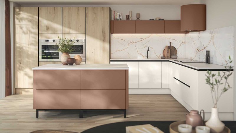
1. Terracotta Revival
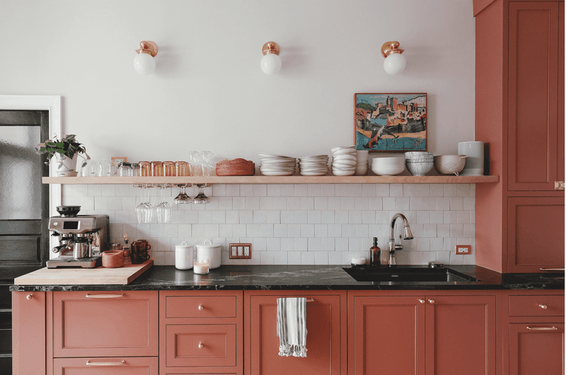
Warm, earthy, and unapologetically Mediterranean, terracotta brings sun-baked sophistication to modern kitchens. Unlike the 90s terracotta that felt heavy, today’s version appears weightless when paired with cream countertops and brass fixtures.
Natural light makes this clay-inspired hue glow rather than darken. Imagine Italian countryside warmth meeting minimalist cabinetry—suddenly your morning coffee ritual feels like a Tuscan getaway.
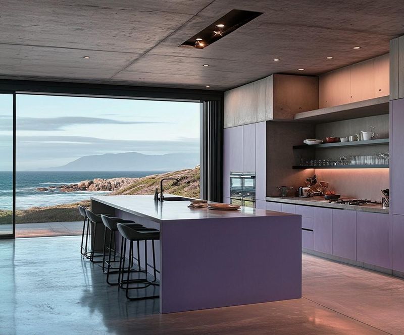
2. Midnight Aubergine
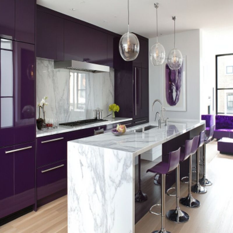
Dramatic without the darkness of black, midnight aubergine carries the sophistication of a vintage velvet smoking jacket. Kitchens wearing this deep purple-black shade become intimate conversation spaces rather than just functional cooking zones.
Apply it on lower cabinets beneath marble countertops for grounding weight. The color absorbs and reflects light differently throughout the day, shifting from near-black morning mystery to rich purple evening luxury.
3. Butter Block Yellow
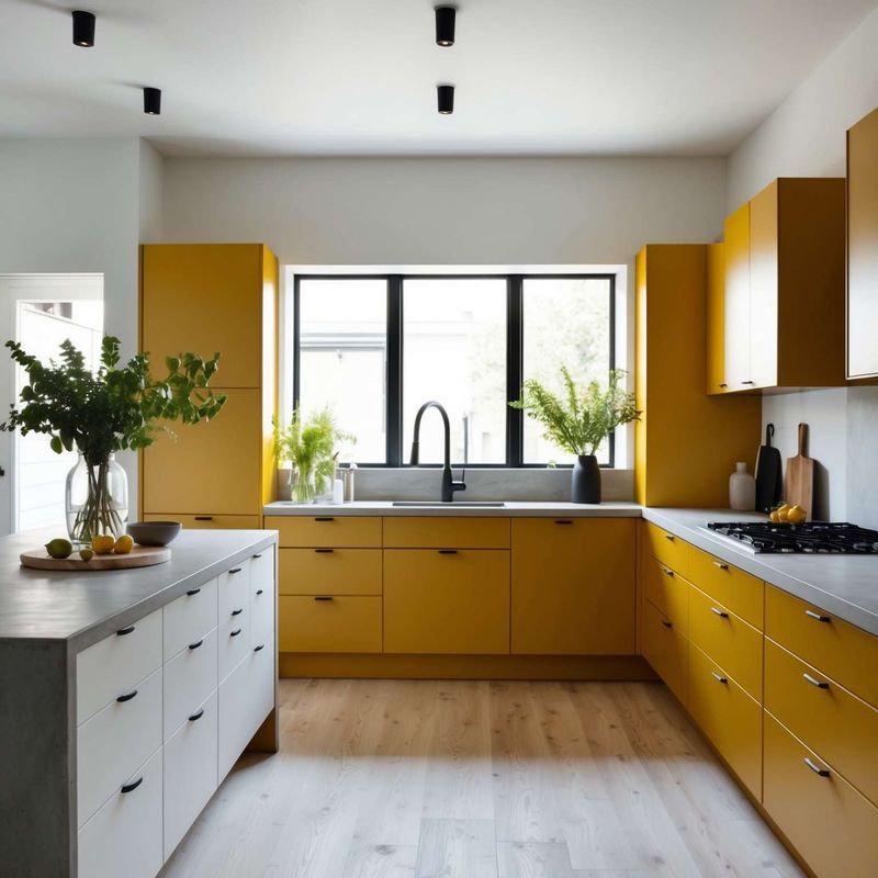
Forget cautious cream—butter block yellow boldly reclaims the kitchen with sunlit confidence. Reminiscent of grandmother’s farmhouse but filtered through a Scandinavian design lens, this rich yellow creates instant happiness without veering into childish territory.
Matte finishes prevent overwhelming brightness while wood accents and white walls balance the statement. Morning light transforms these kitchens into golden hour photography sessions, regardless of actual time.
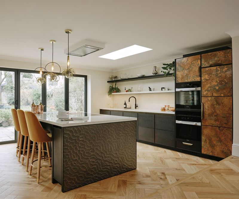
4. Oxidized Copper
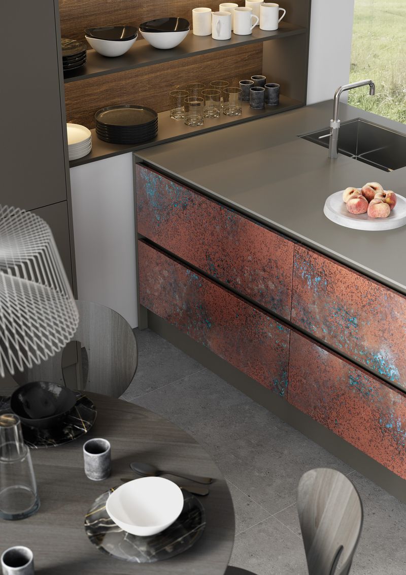
Living color that tells a story—oxidized copper brings patina-rich history to contemporary kitchens. Neither fully blue nor fully green, this weathered metallic sits comfortably in the teal family while maintaining distinctive character.
Designers pair it with unlacquered brass hardware that ages alongside it. The color creates conversation without shouting, especially in north-facing kitchens where natural light reveals its multidimensional blue-green depths without overwhelming the senses.
5. Charred Vanilla
Vanilla isn’t playing it safe anymore. Charred vanilla—a smoked, toasted cream with warm undertones—offers complexity where basic white feels sterile. French pastry chefs would approve of this culinary-inspired neutral.
Wall-to-wall application creates cozy continuity while still reflecting light. Morning shadows play across the surface revealing subtle depth variations, while evening light brings out honeyed warmth that makes dinner guests linger longer over dessert.
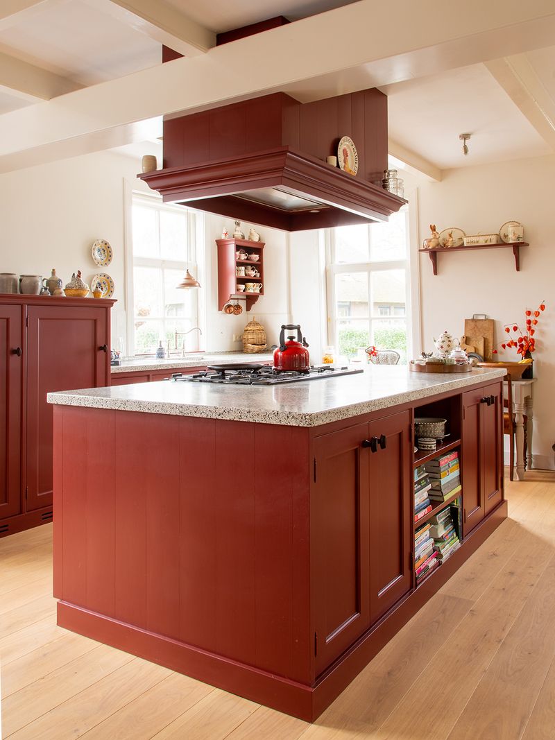
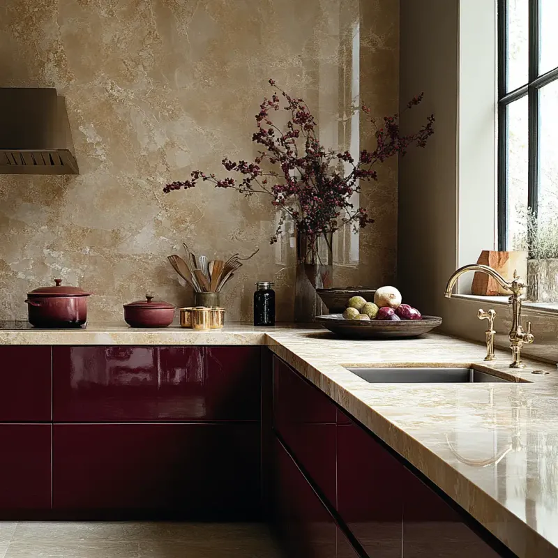
6. Moody Mulberry
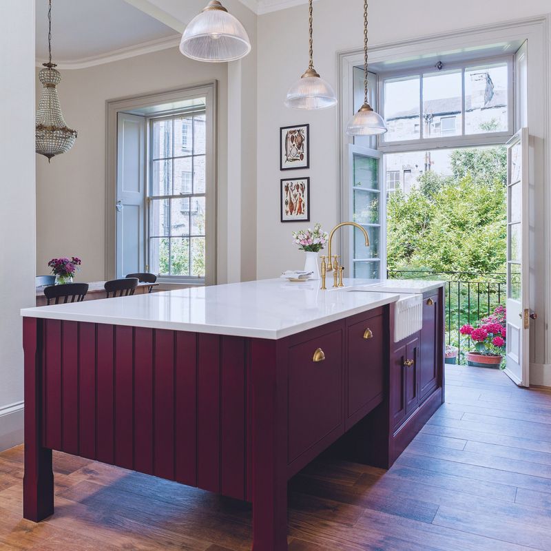
Berry tones have graduated from accent walls to full kitchen commitment. Moody mulberry—a sophisticated burgundy with blue undertones—offers dramatic depth without the heaviness of traditional dark colors.
Surprisingly versatile, it pairs beautifully with both marble and concrete countertops. Natural light reveals its fruit-inspired origins while evening lighting transforms it into a mysterious backdrop for dinner parties, making even takeout containers look like carefully plated cuisine.
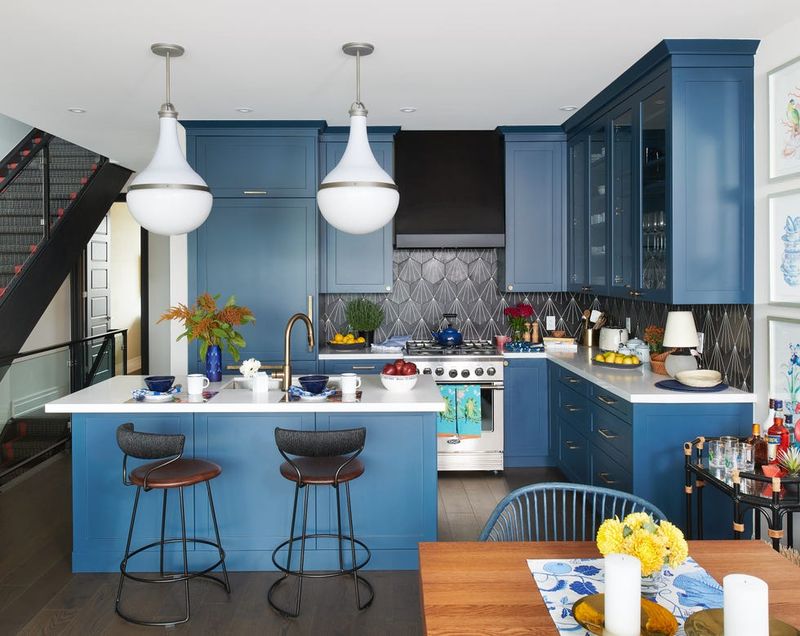
7. Faded Denim
Comfort color gets architectural treatment with faded denim—a lived-in blue that feels simultaneously nostalgic and forward-thinking. Like your favorite jeans, this shade improves with time and light exposure.
Manhattan designers particularly embrace this tone for its urban sophistication without cold modernism. Paired with warm woods and concrete countertops, faded denim creates kitchens that feel collected rather than designed—spaces that welcome cooking experiments and midnight snack raids equally.
8. Dusty Coral
Neither pink nor orange but capturing the best of both, dusty coral delivers subtle warmth without overwhelming smaller spaces. This color emerged from Miami design studios but quickly found favor in northern climates for its sun-kissed quality.
Morning light emphasizes its peachy undertones while evening transforms it into a sophisticated backdrop. Particularly striking with unlacquered brass hardware that will patina beautifully alongside it, creating a kitchen that evolves rather than dates.
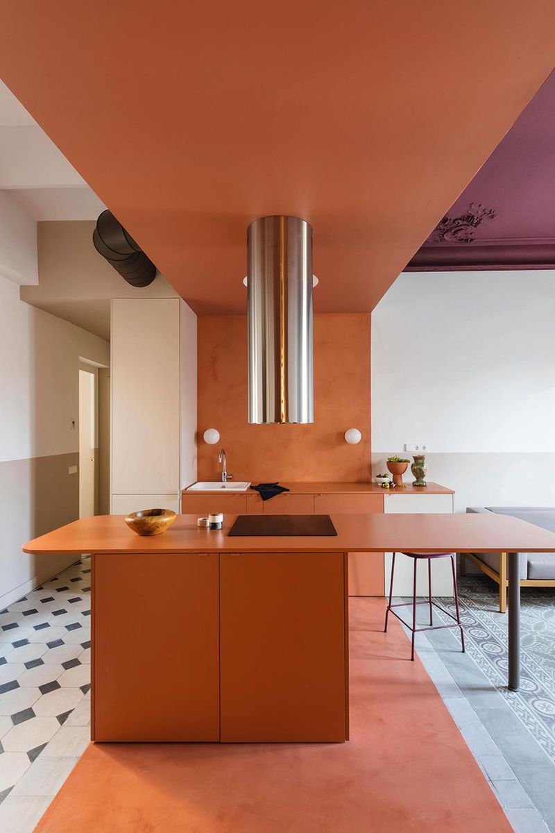
9. Smoked Paprika
Culinary-inspired and unapologetically bold, smoked paprika brings Spanish influence to modern kitchens. This burnt orange-red with brown undertones creates statement spaces that still feel remarkably livable.
Never flat or one-dimensional, the color shifts dramatically from morning vibrancy to evening richness. Designers pair it with creamy countertops and matte black fixtures for balance, creating kitchens that feel like they belong in renovated Barcelona apartments rather than cookie-cutter developments.
10. Lavender Fog
Purple returns from design exile with lavender fog—a sophisticated gray-purple that reads almost neutral while maintaining distinct personality. Morning light brings out its gentle purple undertones while evening dims it to sophisticated gray.
Particularly effective in kitchens with eastern exposure where sunrise illuminates its complexity. Marble with purple veining amplifies the effect without becoming themed or precious, creating spaces that feel simultaneously collected and curated.
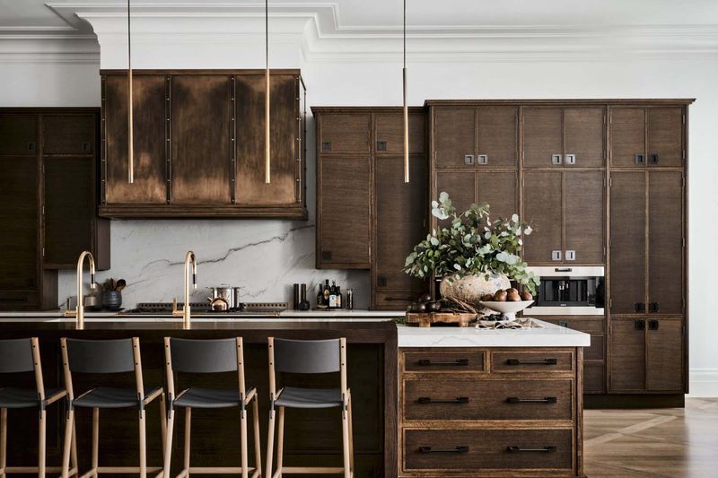
11. Burnished Bronze
Metallic finishes evolve beyond hardware with burnished bronze—a rich, dimensional brown with subtle shimmer rather than obvious shine. This color brings unexpected warmth to modern kitchens while maintaining sophisticated edge.
Unlike flat browns, burnished bronze captures and reflects light differently throughout the day. Particularly stunning paired with cream countertops and natural wood floors, creating spaces that feel simultaneously ancient and modern—like discovering a perfectly preserved Roman villa retrofitted with Viking appliances.
12. Faded Black Plum
Nearly black but never flat, faded black plum offers complexity where straight black feels harsh. In morning light, subtle purple undertones emerge; by evening, the rich darkness creates dramatic backdrops for illuminated countertops.
Parisian designers particularly favor this shade for its old-world sophistication. Paired with marble and brass, these kitchens feel like they’ve witnessed centuries of conversation rather than recent renovation—spaces that make even microwave dinners feel like culinary achievements.
13. Weathered Indigo
Japanese indigo meets American denim in this lived-in blue that brings instant history to new spaces. Unlike typical navy, weathered indigo shows deliberate fading and dimension—like perfectly broken-in jeans translated to cabinetry.
The color creates striking contrast against white walls while maintaining sophisticated calm. Natural light reveals subtle variations throughout the day, while evening transforms these kitchens into intimate dining spaces where conversations naturally deepen along with the blue tones.
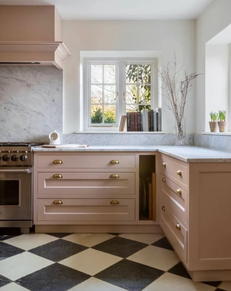
14. Clay Pink
Forget millennial pink—clay pink brings earthy sophistication with terra-cotta undertones that ground this otherwise delicate color. Neither saccharine nor childish, this warm neutral creates surprisingly versatile backdrops for both traditional and modern kitchens.
Morning light emphasizes its warmth while evening softens its presence. Particularly stunning when paired with natural wood elements and cream stone, creating spaces that feel simultaneously ancient and contemporary—like discovering Mediterranean pottery shards reimagined as modern kitchen spaces.
15. Tarnished Brass
Metallic without showiness, tarnished brass brings subtle gold tones mellowed by age and character. Neither yellow nor brown but somewhere beautifully between, this color creates instant heritage in new construction.
Light plays across the surface revealing complexity rather than flat color. Particularly effective in kitchens with southern exposure where changing daylight continually transforms the space, creating environments that feel simultaneously grand and intimate—like discovering an antique music box scaled to room size.
16. Charcoal Blue
Neither fully charcoal nor completely blue, this complex neutral brings sophisticated depth without traditional darkness. Morning reveals subtle blue undertones while evening transforms it into dramatic near-black backdrops for illuminated countertops.
Scandinavian designers particularly embrace this shade for creating cozy yet sophisticated environments. Paired with blonde wood and white marble, charcoal blue creates kitchens that feel simultaneously substantial and airy—spaces that ground without heaviness.
17. Warm Mushroom
Beige gets dimensional with warm mushroom—a sophisticated taupe with distinctly organic character. Unlike flat neutrals, this color shifts dramatically with lighting, revealing complex undertones throughout the day.
Natural materials particularly shine against this backdrop, making marble veining and wood grain appear more pronounced. Morning light brings out its warmth while evening softens it to enveloping comfort, creating kitchens that feel like they’re giving you a gentle hug rather than simply housing appliances.
18. Matte Cocoa
Rich without heaviness, matte cocoa brings unexpected sophistication to contemporary kitchens. Unlike traditional brown cabinets, this chocolate-inspired hue offers depth without darkness when paired with reflective surfaces.
Particularly striking in kitchens with western exposure where afternoon light warms its red undertones. Brass hardware creates stunning contrast while marble countertops lighten the overall effect, creating spaces that feel like they belong in renovated Parisian apartments—simultaneously classic and completely current.
19. Dusty Olive
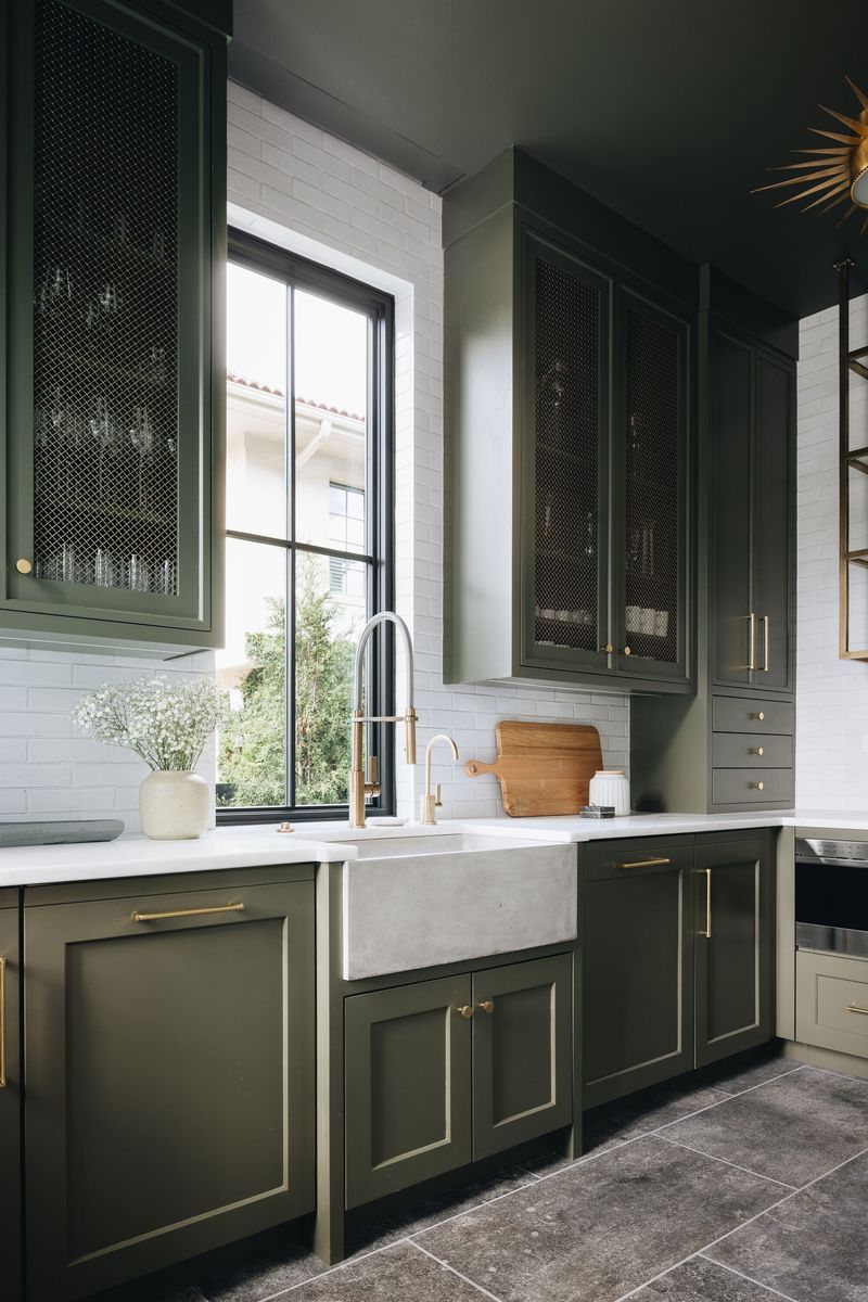
Yes, it’s technically in the green family, but dusty olive has evolved beyond trendy sage into something more complex and enduring. This muted, gray-influenced olive creates sophisticated backdrops that feel neither too traditional nor aggressively modern.
Morning light reveals its subtle green character while evening dims it to sophisticated neutral. Particularly effective when paired with unlacquered brass and cream stone, creating kitchens that feel like they’ve evolved rather than been installed—spaces with instant history and character.
20. Weathered Cedar
Wood tones reimagined as color with weathered cedar—a sophisticated orange-brown with subtle red undertones that brings natural warmth without actual wood grain. Unlike typical brown, this shade captures the silvered quality of aged cedar.
Concrete countertops create striking modern contrast while brass fixtures add complementary warmth, creating spaces that feel simultaneously rustic and refined—like discovering a perfectly weathered cabin with chef-worthy amenities.