17 Rules Designers Always Follow To Find The Best Exterior Paint For Your Home
Picking exterior paint sounds simple, until you’re staring at 50 shades of gray wondering which one won’t make your house look like a storm cloud.
I’ve learned the hard way that color choice can make or break your home’s curb appeal, and it’s not just about looks. The right paint also protects your home and can boost its value down the line.
Luckily, designers have a few tried-and-true rules to take the guesswork out of it. If you’re planning an outdoor refresh, these tips will help you choose a color you’ll love pulling up to every single day.
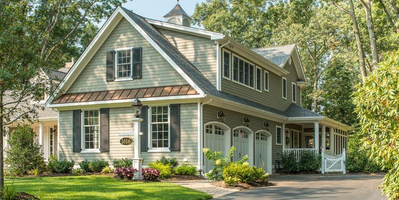
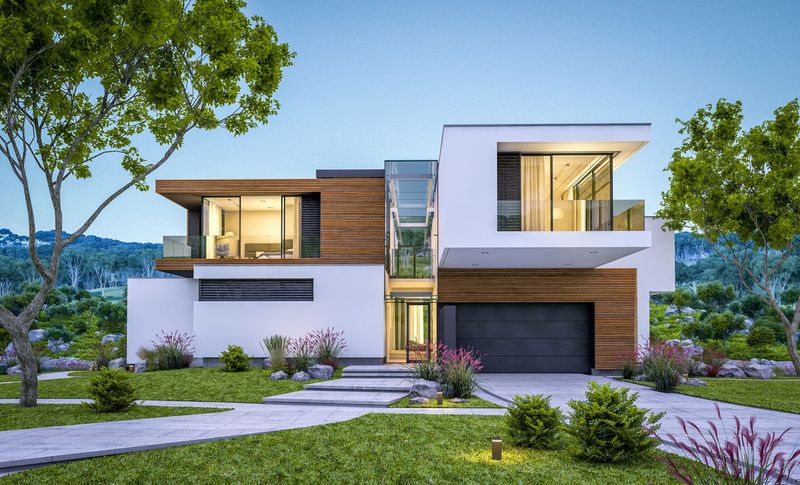
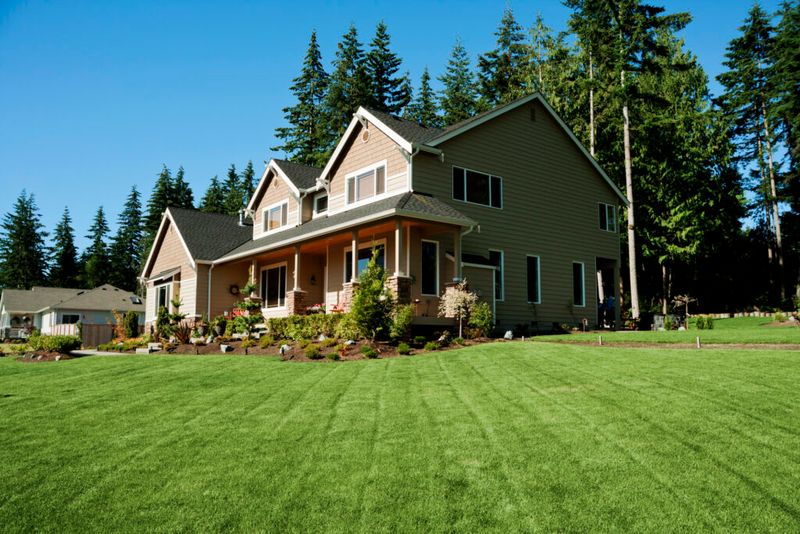
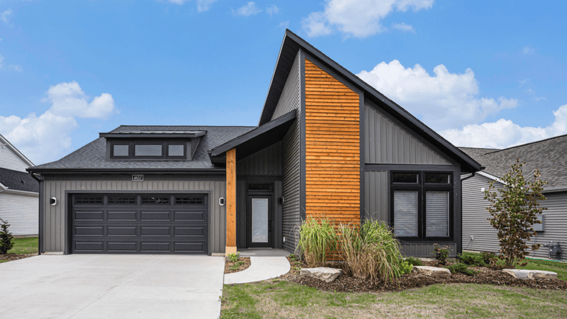
1. Consider Your Home’s Architecture
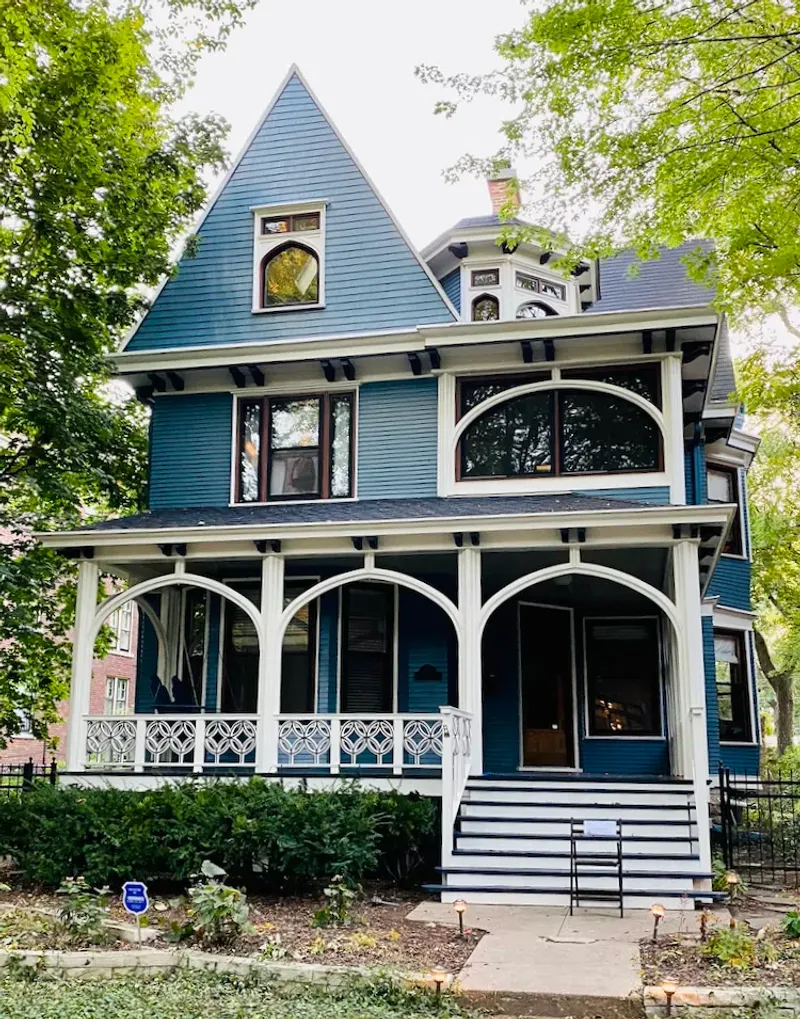
Victorian homes look stunning in heritage colors, while mid-century modern houses pop with bold, clean hues.
Your home’s architectural style provides natural guidance for your color palette. Ranch-style homes often shine with earthy tones that complement their horizontal lines.
If you live in a craftsman bungalow, rich, nature-inspired colors will highlight those gorgeous woodwork details and create a harmonious look with the surrounding landscape.
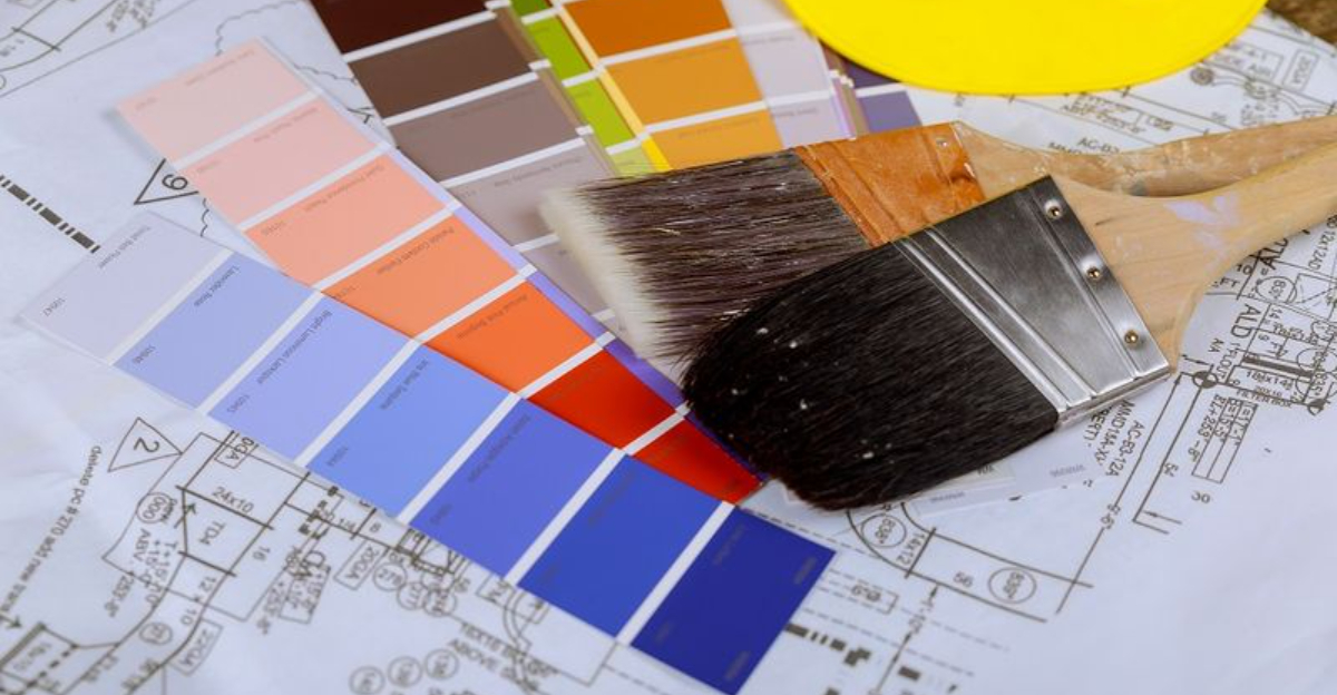
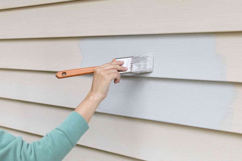
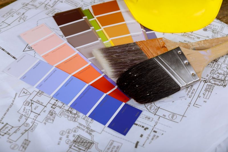
2. Test Paint Samples In Real Conditions
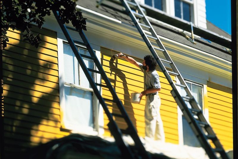
Forget those tiny paper swatches! Buy sample cans and paint 2-foot squares on different sides of your house.
Colors change dramatically depending on sunlight exposure. Morning light brings out blue undertones, while afternoon sun amplifies yellow and red.
Look at your samples throughout the day and in different weather conditions before making a final decision. What looks perfect at noon might seem completely wrong by sunset!
3. Match Your Climate Needs
Hot, sunny regions demand paints with UV protection to prevent fading and cracking. Coastal homes need formulas that resist salt spray and moisture.
Cold climate dwellers should look for flexible paints that can expand and contract during freeze-thaw cycles. Rainy areas benefit from mildew-resistant options.
The wrong paint for your climate means redoing the whole job years sooner than necessary – an expensive mistake nobody wants!
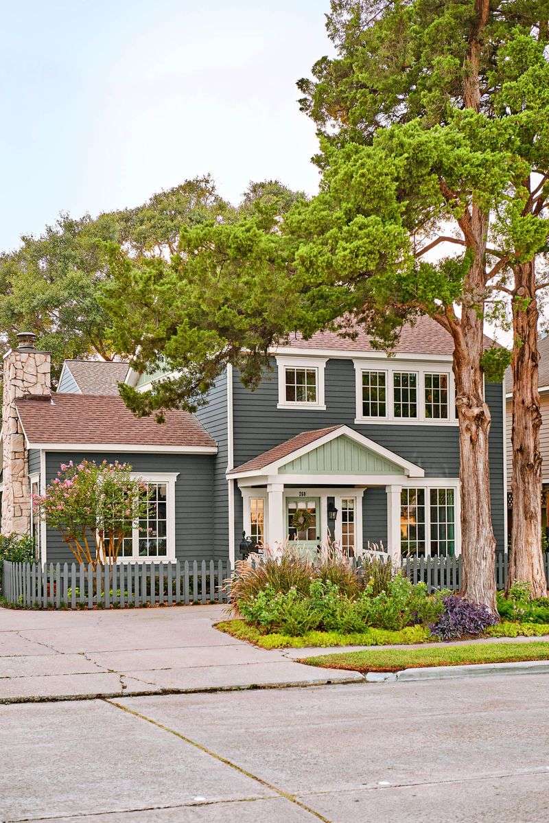
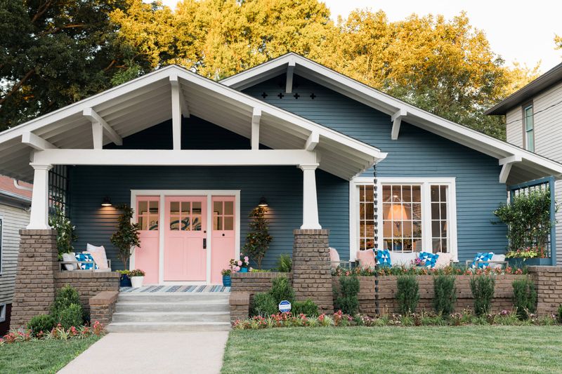
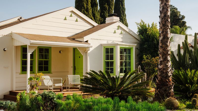
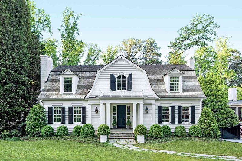
4. Respect The Rule Of Three
Most designer-approved color schemes include exactly three hues: one for the main body, another for trim, and a third for accents like doors and shutters.
This balanced approach creates visual interest without chaos. Sometimes the accent color might be bold – like a cheerful red door against neutral siding.
Your trim color should complement but contrast with your main color, typically in a lighter shade for definition. When these three elements work together, magic happens!
5. Analyze Your Fixed Elements
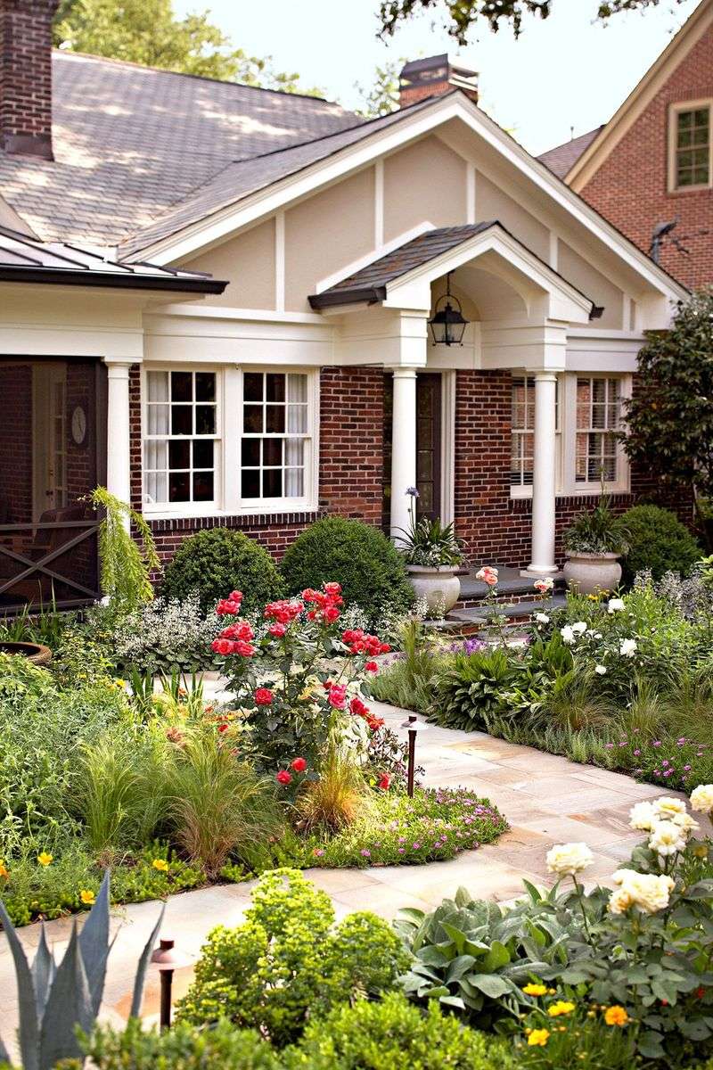
Stone foundations, brick accents, and roof colors aren’t changing anytime soon. Smart designers select paint colors that harmonize with these permanent features instead of fighting against them.
Got reddish brick? Cool blues might clash while warm tans complement beautifully. Notice the undertones in your stone, roof shingles, and hardscaping.
Yellow-based creams look stunning with warm-toned features while gray-based whites pair perfectly with cooler fixed elements.
6. Look At Your Neighborhood Context
While standing out slightly is fine, choosing a color that screams for attention amid traditional homes might make your house the neighborhood eyesore.
Study what works in your area. Historic districts often have specific approved color palettes. Even without formal restrictions, neighborhood harmony matters.
Try walking around your block with a camera, snapping photos of homes you admire. You’ll likely notice patterns in what looks appropriate for your specific location.
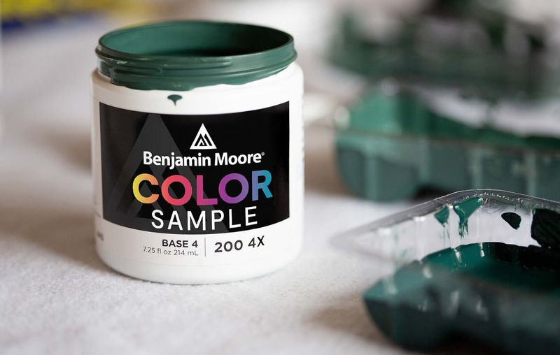
7. Prioritize Paint Quality Over Price
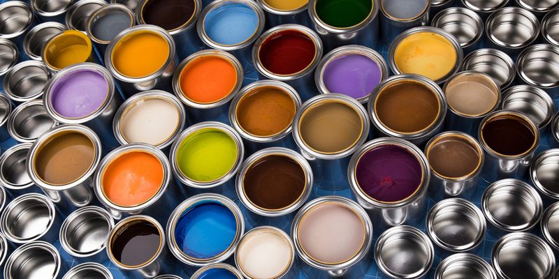
Bargain paints might save money now but cost more later. Premium exterior paints resist fading, cracking, and peeling far longer than budget options.
Professional designers insist on top-tier products because they contain more pigment, better resins, and specialized additives.
Though you might pay double upfront, quality paint often lasts twice as long – sometimes 15+ years versus 5-7 for cheaper alternatives. Plus, you’ll avoid the hassle of repainting sooner.
8. Understand Finish Functionality
Flat finishes hide imperfections but collect dirt. Glossy sheens clean easily but highlight every flaw. Most designers recommend satin or low-lustre finishes for the main body of homes.
Semi-gloss works beautifully for trim because it stands up to weather and provides subtle contrast. Never use high-gloss on large exterior surfaces unless you’re going for a very specific historic look!
Each finish serves different purposes beyond just appearance.
9. Factor In Your Landscape Palette
Lush green surroundings call for different paint choices than desert xeriscaping. Smart designers select colors that complement the dominant hues in your yard throughout most seasons.
Homes surrounded by evergreens look stunning in warm tones that contrast with cool greens. Desert landscapes pair beautifully with sandy neutrals or soft terra cottas.
Your garden and hardscaping create a natural color context that should influence your paint selection.
10. Use Light Reflectance Values Strategically
Every paint color has an LRV number indicating how much light it reflects. Higher numbers mean brighter, more reflective surfaces – important in hot climates to reduce cooling costs.
Lower LRV colors absorb heat, which might benefit colder regions. Beyond energy concerns, LRV affects appearance too.
Very high LRV whites can appear blinding in direct sunlight, while very low LRV darks might fade faster. Ask for LRV ratings when comparing similar colors.
11. Embrace Historical Accuracy When Appropriate
Owners of period homes often find that historically accurate colors look most appropriate. Many paint companies offer heritage collections based on archaeological research of actual historical pigments.
Colonial-era homes weren’t actually all white! Many featured rich ochres, deep blues, and earthy reds. Victorian houses often sported elaborate multi-color schemes.
Research your home’s era before deciding on colors – authentic choices often look surprisingly “right” once applied.
12. Consider Directional Exposure Effects
North-facing surfaces receive cooler, bluish light that can make colors appear more muted and cool-toned. South-facing areas get warm, yellowish light that intensifies colors.
East-facing sections enjoy gentle morning light, while west-facing walls endure harsh afternoon sun that can fade paint faster.
When testing colors, apply samples on multiple sides of your home. A color that looks perfect on your north wall might appear completely different on your western exposure.
13. Pay Attention To Visual Weight
Darker colors make structures appear smaller and more grounded. Lighter colors create an impression of larger size and airiness.
This optical principle helps designers balance awkward architectural proportions. Top-heavy houses benefit from darker base colors to create visual anchoring.
Homes that seem too small can appear more substantial with lighter upper stories and darker foundation colors. Visual weight isn’t just about aesthetics – it can fundamentally change how your home sits in its environment.
14. Recognize Regional Color Traditions
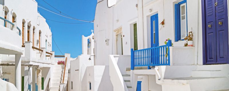
Certain colors feel naturally at home in specific regions. Think sunny yellows in Mediterranean climates, cool blues in coastal areas, or earthy tones in mountain settings.
New England homes traditionally feature crisp whites with black or green shutters. Southwest adobe styles embrace terra cottas and turquoise accents.
These regional palettes developed organically over generations, often using locally available pigments that complemented the surrounding landscape.
15. Understand Color Psychology
Blue conveys tranquility and trustworthiness – perfect for creating a welcoming family home. Green connects to nature and renewal, ideal for homes in garden settings.
Yellow radiates cheerfulness but can overwhelm in large doses. Gray provides sophisticated neutrality that works in nearly any setting.
Professional designers consider these psychological impacts when recommending colors, knowing that your home’s exterior creates an emotional first impression for visitors.
16. Factor In Maintenance Requirements
Very dark colors absorb more heat, which can cause premature aging and warping of siding materials. Ultra-bright whites show dirt quickly and require more frequent cleaning.
Medium tones in the middle of the color spectrum typically require the least maintenance. Certain colors like reds and yellows contain pigments that fade faster than others.
Designers weigh these practical considerations alongside aesthetics when making recommendations for busy homeowners.
17. Use Technology Tools Wisely

Virtual painting apps let you upload photos of your home and digitally “paint” it different colors. While helpful for narrowing choices, these tools can’t replace real-world testing.
Color-matching technology can identify exact paint formulas from inspiration photos. Some paint companies offer color consultations via video chat.
Smart designers combine these high-tech approaches with traditional methods like physical samples for best results.