15 Kitchen Colors Designers Say You Should Try In 2025 (Plus 5 Green Shade Options)
Thinking about giving your kitchen a fresh look? I’ve been eyeing paint swatches lately, and let me tell you, the 2025 color trends are too good to ignore.
Designers are leaning into shades that feel bold, energizing, and totally joyful, and I’m all for it. Your kitchen should inspire you, whether you’re scrambling eggs or hosting friends for wine night.
If you’re ready to ditch the dull and bring some serious style into the heart of your home, you’re in the right place. Here’s the inside scoop on the colors set to take over kitchens in 2025.
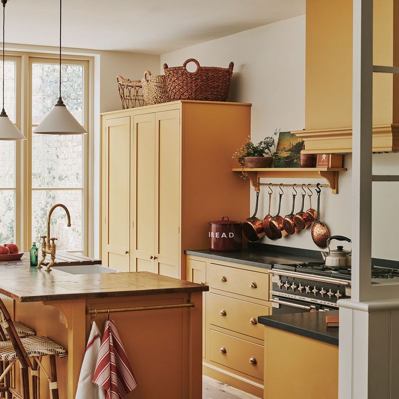
1. Terracotta Dream
Warm earthy tones are making a massive comeback in 2025! Terracotta brings that sun-baked Mediterranean vibe right into your cooking space, creating a cozy atmosphere that feels both trendy and timeless.
When paired with natural wood elements and brass fixtures, this orangey-brown shade transforms even the most basic kitchen into something special. Plus, it hides those inevitable cooking splatters better than lighter colors ever could!
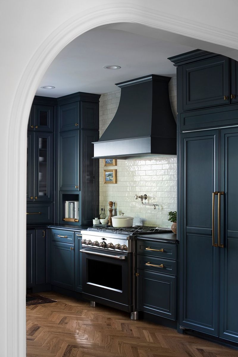
2. Midnight Navy
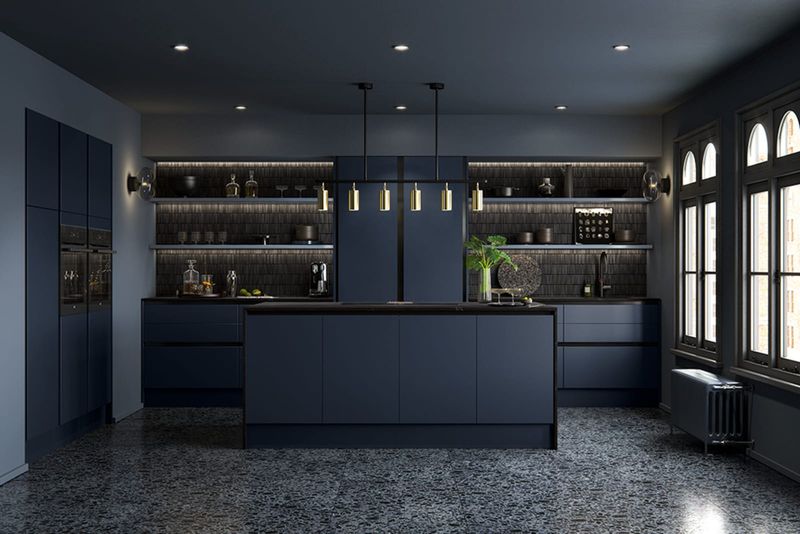
Looking for something bold yet sophisticated? Midnight navy adds instant drama without the heaviness of pure black. This deep blue tone creates a perfect backdrop for metallic accents to shine.
Many homeowners report feeling calmer in navy kitchens, even during hectic meal preps! The color works surprisingly well in both large and compact spaces, making cabinets pop while grounding the entire room with its rich, velvety presence.
3. Buttery Yellow
Sunshine in a paint can! Buttery yellow injects instant cheerfulness into any kitchen space without screaming for attention like its brighter cousins. Even on cloudy days, this soft hue creates the illusion of natural light.
Surprisingly versatile, it plays well with both modern and farmhouse aesthetics. The subtle warmth makes food look more appetizing and morning coffees more inviting – probably why so many restaurants choose yellow for their dining spaces!
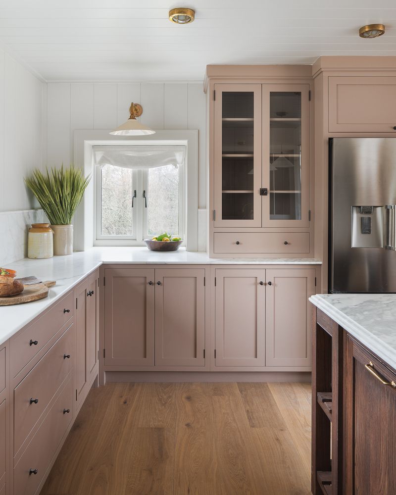
4. Dusty Rose
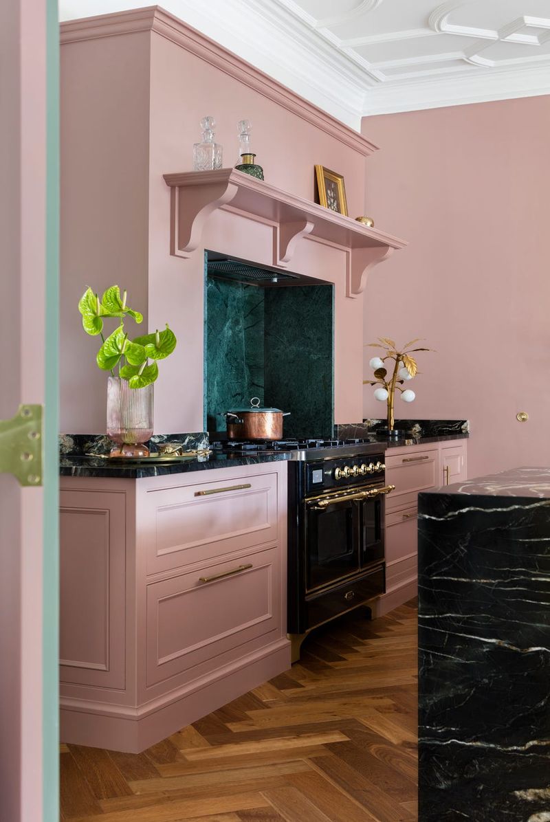
Forget what you know about pink kitchens! Modern dusty rose offers a sophisticated neutral with just enough personality to make your space stand out.
This muted pink has gray undertones that keep it from feeling too precious or feminine. Surprisingly practical, it hides fingerprints better than white while creating a warm, flattering glow that makes everyone look their best.
Pair it with matte black hardware for an edgy contrast or gold fixtures for glamorous vibes.
5. Charcoal Gray
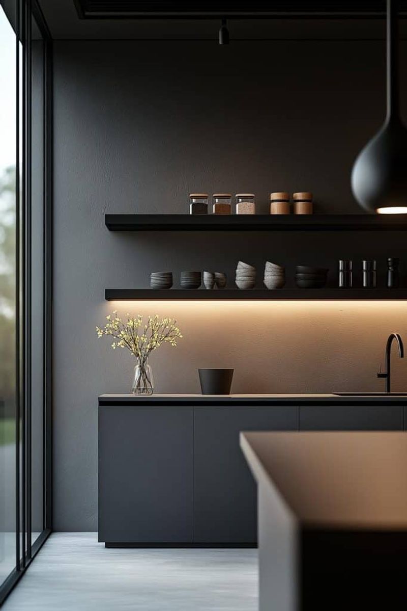
When black feels too harsh but you still want drama, charcoal gray delivers the perfect punch! This sophisticated neutral creates a modern backdrop that makes colorful dishware and fresh produce pop vibrantly.
Unlike true black, charcoal shows less dust and fingerprints while still offering that high-contrast look designers love.
Many homeowners report their kitchens feeling more spacious after switching to darker walls – contrary to the old design myth about dark colors shrinking spaces!
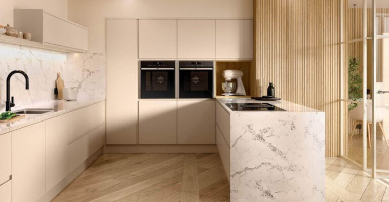
6. Creamy Mushroom
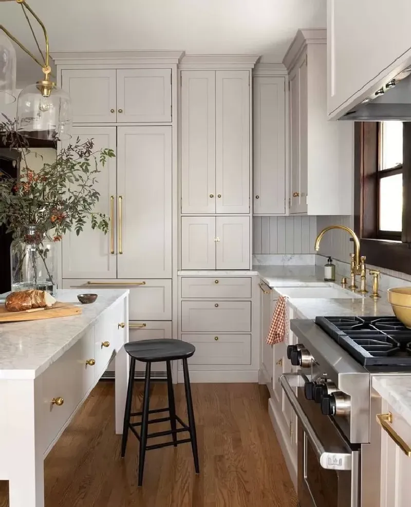
Somewhere between beige and gray lives this perfect neutral that designers can’t stop talking about! Creamy mushroom offers warmth without the yellowish undertones that make some beiges feel dated.
This chameleon color shifts throughout the day as light changes, sometimes appearing more taupe, sometimes more greige.
The earthy quality makes it an excellent backdrop for both colorful accents and natural elements like wood and stone, creating a kitchen that feels grounded yet fresh.
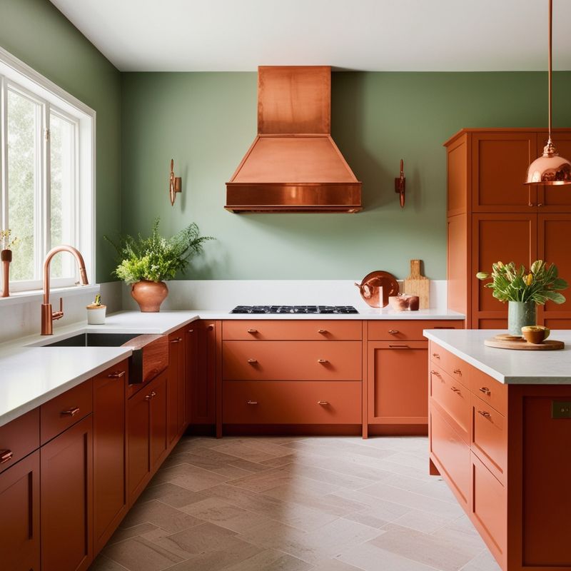
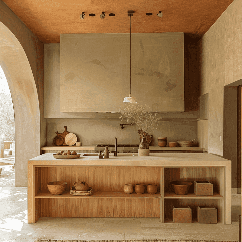
7. Burnt Orange
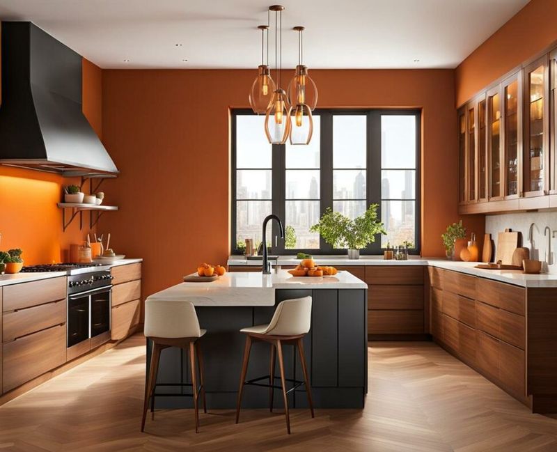
Spice up your kitchen with this zesty hue that feels both retro and totally fresh! Burnt orange brings warmth and energy without overwhelming the senses, making it perfect for accent walls or statement islands.
Food actually looks more appetizing against orange backgrounds – there’s a reason fast food chains use this color!
When balanced with crisp whites or cool grays, this spicy shade creates a dynamic cooking space that energizes morning routines and dinner prep alike.
8. Powder Blue
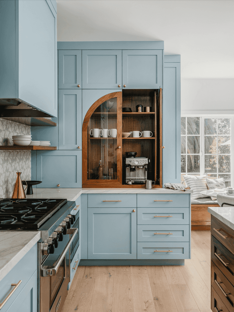
Soft yet statement-making, powder blue brings the serenity of clear skies into your cooking space! This gentle hue has replaced stark white as the go-to choice for homeowners seeking brightness without harshness.
Studies show blue environments can actually reduce appetite – helpful if you’re watching what you eat! The versatility of powder blue shines when paired with natural woods for a coastal vibe or with black fixtures for a more contemporary edge.
9. Rich Chocolate
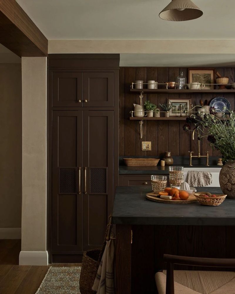
Decadent and luxurious, chocolate brown is making a delicious comeback in kitchen design! This rich tone brings unexpected depth and warmth, especially when used on cabinetry with interesting woodgrain showing through.
Brown might seem like a safe choice, but it actually creates dramatic impact while hiding everyday kitchen messes better than lighter options.
The earthy quality makes food prep feel more grounded and organic – perfect for those who love cooking with natural ingredients.
10. Blush Beige
Move over, plain beige – your prettier cousin has arrived! Blush beige adds just enough pink undertone to create warmth without feeling obviously pink, making it the perfect not-quite-neutral for modern kitchens.
The subtle rosy glow makes everyone look healthier in this space – like natural Instagram filtering!
Professional designers love how this shade changes throughout the day, sometimes appearing more neutral, sometimes showing its pink personality depending on the lighting.
11. Stormy Blue-Gray
Caught between blue and gray, this moody hue brings sophisticated drama to kitchens without feeling cold or severe.
Stormy blue-gray creates a perfect backdrop for making stainless steel appliances and brass fixtures really pop! Unlike pure grays that can feel industrial, this blue-tinged version adds depth and character.
Many homeowners report their kitchens feeling more like intentional design statements after switching to this complex color that shifts subtly as natural light changes throughout the day.
12. Warm Clay
Not quite terracotta, not quite beige – warm clay sits perfectly in between, offering earthiness without overwhelming the space.
This grounded neutral creates kitchens that feel connected to nature and incredibly inviting. Clay tones pair beautifully with both cool whites and deeper earth tones for a balanced palette.
The color’s natural variation means it never looks flat or boring, instead creating depth that makes even budget cabinetry look more expensive and thoughtfully chosen.
13. Matte Black
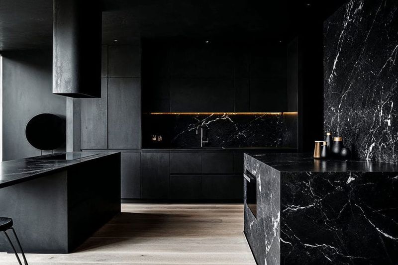
Bold and undeniably dramatic, matte black creates instant impact while hiding a multitude of cooking sins! Unlike glossy black that shows every fingerprint, the matte finish offers practicality with its high-style punch.
Contrary to popular belief, black kitchens can actually feel incredibly cozy rather than cold. The trick is balancing with warm woods and plenty of texture.
Many homeowners report their black kitchens becoming the most photographed spaces in their homes!
14. Soft Lilac
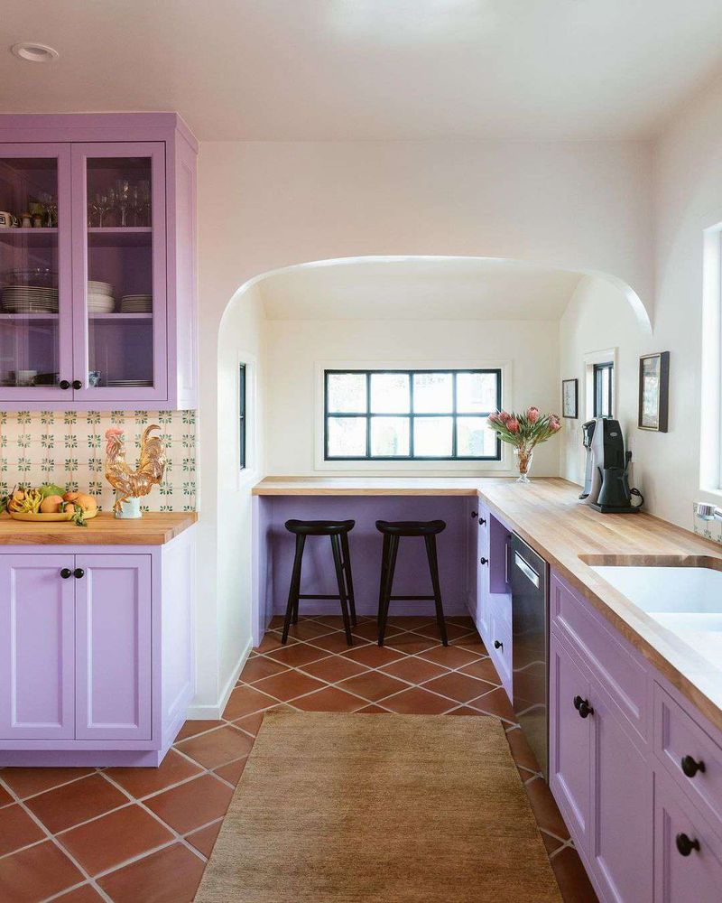
Purple in the kitchen? Absolutely! Soft lilac brings unexpected personality while remaining surprisingly versatile. This muted purple has enough gray undertones to function almost like a neutral while still adding character.
Morning light makes lilac kitchens feel especially magical, casting a gentle glow that starts the day on a positive note.
Even skeptical partners tend to come around once they see how this color creates a unique space that’s both calming and conversation-starting.
15. Classic Cream
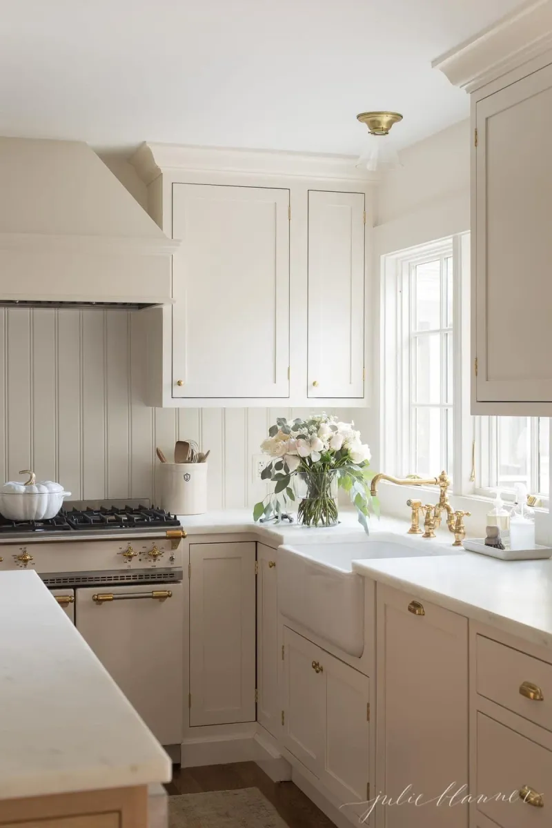
White kitchens had their moment, but cream is stealing the spotlight for those wanting brightness without harshness. This softer option brings warmth that stark whites simply can’t match, while still providing that clean, timeless look.
Cream kitchens hide minor messes better between cleanings – a practical benefit any busy cook can appreciate!
The subtle yellow undertones make the space feel sunnier even on cloudy days, creating a naturally uplifting environment for morning coffee or evening meal prep.
16. Sage Green
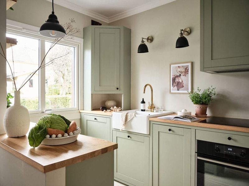
First of our green options, sage brings nature’s calming influence indoors with its soft, muted personality.
This versatile green works in virtually any lighting situation and complements most design styles from farmhouse to modern.
Studies show green environments can reduce stress – perfect for busy cooking sessions! Sage creates a beautiful backdrop for both colorful produce and neutral dishware, making everything in the kitchen look intentionally styled without trying too hard.
17. Emerald Green
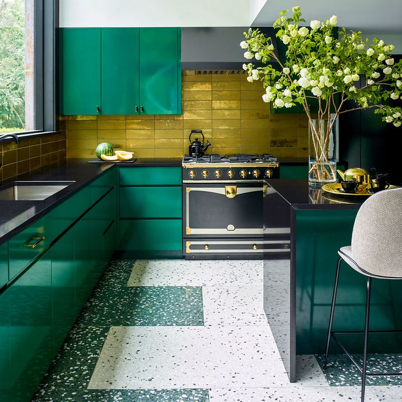
When you want a kitchen that makes a statement, jewel-toned emerald delivers major personality! This rich green brings luxury and depth, creating a space that feels both classic and daring simultaneously.
Emerald particularly shines in kitchens with good natural light, where its depth and variation become most apparent.
The color creates a beautiful backdrop for gold or brass hardware and fixtures, with many designers calling it “the new navy” for its sophisticated yet bold presence.
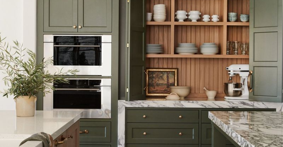
18. Olive Green
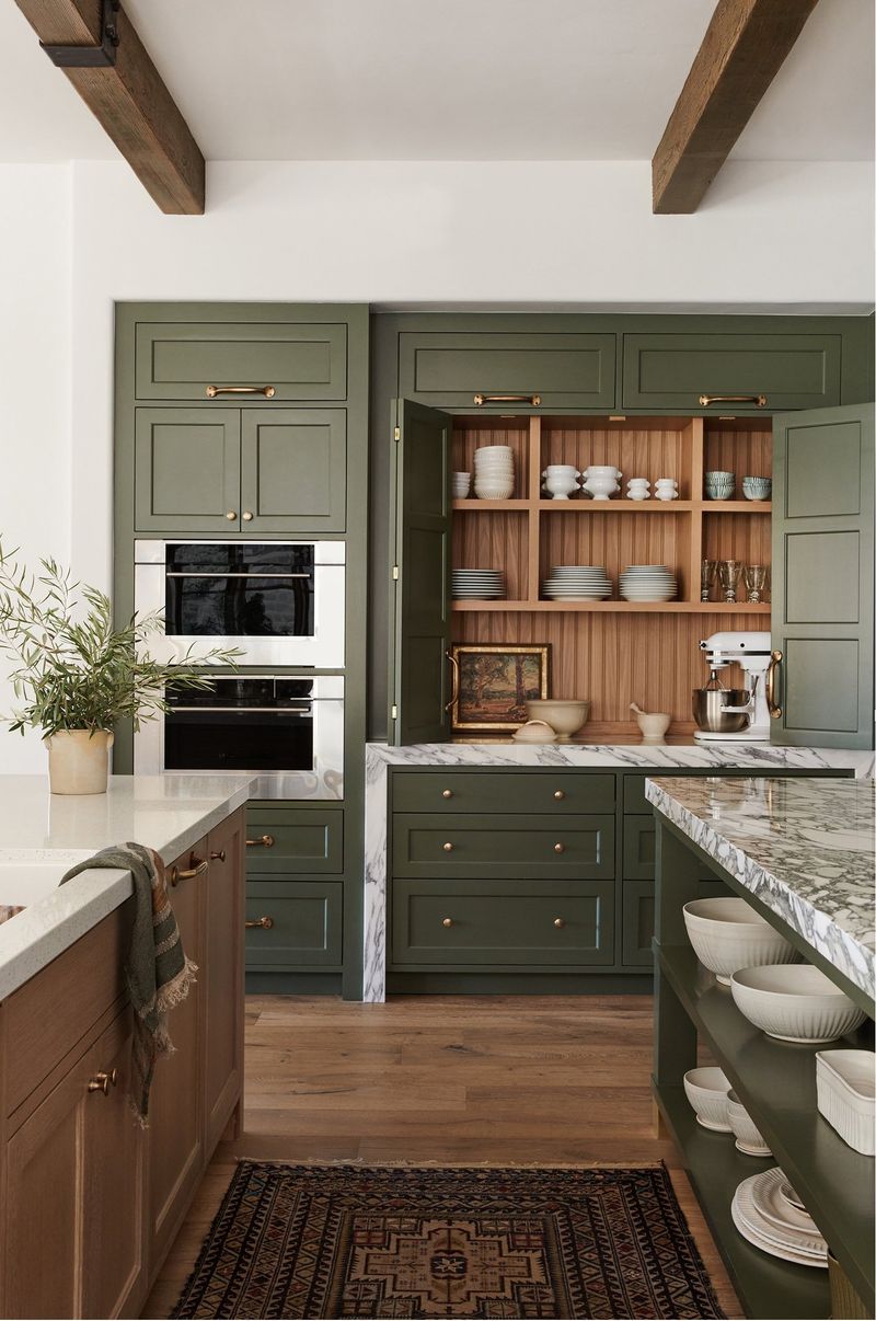
Earthy and organic, olive green brings Mediterranean warmth and natural vibes to any kitchen space.
This complex green has brown undertones that help it function almost like a neutral while still offering distinctive character. Olive particularly shines when paired with natural materials like wood and stone.
The color has historical roots in many cultures’ cooking spaces, making it feel simultaneously fresh and timeless – a rare combination that explains why designers predict it will remain popular well beyond 2025.
19. Mint Green
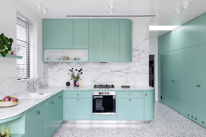
Refreshing and unexpected, mint green adds retro charm with modern appeal! This cheerful hue brings playful energy to cooking spaces while still feeling sophisticated when paired with the right elements.
Mint works surprisingly well with many other colors, from pinks to blues to neutrals.
The color naturally brightens darker kitchens, reflecting available light to create a space that feels airy and open even in smaller footprints – making it perfect for apartment kitchens or galley layouts.
20. Forest Green
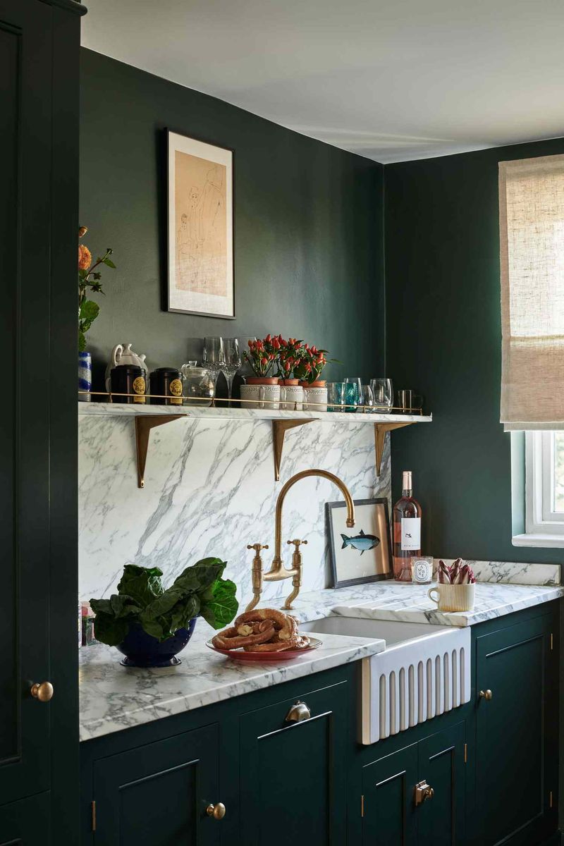
Deep and dramatic, forest green brings the lush feeling of woodland retreats into urban kitchens! This saturated green creates instant sophistication and pairs beautifully with both light marble and darker stone countertops.
Unlike brighter greens, forest green has a timeless quality that won’t quickly date your kitchen.
Many homeowners report this color creating a cocooning effect that makes cooking feel more relaxing and intentional – perfect for those who view their kitchen as a retreat from busy lives.