18 Colors To Never Combine With Blue, According To Interior Designers
Blue might be the darling of interior design, but it’s not a universal matchmaker. Pair it wrong, and that serene vibe turns chaotic in seconds. From clashing undertones to energy-killing combos, certain colors just don’t play nice with blue—and designers have thoughts.
Bold ones. If you’re planning a palette around this cool classic, these cautionary tales will save your walls (and your eyes) from regret.
1. Muddy Yellow — Nautical Nightmare
Combining muddy yellow with blue creates the visual equivalent of seasickness. The murky undertones fight
against blue’s clarity, resulting in a space that feels perpetually grimy.
Remember those 1970s kitchens with harvest gold appliances against navy cabinets? There’s a reason that trend died a necessary death. The pairing ages a room by decades, not in the charming vintage way.
2. Neon Green — Digital Eyestrain Incarnate
Neon green paired with blue screams ‘abandoned laser tag arena’ or ‘early 2000s website design.’ The vibration between these hues creates optical fatigue within minutes.
Your living room isn’t trying to be a Mountain Dew commercial from 2003. The combo feels perpetually backlit by an aging computer monitor, making even expensive furnishings look like they were sourced from a clearance bin.
3. Salmon Pink — Suburban Hotel Syndrome
Salmon pink and blue together evoke every forgettable conference room from Tampa to Tulsa. The pairing screams ‘we renovated in 1992 and called it a day.’
The combo’s dated Miami Vice energy makes even the most expensive furniture look like it was purchased from a hotel liquidation sale. No amount of styling can overcome the inherent corporate blandness that emerges when these colors meet.
4. Burgundy — Historical Heaviness
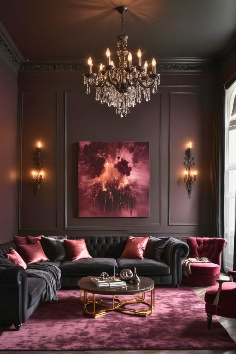
Burgundy with blue creates a visual weight that sinks faster than the Titanic. Victorian homes tried this combination extensively—even they eventually surrendered.
The richness of burgundy competes with blue’s depth, creating a palette power struggle no room can withstand. Add some gold accents and you’ve got yourself the official look of ‘inherited furniture nobody actually wants.’
5. Olive Green — Military Surplus Mistake
Olive green and blue together create the ambiance of an army surplus store that moonlights as an aquarium. The murky, utilitarian feel never translates to ‘intentional design choice.’
Both colors contain complex undertones that actively sabotage each other. What begins as an attempt at sophisticated earthiness quickly devolves into a room that feels perpetually under-lit and vaguely institutional.
6. Mustard — Condiment Catastrophe
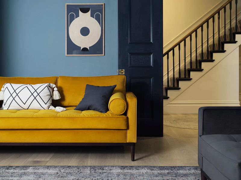
Pairing mustard with blue creates the visual equivalent of a hot dog dropped on a good suit. The yellow’s warmth turns sickly against blue’s cool restraint.
This combination dominated 1970s dens and basement rec rooms for all the wrong reasons. The clash creates visual tension that no amount of macramé plant hangers can distract from. Your home deserves better than looking like a vintage fast food chain.
7. Burnt Orange — Broncos Fan Cave Vibes
Burnt orange and blue together scream ‘sports team devotion’ rather than ‘thoughtful design choice.’ Unless you’re deliberately creating a shrine to Denver’s finest, this combination lacks sophistication.
The retro boldness of burnt orange fights blue’s serene nature, creating visual competition no room can referee. Even high-end furnishings start looking like licensed team merchandise when these colors collide.
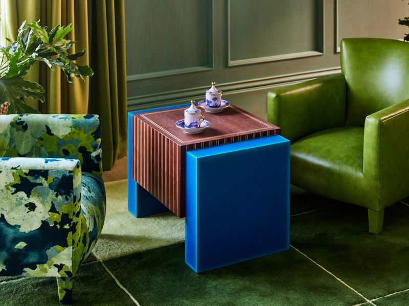
8. Teal — Underwater Confusion
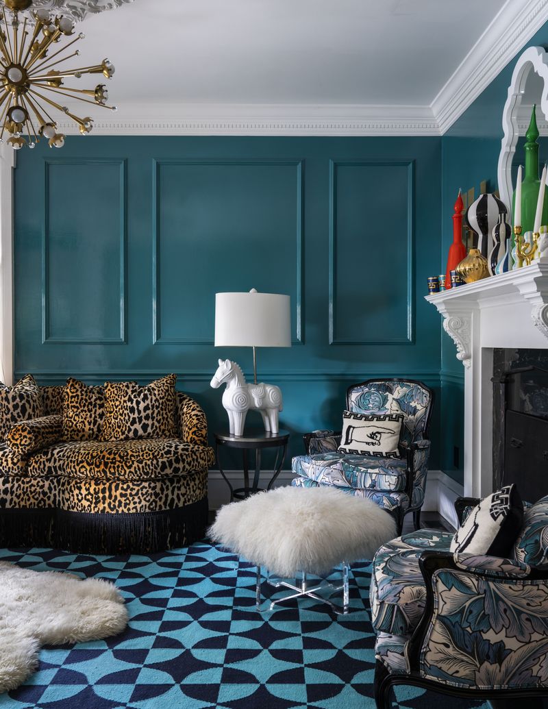
Teal and blue create the interior design equivalent of a color identity crisis. The similar wavelengths blend into a murky middle zone where distinction goes to die.
Without significant contrast, your eye searches desperately for a focal point and finds none. The result? A room that feels like you’re viewing it through aquarium glass after hours without sleep. Even the fish would find it disorienting.
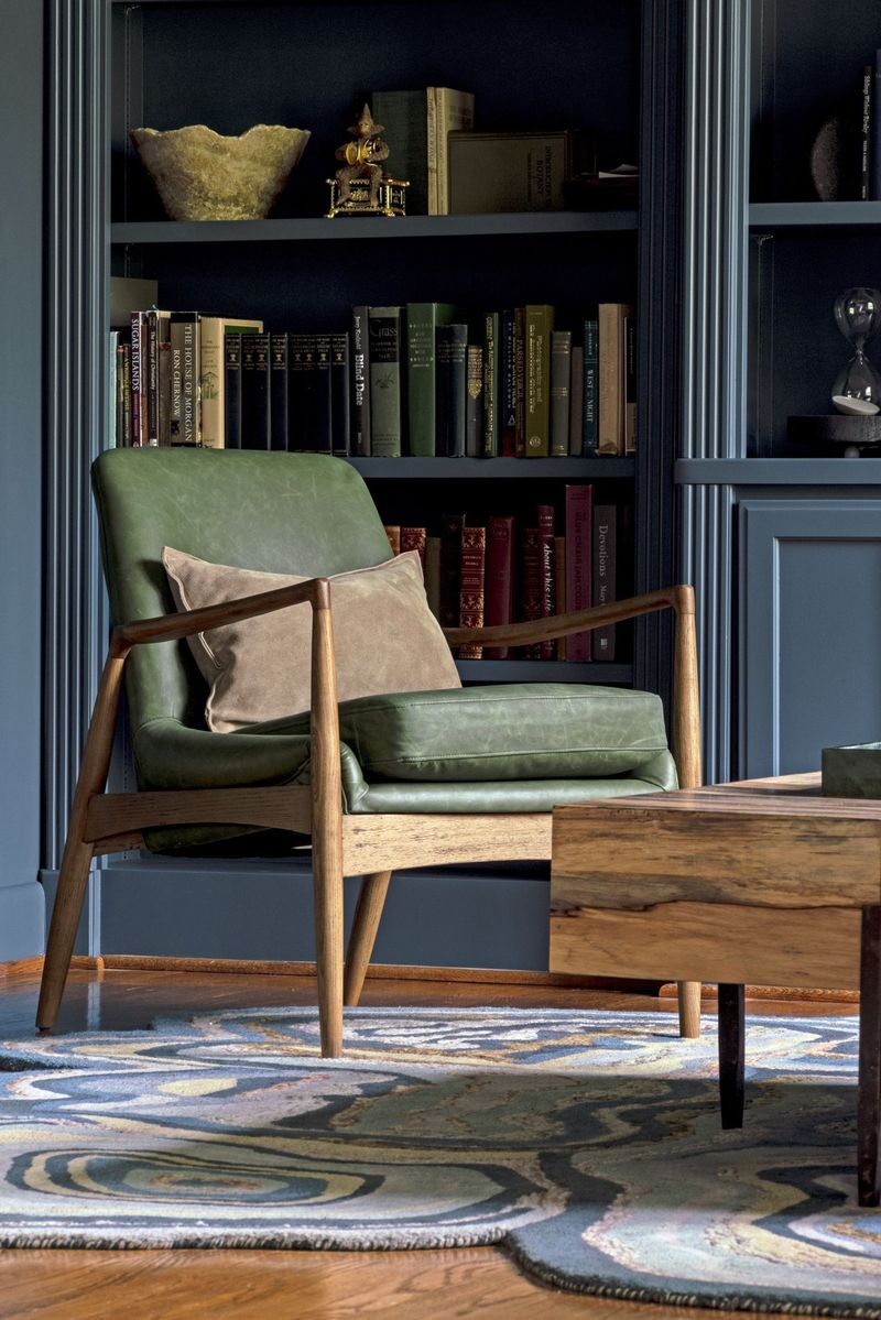
9. Forest Green — Prep School Detention
Forest green paired with blue summons the ghost of every private school uniform and country club wallpaper from 1987. The combination radiates enforced tradition rather than personal style.
Both colors compete for dominance in the ‘serious and stately’ category, creating visual heaviness that no amount of brass accents can lighten. Your living room shouldn’t feel like somewhere you might be required to wear a blazer.
10. Purple — Royal Overkill
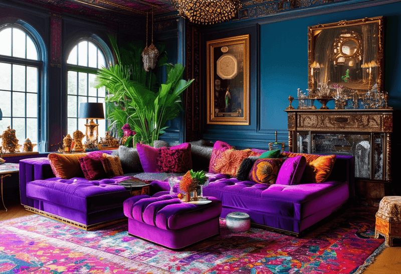
Purple and blue together create a regal overdose that would make Prince himself suggest a neutral. Both colors demand to be the monarch of your color scheme.
The combination quickly veers into adolescent bedroom territory or spiritual crystal shop aesthetics. Unless you’re decorating a wizard’s study or unicorn-themed nursery, this pairing creates a room that feels perpetually like it’s trying too hard to be magical.
11. Brick Red — Patriotic Fatigue
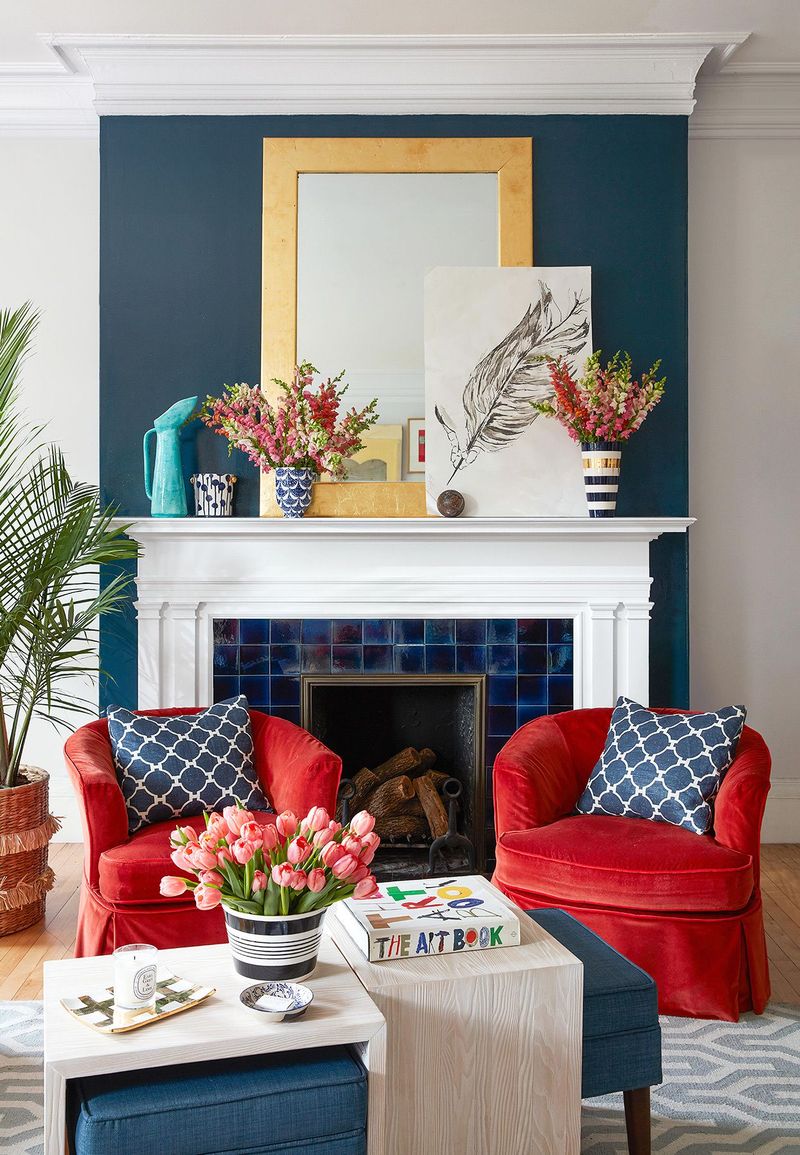
Brick red and blue together immediately trigger flag associations that never translate to sophisticated interiors. Your living room shouldn’t look like it’s perpetually celebrating the fourth of July.
The high-contrast pairing creates visual vibration that exhausts the eye. Even expensive furniture starts looking like it belongs in a campaign headquarters when surrounded by this politically charged combination.
12. Baby Pink — Gender Reveal Gone Wrong
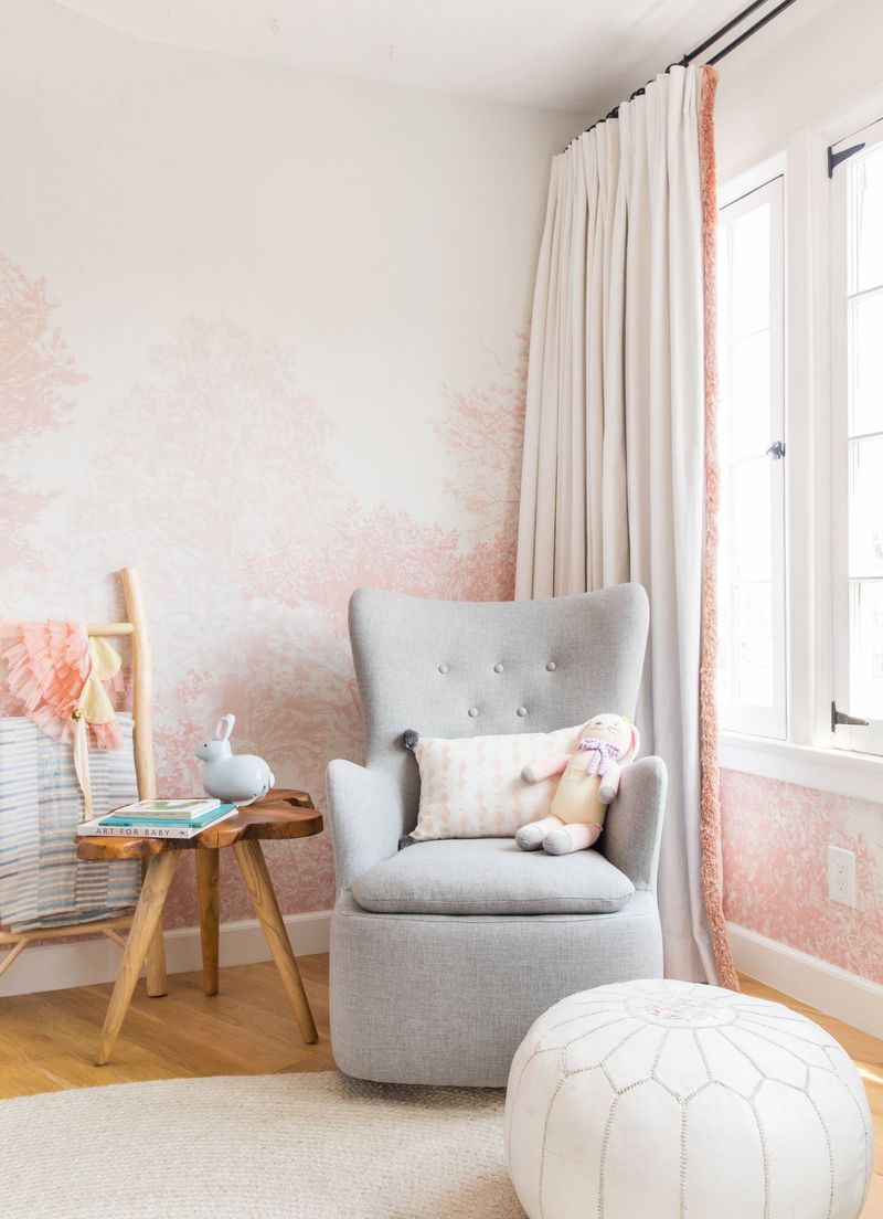
Baby pink and blue together create the interior design equivalent of a gender reveal party that never ends. The nursery-core combination infantilizes even the most sophisticated spaces.
This saccharine pairing transforms adult living areas into spaces that feel perpetually decorated for twins you don’t have. The cotton candy palette makes serious furniture pieces look like they belong in a doll’s house, regardless of their actual price tag.
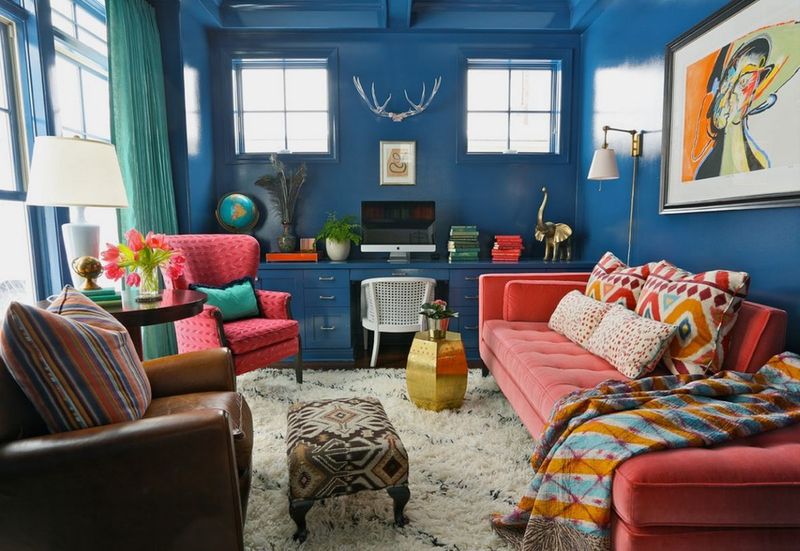
13. Bright Red — Visual Shouting Match
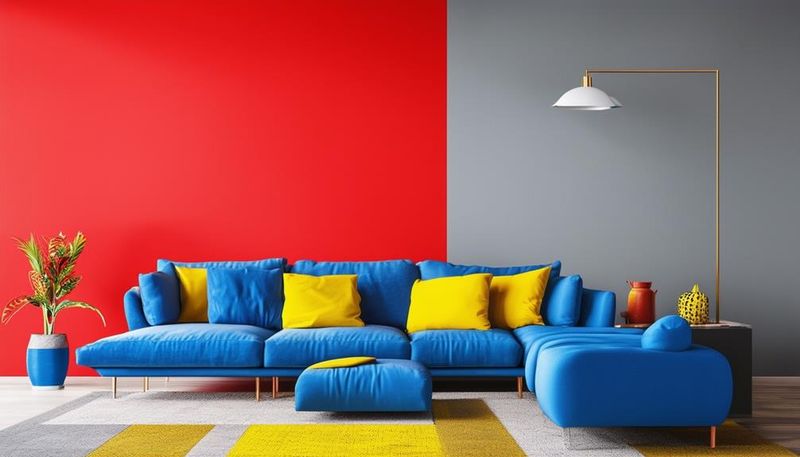
Bright red and blue together create the visual equivalent of two people yelling over each other at a dinner party. The primary color confrontation feels elementary rather than elegant.
This combination delivers playground primary energy that no amount of expensive styling can elevate. Superman’s costume works for fighting crime, not for creating restful living spaces where actual humans need to relax and converse without visual competition.
14. Beige — Corporate Boredom Personified
Beige with blue delivers all the excitement of mandatory workplace training videos. The combination whispers ‘I gave up on having opinions about my surroundings.’
When blue meets beige, it’s usually in waiting rooms where time stands still. The combo lacks conviction—neither bold nor subtle, just vaguely present. It’s the design equivalent of small talk with strangers: inoffensive but ultimately forgettable.
15. Turquoise — Coastal Gift Shop Overload
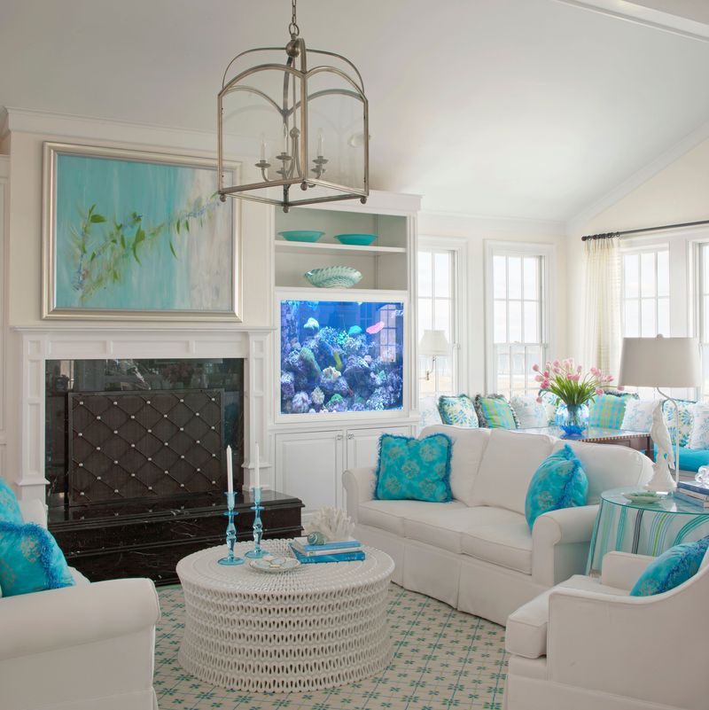
Turquoise and blue together create the interior equivalent of a beach souvenir shop that sells seashell wind chimes. The watery overkill lacks sophistication and restraint.
The aquatic color saturation feels like you’re decorating with leftover mermaid party supplies rather than creating a thoughtful adult environment.
16. Gray-Blue — Undertone Civil War
Gray-blue paired with true blue creates an undertone battlefield where neither color can claim victory. The nearly-but-not-quite matching effect creates perpetual visual discomfort.
Like wearing navy socks with black pants, the combination signals either colorblindness or getting dressed in the dark—neither being the design statement most homeowners aim for.
17. Chartreuse — Electric Frenzy
Chartreuse, a vibrant mix of yellow and green, can electrify any space, but when paired with blue, it becomes an overwhelming clash. Imagine entering a room where the walls are a serene navy, but the furniture screams in chartreuse tones.
This combination can evoke a sense of chaos rather than comfort. The sharp contrast between these hues can lead to visual fatigue, making the environment feel tense.
For those seeking tranquility, replacing chartreuse with softer earth tones can transform the space into a haven of peace and relaxation.
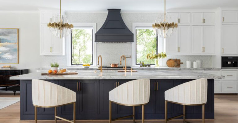
18. Copper — Industrial Clash
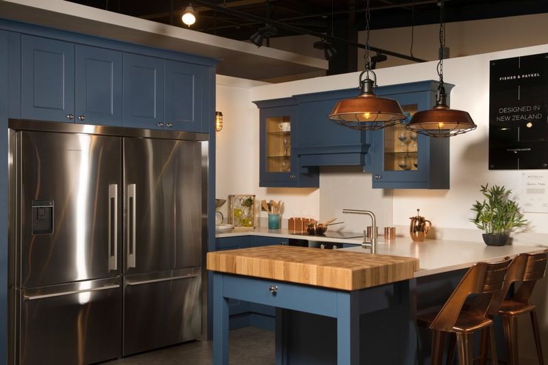
Copper, with its warm metallic sheen, can add a touch of industrial chic, but when set against blue, the effect can be unsettling. Imagine a kitchen where the cabinets are a calming sky blue, yet the hardware and fixtures gleam in copper.
The coldness of blue can clash with copper’s warmth, creating a disjointed feel that detracts from the kitchen’s unity. This pairing can inadvertently highlight flaws rather than features.
To achieve a balanced look, consider pairing blue with cooler metals like silver or chrome, which align harmoniously with its tones.