19 Interior Layout Mistakes That Make New Homes Feel Strangely Cramped
Have you ever stepped into a brand-new home expecting it to feel open and airy, only to wonder why it feels oddly cramped? I’ve had that exact moment, and it turns out the problem isn’t the size, it’s the layout.
So many of us unknowingly make design choices that close off space and disrupt flow, even in homes with plenty of square footage. I’ve learned that little things like furniture placement or lighting can make a big difference.
Here’s a look at some of the most common layout mistakes that could be making your space feel smaller than it really is.
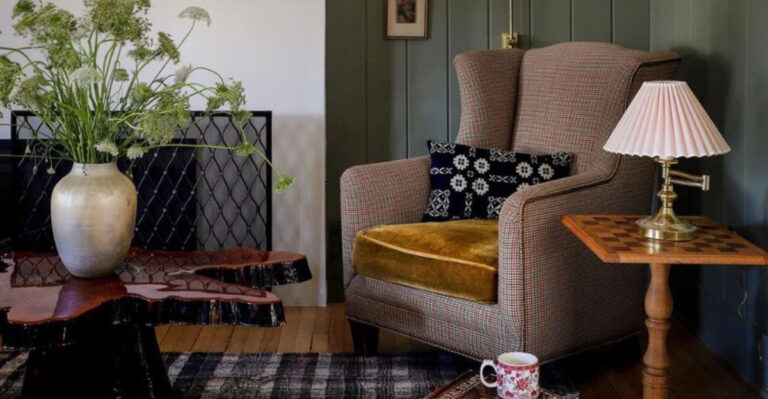
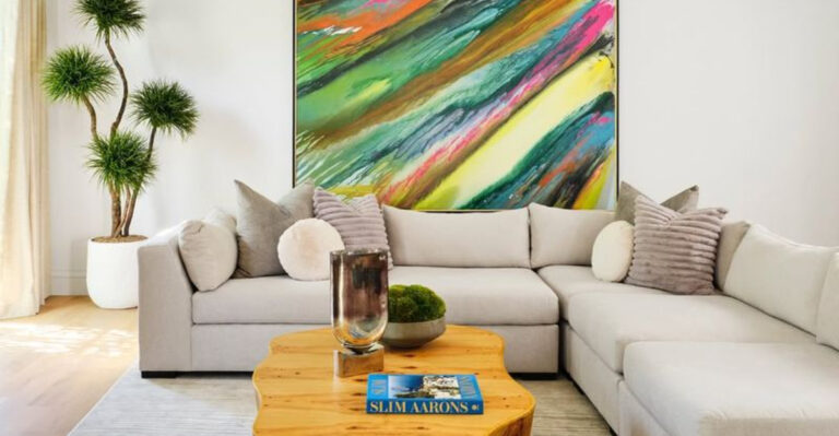
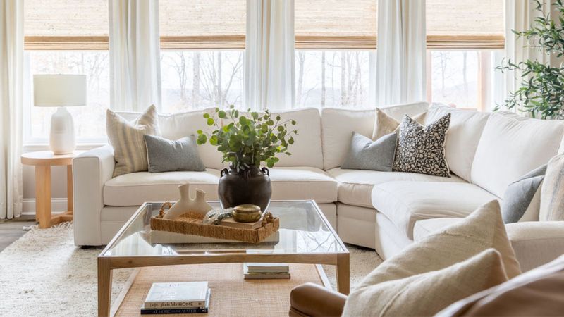
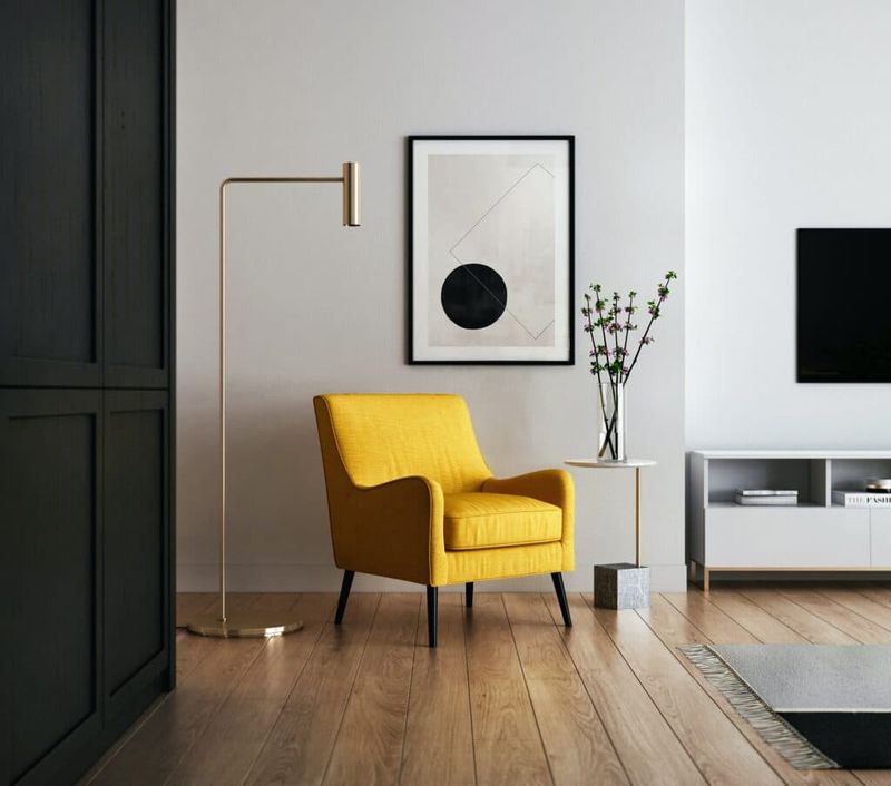
1. Oversized Furniture Invasion
Giant sectionals might look amazing in showrooms, but they turn living rooms into obstacle courses faster than you can say “excuse me” while shuffling sideways to the kitchen!
Your sofa shouldn’t take up more than a third of your living space. When furniture dominates a room, air can barely circulate between pieces, creating that boxed-in feeling we all dread.
Scale matters tremendously in interior design – just like wearing clothes that actually fit makes you look better, right-sized furniture makes your home feel larger.
2. Wall-Hugging Furniture Syndrome
If all your furniture is plastered against walls like they’re magnetic, you’ve fallen into a classic layout trap! This creates that dreaded “waiting room” effect where conversation feels awkward and formal.
Pull some pieces away from walls to create breathing room and conversation areas. Sometimes floating furniture in the middle of a room actually makes the space feel larger because it creates purposeful zones.
Imagine your furniture arrangement as a dance – partners need some space between them to move gracefully!
3. Blocking Natural Light Sources
Whoops! That bookcase in front of your window is basically a light thief in disguise. Natural light is like magic fairy dust for making spaces feel open and welcoming.
When furniture blocks windows, you’re not just losing light – you’re visually shortening walls and disrupting the flow of energy. Light needs clear pathways to bounce around and illuminate corners.
Keep window areas clear and consider using mirrors strategically to bounce existing light deeper into your space for that sun-kissed, spacious feel everyone loves.
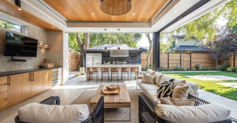
4. Cluttered Pathway Obstacles
Moving through your home shouldn’t feel like completing an obstacle course! When furniture creates zigzag pathways or forces you to squeeze through tight spots, your brain registers the space as confined.
Good flow requires at least 30-36 inches of clearance for main walkways. Map out how people naturally move through your space and create unobstructed lanes for movement.
Think about how water flows smoothly down a stream – your walking paths should feel just as natural and unobstructed for that spacious, breathable quality.
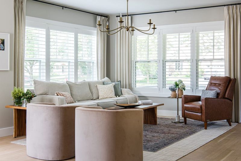
5. The Rug Size Mishap
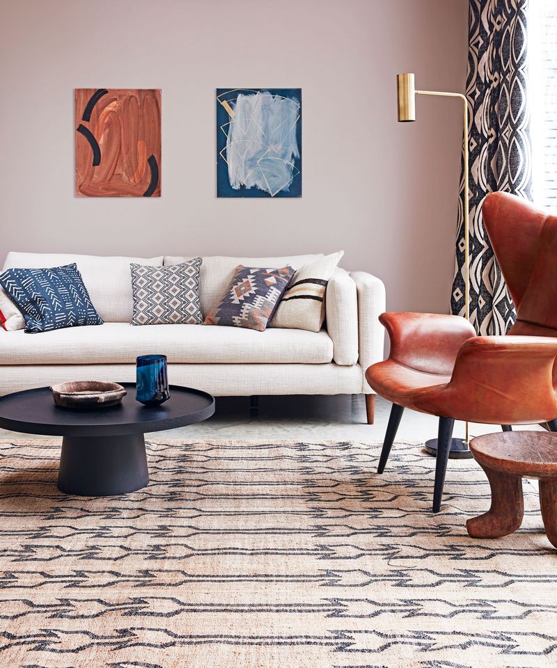
Tiny rugs floating in rooms like little islands make spaces feel choppy and disconnected! A too-small rug creates visual boundaries that chop up your floor space into sad little zones.
Your rug should be large enough for at least the front legs of furniture to rest on it. This creates a cohesive conversation area and visually expands the room by unifying the space.
Remember this golden rule: when in doubt, go bigger with rugs – they’re like the foundation that holds your furniture groupings together in harmony!
6. Poor Lighting Distribution
One lonely ceiling light creating a spotlight effect while leaving corners in shadows? That’s a recipe for cave-like vibes! Uneven lighting creates visual dead zones that make spaces feel smaller.
Layer your lighting with a mix of ambient, task, and accent sources at different heights. When light reaches all corners of a room, our eyes perceive more space and dimension.
Think of lighting as painting your room with light – you wouldn’t paint just the center of a canvas and leave the edges blank, would you?
7. TV Placement Domination
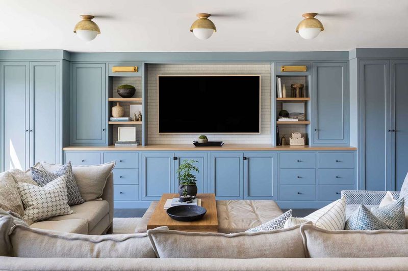
When your giant TV becomes the room’s shrine, with all furniture pointed at it like worshippers, you’ve created a one-dimensional space! This arrangement limits conversation and makes rooms feel like nothing but viewing chambers.
Consider placing your TV off-center or in a cabinet that allows it to be hidden sometimes. Create secondary seating arrangements that encourage face-to-face interaction.
Your living room should offer multiple activity zones, reading, chatting, gaming, not just a home theater setup that takes over everything else!
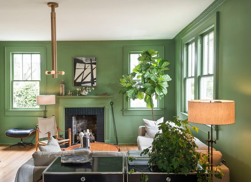
8. Forgotten Vertical Space
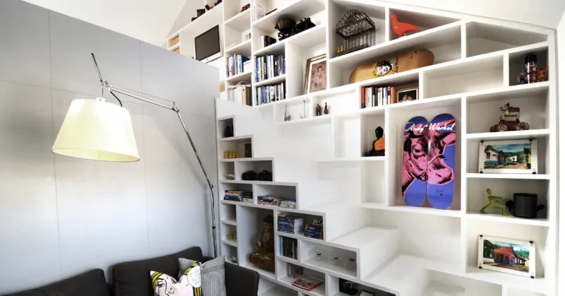
Looking up? Most cramped-feeling homes totally ignore the upper third of their walls! When everything in your home stays below eye level, you’re wasting prime real estate.
Draw the eye upward with tall bookshelves, hanging plants, or artwork placed higher on walls. This vertical emphasis creates the illusion of height and spaciousness even when square footage is limited.
Just like city planners build upward when ground space is scarce, your interior design should capitalize on vertical dimensions for that expansive feel!
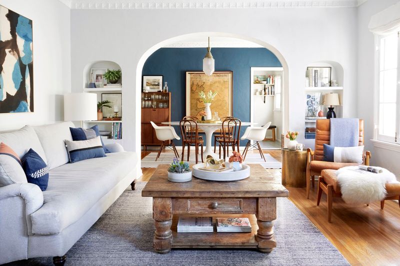
9. Matchy-Matchy Furniture Sets
Buying that entire bedroom set straight from the showroom might seem convenient, but it’s actually a space-jammer! When everything matches perfectly, your eye doesn’t travel around the room – it sees one big blob of sameness.
Mix up your furniture styles, heights, and visual weights to create interest and dimension. Different pieces encourage visual exploration, making spaces feel more dynamic and larger.
Think of your room as a party – it’s more interesting when guests have different personalities rather than being identical clones, right?
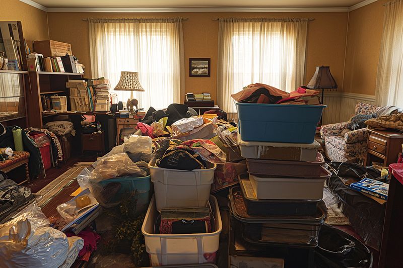
10. Too Many Small Decorative Items
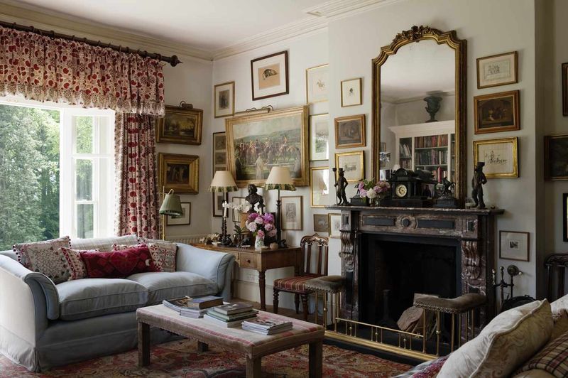
Love collecting knickknacks? Those twenty tiny figurines scattered across every surface create visual noise that overwhelms spaces! Small objects multiply visual clutter exponentially.
Group smaller items into curated collections with breathing room around them. One striking larger piece often creates more impact while maintaining spaciousness than numerous small items.
When decorative items compete for attention like kids yelling “look at me,” your brain gets overwhelmed and perceives the space as chaotic and smaller than it really is!
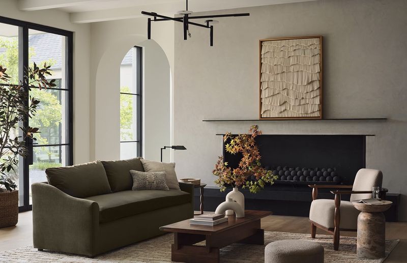
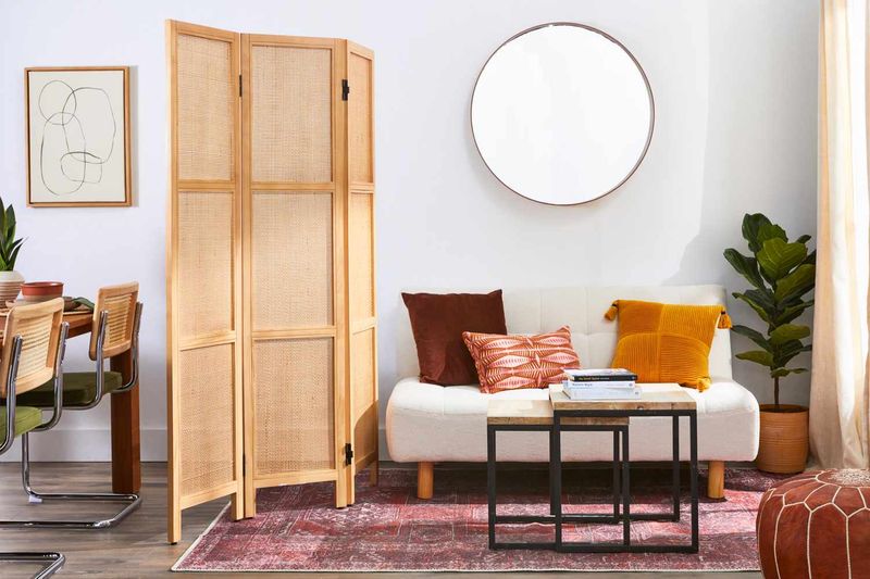
11. Ignoring The Power Of Negative Space
Horror vacui – fear of empty space – leads many homeowners to fill every inch with something! Yet emptiness is actually a design element that helps rooms breathe and feel luxurious.
Allow for purposeful empty areas where your eye can rest. Think about famous paintings – the blank areas are just as important as the detailed parts for creating balance.
Negative space acts like the silence between musical notes – without it, you’d just have noise! Your home needs these visual pauses to feel harmonious and spacious.
12. Bulky Window Treatments
Heavy, dark curtains that swallow windows whole are like putting your room on a visual diet – and not in a good way! When window treatments block parts of windows even when open, they’re stealing precious light and view.
Opt for treatments mounted higher and wider than your actual window frame. This simple trick makes windows appear larger and maximizes both light and the connection to outdoors.
Your windows are like your home’s eyes to the world – don’t give them tiny, squinty peepholes when they could have wide-open, expansive views!
13. Mismatched Scale And Proportion
Mixing tiny chairs with massive tables creates visual confusion that makes spaces feel awkward and cramped! When furniture pieces don’t relate to each other proportionally, the room feels off-balance.
Maintain consistent scale within furniture groupings. If you have a substantial sofa, pair it with coffee tables and side tables that have similar visual weight.
Just like wearing a giant hat with tiny shoes would look strange, your furniture pieces need to make sense together size-wise for a harmonious, spacious-feeling room!
14. Door And Cabinet Clearance Problems
Furniture blocking doors from fully opening or cabinets that can’t extend completely? You’ve got a functional flow problem that instantly creates cramped feelings!
Always map out door swings, drawer extensions, and cabinet door arcs before placing furniture. When functional elements can’t operate properly, the usable space shrinks dramatically.
Nothing says “this place is too small” quite like having to shimmy sideways through a partially opened door because a dresser is in the way!
15. Improper Art Hanging Height
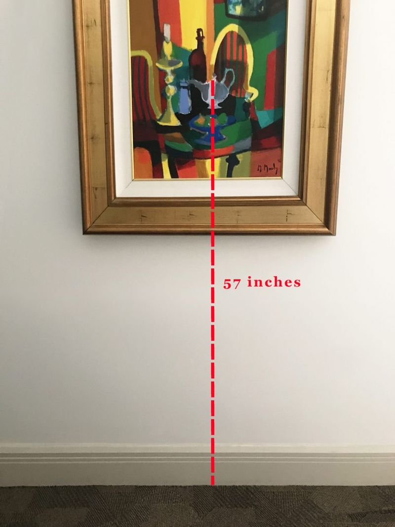
Artwork hung too high creates floating disconnected elements that make ceilings feel lower! When art doesn’t relate to nearby furniture, it creates visual disconnects that fragment your space.
The center of artwork should generally hang at eye level (about 57-60 inches from the floor) or relate directly to nearby furniture. When art connects visually to furniture below it, it creates cohesive zones that feel intentional.
Your walls and furnishings should have a conversation, not shout at each other from across the room!
16. Neglecting Entry And Transition Spaces
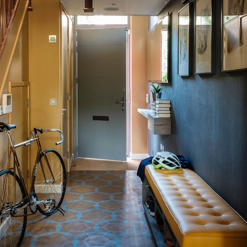
When your front door opens directly into a wall of furniture, you’ve created an unwelcoming bottleneck! Entry areas set the tone for your entire home’s flow.
Create a proper landing zone with at least 3-4 feet of clear space around entry points. This breathing room allows people to enter gracefully and sets up proper circulation patterns throughout the home.
First impressions matter – if guests feel cramped the moment they step inside, they’ll carry that feeling throughout their visit no matter how spacious other rooms might be!
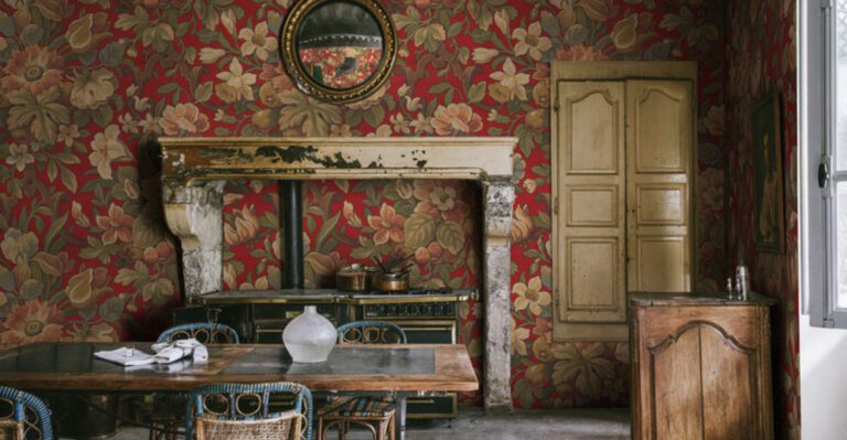
17. Visual Noise From Too Many Patterns
Mixing florals, stripes, geometrics, and animal prints in one space? Your eyes don’t know where to rest in this visual cacophony! Pattern overload creates mental clutter that makes spaces feel chaotic and smaller.
Limit bold patterns to 2-3 per room and balance them with solid colors. When patterns compete for attention, they create boundaries that visually chop up your space.
Think of patterns like seasoning – they add flavor, but too many competing spices just create confusion rather than enhancement!
18. Single-Height Furniture Lineup

When all your furniture hits the exact same height line, you’ve created a visual horizon that flatlines your space! This cookie-cutter approach makes rooms feel predictable and smaller than they are.
Vary the heights of furniture pieces to create visual interest and movement. Mix taller elements with lower ones to draw the eye around the room and create a more dynamic feeling.
Your furniture arrangement should have rhythm like a cityscape with varying building heights, not the boring flatness of a suburban strip mall!
19. Poor Mirror Placement
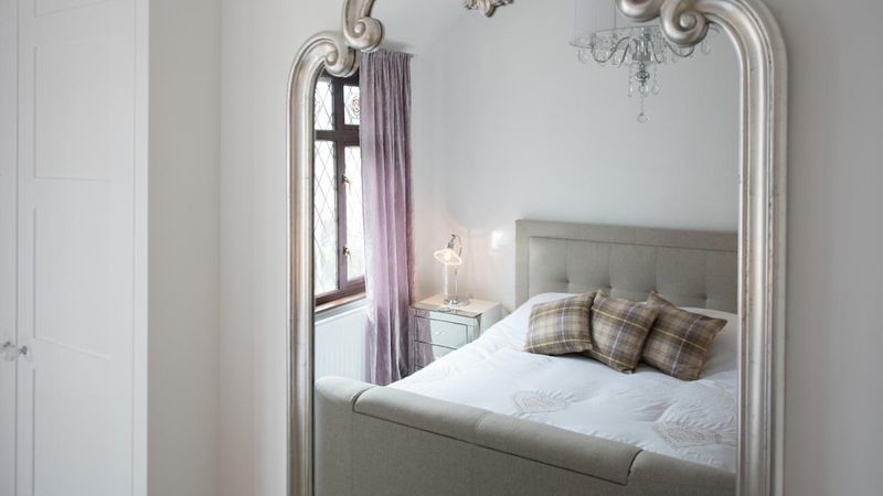
Mirrors can double your visual space – but only when they reflect something worth seeing! A mirror facing a blank wall or cluttered area actually multiplies the problem.
Position mirrors to reflect light sources, windows, or attractive views. This strategic placement creates the illusion of additional space by visually expanding boundaries and brightening the room.
Mirrors are like magic portals in design – they can either transport you to new visual dimensions or just show you more of what you don’t want to see!