
I’ll be honest, I’ve definitely walked into a few homes and instantly thought, yikes. It happens fast and it’s not about being snobby, your brain just picks up on certain design mistakes right away.
I learned this the hard way when staging my first home. That’s when I discovered that professional stagers really are magicians. They know exactly which decorating missteps scream bargain basement and which ones quietly sabotage the whole vibe.
If you are curious about the biggest offenders they spot over and over, you are going to want to pay attention to these common staging sins.
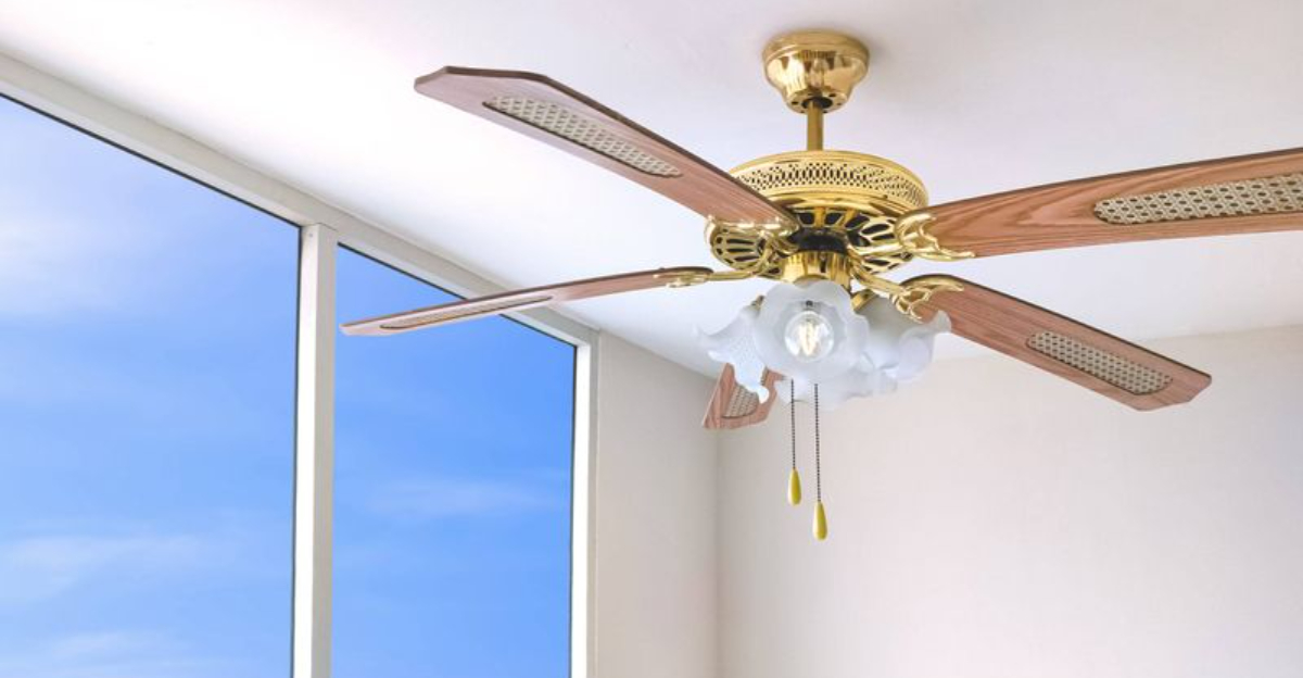
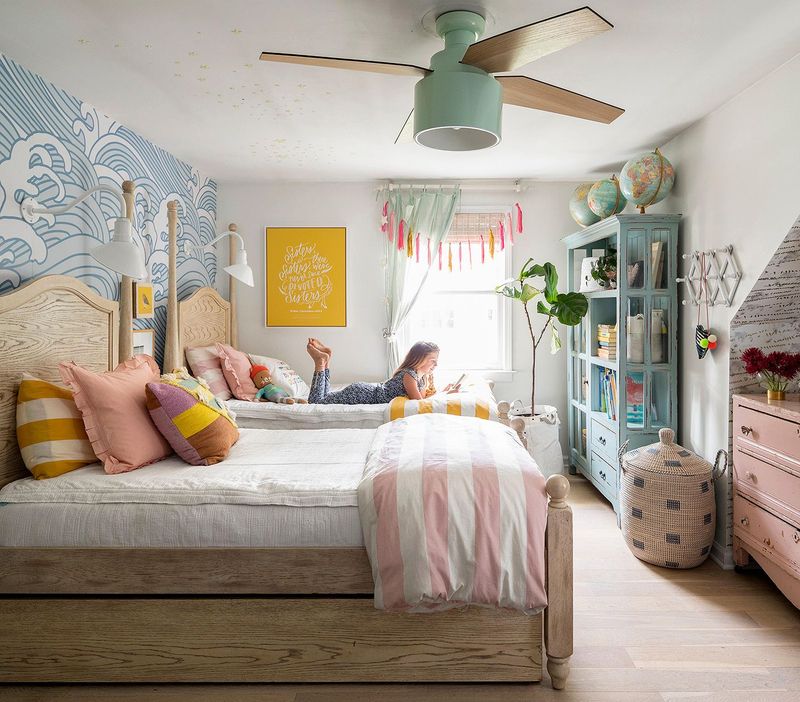
1. The Ceiling Fan
Whoever decided that dusty, yellowed ceiling fans with dangling pull chains should be the centerpiece of every room probably never sold a house for more than asking price!
Sometimes the blades collect so much dust they look like fuzzy caterpillars ready to shed all over your guests. If your fan makes a clicking noise that sounds like it’s counting down to liftoff, it’s definitely time for an upgrade.
Fun fact: A quality ceiling fan installation can actually increase your home’s value by creating the perception of improved air circulation and energy efficiency!
2. Outdated Window Treatments
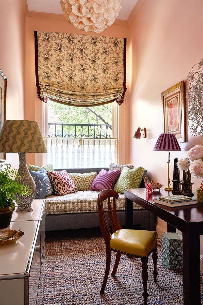
Heavy, outdated drapes can darken a room and make it appear stuck in the past. Imagine windows shrouded in layers of fabric that block light and feel oppressive.
Modernize with lighter, airy curtains or blinds that let natural light in. This change brightens the space and lends a contemporary feel.
3. Plastic Vertical Blinds: The Motel 6 Special
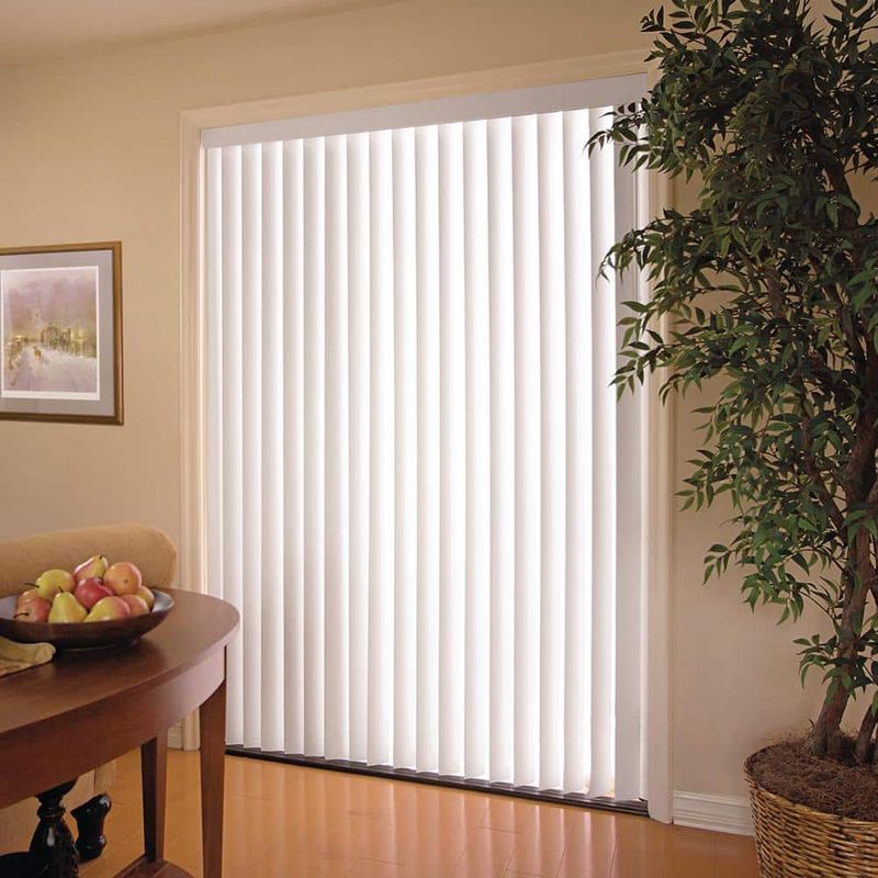
Nothing screams ‘I’ve given up’ quite like those yellowing plastic slats clacking sadly in the breeze. Vertical blinds belong exclusively in 1980s corporate offices and budget motels where questionable stains lurk on the comforters.
Replace them with curtains, roller shades, or roman blinds—anything that doesn’t remind visitors of filling out tax forms under buzzing fluorescents. Even basic IKEA panels would be a glow-up from this dated window crime.
4. Matching Furniture Sets Straight From The Showroom
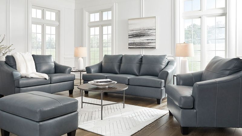
Walking into a living room where every piece matches perfectly—same fabric, same wood tone, same manufacturer—feels like entering a furniture store display, not a home with personality. The ‘buy the whole room’ approach screams ‘I lack imagination’ louder than a Real Housewife at a wine tasting.
Mix it up with complementary pieces instead. Even one statement chair or table from a different style family breaks the ‘I bought this during the Columbus Day sale’ vibe.
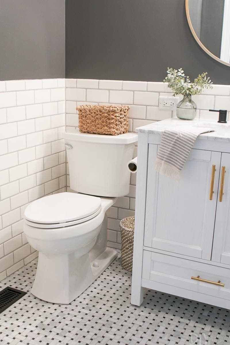
5. Wall-to-Wall Carpet In Bathrooms
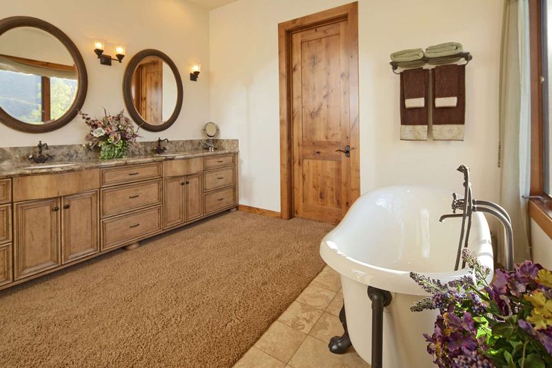
Carpet in bathrooms is the design equivalent of wearing socks in the shower—fundamentally wrong and deeply concerning. This moisture-trapping nightmare harbors more bacteria than a petri dish at a science fair.
Beyond the obvious hygiene issues, it screams 1970s rental property that hasn’t been updated since Nixon resigned. Tile, luxury vinyl, or even engineered hardwood offers the same warmth without the mildew bouquet that carpet inevitably develops around toilets.
6. Live, Laugh, Litter: Word Art Overload
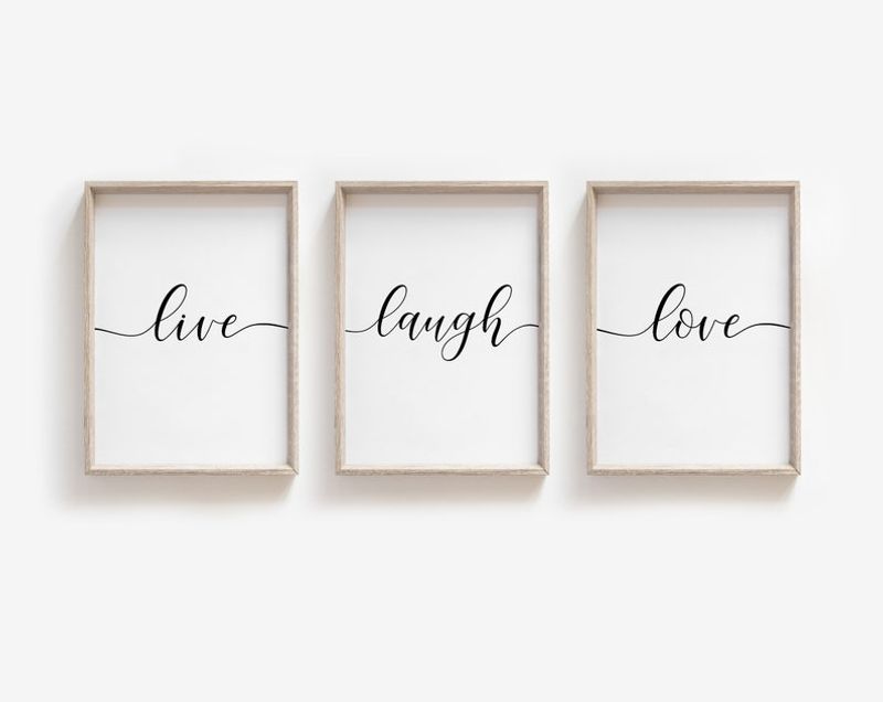
Nothing announces ‘I shop exclusively at HomeGoods’ quite like walls plastered with mass-produced platitudes about family, wine, or beach life.
These factory-made sentiments—especially in that cursive font that’s somehow both chunky and wispy—make your home look like a Pinterest board come to horrifying life.
If Joanna Gaines wouldn’t put it in her farmhouse, neither should you.
Replace with actual art, vintage signs, or—revolutionary concept—nothing at all. Empty wall space isn’t a crime.
7. Exposed Electrical Cords: The Room’s Nervous System
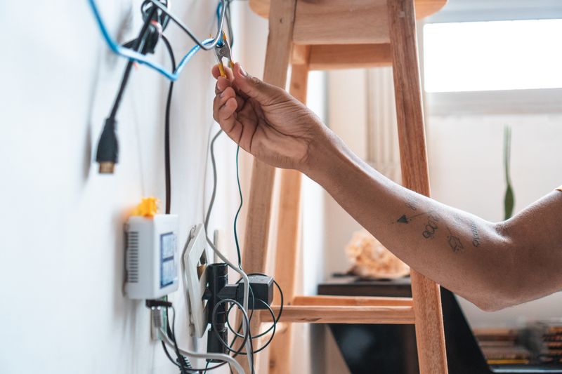
Nothing says ‘I don’t quite care enough’ like a tangle of black and white cords snaking across your living space like some kind of electronic kudzu. Those visible power lines create visual chaos that even Marie Kondo would need therapy to address.
Cord management isn’t just for tech nerds—it’s for anyone who doesn’t want their home looking like the back of a Best Buy. Cable channels, cord covers, or strategic furniture placement can hide these necessary evils without requiring an electrical engineering degree.
8. Hollow Core Doors With Factory Knobs
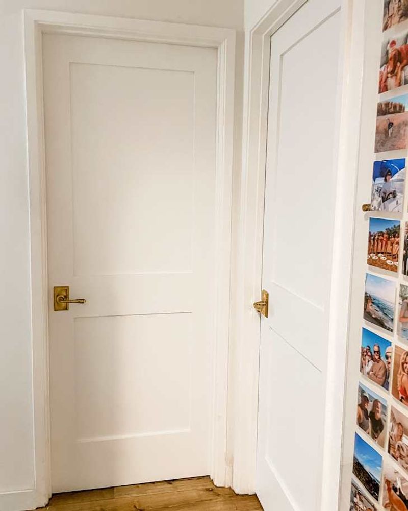
Those ultra-lightweight, hollow-sounding doors that came standard with your house are essentially cardboard pretending to be architecture. They’re the housing equivalent of serving Kraft Singles at a dinner party—technically present but fooling absolutely no one.
Replacing interior doors isn’t cheap, but few upgrades deliver more bang-for-buck in the perceived quality department. Solid core doors with updated hardware make your home feel substantial rather than slapped together like a dorm room furniture kit.
9. Fake Plants Collecting Real Dust
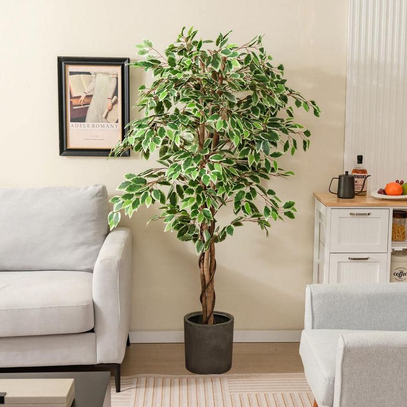
That faux ficus in the corner might have seemed low-maintenance, but it’s become a shrine to neglect—a dust-collecting monument to convenience over style. Plastic greenery, especially the obviously fake kind with that peculiar sheen, reads as dated as a MySpace profile.
If you’re plant-challenged, opt for high-quality silk versions or go with something genuinely low-maintenance like succulents or snake plants. Even empty decorative pots look more intentional than those sad synthetic leaves from 2007.
10. Popcorn Ceilings: The Asbestos Aesthetic
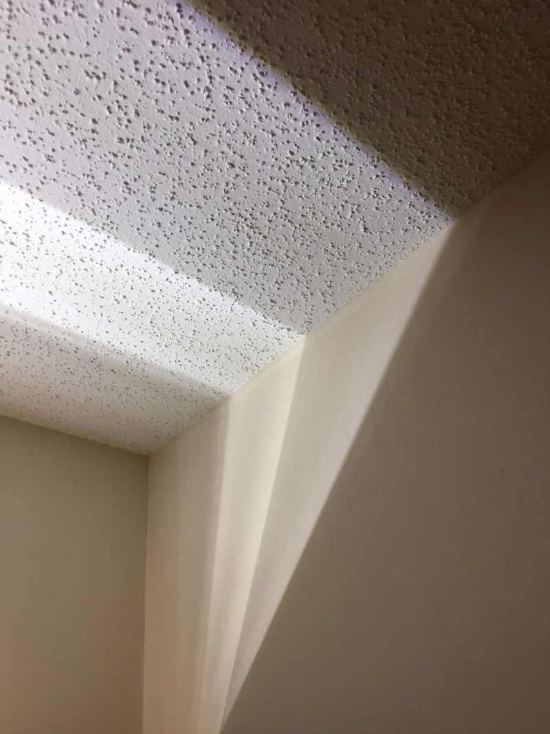
Those lumpy, spray-on ceilings that resemble cottage cheese gone wrong aren’t just outdated—they’re the architectural equivalent of a mullet. Builders installed them to hide imperfections and save money, not because anyone ever looked up and thought, “Yes, my ceiling should resemble the surface of the moon.”
Scraping them is messy but transformative. If removal isn’t feasible, consider ceiling planks or beadboard to cover the textured nightmare without major demolition. Your guests will stop staring anxiously at what might fall into their drinks.
11. Mini Blinds With Missing Slats
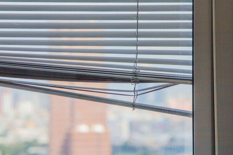
Those flimsy aluminum window coverings with their perpetually bent slats and dangling pull cords create an instant “neglected apartment” vibe. When several slats are missing or permanently kinked, your window essentially wears a damaged grin that screams “I’ve given up.”
The bent metal catches light in all the wrong ways, drawing attention to the window’s sad state. Replacing them costs less than a decent takeout dinner for two, yet dramatically transforms the room from “first apartment after divorce” to “actual adult lives here.”
12. The “Flush Mount Whatever Was Cheapest” Lighting Collection
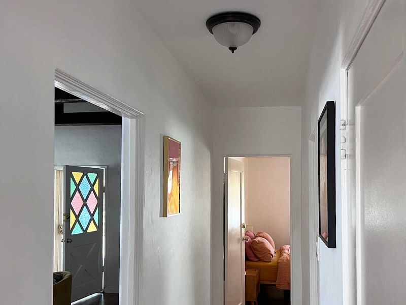
Mismatched builder-grade lights throughout your home—frosted mushroom in the hall, Hollywood strip in the bathroom, faux-Tiffany in the dining room—create a chaotic energy that screams “piecemeal renovation.” It’s like wearing flip-flops with a tuxedo—one element undermines everything else.
Lighting is jewelry for your home, not an afterthought. Creating a cohesive lighting plan with fixtures that relate to each other (even if not identical) instantly elevates your space from “random Amazon purchases” to “someone with actual taste lives here.”
13. Visible Shower Liners Without Curtains
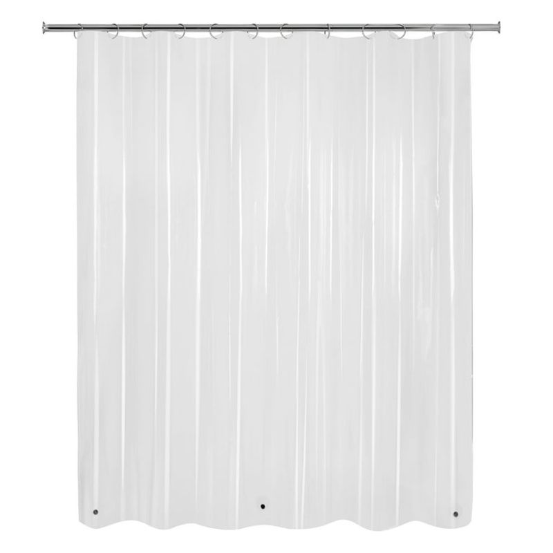
Using only a clear plastic shower liner without a decorative curtain is the bathroom equivalent of wearing underwear without pants. That flimsy, wrinkled sheet of plastic—probably sporting orange soap scum at the bottom—transforms your bathroom from potential sanctuary to college dorm throwback.
Decorative shower curtains cost less than two cocktails at a decent bar, yet magically convert your bathroom from “making do” to “designed with purpose.” Bonus points for hanging both liner and curtain from a proper rod installed at ceiling height to create the illusion of vertical space.
14. The Blank Wall Museum of Nothing
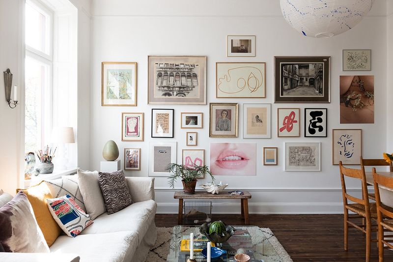
Vast expanses of empty walls create an echo chamber effect that screams “just moved in” or “recently divorced.” Particularly egregious are those lonely nails or hooks—evidence of artwork past—that remain like relationship ghosts, marking where something once hung.
Art doesn’t require a trust fund. Framed vintage scarves, mounted plates, or even carefully arranged postcards create intentional moments that draw the eye. Empty walls tell visitors you’re either just passing through or pathologically minimalist—neither impression suggests comfortable permanence.
15. Visible TV Cords Dangling Like Electronic Vines
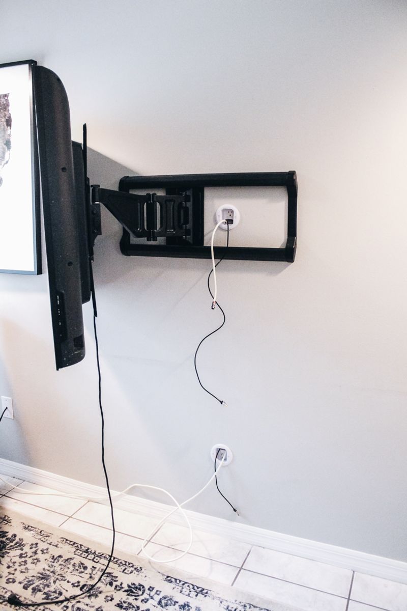
Mounting your TV above the fireplace might seem sophisticated, but leaving those black cords dangling like sad tentacles ruins the elevated effect. Nothing screams “I almost tried” like a beautiful wall marred by exposed cables snaking down to outlets.
Cord covers, raceways, or the increasingly affordable in-wall cable management kits instantly upgrade your space from “tech-forward frat house” to “adult with standards.” Even painted cord covers look infinitely better than that black umbilical cord connecting your expensive TV to its power source.
16. Toilet Tank Tchotchkes
Decorating your toilet tank with figurines, framed photos, or worse—toilet-themed humor signs—creates a porcelain shrine to questionable taste. Nobody wants to make eye contact with your family vacation photo while answering nature’s call.
The toilet is not a display shelf. It’s a utilitarian fixture that deserves respect through simplicity. Keep essentials nearby but hidden in attractive containers. A small plant or minimal art on the wall above works if you must decorate this zone, but your toilet tank should remain a clutter-free zone.
17. Refrigerator Collage: The Kitchen’s Mood Board
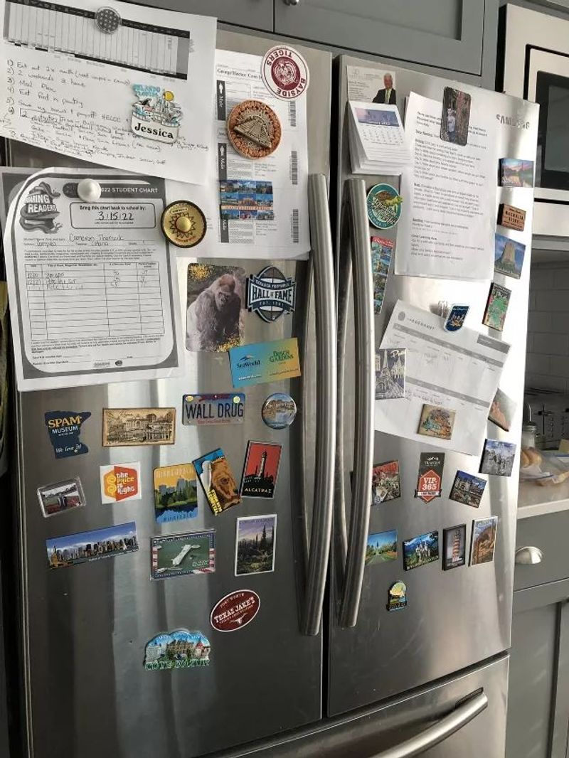
Covering your refrigerator with a chaotic gallery of save-the-dates, children’s artwork, expired coupons, and novelty magnets transforms your kitchen into a visual tornado. What starts as practical memory-keeping quickly devolves into a metallic bulletin board screaming “disorganized mind lives here.”
Curate ruthlessly if you must display items. A sleek magnetic board elsewhere in the kitchen corrals important papers without creating visual chaos. Modern refrigerators with their specialized finishes aren’t designed to disappear under a paper blizzard—they’re meant to be design elements themselves.
18. The Microwave-As-Architectural-Feature Placement
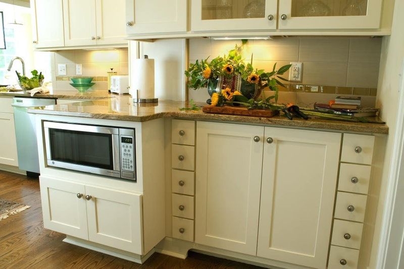
Positioning your microwave as the kitchen’s focal point—especially when perched on a counter directly at eye level—instantly creates a “convenience over style” statement. This placement screams “I heat more meals than I cook” while consuming precious counter space and disrupting visual flow.
Consider relocating it to a built-in nook, under-counter position, or inside a pantry if possible. If counter placement is unavoidable, at least tuck it into a corner rather than center stage. Your kitchen should showcase your culinary aspirations, not your Hot Pocket addiction.
19. Floating Rugs: The Interior Design Lily Pad
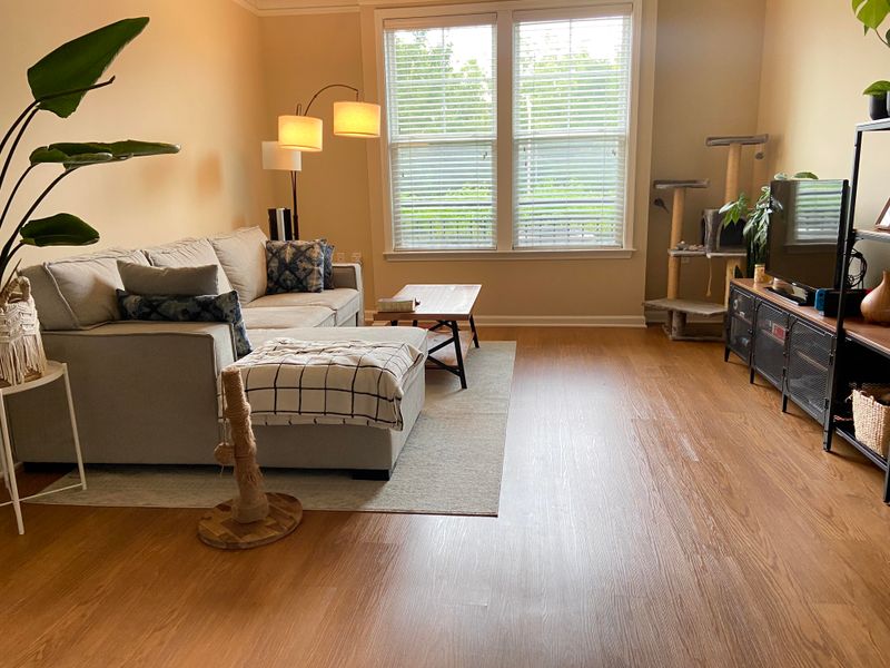
Undersized area rugs that float like islands, touching no furniture, create a disjointed, choppy feel that makes rooms look smaller and hodgepodge. That 4×6 postage stamp centered under your coffee table resembles a misplaced bath mat rather than an intentional design element.
Rugs should anchor furniture groupings, with at least front legs of major pieces resting on them. Size up—an 8×10 is almost always better than a 5×7 in living spaces. The right rug creates cohesion and definition, while the wrong one makes even expensive furniture look like random thrift store finds.